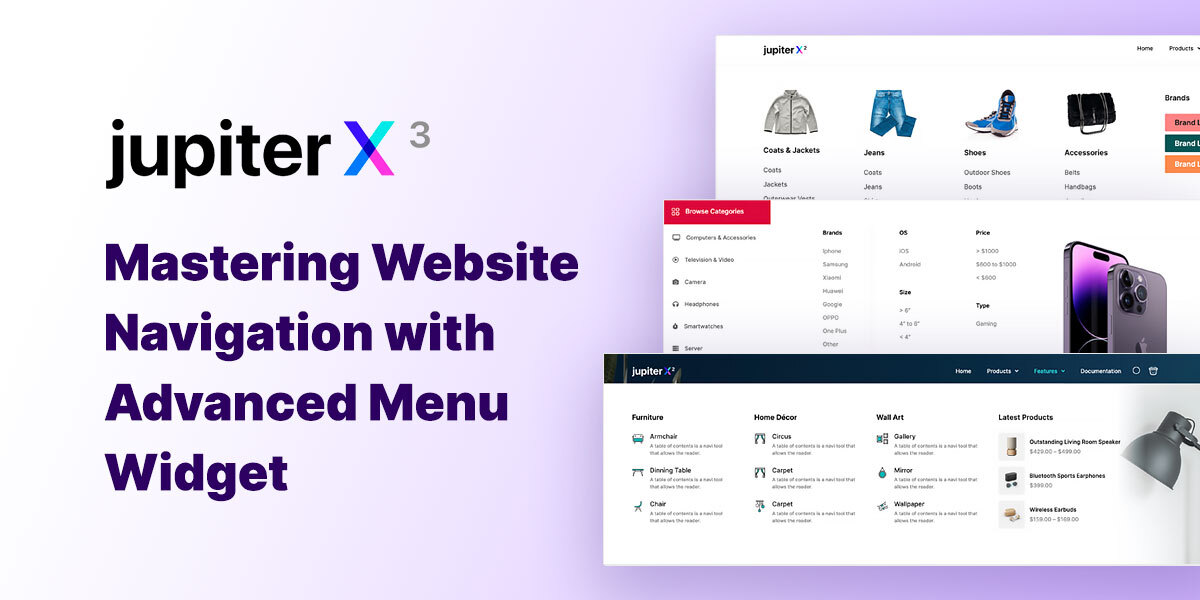
Website navigation plays a crucial role in user experience. The better navigation a website has, the higher engagement the site visitors will have with your site and the lesser chance there is that they will leave your site. Jupiter X v3 introduces the Advanced Menu widget that simplifies building professional-looking menus even the most complex ones.
In this post, we’ll delve into the benefits of the Advanced Menu widget, recently released in the new Jupiter X v3, walk you through the steps to create different types of menus and share best practices to create eye-catching menus.
Introducing the Advanced Menu Widget
The new Advanced Menu widget in Jupiter X improves the menu-building experience in two major ways.
Versatility
The new Advanced menu widget provides you with the flexibility to design various types of menus to match the overall aesthetics and functionality of your website, improve website navigation and enhance the usability of your website.
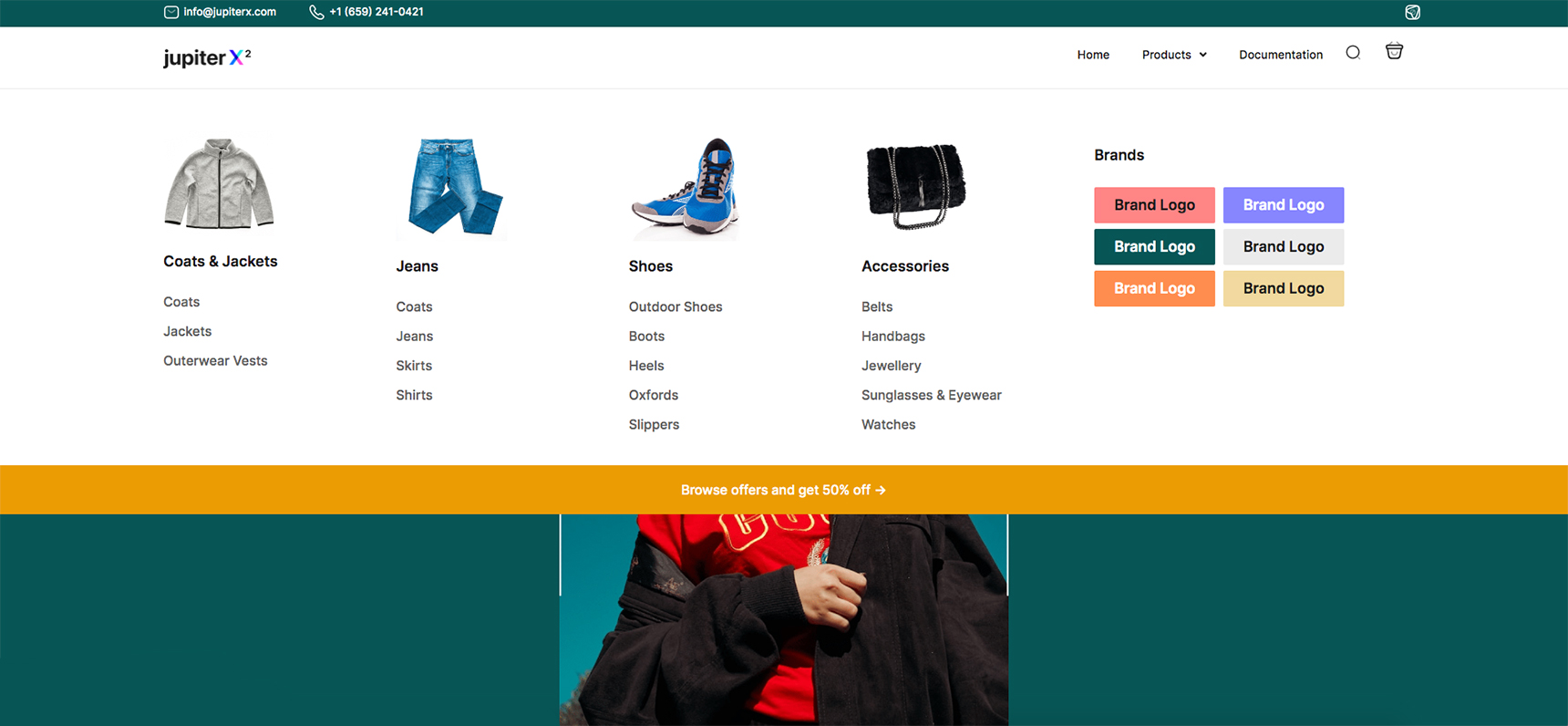
Whether you need a simple regular menu for a straightforward navigation experience, a dropdown menu for organizing sub-menus, a mega menu for displaying a large number of items, a full-screen menu for a unique and immersive navigation experience, a side menu for adding a sidebar menu to your website, or even a horizontal or vertical menu for a creative and customized layout – the Advanced Menu widget can help you create all types.
Visual front-end editing
This is about the main challenging aspect of building menus in WordPress: back-and-forth backend and frontend editing. The new advanced menu builder widget eliminates the need for tedious backend editing and offers a completely visual editor to build and modify any type of menu.
Using the drag-and-drop functionality and visual controls you can track and adjust your menu design in real time and make sure it fits the website’s overall look and purpose.
How to create Advanced Menu in Jupiter X
Using the old Mega Menu, you need to create the menu in the Menus section, add the Mega Menu widget to each menu then assign templates to each menu item separately. In other words, you need to add a sub-menu and assign a section template to it. The section template will show as your mega menu when you hover over the parent menu item.
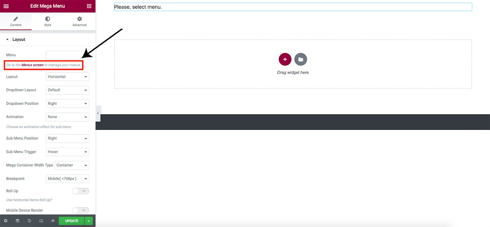
Following the introduction of the Layout Builder in the Jupiter X2 update however, all steps are gathered in one place in the frontend and you just need to use the Advanced Menu widget to create different types of menus easily and in seconds.
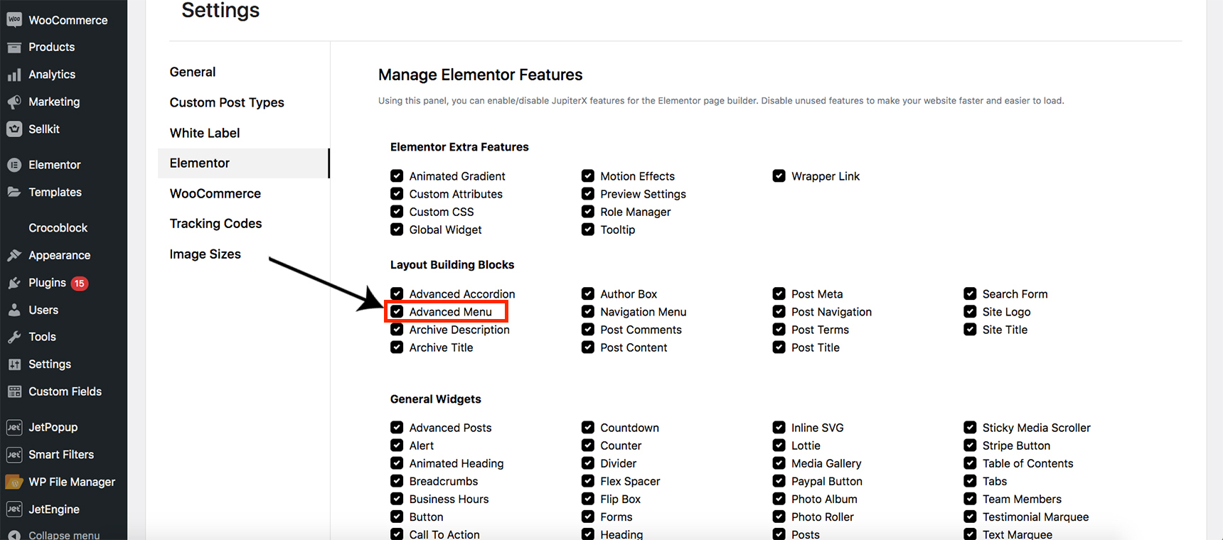
Before starting to create your menu first you need to make sure Advanced Menu is installed for the Elementor page builder. Go to Jupiter X > Settings > Elementor and check if the Advanced Menu feature is checked off in the list.
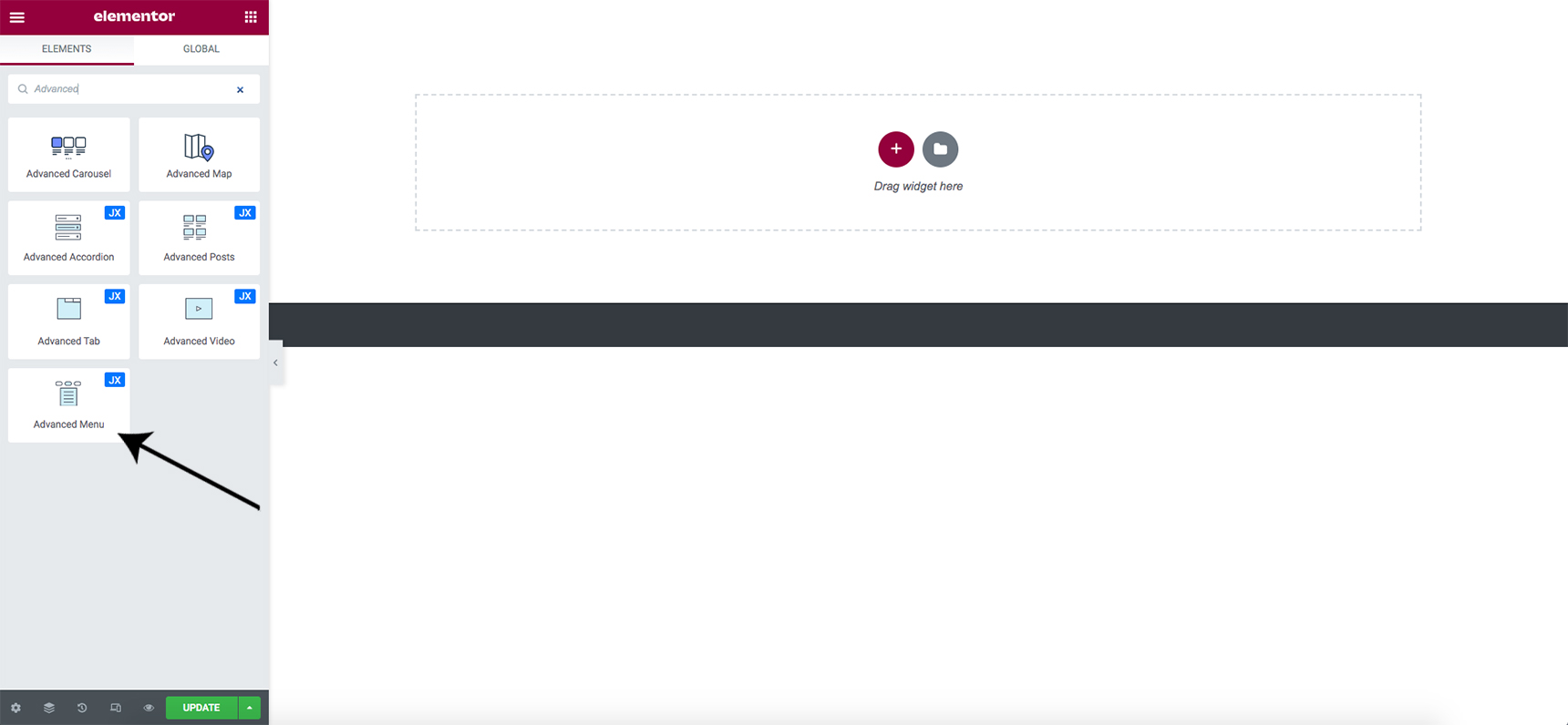
Create a new header in Layout Builder and open it, search for the Advanced Menu in the Elements section, and drag it to your page. This is the first step in creating and customizing various types of menus as you please.
There are 4 types of layouts available you can choose from to create your menus: Horizontal, Vertical, Dropdown, and Off-Canvas.
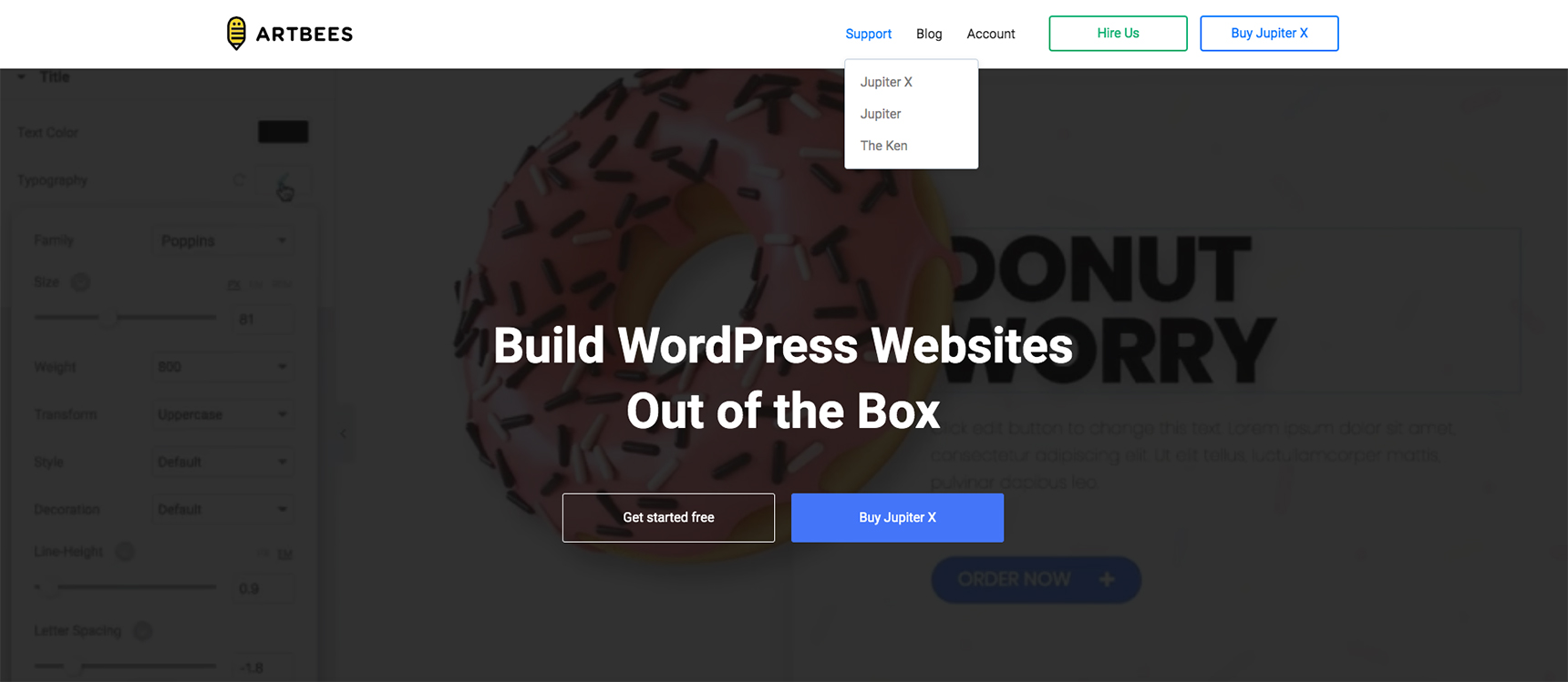
Horizontal menus located usually on top of the website and running horizontally across the page, are a popular navigation choice for websites as they provide a user-friendly, space-saving, and design-flexible navigation option that can enhance the overall user experience of a website. They can be expanded to show sub-navigation options or dropdown menus, but they are generally limited in the amount of information they can display.
Vertical menus are typically located on the right or left side of the website and run vertically. They are designed to display a range of navigation options in a single column and can be expanded to show submenus or dropdowns. Vertical menus are often used for websites with a large number of navigation options, or for websites with a more modern, minimalist layout.
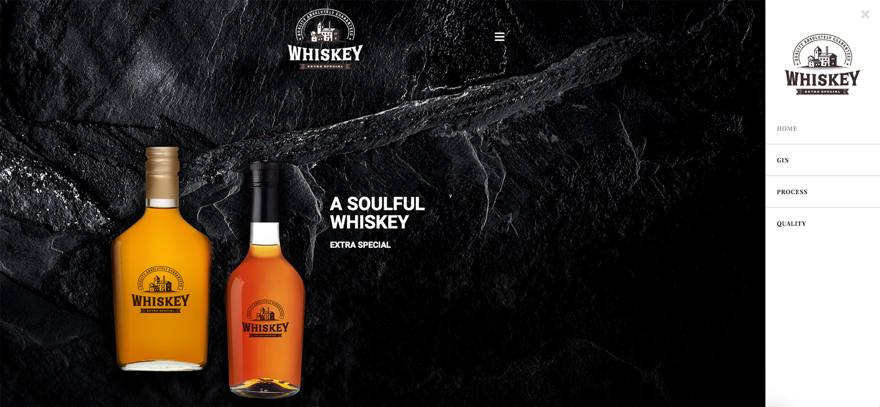
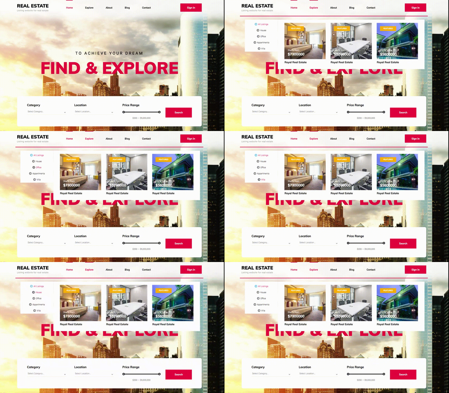
Dropdown menus are designed to display a list of navigation options in a vertical or horizontal list. When a user hovers or clicks on a menu item, a dropdown menu appears with a list of related submenus. This allows website owners to display a large amount of information in a compact space, and it can be a useful way to organize navigation options.

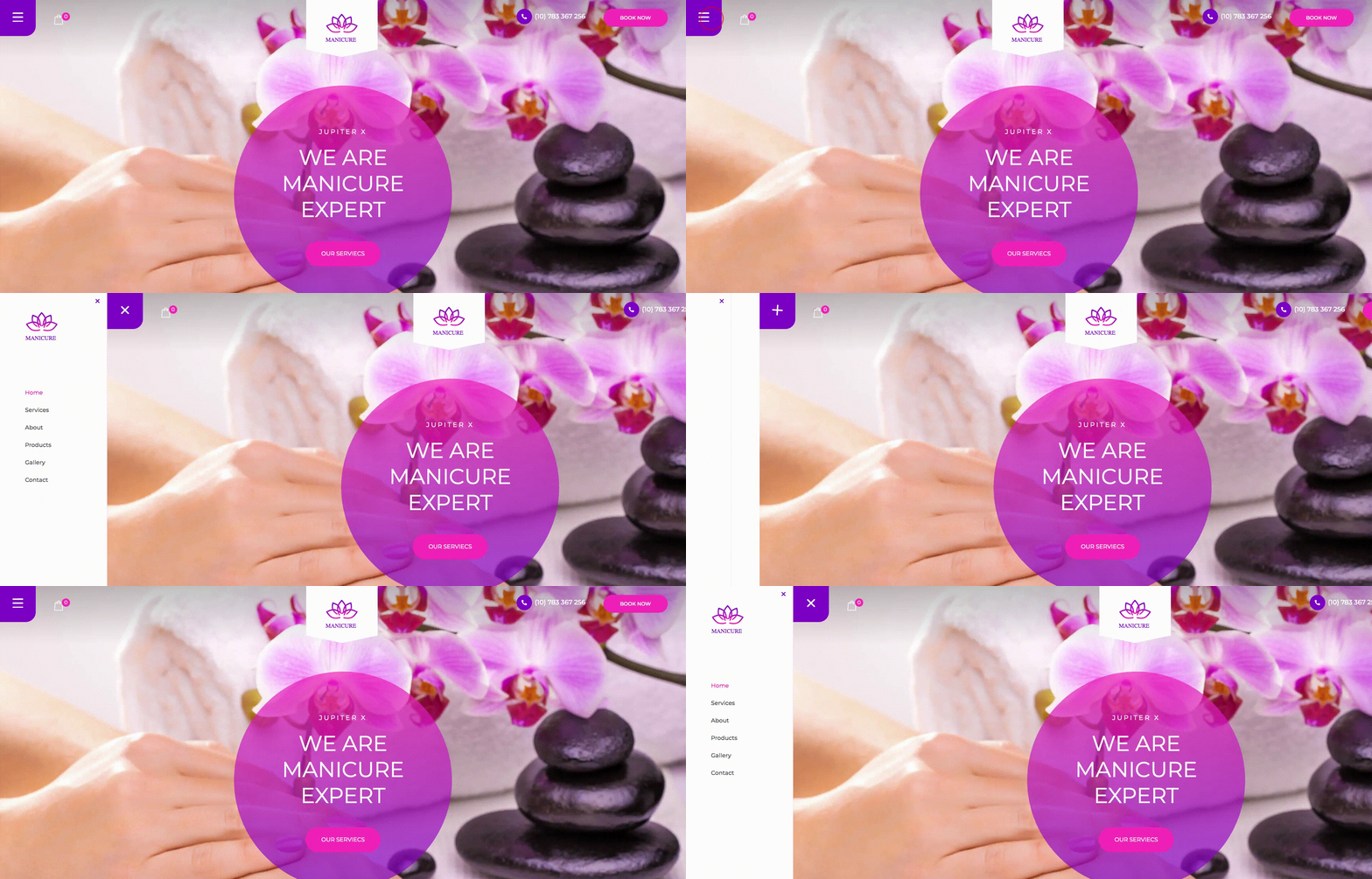
And finally, Off-Canvas menus tend to be more space-saving than the others, as they are designed to be hidden off the screen and only appear when triggered by a specific button or icon. This frees up valuable screen space and presents a cleaner interface. This also makes the Off-Canvas menu more user-friendly on smaller screens like mobile.
Best Practices for designing appealing menus
When designing menus using the Advanced Menu widget in Jupiter X V3, there are several best practices you can follow to create appealing and effective menus that enhance your website’s user experience. Here are some tips to consider:
Keep it simple
A clean and simple menu design is often more effective in helping users navigate your website. Avoid cluttering your menu with too many items or complex layouts that may overwhelm visitors. Stick to a clear and concise menu structure that is easy to understand and use. Always remember that “less is more”!

Use visual hierarchy
Utilize visual hierarchy to prioritize important menu items and guide users to the most relevant sections of your website. Use larger font sizes, bold or italic styles, and different colors to differentiate between different levels of menu items. This helps users quickly identify and access the information they are looking for.
Mind the responsiveness
With the increasing use of mobile devices for browsing, it’s crucial to ensure that your menu is mobile-responsive and works well on smaller screens. Use the Advanced Menu widget’s mobile menu styling options to create a seamless and user-friendly experience for mobile users. Test your menu on various mobile devices to ensure smooth navigation and readability.

Make it visually fun
Consider adding visual items such as icons, arrows, or hover effects to your menu items to make them more visually appealing and catching. This can help users quickly understand the functionality of each menu item and enhance the overall navigation experience.
Let’s wrap it up!
The Jupiter X v3 Advanced Menu widget offers a powerful and versatile solution for designing visually appealing and user-friendly menus all through frontend editing for your WordPress website.
This widget serves as a great replacement for Elementor Pro’s menu builder or any other third-party library, meaning that you won’t need to pay for any extra fees or subscriptions and make use of this widget along with many other native widgets built right inside Jupiter X core.
Let us know in the comments how you found this widget and how it helps with your website menu design. Is there any other best practice to follow when designing a menu for a WordPress website?


1 Comment
What a nice post! Thank you so much and I am really looking forward to reading more and more articles from you