What is the psychology of color?
Website color scheme can elicit different kinds of emotions depending on the background and experiences of the users. While it would be difficult to predict all the experiences of your clients, it is possible to generalize the interests of your viewers depending on your product.
A study entitled “Impact of Color on Marketing” showed that as much as 90% of initial conviction about a brand is based on web color alone. So the wrong color of a website may drive potential clients away even if they need your product.
But who likes what colors? After studying who your target audiences are, base the website color theme on what appeals to them and create a customized color theme that will avoid using colors that turn that specific group off.
For example, ladies are attracted most to shades of blue, purple and green. They tend to dislike the colors brown, gray and orange. Meanwhile, men are more likely to enjoy blue, green and black. They hate brown, orange and purple. If you’re targeting both genders, use colors which are loved by both genders like blue.
What do colors say about you?
Blue can be used as a website color to establish trust with the users. It conveys calmness, confidence, loyalty and trust. That’s why you may notice that successful platforms like Facebook, trusted banks and brands use the color blue.
Yellow may frequently be associated with joy but it can also arouse anxiety. Go easy on the color yellow if you don’t want to aggravate unnecessary apprehension. A yellow call-to-action button will be enough to attract attention.
Green is known to be an icon for nature but it’s also a color that sparks creativity. Black signifies elegance and power and exudes a sophisticated, top-tier and cutting edge service or product.
Orange emphasizes urgency so can be good to use for conversion. Just like yellow, orange must be used sparingly to avoid overwhelming the users.
White must not be taken for granted because a spacious white background represents liberty and breathability.
The best colors to use for a Call to Action are red, green, orange and yellow as, according to studies, these bright colors have the highest conversion rates. Let’s see some examples from our Jupiter WordPress theme templates:
Major Color Schemes for Different Niches
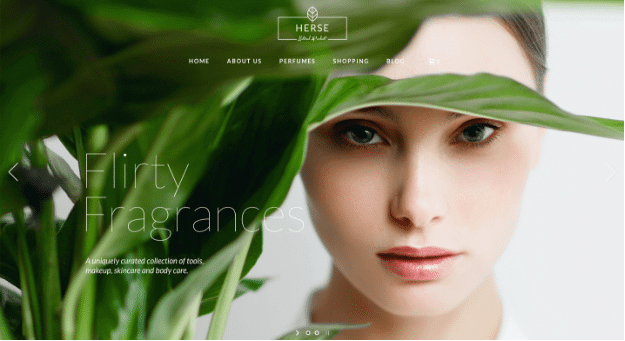
Herse’s color scheme is best for websites which target women. Brands like beauty products and jewelry are best suited for this template. The color scheme is composed mainly of green and white. Colors that are both appealing to women.
Brands that are environmentally friendly will particularly benefit from this because of what the color green signifies. The color scheme is calm, breathable, simple and serene.
The main color of Summanus is blue. A blue website color implies sincerity. Blue can be ideal for brands which need to gain trust and confidence from clients like banks and healthcare institutions. Brands offering products related to sensitive matters like health and finances must make users believe that they are in safe hands.
A blue-themed website is one way to trigger that feeling of security and assurance. Blue is a color appealing to both genders so it can be used for websites which target both men and women. It also has plenty of white background so it is not overwhelming to visitors.
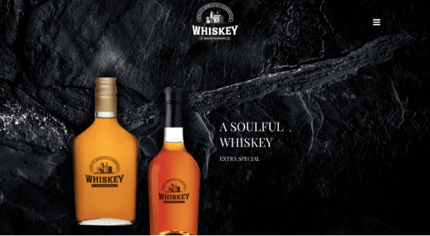
Guru is a great choice for luxurious brands. The background is black which speaks of elegance and sophistication. Classy perfumes, alcoholic drinks, and watches will stand-out using this color scheme. Men who want high-class products will particularly be attracted to this website design.
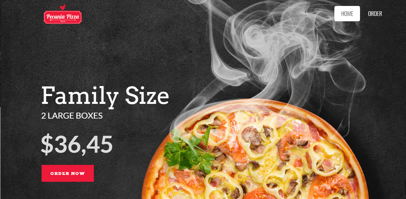
Pecunia has a perfect color scheme for brands relating to low-cost food. The color red boosts appetite which will attract users to buy. The call-to-action signs on the website are all in red color which is proven to generate more conversion rather than signs in black.
Next time you walk by a fast food chain take a moment to notice the colors used for the interior and menu and you’ll see they’ve been ahead of the color curve for a while.
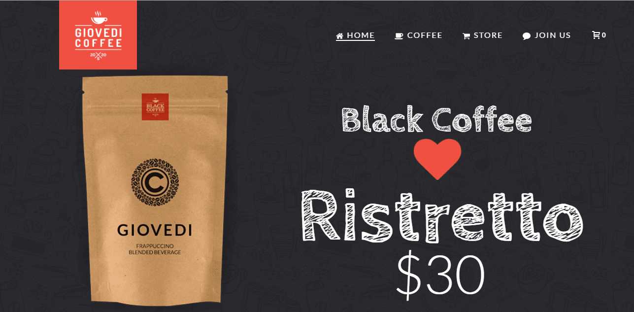
Giovedi has also an ideal color scheme for food products. It is a combination of black, red and white colors which will wonderfully showcase refined food products. The website looks classic, refreshing and appetizing while being straightforward, not overly cluttered and intuitive.
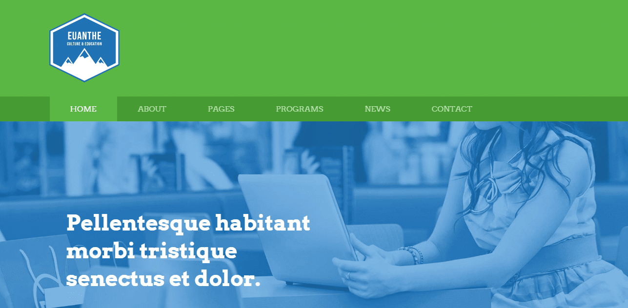
The colors blue and green used in Euanthe are appealing to both genders. Adding to the description of each color from before, both blue and green website colors represent growth and productivity making this template work best for corporate businesses and organizations.
Since green also sparks creativity, it is an excellent choice for artists such as photographers and writers. It can satisfy the eyes without detracting from the art and work itself.
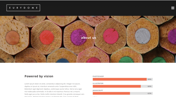
Eurydome is another template choice for artists which makes use of beautiful color contrast which also creates a striking design with a black and white menu. It has mainly black and gray colors incorporated which denote sophistication and has just the right amount of red to call attention but not overwhelm users.
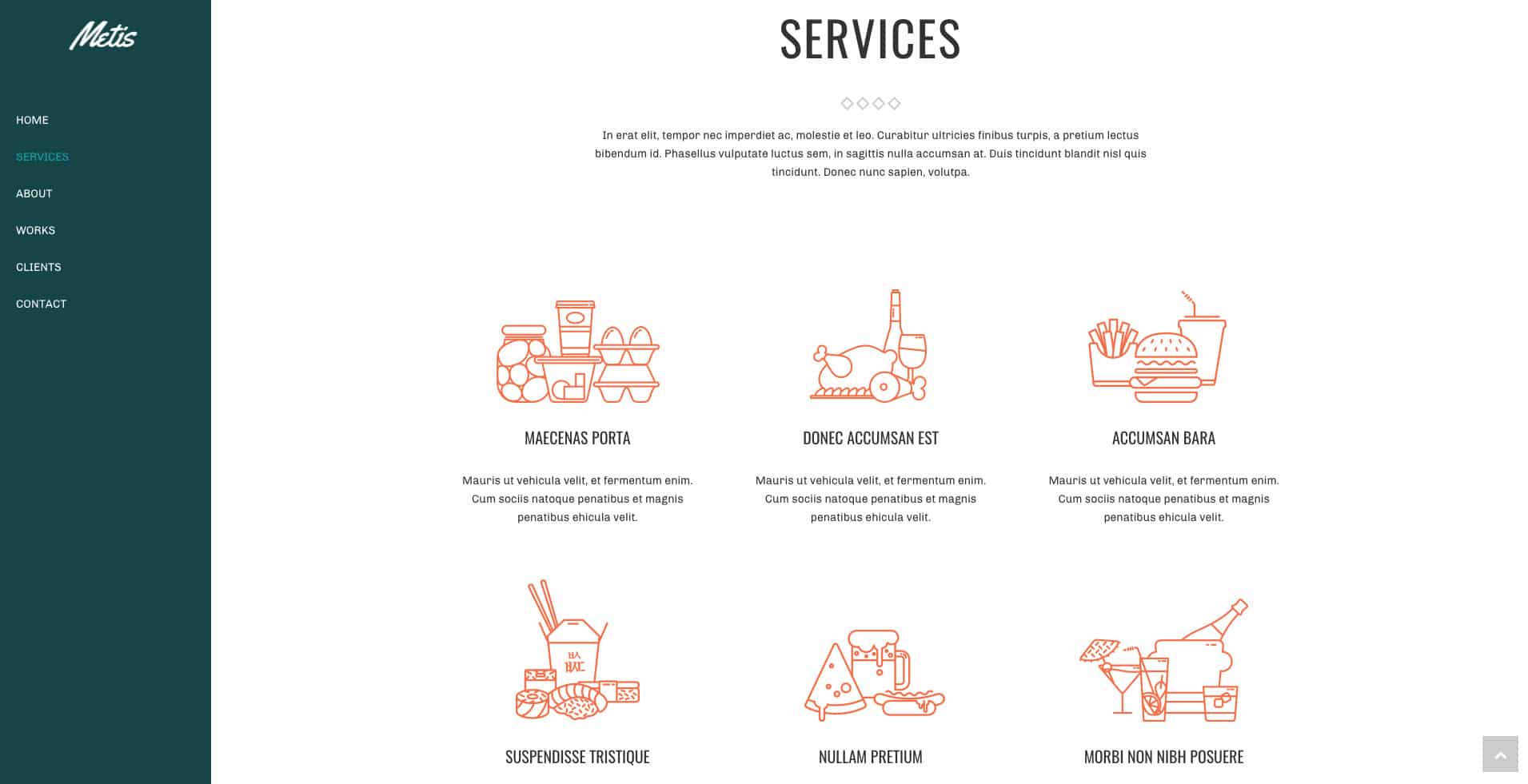
Metis is an alternative website design for artists, businessmen, and organizations. The blend of colors elicits professionalism, creativity, and sophistication. Black is beautifully contrasted with the bold orange. Remember to consider that the contrast of colors in web design affect the readability of the texts on the website.
3 Useful Tools in Choosing a Website Color Scheme
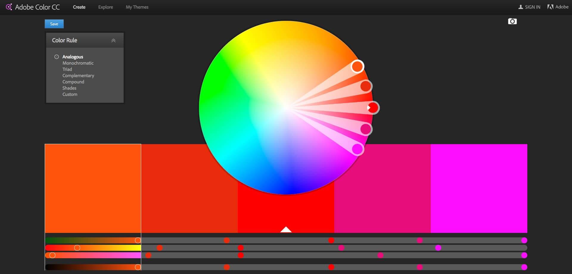
This amazing tool allows you to create your own website color theme. Yes, to some of you that may sound like fun and to others completely overwhelming, but after considering the factors mentioned above, you’ll have a better idea of which colors to prioritize on your website.
You can adjust the settings to different color rules and play around with the wheel until you find the perfect match. You can also find color themes using a picture.
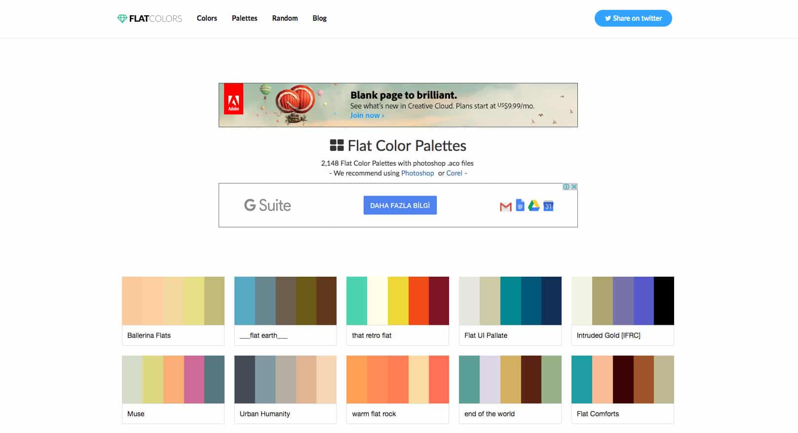
With this, you can choose from hundreds of pre-combined color schemes so you don’t need to do it yourself. There are palettes which contain one color in different shades if you opt to go for a single color. Others form the different color rules forming interesting combinations.
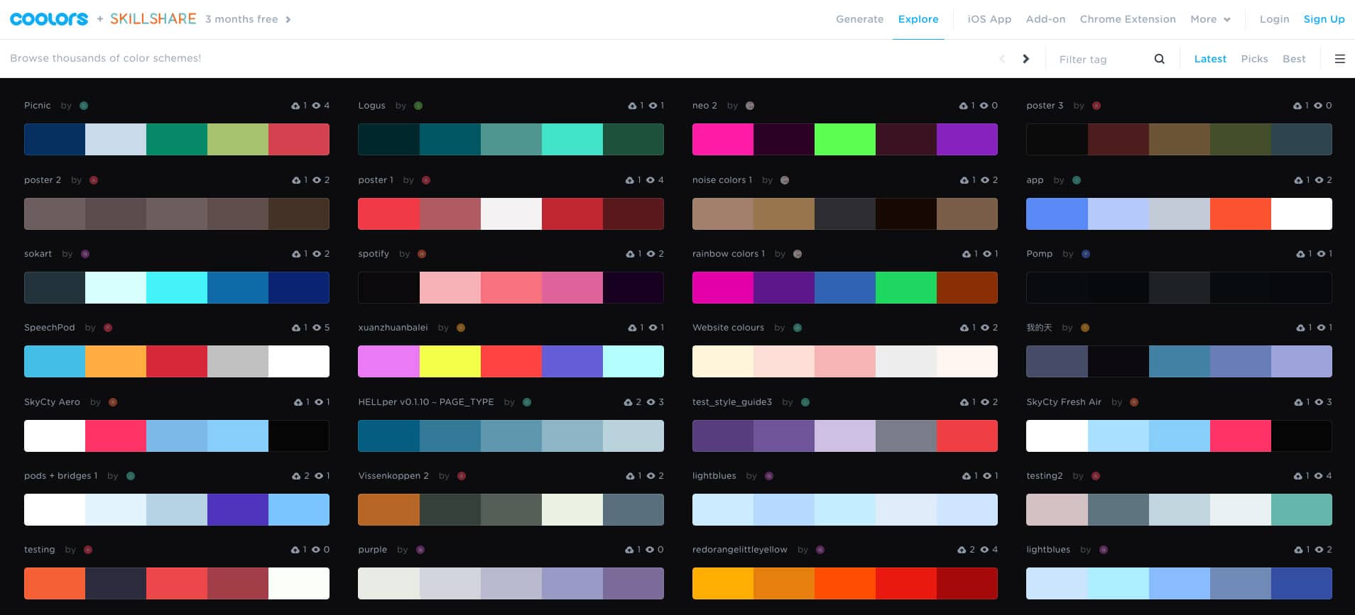
In Coolors, there are almost 400 ready-made color schemes for you. You can also choose an image to base the color combination you want and with this tool, you’ll be able to modify and refine the colors.
Bottom-line with colors
While the colors you choose to include in your website are definitely an influential factor in the tone of your website, there are no clean-cut, hard-rules in choosing which colors will win or lose customers. Nevertheless, there are guidelines that provide us with a better idea and direction of how we can wield colors to project different impressions about our services or products.
When it comes to colors, just like in other elements of website design, you always have to keep it convenient for the users. Use the colors that will attract them. Avoid or do not use colors they do not like. Make color combinations that will make the words in your website more visible. Try your best to give them the right signals, emotions, and experiences by the colors you choose.



No comment yet, add your voice below!