In e-commerce, converting site visitors into paying customers is ultimately and unquestionably a major objective. If you’ve sat in on any team marketing meeting or reviewed Google Analytics lately, the conversion rate of your WordPress website is something hard to ignore – and rightly so.
Let’s say you’ve checked your Google Analytics lately, and you find something rather peculiar with regard to your metrics. You notice that the bounce rate in the “Purchasing Page” of your WordPress website is higher than the “Confirmation of Order” or “Thank You” page of your WordPress website. That’s where you’ve got a problem.
You have to ask yourself: why are people filling up their cart, reaching the checkout page but then not finishing the purchasing process?
What could be the reason behind those lost conversions? In this article we will look at three areas you should look at in order to increase conversions from your online shopping cart on WordPress:
- Making sure your purchasing page is correctly organized and has the appropriate colors and functions.
- Choosing the most fitting online payment system for your products, services and customers.
- Ways to reinforce the security and credibility of your payment system to your customers.
Give Your Purchasing Page On WordPress A Face-Lift
The first thing you’ll want to do in order to optimize your conversion rate is to make sure your purchasing page is looking professional, secure and simple. In a recent survey by Kissmetrics.com, it was discovered that the #1 influencing factor for purchasing an item was the visual dimension of the product. That importance also applies to the visual dimension of your WordPress website, which can greatly affect the perceived worth of the items being sold. The same study found that people’s subconscious judgments about a product are made within 90 seconds of initial viewing – 90 seconds! That doesn’t give you much time to win customers over, and to persuade them to purchase directly after. Learn how to use the purchasing page design options on WordPress to your advantage – increasing conversions whenever possible.
-
Hierarchy
One way to optimize conversions is to make sure the layout of the purchasing page has the most logical and natural flow for the website visitors. There should be a clear hierarchy of information established. The most relevant and vital content and call-to-action buttons belong above the fold to eliminate the risk of viewers missing it. Any additional information can be added below the fold, so that it’s accessible without causing distraction.
-
Colors
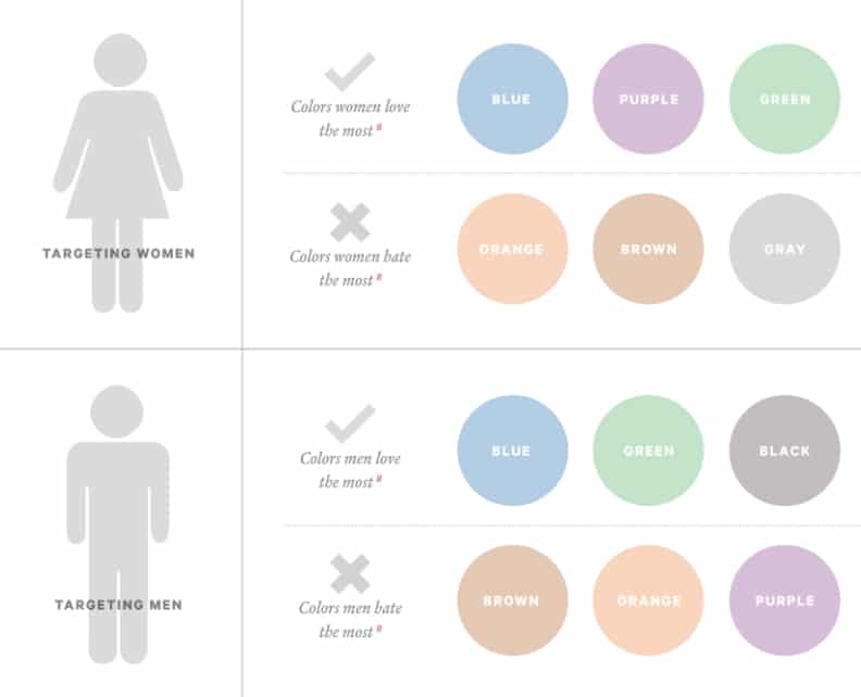
The colors of your purchasing page on WordPress should be adjusted with brighter colors used for call-to-action buttons. The colors to use on the purchasing page on WordPress will vary depending on your demographic, but generally speaking blue and green are good to use throughout the page, whereas orange and brown should be avoided. Here is a clearly organized chart showing different options and preferences that should be taken into account:
We’ve found that the best colors to use for a call-to-action button are red, green and yellow, as these bright colors have proven to have the highest conversion rate.
-
Buttons
In some cases, the plugins will have their own buttons in WordPress, but if you have control over the font and size of those buttons, we suggest tailoring them in such a way that would be eye-catching and visually stimulating. A few best practice tips for the call-to-action buttons on your purchasing page on WordPress include: using impressionable copy that compels viewers to click the offer, keeping the words action-oriented (“Buy, “Download”, “Register”), and making the font and button large enough to stand out from the rest of the page. Widening the white space around the purchase button will catch visitor’s attention, so try not to overcrowd the purchasing page.
Also, don’t be afraid to try some A/B testing with your purchase buttons on WordPress. Even small adjustments can make a dramatic difference in your conversion rates. In my opinion it’s worth putting in a bit of time to perfect the look and determine what works best for your business’ WordPress website.
Choosing the Right Payment System for Your WordPress site.
There’s nothing worse than getting a visitor acquainted with your WordPress website, interested in your items, wooed by all the options, adding the perfect selections to their cart, only to lose them when it’s time to make the final purchase out of laziness or confusion. That’s where the right payment system can help your WordPress website conversions tremendously. Out of a list of popular online payment solutions, a few that are compatible with WordPress include Paypal, Stripe, Dwolla and WooCommerce.
Paypal – Paypal is one of the best known options and the most widely used online payment systems on WordPress. That fact alone makes this one of the most favorable options since it gives a majority of visitors the comfort and convenience they’re looking for when making online transactions.
Stripe – The application process for Stripe is quick and painless. Once you’ve signed up you can start accepting payments immediately. It also processes payments directly on your WordPress website, saving you the headache of complex payment gateways, merchant bank accounts, and PCI compliance.
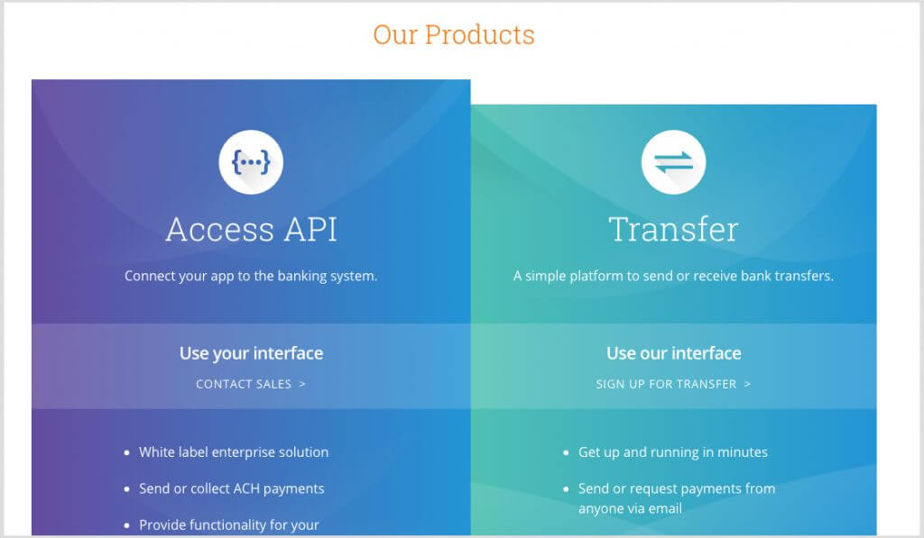
Dwolla – Dwolla is free for users and offers advanced tools for WordPress users at a flat, monthly rate. The cool thing about Dwolla is that it is one of the few systems that can transfer funds through email, phone, Facebook, LinkedIn, or Twitter.
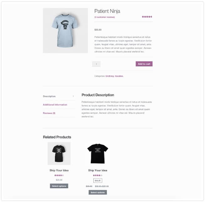
WooCommerce – WordPress users can create an entire e-commerce shop with this WooCommerce. Additionally, WooCommerce has one of the best systems to configure customers’ shopping carts so that they provide related purchases based on browsing history or past purchases made on your WordPress website:
Increase Conversions By Making Your WordPress Website More Credible
1. Security
Whichever system of payment you choose, make sure it is a secure system and that from first glance, it’s clear to your clients that their security is ensured. Looking at the data at Artbees, we have found that most clients prefer to use credit cards while making purchases. So it is beneficial for you to make your shopping cart credit card friendly. By using a trusted payment system like the ones mentioned above you will put your customers’ worries at ease.
2. Confirmation
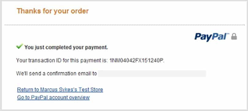
Another way to make your WordPress website more credible is if you finish the purchasing process with a “confirmation of purchase” page. Without it, some customers might be searching your WordPress website and their emails frantically to see if their purchase went through. Every online payment system works a bit differently, but most of them include an option to have a confirmation page like the one pictured below.
By always incorporating a confirmation of purchase page, you will give your clients the reassurance they need, thus improving the purchasing experience and making it more likely that they’ll return to buy more.
After all, that’s what Conversion Optimization is all about. If you follow the tips and tools we detailed in this article, you will see better results in your conversion rate on WordPress guaranteed. If done correctly, you’ll be converting your website visitors to very happy and satisfied lifelong customers.
Overview of Optimizing Your Conversions on WordPress
First, make sure your Purchasing Page on WordPress is in good shape: have a hierarchy of vital information, pay particular attention to the colors you’re using, and make the call-to-action buttons stand out.
Next, connect your WordPress with the most ideal payment system for your business. This could be Paypal, Stripe, Dwolla, WooCommerce or another reputable system.
Furthermore, you need to show visitors that you have a secure website that’ll take care of their purchases. Make your security visible and always include a confirmation page after a purchase is made.
Lastly, sit back, relax and watch the payments roll in!




No comment yet, add your voice below!