We’ve also become much more impatient as our attention spans continually shorten and our options, alternative and choices constantly grow. This trend is tremendously important for you to understand and to adapt to while designing the layout of your website.
Even the most brilliant business idea, the latest technological advancement or the most original service can go dismissed on a website if visitors can’t navigate their way through the information easily. The amount of time they’ll spend trying to figure it out will last about as long as it takes for them to think “let me check Google again”. If there’s one thing that you should focus on while curating your WordPress website, it is to thoughtfully streamline the navigation of an average user who’s visiting for the first time.
Before your big launch, take consideration of the do’s and dont’s in WordPress website navigation to make sure your website’s navigation creates the optimal user experience. This article will lay out the most significant factors to consider. We suggest creating a site map diagram to be sure your layout is as intuitive as possible. Check out this list of 10 sitemap generator tools to do so. Instead of completely redoing your website, or transforming it, hopefully you can start by making a few changes to the layout and design to streamline the process – leading to more visitors, conversions, action and satisfaction.
3 Major Do’s For Your WordPress Website Navigation
-
Do Use Data To Your Advantage.
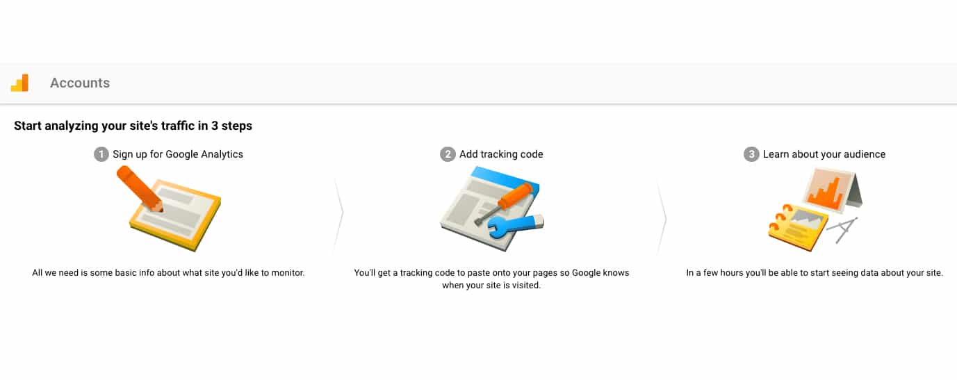
If you haven’t launched yet, make sure to connect your website with a few analytic tools before you begin. Certain metrics in Google Analytics (Pages, Bounce Rate, Overview) can help you determine which parts of your website perform better than others. Restructure your layout accordingly. If you pay close attention to the demographic of your website visitors you’ll have better insight into how they might prefer to browse. Your WordPress website navigation should reflect your target user. Does Google Analytics show that most of your viewers are female, in their 20’s and located in the U.S.? If that’s the case, you can improve your website’s navigation with linked photos and more complex features since research shows that that demographic tends to be quite visual and tech-savvy.
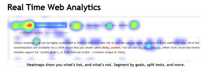
Another way to use data to improve your WordPress website navigation is to use analytical apps, like Clicky which offers incredible amounts of user behavior data and heatmap features. You can see exactly where visitors are going on your website in real time. It’s pretty cool! Some see Clicky as an advanced version of Google Analytics, because it gives much more detailed information allowing you to discover what are the most popular parts of your design, and what are the problem areas.
-
Do Omit Information That Isn’t Crucial.
After doing your research with the data analytic platforms mentioned above, use that newly acquired knowledge to cut out any junk from your website. Many web designers are stripping their sites of all noise by making a big transition to the one-page layout. Without having to make such a dramatic change, you should consider consolidated pages whenever possible. When it comes down to it, people don’t want to look through more pages than they have to.
Research in the psychology of user behavior shows that users want to feel in control when navigating a website, which means that you shouldn’t crowd the page or offer endless amounts of scrolling. Put the control back in the user’s hands by decluttering and making everything they need very apparent. Get rid of any unnecessary or repetitive information and you’ll increase your website responsiveness and SEO.
-
Do Offer Further Refinements and Recommendations Whenever Possible.
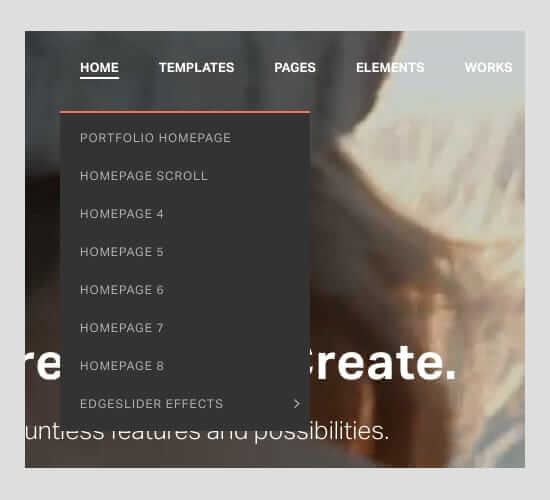
Different people want to browse in different ways and it’s up to you to give them options – with tabs, drop-down menus and filtered options. You can have broader categories listed but in some cases, it might be good to give people more specific drop-down options. For example, instead of only having a “Woman’s Apparel” tab, include refined options such as “Sweaters”, “Shirts”, “Bottoms”, “Shoes”, etc.
Make it easy for viewers to continue browsing around your website. Throughout your blog add options to check out related blog posts. If you’re using Jupiter you can activate this feature in “Theme Options” under the “Blog/News” tab. Similarly, in an e-commerce website, allow visitors who are purchasing products to see other products they might like. WooCommerce is a great tool that can help you add that option.
3 Major Don’ts For Your WordPress Website Navigation
-
Don’t Use Over-Technical Terms
In an attempt to sound more professional, some websites end up deterring visitors by making their navigation labels too industry-specific. In order to avoid this, keep the average user in mind. What kind of language is he/she used to? Don’t assume that the average Joe will know the acronyms that you and your buddies use, or even you and others in your industry. Keep it simple.

-
Don’t Overload Your Website With Buttons
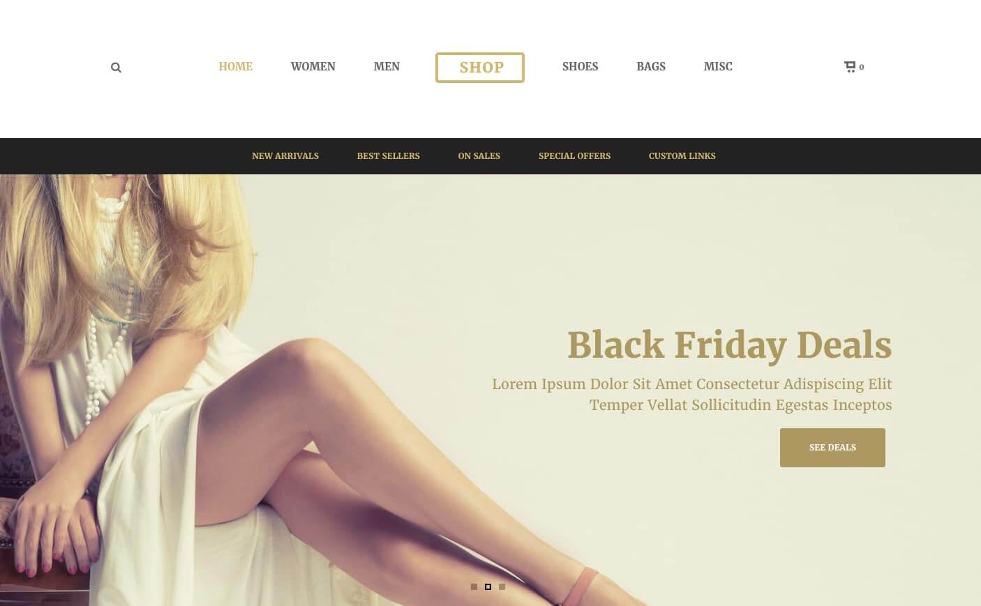
These days people think the more you throw at customers, the better the chance that something will stick, but that isn’t necessarily true. Narrow down which call-to-action buttons you really need and emphasize those by increasing the white space around them and by placing them in eye-catching locations.
One thing that many companies do, which actually hinders their business is linking their website too often. Not only will that throw off the user’s navigation path, but it will also detract from the links that are most important for them to click on. Only include links – including your social media pages – that are most essential to your business plan.
-
Don’t Forget Your Target Market
As mentioned earlier, if you’re designing correctly you’re keeping specific people in mind. Customize your menu to fit your target market’s initial and most imperative needs. For tips on how to do this customization in Jupiter specifically check out this article.
Ask yourself two questions. 1. Are all of my target market’s needs met after visiting my WordPress website? And 2. Can they find the solution to their problems easily? If that answer to those two questions is yes, then congratulations – you have aced the art of WordPress website navigation. With a smooth flow, research-backed features and clear direction, your business will be booming in no time.
Overview Of WordPress Website Navigation
3 Major Do’s For Your WordPress Website Navigation
- Do Use Data To Your Advantage.
- Do Omit Information That Isn’t Crucial.
- Do Offer Further Refinements and Recommendations Whenever Possible.
3 Major Don’ts For Your WordPress Website Navigation
- Don’t Use Over-Technical Terms
- Don’t Overload Your Website With Buttons
- Don’t Forget Your Target Market




No comment yet, add your voice below!