The elements of your blog’s design and layout will determine if a new visitor will stay and read, or leave in an instant. If you’re using a WordPress blog layout with a difficult user interface, then users can get turned off and leave your site. This is counterproductive!
Luckily, we at Artbees have tried to hedge that risk when designing our products. Now your WordPress Jupiter theme has 9 blog shortcodes that you can use for your main blog page to showcase all of your blog posts.
Blog Page Layouts in Jupiter WordPress Theme
1. Blog Classic
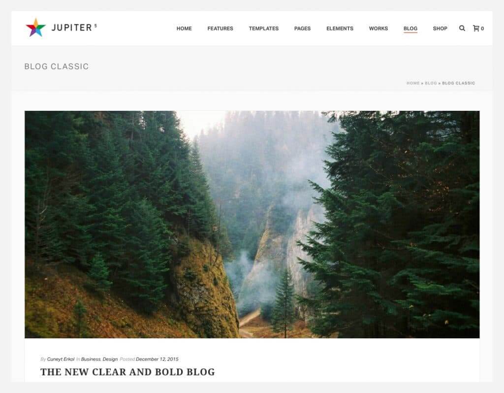
The blog classic layout is ideal for personal blogs and online journals. It provides a visual list of your most recent blog posts. Blog Classic is best if you want your readers to focus on your written content. It makes use of white space so your page will look fresh and neat.
There are no components on it so your users can read with ease and focus on your content. This classic style can be arranged in three layouts. Blog Classic shows a list of blog posts with a 250 character snippet of your content.
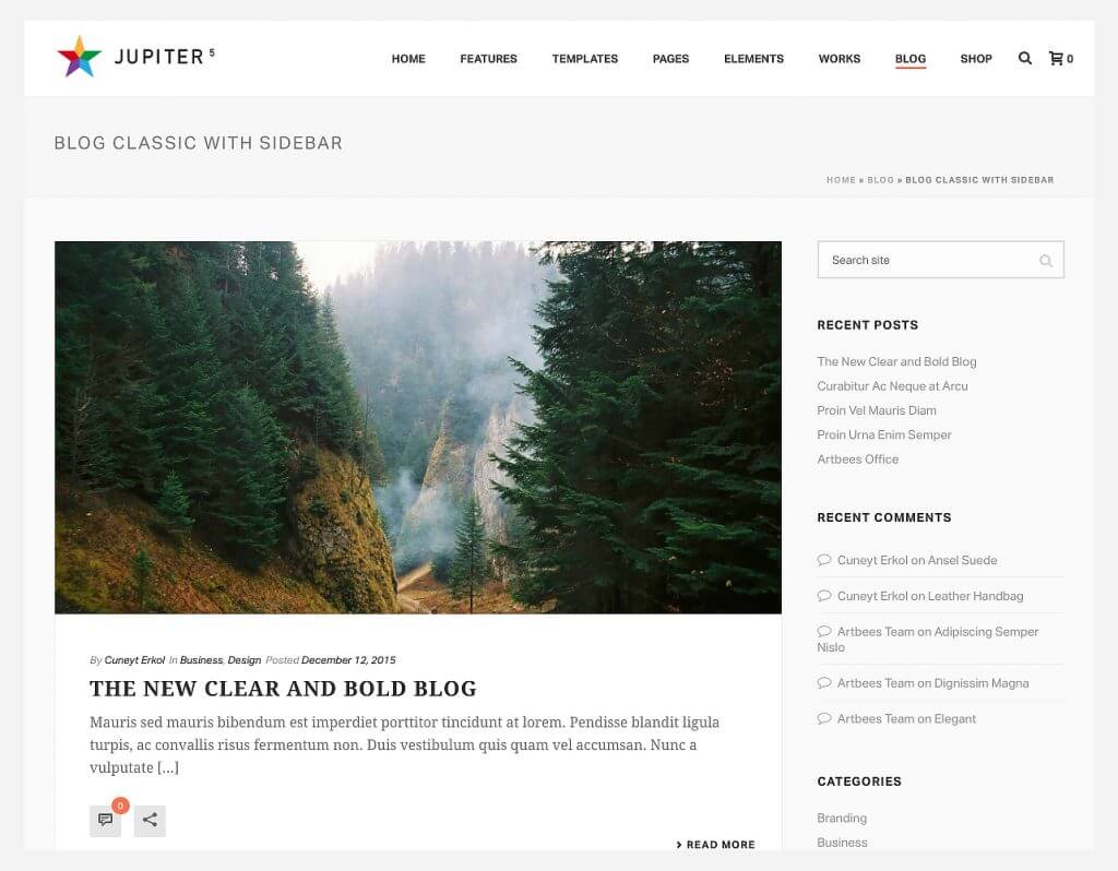
Blog Classic With Sidebar enables you to place a sidebar for your sections such as recent posts, recent comments, categories, or even a signup box for subscriptions.
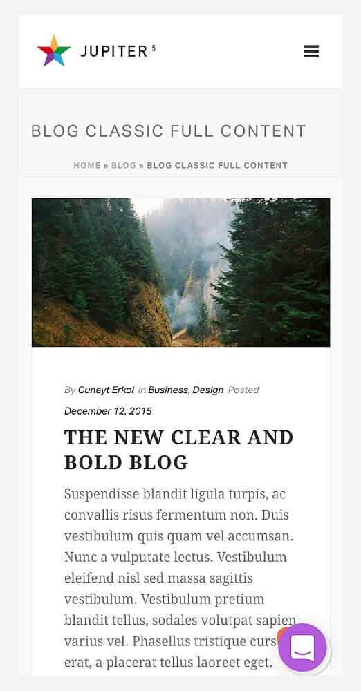
On the other hand, Blog Classic Full Content provides the complete blog content. Scrolling down will show you another blog post with full details as well.
2. Modern
The modern layout with sidebar looks very similar to the Blog Classic style, except the social buttons are located at the side of the snippet. The sidebar contains recent comments which allow readers to easily engage with the blogger and other readers.
The sidebar also contains recent posts and categories for easier navigation. It also has a full-width version that enables you to remove sidebar features. The modern blog layout is great for personal blogs and lifestyle blogs.
3. Grid
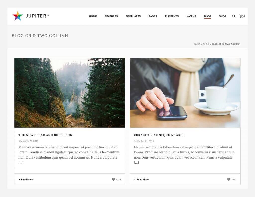
This two column grid log is best if you want to showcase different blog posts at once. You can also choose three or four columns. It is ideal for photography and design blogs since the images are highlighted on the page. The more columns you have, the more images you can feature on your main WordPress blog home page.
The great thing about the Grid layout is that your readers and subscribers can easily scan all the blog posts you’ve published. This lets your readers choose which content they want to read first. This is best for blogs that post educational and informative content.
4. Newspaper
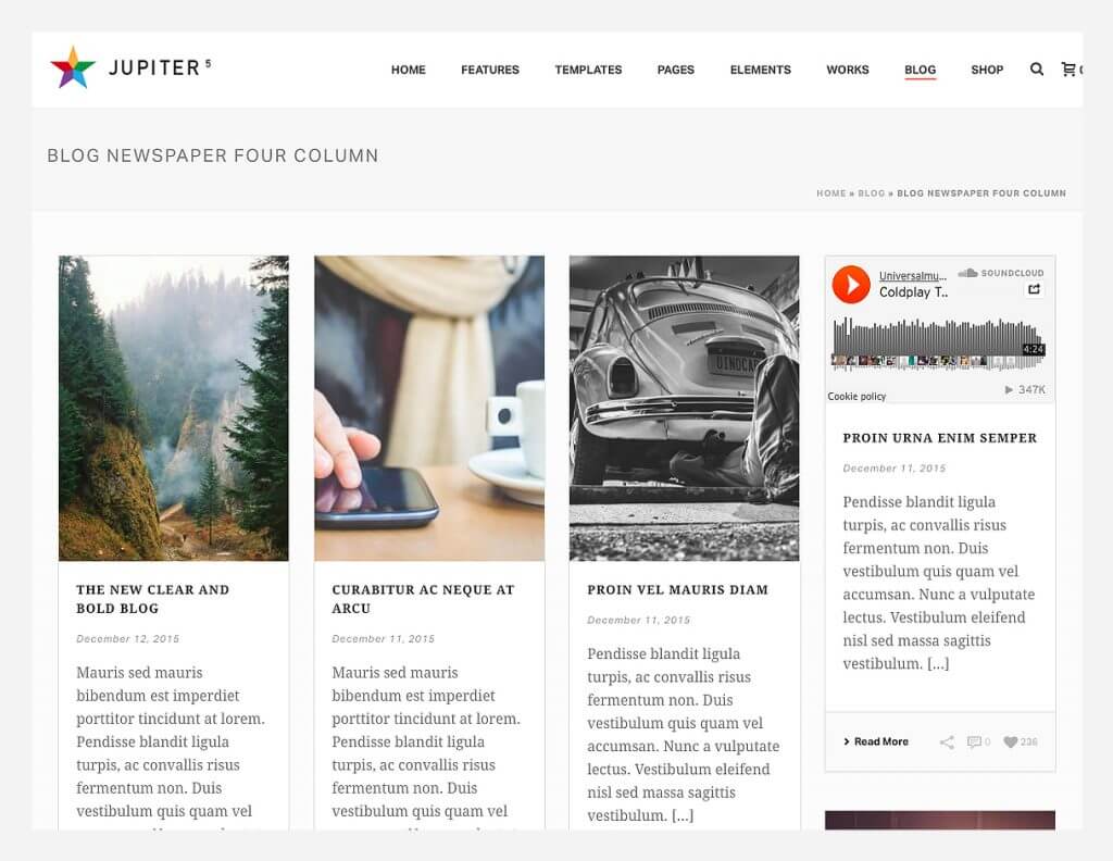
If the purpose of your blog page is to place announcements and news articles for your readers to browse through, then this blog layout is for you. Patterned after the Grid Blog Layout, the Newspaper layout features more social sharing and engagement buttons. You can customize this into two, three, or four columns.
The newspaper blog layout shows snippets of your content to catch the attention of your reader. This also lets them choose which post they want to open or read first. Use catchy images to ensure that your readers stay on.
This layout will work perfectly for news blogs and company microsites that post internal announcements and events.
5. Spotlight
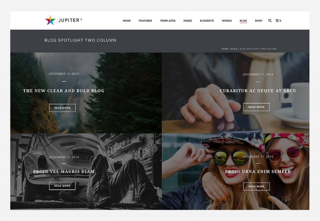
Spotlight works best if you want to feature images in your blog. It is ideal for photography, art and travel websites. It works to attract the audience through vibrant pictures, the bold titles and navigation buttons will gradually guide your audience to consume your content.
Through your blog home page alone, you will be able to show your visitors your artistic prowess. Spotlight blog layout is great for that visual wow you’re pushing for.
6. Magazine
Magazine contains the right blend of images, texts, and white space to keep a visitor interested but not overwhelmed. The most recent blog is highlighted in the center while the other blogs are presented at the sidebar. This layout is ideal for magazine and news websites by presenting an organized timeline on the sidebar while featuring a highly important piece.
7. Thumbnail
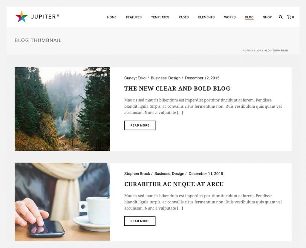
This layout is also ideal for personal blogs and business websites looking to market their products and services using content marketing. The blog homepage consists of thumbnail images, titles, and excerpt of several blogs so that readers can easily choose which articles to read.
Visitors can easily see the date it was published so they can determine the relevance and credibility of the articles by presenting them in an organized manner.
8. Blog Teaser
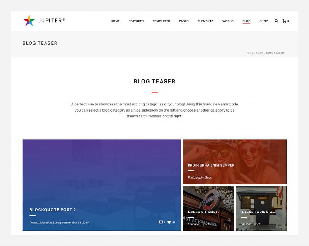
Blog teaser allows visitors to scan images on its homepage. Three blogs are presented in one column so readers can select contents to read with no trouble. This layout is suitable for blogs that need to be rich in both images and content such as adventure, lifestyle and travel websites.
The best thing about blog teaser, is that it allows you to feature your high performing blog posts on your main blog page using a carousel style. You can also just pick a category of the blog posts that you want to place in your blog slideshow, while other blog posts can be shown on the right side in smaller thumbnails. This layout also works great for e-Commerce businesses.
9. News
This layout is perfect for news blogs since it can feature multiple articles at once. The most important news is presented boldly while the rest are cleverly positioned on the page. The featured section is great for breaking news and headlines to make sure that your subscribers and visitors notice that blog post immediately.
How to Change your Blog Page Layout in Jupiter
Click here for instructions on how to change your blog home page layout.
Conclusion
Choosing your WordPress blog layout and design is very important in branding and marketing. If you want your website visitors to get a holistic idea of what your blog is about, then you need to carefully select the design and layout you want. This is why Jupiter created a number of blog layouts that even beginners can easily customize.
So, experiment with the perfect Jupiter blog page layout and design and select the one that best fits your brand.






No comment yet, add your voice below!