In a website, it should be present early on! It should already hook your visitors to scroll through more pages and tabs to know more about your business. Accomplishing this may be a daunting task. Thankfully, our Jupiter WordPress theme allows for maximum customizability so your business can exemplify how product presentation is a stunning art form.
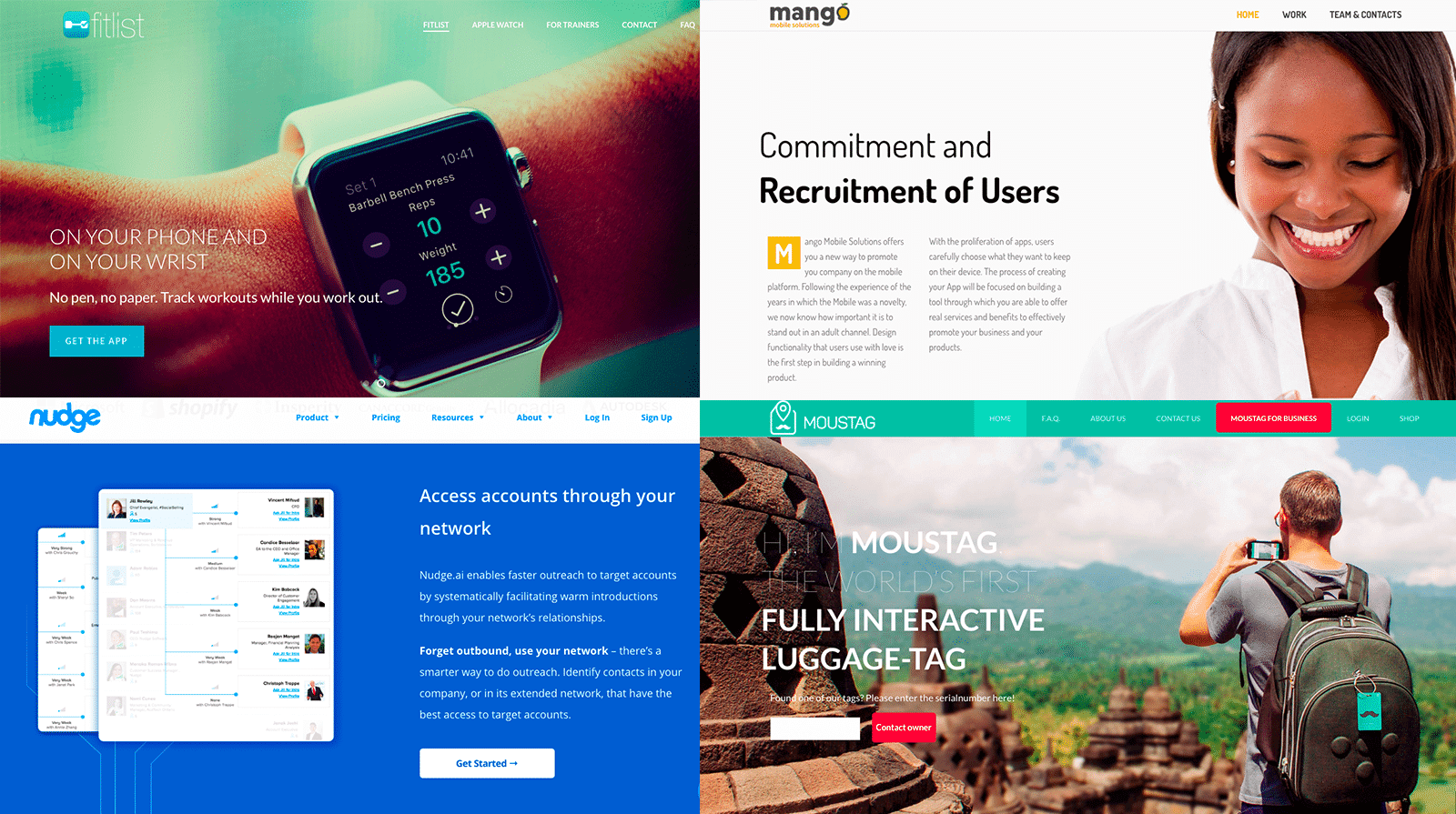
Here’s a list of product presentation websites built by Jupiter WordPress Theme to help them fulfill their website requirements and have an amazing presentation that’s pleasing to anyone who will visit them!
Weemss
Weemss is an events management software that does the heavy work so their clients can have more time to be creative and focus on other matters.
When you open Weemss, one of the most awesome product presentation websites built by Jupiter, you are greeted with the message of what their business is all about. You won’t need to look any further. From this point on, your eyes will feast on great color combinations and a host of other neat features all thanks to Premium WordPress Theme. They have a shape divider between the header and the bottom part of the page. It’s a simple design element but something that works for them!
The boxes that houses the types of software they offer have a cool shadow effect to make them pop. They also tried to build credibility by showcasing two important facts about their business – their list of clients and user ratings. The user ratings are solidified with the use of images instead of just plain old text.
Moustag
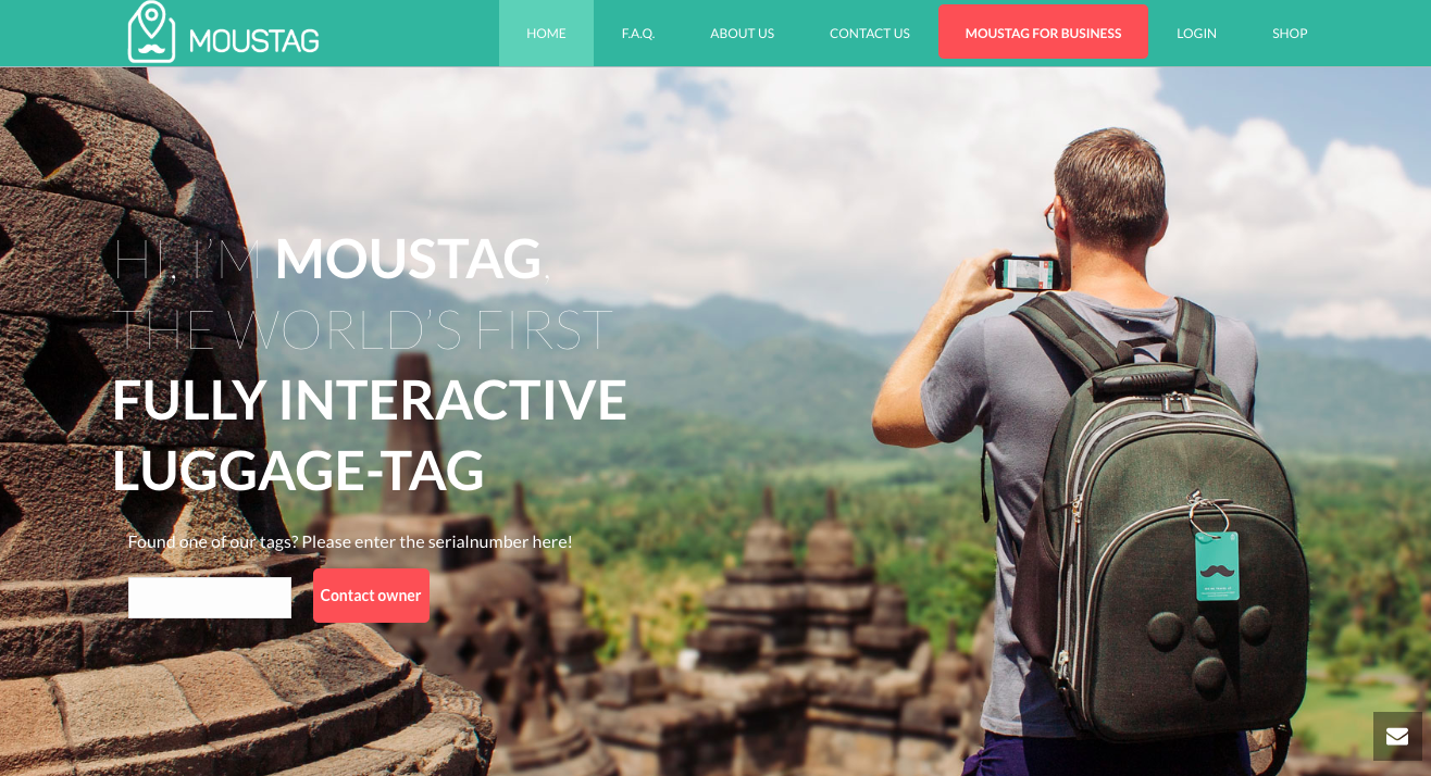
Moustag is the world’s first fully interactive luggage tag and also, in our honest opinion, on of the best product presentation websites built by Jupiter!
This website is pretty unique with its tonality. The product greets you as if it’s a real person. Such move can already make some visitors at ease. In terms of visual presentation, the website has a mono-color attack in terms of design for its homepage. It looks clean and crisp! Another thing that’s good to note are the icon boxes they utilized for the site. It makes all the elements pleasant to the eyes as they are organized. To add to these features, they have a cool animation for their mock ups which can make the site more interesting than it already is.
Nudge
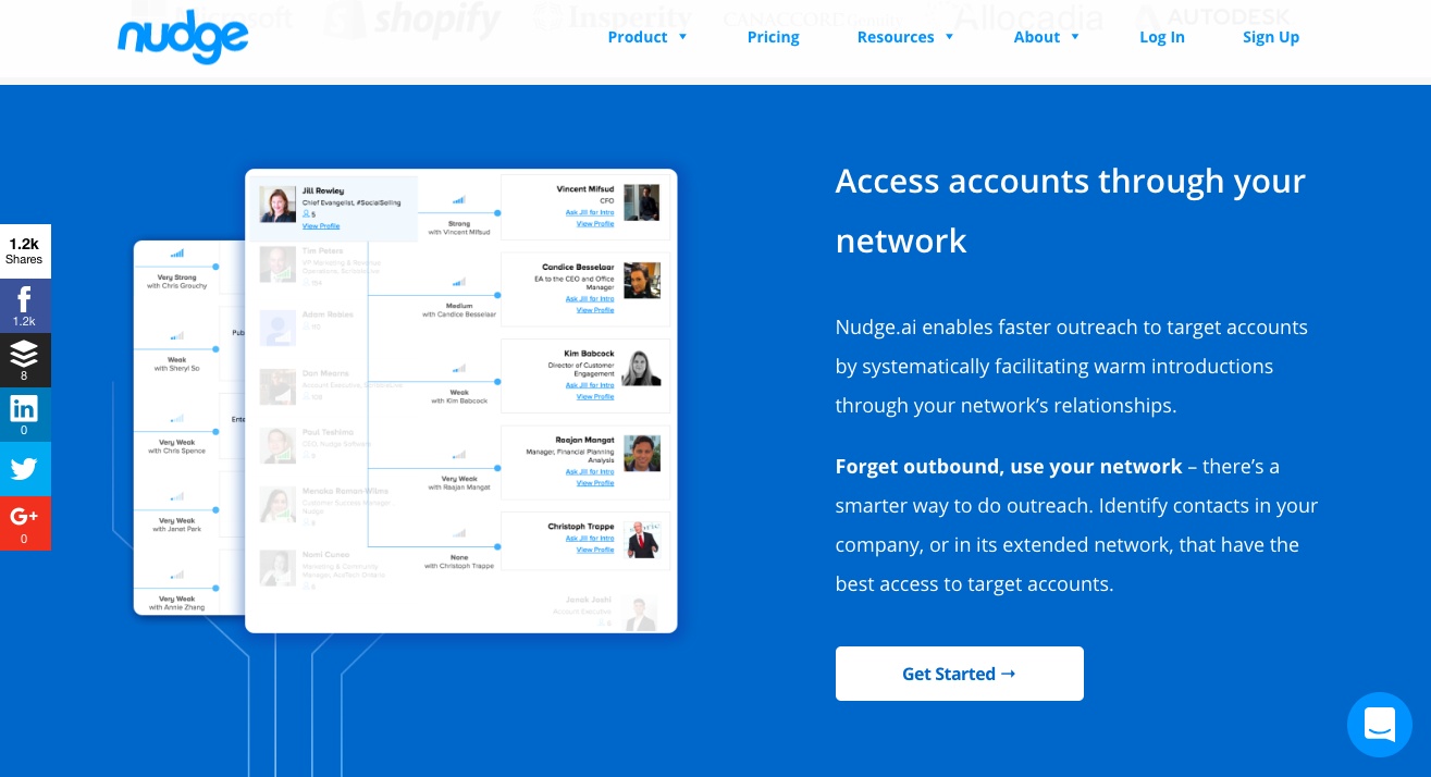
Nudge is a lead generation company with the tagline, “relationship intelligence designed for modern sales teams”.
You are greeted with a person’s smiling face – very apt for what this website offers. It’s all about building relationships and, as a result, growth in sales. The site uses a shade of blue that’s very calming for the eyes and shows some bit of professionalism – as people say that the color blue implies honesty, trust and dependability.
What’s a nice catch for this website is the fact that they have a video player explaining how their product can help possible clients reach their business objectives – by building and cultivating on existing relationships. It shows the features and the pros of their product.
Mango Mobile Solutions
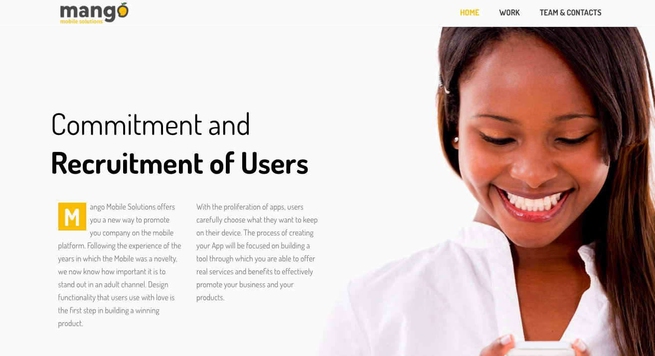
Mango offers a new way to promote their client’s business on the mobile platform.
The fullscreen header is a sight to behold for this website. What adds to the overall aesthetic of their chosen Premium WordPress Theme is that the header has edge sliders that can feature multiple photos – those that are relevant and important to the business as of the moment. If you’ll utilize this feature, you can use it to showcase an ongoing website promo or the latest industry news. They are also using icon boxes for a clean, crisp and organized look.
On top of all these features, they have integrated Google Maps to the design so visitors would know where Mango Mobile Solutions is. It’s actually a great feature to implement on your website if you have a lot of stores – so people would have an idea where your stores are located at a glance.
Fitlist
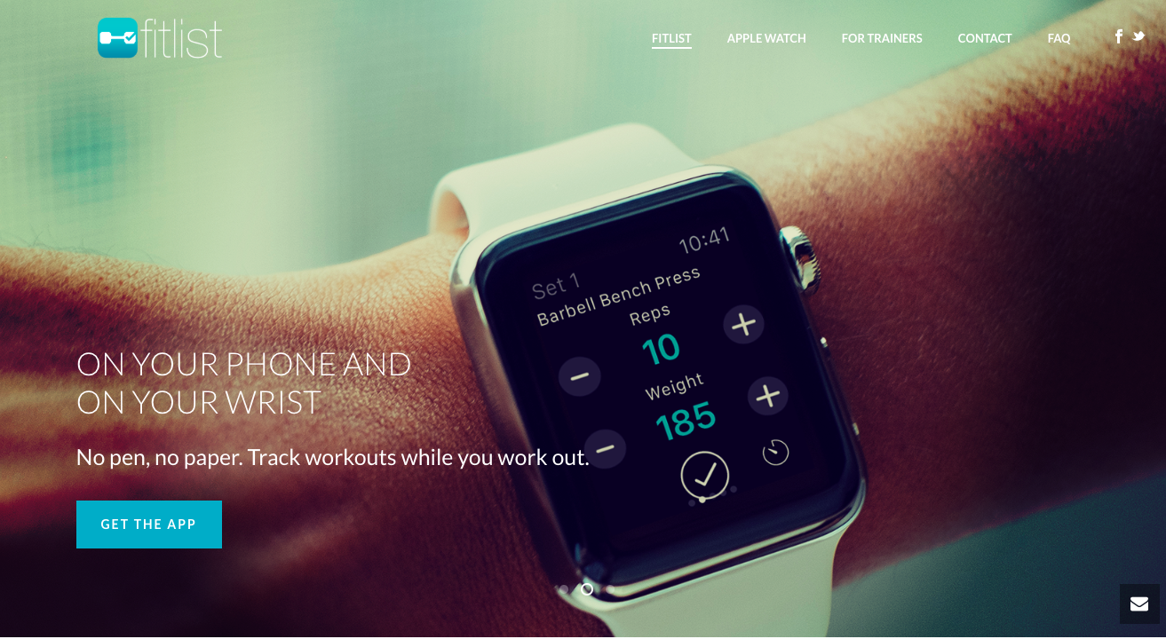
Business Background: It’s now easy to add, track and complete exercises. It is your workout log and fitness tracker for any type of exercise you want to track.
The website has a serious tone which is aligned with their product. Fitlist helps its customers to keep track of their workouts – instilling in them a sense of discipline to help reach their goal. To further enhance any visitor’s experience, they have used a parallax edge sliders for the header to tell a story about their product and has different types of icon boxes featured in the homepage.
For a dynamic experience, the homepage also utilizes the View Port Animation. It functions smoothly so it does not ruin the whole visitor experience. And to top it all off, they placed in testimonials from their customers to showcase their appreciation and review of the product.
Wrap Up
There are different ways you can present your product. It’s up to you how you can make product presentation websites built by Jupiter flexible, to fit your business requirement. Finding what works may take some time but you can take cues from these sites and how they utilized Premium WordPress Theme from Jupiter!



No comment yet, add your voice below!