Well, we know there’s better things you can do with your time than to fiddle around with different features and figure out how to navigate our themes. So we sat down with two from our template production team, Cuneyt and Alex, to make a list of the most useful and impactful features you should know about before you start designing with Jupiter.
Before you dive into designing your pages…
Keep your settings global, rather than local.
In your Theme Options, you can modify the global settings including Typography, Styling or other features which would then be applied to all of your pages. While some people prefer to change the settings for each page individually (which you can do in Page Options by overriding Global Settings) we suggest you keep it global so that should you decide to make any changes in the future, you won’t have to go page by page to do it.
Adjust the font sizes of your written content for different devices.
Before you start to design, think about which devices your target audience is most likely to be browsing your site. Nowadays, mobile and tablet devices are overtaking desktops or even laptops. So that means you’ll need to have force responsive font size which adjusts on whichever device your visitor is using. You can activate this by going into the Fancy Title feature, choosing “Force Responsive Font Size?” and choosing the font sizes for smaller devices.
Considerations On The Style of Your Website.
If you want to ditch endless scrolling websites, use Edge One Pager.
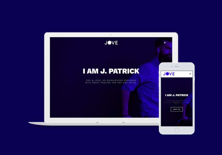
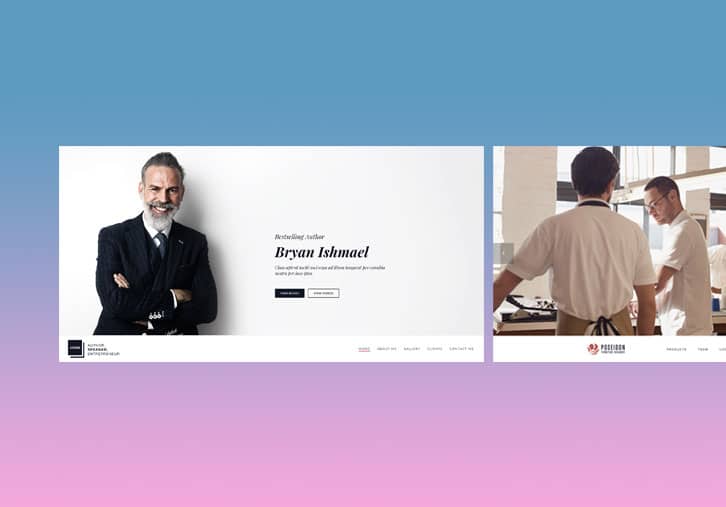
You may have not even known, but there is a way to create a website that relieves your visitors of having to endlessly scroll through each page. An increasing number of people prefer to have a more compact site that includes the relevant content on one consolidated page. With Jupiter, the ‘Edge One Pager’ is perfect then to create a shorter landing page that allows you to include all of your content in a focused manner. Take a look:
Your landing page makes your first impression; take your pick.
To decide what kind of landing page you’d like, explore the ‘Page Title Box’ element to see the different pre-designed landing page styles available, each customized with different features and styles. Here you’ll see landing pages that are parallax, scaling down, have gradient effect, or have a smooth parallax scroll.
Use the Custom Box shortcode to partition your website.
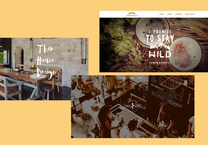
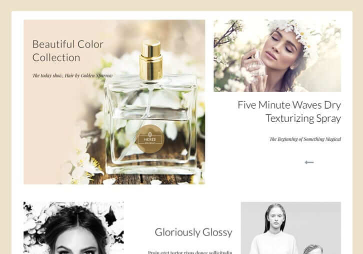
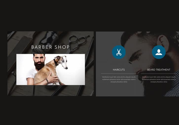
This is a really useful shortcode to use while converting your content over to WordPress. It’s a very versatile shortcode that will partition and organize your website in a streamlined way and that will make your designing process much easier from the beginning. Here you can see a few examples of how you can utilize the Custom Box to organize your content.
Once you’ve started designing your pages…
Add a little magic to your Page Sections.
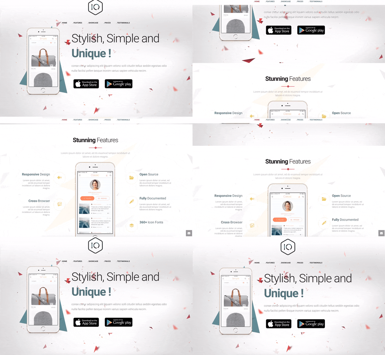
There are a few fun tricks to get your page sections to flow in a unique and eye-catching way. Try this out! In your ‘Page Section’ settings, select the ‘Fixed Image Option’ from the ‘Background Attachment’ section. If you have both Page Sections on top of each other with the same image and settings, they will then create this curtain effect that’s sleek and sexy.
Tell them more about your talented team members in detail!
When you have a team of awesome, multi-talented and experienced individuals, there’s no better marketing you can do than to showcase the expertise that makes up your enterprise.
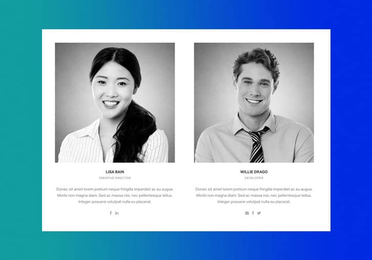
Usually our users use the Employee Element to show their team members but so many people don’t know that there is a feature which allows the visitor to click on the team member to view their full bio and experience. To do this, go to ‘Employees’ on your Dashboard to edit each ‘Employee’ Post Type and activate the ‘Single Employee Page?’ in the options section.
Gradient’s Comeback
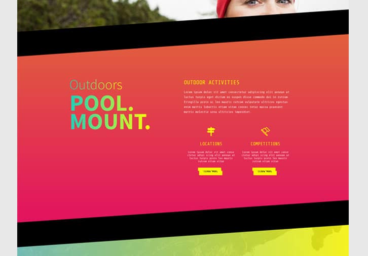
We know that one of the big comebacks for 2016 was the increasing use of gradient in web design. If this style suits your taste and visual preference, there are a few options for you to use Gradient Icon Boxes or Gradient Fill Sections to add dimension to these elements. Additionally, we’ve allowed users to activate this feature in many of the offered elements so keep an eye out for it in each shortcode setting.
Change up the look and location of your header.
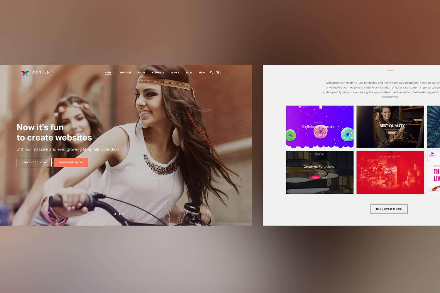
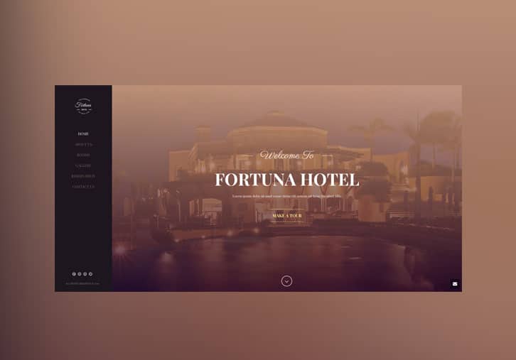
Headers are no longer just a menu of options at the top of your site stamped with your logo—or, at least, they shouldn’t be just that. You can now make your header an equally important aspect of your entire website’s design and content as well as improve the overall user interface. You can do this by either applying a transparent setting to your header or using a background image in your header. Check out what I mean:
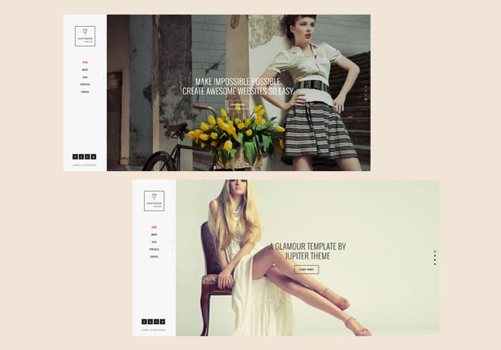
The next fun thing you can try out to see if you like is to edit the ‘Header’ shortcode settings which you can find using the Visual Composer. Here you can choose to place the header on a different part of your website other than the top, including the bottom, side or middle of your content. Here are some examples to look over:
Page Sections divided by more than a line
There can only be so many ways to separate your page sections, right? Wrong! Jupiter includes features that allow you to divide your page sections with patterns and shapes that break away from the norm and create a visually playful user experience for your visitors. Just use the Shape Divider shortcode and browse the different ways to frame your content!
Play with Parallax.
The Parallax shortcode can create an exquisite and jolting visual experience for your visitors. You can add sharp images and videos that will welcome and guide your visitors through your website and content and make your website more than just a source of information, but an experience.
It’s the little things that can add up to an exceptional user experience.
It takes time and thought to decide what your website’s objectives will be and how you want to structure the content to achieve those goals. You’ll find that even the smallest of elements and modifications in your web design can shift the entire focus and intention of your website, thus changing your visitors’ perception and ability to navigate easily through your content. Our intention is to bring to your attention the various features and settings you can use to maximize your use of Jupiter and take your website to an even higher level that will gets those leads and conversions to increase.
Let us know in the comment section below what cool tricks and features you’ve found with Jupiter!


11 Comments
Great tips! Thanks!
Thanks for your feedback Leonardo!
We’re glad this article was useful for you Leonardo, thanks for your feedback!
very great!!
Thank you Divulga! We’ll start to focus on more specific and detailed posts to walk our users through maximizing their Jupiter experience. Stay tuned!
Thanks Divulga! Glad it was helpful for you 🙂
This is a great blog post because you show specific examples of how to use the elements to build out a page. Please do more of this. It helps us freelance designers better understand how and why to choose elements to create a custom look. Thanks!
Thanks Jeff for your comments! We’ll be sure to take this into account for our future blog posts and always welcome your honest and instructive feedback.
Thanks Jeff for your feedback; we’ll be sure to start including more of these types of articles in our blog circulation. If there are any other specific how to’s you’d like covered, let us know in the comments below!
Wow.. just purchased Jupiter a week ago. I’m truly amazed of what you have done!
We’re so happy to hear that! If there are any more tips or topics you’d like us to cover, don’t hesitate to let us know!