At Artbees, we use Adobe Cloud libraries in UI and UX prototyping. It’s a design-collaborative tool that helps our team come up with a dynamic app or website mockup. In this blog post, we’ll talk about how our team utilizes creative cloud libraries in our UX and UI prototypes.
Why UI and UX Prototypes?
Before jumping into Photoshop or Sketch to design a user interface for a new project, we usually discuss it with our team first. Different people might be involved, from CEO to support reps, who may comment and provide significant feedback about the project.
So, our designers need to show them what they have in mind, either on a piece of paper or a prototyping tool. We pivot, learn and improve until a final draft or UI mockup is agreed upon. Every member of the team also uses this prototype as a guide to develop a product or feature.
Problems with Prototype Wireframes: Hard to Maintain
A prototype is meant for constant changes and improvements.
Let’s say we have 20+ pages of UI prototypes for a web application project. Each might have some common elements such as header, navbar, sidebar or other UI components. Now, if somewhere along the way, we decide to change one of those component dgnesis, then we have to update all other pages as well.
[call_to_action title=”Give your work a boost with a huge library of design elements from our partner GraphicRiver.” target=”_blank” url=”https://1.envato.market/c/1239055/275988/4415?u=https%3A%2F%2Fgraphicriver.net%2F” type=”link”]
That’s not easy at all. Given the fact that this process could be repeated again and again, there seems to be a problem.
Solution: Live Templates and Reusable Elements
Essentially, the problem is not new. Neither is the solution.
If we could ever manage to have some sort of reusable elements that are all linked to an original file, then we would be able to change our prototypes as much as we want. Since elements are derived from an original file, any change made to that file will affect its instances. This way, all documents are always up to date.

Choosing the Right Wireframe Tool
Almost all of famous prototyping or wireframe tools such as invision, Zeplin, and more, have live templates and reusable elements as native features. These tools also offer more features like interactions.
But, if your team is like ours and you prefer to create prototypes right from where you usually design stuff and do not want to deal with exporting or third-party syncing, then here’s some good news for you.
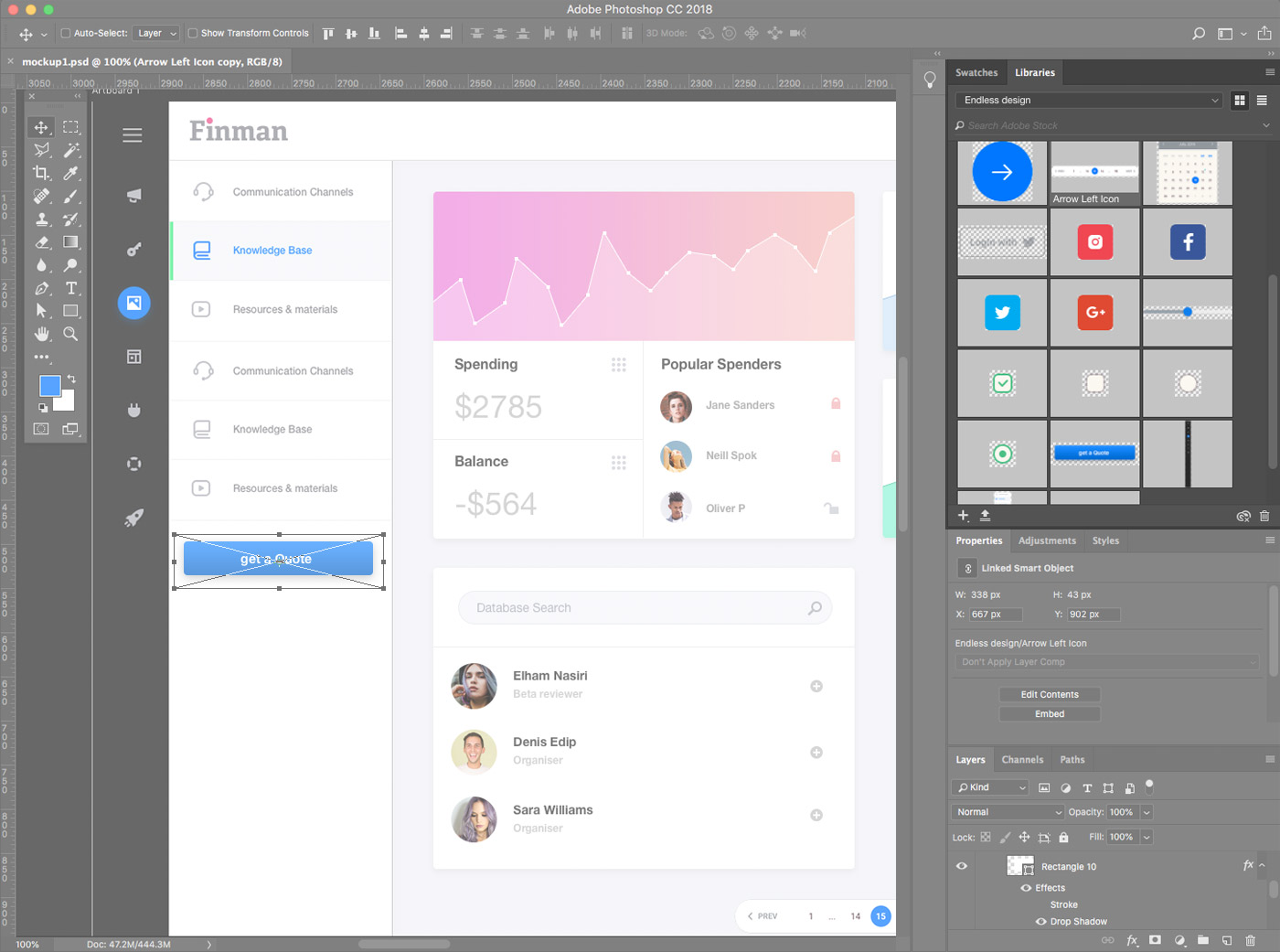
Adobe Cloud libraries can help you do this! If you’re an Adobe Creative Cloud user, then you may have come across a panel called “Libraries”, a collection of graphic assets and colors you can use across your documents.
It’s sitting on the cloud, too, which means that you can access it from any computer or location, and all changes will automatically be reflected. That’s where magic happens. Your colleagues will instantly see whatever changes or additions you make, so project collaboration is easier and smoother.
How We Use Adobe Cloud Libraries as Design Language
We look at such shared libraries as an opportunity to stay connected — a visual language that anyone in the team can speak.
Here is how we do it at Artbees:
- A Designer designs basic components and puts them into a shared library.
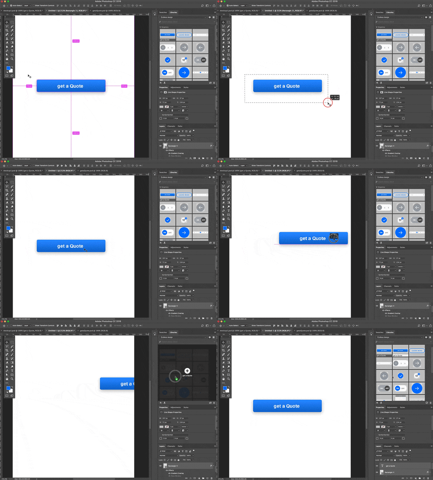
- Then, more people start working with those components to create different sections, pages or states of a prototype.
- Gradually, more elements and sections — those that should be repeated across the project — are added to the library
- Soon, we have a set of prototypes that are dynamically linked to each other.
- Once an asset is modified by one of the designers, it will then be updated across all instances, so everyone sees the latest version.
For example, we are planning to work on multiple prototypes of an admin panel for a sale reporting app. Although the content is rather different, at least two sections – header and sidebar – repeat in every page.

Moreover, each UI control element, such as text inputs, buttons, switches, etc. are commonly used across the software. We started the whole project in a Photoshop-shared library as our centralised UI kit.
At Artbees, we use three types of assets in a library:
-
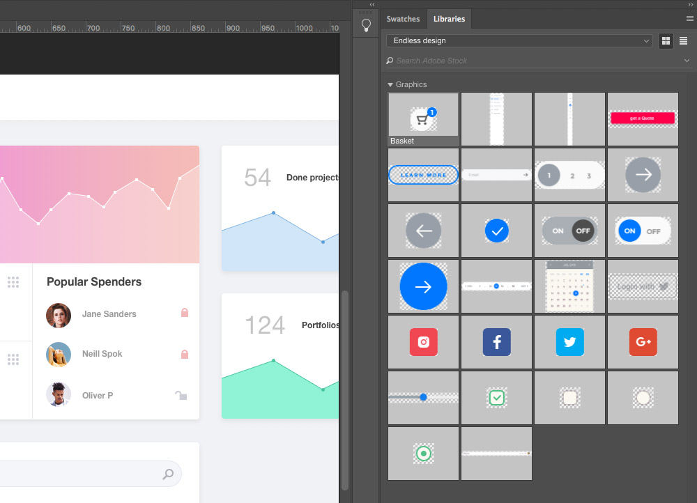
User Interface Controls and Components
UI controls and components can be anything from input fields to widget. These elements help build a page, so it’s common for us to change them several times during the project lifetime. They are all shared among the team and of course, are always up-to-date.
-
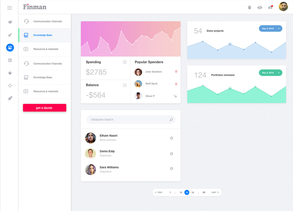
Main User interface
The main UI refers to the basic software skeleton — headers, navbars, sidebars, and more. This does not change much, but when it does, it’s immediately available for anyone in the team.
-
Colors
Adobe Cloud Libraries include a useful guide to color samples we have used throughout the software. Although designers use these to instantly apply colors to elements, it’s also helpful when our developers start working on styles. They won’t need a color picker or extra documentation from designers.
That is how we do UX and UI prototyping at Artbees! Most importantly, it’s how we stay connected through design languages. Every project has its own library and therefore a particular design language. After adopting this workflow, we saved lots of hours and achieved drastically more flawless prototypes. Because of Adobe Cloud Libraries, nobody is afraid of changes anymore!
Disclaimer: This is not a sponsored post. Adobe Creative Cloud in no way paid for this blog post to be created or published.


No comment yet, add your voice below!