Agency websites created by Jupiter must show excellence in design no matter what page a visitor lands on. The look and feel should be easy and lovely. But, design doesn’t end in aesthetics, UI and UX are just as important. Functions should be easy to see, understand, and navigate. Every detail must serve its purpose and the visitor should move smoothly around the website.
The best UI design allows users to complete a task at the shortest time and easiest way possible. UX design must also be taken into consideration to ensure that it is enjoyable for a user to browse your website.
Here are examples of cool and trendy agency websites created by Jupiter who are winning at design, UX, and UI.
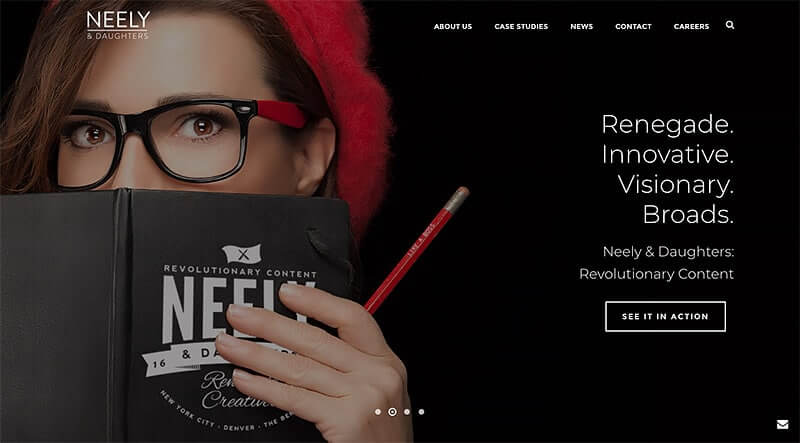
Neely & Daughters provides world-class solutions to their clients’ creative problems. Their broad line of work runs across digital media, events, concepts, and creative content.
Their header, built up with Edge Slider element, has labels that are clear, straightforward, and easy to navigate. The home page has a slideshow background that has a bold and creative picture which represents their brand well. The built-in view port feature of each single slider helped them to build an active header, which looks like LayerSlider, but is indeed Jupiter’s default slider, Edge Slider.
The homepage is maximized; it contains everything that a potential client has to know about them. It includes their mission statement, portfolio, and client testimonials. In “What We Do” section, they used Jupiter’s Portfolio element, while in the “How We Do It” section, they used our Animated Column element without any background (transparent), making it all the more beautiful. Client and Testimonial elements have also been used on the next two sections. And finally for the “The Buzz” section, they used Blog element. Indeed, this is one of the great agency websites created by Jupiter WordPress theme.
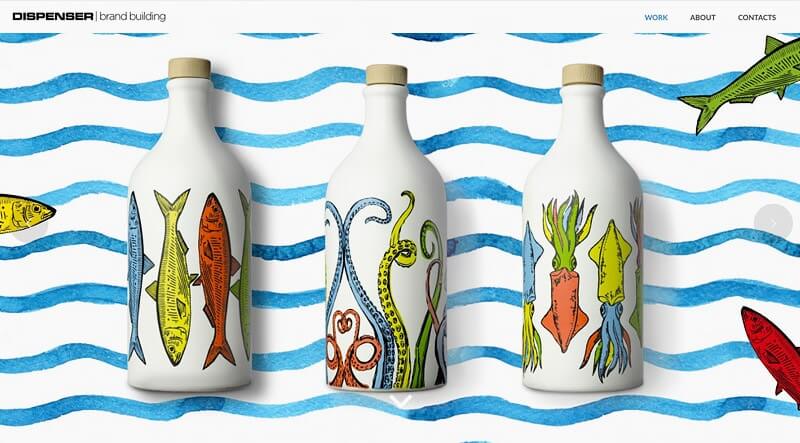
Dispenser Studio is an Italian Brand Building company. Their services include the development of a brand and corporate identity, packaging design, corporate storytelling, and brand environment.
They simply crafted their homepage by using two elements — Edge Slider and Portfolio. So, we can call their website a portfolio-based website.
The navigation bar and the brand’s logo is minimalistic, a trendy approach nowadays. Below the navigation bar is a portfolio slideshow which is a great way to feature their works. The slideshow auto plays but it can also be moved at the user’s pace.
Their about page is striking and unique. They managed to incorporate their design and photo editing skills while telling their brand story. The footer has just one button leading back to the home page, a unique approach in using the footer.
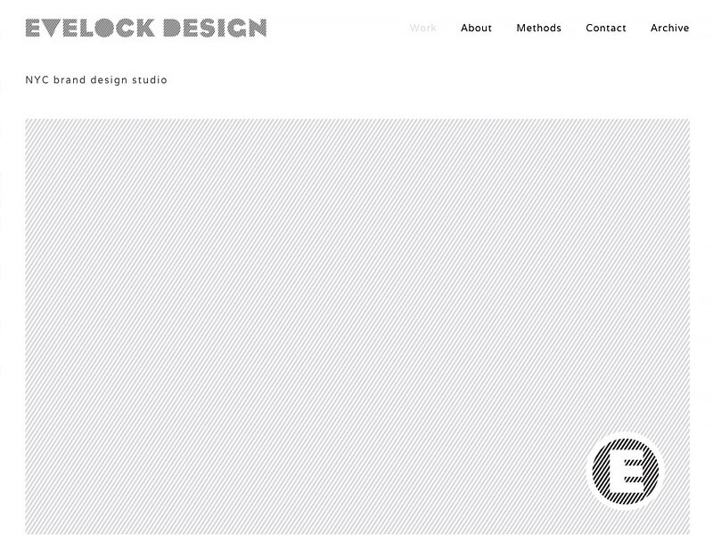
This company is owned by the multidisciplinary designer James Evelock. His work revolves around branding, web, packaging, print and trade environments.
Again, this agency website created by Jupiter is a portfolio-based website that mainly uses Edge Slider and Portfolio elements in the homepage. The Evelock Design has an intriguing vibe. It has a smooth and artistic grayscale theme. The navigation bar contains social media icons which are very convenient for users to connect with him. James used the home page brilliantly in showing his design portfolio.
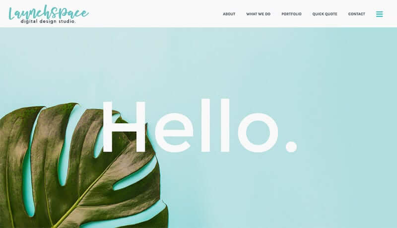
LaunchSpace is a digital design studio that delivers exceptional, creative solutions that are functional and brilliant. Their aim doesn’t end in aesthetic appeal but they also help clients reach their business goals.
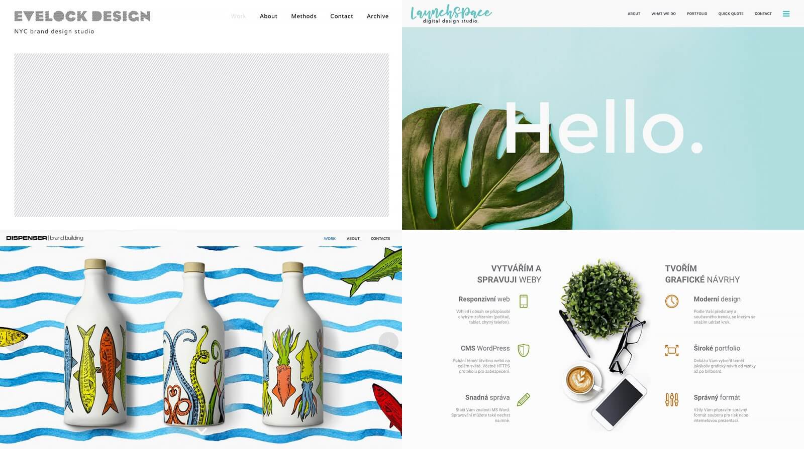
Just like other agency websites created by Jupiter, this site used side dashboard and some Half Page Sections. They created a cool and smooth design by keeping to simple layout and colors. The header, which contains only a leaf and the word “hello” against a sky blue background, suggests professionalism and trustworthiness.
The copy and images on the homepage are clear. Users can easily know what they do by just looking at the homepage. The “quick quote” sign up form in the home page is clever and user-friendly. It’s easy for the client to start working with them and it’s also a great way to build subscribers.
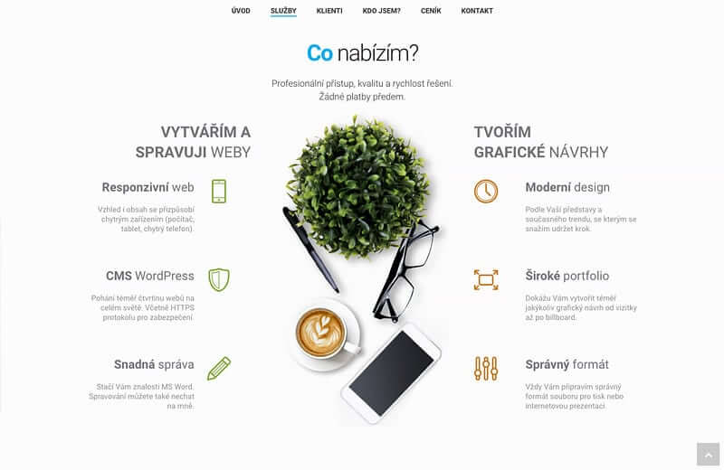
This company is dedicated to web and graphic design following the latest trends. They aim to materialize the client’s imagination in website creation and management and graphic design.
The amazing thing about agency websites created by Jupiter is that they can completely customize their site according to their niche and target marketing. As such, this website used the multilingual feature which is important if you want to focus locally but you also like to reach global clients.
The owner also maximized the home page by directly mentioning his services and contact information. He has managed to squeeze all the important information in one page without making it look cluttered, through Simple Page Section with “Scroll To Bottom Arrow” feature.
They used the Box element on the “Co nabízím?” section, while lots of View Port animations made their website more dynamic. Finally, they created quite a beautiful pricing table using Jupiter’s Builder Style on their “Ceny na míru” page.
Conclusion
The owners of these agency websites created by Jupiter have truly exhibited their design skills. They made it easy for users to see what they do and see samples of their work. They truly know how to “wow” visitors.
Being a top-notch designer means you are able to create extraordinary outcomes from ordinary elements. Premium WordPress Themes which you can easily tweak or build from scratch makes your job in creating website easier so you can focus on crafting notable designs for your clients.


2 Comments
Nice, As a designer, I really like this article. I am impressed with these designs and going to try making these designs for my next project, thank you.
The amazing thing about agency websites created by Jupiter is that they can completely customize their site according to their niche and target marketing