Your website as a digital agency is your face and office on the internet. If visitors are pleased with their experience on your website, they’ll consider you. If not, they’ll leave without even knowing what you have to offer. The design, UI, and UX of your website must be responsive and provide a great user experience.
Always think about the end user when planning on what elements to include. Websites don’t need to be complicated; it just needs to serve its purpose. Well-placed share buttons, clear call to action, social media icons, and unique branding are just some of the elements you need for your digital agency website.
Here are 5 digital agency websites created by Jupiter WordPress theme and how design and functionality were maximized.
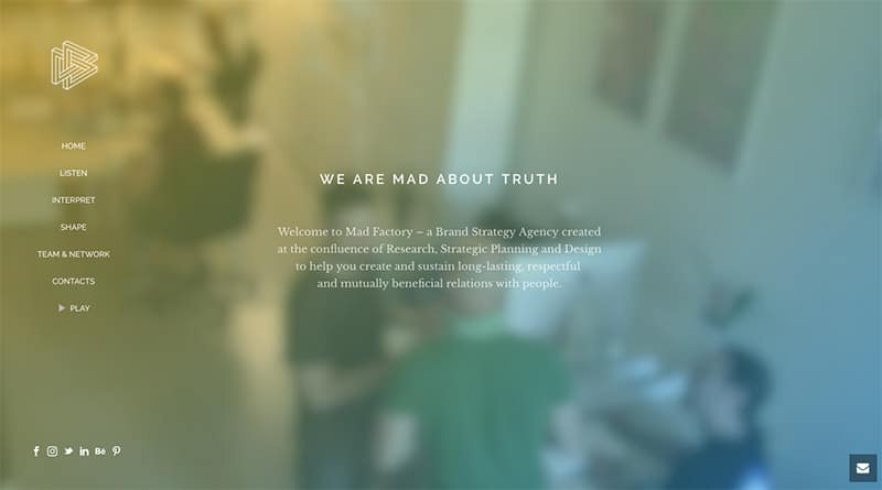
Mad Factories is unlike any other brand strategy agency. Their strategies are backed by research, strategic planning, and design. They help clients build long-lasting, respectful, and mutually beneficial relationships with people.
The uniqueness of this company is showcased on this digital agency website created by Jupiter WordPress theme. They have used the Vertical header which is used less commonly among Jupiter headers. It is transparent at first but it transforms into a white background upon scrolling down. It is more bold and intriguing compared to the three conventional headers.
Their home page has a full-width video as background creating a cool vibe at the first load of the page. The title in the header is playing on a typewriter style which adds more dynamism to the website. They have perfectly used 2 small banner-sized layerslider throughout the homepage and decorated them both with a gradient background and large fonts. They also have animated columns and they used gradient feature of fancy title on the section above the footer.
Mediatics is a web design agency based in Barcelona. They specialize in designing web pages and online stores. They help clients communicate in a clear, attractive and effective way to build brands and increase their revenue.
There is a dynamic vibe in the website because they have used the Video background feature of Page Section. They used only black and red creating a formal, nice, and neat looking website. They’ve used the Slide Box style of Portfolio for presenting their works and the Change Icon feature to change the Permalink Icon.
The company further enhanced the beauty of the site by using parallax effect. They eliminated the footer, unlike conventional websites which made the website straightforward.
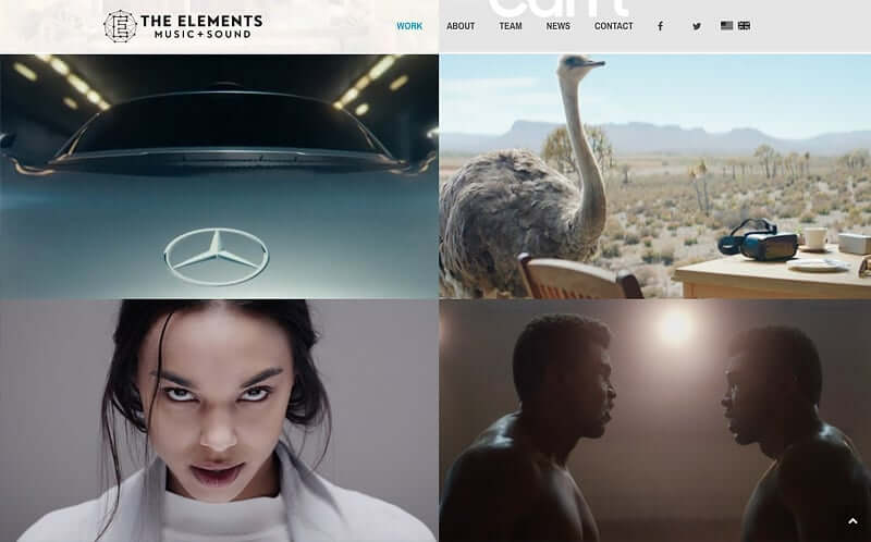
The elements is an award-winning original music, catalog licensing, and sound design company with offices in Los Angeles and London. They are devoted to keeping their standards are incredibly high and exceed their clients’ expectations.
They have also used the video background feature of the page section. They leveraged Jupiter’s theme to build up their outstanding Portfolio. They’ve used Employee shortcode to creatively introduce their power team. They used the News element to keep viewers updated.
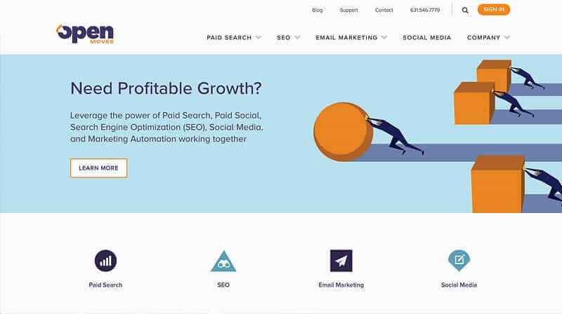
Open Moves is a team of passionate digital marketers who helps small-to-mid-sized businesses meet their marketing needs. They offer innovative services across PPC, Paid Social, SEO, Email Marketing, and Social Media.
They have perfectly used the Sub-menu + Header Toolbar to make navigation smooth and easy for visitors. They have used the icon box and custom box to make it easy for potential clients to reach out to them. They have utilized the maximum limit of the footer which has allowed a complete and clear summary of the website’s contents. They used a minimalistic approach to Jupiter’s theme which is neat and appealing.
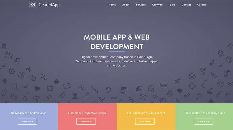
Geared up specializes in developing bespoke apps and web platforms. They provide a collaborative approach to all projects to be able to deliver top-notch digital solutions.
The team added View Port animation which has made their Homepage more dynamic. They have maximized the potential of the Jupiter theme by adding their own touch of fancy images. They also have a custom box and a contact form which is easy to use.
Conclusion:
These digital agency websites created by Jupiter WordPress theme are great examples of websites in their own niche. Every element adds to the beauty and user-friendliness of the pages. They are all client-centered but each one has its own unique vibe aligned to the brand. A premium WordPress theme from Jupiter allows you to stand out and reach the full potential of your digital agency by templates that are easy to use and modify.




3 Comments
Wow, this looks really good! Thank you for sharing this information – it is inspiring. Now it takes a lot of things to create your own brand or website. For example, in the competitive niche of document scanning, it is now very important to have a good website.
I love this article! I learned a lot about what makes a website great. How can I build my own website?
Thank you for sharing this information – it is inspiring