Let’s say you’re running a pretty popular restaurant with delicious food and special recipes in town and you start thinking about moving things online to showcase your mouthwatering food, entice more hungry customers and even open up new branches all over the city. Smart move! But building a website for your restaurant is no easy feat unless you know the key elements for your restaurant website to make it both attractive and user-friendly at the same time.
In this article, by looking at 5 Jupiter X restaurant templates, we’re going to take you through the key elements that will help you build a mouthwatering restaurant website that’ll help you build a strong web presence and make your site visitors drool!
Images Layout
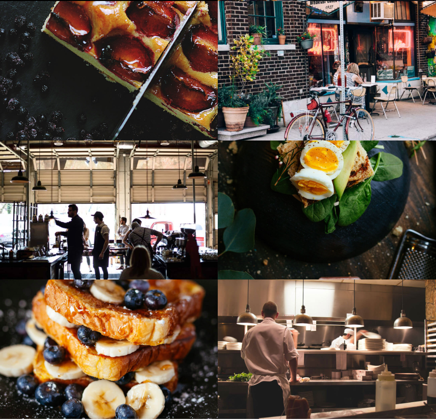
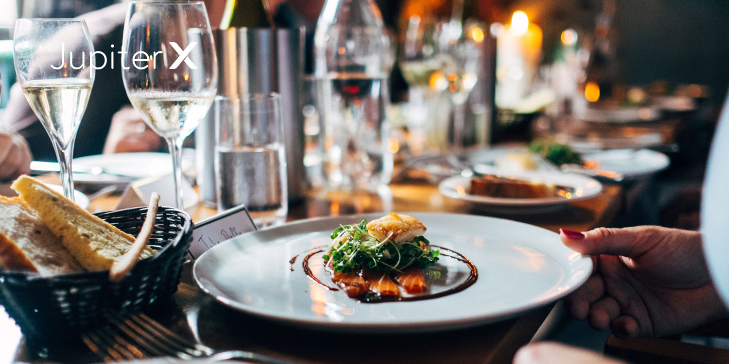
Go visual! You’ll hear this from just about every graphic designer you hire to design your website. And, yes, get ready to read about it once in a while in this post too! Images have a magical effect on promoting your restaurant. You don’t open a restaurant website to read the About page or to imagine what the food looks like from the menu, right?! A bunch of high quality and tempting images of the food hits visitors in the stomach every time! So folks, let’s admit that they’re essential elements for your restaurant website, and Images Layout is probably the best element to help you out showcasing them.
Images Layout lets you showcase as many images you want in up to 6 columns, choose between 4 different layout types (Masonry, Grid, Justify and List), add titles and description as well as different background overlay and lure visitors with appetizing pictures of your gourmet dishes!
You can find a beautiful live example of this element in the Jupiter X Danae template.
Posts Element
If you have a blog you are regularly updating to offer tasty recipes, writing about healthy diet trends or simply sharing the latest news with your restaurant, you might want to organize and show them on different pages of your website. And this is all possible with the Posts element. There are many features to play with and customize to your taste, skin type, layout and categories to name a few. And as mentioned before, you can set the source to be a blog or portfolio.
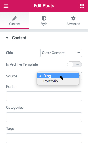
Or you can simply drag and drop the Posts element and start building it from scratch without linking it to the blog or portfolio. If you need to read more about its features and how to work with it, please head over here.
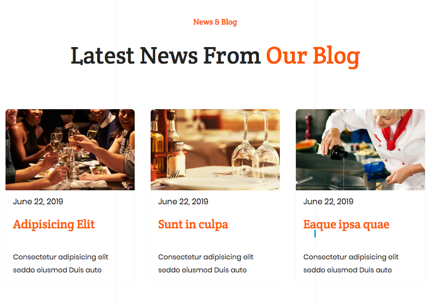
Here’s a nice example of the Posts element in action from the Jupiter X Restaurant template:
Form Builder
Add as many delicious food pictures as you want and catch the attention of visitors to your stunning food art, but at one point you’ll need to turn those visitors into paying customers and increase the restaurant’s footfall. A functional and easy to use reservation form will do the job! Now that visitors are even more hungry by browsing through tempting food pictures, they should be directed toward booking a table.
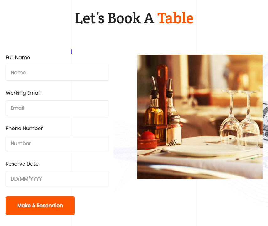
Forms can be used either for reservations or as a means of online ordering if you happen to have that option. You can create a simple form in seconds with the Form Builder element. Just drag and drop the Form element to your page, edit the placeholders, add an action email to collect the information and that’s it! You now can receive orders and bookings!
Avoid too many fields and ask questions with short answers as much as possible in order to make the booking process easy and efficient. The form used in the Jupiter X Restaurant template serves as a good example.
Slider
A slideshow is always a great way to feature menu specials and give customers a sense of what’s in store for them. Imagine opening the homepage to a full page header slideshow of your delightful hamburgers! Just like this delectable slide reel in the Jupiter X Burger Restaurant template:
Slider Element
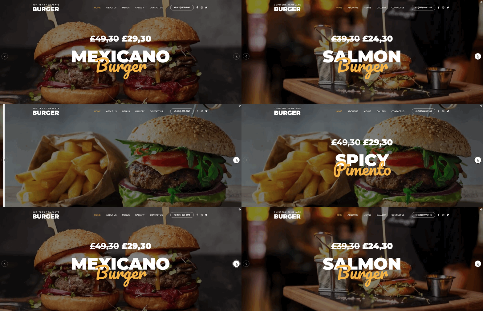
Adding slideshows is pretty easy in Jupiter X. All the steps you need to go through are explained in detail in this video. After watching the video in full, creating a stunning slideshow will only take seconds.
Testimonials
How many times have you booked a hotel room over another only because of a couple more positive reviews and ratings? How many times have you chosen a product online just by checking its stars and positive comments? Nearly always, right? The same thing goes with restaurants too! Testimonials are like social proof that will help potential customers choose you.
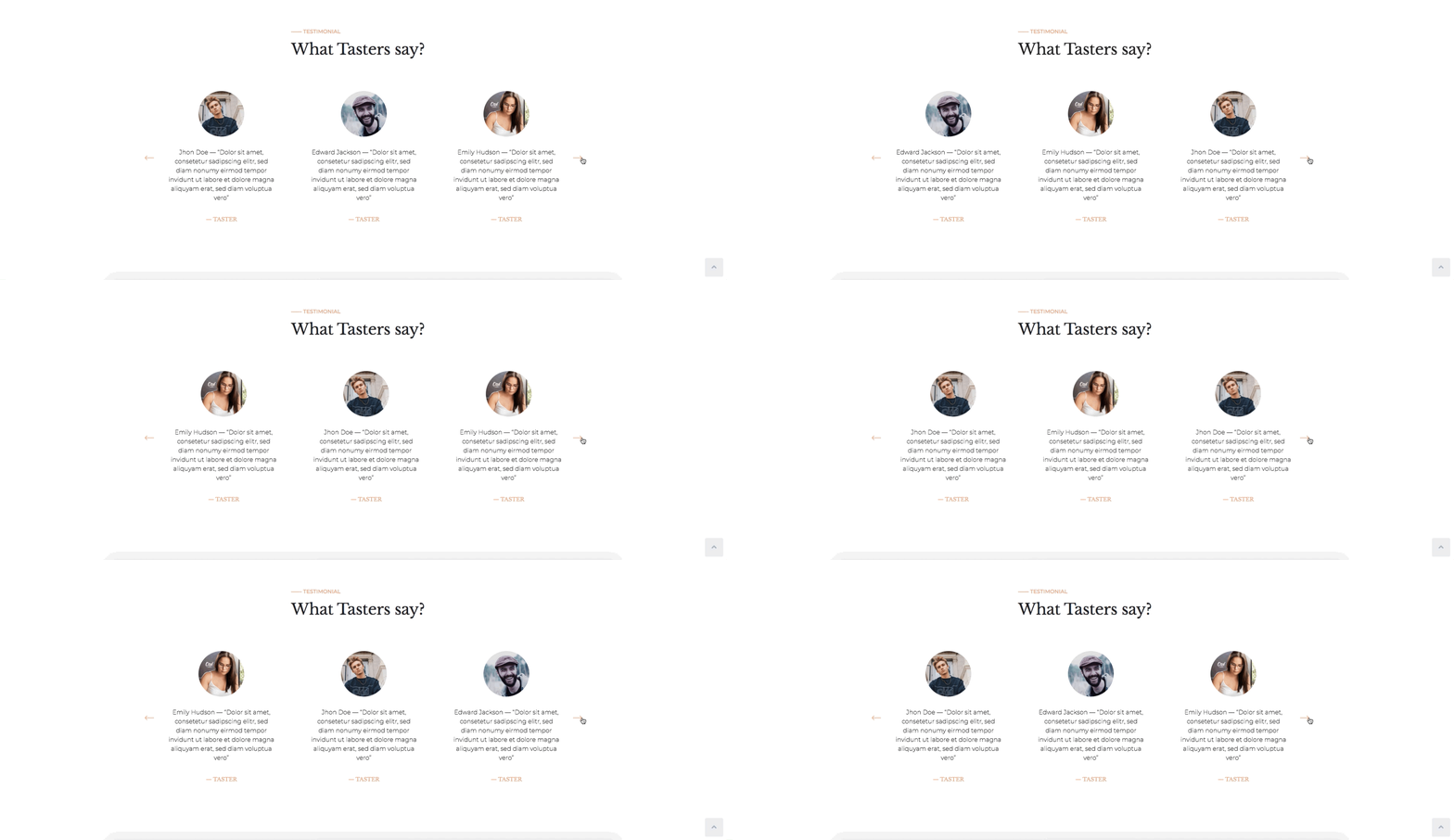
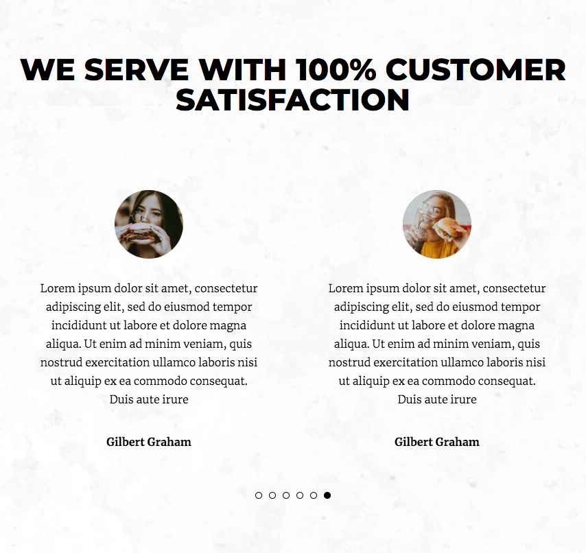
Using the Testimonials element, you can add an uncluttered and beautiful set of customer testimonials, customize its text, style and positioning, play with its animation settings and let the uniqueness of your restaurant stand out through the words of your satisfied customers. The Jupiter X Burger Restaurant template features a nice example of this element in action:
Price List
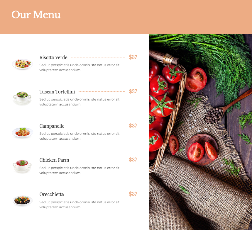
Restaurants and online businesses that are offering a product should have a functional price handling system for customers’ convenience. Using the Price List element, you can create your special menu and feature your dishes in an organized way. You can visually customize every detail of the list like the heading, image, price and even make items clickable by adding links.
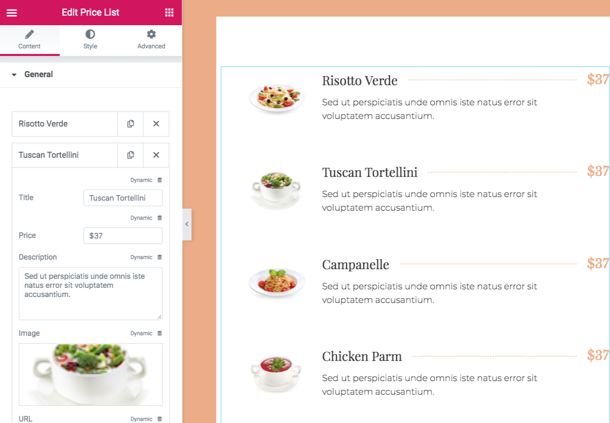
The Jupiter X Italian Restaurant template features a beautiful sample of the Price List for its menu:
Animated Box
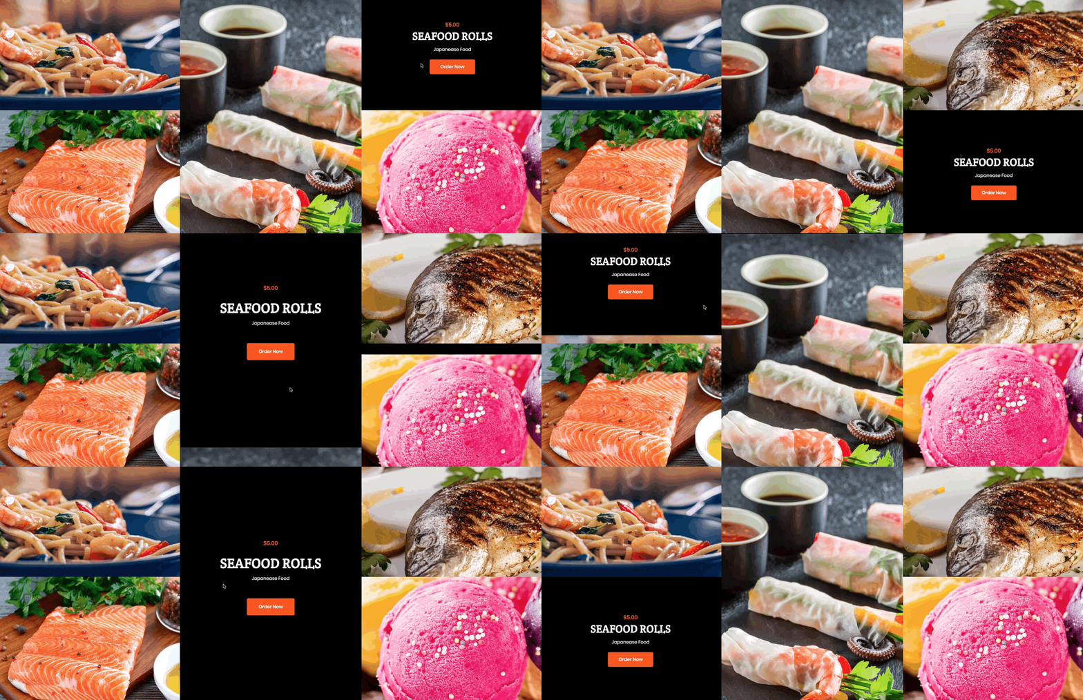
We’ve emphasized the importance of images for a restaurant website enough, so no need to repeat ourselves! But there is always room for more fun! Using the practical Animated Box element, you can put your images inside a box with different animation effects; write some important content on the backside of the box; customize the layout, color, style; add icons and links and choose among many cute animation effects. That’s fun, right? Mark our words – adding a bit of taste to your image-dominant page guarantees customer satisfaction! Here’s a sample of the Animated Box element from the Jupiter X Restaurant template:
Counter
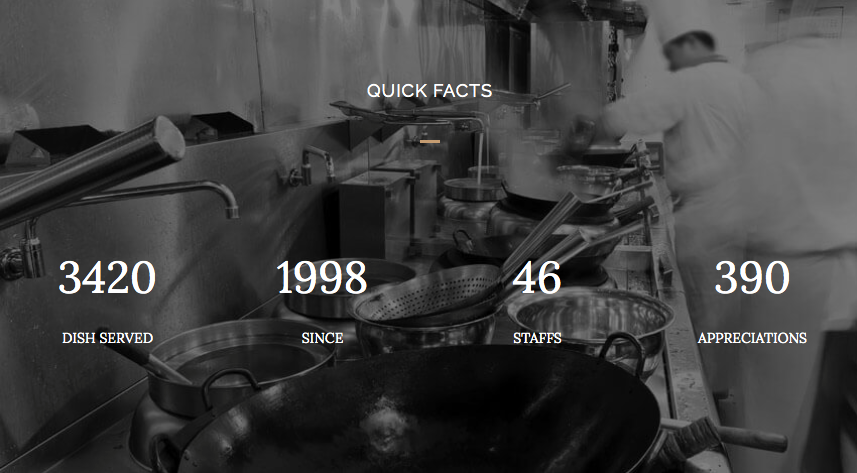
Another dynamic element for your restaurant website that will help you boost your restaurant’s reputation, increase the trust of the existing customers and create potential new visitors, is the Counter element. Just drag and drop the element to your page and brag about the number of satisfied customers, branches around the city, dishes served, any health certifications awarded, as well as any other interesting numbers while playing with its eye-catching styles and animations. Your achievements are definitely worth a mention!
Here is an example of the Counter in action from the Jupiter X Europa template:
Tabs Element
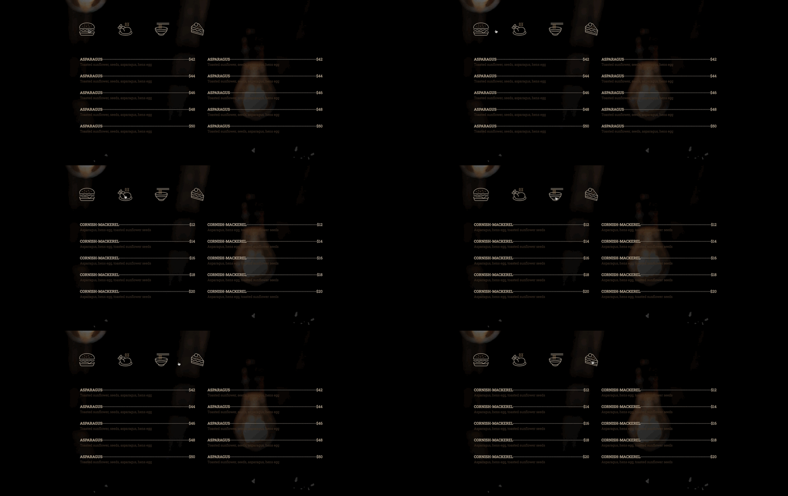
If you own a big restaurant that offers all kinds of food, from seafood to Mexican and from appetizers to desserts or from alcoholic to soft drinks, you might want to organize them into tabs to avoid your site visitors a headache! The Tabs element will help you make it happen in the neatest way possible. You can put each type of food in one tab, set a vertical or horizontal look on it, add icons next to titles, use images and customize every detail about tabs items such as background color, title, description and many more as you please.
Check out how it looks live in the Jupiter X Steakhouse template:
Wrapping up elements for your restaurant website
In this post, we highlighted some essential elements for a stunning restaurant website in the hopes that it’ll encourage you to get started with your unique and tasty restaurant website. So now that you have the ingredients you shouldn’t be waiting any longer, hungry customers are waiting outside!
Let us know in the comments about your experience creating your restaurant website or if you have already created yours, drop us the website URL for as inspiration for your fellow restaurant owners.


No comment yet, add your voice below!