Are you right in the middle of planning for your big day? Preparing a wedding website has become a growing trend among newlyweds – but among all other tasks that need to get done, typically very few couples find the time and energy to build their website! Well, we all know how stressful ticking things off the wedding to-do list can be – however, creating a wedding website doesn’t have to be! This is particularly true when you know which elements for a wedding website to use and where. In fact, this will be the easiest of all wedding planning tasks! And we’ll show you just how you can easily get it done.
In this article, we’re going to walk you through the key elements that should be used in a wedding template while having a look at three Jupiter X wedding templates. If you’re planning a wedding website (or maybe a wedding!) this will specifically help you kickstart your website. We will try to visualize what an informative, classy and fun wedding website should look like, as well as showcase a list of important elements for a wedding website that best matches your big day’s theme and style.
Websites that are built for special occasions such as weddings, Valentine’s Day, engagement parties, graduation ceremonies or even honeymoons are like online albums in a way. So the focus should be on images and the elements that organize images. Jupiter X’s Sarpedon template can be a good example of such a concept. Using elements like the Image Carousel and the basic gallery portrays an image-driven template. Let’s go through one-by-one some of the useful elements that’ll help you build a clean, well-designed website (or better to say online album) for your big day:
Image Carousel
Your website loads to a beautiful set of you and your partner’s photos, and the first thing visitors see on your website is a collection of your most precious photos together – isn’t that fancy?! We think so too! You can do this with the Image Carousel element. Here’s how it looks in the Sarpedon template:
You can customize the Image Carousel down to every single detail: from image size, the number of slides to show on one click, animation style, and speed to hover effects.
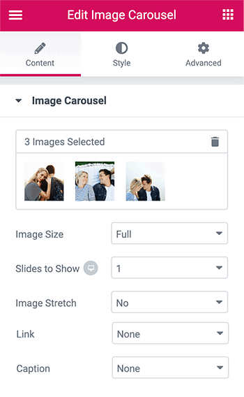
You can learn more about the Image Carousel element by looking at more examples here.
You most probably have an Instagram history with your partner that you carefully created to share with your followers. You can actually showcase your Instagram feed on your website by using the Instagram element. Choose between grid, masonry and list layouts to make pictures appear as you wish. You can also choose which photos to show, set the number of columns and customize the overall look of the element. To read more about how to work with this element in detail, please visit this page.
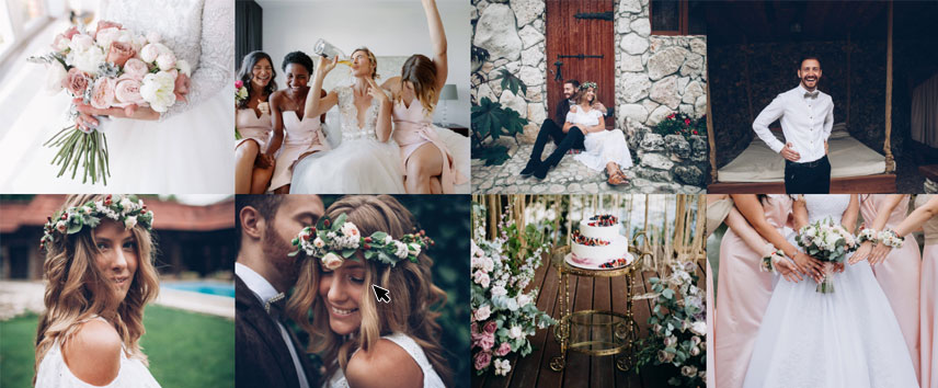
A typical wedding website template should allow you the option to showcase your love-filled pictures through Images Layout in the catchiest way, as well as collect information and track down your attendees through a well-designed RSVP section equipped with a functional Form element. The Leda template is Jupiter X’s other one-page wedding template that comes in handy with these two elements.
Let’s take a look at these elements that – together with the other carefully planned details – will make your guests congratulate you twice on your big day!
Images Layout
As mentioned earlier, you can showcase your pictures in an organized way with the Images Layout element. Just like with any other image-related element, you can customize its look, hover effects, number of images and columns to show, add an icon or a title on the image and many more!

Images Layout has four different layout styles you can choose from: Masonry, Grid, Justify and List. Their width and height sizes are what differentiates them from each other. For this template, we choose the Grid layout to ensure that all items have the same width and height. To learn more about the other layouts, you can head over to our knowledge base and read more here.
Form Builder
Wouldn’t it be cool and creative to gather all your RSVP information in your email instead of just posting your guests one-by-one and receiving reply notes in your physical mail? Of course, the traditional way is fun, but a simple online RSVP form can save you a lot of time, money and energy and ease the wedding planning tension a bit!
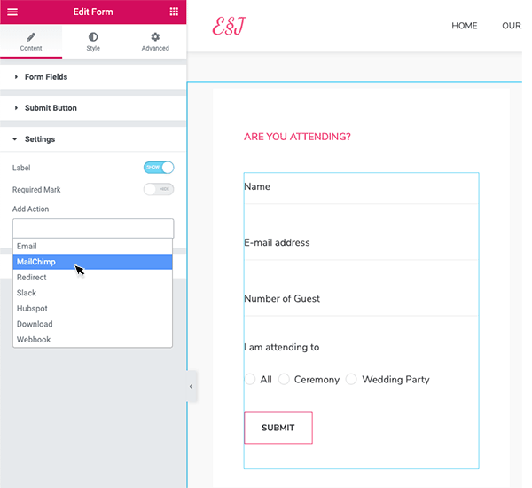
You can create a simple form in seconds with the Form Builder element. Just drag and drop the Form element to your page, edit the field placeholders and sizes and add the email you want to gather information in the “Add Action” section of the setting, and tada! You’ve got yourself a nice and clean RSVP form!
You can even customize the feedback message to pop up after a message is sent. It can be a catchy informal “thank you” message from you and your spouse or a more formal one appreciating their reply.
Learn more about the Form Builder element and how to create one here.
And last but not least let’s dig into three more elements for a wedding website that should not be forgotten! We’ll look for the examples in one of Jupiter X’s most recent wedding templates, the Wedding Invitation.
Countdown
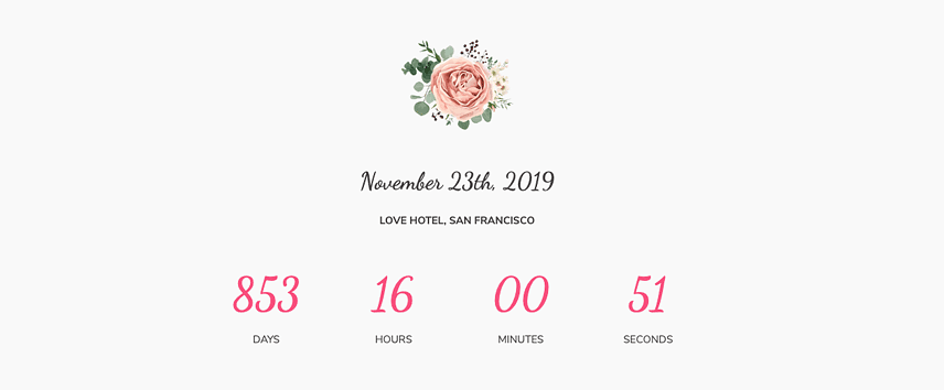
Why not add some hype around such an important day of your life?! Add a countdown timer to your website and make your guests wait excitedly and impatiently for the big day to come. You can play with this element all you want, change its styling, typography and the overall appearance, choose between different timer types based on your taste and even set what happens after the timer is expired. You can find detailed instructions on how to use the Countdown element here.
Horizontal Timeline
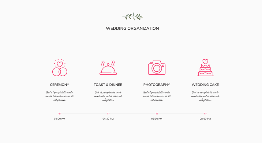
You can showcase the main activities happening on your wedding day using the Timeline element. Add as many items as you want and stylize each by adding icons, titles, and texts and set the timing for each so that your guests know what kind of fun events they should be expecting at your wedding.
Here you can find examples of Timeline in vertical and horizontal style.
Team Members
Yes, you heard correctly! You can actually use the Team Member element to introduce your very precious bridesmaids and groomsmen! Create a profile for each of them and customize the look of it by adding names, photos, position, and even their social media accounts! Cute surprise, eh?!

Wrapping it Up
Everything is set for a fun and beautiful wedding website, you just need to plan on which elements suit your taste and get it done – it’s as easy as a piece of wedding cake!
Let us know about your experience in the comments. Have you built a wedding website for your special day? How did the invitees and attendees like the idea? Or you just made up your mind creating one just now? We would love to hear your ideas!


1 Comment
These reviews helped determine which builder to hire for my forthcoming wedding and my new small company. Thank you for taking the time to share your thoughts!