This is a guest post contributed to Artbees Themes blog by Qode Interactive.
When you run an online store, every single thing you decide to show to the store’s visitors can affect the visitors’ intent to make the purchase. That’s why shop designers obsess over copy, use the highest-quality images, pay special attention to colors and layouts, and ensure that every element of the website and each page is just right.
The add-to-cart button is one of those elements. It’s an almost obligatory element for any online store, serving the dual purpose of reminding the shopper of what you want them to do on a product page – add the product to the cart – and giving them a handy way to do so.
However, because they’re not as prominent as call-to-action buttons, it can sometimes seem that the add-to-cart button doesn’t get the attention it deserves. In this article, we’ll try to rectify that and help you create the perfect add-to-cart button for your online shop.
Add-to-Cart Button Improvements – What’s at Stake?
An add-to-cart button is one method you can give to customer disposal for shopping in your online store. It implies that a shopper will add an item, a service, or a specified amount of it, into a cart that could include other items that could be edited, left for a later review, or completely abandoned.
Add-to-cart buttons don’t have the immediacy of buy-now buttons. But, on the other hand, they’re not a part of a long process like request-a-quote buttons can be. They’re somewhere in between but still a prime candidate for careful design planning and deliberate optimization.
The worst thing an add-to-cart button can do is – not work. If a website visitor clicks on it and nothing happens, that problem goes over the scope of optimization. It warrants the attention of a developer, probably with experience in troubleshooting WooCommerce, the most popular store platform for WordPress.
The second worst thing is that the button doesn’t perform its function well. For example, the button might be challenging to see or discern, it could have text that’s not appropriate, or it could just look and act in an unappealing manner. Whatever the reason for its poor performance, the result is the same and visible in the shop’s bottom line.
Crafting the Perfect Add-to-Cart Button
The add-to-cart button is a feature that comes with WooCommerce, so there’s no need to build one from scratch. However, creating a button that matches your website’s needs is entirely different, as there’s no way of doing it easily without third-party solutions.
Changing the text of the add-to-cart button is a great example. There’s no easy way of doing it natively. Even WooCommerce recommends doing it by adding the following code to your child theme’s functions.php file:
?php
// Change add to cart text on single product page
add_filter( 'woocommerce_product_single_add_to_cart_text', 'woocommerce_add_to_cart_button_text_single' );
function woocommerce_add_to_cart_button_text_single() {
    return __( 'Add to Cart Button Text', 'woocommerce' );
}
// Change add to cart text on product archives page
add_filter( 'woocommerce_product_add_to_cart_text', 'woocommerce_add_to_cart_button_text_archives' );
function woocommerce_add_to_cart_button_text_archives() {
    return __( 'Add to Cart Button Text', 'woocommerce' );
}
Changing the looks of the button, in that case, involves adding custom CSS to your website. Even though the Theme Customizer makes that process more accessible and interactive than adding lines of code in a file or plugin, it’s still a bad option for people who don’t know CSS.
The other option is to use a plugin. For Elementor users looking to broaden their choice of widgets, the Qi Addons for Elementor plugin is a solid choice. With more than a hundred widgets in its premium version, the plugin can help its users with many incredible things in Elementor – including crafting the perfect add-to-cart button.
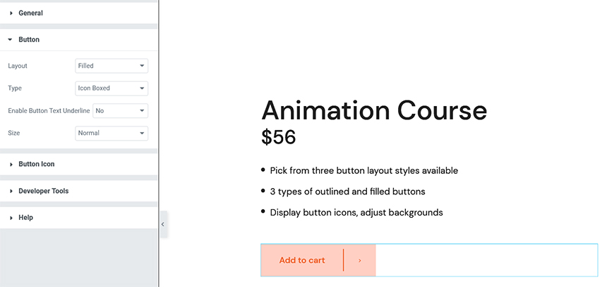
The Add-to-Cart Button widget is one of the free widgets available with Qi Addons for Elementor. Its options will let you select the layout of the button, its type, and size, as well as change the button icon and set its position.
More importantly, the styling options let you choose the color and shape of the button, the typography of the text, as well as the look of the button on hover.
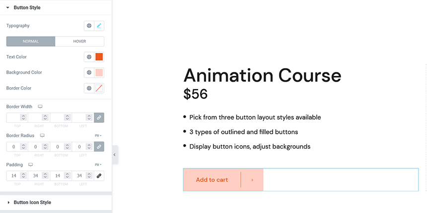
Anyone familiar with Elementor will have no trouble tweaking the add-to-cart button to perform perfectly. Still, having complete control over the look and behavior of a button is one thing. Knowing which things might lead to better button performance is another.
Tips for a Better Add-to-Cart Button
When creating the perfect add-to-cart button, it’s essential to understand that there’s no such thing as a standard button. Instead, you’re looking to create the best add-to-cart button for your exact shop. With that in mind, let’s see some popular principles that might lead you to create a decent add-to-cart button.
Choose the Right Color
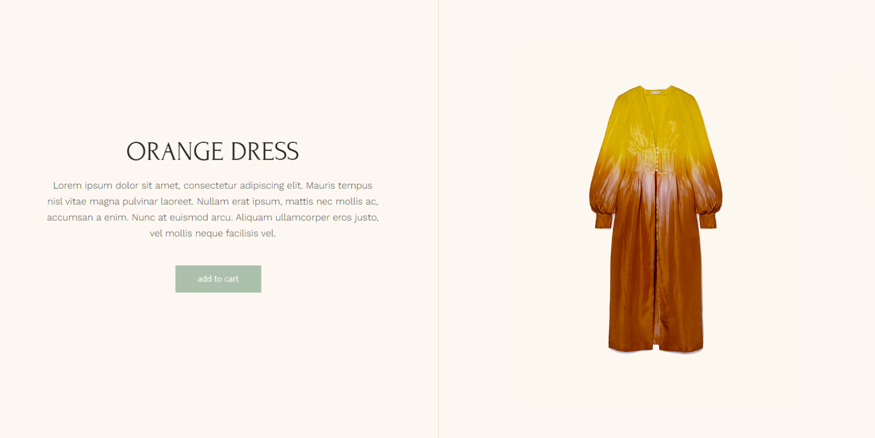
When choosing the right color for your add-to-cart button, it’s easy to follow the advice usually given for calls-to-action and make the button red. And that might work – as long as the red stands out nicely against the background color.
Blue, green, or even a dark gray color can be a solid choice for an add-to-cart button. Still, instead of thinking about specific colors, think about visibility, and choose accordingly. Try some gradients, too.
Don’t Overdo It with the Text
An add-to-cart button is not a good place to practice copywriting skills. For the most part, sticking with the generic term will suffice.
The exception to the rule is if you’re using a branded term for adding items to the cart. That’s a risky choice and must be made as part of the overall branding strategy.
The one thing where you can’t go overboard with the text is visibility – make sure it stands out against the button. Choose a legible font and a color that won’t be drowned out by the color of the button.

Give It Some Style
A great way to make the button more attention-grabbing is to include several style choices, such as borders or even a shadow.
The trick, of course, is to avoid overdoing it. If these stylings make the text illegible or the button too cluttered, don’t use them. Color, size, font, and positioning alone can get you good results.
Mind the Edges – or Don’t
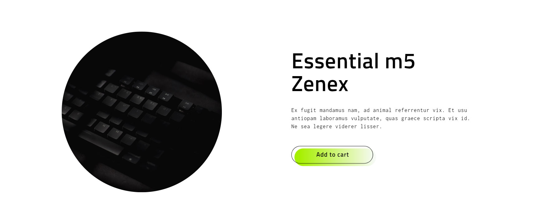
Having 90-degree edges on an add-to-cart button is a controversial choice. Current best practices often say that edges should be rounded, citing people’s innate fear of sharp edges as their rationale.
Even if that were true, if your overall website design calls for rectangular buttons, that’s how you should make them. If the buttons stand out in the wrong way, they’ll affect the perceived quality of your website. This, in turn, might undermine people’s trust in your shop. And that’s a big problem.
Make the Button Reactive
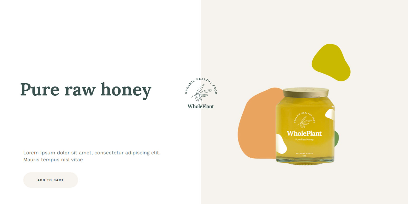
A great tip is to add some motion or changes to the button when people hover over it. It doesn’t have to be a flashy animation. It shouldn’t be.
Something small, like thicker borders or a slight color change, can go a long way to make the button more appealing.

See It from the Customer’s Perspective
The final advice for creating the perfect add-to-cart button is always to take the extra step and view it from the shopper’s perspective. This means testing it regularly to ensure the button isn’t broken.
It also means shopping in the store occasionally, as regular customers do. It means adjusting the page’s layout to fit the devices people use to shop at your store. Decluttering, so the button is readily visible is another essential part of seeing things from the shopper’s perspective.
Let’s Wrap It Up!
Your store’s add-to-cart button is an essential element for the store’s performance. More important than its role of enabling people actually to add your products to their cart might imply. As such, it’s a button you should pay attention to and occasionally improve for better performance.
If you’re using WordPress and WooCommerce, the easiest way to customize your add-to-cart button and make it perfect for your store is via third-party plugins. For example, if you need to change the size, shape, and color of the button and you happen to use Elementor, Qi Addons for Elementor is the perfect plugin for you.


No comment yet, add your voice below!