While social media has dramatically changed the world of photography, it has also provided platforms for ordinary people to reveal their inner photographers. And the majority of us embraced it for good as these social media sites have become increasingly popular by the day. But if you’re a professional photographer – or have a real passion and talent for it – it might be time to create an ideal photography website as a way to store and showcase your valuable photos.
Wouldn’t you prefer your beautiful snaps be displayed in a professionally made website to impress the crowd and potential clients rather than scattered around Instagram or Flickr? You owe that to your skills and talent!
Too confused to know where to start? We hear you! Starting off somewhere is always a hassle, but worry not! Jupiter X has got you covered! In this post, we’ll walk you through 5 photography website templates, explaining each one’s unique anatomy as well as features that will help you choose the best option that best suits your expectations and goals. It will also help you get your hands on your personal or corporate photography website in a snap!
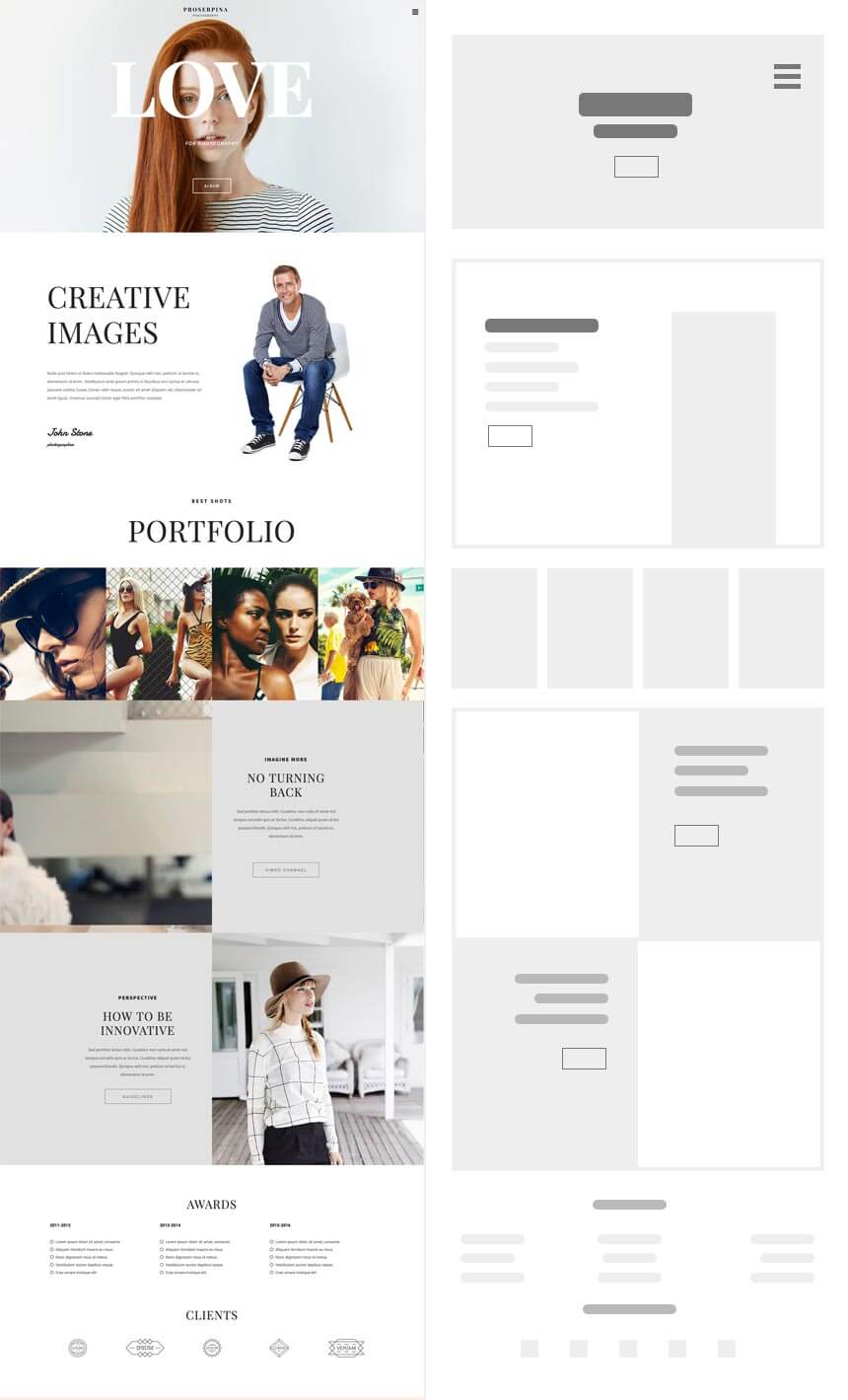
Proserpina: Mixed
Multipage with right sidebar navigation and sectioned homepage
https://jupiterx.artbees.net/proserpina/
Who should use it?
One of our popular photography templates, Proserpina, is perfect for both freelancers and studios who want an uncluttered, yet descriptive portfolio website.
Homepage Structure
The homepage consists of a full-height hero section that you can leverage to shout your name as your personal/professional brand with an intriguing background image, descriptive sections to write about yourself, your business and your projects, portfolio and one-half large sections with video background that adds a cinematic feel to your website if you want to showcase your video editing and shooting abilities. The burger menu with the right sidebar navigation effect helps place focus on the content and images more by keeping menu items out of sight.
Inner Pages
Proserpina has 2 inner pages: Portfolios and Contact. You can store your photo albums and collections in a clean portfolio page. Your concept and vision matter for every single photo. So what’s even better than putting them in different categories for faster and smoother navigation through your photos? Proserpina comes with Posts Element that you can categorize according to your point of view.

Forms, addresses, and social media channels make you reachable to your customers and give them a way to stay in touch with you. You have it all in the contact page, which is ready for customization.
With no more than 3 pages (Home, Portfolio, Contact), this template has everything your audience needs to know about you, your style and your work.
Locaste: Dark Minimal
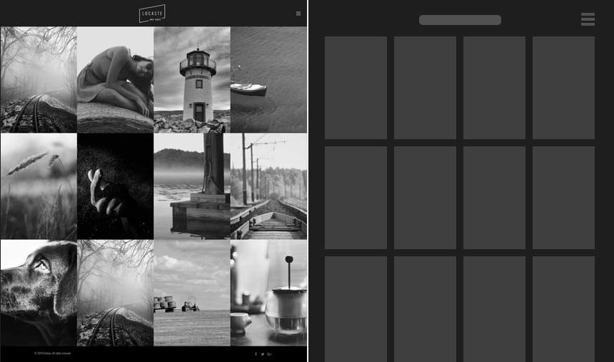
Multipage page with a 4-column grid
https://jupiterx.artbees.net/locaste/
Want to impress your audience with nothing but your photos at first sight? Well, search no more! Locaste template does just that!
Who should use it?
This minimal template can suit both freelancers and studio owners of the same taste.
Homepage Structure
The homepage loads to a full gallery of photos using the images layout and is organized in 4 columns with no other text or elements to distract your visitors. And the tiny burger menu adds up to it! So the no-intro homepage style is also surprisingly compelling to website visitors.
Inner Pages
Locaste has 4 inner pages: About, Gallery, Blog and Contact. They all follow the overall minimal style of the template but contain multiple layout options to choose from for Gallery and Blog pages.
You can choose between various gallery and blog layouts, from classic to masonry, each with a categories option and different column structure to better organize your albums and posts.
The About page includes 4 main sections, a hero section with a background image, the about section to write about the artist or the business, a section to add teammates and the last section organized in 2 columns of an image and text, which can be dedicated to anything related to the photos, studio or the artist.
And finally, the contact page consists of a column for the address, social media accounts and a simple form following with a Google Map.
All in all, if you need a big album and a blog to write about the spirit behind your photos, this clutter-free template is the perfect choice. Just take your camera and let Locaste guide your fans through the magical world of your shots!
Cynosura: Minimal
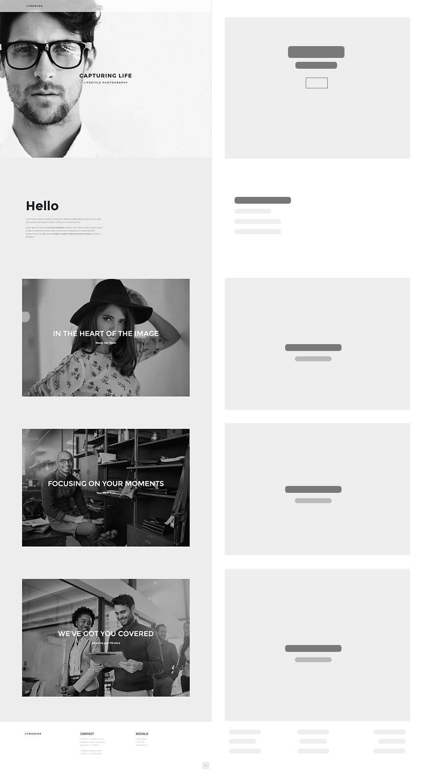
Single page with no navigation
https://jupiterx.artbees.net/cynosura/
You’re a beginner, you know you’ve got the eye and want to share it with the world, but in no way want to mess with the technical hassles of creating a complicated website! We hear you and offer you the ultra-minimal one-page Cynosura template.
Who should use it?
This single page template is perfect for freelance photographers who just need to set up a virtual album and a place to communicate with those who find their photography interesting.
Homepage Structure
The homepage loads to a short intro consisting of a full-height background image and some minimal text without a navigation bar. There are no inner pages, and the portfolio is presented on the same page. So all you need to do is to add a photo album element, upload your photos, add your social media accounts and contact information in a simple footer, and trust us, that’s it! You have your simple cool portfolio website.
Arbius: Simple
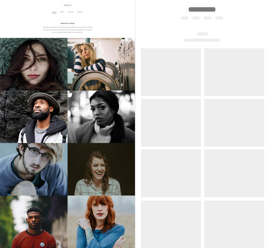
Multi-page with 2-column Grid
https://jupiterx.artbees.net/arbius/
Who should use it?
This multi-page template is ideal for those freelancers who would like to add a bit more detail to their online portfolio.
Homepage Structure
The homepage starts with a short intro and portfolio organized in two half large columns that each can be served as an album containing more information and photos inside, as well as a minimal footer.
Inner Pages
Arbius has three more inner pages: About, Personal and Contact.
The about page is simply made up of some image and text elements and defines what can be called the best “about” page in its most concise and well-set way.
The personal page can be called your album storage. You can organize your photos into different albums here using the photo album element.
And, finally, the very simple contact page contains your personal studio address, phone number, and email. Isn’t that what a typical contact page should offer?
Jovial: Classic
Multi-Page with classic navigation and sectioned homepage
https://jupiterx.artbees.net/jovial/
Who should use it?
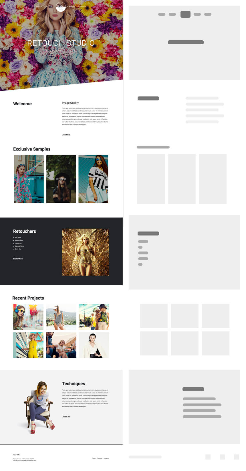
Jovial is a classic multi-page template, perfect for photography studios that consider their website as the main platform to present their services, explain the techniques they use and to showcase their work samples.
Homepage Structure
The section-based homepage starts off with an eye-catching intro, a full-height hero image, and scrolls down to more sections, each containing details and explanations about the services offered. The proper combination of image and text while avoiding an uncluttered overall look is noticeable.
Inner Pages
Like the majority of the classic website templates, Jovial also has many inner pages: About Us, Our Team, Projects and Contact Us.
The about page has an intro with bold headings on top and a cover image below. The inner sections in between can be served as side notes about your business. The fixed background with text element walking on it adds a sophisticated look to the page.
The team page has the same bold heading and cover image style and uses sections to introduce the team members. A whole descriptive section that speaks to the members’ background and experiences sounds great! Some of the sample works can also be added as posts to the page. It will for sure invite the visitors to check on the projects page!
The projects page is all about its name! Following the same intro style, it’s your treasure chest, storing your work samples and past projects.
And finally, the contact page which will serve as a bridge between you and clients with a Google map and contact information down the page.
Wrap Up
We showcased 5 models that represent different approaches in design and content for an ideal photography website and can be chosen as a foundation or inspiration for your photography website based on your brand’s characteristics and preferences.
Have you already started setting up your website? Do you plan to strengthen your online presence and let the world see through your eyes? Let us know in the comments!


1 Comment
I appreciate the effort and time you put into crafting such an outstanding piece of writing. Your passion for the subject shines through in every word, making it clear that you have a deep understanding and respect for the topic.