Agency website templates are all about design that is clean and easy-to-understand, which in turn allows visitors to easily access information from the homepage. In this article, we break down this concept and discuss the key elements in creating an agency website.
You’re in luck! We’ve gone ahead and compiled a list of the most crucial elements needed for an agency website. Plus we included a couple of interesting gems that will allow you to showcase your agency.
And more good news: you don’t have to be a programmer to create a professional-looking agency website. In other words, you won’t have to write a single line of code at any stage of building up an agency website. A major part of the work is done for you already, and every user gets the most out of their preferred site editor. Let’s dig in!
Hero sections
Hero sections are the part of the page that appear as the first element. Your site visitors will notice the hero section the second they enter your site – as you might imagine, hero sections are one of the most important sections for agency websites. Your goal here is to create an eye-catching section that will keep the visitor on your page and invite them to browse other parts of your site.
Usually, the hero section is built with a visually appealing background or side image, brief explanation text of the company’s main goal and sometimes call-to-action buttons.
Jupiter X has several examples of how a hero section can attract visitors. Let’s check them out:
- The hero section from the Startup template:

2. The hero section from the Digital Agency template:
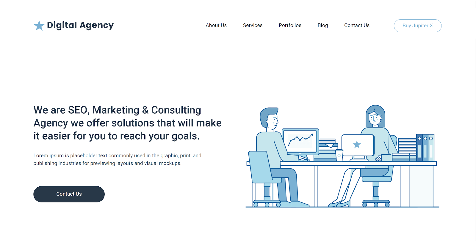
3. The hero section in the Agency 2 template:

Services section
The services section is another vital part of your agency website that should not be overlooked. In this section, you should display all services offered to your visitors, which means that it should be crystal clear and easy to understand. You can provide a brief explanation of the service and a call-to-action button for more information. These buttons can be used to direct visitors to the single services page.
The popular layout for any services section is divided by several columns. Elements, image elements and tabs can be used to beautifully display the services offered by your agency.
- The services section from the Agency 2 template:
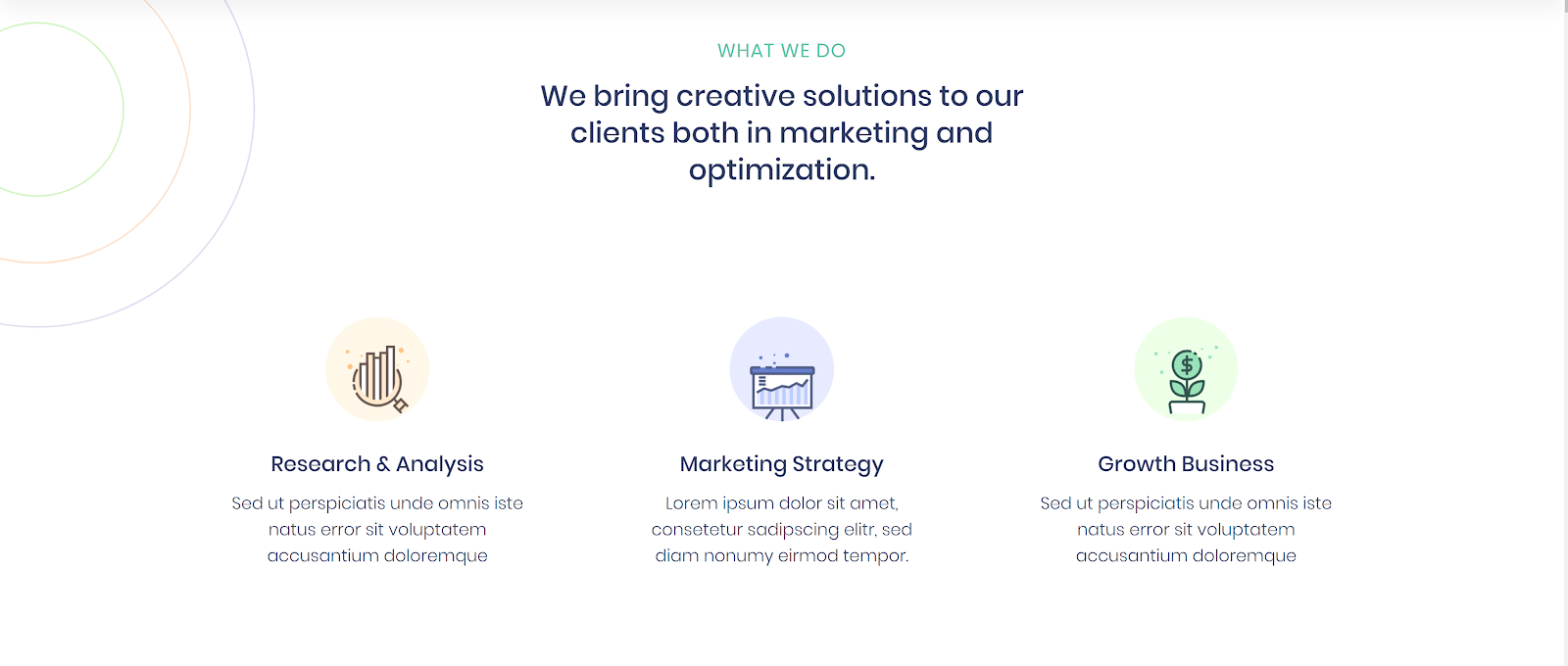
2. The services section in the Ruminus template:

3. The services section in the Metis template:
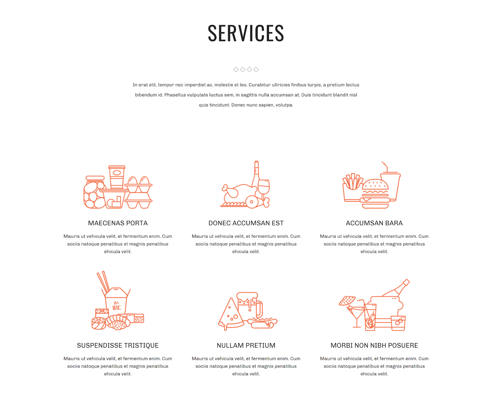
Portfolio
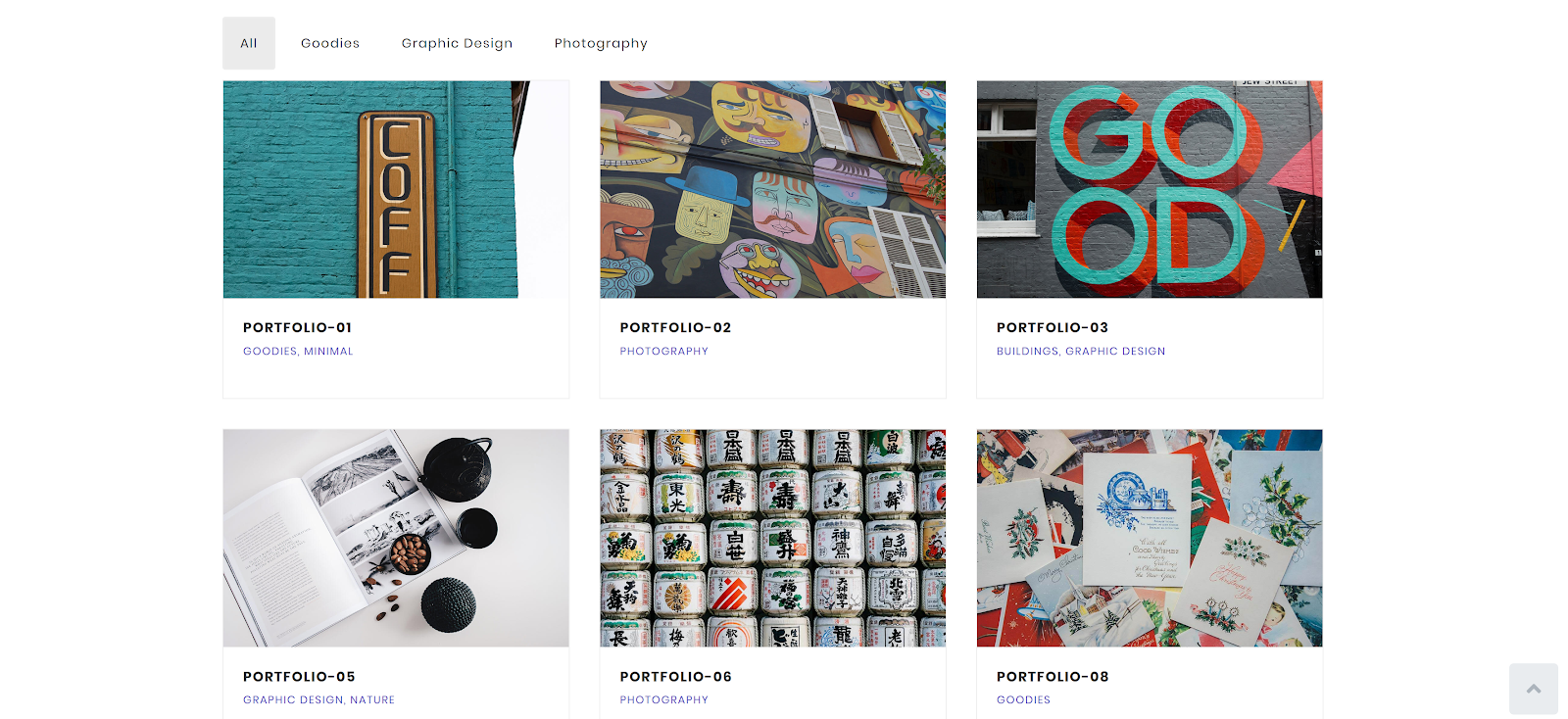
The portfolio section is where you’ll need to beautifully showcase your recent work. The appearance of this section depends on the type of your business. So, if you have a software agency, then you have to list the most popular programs you’ve completed. If you’re a web design studio, then you might want to list the websites you’ve created. If you’re a music composer, you can list your popular soundtracks and so forth. In other words, depending on what you do and what you want to showcase, the elements used in a portfolio will change accordingly.
In Jupiter X, there are several Elementor widgets to showcase portfolios. These portfolios can be dynamic or they can be assembled with elements that are not dynamic and manually linked to the single portfolio page or to directly linked to the project website.
Let’s take a look at some examples:
- The portfolio section in the Euporie template:

2. The portfolio section found in the Metis template:
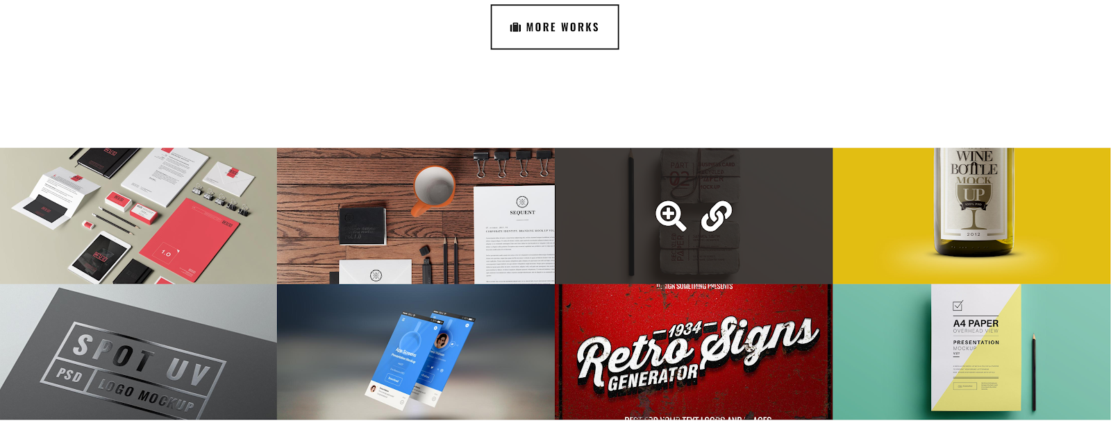
3. The portfolio section in the Zethus template:
Recent publications
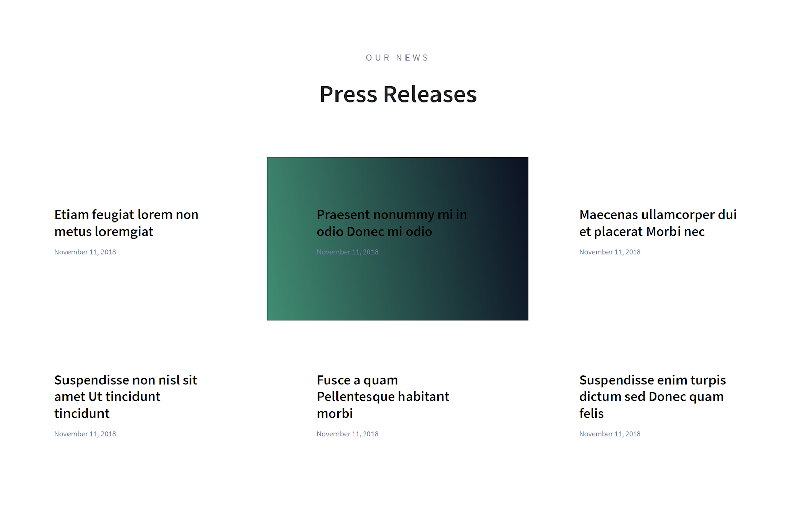
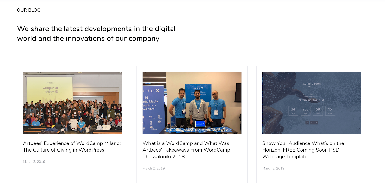
Recent publications could be treated as a blog section. Of course, what you decide to name this section when creating an agency website is up to you. Depending on what you prefer, you can call this section “recent publications” or a “blog”. The blog section on the main page might contain recent publications from your company’s activity. Nowadays, keeping up with blog posts has become extremely important. So, if you decide to place this section on your main page, then you have to constantly publish your posts.
Whenever I browse a company’s website, I pay attention to the blog section such as the date when they last published a post. So for instance, if it’s been 6 months or a year since they last posted, then I might come to the conclusion that the company is not paying attention to the public or are not serious about keeping up with the latest trends in their industry.
Jupiter X has several Blog widgets to showcase recent publications. You’ll need to use the Posts element and style the look as you want in the element settings.
- A recent publication section in the Startup template:
2. A recent publication section from the Agency template:
Partner section
This section highlights the prominent partners of a company or business, which can go a long way in increasing the value of a brand and could generate extra leads. The power of the partner section shouldn’t be understated. If you have partnered with globally recognized or trusted partners, the chances are that other big companies will want to partner with you as well.
- The partner section in the Agency template:

2. The Partner section in the Startup template:

Subscribe section
At some point, subscribers might become your next client or partner, meaning that they are one of the most important parts of your business. While creating an agency website, keep in mind that you’ll definitely want to have a subscription section right on your homepage. This beautifully created section may also attract more visitors, and you might also want to include some info about what you’re going to do with the list of subscribers. In other words, it’s a good idea to promise that you won’t spam their mailboxes and that they’ll be able to opt-out anytime they want.
- The subscribe section in the Startup template:

Footer anatomy
Footers could play a significant role on your agency website. While designing a footer, you should remember one vital thing: the footer appears on every page, so you’ll need to make it very attractive and informative. A footer is a place for only necessary information, such as contact info, important pages on your site (such as About Us or Pricing) and a subscription box.
- The footer section as seen in the Startup template:
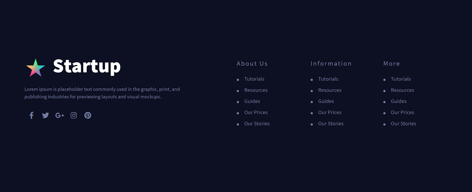
2. The Footer section in the Zethus template:

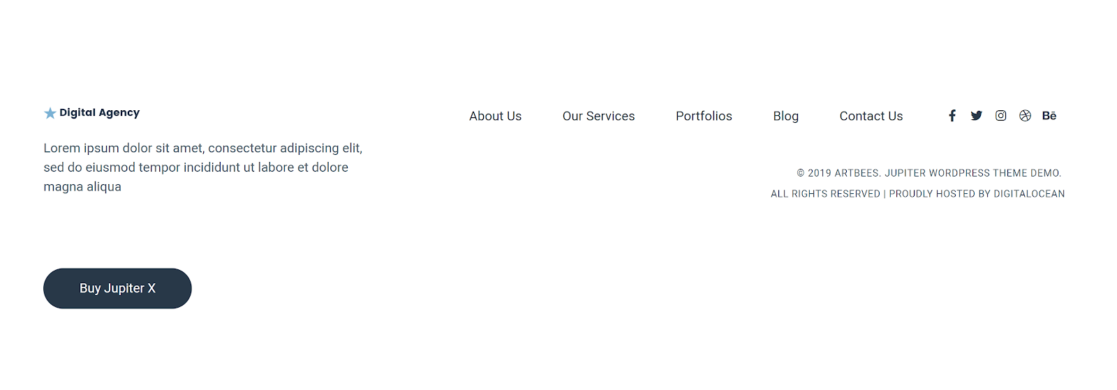
3. The footer section in the Digital Agency template:
Conclusion
When you have a powerful tool such as Jupiter X at your disposal, creating an agency website shouldn’t be a complicated process. Jupiter X offers a great selection of web templates dedicated to agencies that have differing profiles. In order to build up an agency website, you don’t have to start from scratch, as the readymade templates can be imported with just a few clicks – all you’ll need to do is change the text and images and you’re set!
I hope this article will help you create an agency website that suits your needs in no time at all. We’d love to hear about your experiences, so please comment in the section below!


No comment yet, add your voice below!