Today, web development in the digital era moves at a rapid pace. The time of plain-text websites ended long ago. And this is for the better. The choices for unique website templates – from interactive web templates to animated web templates – available to the customer is mind-blowing. And this is particularly true to anyone in creative fields who’d like to quickly and easily build up a creative website template.
Optimal website design plays a vital role in the success of a business. Making a good first impression is the most important part, and it directly correlates to user engagement. In this article, we break down this concept and discuss the key sections needed for a creative website template.
When someone first enters your website, there are a couple of essential elements that will grab their attention. This article explains everything that you need to know to make a great first impression. As you might have noticed by now, our other posts highlight that programming skills are not necessary in creating a creative website template. Furthermore, this becomes even easier if you have a WordPress theme that comes with everything you need like Jupiter X.
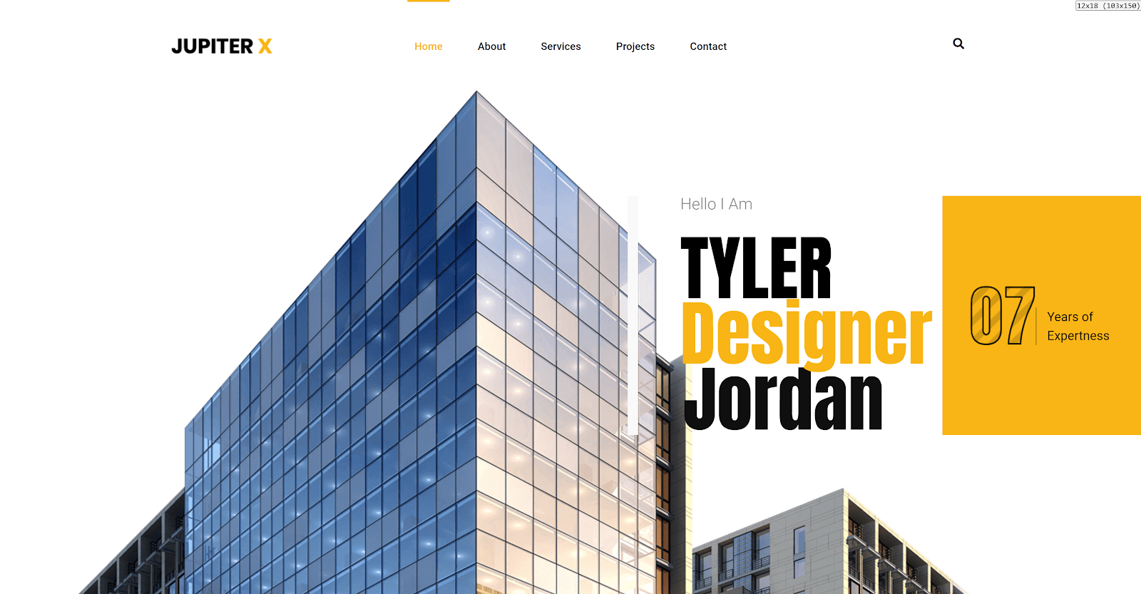
Hero Section
The purpose of a header is to convey the core of your business to the visitor. A carefully designed header design layout must announce the core of your business to the visitor. In designing the layout of the header, you have several choices: a static header image, a header image with text overlay, a slideshow header or a video background header.
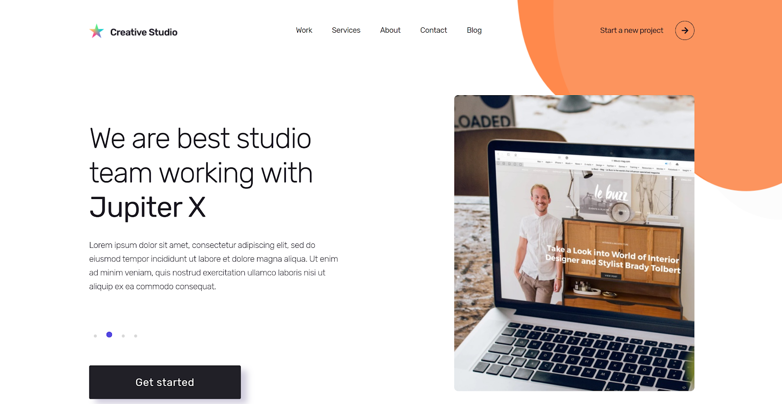
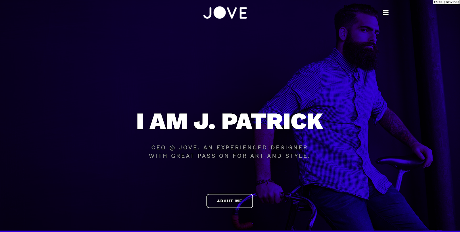
While hero sections vary in terms of layout, for example, a popular use case is the full-screen hero section. However, this is not the rule, and you may also use a half-screen hero section. Jupiter X Creative Studio, Jove and Architecture templates offer different designs of hero sections for a creative website template:
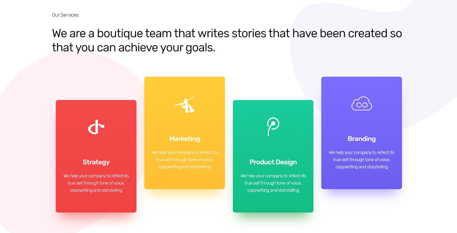
Services
Following heroes, in the Services section, companies or individuals talk about their services or the area of their main specialization. This is probably the most important part of the whole website. In this section, you’ll need to introduce services offered by your company to your visitor. While there are several standards and known design rules about how to design such a section, you are free to change this up since we’re talking about creative website templates. Make it your own by offering something new in design, layout or colors. But let’s not get too carried away: don’t forget to keep the section clean and simple. In other words, anyone viewing your website shouldn’t leave your site with any questions about what you’re offering them and how.
Let’s go ahead and take a look at several examples of a Services section in Jupiter X Creative Studio and Startup templates.
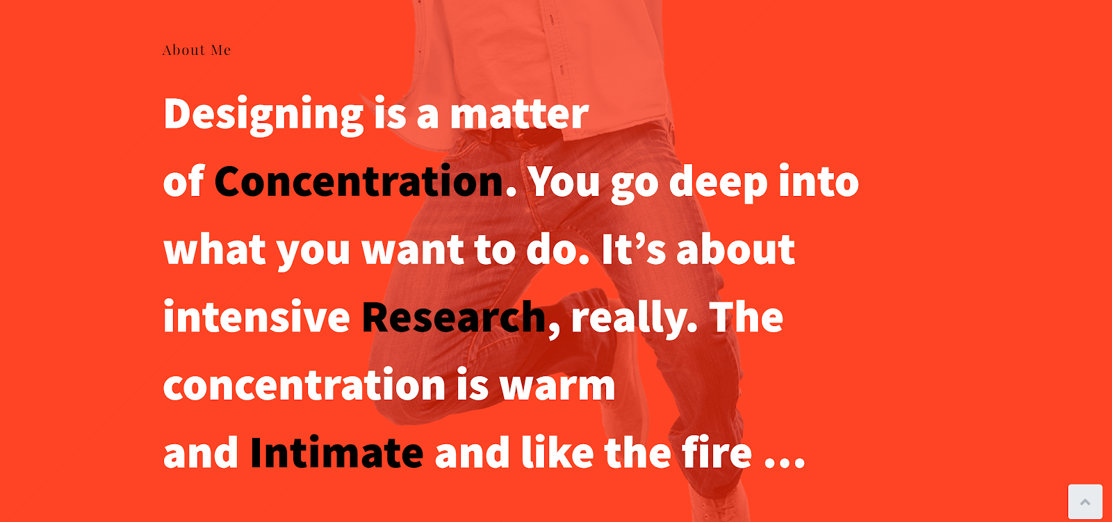
About Us
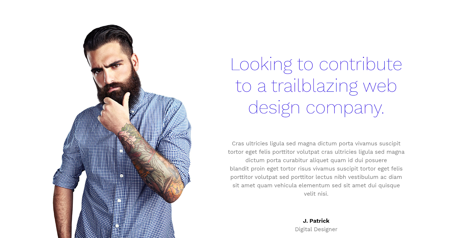
When it comes to the About Us section, professional website designers and developers only provide very little information on the main site. This can be seen as a brief about what the brand is about – it’s better to keep these short and simple on the homepage. In terms of location, it’s good to place the About section either right after the Hero section or below the Services section. However, this is not the rule, and you can also place this info in the Hero section.
The About Us section should contain a brief description of the company or person, how they started the business, where they are at this moment and what is in their future. Here are some examples from Jupiter X Kore and Jove templates.
Partner
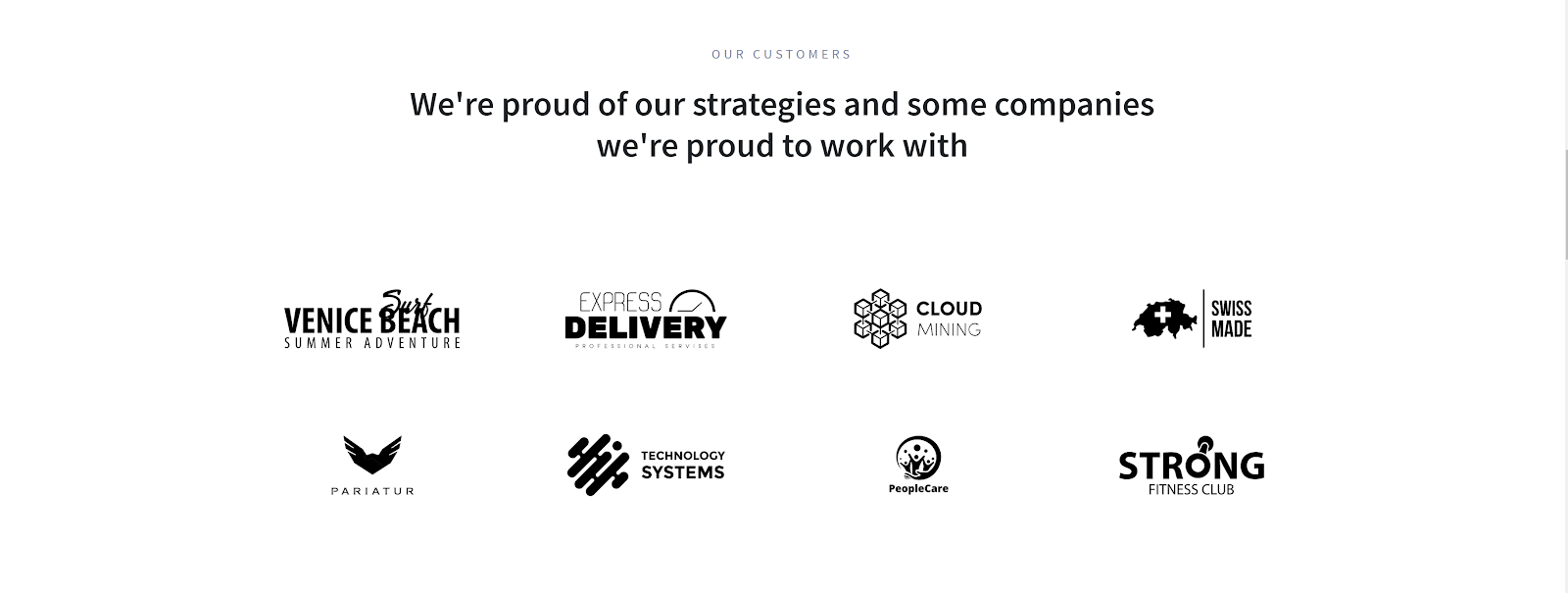
Partner sections are a vital aspect to your website, as they provide visitors confidence into a company’s dependability. Most Partner sections contain lists or a table of partner logos. While logos are often more readable and recognizable, it’s also essential to include the partner’s full name in addition to their logo. You can also add a link to their website in this section.
Depending on the number of partners in the section, we might also include a short synopsis of your relationship and how they are partnering with you. You might want to take it a step further, and give each partner their own profile page. Another option is to group the partners by categories; for example partners in design projects, software exchange projects and so on. Check out these examples from Jupiter X Agency and Persephone templates.
Clients
The Clients and Partners sections are similar to each other. However, they differ in their purpose. Clients are the most valuable thing as businesses are fully dependent on clients. Similar to the Partners section, we can use a list of logos. We can also add links to a project that your company worked on for a client.
Along with a list of clients, we may also include testimonials (which is a great addition to any kind of website) from previous clients, which will add more weight to the section and increase user engagement. Below are examples from Jupiter X Agency and Creative Studio templates.
Showcase
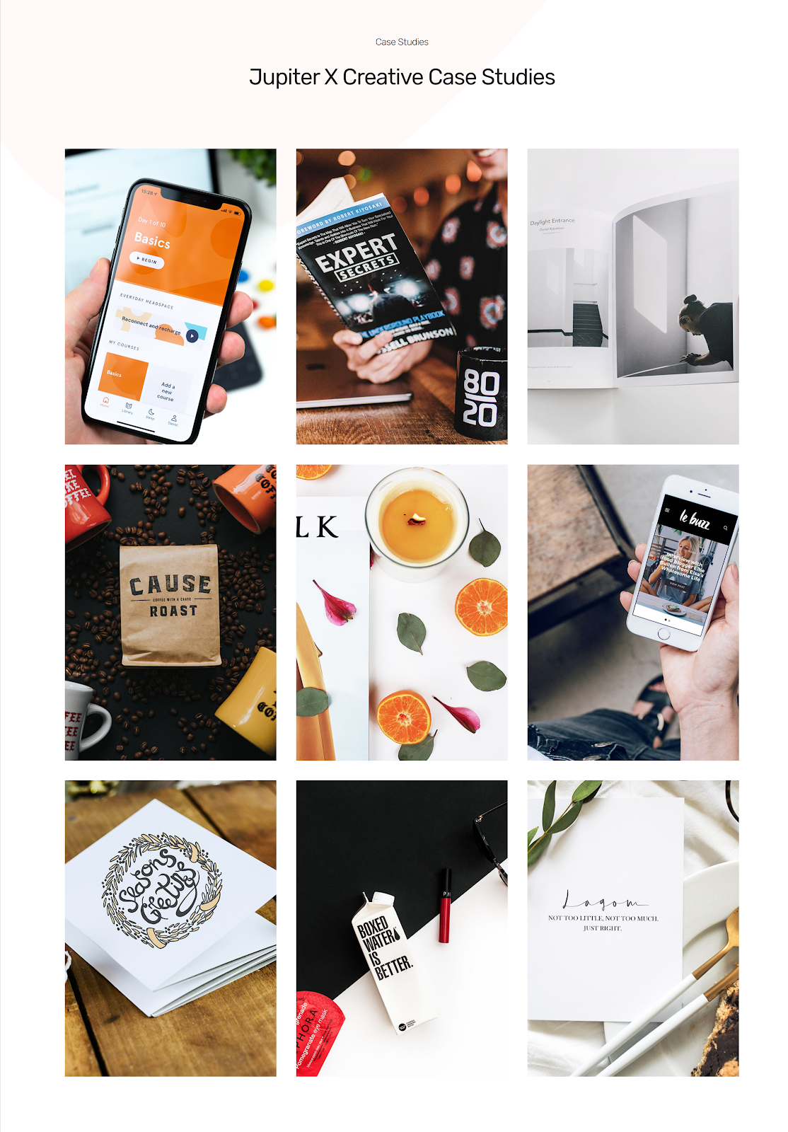
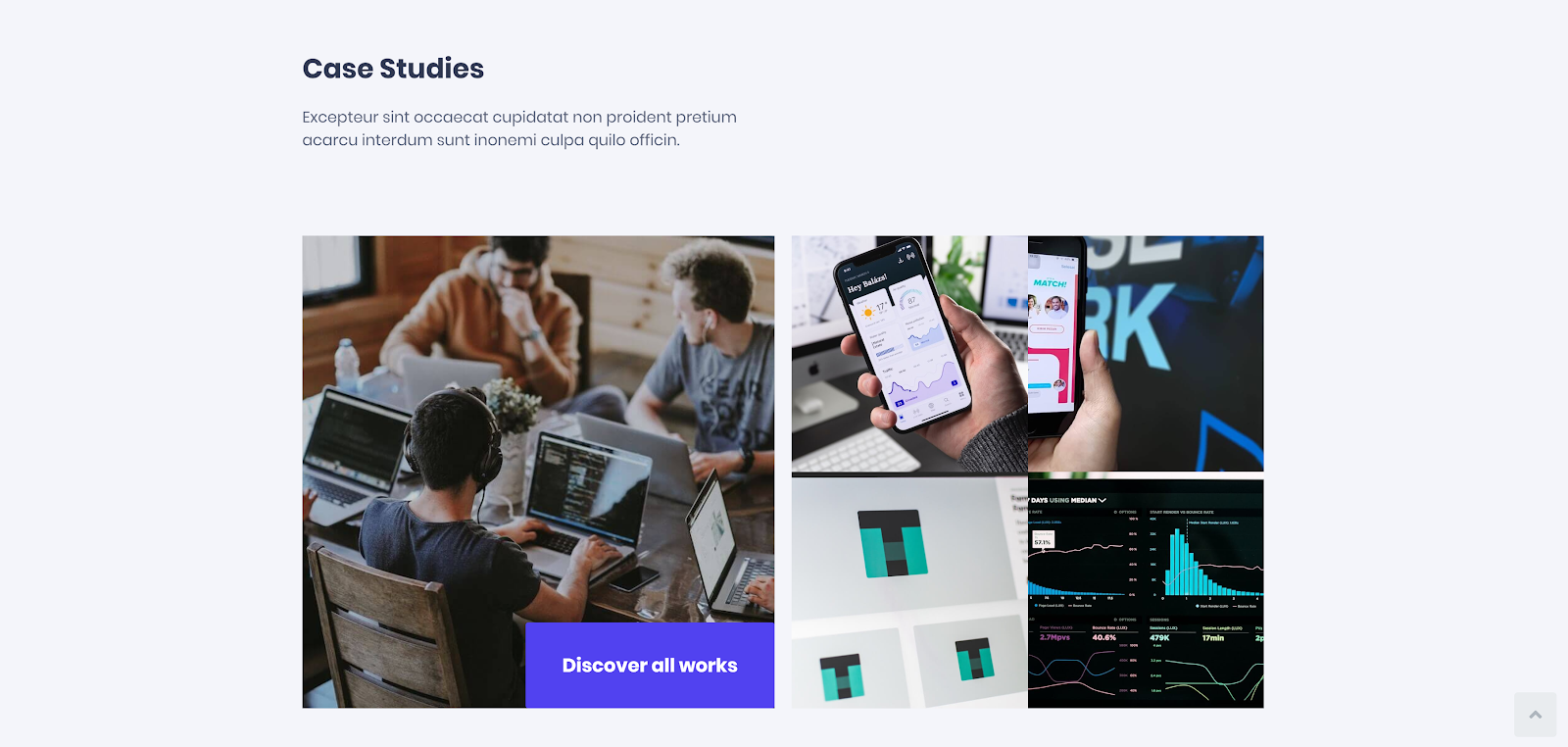
A Showcase – or commonly known as a Portfolio section – is a great opportunity for you to display your work and case studies to visitors. This section isn’t only for work: you can also use it to show your unique personality, talent and experiences. Portfolio sections are particularly useful in creative fields for photographers, designers, developers and more.
To get a better idea of how you can put this into action, take a look at some Showcase sections in Jupiter X Creative Studio, Software 2 and Persephone templates.
Photo Album
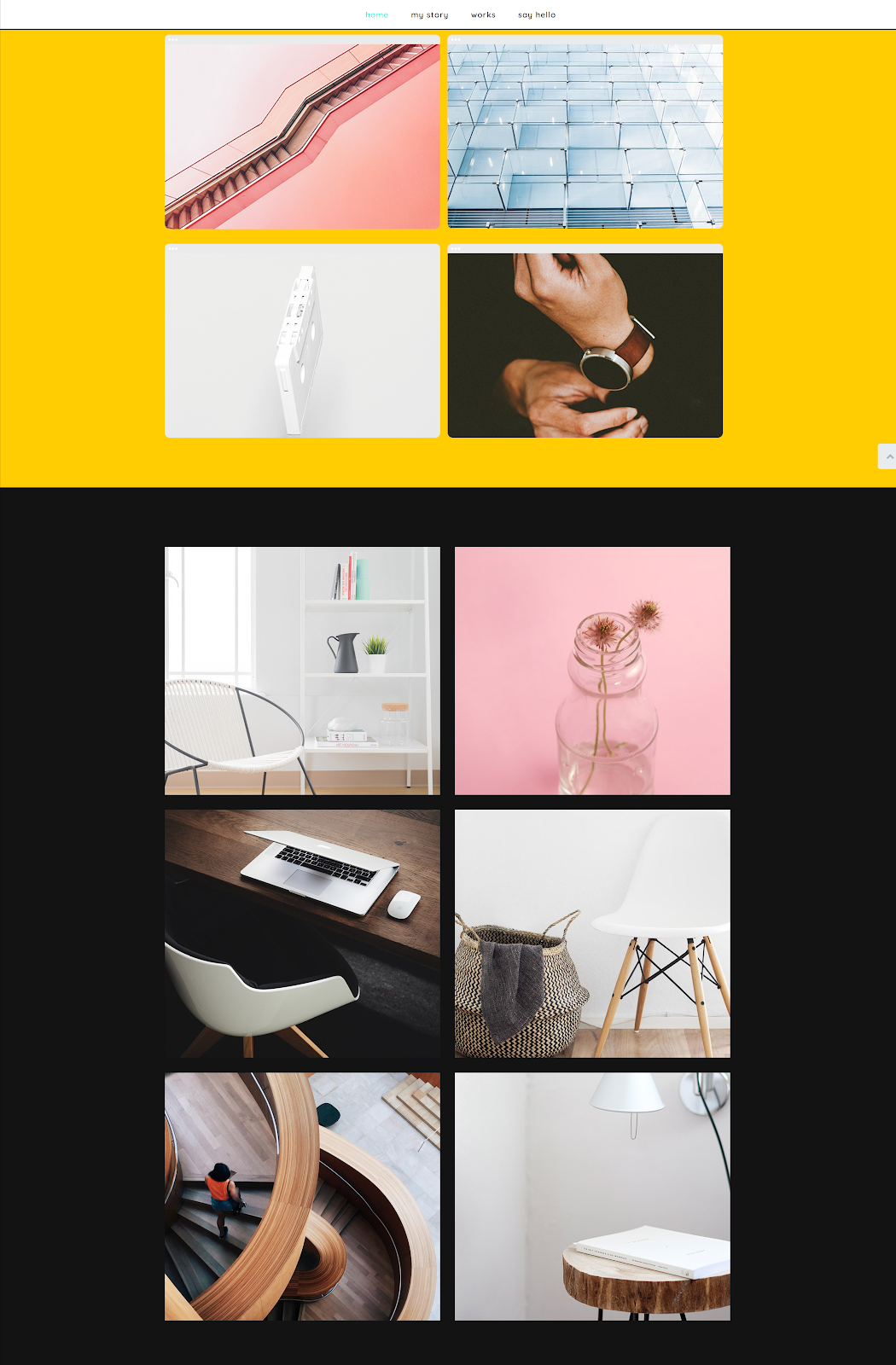
If you’re a photographer or creative artist, then having a Photo Album section on your site is a must to showcase your art. It’s important that you are able to showcase your work in the most creative way possible, which is why placing raw images in a column simply won’t cut it. That’s where the Photo Album section comes in handy as it offers variation in creatively displaying photos. Take a look at the following examples from Jupiter X:

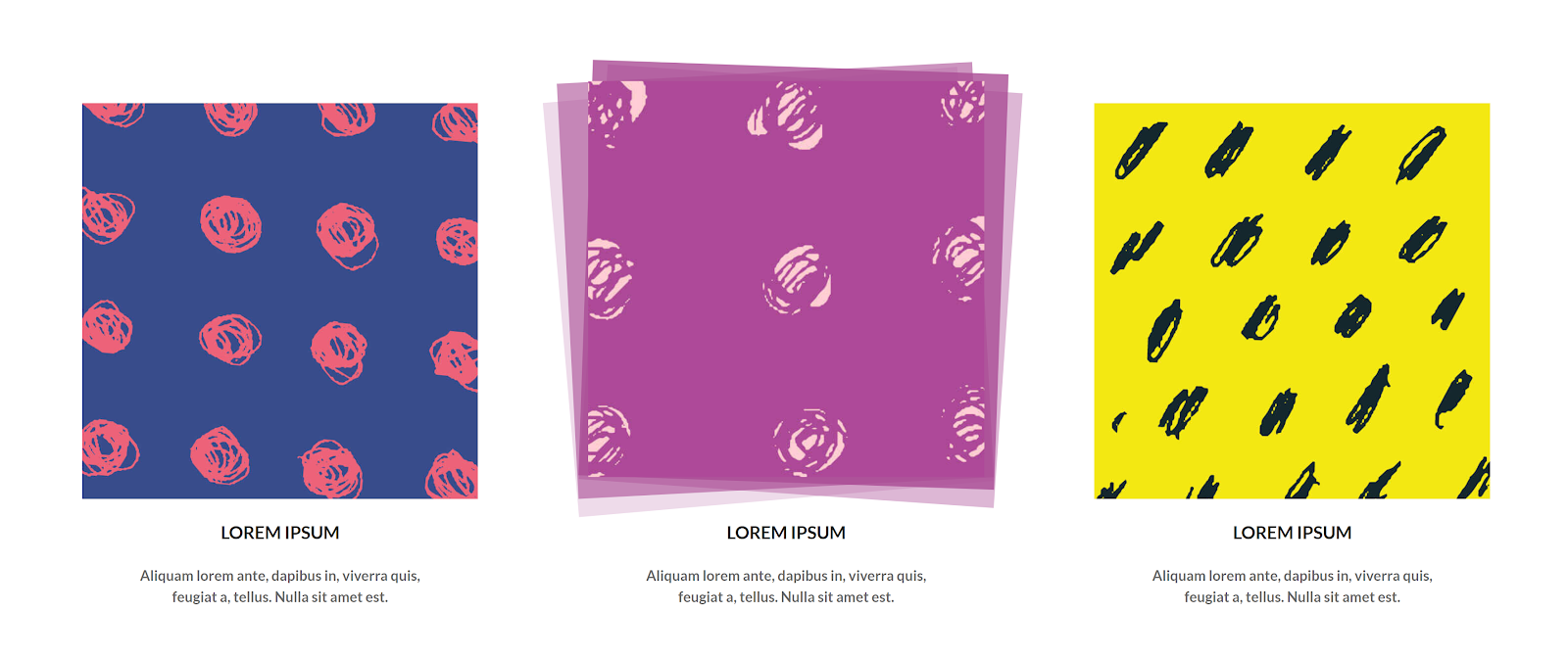

Full examples can be viewed here:
https://jupiterx.artbees.net/elements/photo-album/
Contact section
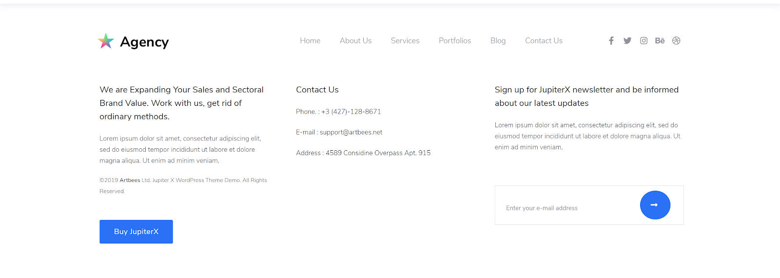
On traditional websites, you’ll find important info like the site map, address, link to the website’s privacy policy page in the Footer section by default. This information is usually organized in several columns, and the most popular is a combination of three or four columns.
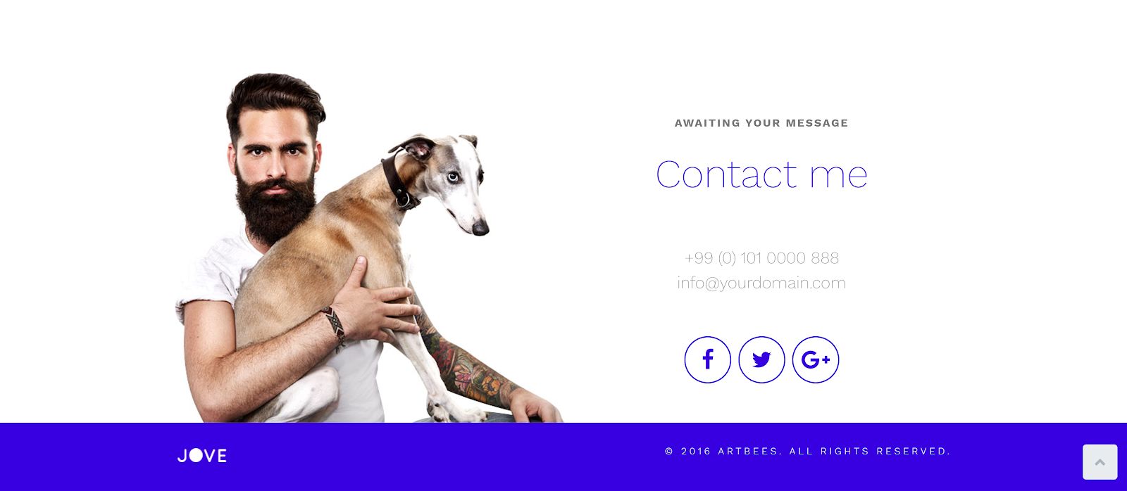
Of course, with creative website templates, you’re definitely not bound to this rule, and you might want to leave only important information in the footer. Creative templates are all about the creative approach, which calls for simplicity. In the Contact section, you might want to input only the necessary information such as contact details, social media or several words for engagement. Check out some of samples below from Jupiter X Jove, Agency, Kore and Persephone templates:
Wrapping Up
Incorporating creative websites into your development process all depends on the goals of your site and the needs of your visitors. Developing a creative website is probably the most interesting design work you can come across – but it’s also the most challenging. The main thing to keep in mind is not to get overwhelmed by new ideas. It’s worth mentioning that while adding several moving elements onto a page might look visually appealing, it might be difficult to make them responsive.
Jupiter X offers a great selection of web templates dedicated to creative agencies or individuals. And the great news? You don’t have to start from scratch, as the readymade templates can be imported with just a few clicks – all you’ll need to do is change the text and images and you’re all good to go!
We hope that this article provides you with all the tools you need to implement creative website templates into your pages. We’d love to hear about your experiences, so please comment in the section below!







1 Comment
Lovely content. I found this inspiring.