When was the last time you bought a magazine? The chances are that you don’t even remember unless you’re an avid reader who still carefully keeps up the tradition of going to the newsstand and picking your favorite magazine right after it comes out! Just like in every sector, the internet and digital age has dramatically changed the world of magazine publishing. Every day more and more magazines are moving online in order to keep up with the pace. Publishers have come to an understanding that online magazines are becoming more popular because they are easily accessible, and in most cases, free.
That being said, the trend of online blogs and magazine websites with WordPress on the rise. Undoubtedly, content is king, but if you want to put up a magazine website that is aesthetic, professional, visually appealing and user friendly, you need to pay double attention to website design. Even the best content seems banal sitting on a bad design.
Magazine-style websites should be dynamic, stylish, rich in content yet uncluttered and consistent in design. Maintaining these criteria is not easily achievable, so in this article, we put together some key tips along with some live examples from Jupiter X magazine and blog templates that can help you get inspired and create a professional-looking magazine website to reach a wider audience.
Layout matters!
Grid and masonry layout
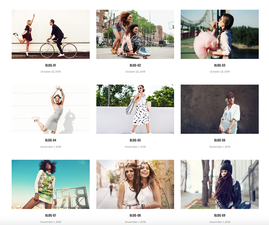
Using vertical and horizontal lines of the grid system to organize content has always been a common practice in traditional paper magazines. Grid layouts are now modernized following the trends and are still a popular layout for blog, news and magazine websites as they make the website visually appealing, neat and easy-to-read. The grid layout – which looks like the cells of a table spaced perfectly right next to each other – creates the best architecture to organize your posts. Most of the Jupiter X magazine templates are designed under the grid layout in most sections. Here is an example of how it looks in action in the Joi template:
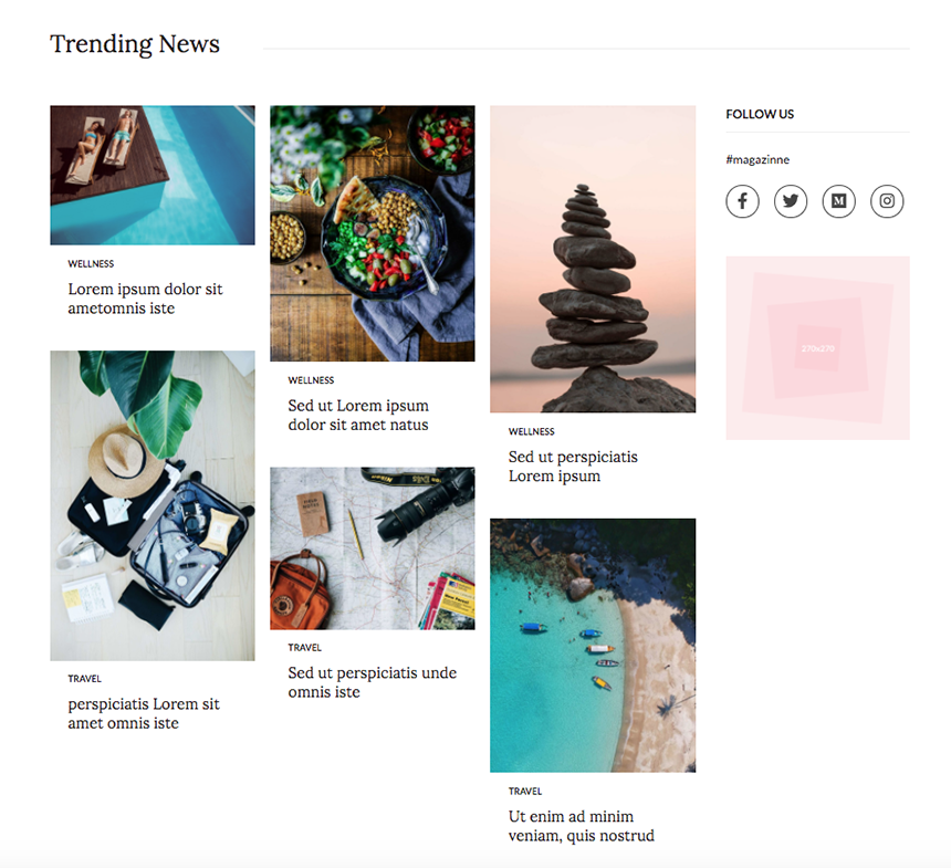
Another popular layout when designing magazine websites with WordPress is the masonry layout. A slight difference between masonry and grid layout is that images can be displayed in a larger size and that they are more fluid in their placement on the page. The Masonry layout comes in two inner and outer formats with their own aesthetic features. The trending News section in the Magazine 2 template enjoys this layout:
Lists
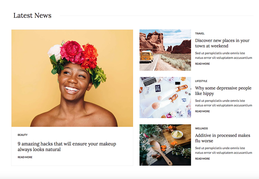
One of the unavoidable widgets in blog or magazine websites that feature heavy content is the Smart Post List, which will help you to organize posts in an interactive manner. You can customize the lists in many ways such as image size, featured post style, alignment, meta and more. Check out an example of the listing posts in the Magazine 2 template:
Tiles
Another cool way to display posts in stylish tiles is by using the Smart Posts Tiles widget. Just like lists, you can customize nearly everything in tiles, from image size and title length to box overlays and height and width. A perfect example of this style is live in the Photography Blog template’s homepage.
Posts carousel
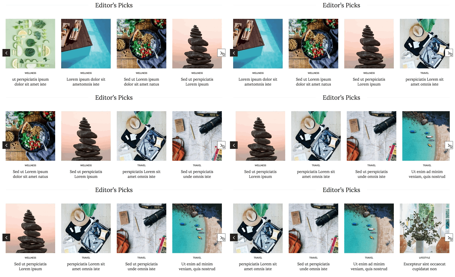
One common and eye-catching way to display the recent posts on the website is by using a carousel style. Showcase your featured or most recent posts in moving slides, and readers will much easier be able to locate the important posts or even the archived posts from the past. Magazine 2 template uses the carousel in a neat way.
Visually appealing is a must!
The next time you buy a paper magazine, pay attention to the number of images, colors and other visual elements used on various pages. With a lot of content to read, rich media can make the design of your website compelling and more entertaining.
Images
Don’t underestimate the power of images in drawing the reader’s attention to stories. Think of your homepage as the cover of your magazine and try to make it as much attention-grabbing as possible. Use big, bold and high-quality images that are of course in line with your design style. Jupiter X’s Joi, Meditrinalia and Photography Blog templates include this image rich layout.
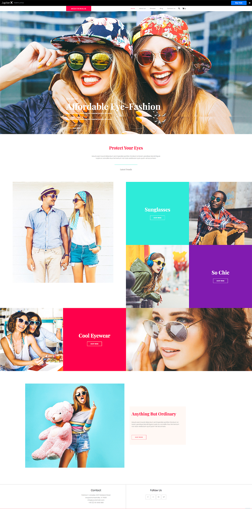
It would be even better you can invest in taking your own images. If that’s not possible, then you can look for stock photos on quality websites such as Shutterstock and Unsplash.
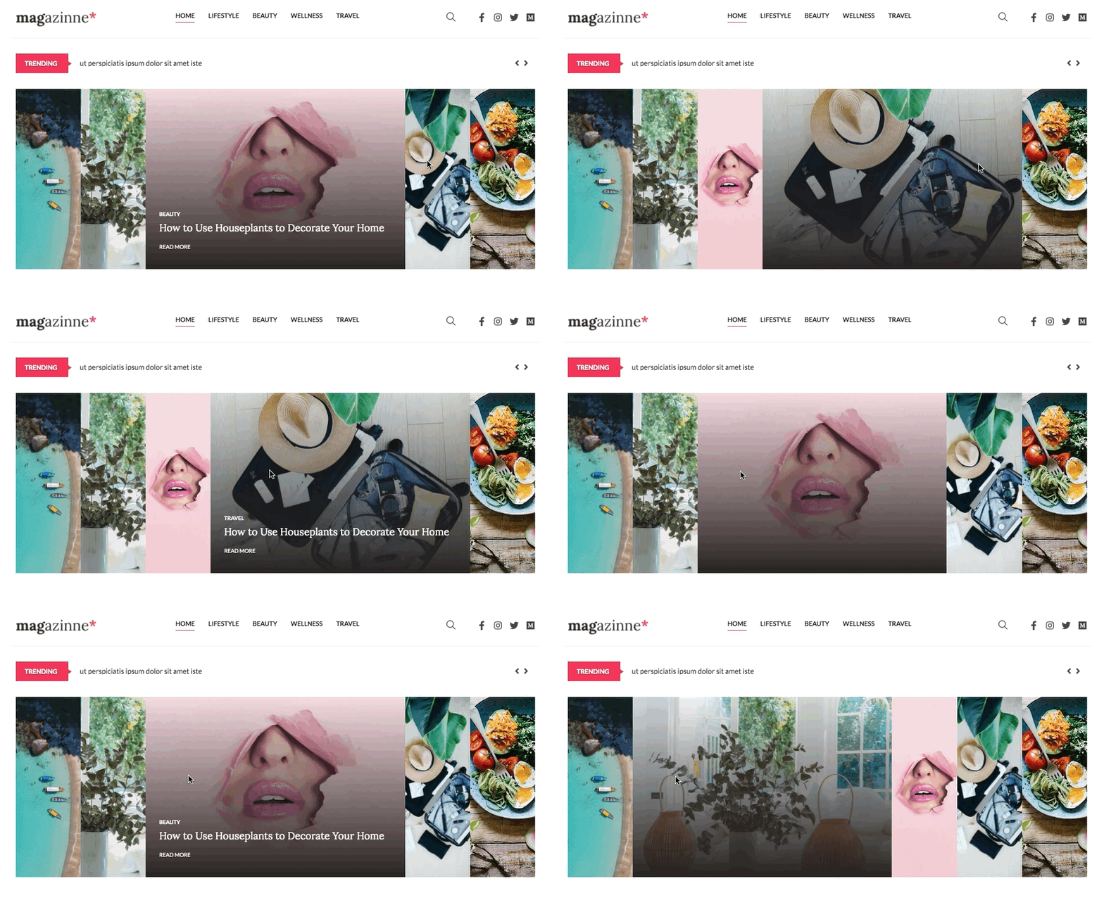
Using image-specific elements such as Image Accordion and Slider to showcase your posts makes your website even richer. You can find examples of these elements in the Magazine 2 and Simple Magazine templates.
Videos & animations
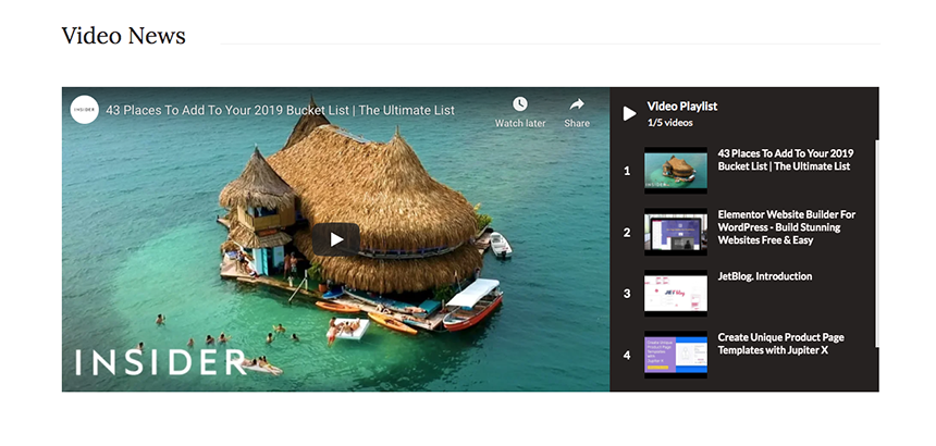
One fundamental difference between paper and online magazines is the use of videos and animations. Using them adds to the dynamism of the website. People tend to pay more attention to the posts that include a video compared to the text-only ones, so try to incorporate engaging videos that match the general feel of the website and the post they represent when you create a magazine website with WordPress, just as we did perfectly in Blog 2 and Magazine 2 templates.
Fonts
Another important factor that will make your website pleasing to the eye is the right use of fonts and typography. Don’t be afraid to use different fonts, font sizes and font colors that are consistent with the website design. Use larger fonts for headlines or the top news you want to highlight and smaller fonts in the footer or for older posts etc. Check out the various fonts, sizes and colors in Joi, Meditrinalia and Health Blog templates.
Headline
Regardless of how many types of content your magazine is covering, they all need attractive headlines – in design and content – to be read. It doesn’t matter if it’s on the stand or on a computer monitor – the first thing that a reader’s eye is going to notice is the headline. That’s why it’s worth spending time on it. According to some tests regarding headlines, the traffic to content can vary to as much as 500%. Thankfully, Jupiter X has solved the design part of headlines for you, and all you need to think about is content.
Avoid clutter
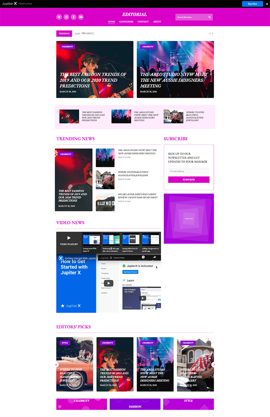
The most distinctive feature of magazine-style websites as stated above is being dynamic with too much content grouped together in a space as small as a screen. This creates a fine line between being stylish and being cluttered. While paying attention to the visual aspects of the website, you should also be careful not to drive your audience into an unwanted mess. Embrace white space and let your readers take small breaks in between their navigation throughout the website and focus more on the content that’s appealing to them.
The Blog 2, Isonoe and Simple Magazine templates struck the perfect balance between the white space and the posts and this created a seamless and uncluttered layout despite being heavy on content.
Allow users to navigate easily
Sidebars
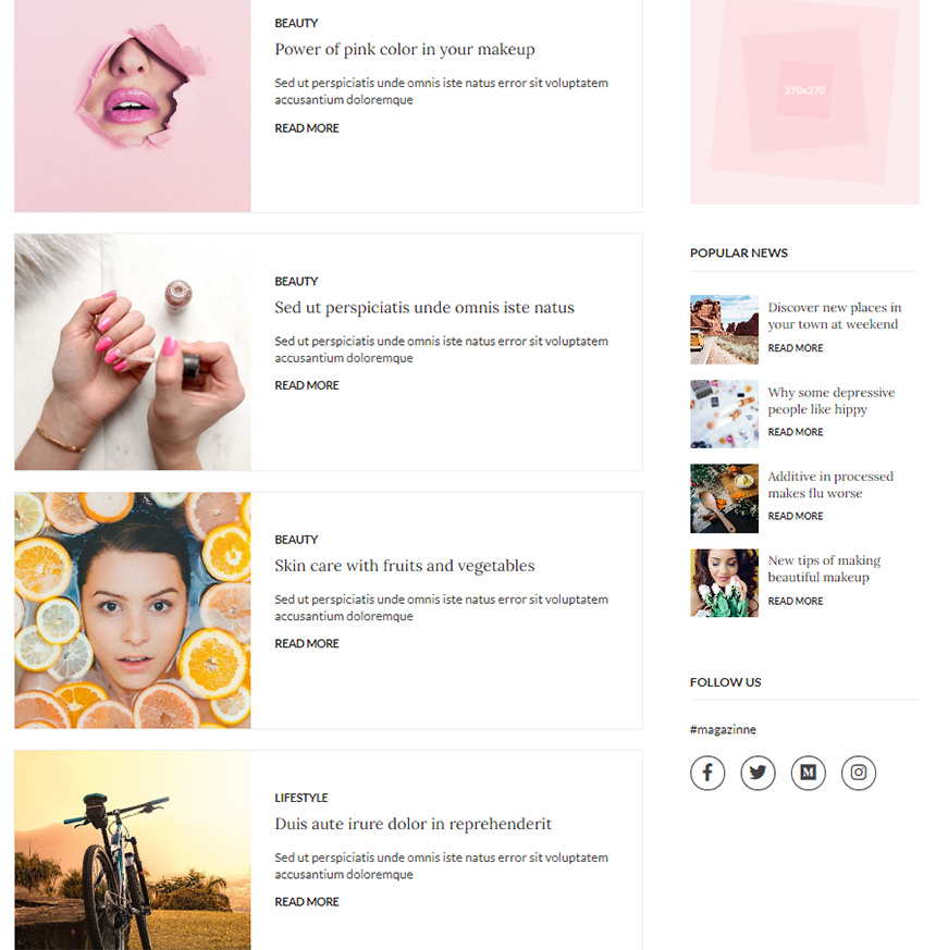
There is a debate about using sidebars nowadays. For certain types of websites, sidebars have become obsolete. However, in situations where users need some guidance and/or you have a content-heavy website (such as a magazine website), sidebars can be useful. Sidebars play an essential role in designing magazine websites with WordPress as they are an excellent way to show other articles or pages of your website. They also allow users to navigate easily through the website or to display call-to-action buttons for something like a subscription or even a place for your social media accounts, just like we did it stylishly in Magazine 2 and in Magazine without any clutter to get the benefit of sidebars.
Mega menu
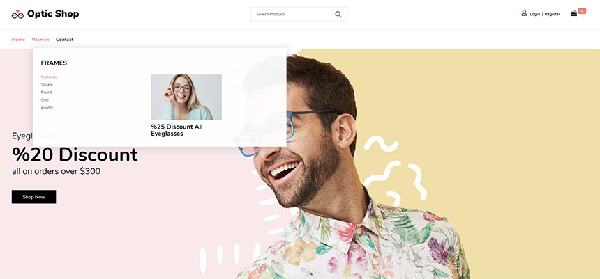
If your magazine website has a lot of categories and subcategories, then a mega menu is a good option to let users navigate easily through different parts of your website. This type of menu is useful to show all of – or most of – submenus of the main menu, and you can have a short description for each item on it. You have infinite customizability with Jupiter X’s Mega Menu, with a horizontal or vertical menu and add text, video, list items, image, icon, form and many more elements on your menu.
News Ticker
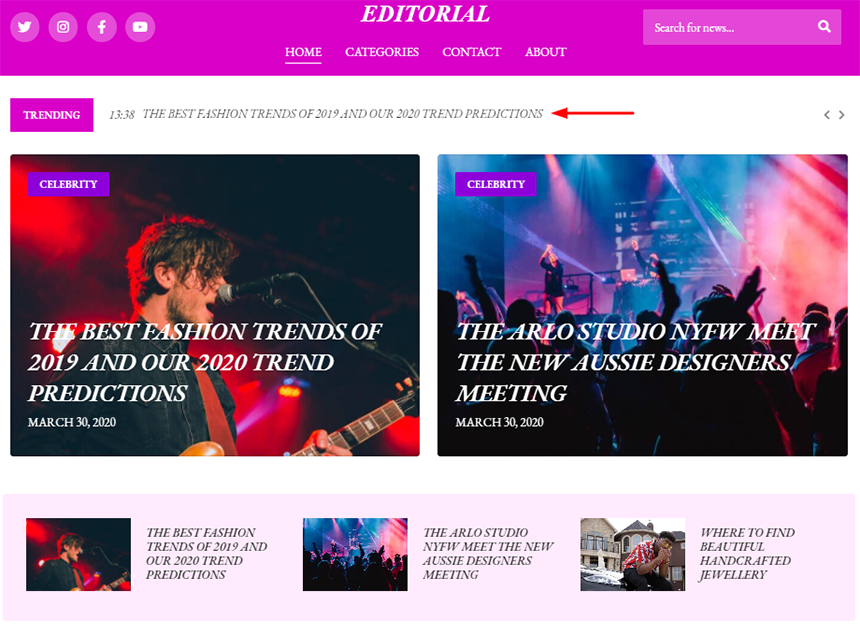
Have you ever noticed that narrow band of tape at the bottom of television channels for displaying news, information, advertisement, etc? It’s called a news ticker and is being increasingly used on the homepage of websites to show related information just like television channels. It can draw attention not only to the information that is shared but to the whole website. On a magazine website, you can use it to share your new articles so users can easily click and access that article. Or if you have a market or finance magazine, you may use it to show the price or rate of things that change frequently, but like most elements in a magazine website, it shouldn’t make the website appear too busy. Take a look at how we go about implementing this in the Blog 2 template.
Divide into categories
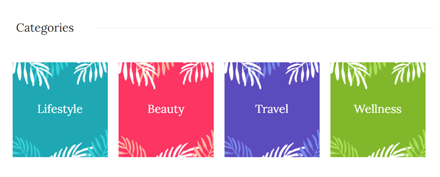
Another excellent way to appeal to site visitors while creating a magazine website with WordPress is by archiving your content into meaningful categories. To do that, you should have a clear understanding of why your audience visits your website. Avoid making too many categories as it can cause clutter on your website. For example, if you’re thinking of having a general fashion magazine, it would be wise to divide categories into Men, Women, and Kids for the main page. Jupiter X provides both outer style and inner style for categories, for instance, we designed Magazine 2 with inner style to categorize contents and Fashion Blog with outer style.

Include a subscribe button or sign-in form
Online magazines are becoming popular for a reason: they are easily accessible. In order to keep readers engaged and faithful to your magazine or blog, you should let them subscribe to it with ease and just like they could get paper magazines in their mailbox, let them gain access to the latest news in their inbox. Failing to do so can make you lose them forever to competitors.
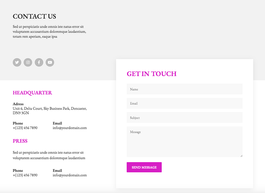
Most magazine templates from Jupiter X include a subscription section and a contact form for possible questions and queries. The best practice is that you include the subscription button down every page of the website. Check out the Magazine 2 and Blog 2 templates as examples for both.
Embed social media
With so much content available for free on the internet and social media, promoting your content seems pretty difficult in such a competitive field. Thus, the effect of social media is undeniable for your brand and content to go viral. Make sure you allow for a discussion on social media about your content, which will operate like “word of mouth” in the digital world. Embed your social media accounts wherever possible on your website that of course does not make the overall design look ugly! The header, footer and contact pages are the best places to consider.
Wrapping up
There’s no doubt that you should focus and spend a lot of time on an eye-catching design to create a magazine website with WordPress, and Jupiter X would be a huge help and easy way to achieve it. We provide various templates with a lot of features for different tastes that, like all the templates of Jupiter X, you can add, edit, or delete every element of your website.
Now it’s your turn, are we going to see a new online magazine soon?


No comment yet, add your voice below!