Make It Industry Specific But Not Too Specific!
People search through templates based on their career. For example a coffee shop owner will spend more time searching in a “Cafe” or “Restaurant” category rather than a “bookstore” category. What he expects from his website is quite different from what a “tailor” does. He needs a set of tools to showcase his coffee blends and pricings. He might be also eager to create a photo gallery to show how intimate and vibrant his cafe looks. For a bookstore though, a photo gallery does not do the job. What it needs most is a comprehensive list including all those book categories to let people find their desired book as fast as possible. So it’s better to stick with a category and create a template for the needs and requirements of that specific industry. However, there are thousands of careers in the world and you can not possibly prepare a template for each.
Instead you create generic templates for an industry category and all those sub categories customise them to address their own requirements. Let’s say we are designing a template for a restaurant and we are using some fish and prawn cliparts as background images throughout the website. Well this for sure is desired for a seafood restaurant but not for fast food. The template is highly customised for a seafood restaurant and it takes a lot of time/skills to adapt it for fast food. Be specific but avoid being too much. Pick up a fictional cafe brand and design a template for that kind of business but keep all those “other sub categories” in mind. The more inclusive your templates can be the better.
Use Colors Responsibly
Your favorite color might be someone else’s hated one! Yes. That is the fact that we have to live with as template designers. Even though a nice greenish yellow works best with a dark black background, some people like it with red. So try to stay move beyond your own taste palate. Your job is to create something for everyone, not just for those who have taste like you.
Make all colors editable in your template and definitely don’t add the colors as part of an image that is not editable.This rule applies to all templates: Less is more. The least amount of color there is, the better. Some designers tend to show off their design capabilities by creating jaw dropping colorful templates.
[call_to_action title=”Get your website the custom design it deserves by Artbees designers ” target=”_blank” url=”https://themes.artbees.net/pages/artbees-care-wordpress-customisation-services/?utm_source=custom-design-related-docs-posts” type=”link”]
The work looks amazing at the moment but perhaps may not in the future. Keep in mind: Users may know nothing about color theory whatsoever. If they ever opt to edit the colorings of a template – which is very likely, right? – they will end up with an ugly combination of colors.
A Template Designer Is a Marketing Hero
A template is an all-in-one . Marketing prospects are included. When you are starting off a template for a business you might imagine what type of content it requires. This is good but never enough.
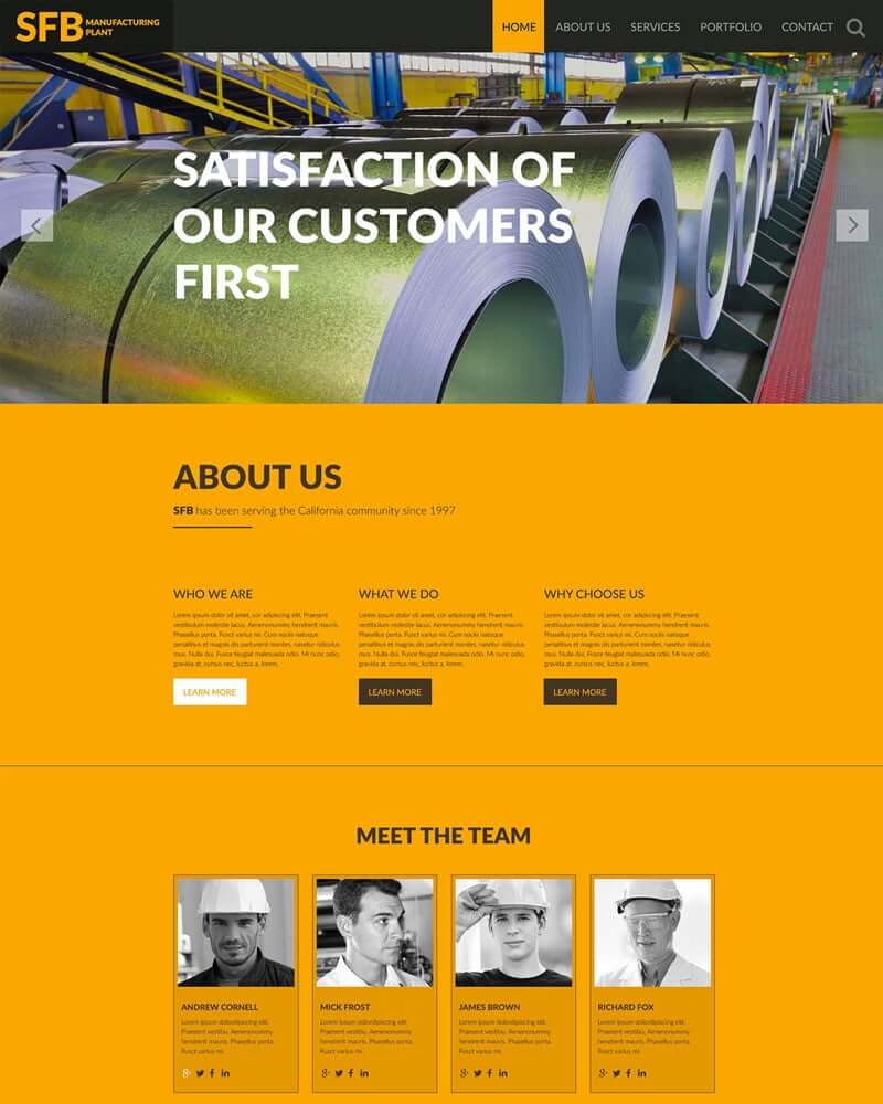
This template from templatemonster.com is designed for manufacturing plants. It looks quite nice but there is one important part missing here which is pretty crucial for all types of businesses and that is “marketing prospects”.
The very purpose of this kind of website – manufacturing plants – is to attract those customers who want something to be crafted with precision. To achieve this goal you need something more than those boring portfolios and generic list of services. These are the things that you can find almost on any website. So what is unique about this manufacturing plant other than its logo?!
It can be an introduction of the types of equipment this factory is using and how precise they are. Something like a technical specification. This requires some tabular data tables etc. which we could not find on this template. Of course there is more stuff you can think of.
People who use your templates are those who want a budget website and unlike big corporations with deep pockets they are reluctant to hire online marketing teams or content providers. Surprisingly, they are not using your templates solely because of its visual appeal but because of the contents you have predicted and prepared for that specific business. So it is your job to help them to market their services and products by creating a stunning looking website with a well planned set of contents.
Avoid Image-dependent Contents
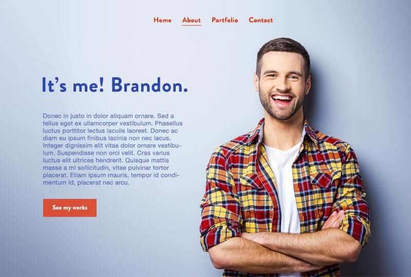
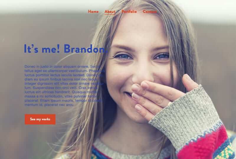
So what is an image-dependent content? Let’s take a closer look at this handsome template below. It looks perfect as long as we care about aesthetics but imagine a noob user wants to replace her own image with this professionally taken photo.
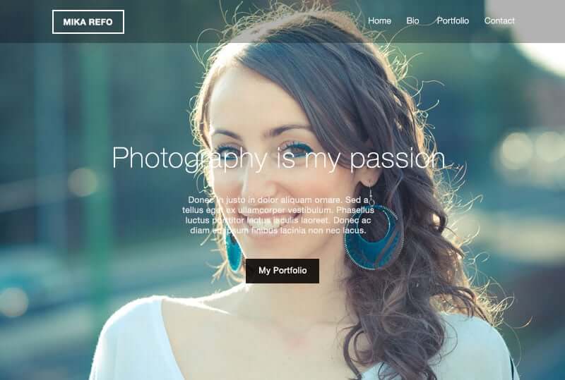
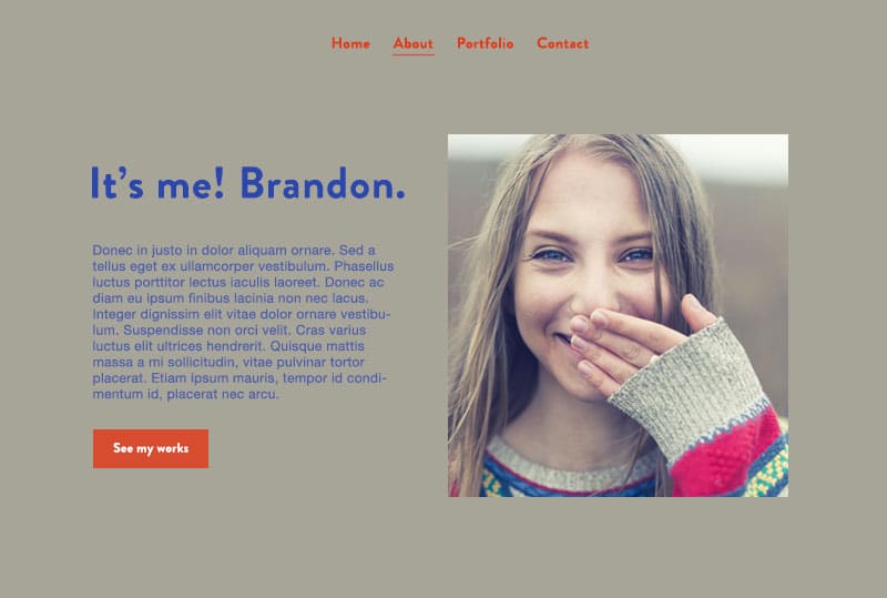
Most probably she does not even have a similar photo with such a large pale background in her personal photo collection. And she can’t use just any image here because the content is highly aligned with the image. This is what can happen if she does so:
So instead of creating layout hassles like this you can do some little tricks to prevent that. For instance you can separate the user photo from the background so she can easily set her own photo out there and maybe change the page background color to match with it.
Say No to “Static Photo Filtering or Blending Mode”
You are right. That title may look strange but it is simply the technical word for photoshopping your photos in web design. But why is it static? Well because it is not dynamic! It’s not editable by code. Your customer can’t t just re-edit her image inside the HTML file. She has to launch a photo editor software and make changes and export it again to HTML. Well if she is such a capable person why would she even need your template in the first place?!
You might know as well that CSS3 gives some of those Photoshop super powers to developers for free. It means you can blur out images, make them grayscale or blend them together right inside the HTML file and you don’t even need to make your hands dirty with a third party software. This applies to templating as well. Users can dynamically replace their own content with yours with all those effects already applied, if you just let them.
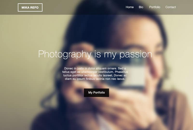
This is a simple example of a no-no template. This designer created an awesome page by blurring out the background image with some text on it.
[abb_padding_divider height=”20″]
[abb_padding_divider height=”30″]
[abb_padding_divider height=”20″]
However there is a pitfall. Not all of these awesome CSS3 functionalities are supported in every browser, Internet Explorer, for example. But you can still compensate with a bit more effort to make it fallback compatible.
Transparent Images? Save it for yourself.
Let’s say you are using a photo in which the object is extracted from the background in Photoshop, exported as a transparent PNG format. Once a basic user takes the wheel to customise the template, no offence but your awesome transparent photo will be among the first items to be replaced! And the user’s photo is probably a non-transparent one with a plain background which clearly does not align with your design.
[abb_padding_divider height=”20″]
The user has no idea how the heck we have removed that ugly background from our photos. And if this image is an integral part of the template which can’t be ignored or removed he has to either live with that or choose a different template. Both can be deadly to your business. So try to use transparent images with some alternate versions or at least use them on neutral background colors.
Think Global
One of the beauties of writing with CSS is the fact that you can write it globally and apply it globally as well. This is uniquely useful when you are designing a HTML template. Just like HTML templates, in WordPress templates we (template designers) are committed to give the same joy to our users. WordPress themes usually have two types of options for customizing. One is through “theme option” or “global settings” and the other can be found in “page options” or “local settings”.
For example many WordPress themes have global options for changing header styles. It means whatever changes you make will apply to all pages, no matter what. But some more advanced WordPress themes have something called “local header styles”. In Jupiter WordPress Theme, you can change the style of header which resides in a specific page. This will allow users to have multiple headers throughout the website if it is needed.
With Jupiter you can create multiple headers with multiple styles. This can be a great option when you are creating a website for you or your client.
But be careful. It is a double edged sword. It can be a dangerous option if you are dealing with templates. The majority of users prefer to have websites with a unified header style. So there is a chance that they might want to override that specific header of yours and make it similar to the rest of the site. This process can be easy for some users but for some it is annoyingly complex. So think again if you are to make a local change to a “used-to-be-global” item.
Develop Your Own Commandments
We are forgetful creatures and yet there are so many parameters and obligations we should keep in mind while designing a template. From standard Image formats to proper usage of shortcodes. There is a long list of rules to remember. At Artbees, we realised we needed a kind of to-do-list to remind us what steps should be taken before releasing a template. We created a document called “Artbees Template Design Guideline”. It is available for all designers in and out of office, representing a list of items with an empty check box beside each one to be marked once it is done. It starts with some important steps which should be taken even before starting a template such as proper naming conventions and templating structure. There are more useful guides to proper usage of specific shortcodes or standard image formats and compressions or parenting the pages or a bunch of other best practices to follow.
We are obligated to check all of these items before deploying our new templates into the collection. We are even updating this guideline once in awhile to address any new issues we encounter. This small but incredibly useful document guarantees our templates to be more effective, safer and of course easier to use.
Here is our checklist . It might be a bit chunky or too much for a simple project but it will inspire you to create your own. (Thanks to Freida for suggestion)



6 Comments
Great write up. This post has given me a lot of insight.
Thanks! Glad that it helps
So, I don’t suppose this “Artbees Template Design Guideline” is available for download? It would be AWESOME to have a checklist of this type! Great article by the way 🙂 ?
Here you go Freida. No secrets 🙂 Thanks for suggesting btw.
Hi Rooz, thank you for the great guide! Believe it or not, this will help many to become more organized and better designers :-)? Tried and true works for me!
You can view the shared document at the end of article