A website header contains various elements like your company logo, images relating to your business, tagline or sales pitch, and navigation buttons that lead to other webpages. Here I’ve put together a guide that will be helpful to website designers or business owners trying to decide on the header type that’s perfect for your specific niche, industry, or brand. Here are some options:
-
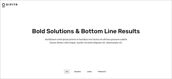
No-Menu Header
With a simple no-menu header design, there can be a greater emphasis on the content. It merely provides the company logo on a transparent header. It is accompanied with text that briefly describes what the business is about. No visual fluff. Just business.
-
Logo Header with Tiny Menu
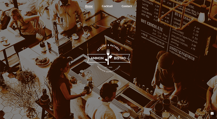
Logo headers are the most commonly used. Usually, website designers just place the logo at the very top of the header with the navigation bar directly beside or below it. A new trend in web design is that logos are placed at the very center of a washed-out image of the establishment to highlight the brand. The navigation bar is also transparent to maintain focus on your brand’s identity as well as a few important pages.
This header type can be used, for example, for restaurants that are eager to be recognized as a brand. No accompanying text is needed. The logo and image will speak for itself.
-
Classic Header Block
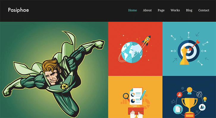
People read from left to right. Because our eyes are trained this way, it’s very common to design a header with the logo on the left side and the menu items on the right. To supplement the design of the classic block header, illustrations or images in grid form may be placed on the banner directly below it.
The classic block header is widely used. This can work great for any business or entity in any industry. It’s simple but customizable to whatever website look and feel you want.
-
Vertical Header
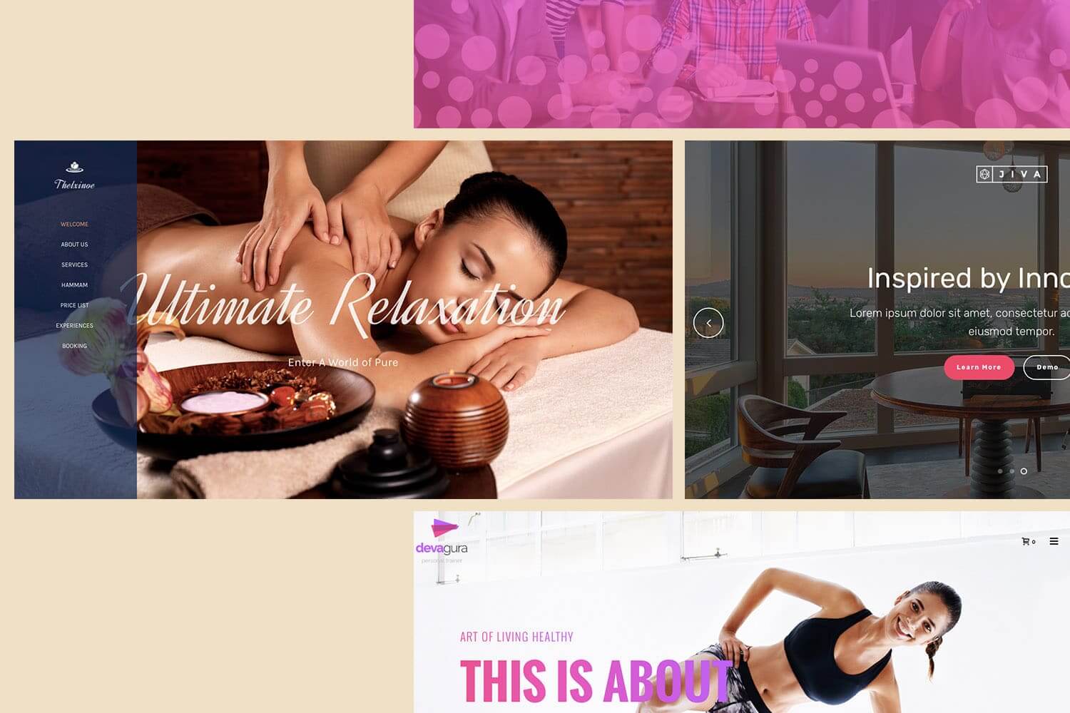
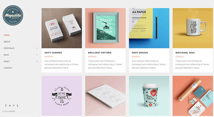
Like in the sample homepage below, vertical headers with a navigation column on the left is great for lifestyle and entertainment websites. The vertical header container is translucent and can be further customized to be fully opaque. This allows for a single image to be the focus of the homepage.
The vertical header can also be optimized for e-Commerce stores. Place the vertical header on the left, so that visitors can see the company logo and menu first, and immediately view your featured products to the right. This is a great way to showcase your items, and provide users an overall idea of what your store offers.
-
Vertical Header Aligned Right
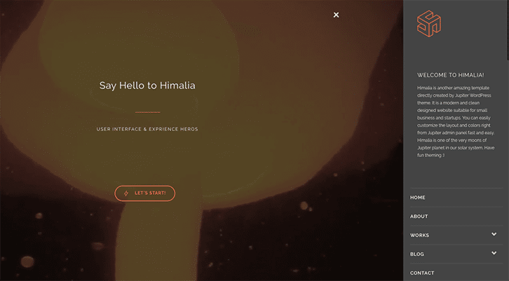
Turn it the other way around by aligning the vertical header on the right. Let the user’s eyes focus on your brand before the menu header. This header type is suitable for small businesses and startup companies whose primary goal is to entice users to know more about their brand.
-
Classic Transparent Block with Call-to-Action Banner
This is similar to the classic header block, but the header container is transparent. This type of header is great to use with the sticky header feature activated so a more compressed version of the logo accompanies the user while scrolling down — perfect for brand recall.
Classic transparent blocks are great to use with a huge banner that can serve as a landing page. It features a highly emphasized call-to-action button that can immediately draw the attention of your visitors. This provides a perfect opportunity for online entrepreneurs and agencies to use their homepage as a landing page.
-
Dropdown Menu Header
Another excellent way to focus your user’s attention on your offer is to create a dropdown header on a transparent block. This way, your user’s eyes immediately focus on what you have to offer. Highlight your flash sale, a limited time discount, or an offer they can’t resist, then your user will either scroll down to find something else to click, or avert their eyes to the dropdown button where they can view other webpages where they can make the purchase. The tiny shopping cart button beside the dropdown indicates that you’re an e-Commerce site. It’s shopping time for your customers!
No matter which header you end up choosing…
For any header type you choose, one thing needs to be certain – responsiveness. Website headers need to be mobile optimized or fully responsive to display all the elements you choose to include.
From the website header alone, users can get a clear picture of what kind of business you do. If your header does not display properly on mobile devices, then that does not bode well for you. Whether you’re a designer or a website owner, choosing the right header design is vital to your website’s success.
At Artbees Themes, we recognize the importance of headers that are unique to every business. Websites vary in terms of design, purpose, and nature of business. With Jupiter, you can fully customize headers to match your brand.





No comment yet, add your voice below!