Sure, great public speaking skills and a mastery of PowerPoint may suffice for a product pitch, but if you want to present your creative project or case study, you’re going to need more than just charisma and a big screen! In order to showcase your work effectively you should have a bit of creative understanding and familiarity on how different visual elements can be employed to transfer the value of the creative work flawlessly and without waste. Here, I’ll cover some key principles that when applied to your presentation, can increase that lasting impact you’ll have on your audience. Let’s get started!
Present the Evolution of Your Project.
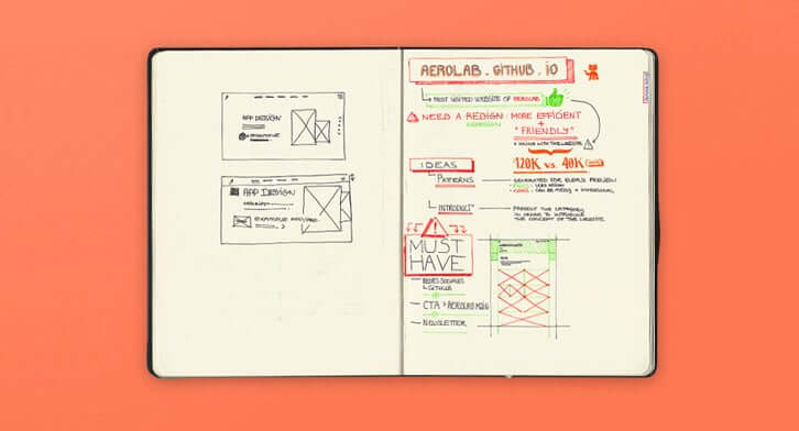
A creative portfolio project (if it really even belongs to that category!) has most probably had its ups and downs with fluctuations, challenges, triumphs and disappointments. Yet eventually, it morphs into the great piece of work you are proud of and that your client is happy with. All of this is worth mentioning. Don’t hesitate to show the different steps that were taken up until the final product evolution. Flaunt those early sketches, the wireframes in your design software and, ultimately, the final product. By showing the thought, time and approach you took in achieving the final product, the audience will have a deeper appreciation for your product and personally connect with its development.
Use page sections.
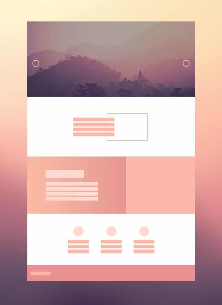
I know you’re tired of page-section-based web design, but using them is still the best way to showcase a project. Page sections act as a visual narrator that describes the story of your project. Here’s a common but quick method to present different parts of your project:
Hero Section + White Section + Colored Section + White Section + Colored Section + … + Footer
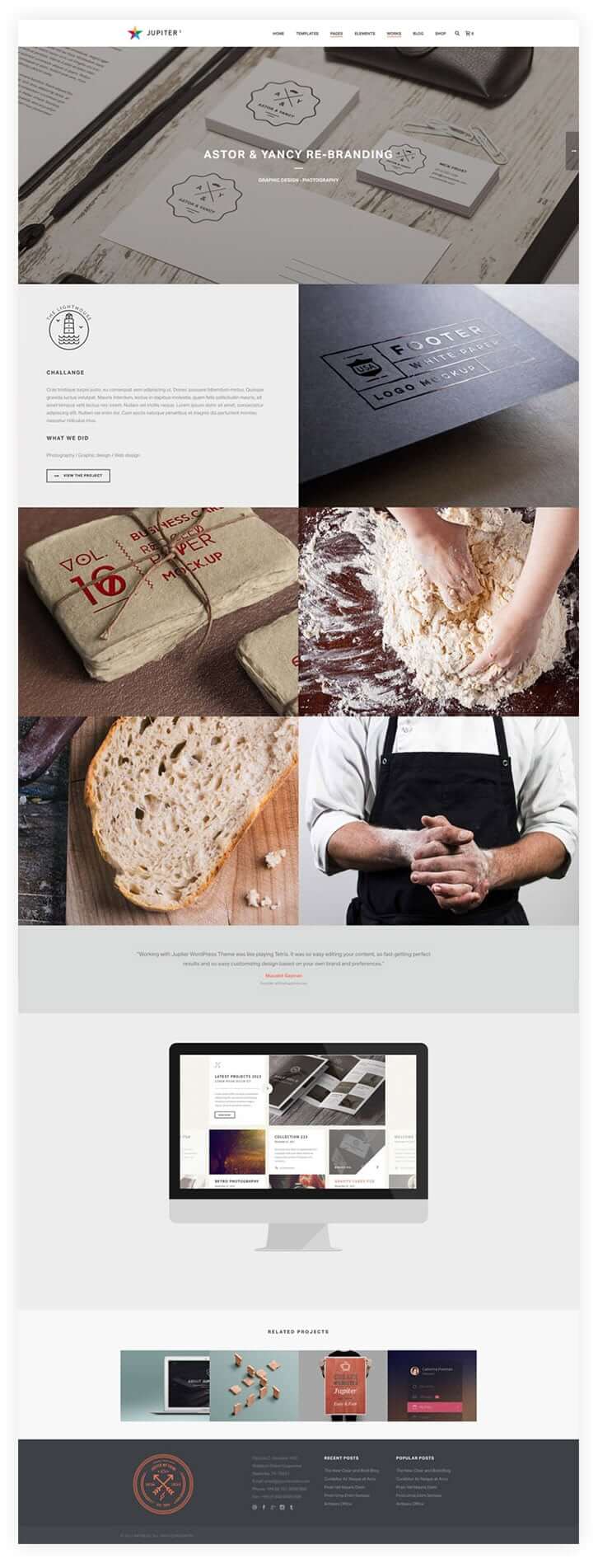
Some of the colored sections in this formula can be replaced with sections that have image backgrounds. Make sure to distribute the content based on the importance and priority in sections. Here you’ll see the order an average creative work presentation can have:
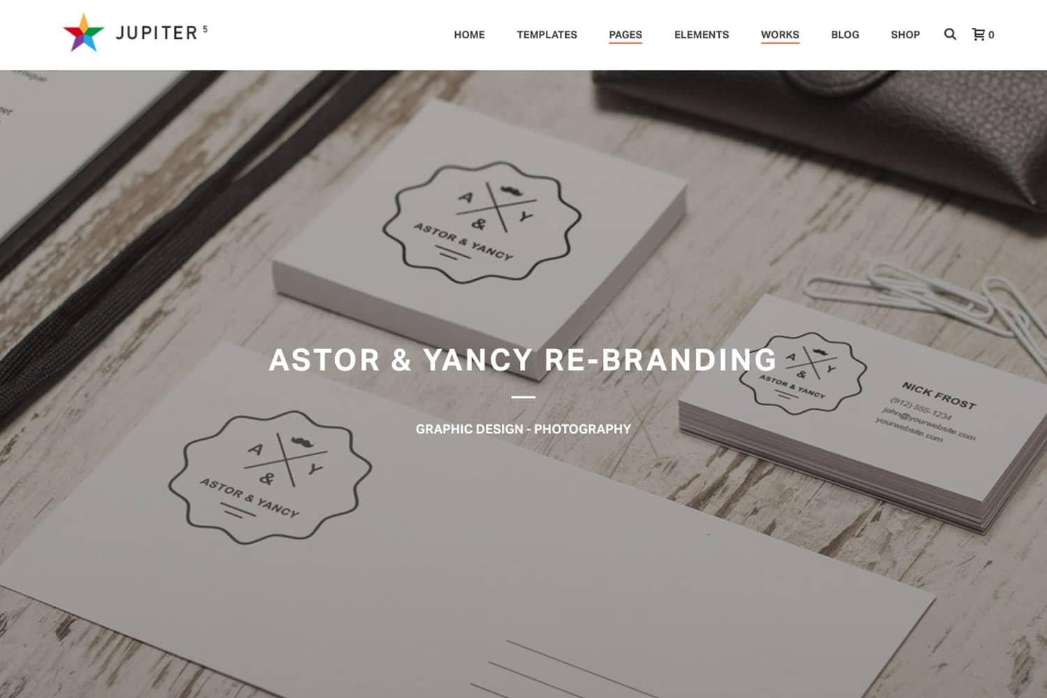
– Hero: A large image or a full-width slider including shots from the final product, project title and maybe a small excerpt about it.
– Intro: A general synopsis of the project (use of data containers, icon boxes)
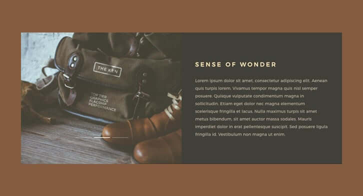
– Showcase: This can be a series of sections including more shots from your project from the beginning to the final stage. You can present your images with different content types such as large images, sliders, carousels, etc.
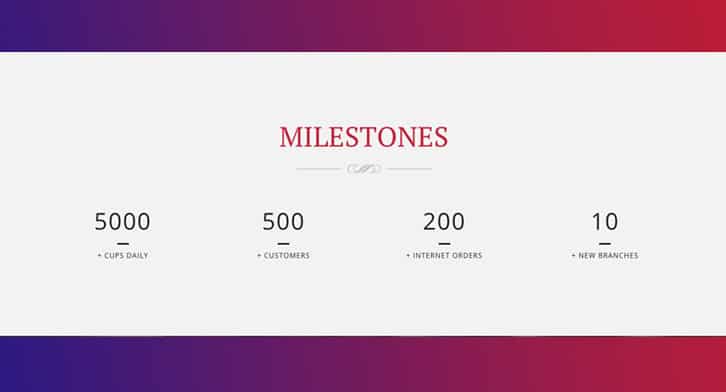
– Complementary Points: Include what is indirectly related to this project like your client testimonials, statistics and other data that relates to the progress of your project.
Large Imagery.
You’ve already heard many times that the power of a single image can convey a thousands words. If you’re a designer, illustrator or photographer you will need large blocks of imagery in your case study. Try to minimize the use of text blocks as much as you can. When accompanied with small chunks of texts (mostly titles or small sentences) large images can facilitate a smooth and impressive overview of your project for your audience.
Data Containers.
Case studies often have a lot of information included which is why you should be a bit cautious when building a case study for a creative project. When determining the use of your ‘real estate’ in a creative presentation, give priority to the creative work itself. Because people usually scroll and scan the content of a case study, the first priority can be showcasing the images of your project. Use of data containers also helps the economic usage of the space. Try out the tab slider, flip box, content box and animated sliders; these are all great examples to present your work.
Numbers and figures add authenticity.
Bring some factual numbers to the table that demonstrate to your audience the sponsors, customers and momentum you already have following your work. Some facts that may be of interest to your audience are: how long your project took to complete, how many sketches were made before you reached the final concept or how many Photoshop layers it’s comprised of. Providing numbers using a large font can also aesthetically balance your layout and add a bit of typographic taste, while preventing your page from looking like a photo book. If you want more dynamism in your page you can also add viewport or milestone animations to the numbers.
Testimonials.
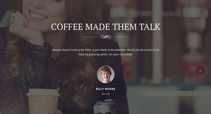
The best way to finish your story is to show the reactions and feedback of your clients upon receiving the final product! Do your best to make it real and authentic, maybe linked to your client’s website or personal page if permitted. DO NOT bring testimonials in full text without a correlating portrait. It’s useless! The more face time you can get from your clients, the better! Consider recording a brief interview with them or asking for a quick video testimonial; this can be much more engaging and effective for your audience!
Mockups.
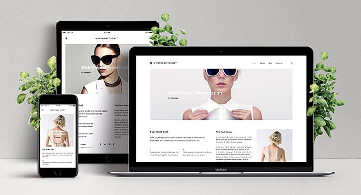
If you’re showcasing a UI or website design project, provide different kinds of imagery that portray them. From the actual page and template designs to their mockup on browsers, different screens and handhelds, show your audience the full idea of your work. There are plenty of high quality mock ups out there both free and premium.
Image Grids and Containers.
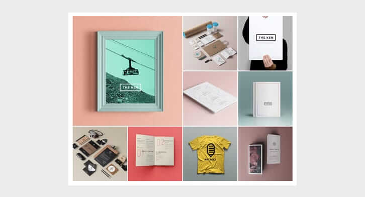
Use different creative image modules in your page to showcase your work. Your design may include one image grid at some point.
You can also use image grids with different structures and ratios.
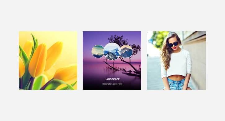
There are other image containers that might come in handy as well including this photo album:
Using an image container like any of these shown above, will save you both space and encourage the audience to interact more with your page and see more of your project.
We’re here to make this easier.
When choosing a website builder or WordPress theme for your portfolio presentation project, the ideal scenario is to have a theme that will back you up with at least most of the elements and features mentioned in this article. That being said, not all of these features are available in our Jupiter and The Ken WordPress themes, and we’re working to change that. In the meantime, though, we’ve made sure to offer many ready-made case study templates you can start your work with: Freeart App Design, Brilliant Stationary Design, Olivera Note, Case Study 1, Case Study 2, Case Study 3, Case Study 4.



No comment yet, add your voice below!