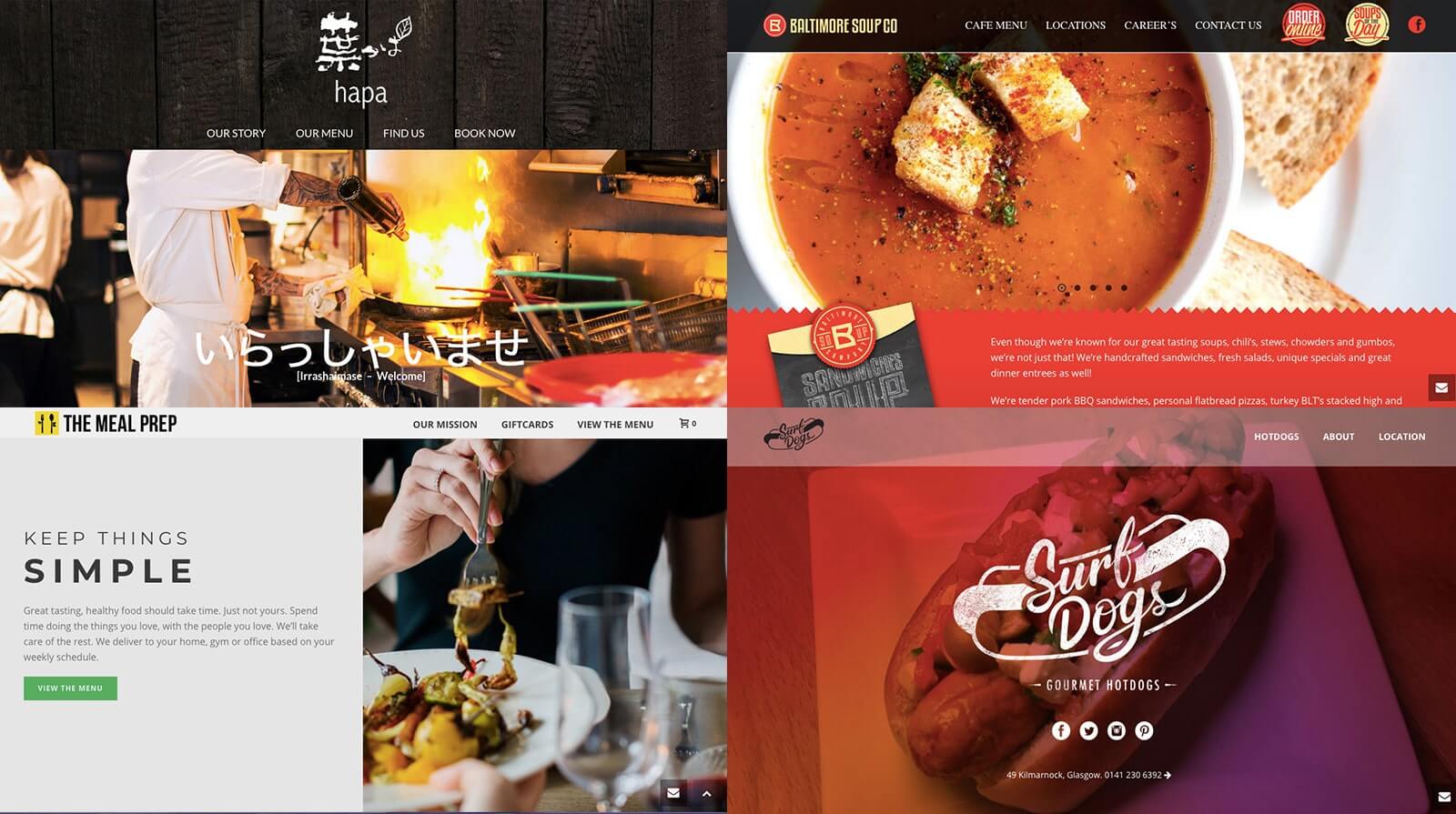
That’s why it’s crucial for restaurant owners that the website has all the essential elements, like an enticing food gallery, menu, map and thematic background photos – to attract prospects and raise the overall profile of the business. You may get inspiration from these six restaurant websites built by Jupiter.
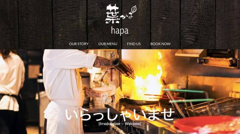
Located in Toronto, Canada, this restaurant provides a taste of Tokyo through an enticing array of mixed Japanese cuisine and modern flavors. Its page is one of the many restaurant websites build by Jupiter that has a rich combination of backgrounds and colors, which depicts a perfect blend of traditionalism and elegance. The parallax scrolling effect, wherein the background templates move at different speeds, also provides an exciting browsing experience. It almost feels like you’re in the
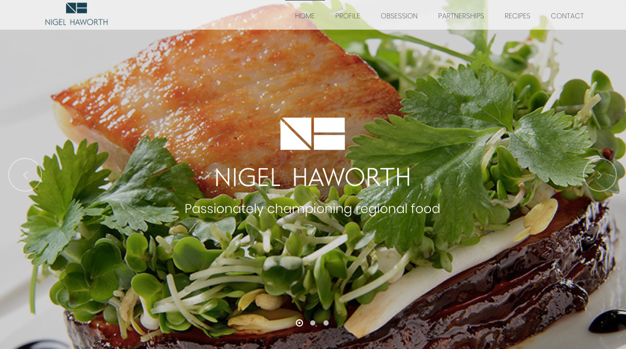
This site represents an all-in-one profile of Michelin-star chef Nigel Haworth, and celebrates his world-renowned recipes, achievements and culinary events in the UK. It has a series of tabs that run you through tidbits of information you may want to learn about the chef and his culinary creations, with a countdown feature that keeps you on track of upcoming events.
Meanwhile, the image boxes make emphasis on his tempting recipes. Plus, the parallax effect of the edge slider and page sections create a smooth, easy-to-navigate website experience that makes this one stand out among restaurant websites built by Jupiter.
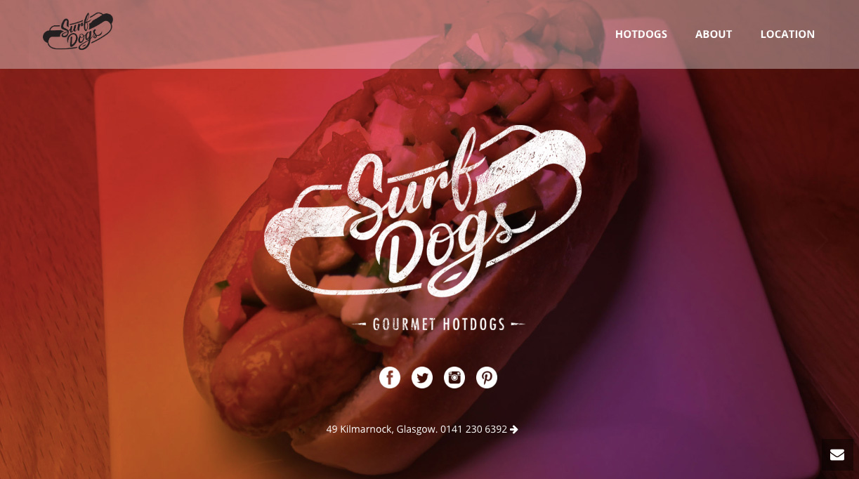
Surf Dogs, owned by a former highly-travelled sound engineer, features quality and exciting hotdogs in all its glory. The promise of providing such enjoyment is effectively emphasized in its website with portfolio samples of their products inspired by various hotdogs from east to west. The overall site is easy to navigate with its nice single page crafted by Layer Slider wherein only the background changes, but highlights a variety of simple icons and an advanced Google map.
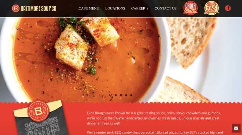
Known for their collection of soups, this restaurant also offers a wide array of handcrafted sandwiches, salads and more. Just within the site’s modified header, you get a glimpse of their crafted-to-perfection dishes that allure you with its striking Kenburned effect (gradual zoom) on the edge slider.
The overall restaurant website also bags a nice combination of shape divider, ornamental title and icon box that provides an urban atmosphere. You don’t have to look at other sites for more information as they have already attached a contact form for your convenience.
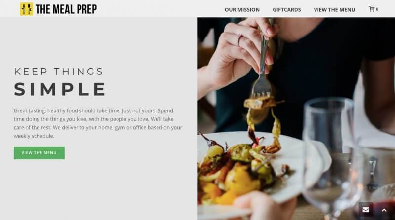
Its concept of delivering fully-prepared healthy meals by top chefs right at your doorsteps makes The Meal Prep a convenient option for customers. Like the business itself, the website is also a beautiful piece of work.
It starts with an edge slider with parallax effect and “Scroll to Bottom Arrow” feature. As you go through, you’ll be amazed by the section layout feature (one-half lay-out) of the page section which boasts a clever use of navigation.
High-definition clip-arts have been used across different sections, along with color combinations such as yellow dividers, yellow logo, yellow pre-loader, gray backgrounds and green buttons that highlight important texts on the website and draw everything together pleasantly. It also makes use of the WooCommerce plugin. Testimonials are attached, too, to effectively garner the attention and trust of customers.
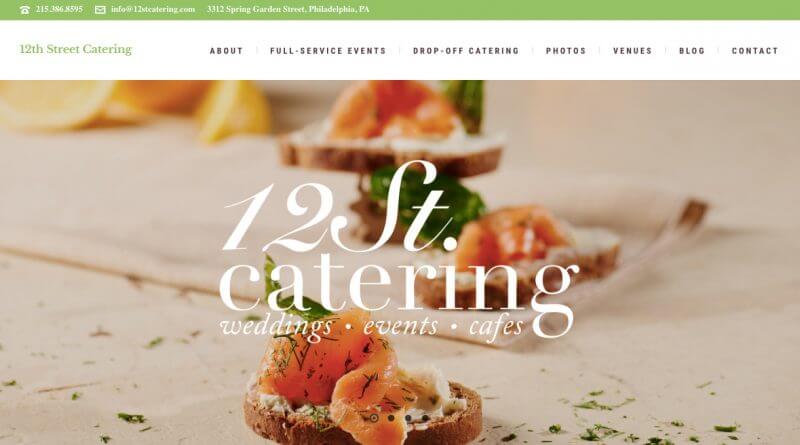
A full-service catering business in Philadelphia, 12th Street Catering is dedicated to providing outstanding food with beautiful décor for all occasions. They believe that you eat first with your eyes, then with your mouth, that’s why their professional food photography on their website is so striking. Indeed, adds sense of elegance and sophistication, especially on the edge slider.
The designers of this restaurant website built by Jupiter made a perfect decision to use Section Layout feature (one-half layout) on the page section to make space for engaging copy, alongside a tempting photograph of their food. The subpages are mostly built by tabs and image galleries, portfolio, blog and contact form, all set to complete the customer’s excellent website experience.
Conclusion
These restaurant websites built by Jupiter prove that your digital site is where the experience begins. Don’t wait for customers to walk inside your restaurant before you start enticing them with your delicious food. Critical to its success is how you integrate various vital elements mentioned above to create a mouth-watering recipe of your own unique site.


No comment yet, add your voice below!