Let’s start with a simple clue that sums up this and all other similar topics: the best website design is one that allows the audience to predict what the site is about without seeing the textual content. Imagine entering a law firm website – you’ll immediately be able to guess it has something to do with the law. Or you land on a traveling agency website, and you can automatically tell it’s about traveling and tourism.
All comprising elements of a website – and not just its imagery – play a role in carrying on this mission. The main layout, composition, colors, typography and the elements are a part of it. The very same thing is true about a sports website. In this post, we’ll provide some valuable tips for your sports website you can easily use to build something that speaks for itself – without relying too much on its textual content. We’ll use vast a range of Jupiter X templates as examples for gym, powerlifting, yoga, meditation, pilates, and sports event websites.
Layout and composition is a cornerstone
First things first! The layout and composition are the primary factors in the design and the foundation for everything built upon it. Without a solid and clearly thought-out layout and composition, your content will always seem like it lacks something.
Vast sections with bold imagery
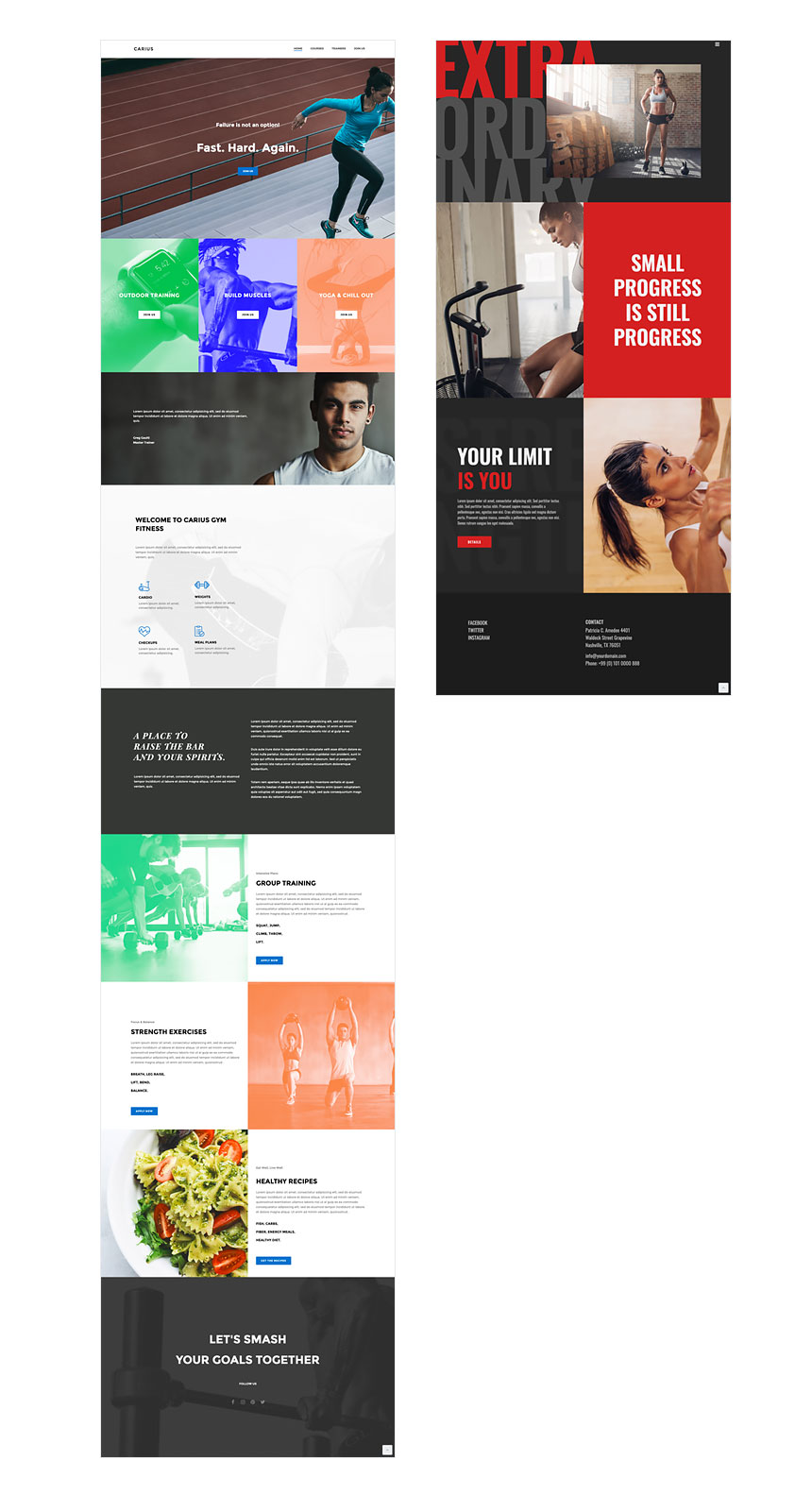
A powerlifting center, a gym or an off-road club can enjoy a layout built by vast sections with bold typography and large imagery. If you or your client can afford professional photography from the venue (or at least a Shutterstock subscription!), this layout will help your website shape an image of power and athleticism without much textual content. Jupiter X Caelus and Carius are good examples of sports website templates built in this way.
Diagonal sections
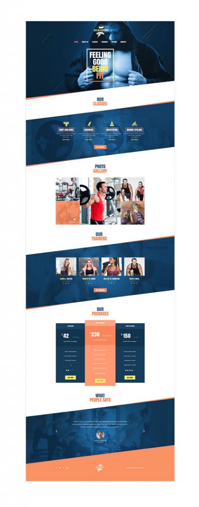
In graphic design theory, ordinal lines imply movement, dynamism, and livelihood. Using this feature in a website layout will add a level of visual dynamism and excitement for your audience as they scroll and explore your page. It’ll drive them efficiently towards engaging with your call to action. The Jupiter X Hercle template, which is specially designed for off-road clubs and professionals, has expertly used this technique in its layout.

And the Hermippe template is an excellent example of utilizing this technique for a gym website.
Colors are energizers!
Color is like the air your page requires to breathe. One excellent tip for your sports website: a color-aware design will appeal to your visitors and make professionals such as designers say “wow, this company hired the right designer for their agency.” Think of what design will signify your or your client’s brand values. If it’s a gym or dojo, your brand will definitely need sharp and preferably warm colors to carry its meaning.
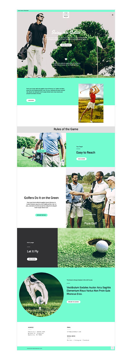
The Jupiter X Hebe template uses a mixed approach for its accent color. It uses an accent color that is somewhere between green and blue. Green signifies nature, calmness and a golf course, and blue signifies stability, depth and horizon. That’s about all the meaning a golf club needs to convey.
If your brand wants to promote peace, composure and balance like a meditation or yoga house needs, use calming colors such as green with friendly tones and lower saturation. Have a look at the Feretrius template to see a live example of calming colors in action, which illustrates to the audience a glimpse of peace and calm they can achieve doing yoga or meditation.

Show visitors their future selves in the photos
Imagine you’re looking for the nearest gym with the facilities and conditions you want. You’ll find some viable places through using Google, Foursquare or Yelp, but you’ll definitely want to check their website before calling and booking an appointment to visit and possibly subscribe. And hey, while you’re at it, you definitely don’t want to read blog posts or even a couple of paragraphs about the history, philosophy and achievements of the club you are considering. What you will do is just skim the homepage or landing page.
This is typically the audience for a sports club website; they mostly are in a rush and don’t have much time to spend on a landing page. So you won’t have much time to appeal to and persuade this type of visitor. This means you should use your page assets accordingly and efficiently.
The first thing to consider is imagery. Your visitors will rely a lot on what they can get through quickly scanning your page, and images are definitely a good way to capture those scanning eyes. Good imagery for a sports website requires professional photography or some great collection of stock photos related to your area of specialty. If you rely on stock images for your sports website do make sure they are:
- High quality: Captured by professional photographers
- Well-light: Not too bright or too dark
- Matching in color: They align well with your design color palette, especially with your accent color
Also, it would be good if you can show consistency in the stock photos you use, for example, with the same model posing in the photos. The Jupiter X Devagura template uses stock photos in the template, but they are used seamlessly in the hero section of all pages in accordance with the page content and design characteristics.
Write to motivate – not communicate
Following the same mindset we discussed in the last section about the visitor’s short attention span and importance of the right imagery, I want to emphasize the same thing about the role of writing in your sports website. Another tip for your sports website is that writing is more of a marketing tool than a means of communication. The copy for your sports website should work hand-in-hand with all other elements discussed in this post to drive the audience forward, motivate them to hit the gym and to work those muscles. So imagine the type of writing we need here:
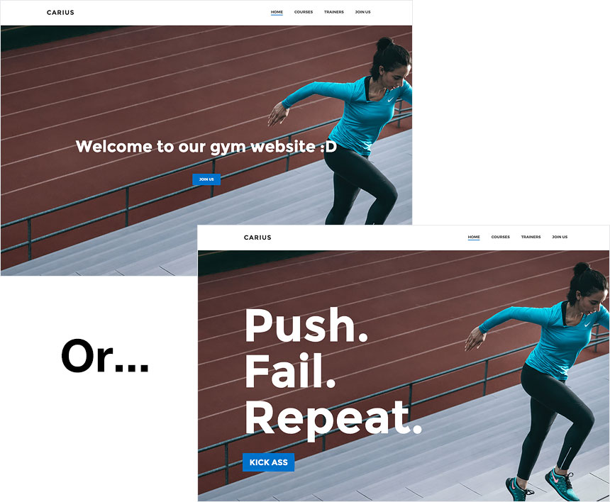
If you can easily understand that you should not begin your website with a big ‘Welcome to our official gym website’ in the hero section, then you can say you’re qualified to write your website copy yourself – and you’re good to go! But if not, you really need to consider hiring a copywriter to write your website copy that aligns with your and your brand’s specific values.
Use an athletic typography
What you say is not enough – how you say it also matters. Remember you’ll need good typography that matches the message you want it to carry. Consider Oswald, Anton and Source Sans Pro as great sports fonts that can be used in a gym or powerlifting club website. They are also standard Google Fonts that are available to use for free.
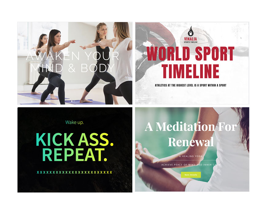
If it’s for a meditation, pilates or yoga website, then you might want to think of a more sleek font with less emphasis on power, movement and challenge and more on calmness, elegance, and peace.
Showcase – don’t just tell – your athletic story
Any business or personal brand has a history. But a sports brand also has a story. You came a long way striving, struggling and failing before you achieved where you currently are. If you think it can inspire your website visitors and motivate them to start working out under your guidance and expertise, you’ll need to showcase your story and achievements like an athlete, not like a resume.
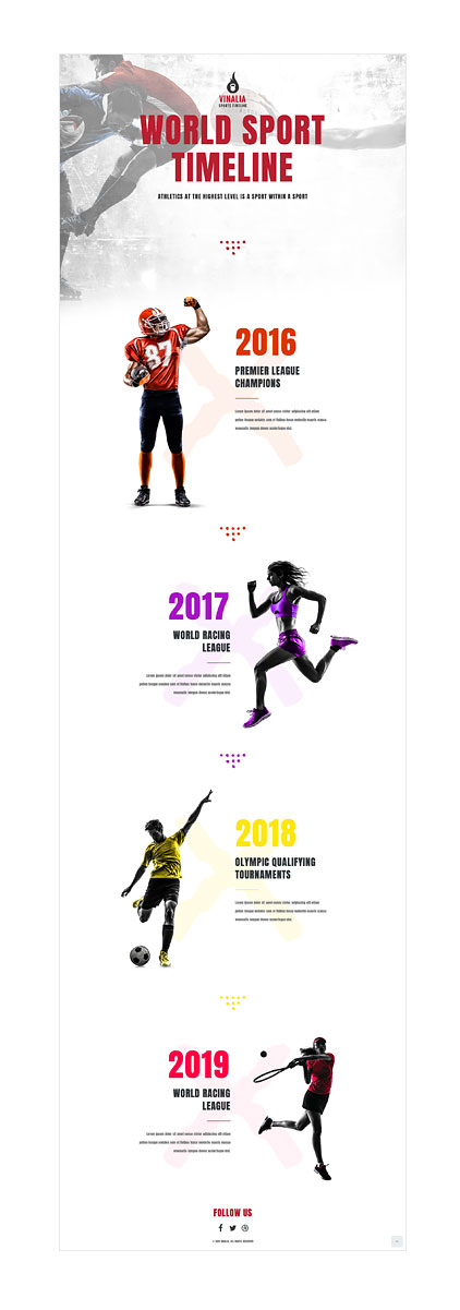
The Jupiter X Vinalia template beautifully showcases a challenging athletic history with a timeline. Each year gets a title, image, and description with a color identity. Once you start tripping down memory lane, you can’t help but scroll. You can expect your visitors are twice as more confident in taking their first course with you after scrolling through this page.
Tell visitors why you are the best to train them
Without too much marketing pressure, you should convey to your visitors who you are. You don’t have to do this the second they arrive on your website, but it should be somewhere on the first page of your website. Employ honest but confident language and explain your skills, exclusive points and why you think you are the best person to train your website visitor.
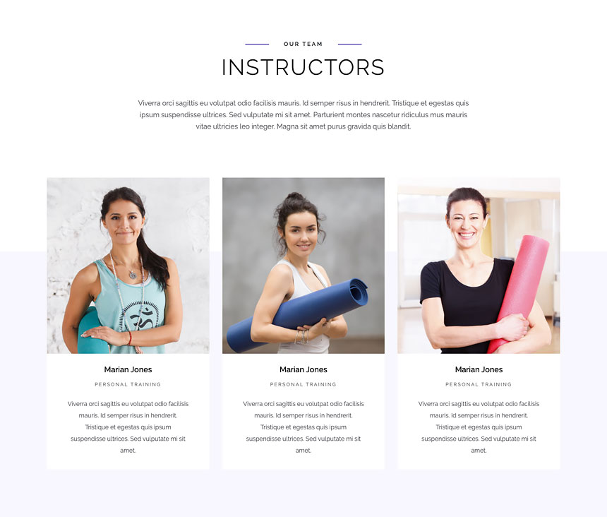
The Jupiter X Pilates Studio template is a nice and informative pilates studio website template that uses trainers’ profiles with the Jupiter X Team Members element.
Make it personal and share your clients’ feedback
People will trust your sales pitch a lot more if you can manage to show that your clients are happy with your product or service, which is another great tip for your sports website. If you have satisfied clients, reach out to them and ask them to provide a testimonial about you and your service. If they hesitate, reward them with a free session in return. It’s definitely worth it!
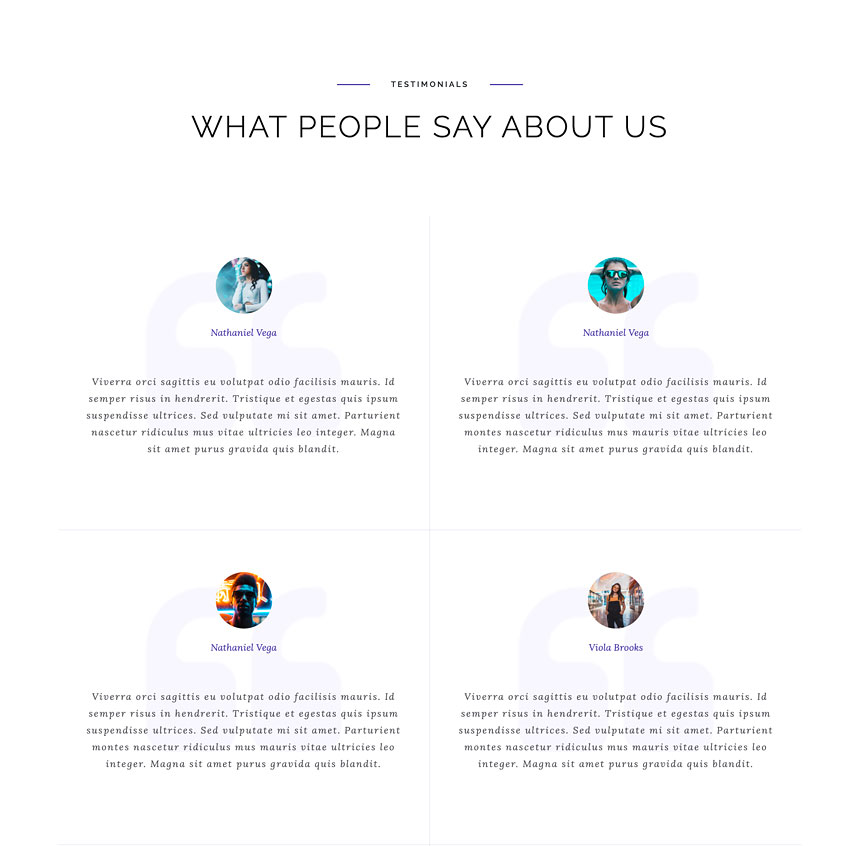
If you want to design a website for a gym or studio, then make your website content as ‘humane’ as possible by including info about your instructors, quotes from them as well as testimonials from your customers. See how Pilates Studio uses the Jupiter X Testimonial element to beautifully organize customer reviews and feedback.
Animate it, make it fun
Movement is one ruling factor that all kinds of sports have in common (well, chess is an exception, I guess!). So how can we design anything related to sports that are not promoting or signifying movement? You can animate some parts of your sports website to add a sense of movement to it. Some elements such as sliders are naturally moving elements, but you can also manually move some elements such as sports figures and models.
The Feretrius and Vinalia templates from Jupiter X WP have used this idea to add a sleek sense of dynamism to their design. The parallax effect is another technique that spices up your layout by adding depth and movement. Using the parallax effect together with the manual viewport animation of elements is commonly used in tons of websites these days.
Add some hype to your sports event with a countdown
It’s a good idea to use landing pages instead of multi-page websites for sports events as people who come to these websites want to quickly see the essential info such as dates, conditions, and prices then sign up and leave. You can define 5 essential sections that cover all the info your participant wants to know. For example for an extreme mountain biking race, you need the following 5 sections:
1- Intro: Nice hero section
2- Countdown to your event
3- Some background info about the event and its experience
4- The roadmap
5- Outro: schedule + call to action
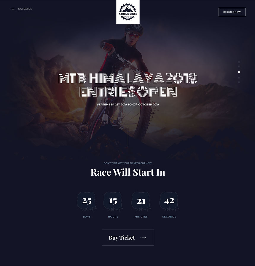
Using a countdown element in the hero section or the first parts of the landing page will add some hype to your event and encourage visitors to proceed with the rest of the page so they can sign up to participate before the time runs out. You can also show the number of remaining seats or slots to amplify the visitor’s sense of urgency. The Jupiter X Mountain Biking template is an excellent example of a website for a sporting event.
Possible call to action? Call, sign up, book, smash!
So thanks to following all the above practices and guidelines, your visitors have made it taking an action. Without a good call to action section or element, your best bet is that they’ll find your address or contact info from Google and proceed – but it’s also very likely that they’ll vanish to your competitor’s website where they can find all the info they need in one page.
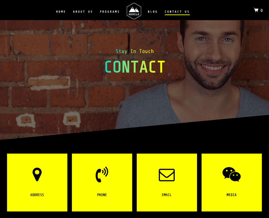
There are different kinds of calls to action you can use for a sports website such as calling or booking an appointment. Alternatively, you can put your contact info and a contact box on your landing page or contact page for any possible inquiries. This is what is beautifully done in many sports templates from Jupiter X WP, including Farreus, Feretrius, and Hermippe.
Is that all?
Definitely no! Nobody can say the above list of elements and factors makes a working sports website. There are many ifs and if-nots involved in a website’s success. But you can definitely say these tips for your next sports website will help it engage and convert visitors more efficiently.
Do not forget to check the Jupiter X WP list of sports website templates if you want to kickstart your project with some solid design foundation provided by Artbees experts. And as always said, let us know in the comments if there is a factor or element you think is missing and should be included in this list or share your experience applying these practices to a sports website for you or a client.


1 Comment
Thanks so much for the tip, that’s interesting.