
Homepages were once the most important part of a website – or even for any online presence for that matter. Looking at the rapid evolution of the web over the last decade, especially in the last few years, we see that the situation is the complete opposite. A local business’ homepage might be the least important aspect of an online presence, especially if they also have social media profiles, an Instagram page, a Yelp or Foursquare page – and of course landing pages.
Think of landing pages as a place where you actually do, grow and conduct your business whereas homepages are a mere ornamental, beautiful and purposeless representation of your company or business. A landing page is a web page that serves as the entry point for a website or a particular section of a website. Landing pages are your best (and maybe the last!) opportunity to grab a visitor’s attention and make them consider you.
A homepage is built from thin air regardless of any other factors out there. But a landing page is built as part of your global business funnel. In fact, this gives your landing page its most important and differentiating feature than any of your website’s other pages which is its purpose. That purpose is defined with regard to where your landing page stands in your business funnel. Is it the page you’re directing the traffic from your Google Ads? Is it where your social media followers will land on when visiting your website?
Today, I’ll show you how to build a modern Agency landing page with Jupiter X. The landing page I have chosen for this month’s crash course is inspired by one of the most recently released Jupiter X templates called Agency. It’s been tweaked a little to fit the purpose of this course. If you are a Jupiter X premium user, you can activate it for your website from your Jupiter X control panel.
The final Agency landing page with Jupiter X will include the following sections:
- Header
- Hero section
- Intro
- Services
- Sub services
- Customers
- Testimonials
- Blog
- Footer
This blog post will cover the general instructions on how to build these sections but for more detailed coverage of the building process, settings adjustments and final tweaks do not forget to watch the video.
Header
First thing first! What exactly do I mean by a header? The header is the topmost structure in a website that usually includes a logo and a navigation bar (unless there is side navigation). There can be search, social and cart icons depending on the website type as well. Also, some websites might need a toolbar above the main structure (e.g. e-commerce and listing websites) which is also considered to be part of the header structure.
Layout
The header structure in Jupiter X is built and managed by the Header Builder. Once you are done installing Jupiter X in the WordPress dashboard go to:
- Templates > Add new, and in the upcoming page find Template Type > Choose header as template type and give it a name.
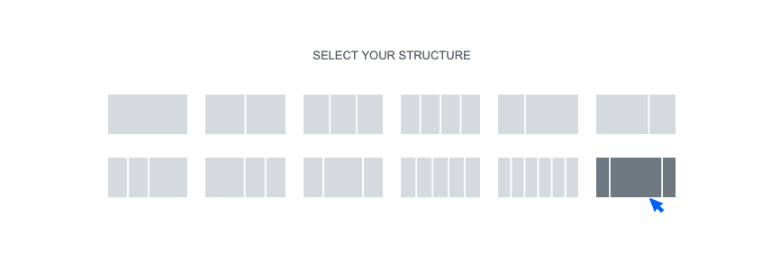
You’ll be taken to the Elementor building environment. An Elementor library will load with three tabs: Block, Pages, My Templates. This window includes readymade or saved blocks and page templates. We’re going to create our own header template so we can close this window. We are in the Elementor building space with the element library bar on the left hand and authoring space on the other side.
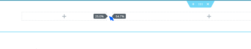
- Add New Structure (red circle with plus) > select the 16/66/16 structure
We need to tweak this column structure a little by manually resizing the columns. Click on the divider between columns until the following ratio is achieved: 25%, 55%, %20%
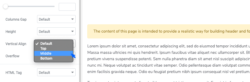
- Edit Section (on the left side) > Layout settings > set the Vertical Align as Middle.
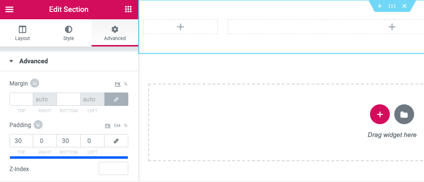
- Edit Section (on the left side) > Advanced settings > set the padding as follows:
Logo
Let’s start adding content to our page by adding a logo to our header.
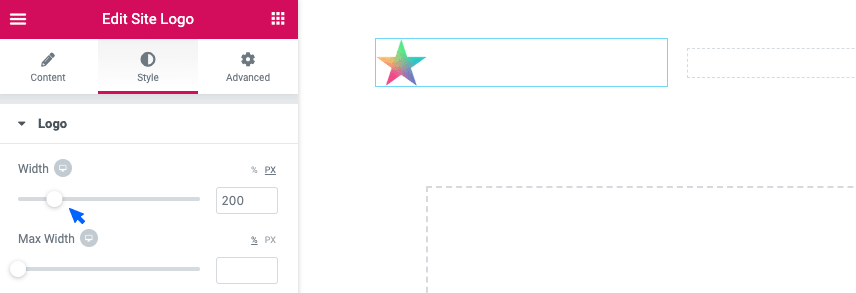
- Add the Site Logo element to the left column.
- Edit Site Logo > Choose a logo from the menu. If you haven’t uploaded your logo yet, you should click on the Customizer link below the dropdown and upload different logo versions for your website. In Jupiter X, you can define different logos for primary, secondary, sticky and mobile usages. In this tutorial, we’ll use the primary logo for the light version and secondary for the dark version.
- Once you’ve uploaded your logo, go to Edit site logo > Style > Set logo size to 200px.
Menu
The second item that goes into the header structure is the menu where we list different sections of the page for users to navigate.
- Add a Navigation Menu element into the second column
- You will need to add a menu from the drop-down menu. This will specify the menu and includes the menu items that go inside the menu. You can do this two ways:
- Appearance > Menu
- Appearance > Customize
In this tutorial, we’ll use the second method.
- Once the customizer is opened, select Menus from the left sidebar. In WordPress, menus are comprised of two concepts: The menu that includes the menu items and the Location to assign that menu to.
- Click on the Create new menu button give it a name
- Select a location for it which in this case is Primary Menu
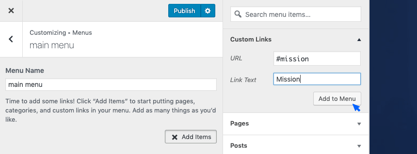
- Now click on the Add items button and in the upcoming panel, select Custom links
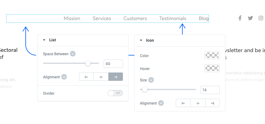
As you might have guessed, this is going to be a menu for a single landing page so we will need a one-pager menu for it. Each of our 5 menu items should be a custom link with its title in the Link Text field and the URL set as #title. For example, the menu item ‘Mission’ will have ‘Mission’ in the link text and #mission in the URL.
The process of creating the menu is not over yet and later in the tutorial, we’ll assign each menu item to its respective section on the page.
Once you’ve created your menu items, assign its location and save it and go back to your header template. Click on the menu elements and from the sidebar, select the menu that you just created.
- Edit Navigation Menu > Style > Main Menu Items > Typography > Set the font size to 16 and the weight to 400.
- Let’s make our logo items gray. In the same setting, we’ll find a 3-tabbed structure for normal, hover and active states of the items. Set the color of menu items in the normal state as #c8c9cc
- Our menu items should go white on hover. So from the same setting area we’ll set the hover color to #fff
- Let’s give our menu items some margin: Top:0, Right:7, Bottom:0, Left:7
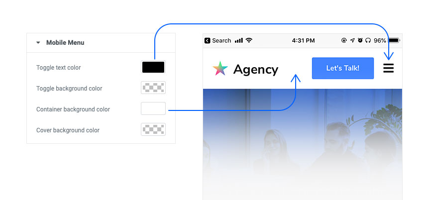
- We should also not forget to think about how our menu looks like on a mobile screen. Set the background color for the mobile menu container as well as the mobile menu toggle icon to white and black.
Call to Action
The last item to go into our header in a nice-looking CTA button.
- Drag a button element to the third column in the header structure.
- Edit Button > Content > Align the button centrally
- Edit Button > Style > Button Typography > Set the font size to 16 and the font-weight to 700
- Edit Button > Style > Normal > Set the text color as black and the background color to white
- Edit Button > Style > Hover > Set the hover text color as white and the background color to our accent color, which in this case is a lovely blue.
And finally, let’s add some radius and margin to our button to make it fit best within the header structure.
- Edit Button > Style > Border radius: 3, 3, 3, 3 px Padding: 17, 30, 17. 30 px
So this is it. We’ve just built our header structure:
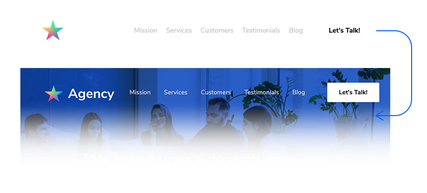
As you can see, the header structure is built in abstract and may look incomplete at first sight. But also as indicated above, it’ll look perfectly fine when it’s used along with the hero image, which we’ll create in the next step. But before that, there’s one more thing we should take care of! Our header will look as beautiful as above in the mobile version.
Jupiter X will automatically turn your menu into a burger icon, which will be left in between the logo and CTA. Mobile users are traditionally used to the burger icon in the corner of site navigations in mobile, so we better swap the placement of the menu and CTA. For that, we’ll need to add a header right below the current header with the mentioned changes applied:
Mobile Header
- Right-click on Header Structure > Duplicate
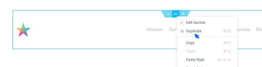
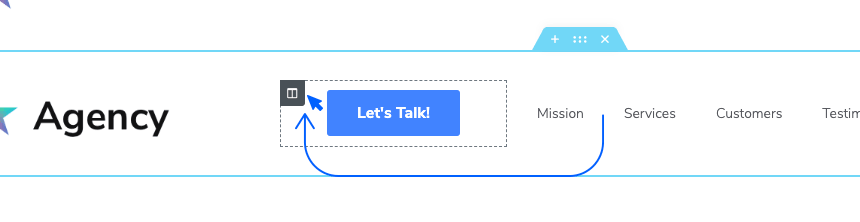
- In the second header structure, swap the menu and CTA columns. Hover over the CTA button column, click on the gray handle and drag it before the menu column. And you’re done!
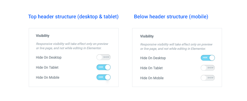
You now have a two header structure below each other. The top structure will be used for desktop and tablet users, and the one below will be for mobile users. But how do we set those conditions?
Simply right-click on the top header structure:
- Edit Section > Advanced > Responsive > Enable the ‘Hide on tablet’ and ‘Hide on Mobile’ (so it will be used only for desktop users)
- Do the same thing for the below header structure but this time enable ‘Hide on Desktop’
Sticky header
There is one more header structure we need to decide about. The sticky header is the state of the header when you scroll down the page. In sticky mode, a header usually becomes narrower and includes only the information you want the audience to see along the way down the page. In Jupiter X, the header and sticky header can have two entirely different designs, so we should create them separately.
On our landing page, our sticky header will be exactly the same as the normal header. So what we need to do is to copy the header structure from the main header template.
Create a new template for the sticky header by using the same method we used to create the header template earlier in the article and then paste what we copied into the new template.
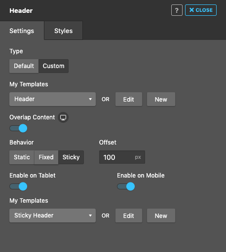
Activate your header
We have created three header structures so far: the main header, the mobile header and the sticky header. The mobile header is created right inside the same header but enabled only for mobile view, and the sticky header is created separately in another template (we don’t need to define the mobile version for the sticky header as it’s disabled on mobile by default). What’s left is to assign these templates to the right header slots in Jupiter X.
In the WordPress dashboard:
- Appearance > Customize
- Select Header from the sidebar
- In the upcoming header dialogue box, select Custom as the header type and then select the main header template you created.
- Also, choose Sticky as the behavior as the sticky template we just created from the drop down menu.
- Enable the content overlap so our header overlaps the background image in the hero section.
- And finally, make sure the Enable on Mobile is disabled as we don’t want a sticky menu in that view.
And that’s it! We’re officially done with our header structure. Now let’s move to the hero section.
Hero section
We created our header on a separate page as a template. Now we need to create an actual page that will be used as the landing page, set the template we just built as its header and then continue to build the hero section. In your WordPress dashboard, go:
- Pages > Add New
In the ‘new page’ meta option section, there are settings about different sections of the page you are going to create including the header, main, title, and footer. In the header section, find the setting for ‘Overlap Content’ and set it as ‘No’. We do this so the header that we have created won’t disturb us while creating the section for the hero by overlapping it. Once we are done building the hero section, we’ll switch this option back to ‘Global’ so the header overlaps the hero.
- In the new page authoring area, click on the Edit with the Elementor button and start creating the hero section in the Elementor environment.
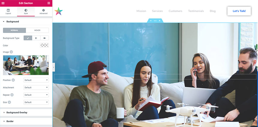
- Click on the Add new section red button and choose the single-column layout.
- Edit Section > Layout setting > Set the content width as 700px.
- Our hero section has a set height size, so we’ll set the min-height as ‘min height’ and the value to 615px.
- The content in our hero section is vertically centered.
- The hero section has a background image so here we go: Edit Section > Style setting > Set normal as background and choose the Classic style. Click on the plus button to choose an image from the library or to upload one.
So this is how our hero section looks like up to this point. As you can see, there are more details that should be added to the hero, and the header section should overlap the hero section. We’re going to apply this in the following steps:
- Edit Section > style setting > Background
- Position: Top Center so the most important part of the image will be visible most of the time.
- Repeat: No Repeat to avoid unwanted repeating of the image
- Size: Cover so the image covers the entire hero section.
- Size: Cover to have the whole section filled with the background image
- Edit Section > Style > Background Overlay:
- Color: #114cbd
- Opacity: 0.9
- Blend Mode: Multiply
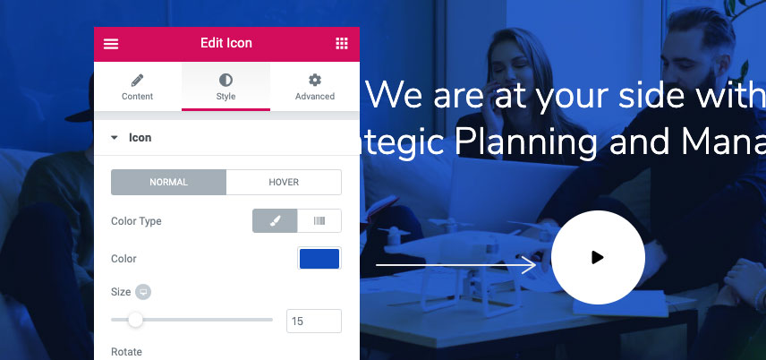
Add a heading, a spacer and an icon to the section. Edit the elements’ content according to the model and set the heading to H1. To get the playback button to look the way it is on the main landing page, don’t forget to change the size of the icon to 15px and set the correct color for it from Edit Icon > Style> Icon. Also on the same tab, add a 45px padding in all directions. From Edit Icon > Style> Icon > Container, change the container color to match the target.
Intro section
Compared to the hero, there is not much work to do in this section – paying attention to some can do the trick. Just add a two 1⁄2 1⁄2 section and from Edit Section > Advanced, add 100px of padding to the top and bottom of the section.
As for the rest of this section, just add two headings and one paragraph and a button to the left column and an image to the right column. Here are some details to get the look right:
- The first heading is H4.
- The second heading is H2.
- The button has a no-color background and an icon.
- Move the icon to after the text from Edit Button > Icon by setting it to be right-aligned.
- Set the image size to Large and also make it right-aligned.
- Add paddings from Advanced tab on each elements’ settings to give the correct spacing.
Services
There is a trick to make this section really fast: add a ⅓ ⅓ ⅓ section. Make one of the columns exactly like the model and then remove the other two and just duplicate the first column twice to get the whole section done in under 5 minutes. But you need to do it as follows:
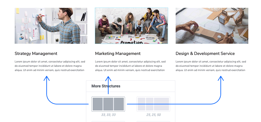
- In the Edit Section > Layout, change the column gap to none.
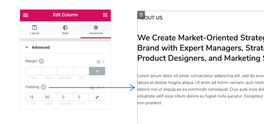
- Click to edit the first column on the left, from Edit Column > Advanced set all margins to 20 and padding to 0.
- Add an Image Layout element from Edit Image Layout > Content > Settings. Adjust the settings as follows:
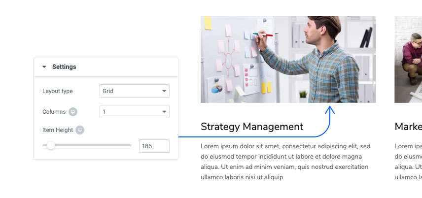
- In the Edit Image Layout > Content > Item add one item and set the image size as full. Remove icon, title, and description. Set the link type as external.
- Add a spacer, a heading, then a paragraph and edit the content, size and weight.
- To add the hover effect, go to Edit Column > Style > Border set the Border Type to Solid then set the border width to 1px for bottom and zero for others. Change the color to #f1f1f1, click on hover and change the color to #2b71f6
Now you can remove the other two columns and duplicate the one you made twice and then simply change the content.
Note – You might wonder why we had to add a ⅓ ⅓ ⅓ structure as we could have added a single column, edit it and then duplicate. The issue is, in a real project you will not have the values for image height padding, etc. and therefore you would not be able to predict how your column will look unless it was within the proportions used in the design.
Subservices
Things get a tad bit more interesting in this section as we have an object that overflows this section. But before getting to that, let’s build the other parts of the section:
- Add a 1⁄2 1⁄2 section and from Edit Section > Advanced set the top and bottom paddings to 100px.
On the left column:
- From Edit Column > Layout, change the column width to 70%.
- From Edit Column > Advanced, add a 25px padding in all directions.
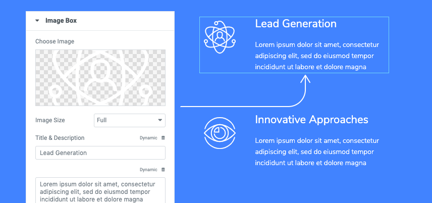
- Add a heading and an inner-section on the left column.
- On the left Inner-Section column add an Image-Box set to the image to be on the left.
- From Edit Image Box > Style > Image set the image space and width to 30.
- Again From Edit Image Box > Style > Content set the spacing to 18 and also edit the typography and color.
- Duplicate this three times and move two to the right column in the inner-section.
- On the left column of the inner-section, add 100px padding from the right
- On the right column of the inner-section, add 100px padding from the left
On the right column:
- Duplicate the Work With Us button from the Intro section and bring it to this column and change the color to white.
- Add a spacer under the button set it to 180px.
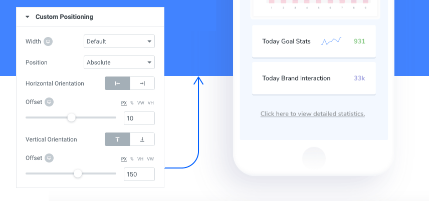
Here is the interesting bit: the smartphone mock-up screen. There are three things that we should get right here – the position, corner radius, and the box-shadow. Here it goes:
- Add an image, change the image content to the smartphone mock-up.
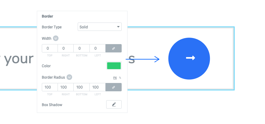
- From Edit Image > Style > Border
- Change the border radius to 45px
- Click on the box-shadow and give this value to the color rgba (71,72,133,0.16), and edit the rest of attributes as below
- In Edit Image > Advanced > Custom Positioning
- Set Position to Absolute
- Set the offset values as below
Customers
This part of the page is made up of two sections: the part with headings and text as well as the part with logos.
- For the upper half, duplicate the intro section and carry it to after Subservices. Modify the paddings to copy the look and remove the button (Work With Us). Also remove the image for the right column.
- For the lower half, add a ⅓ ⅔ section.
- On the left column from Edit Column > Advanced, add a 100px padding from the right and then do the following:
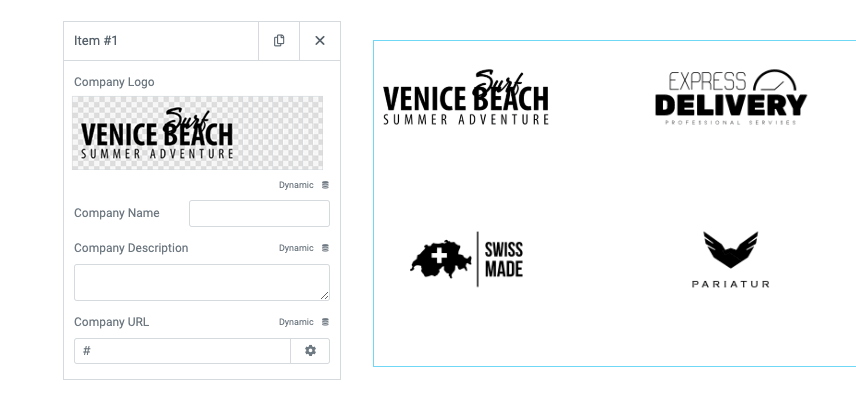
- Add a Brands element and set the columns to 3.
- Remove all the items but one, click to edit it, leave all fields empty and only choose the logo.
- Duplicate the item and change the logo with another one.
- From Edit Brands > Style > Company Logo > Logo Wrapper, add a 100px padding from the right.
- On the right column from Edit Column > Advanced, add 20px and 50px paddings to the top and left respectively, and then continue by
- Add a heading edit the content and typography
- Add a spacing of 50px
- Add the Google Ad badge
- Add a small spacer
- Add the Facebook MP Badge
Testimonials
Jupiter X has a Testimonials element, however having absolute design freedom while showing the reviews in the agency landing page with Jupiter X tabs element comes in handy. Like the one we used for the Restaurant Menu in the first crash course. These are the things we should do:
- Duplicate the upper half of the Customer and carry it to the bottom of the page and change the section background color to #f9fcff and also edit the section paddings to 80px top and bottom.
- Remove the text editor.
- Add this tabs element (There are multiple tabs elements in Jupiter X. Make sure to use the one indicated below):
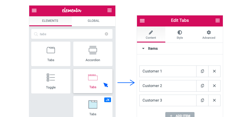
- In Edit Tabs > Content remove two items and keep only one. Change the icon to user-o (short for User Outline) and for the label type Customer 1. Leave Choose Template on Select.
- From Edit Tabs > Style change the looks of the element however you like. To remove the borders in each part, set the border type to Solid and then set the border width to 0.
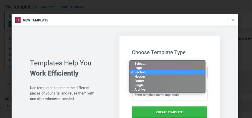
- Save your work and go to Dashboard > Templates > Saved Templates and click on Add New. In the windows that open, choose a title for the template, choose Section for template type and wait for the editor to open.
- Create a ½ ½ section, add an Image to the left and a Text Editor along with it and Icon Box to the right column.
- Adjust the paddings and spaces as you wish.
- Change the typography and color to match the design.
- In Edit Icon Box > Style > Icon, enter 0 for the Icon Size and in Edit Icon Box > Style > Content, enter 0 for the Title Spacing.
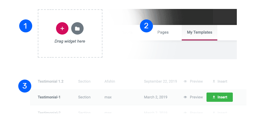
- Publish and go back to the dashboard and add another section template
- In the editor, click on the folder icon (see the pictures below), add your template and edit the content to create more testimonials in a breeze.
- Now go back to edit the page.
- In Item, choose one template, duplicate it and choose the rest of the templates for duplicated items.
Blog
For the blog section, duplicate the Testimonials section and remove the Tabs. Add a Spacer on top of the section100 px. To get the Heading in two lines, use <br> where you want the line break. Add a Post element and do the following:
- In the Edit Posts > Content > Settings make the settings as seen below:
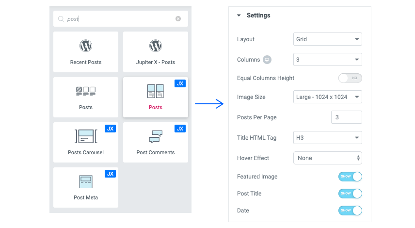
- Set the rest to inactive.
- As for the look of the section, apply these settings in Edit Posts > Style
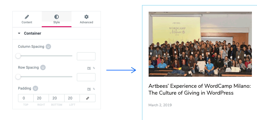
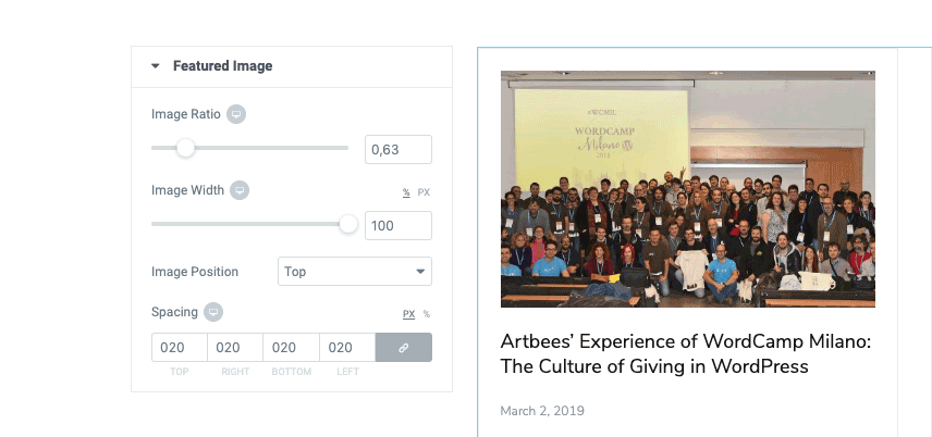
- Set the Border Color to Normal: #e6e7ec and Hover: #4183ff and Border Width to 1px. Continue to Feature Image and make the following changes:
Do not forget to edit the typography and colors of the other parts of the element.
Contact Us
To make this section, add a two-column structure. Go to Edit Section > Layout, set the minimum height to 720px and column position as Middle.
- To make the background look like the hero, apply the same settings to design. After doing this, set the left column to 35%.
- Add a Heading to the left column, and a Form to the right column.
- Apply padding from the left for the right column.
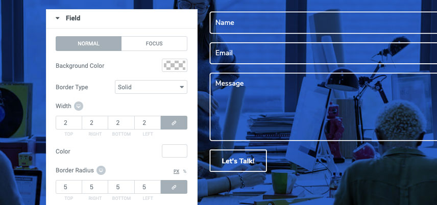
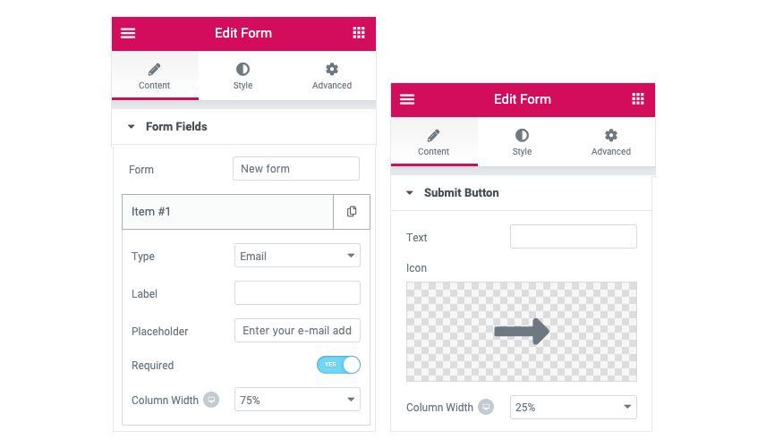
- To get the look and function of the Form, go to Edit Form > Content> Form Fields.
- Open each item and set them up according to the model.
- From Edit Form > Content> Submit Button, change the text to “Let’s Talk”.
After that, go to Edit Form > Style and apply the settings below:
- General: Column Spacing: 11 Row Spacing: 19
- Field: Apply the following!
- For field focus state, only change the Background Color to rgba (255,255,255,0.17)
- Button: Border Type Solid – Border Width 2px (in every direction)
Footer
Hang in there – we’re almost done! There’s only one thing to do and believe me, it’s very straightforward. To get it done:
- Go to Templates > Add New and choose the Section Type to Footer.
- In the editor, add a ⅙ ⅔ ⅙ section.
- Add a 100px from the top and 15px from right and left.
- Add Logo to the left column and an Icon List (Set it to horizontal) to the middle column.
- To remove the icon, set its color to Transparent.
- Add and Social Icons in the right column.
- Add a ⅓ ⅓ ⅓ section and set paddings to Top:50px, Bottom:30px and 15px from Right and Left.
- Add a Heading, a Text Editor, and a Button to the left column.
- Configure the typography, duplicate the Heading twice and drag the duplicates to the other two columns. Then edit the content.
- Duplicate the Text Editor, drag it to the right column and then edit the content.
- In the middle column, add an Icon List (Set it to Vertical), edit colors and typography and remove icons as mentioned previously.
- In the Right Column, add a Form after the text editor and remove all fields other than email. To get the look, apply the settings below:
- In Edit Form > Style > Button do the following:
- Set the Height and Width of the button to 45px
- Set the Color to Normal (#2b71f6) and Hover (#4183ff)
- For the Border do as seen below:
Now, all you need is a Divider and a Text Editor (for the copyright section) to finish the job. Add a section for each – and you’re done!
That’s a Wrap on our Agency Landing Page with Jupiter X
In our second installment of the JupiterX crash course, we made an Agency landing page with Jupiter X in less than two hours. By following these crash courses, you’ll be able to build expensive-looking webpages without breaking the bank.
Jupiter X is there to empower people who want to imagine and create, be it for a business or some good looking digital content. Do watch the video that comes with the post so you don’t miss any steps in making an Agency landing page with Jupiter X. Stay tuned for our next crash course!

No comment yet, add your voice below!