So, how do you create a CTA button that converts? Here are some quick tips you can take note of before your start crafting your CTA buttons.
Get the most relevant button design tips here:
- Use words that compel users to take action. Opt to use persuasive verbs like “take this course” or “claim your free trial”.
- Test your buttons. It’s the only way to find out what works best for your audience.
- Choose the most appropriate colors. Select an attractive color that forms a pleasant but eye-catching contrast with your background.
- Keep the size noticeable but not obnoxious.
- Experiment with shapes and styles of your buttons. Do it one at a time for you to see how it performs.
There are two button shortcodes in Jupiter WordPress — Button and Gradient Button. Now, let’s move on to crafting a CTA button to leverage your website and your content. Read on to learn about the different ways you can design your CTA buttons with Jupiter.
Button
-
Style
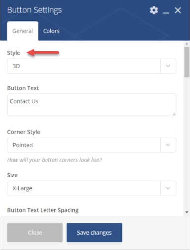
You can adjust the style of your button into 3D, 2D, flat, outline, savvy or double outline. Remember when I mentioned making your button stand out in an eye-catching but not tacky way? Just using these subtle options can make your button stand out to the visitor without being too loud or gaudy.
-
Button Text
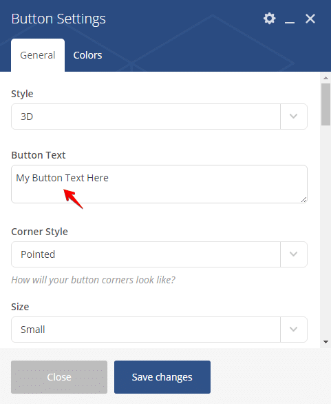
Use action words that compel your visitors to click that button. Don’t make it too long; one to three words will do as long as they clearly state what will happen when the user clicks the CTA. This point is especially important—there’s nothing more annoying that clicking a button expecting to take one action and being redirected to a completely different page. Additionally, make sure that the loading speed is fast once they click the button! Any more than 5-8 seconds and you’re likely to lose them.
-
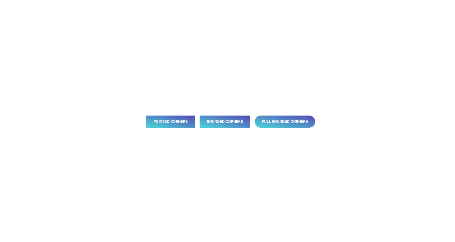
Corner style
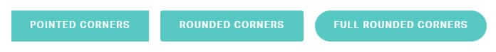
Even this small detail can have a great impact on the effectiveness of your CTA. Available corner styles for you to choose from are pointed, rounded or full rounded.
-
Size
The size should be congruent with the importance of your CTA. The major CTAs should have the largest size. Sizes you can pick from are small, medium, large, X-large, and XX-large. Again, though, although your main buttons should be bigger than others, don’t overdo it!
A button that takes up half a page (yes, we’ve seen it) is a bit laughable and will seem unprofessional. At the same time, you should also consider your target audience. For example, there is a pattern of inserting larger-sized buttons and text based on having an older audience. Point is, think of what’s easiest for your audience to navigate.
-
Button Text Letter Spacing
Spacing is important to improve the legibility and design of your text. Use this option to add space between each character. In some cases, you may also consider changing the font you use for the button text.
-
Add Icon
You can add icons to your button, along with text, or use an icon alone. Oftentimes websites trying to reach a multilingual audience opt to use icons on their CTA that are universally understood. But overall, it’s better to use an actionable word. An icon should make your CTA clearer, not confuse the client.
-
Animate Icon
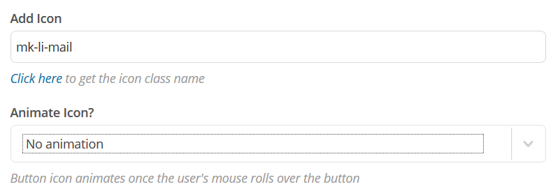
You can add this feature if you want to make your CTA more noticeable. A button icon can become animated once the user’s mouse rolls over the button. This is a simple way to add a subtle note of interactive design that will catch the visitor’s attention.
-
Button URL
You can edit this section if you want to add a link to the button. Though again, make sure to add https:// befor the URL so that the link will work.
-
Target
This option allows you to decide whether your link will open up in the same window, a new tab or another new window. Internal links should open in the same window, for a better user experience. This can contribute to how you want your user to focus on your landing page, instead of other pages. This also helps avoid confusion and redundancy.
On the other hand, external links should open in another tab or another window, so that your visitors can get back to your website easily.
-
Full-width button

This option lets you expand the length of your CTA to cover a whole row of your page so that rather than being in a box shape, it will take up the entire width of the page like a ribbon across the bottom. You can also change the options so that even as the user scrolls through your page, the full-width button stays in sight.
-
Custom Button Width
If you do not want a full-width CTA, you can customize the width of your button. With this option, you can choose your desired width according to pixels to make your CTA button size proportionate to the rest of the elements on your page for an overall more eye-pleasing design.
-
Button Background Color
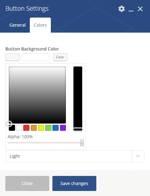
If the style you chose allows you to have a background color, you can change it to make your CTA more eye-catching and, again, stand out from the rest of your page. Play around with different colors to see which one makes the button decorative.
-
Button Text Color
Use this to set your desired color for the text in your button. Choose a color that makes your CTA clearer and more noticeable. Now we’re not saying to use loud and neon colors, just be sure that the button color clearly contrasts with the background color.
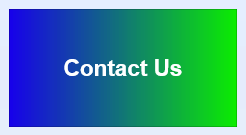
Gradient Button
-
Style
For gradient button, your options for the main style of your CTA is 2D, flat, outline, and double outline.
-
Button Text
This is where you add the words for your CTA. Remember to use short action words.
-
Corner style
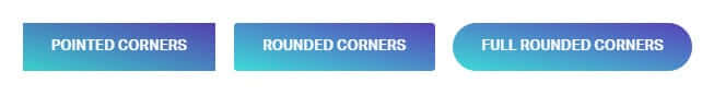
This option allows you to change the sharpness of your button’s edges. You can have it pointed, rounded or full rounded.
-
Size
This option enables you to set the general size of your button. It can be small, medium, large, x-Large or xx-Large.
-
Gradient Fallback Color
Use this to assign your fallback shade of your gradient functionality.
-
Button Text Color
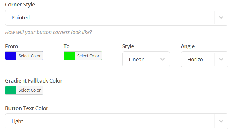
You can set the color of the text using this option. You can choose from light or dark depending on the color of your gradient.
-
Button URL
Use this to add a link to your button. Do not forget to include http:// before the link to avoid error.
-
Target
Customize this option if you want the link to open a new window or the same one.
-
Full-Width Button
Enable this feature if you want your button to cover a whole row.
-
Custom Button Width
If you do not want full width, edit this section to change the size of your button width.
Final Tips
CTA buttons are crucial to achieving your website goals. They are key-players in converting every visitor into customers.
To find out which design will work best for your website CTA, you can perform A/B testing. Finally, make sure to change one element at a time for you to accurately measure the effectiveness of every change.

No comment yet, add your voice below!