The key is to keep the webpage relevant and engaging, without adding too much noise and excess content. There are subtle ways to make your website more attractive. One way to do this is to add gradient colors throughout your website. This is a growing trend in the web design world, and after reading this article you’ll understand why. The good news is that with the Jupiter theme you have the possibility of using gradient elements in WordPress.
Whether you want it in the background of your website or part of your text color is up to you. But the nice thing is that the opportunities are all there and can be easily done using the one-and-only Visual Composer Editor. Today we’re going to describe these various options and explain how you can set gradient elements in WordPress to make your webpage really pop
How Background Gradient Work
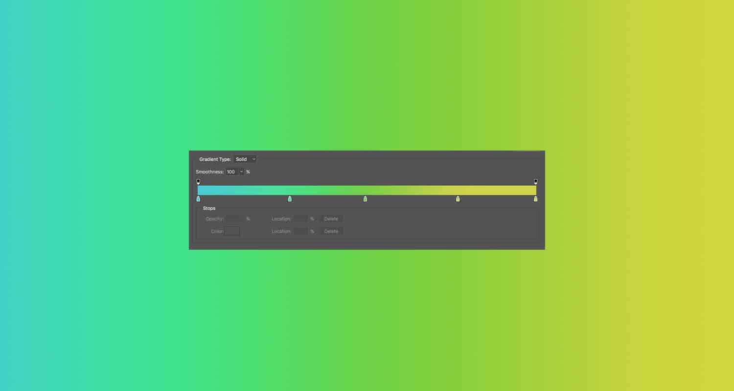
You’ve all undoubtedly seen gradient colors on the web, but let’s break it down to make sure we’re all on the same page. Gradient backgrounds are backgrounds that include two colors, each color transitioning to the other. This gives the page a new dimension, making it look more sleek and polished than a standard single-colored webpage.
As we mentioned before, incorporating gradient elements in WordPress has been a growing trend in recent years. The gradient effect is commonly used by top design brands like InVision, and can hardly be missed when browsing through designer portfolios like the ones on Dribbble.
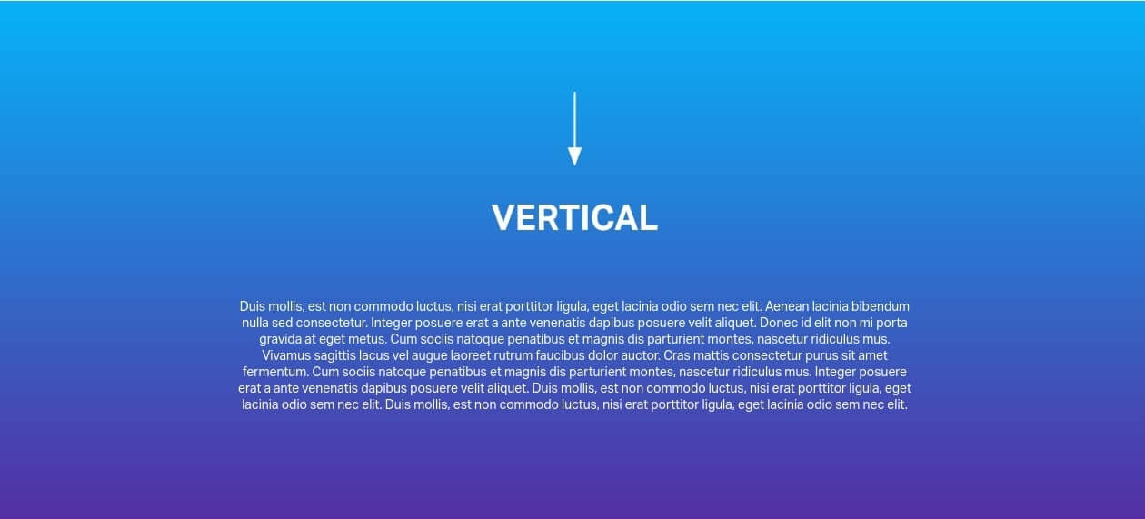
There are also design options available within the gradient elements in WordPress. You can change the gradient setting to be either linear or radial, and set the angle of the gradient to your liking; either the ‘top to bottom up’ angle or the opposite ‘bottom to top’ angle.
In addition to section gradients, you also have the option to set entire background overlays as gradients – which places the colors over background images to give them a special effect.
Gradient Elements In WordPress
The easiest and most effective way to include the gradient elements in WordPress, and more specifically, in Jupiter, is by using the Visual Composer Editor. Certain elements in the Visual Composer have a Gradient color setting which allows you to add a button or background with gradient color. This can be done by adjusting the spectrum from one color code to another.
Gradient Button
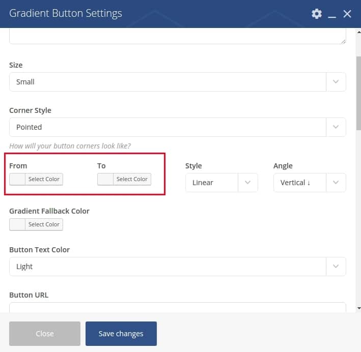
Adding a Gradient Button is a great idea, especially if it’s for an important call-to-action button! All you have to do is search “Gradient Button” when adding an element to your page. This element will allow you to add buttons that look slightly highlighted or just a bit fancier with the gradient color:
The two transitioning colors can be set in the From and To settings as pictured below:
This is where you want to select the starting point color of the gradient spectrum and the ending point color of the gradient spectrum. Make sure to test out a few different options to make sure the two colors look good fading into each other. The last thing you want to do is give your website visitors an unnecessary eyesore.
More details regarding Gradient Button element can be found in this Jupiter shortcode article.
Icon Box Gradient
Another gradient element is the Icon Box Gradient which allows you to display icons in a colorful box shape:
The settings for gradient color are the same as in the Gradient Button. There is also an article about the Icon Box Gradient element which you can read here.
Font Icons
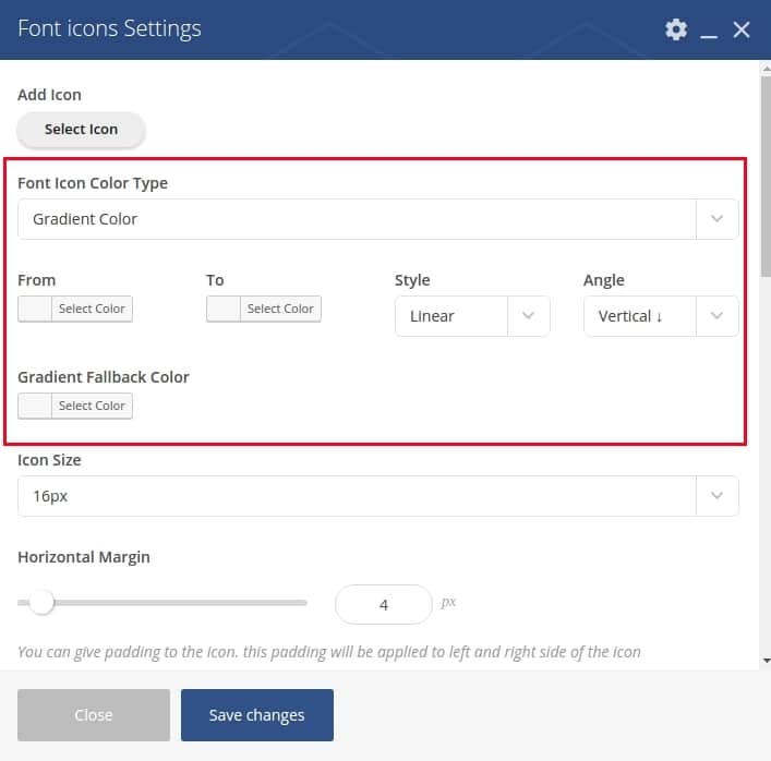
With the Font Icons element you have the possibility to set gradient color for the actual icons like this:
You just need to select Font Icon Color Type as Gradient Color and then set the From/To colors of the gradient spectrum:
Read the Font Icons element documentation on this page.
Fancy Title
The Fancy Title element is one the most frequently used elements in Jupiter theme and it’s easy to see why. It adds that special something to make your titles stand out from the rest of the content.
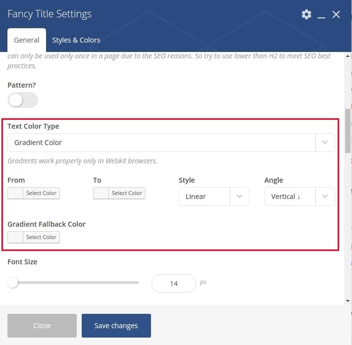
The fancy title allows you to display an extremely impressive title with many beautiful styles to attract your viewers at first click. And one of the style’s settings is gradient color:
You can find more information about Fancy Title here.
Page Section
With the Page Section element you can add a background image or background color to the section of a page.
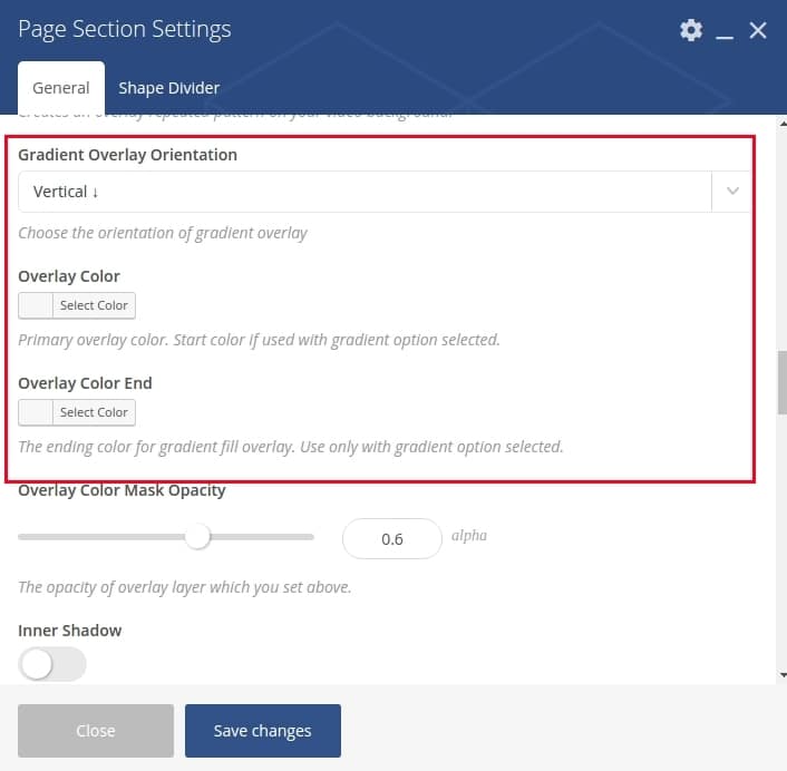
There’s an option where you can set the overlay gradient direction for the background of the page section. To do this, simply add the starting color for the gradient overlay and the ending color for the gradient overlay in the settings section pictured below:
The detailed description of Page Section element is written in this article.
Custom Box
Custom Box element is quite similar to the Page Section element. It allows you to create a box container of content with its own background color/image.
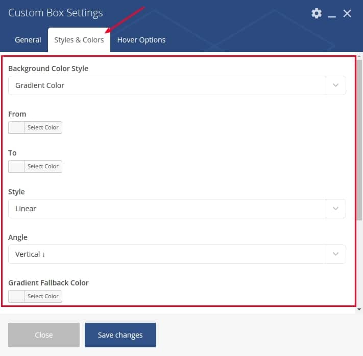
When editing the Custom Box settings, you’ll see a Styles & Colors tab where you can set gradient colors of the background:
This element is also described in this article for the Jupiter theme.
Types Of Gradients
There are two types of gradients: linear and radial.
Linear Gradient
A linear gradient starts at one point and changes along a straight line to the endpoint. The direction of linear gradients can be up/down, left/right, or diagonal.
Radial Gradient
A radial gradient starts from a central point and radiates outwards towards the outer endpoint.
So Why Use Gradient Colors Instead Of A Single Color?
Gradients are best used when they provide depth. A gradient should never take away from a design or distract from the message of the design. In most instances they should be used to mimic a light source in either radial or linear format. The radial option provides the best look for zeroing in on something and can be used to draw attention to a specific area of your application or design. Whereas the linear can give overall dimension to the page.
The best application of the gradient element in WordPress is when it is used in a subtle way to draw attention or provide depth and texture to a design. They are there to make objects or backgrounds seem more realistic as it pertains to light. So gradients are one of those things that can take a design from good to great. Don’t hesitate to use it!
Overview Of Using Gradient Elements In WordPress:
- Gradient backgrounds have two colors transitioning into each other.
- You can include the various gradient elements on buttons, icons, titles, custom boxes or even whole page sections.
- The different types of gradients include linear (which changes as you move horizontally) or radial (which changes from the center moving outward).
- The gradient element should be used to provide depth to your WordPress website in areas that could use some highlighting.








No comment yet, add your voice below!