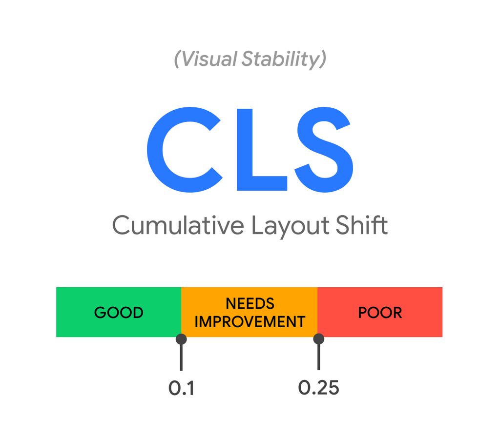
Cumulative Layout Shift (CLS) is a metric to measure the visual stability of a web page (or application). You’ve probably experienced reading an article, and suddenly, your page jumps up or down and you’ve lost your place. CLS is also important because it’s considered a key factor of website performance on GTMetrix or Page Speed Insights.
Although it’s possible to have a completely stable web page by following the guidelines below, since it’s only one of the key factors of measuring website performance, keeping a page at CLS Zero may cause some disadvantages for the other factors. So, the best practice would be to have a balance between the performance metrics and keep the values at a minimum and balanced with the others.

In this article, I’m going to discuss the CLS and the ways to avoid it on a WordPress website.
What is CLS?
Based on this doc from Web Incubator CG, the CLS can be calculated like this:
Each animation frame (a.k.a. “rendering update”) computes a layout shift (LS) score approximating the severity of visible layout instability in the document during that frame. An animation frame with no layout instability has an LS score of 0. Higher LS scores correspond to greater instability.
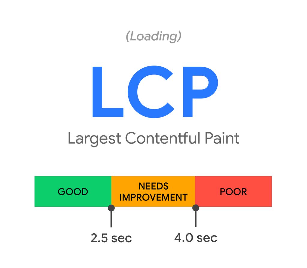
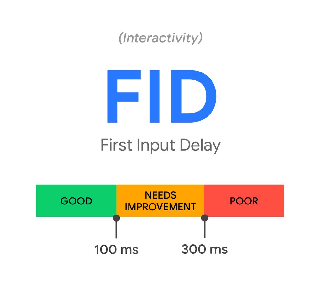
To calculate the layout shift score, the browser looks at the viewport size and the movement of unstable elements in the viewport between two rendered frames. The layout shift score is a product of two measures of that movement: the impact fraction and the distance fraction.
layout shift score = impact fraction * distance fraction
To find out more about the impact fraction and distance fraction, please look at this doc. Okay, now that we know what CLS is and how we can measure it, let’s look at ways to avoid layout shifting in WordPress websites. I assume you have a WordPress website and want to improve your performance results but still have a poor CLS score. Let’s see what we can do to get a better score.
How to avoid Layout Shift?
Now that we understand what Layout Shifting is, let’s see how we can avoid it.
Avoid layout-related JS codes
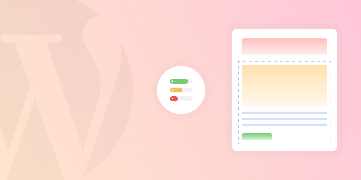
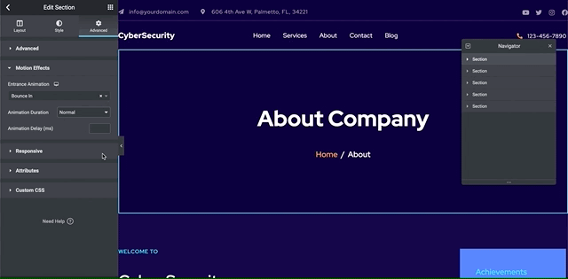
This is perhaps the most important factor in avoiding layout shifting in WordPress. Sometimes you may use JS functions on your website related to its layout, such as using a slider that expands the height of its viewport using JS, masonry layouts or making a div full height or full width using JS. These are all JS functions that can cause layout shifts. One of the live examples is using the “Stretch Section” in Elementor to make a full-width section.
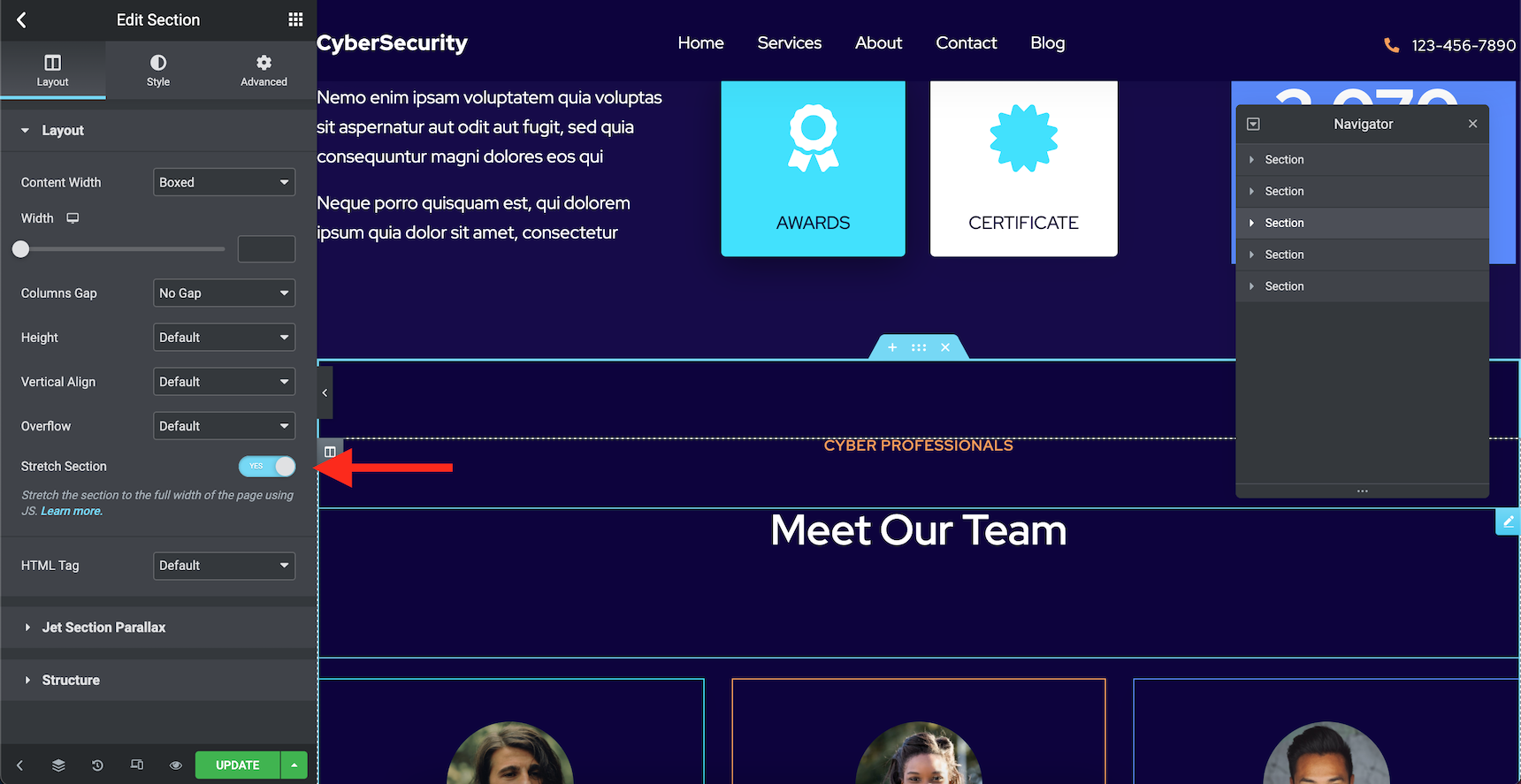
The Stretch Section option uses Javascript to make a section full width. Many people use this option without noticing the side effects. In order to make a section full width, read this guide first and then set the “Content Width” to “Full Width” on Elementor’s section setting.
It’s better to let CSS handle all the layout-related stylings. It’s safer and more accurate and it prevents layout shifts.
Avoid lazy load
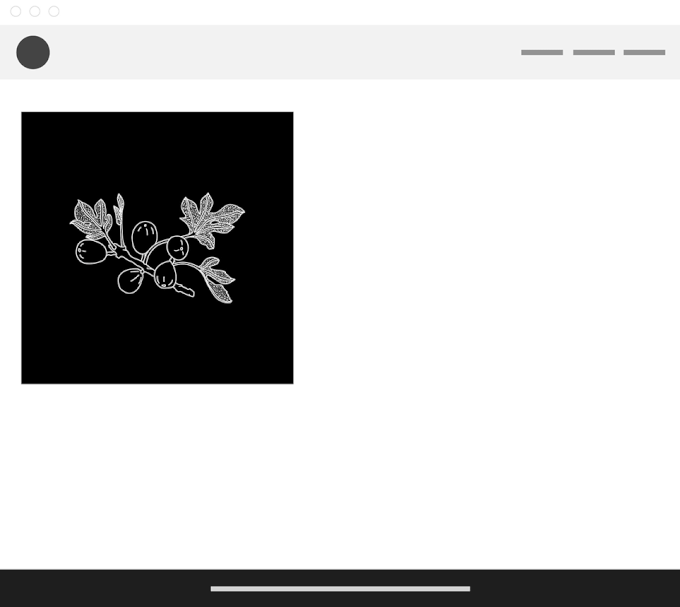
Lazy load means your web page starts loading images, videos or iframes as soon as you see them in your viewport. There is no need to load every item before you scroll down to it, right? Unfortunately, this tactic can backfire if you don’t provide a good placeholder to maintain the height of the element by causing layout shifts. At the beginning of this article, I provided a sample demonstrating how lazy load can cause layout shifts. Now that you know the dangers, make sure you know how to avoid layout shift if you add height to the images and have lazy loading:
One simple way to avoid lazy load layout shifts is to provide the height attribute for images, videos and iframes. This way, the browser knows that it should empty up the space for the asset and it will prevent layout shifts.
Avoid viewport animations
If you knew that viewport animations can cause layout shifts (and consequently lower your performance score) you wouldn’t use them, would you? Well, this is not totally true. Most viewport animations are short, so they don’t affect web pages that much. However, it’s better to avoid having viewport animations on top of the pages while that is the first thing that the browser would render.
Also, using Particles effect and parallax effects using Scrollmagic with automatic scroll can end up increasing your CLS score. However, there might be ways to avoid this.
Avoid lots of custom or Google fonts
If you are using a custom font, you should know that when the browser loads font files it has different scenarios for texts with unloaded fonts. It may hide the text while the font is loading or use a default font until the font completely loads. In both scenarios, you will have layout shifts.
To learn more about different scenarios when loading font files, please check out this article.
By default, Jupiter X uses a JS library named We Font Loader to add Google fonts. However, you can switch between the CSS and JS method through Jupiter X -> Control Panel -> Settings.
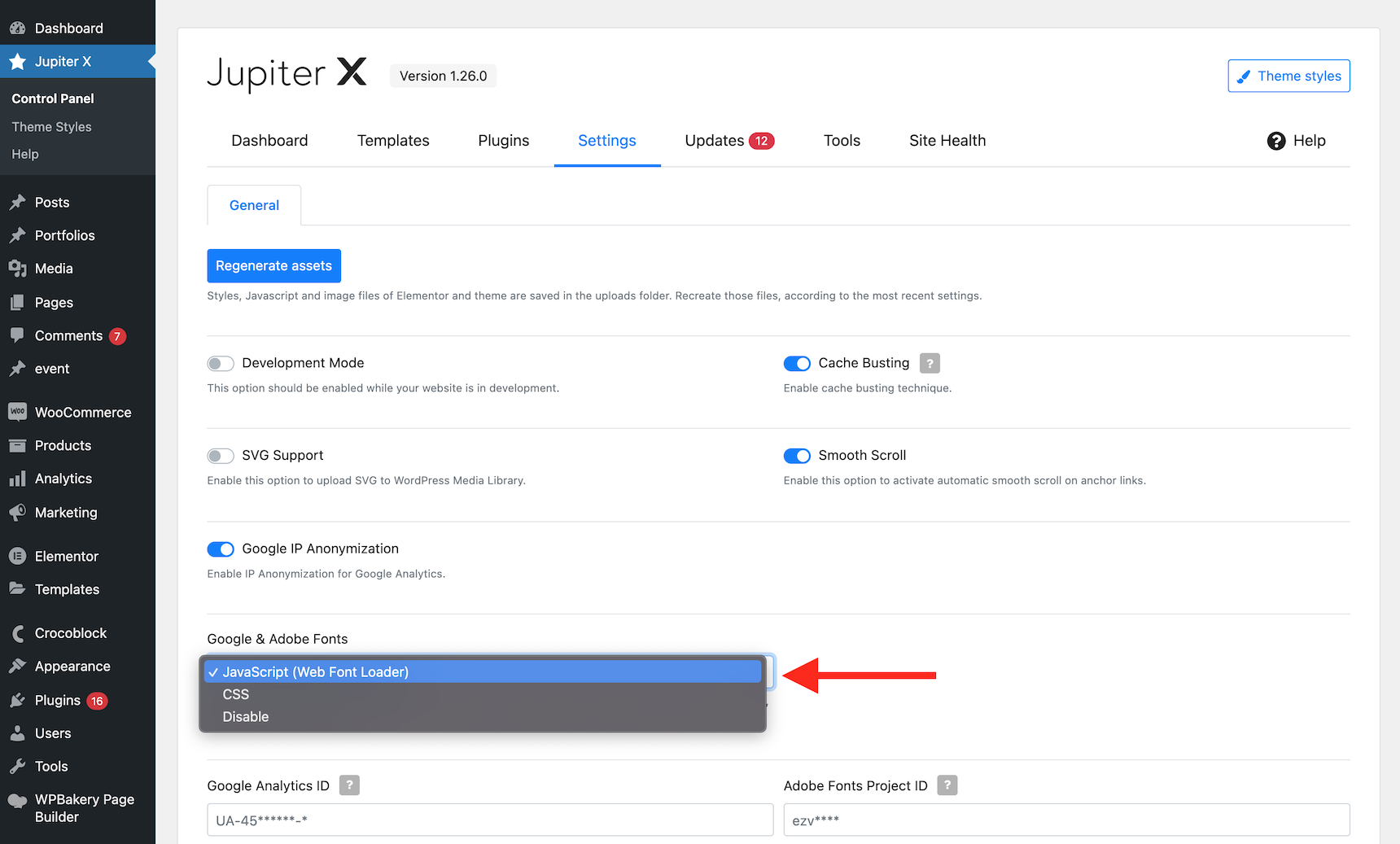
If you choose the CSS method, the web fonts will be called to load inside a CSS file and no JS will be involved. I recommend this method over the JS method.
Also, if you wish to switch the loading custom font scenario (i.e. change FOIT or FOUT) you can add this filter to your child theme’s functions.php file:
add_filter( 'jupiterx_webfontloader_google', function( $fonts ) {
    foreach ($fonts as $key => $value) {
        $fonts[ $key ] = $value . '&display=swap';
    }
    return $fonts;
} );
If you are using Jupiter X, avoid conflicts with Elementor Pro
There is one known conflict with Elementor Pro that can cause layout shifting on a Jupiter X website: using Elementor Pro’s Sticky section option in your header template section at the same time you are using Jupiter X’s sticky header option. Generally, this will cause a glitch and the content will jump, causing a layout shift. It’s better to avoid this conflict altogether, since you don’t need to have two sticky options available at all. Just follow up as explained in this guide to avoid it.
Combine your CSS Files in one place
Having a web page with different CSS files and different CSS rules in multiple places can cause layout shifts. How is that possible? Imagine you have decided to style a DIV block to have 75% viewport height and defined a rule for that in the initial CSS file. But you have another DIV on another page with the same CSS class and you decide you want that one to have a 50% the viewport height. So you add a CSS for the other page inline on that page and now what do you have? The DIV block loads a 75% viewport height for the first, and then when the browser gets to the line where you defined the 50% height, it will apply the new rule and reduce the height.
The best way to resolve the issue is to avoid such CSS conflicts completely. However, on bigger websites, it’s really hard to avoid such conflicts. So, an alternative is to combine all the CSS files and make one above-the-fold CSS file for all the website pages.
An even better solution is to have one critical CSS containing the layout-related rules (widths, columns, heights, margins, paddings, etc.), make it above the fold and then put rest of the style-related rules in another file below the fold. This way your site will perform better because you won’t lose the First Contentful Paint score. Fortunately, great caching plugins such as Autoptimize or WP-ROCKET already provide this feature. So, simply install one and enable these features to avoid layout shifts.
Wrapping up
There are many reasons why your website can have a poor CLS score. In this article, I tried to review some of them and provide ways to avoid them. However, there is one last detail to mention. Remember that embedding external resources such as online forms from free form builders or advertisement boxes can also cause layout shifting in WordPress. In order to improve the performance of your website, you need to know what can cause performance glitches and the ways to avoid them. Hopefully, this article could shed some light on your path forward when it comes to preventing layout shifting in your WordPress site.

1 Comment
Hello,
I have read your blog and i think its very helpful for beginners to develop website and as anyone who has ever built a WordPress website knows, designing and implementing the layout is only the beginning. In order to maintain a cohesive look across your entire website, you need to be vigilant in preventing your layout from shifting as users move about your site.
Thank You