A non-profit’s website shouldn’t only be focused on acquiring donations and sponsors, but should also be capable in educating its visitors about the cause. This is a great platform for reaching potential supporters, so critical to its success is the website’s friendly approach, informative sections, and testimonials of volunteers.
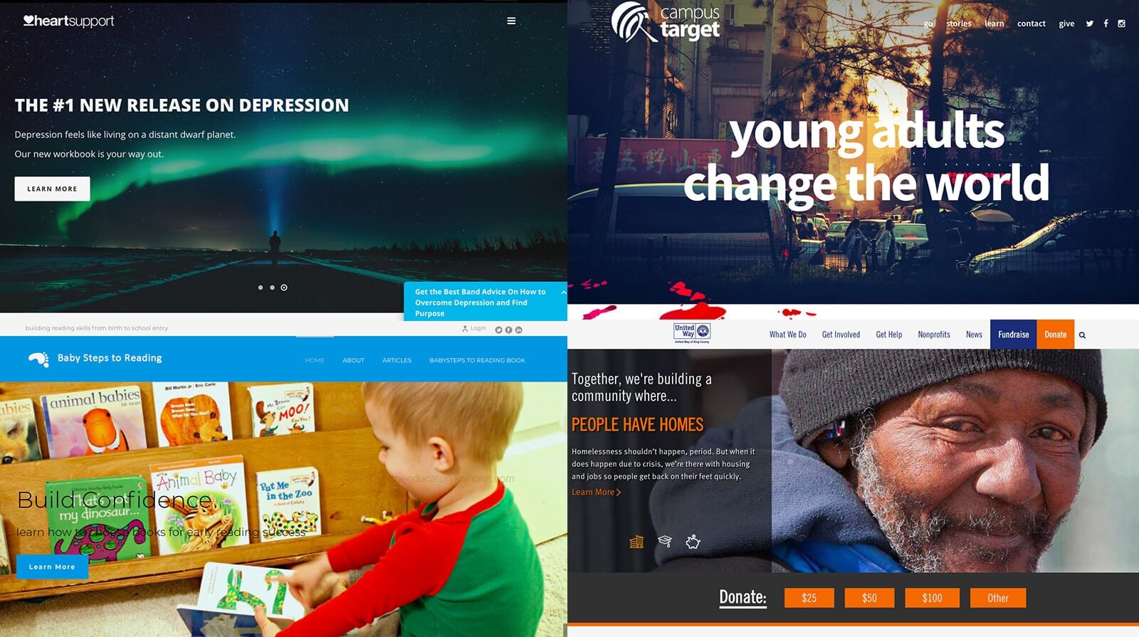
Good thing that Jupiter offers creative WordPress theme templates that integrate essential elements in order to be effective in achieving their goal. Here are five non-profit websites built by Jupiter which can inspire you in creating your own.
1. Baby Steps to Reading
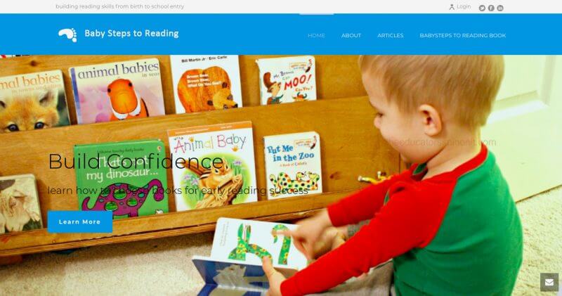
The organization promotes child literacy even before they can sit up, saying that your baby can begin to learn to read by dedicating your time to speak and listen to them. Their website is heavy on blog articles and guidelines even within the subpages, with Kanburned feature of edge slider and toolbar header activated on the landing page. The presence of hi-res images portrays a familial vibe and makes the site more appealing to its target market, moms.
2. Campus Target
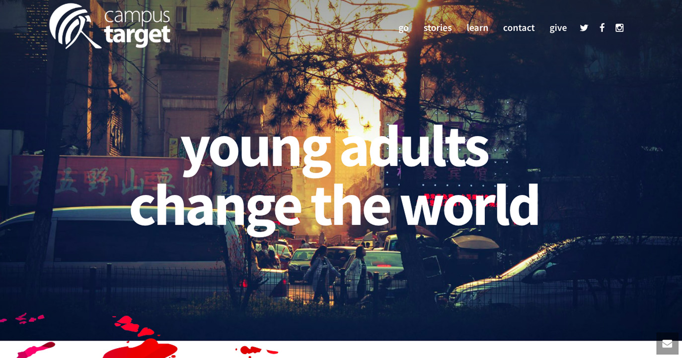
Campus Target is an organization of young adults spreading the Gospel of Jesus one Asian campus at a time. Its site’s theme is very professional. It is an eye-catching one-page design with a nice and sticky header. The big fonts put emphasis on the CTAs, along with large, easy-to-navigate buttons and blog elements. At one scroll, you can already attain everything that you need to know, like how to support a worker and how to donate. These two specific sections are big enough to gain traction from visitors, which is the major goal of the website.
3. United Way of King County
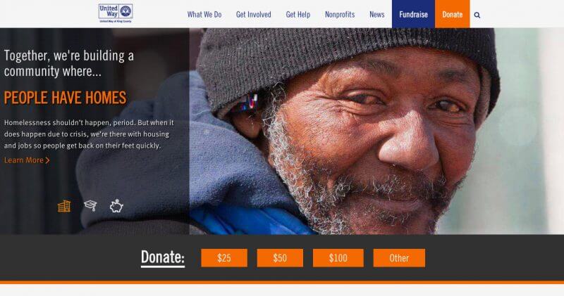
This charitable group stays true to its promise of breaking the cycle of poverty through housing, education, and jobs. Scrolling through the site feeds you with all the answers you could possibly ask for. You’d be welcomed by a very professional and informative header, equipped with a well-positioned Donate section followed by Video Player element that explicates what the organization’s mission is. Within the subpages are milestones, series of blogs, news, Twitter feeds, modified accordion, well-crafted icon boxes, client, and carousel client elements. Overall, this page is very comprehensive and well-organized.
4. Heart Support
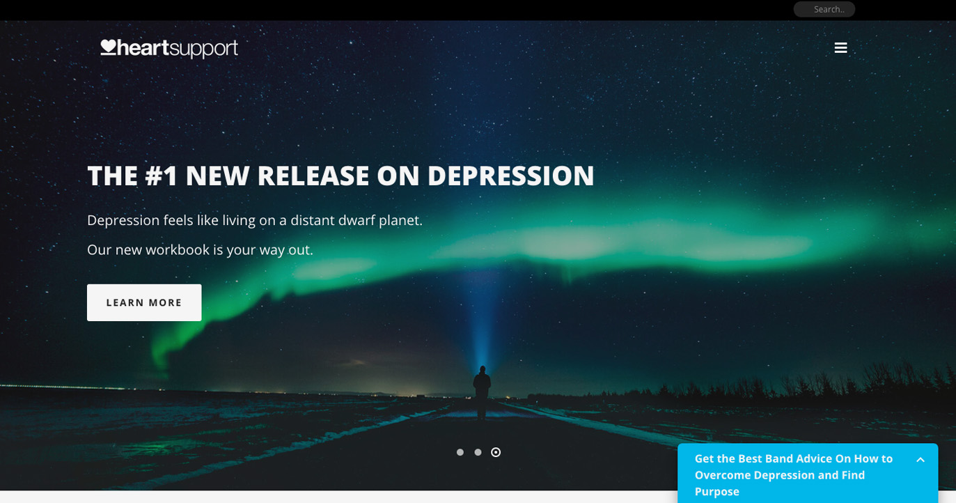
There’s no better way to overcome life’s adversity than to join a support community. Created by a musician, this is the commitment of Heart Support; letting music fans share their story so they have an outlet to burst out their emotions and inspire others as well. The website has melancholic colors but energetic photos that create an atmosphere that appeals to young adults. The landing page starts with an edge slider, equipped with transparent header and burger menu that has a full-screen feature when clicked. As you continue, you’d notice series of theatre slider icon, icon box, transparent custom box and custom boxes with elevation feature.
Conclusion:
Non-profit organizations do not need to shed money to hire an expert for an attractive and effective website. These non-profit websites built by Jupiter are here to testify that you don’t need to craft them from scratch to have all that a great website needs.


No comment yet, add your voice below!