In this article we’ll give you a few quick tips on how to sync your Jupiter mobile site with your desktop and ensure your website displays the same way on mobile as it does on desktop. Unfortunately, this will require some extra work on your part, but because mobile is so popular these days and will likely only continue to trend, the corrections you make now will be well worth the effort.
Taking the time to create a responsive website layout is considered a crucial step towards making your WordPress website optimized for mobile devices.
Jupiter provides the bundled plugin Visual Composer which helps you create your site content. It’s easy to use: instead of messing with complicated code when you want to add something to your website, you can just add an element in the Visual Composer editor and fill in your text/images. If you haven’t already, you’ll soon realize that editing pages with Visual Composer is the easiest and most convenient way to do so.
Let’s focus now on the Visual Composer settings because they’re important for the responsiveness of your site.
1. Check the Visual Composer Settings
Once you’ve installed the Visual Composer plugin (usually done before ever launching your website), check its settings in Dashboard > Visual Composer > General Settings. Make sure the option “Disable responsive content elements” is unchecked.
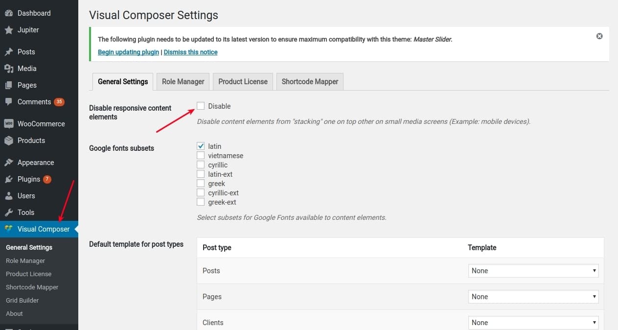
If you activate it, your mobile site will have the same exact layout as on desktop, which will be difficult for mobile users to navigate. Instead, you probably want the elements to be shown one after the other for clarity and improved readability on mobile devices. To achieve this look, keep the responsive content elements disabled.
2. Create Responsive Content with Visual Composer
Since most of us do our website editing on desktop, it makes sense that we’re also checking the edits on desktop. But what about the mobile display? Mobile is becoming ever-more popular to the point that users are making most of their subscriptions and orders off of mobile websites and apps. However, when you’re in the designing mode, this crucial fact can easily slip the mind.
After hours of edits, you might decide to check mobile, where you’ll face a number of issues. You’ll notice for example that the big font size you chose for your titles in Visual Composer, that look so good on desktop, look especially awkward and obtrusive on mobile. In cases such as these you’ll probably prefer to change the font size for mobile only.
There are two ways you can do this:
- Set the font size of the text using custom CSS code with the help of Media Queries (which applies the CSS code for mobile only). We recommend you doing this if you have a bit of coding knowledge already.
- Another method of changing your font size for mobile can be done using tools within Jupiter. All you have to do is hide the row you’re having issues with on mobile and create a new row with new settings for mobile only. Below we’ll show you how this is done.
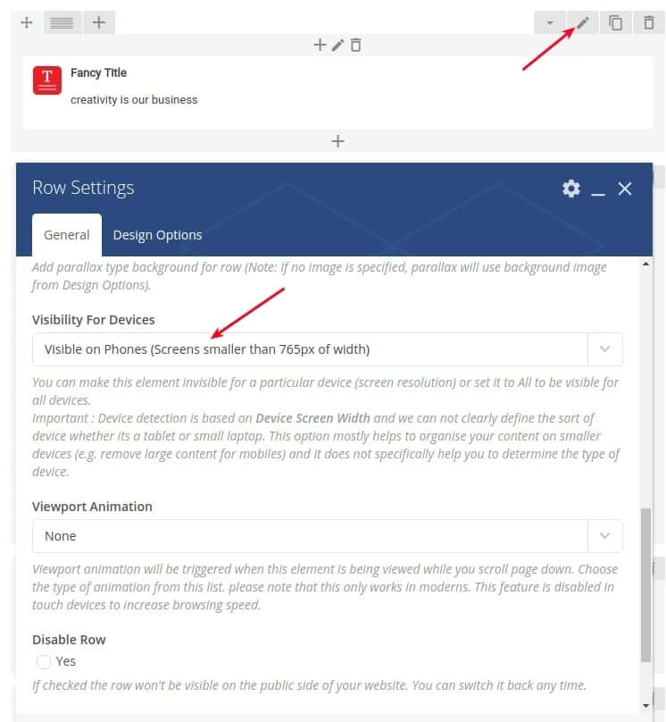
Let’s say you added a row into your page with a Fancy Title like this:
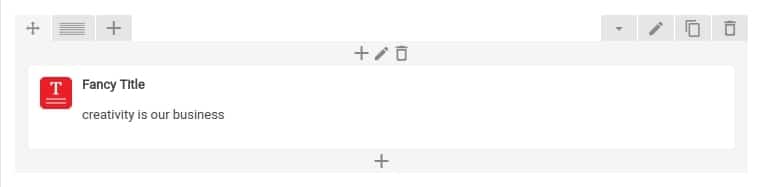
You notice that it suits your desktop view, but not the mobile display. To change its look on mobile alone, follow these steps:
Open the row settings and find the “Visibility for Devices” option. Set it to “Hidden on Phones”.
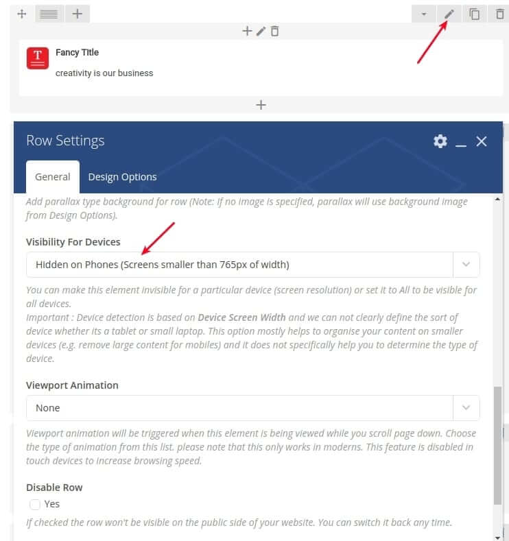
When this is selected, that particular title will only be shown on desktop and tablets.
But what about mobile? How do you get the title shown there?
Don’t worry. It’s pretty simple. Just create a new row with the same title and set the settings that suit your mobile display (perhaps you’ll want it smaller in size or with a more narrow font style). Then, open the row settings and again search for the “Visibility for Devices” option. In this case you should set it to “Visible on Phones”.
With this option, you’ll essentially sync your Jupiter mobile site with your desktop title edits and you’ll have a customized title shown only on phones, edited specifically for the mobile layout.
Now you’re aware how to separate and display different content on mobile and desktop so that the design fits the platform on which it’s being viewed.
3. Set the Padding/Margin in Visual Composer
While editing your Jupiter site on desktop, you’ll typically be moving content around to the right or left or adding some padding around different elements to improve the design. The Visual Composer editor has set padding and margins inside the row settings that will look something like this:
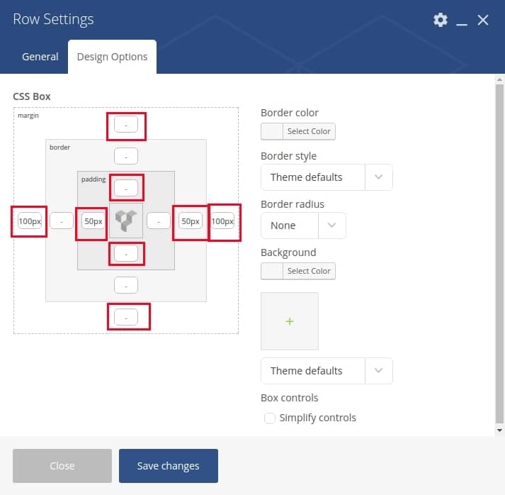
Typically, you’ll adjust these values for the desktop view only, but they’re simultaneously applied to the site’s mobile display too. If you check your content on mobile, you might be disappointed to see that the padding/margin settings that look so nice on the desktop view break your responsive design and look uneven on mobile.
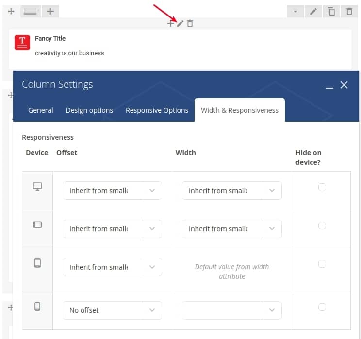
To make sure that those padding and margin settings sync your Jupiter mobile site with your desktop edits, you can either hide the content on mobile and create a new one as described in step two, or you can change the Responsive Options in the Visual Composer Column Settings.
This feature is already described in detail by Visual Composer authors. If you’re interested to learn more, you can watch the tutorial here.
Another option is that you can go without the default Visual Composer padding/margin settings, and instead add an extra CSS class to an element and assign a padding/margin value using custom CSS code with Media Queries.
So now you know how Visual Composer settings can affect and improve the mobile display of your Jupiter site to match your desktop edits. Follow our suggestions to get the content response you desire and you’ll hopefully never experience any problems with your website’s design — no matter the user or the platform.
Quick Recap on How to Sync your Jupiter Mobile Site with your Desktop edits:
Let’s go over what it takes to sync your mobile device’s display with your desktop edits in Jupiter:
1. Check the Visual Composer settings to make them mobile-friendly.
2. Create responsive content with Visual Composer
- Set the font size of the text using custom CSS code with the help of Media Queries.
- Hide the row on mobile and create a new row with new settings for mobile only.
3. Set specific padding/margins in Visual Composer for mobile devices.

No comment yet, add your voice below!