This means you have to consider the implications of every detail in your design. One key feature that shouldn’t be overlooked is the typography in your WordPress website.
On an average website, typography in WordPress makes up 95% of the graphic design (Digital Synopsis). That’s huge! We want to make sure you showcase a great typography in WordPress – a typography one that fits your message and connects with your viewers to give them the most excellent user experience.
Importance of Typography in WordPress (How It Impacts Your Site)
So what’s the big deal? Why not just go with your default options and leave it be? Well, typography in WordPress says a whole lot about your company, your service, your professionalism and the credibility of your website. It can greatly affect the legibility of your content, the user experience and the overall attractiveness of your WordPress website. No matter how clever your copy or how much work you put into your site – all of it will suffer if the presentation isn’t clear, professional and user-friendly.
These days, “user experience” is a major buzzword in business. The reality is that if you want to keep up with your competition, you need to maximize the potential of all UX-enhancing techniques. The best way is to tap into the minds of your users, and experience the range of thoughts, sights and emotions that they’ll experience while engaging with the typography in WordPress. There are any number of studies that show that typography is greatly linked with psychology and emotion. Each typeface communicates slightly different messages which in turn subconsciously affects those viewing it. Think about the font on a child’s birthday party card versus the title font in a horror movie trailer. On the birthday card you might think bubbly, playful, fun, and for the trailer – edgy, dark, bold, busy.
There is a vast array of connotations associated with each font. The typography in WordPress will either help or hinder the overall message. The goal is to have a font that not only fits your message, but enhances it as well.
One of most common mistakes made which can damage a WordPress website’s credibility is typography that looks amateur. Bounce rates will spike, shares will be minimized and conversions will certainly be rare. It goes without saying that this will have a hugely negative impact on your business. Below we will provide a list of major no-no’s and to-do’s when it comes to picking your Jupiter typeface on your WordPress website.
Major Font No-No’s Of Typography in WordPress
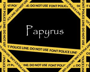
1. Avoid handwritten fonts, especially for navigation.
You don’t want users to confuse your business with your personal diary, so avoid using fonts that are characteristically handwritten. If you’re uncertain about what I’m referring to, take a peek below to see what I mean. The 20 Fonts You Should Absolutely Avoid Using. You may notice that a few very common fonts are on that list, such as Times New Roman and Arial. While these might not be handwritten fonts, they do imply a sort of laziness as they are default options.
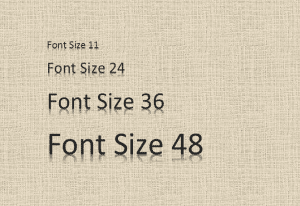
2. Refrain from making the font size too big or small.
Font size is massively important. If you get the size right you will increase legibility and thus, readership. Get it wrong, however, and you can say “sayonara” to many viewers. People don’t want to work hard while browsing the web, and if you make their brains or eyes have to adjust to tiny print or print that takes over the screen, you will not win over customer satisfaction. Here is blog that argues 16 Pixel For Body Copy is the most ideal size for your WordPress website. While we’ll leave that for your own discretion, we do recommend staying somewhere in that range as it has been proven to be preferable to many viewers.
3. Don’t try too hard.
As mentioned before you don’t want to rely on the default settings of WordPress, but you also don’t want to go the other extreme and try too hard when it comes to your fonts. Keep it interesting but simple. If your fonts are too extravagant it could be that they’ll affect your PageSpeed Score. If you want to learn more about how font readability work affects SEO click here.
Typography To-Dos With Your WordPress Website
1. Take advantage of various font providers.
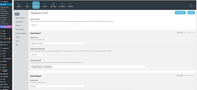
From your Dashboard, if you go into Jupiter Theme Options, you will see that there is a tab designated to Typography. As you scroll down the page you will notice that there are various font providers (listed on the right hand side of the page). For the Jupiter theme on WordPress, Google Fonts/Safe Fonts and Adobe Typekit are your options. These tools offer hundreds, even thousands of great options when selecting your font. There are many other web font services out there, but these too are known for their universal appeal and popularity.
The advantages to Google’s fonts is that they hold some of the web’s most popular font options, the load times are generally fast and reliable and the best part is that they’re free! Typekit’s advantages is that it has a massive library to choose from, the fonts are high-quality, but in certain cases you do have to pay quite a bit.
2. Get to know your typeface options.
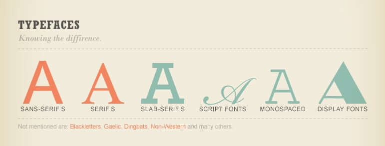
If you are at a stage where you are browsing fonts, you will see a few recurring options. The options of typography in WordPress, using Jupiter, will often give you the following options: Serif, San-Serif, Cursive and Monospace. These are not fonts – they are font categories.
Serif is a font category where the fonts have little strokes projecting from the edges of the letters.
San-serif means that it is without the strokes (refer to below photo).
Cursive typically includes script or handwritten fonts. These tend to be fancier and more elegant. We recommend that they be saved for headers, and used sparingly.
Monospace fonts (also known as fixed fonts) contain letters and characters that occupy the same amount of horizontal space. This is contrary to proportional fonts which only give as much space as each letter requires. So, the letter “m” would take up more space than the letter “i” whereas with a monospace font each letter would be spaced out exactly the same.
3. Make sure the Header and Body go well together.
A key element to getting your design down, is pairing the right fonts together. Your Header and Body fonts should be compatible. Headers will obviously be slightly bigger, more noisy and made to jump out at the reader. The Body should complement the Header, but remain more neutral, smaller in size and more descriptive. There is a whole science behind choosing the right font pair, and so to help you choose yours, we highly recommend using tools such as Font Pair or Font Flame.
Let’s Cover Typography in WordPress One More Time
We hope this article has given you a better understanding about the importance of typography on your WordPress website. You can increase legibility, UX and typographic beauty in your WordPress website by following the following tips:
Major Font No-No’s With Typography in WordPress
- Avoid handwritten fonts, especially for navigation.
- Refrain from making the font size too big or small.
- Don’t try too hard.
Typography To-Dos In Your WordPress Website
- Take advantage of various font providers.
- Get to know your typeface options.
- Make sure Header and Body go well together.

1 Comment
Hey, very informative and great article about typography and WordPress. I read the complete article and after reading this I will notice some very valid points. I will try to use these tips. Thanks for finally sharing this article.