Creating an online store that sells is serious business. More than 3 billion people are online worldwide and mobile internet penetration is forecast to reach 71% by 2019 (source Global Internet Society). With so many customers moving from buying through brick and mortar stores, to shopping from the comfort of their own homes, or on the go using smartphones and tablets, it’s even more important to get it right first time when it comes to selling your products online.
What features should an online store have to make it stand out from the rest of the competition. What are the hooks needed to engage the customer and clinch the sale? What are the features and elements needed to showcase your products for optimum saleability?
In this article we will discuss some of the ways in which you can optimise your online store from the landing page to store layout, from meeting your customers’ needs to ensuring your site is social media friendly. Read on for some awesome tips and start selling more today.
Create a Killer Landing Page
Regardless of what you sell, it’s important to create a positive impact as soon as the customer loads your site. A killer landing page is an absolute must if you want customers to stay on your site, be interested in your products and to convert to those all important sales.
Focus on your main selling point by creating a motto or a sentence that sums you up as a brand. Use this as the main title of your page so the customer can instantly see what you’re all about. The best way to do this is to use a theme which allows you to use shortcodes where you can tailor your title so that the colors and fonts stand out from the rest of the page. It works best if you centre your title on the page and use a large font size.
If you’re selling different packages to certain users, you should consider tailoring your landing pages for each package by using pricing tables. This way your customer can go to the product they want to see without having to search throughout your site.
Create A Visually Engaging Layout
You want your customers to stay engaged on your site so opt for a one page navigation template. You will still have a menu that the customers can click on to view different sections of your site. However, instead of opening a new window the site page smoothly scrolls down to the section the customer wants to see. The menu system sticks to the top of the page so the customer never has to leave your main page, giving you more opportunity to keep them engaged on your content.
It’s not just the landing page and navigational options you need to focus on because without a great layout you run the risk of creating confusion, boredom and could lose a potential sale.
Use Visual Composer together with your imagination to create beautiful, meaningful layouts which guide your customer through your site. Your theme builder should be fully customisable with shortcodes to allow you to choose between animated columns, custom boxes, content boxes and so on. Make the use of good color combinations and apparent positioning of elements in boxes. Tailor the layout to suit the niche of what you’re selling.
Have A Clear Call To Action
This is perhaps the most important part of your landing page. The goal of your landing page is to entice a customer to buy your product or service. It needs to be above the fold of your page with a noticeable and engaging background image.
It’s also important that, instead of a stock photo, you use a real life image of your services or products in your background so that your customers can have a glimpse of what you’re selling. If you do not have any chance of adding actual photos of your service or niche, use stock photos that do not look like stock photos. Great resources like DeathToStock provide stock photos that look really authentic .
Meet Your Customers’ Needs
Your potential customer also needs to know that your site is safe for them to use. So whether you’re selling physical products, digital files or services, your customer needs to be confident that their private data is safe. Use a reputable ecommerce platform such as Woocommerce to give your customers peace of mind.
Good Quality Images
It’s so important that your product images are professional and create a good impression. Steer clear of stock photographs and don’t be afraid to spend some of your budget by getting a professional photographer to shoot your product images from various angles. The whole point of the photographs is to give the customer the opportunity to see what they are buying before they open their wallet. Well lit photographs with a constant theme add to the overall professionalism of your website and can be the difference between winning or losing the sale.
It’s not just about having good photographs though. In order to capitalise on your beautiful images they need to be displayed well so it’s a good idea to use a carousel tool or any other kind of tool which showcases your images.
Create a Compelling Newsletter
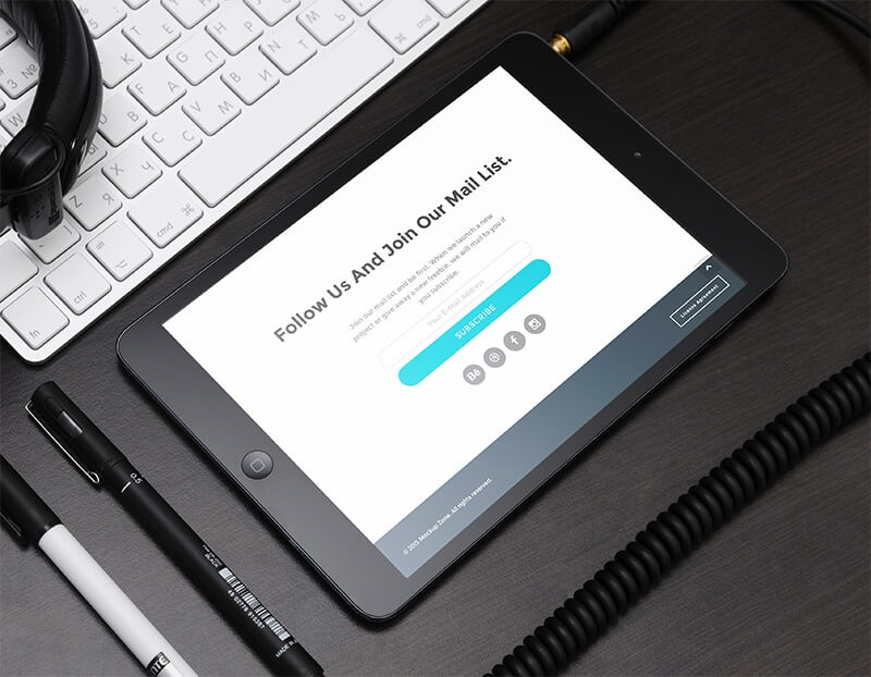
It’s important to keep in touch with your customers so that they can be aware of new products and services you are offering. One of the easiest ways to do that is to create a newsletter that highlights your latest products, services and offers. A well written newsletter is vital tool for continuing to engage your customers. Choose an online store builder that allows you to create a newsletter and integrates seamlessly with Email marketing services such as Mailchimp and Aweber. It’s so important that these services integrate well with your store builder, in order to keep your store operations as smooth and easy as possible.
Which Online Store Builder to Choose?
There are many online store solutions out there, but they’re not all made equal. As a store owner you really want a lifetime solution for your website, one that can grow and change with you as your business progresses. An easy to use, customisable site that lets you stamp your brand on it, while also giving you the freedom to showcase your products in a variety of ways can make the difference between losing a sale, making a sale and even go as far as creating repeat business.
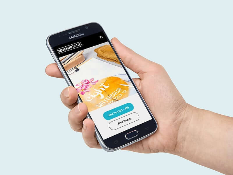
We wanted to know how our users used Jupiter WP theme to create a professional online store that works efficiently and secures the sales. We spoke to MockupZone, a small but successful team of designers who create industry-leading mockup files to help designers showcase their professional works, how Jupiter became the best solution for their online store.
Hey guys, thanks for taking the time to talk to us. First of all, tell us a bit about yourselves and your business. How did the idea of creating Mockup Zone develop?
Well we create mock up files that help every designer who needs a professional showcase for their works. We’re just a small team with 2 graphic designers and 1 photographer. In fact we’re all professional graphic designers, and we work with brands who need creative works.
For the last 2 years we’ve been focusing on creating mock up files and selling them on some marketplaces. We decided recently to sell our works from our own store, so started to look for easy to use and perfect looking WordPress themes to build our store on.
Eventually we found Jupiter and started to customize it according to MockupZone store’s needs. We finally launched our brand new store 3 months ago and began selling our items on our own page via Jupiter WordPress Theme.
Jupiter looks so professional. It has well designed demo pages and the previews are really great. You can say “that’s it” when you take a tour on any demo page. Awesome shortcodes and pre-made page layouts. In fact Jupiter is an all in one for those who are looking for a real professional theme
So this must be a really exciting time for you then. So tell us a bit more about your expectations from your website and how Jupiter helps you meet those expectations.
Jupiter is really amazing. It’s so easy to create page layouts and we can get perfect results for showcasing our items. It’s really safe for selling digital files with Woocommerce. Jupiter has awesome features for generating unique layouts for each product. We could get the final result we wanted. You can customize every detail, there are useful built-in plugins and many more features, which really helped us to launch our store very fast.
It sounds like you found the perfect match for you. Why choose Jupiter over other themes? And what do you think is Jupiter’s best feature for graphic design professionals?
As you know there are tons of WordPress themes. But Jupiter looks so professional. It has well designed demo pages and the previews are really great. You can say “that’s it” when you take a tour on any demo page. Awesome shortcodes and pre-made page layouts. In fact Jupiter is an all in one for those who are looking for a real professional theme. For a graphic designer, the first question is how can I customize my colors, my logo and fonts to this page? While you are using Jupiter, all of the visual editions are so easy and fast. You can get the same result as with your Photoshop UI design.
And how do you think your Jupiter based website will influence your business in the future?
We are so happy with Jupiter. We can do any update or add new features as and when we want. We are just thinking how can we make our store better? Other needs? Jupiter can overcome.
That’s great news! Finally, do you have any advice to give your fellow professionals?
If you need a brand new page for selling or showcasing anything, look for a solution that does not only provide the selling platform. A great solution is the one packed with everything required to accomplish the mission and make the sale. Jupiter WP theme has turned out to be that solution for us and we’re happy with it. The online store builder you choose should only make you busy thinking about your business, not everything about how to create it on the screen. At the end we wanna thank Artbees Themes team for creating a web builder that meets all web design standards and simply enables you to create unique and limitless designs.
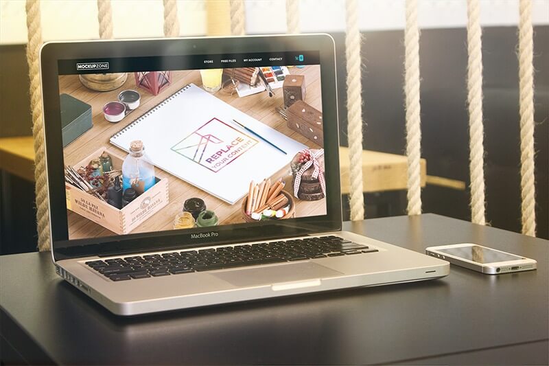
Thanks to the team at Mockup Zone for talking to us. You can check out their site MockupZone to see how they’ve utilized Jupiter’s WordPress Theme to showcase and sell their products. Jupiter’s strength lies in its ability to offer limitless customization, streamlined and powerful built-in templates and a whole host of layout features and shortcodes. These features and more are what makes online stores choose Jupiter as their website solution.
We will let you know about more people from the creative community using Jupiter and their experiences in this blog. We would also like to know your ideas about this theme. Have you used this theme for your online store? What do you think about it? What do you think needs to be added to it? Let us know in the comments.



No comment yet, add your voice below!