That’s a huge portion of the growing market that demands 24/7 access to your website, regardless of what device they’re using. Because of this, more and more businesses are taking a mobile first approach to make their websites mobile-friendly and allow users to easily find the information they want.
This concept also applies to the website header. The website header is the first thing people see when they visit your site. It’s what helps them decide whether they’ll keep scrolling down your homepage or leave. Therefore, it’s important that you have beautiful and functional WordPress headers for every device it’s being seen on.
Why You Should Have Different Headers for Different Devices
As mentioned, the header is the first thing a potential customer of yours is going to see. Let’s say for example that Dany, a potential customer, visits your site on her mobile phone. She expects to see a smooth interface, with all the navigation buttons on the right places so she can have a good experience on your site.
But if you have the same header design for both desktop and mobile devices, then navigating your site on a mobile phone will feel clunky. When Dany experiences this, there’s a high chance she’ll just leave your site without even scrolling down.
On the other hand, displaying a different header that’s optimized for Dany’s specific mobile phone will leave her with a great impression of your brand—making her more likely to continue exploring your website and its content. For you, this means that having customized WordPress headers for every device can have a substantial impact on your visitor’s UX, regardless of how they access your site.
There are plenty of other reasons to have a different header for different viewports, but they all have the common goal of providing a better user experience to your customers. A specific header for a specific device means no more pinching and zooming, and no more side scrolling just to see an entire header that doesn’t fit on the width of your mobile screen. And a better user experience reduces bounce rates, boosts website conversions and improves brand perception.
[call_to_action title=”Get your website the custom design it deserves by Artbees designers ” target=”_blank” url=”https://themes.artbees.net/pages/artbees-care-wordpress-customisation-services/?utm_source=custom-design-related-docs-posts” type=”link”]
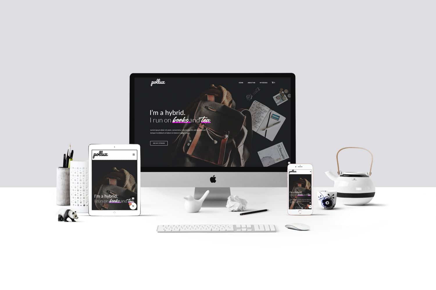
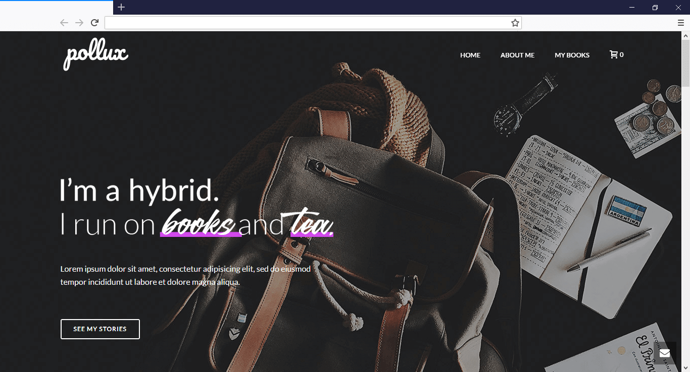
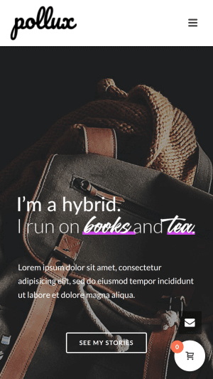
In terms of how to design WordPress headers for every device, you need a website builder that makes it easy for you to design beautiful headers without the intricacies of code. Enter Jupiter V6 Header Builder.
New!!! Jupiter Header Builder
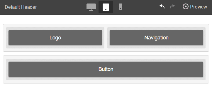
This is where Jupiter’s new feature, header builder, really shines. It lets you create a different header for three different devices; desktop, tablet, and mobile phone. It also simplifies the design process—to the point where you can just drag header elements and drop them wherever you wish to display them on the frontend of your website. Use the header responsive states to create and improve the header appearance on different devices such as desktop, tablet, and mobile.
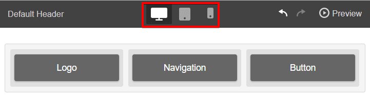
By clicking on one of the devices, you can create a header that will be displayed only on that specific device.
Changing the header in the desktop state will also apply the changes to its child (tablet and mobile) states. Changing the header in the tablet state will apply the changes to its child (mobile) but not parent (desktop) state.
To learn how to use Jupiter’s header builder to build different headers for different viewports, you may check out these articles: Header Builder and Header Builder – Responsive States
Every custom solution makes for a better user experience. With Jupiter’s header builder, you can create custom solutions for a wider range of users, on a wider range of devices. A website can be tailored as well for someone on an old laptop or device as it can for the vast majority of people on the trendiest gadgets around, and likewise as much for the few users who own the most advanced gadgets now and in the years to come. Having a different header for different devices creates a great and unique experience for everyone.
But before you begin creating your website header with Jupiter’s new header builder, make sure to take note of the best practices on how to design WordPress headers for every device.
Tips and Best Practices
Keep it slim and simple (KISS). Your website header should be like an invitation to your home that gives a good impression about yourself (brand), and then leads your readers to explore other parts of your home (website). That said, it’s best to keep your header simple yet memorable. Use a slim design that includes key elements such as your logo and brand name. Find the right combination of colors and imagery that will quickly paint a clear idea of your brand and the value you can offer to your potential customers.
Include links to your most helpful content. Aside from making it beautiful, you also want to make your header functional. Putting in links to your most prominent pages like About, Contact, and Sign Up pages will prevent readers from getting lost in your site and make navigation a whole lot smoother.
Don’t sell anything yet. In one UX study, researchers found website headers that looked like banner ads were actually ignored by people! This phenomenon is called banner blindness, and it’s the reason why you don’t want to upsell anything on your header.
For e-commerce sites, put a search bar on the header. Online retail giants like Amazon and Walmart know this. Having the search bar right above the fold allows your visitors to get right into browsing your catalogue and placing that order.
Last but not the least, test your header on as many screens as possible. At the end of the day, knowing how to design WordPress headers for every device will be a major factor in growing your brand. That’s why no matter which mobile devices your target market may use, you have to be ready for it.

No comment yet, add your voice below!