One of the most well-known WP online events, The WP Summit, brings together some of greatest figures in the WordPress industry to provide the attendees top-tier knowledge, advice and best practices in WordPress-related subjects. In this post we will investigate which elements can best help you run event websites with WordPress and see how The Ken WordPress theme has helped Jan Koch -the host of The WP Summit- by providing those elements.
What should be the main objective of an event website?
Event websites have a clear mission. Converting people who are potentially interested in an event subject into attendees. Regardless of whether it’s a wedding ceremony, a trance music concert, a yoga session, or a technology meetup, the website should easily and coherently reflect the essence and intention of the event and entice the visitor to attend. It should also make signing up for the event as quick and straightforward as possible, devoid of all invasive registration requirements often seen on many online event registration pages. Event websites are small and straightforward. They are not more than a single page most of the time.
The layout of your website should also reflect the same purpose. Right now, your website is most probably a single-page site with a clear and compelling definition of the event, its advantages, the speakers, the agenda, the venue, a contact or registration form and possibly ticket purchase pages. Most likely there are not many pages explaining in great detail who you are, your services, your portfolio, case studies and so on, so you have to be short and clear, informative yet intriguing. So, not sure what to include on your page? We’ve broken it down for you.
An Intuitive Introduction Is Critical
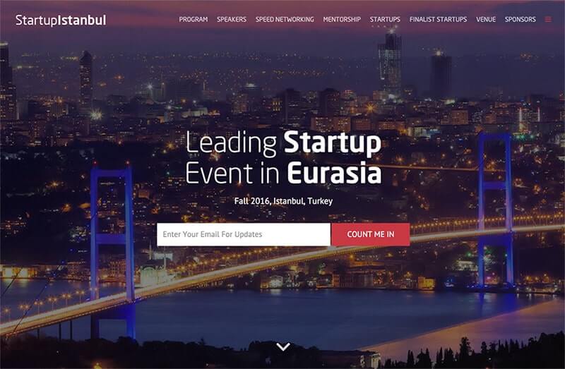
Your chance of getting a visitor to convert to an Early-bird buyer depends highly on the first moments of his visit to your event website. That’s why it’s important to welcome your visitor with an eye-catching introduction, and here’s a few options that will help you do just that:
Eye-catching Imagery
[abb_padding_divider height=”30″]
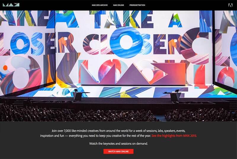
A Solid Visual Element
[abb_padding_divider height=”30″]
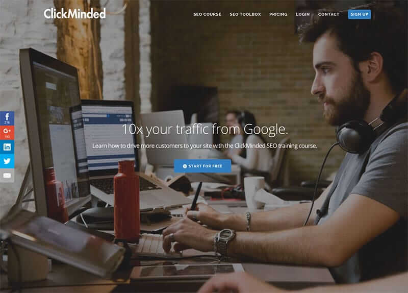
An Intriguing Slogan
[abb_padding_divider height=”30″]
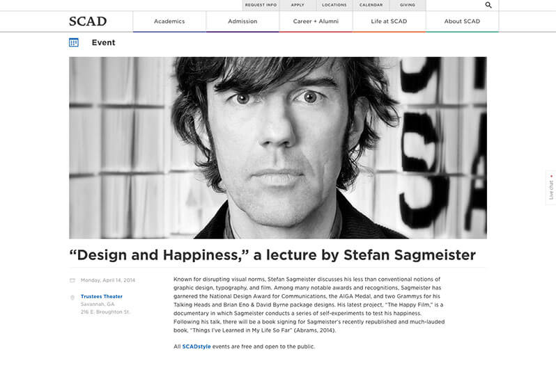
Your image or copy should portray the intention and spirit of your event. Each word should have a purpose to this end, allowing the character of your event do most of the work in attracting visitors. The most guaranteed and proven method to introduce your webinar to your audience is to use a human figure, possibly a portrait of the speaker, as it can be the most immediate way to gain the trust of your audience especially when the speaker is a known figure or from a highly renowned company in the industry.
Grab the Attention With a Short and Impressive Presentation
Use imagery, milestones, counters and buzzwords! That’s the essence of an event. Your page should generate hype and excitement. It should make the audience feel a sense of urgency to get on the guest list and not miss out! If you’re running an event site to generate some leads for your SEO webinar, a great copy complemented by interesting numbers can put your audience in a state of anticipation so that they are figuratively and literally on the edge of their seats counting down the minutes to register and get a spot ahead of their competitors!
[abb_padding_divider height=”30″]
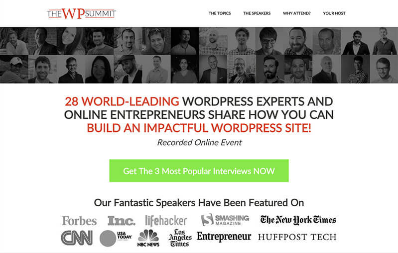
Unlike a typical landing page, an event website landing page is not supposed to tell a story. Your page should show the most important details and elements right off the bat, at first site. Think of what you want to be the first images and words your potential viewer sees and with what intention. This can vary from niche to niche and sector to sector. For example, for trance music fans a portrait of Armin Van Buuren next to a short testimonial from him can be all it takes to get someone to subscribe to your weekly podcast about Trance music. As a digital designer, the logo of Abduzeedo, CreativeMarket, Dribbble and similar sponsors can be enough to convince someone to register for your digital talents meetup next month. Or let’s say you’re hosting a WP-oriented event like The WP Summit; showing a grid-view of a group of some of the best figures in the WordPress industry as the speakers of a WP summit can be enticing enough for a subscription or at least compelling enough to prompt someone to continue surfing the page and gain more information about details of the program. See how The WP Summit organizers employ a combination of these techniques to to grab the attention of its attendees at first glance:
[abb_padding_divider height=”20″]
CTOs and Forms Are the Most Important Parts of Your Page
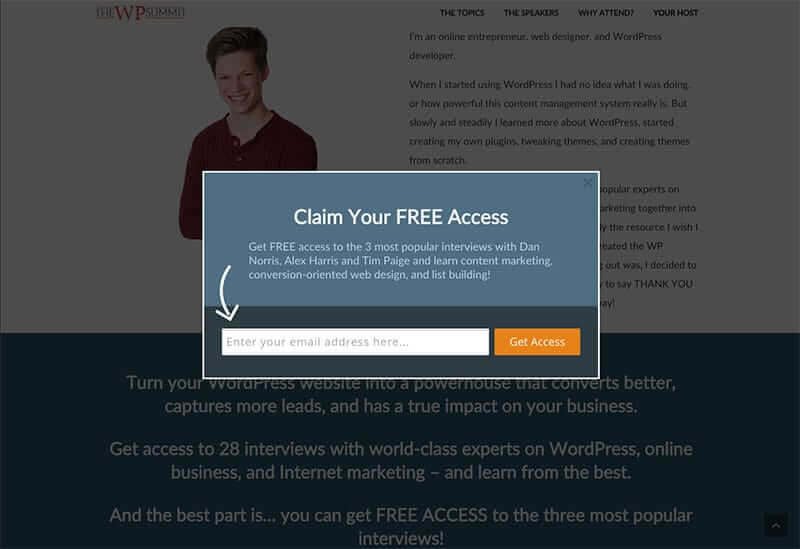
How you brag about your speakers, the number of attendees, the venue that you rented for the event, and the raving reviews you got from previous participants will never matter if you don’t provide ample CTO buttons throughout the pages. Unlike typical landing pages, leaving CTO buttons at the very end of the page can be damaging in event landing pages. There may be users who want to click to learn more or immediately register before scrolling further throughout your page and you should provide them with accessible and attractive CTO buttons across the layout to make it easy for them to do so. If you are providing several separate plans for enrollment, explain to the user what each plan offers and then provide the details together with CTO button (e.g. Early bird, VIP, Entrepreneur, etc.) If you’re offering a form to fill in as part of the registration process make sure to make it intuitive, quick and dumb-proof! User progress bars, success or failure icons are all great ways to make the registration process a more intuitive and less boring process.
[abb_padding_divider height=”10″]

So what other elements do we need to make sure we’ve got a great event website? Well, it’s always a good idea to ask the veterans of the business. That’s why we invited Jan Koch, a famous WordPress Strategist, Summit expert and host of The WP Summit, to sit down with us and discuss his experience creating a WP event site and other insights he could offer for other WP entrepreneurs and readers. A very warm and approachable individual, Koch has been featured on various reputable WP blogs including WPEngine and WPMayor, just to name a few. His The WP Summit online event has attracted 1,100+ attendees from 110+ countries in just 10 days. The great online event whose website is powered by The Ken is a great example of a successful online event website made by a WordPress theme.
We dove right in and asked Koch to share with us his best practices with creating online event sites; here’s what he had to say:
-
What Is the Mission of an Online Event Site and How It Can Contribute to a Community?
Online event sites are like virtual summits gather experts in a certain field and aim to provide knowledge to the community. Most of the virtual summits I know are free to attend, which means people from all over the world get access to an event that provides tons of free information. The problem with offline events is, that they’re location dependent and usually quite expensive to attend. Virtual summits are often free and can be attended from anywhere in the world. On the backend, virtual summits sometimes offer a paid access to all interviews and bonuses. As they’re time-limited events (just like offline conferences), those offers are a good opportunity to leverage the full information even when the event is over. And it’s a good and honest way for the summit host to get a financial reward from the event.
-
Where Did the Idea of Creating a WordPress Event Come From?
My good friend Navid Moazzez has run a virtual summit on personal branding in 2014 and inspired me to do the same for the WordPress community. As I’m a WordPress developer, I thought it would be a nice challenge to gather some of the world’s influencers and interview them on WordPress – so that people all over the world can benefit from their knowledge.
I never saw a virtual summit on WordPress before mine, but seeing Navid’s success made me confident in running my first virtual event in the WordPress community. Luckily, Navid coached me in running the WordPress summit. That saved me tons of hours and much money, as running a virtual summit properly is quite a task to complete. Together he and I worked on the strategy and planning for the event, which is why I’m happy to give him credits here.
-
Why Did You Choose WordPress to Create an Event Site? Do You Think WordPress Can Be A Good Platform to Run and Manage Online Events?
To me, WordPress is the best platform to run virtual events. It’s easy to use and with the right theme and plugins gives you all options you need. Virtual summits have certain requirements to their websites, like embedding videos, download features, list building of course, or a paid membership area for the premium members. From my WordPress developer standpoint I didn’t even look out for another platforms. And even from my friends who aren’t developers, I hear good things about using WordPress for their virtual events.
[abb_padding_divider height=”30″]
-
How Does The Ken Help You Meet Your Expectations from Your Event Site?
The Ken was a great help for the WordPress Summit, as it’s super easy to build great looking page layouts. The Ken made building the landing pages, sales page, and all the content pages for my 28 speakers very straightforward. Due to its rock-solid integration with the Visual Composer and stunning looking pre-designed styles, I didn’t have to do much customizations for the elements on a website, like headlines or boxes. They just looked good out of the box and I only needed to adapt the branding. The Ken also allowed me to build a website that’s loading blazingly fast, especially in combination with Cloudways web hosting. The design and the loading speed of a website are super important for virtual summits (as they should be for all sites). And The Ken helped me build an individually branded virtual event without the hassle of writing hundreds of lines of custom code.
-
What Do You Think Is the Best Feature Of The Ken for Online Event Sites?
If I had to name a single best feature, it would be the flexibility The Ken comes with. The integration with Visual Composer allows site owners to build unique layouts in no time, even if they don’t know how to code. The integration with custom elements like pricing tables, employees, testimonials, and all the other good stuff helps to fully make a website stand out against most other themes. While I rarely need all features of The Ken on the websites I’m building (I don’t just use it for virtual events), having them available comes in handy every now and then. If I were to name a second feature of The Ken, I’d have to say that the Artbees support has been a great help whenever I needed it. They responded fast and were always able to answer my question.
-
Do You Have Any Other Advice to Give Your Fellow Professionals?
A lesson I learned from running the WordPress Summit using The Ken is, that it’s necessary to save as much time as possible, wherever possible. By that, I mean that you should use tools like The Ken, because they save you from coding work or even hiring a developer. It also means that you should work with people who already did what you want to do, and to leverage their experience and expertise. This way you can achieve your goals faster and more efficiently. WordPress is my tool of choice for a good reason, and that’s where I have the biggest expertise and experience in. If you find tools and master those, you’ll soon be seen as expert in that field yourself.
[abb_padding_divider height=”30″]
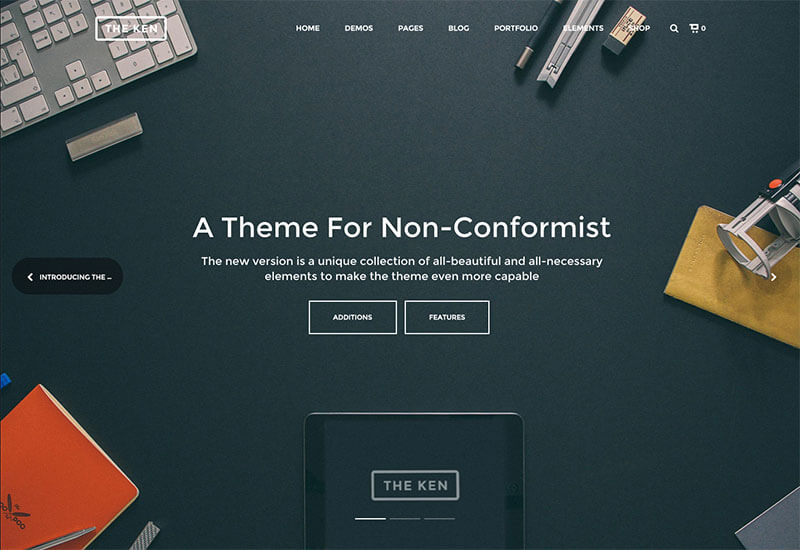
“If you find tools and master those, you’ll soon be seen as expert in that field yourself.” this last one can be the very essence of this article! and it’s then when you can share your experience, skills and knowledge with others and contribute to a community in form of events. Thanks Jan a lot for sharing his experience with The Ken creating an event website with us and more importantly sharing his enormous knowledge in WP related areas via rich events such as The WPSummit and such. If you have a similar experience running or managing an online event via a website don’t hesitate to share it with us in comments section.


No comment yet, add your voice below!