As we discussed earlier in the first post of the series JupiterV5 case study, The Curious Case of Updating Large WordPress Themes, next to theme size, extendibility, speed, and performance, one of the pros we mentioned with regard to providing a major update to our large and popular WP theme was new features. In order to fulfill this objective we were determined to deliver great website user interface features, visual additions. In the third part of our JupiterV5 case study series I, as the art director of this project, will take you through the ins and outs of our visual contributions to Jupiter including UI additions, templates and more.
As you may know, Jupiter V5 hit the ThemeForest last week. It can undoubtedly be considered a big update as its codebase has been thoroughly re-imagined which, in turn, resulted in a massive jump in performance. Apparently, though, we didn’t need to think about redefining the same essential and macro-level improvement to the Jupiter UI the same way we did for the application backend. So what exactly did we need?
Well, in contemplating ways to improve Jupiter, we realized that Jupiter is actually already a beautiful theme and, despite what you may think, this fact does not work in our favour. “Why?” you might ask. Because improving an already sophisticated theme with good UI standards is far more difficult than doing so for an average theme to look better and more up to date. Therefore we couldn’t have just added some new shortcodes or a bit more formatting options to Text Block shortcode and name it a visual improvement. The point we arrived at was that the extendible future of V5 we depicted in the ideation phase for Jupiter would only be achievable if the theme could offer as much customizability in the front-end as it’s capable of with the existing underlying code. We knew, therefore, that this would require a very significant and well thought out transition!
1- The Transition from “Preset” to “Set It Yourself”
Most of Jupiter users chose customizability as the first and most important reason they’re using this theme. So why not push Jupiter’s customizability even further? I remember years ago when we were working on the first version of Jupiter. Since then our motto has always been to provide more customization capabilities to our users which was the underlying intention for tools like “background customizer” or “banner builder”. Almost 65% of our users chose “Flexibility” and “Customizability” as the top reasons they’re happy with Jupiter.
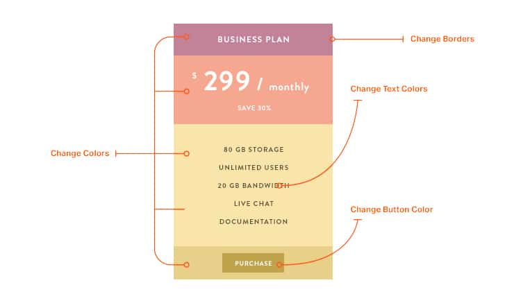
Nevertheless, we still saw that there were some elements in Jupiter which lacked these characteristics. So going forward, we tried to expand the possibilities of customization in almost all new shortcodes and tweaking some of the old shortcodes to be more flexible. This was, in our view, the most direct way of providing more freedom to designers, though it certainly came with some bumps along the way. In one instance, the old pricing table was no easy feat due to design and compatibility barriers so we decided to put it aside and create a new shortcode which is more “customizable”, naming it the “Pricing Table Builder”. With this new shortcode, you can even change the colors, borders and manage contents!
2- Reading Experience
Another area where Jupiter (and most of multi-purpose themes) can improve is typography and, particularly, reading experience. Multi-purpose themes, in order to provide versatility, usually only focus on shortcode collection numbers and the number of templates, often forgetting to put the same amount of attention on increasing utility for bloggers and writers. Having in mind the emergence of great blogging rivals to WordPress such as Medium as well as upcoming new Facebook Notes, we also wanted to take the time to consider how we could improve the reading experience for our products.
A Blog holds a special place in a website that is meant to be read and only read. Blogs usually inherit the same typography style that has been created for the whole website. Typically there aren’t any specific “typography settings” for blogs and having these settings could be a great opportunity for our precious blogs, offering customizability for various line heights, typefaces and font sizes. Sure, you can use WordPress text editor options to some extent to customize your text but this can have its own downsides. First and simplest, some settings like “Line height” or “font family” are not available with this type of text editor. Second, whichever changes you make are only local. That means you’ll have to redo everything again for your next posts.
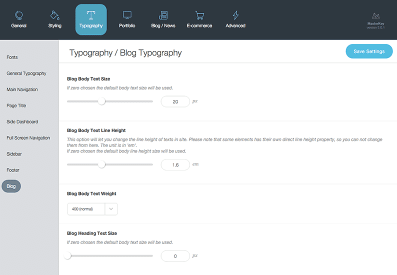
In Jupiter 5, we have integrated all these important typography settings into a new interface. This interface will give users the ability to modify the settings needed for customizing the blog section of a website. The coloring of blog elements, line heights, font sizes, font families and few others will ensure a highly customized blog reading experience. Once you’ve saved your changes, it will apply to all your blog posts from the past and future.
3- Font
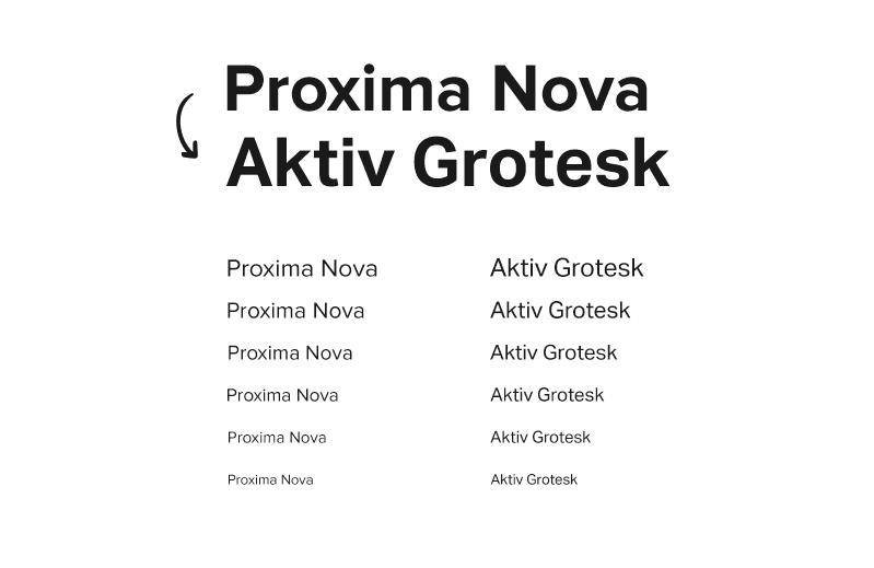
First it was Google, then Facebook, Dropbox and others followed suit. There is a trend of changing logotype with a new wave of fonts that are emerged when Google rebranded themselves with Alphabet and Apple debuted their iOS 9.0. Most of the time you can’t attribute the sudden emergence of a trend to any specific given reason, but in this case it was apparent that companies such as Google, DropBox and Apple were concerned about legibility, in particular for small sized font. You’ll notice if you compare Apple’s recently-introduced official typeface ‘San Francisco‘ to its former ‘Helvetica’ how much more readable it is in comparison. Because we had the same concerns about Proxima Nova, we decided to replace the lovely and popular font with a more legible yet beautiful typeface Aktiv Grotesk pulled from the Adobe Typekit collection. Just like Proxima Nova, Aktiv Grotesk looks great on all weights, capitalized and lowercase but unlike Proxima Nova, it preserves its aesthetic appeal and function even on very small sizes.
4- Smart and Organized Settings
We’ve been talking a lot about customizability but not much about how to offer that customizability. As we’ve mentioned, multi-purpose themes, especially the ‘monoliths’ (see this post to learn what it is) are often bundled with simply too many shortcode settings that promise to deliver customizability, but end up in an overcrowded window full of options that take forever to navigate! Shortcode setting dialogues in previous generations of Jupiter were also quite messy and confusing. Settings were piled on each other without any rhyme or reason. For example in “page section” shortcode settings, there are almost 50 options to choose. Before they were all on a single page and you had to scroll down multiple times to find what you were looking for. In the latest Version 5 though, we keep the basic options in the first tab and moved less important ones to next tabs.
Also, we made some changes to dependant options. Take page section shortcode as an example. If you aren’t looking to have a video background why would you need an option for a “video loop”? We tried to fix this by removing unnecessary options from the default view so that they’ll be available when you actually need them. This helps your settings to be more concise, straightforward and easier to use.
5- Rise of Gradients
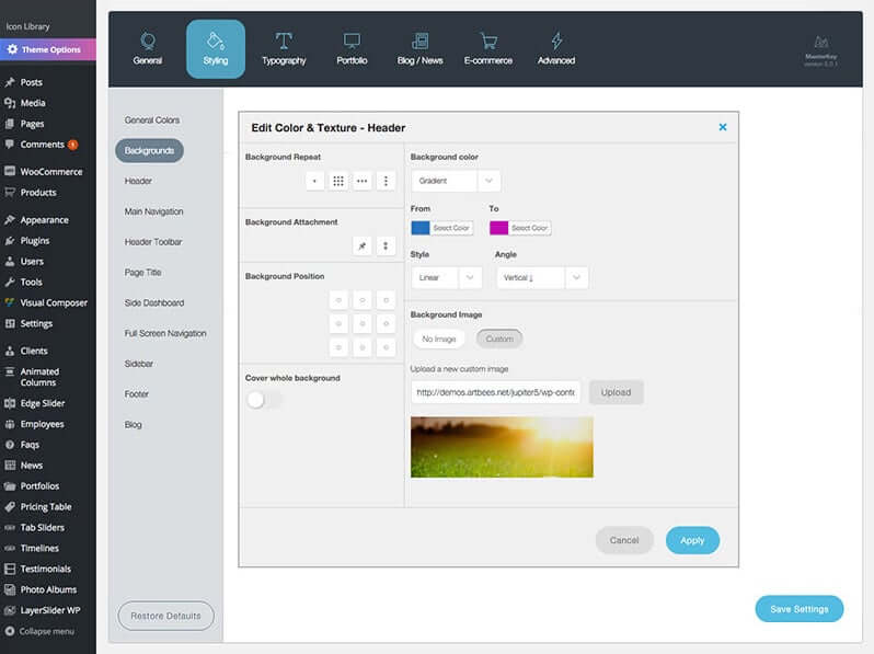
Website user interface trends are changing so quickly that even your newly finished website may look outdated after a while. At Artbees Themes we work tirelessly to stay ahead of the game and offer the latest trends by providing the regular new template updates. These updates are created using the existing elements collection and yet we found there to be one very significant missing element: Gradient colors. As you may have noticed, gradient colors are the new rage and are being used everywhere.
The last noteworthy example I came across was Asana‘s new interface. Designers have been using gradient coloring for years in graphic design applications but up until now it was only used experimentally in websites. Since the first proposal Apple implemented in 2008, the syntax of linear-gradient has evolved substantially and become a commonly used feature in most modern browsers.
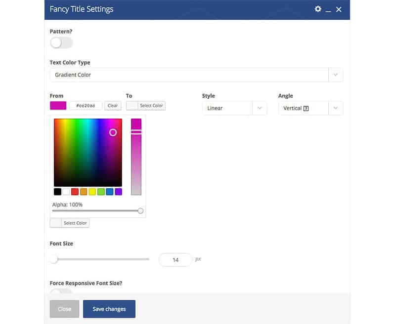
So it was only fitting that we implement this component into the Jupiter V5 to enhance features such as the custom box, icons, buttons, and fancy titles. Previously Jupiter users were only partially using gradient colors on some elements with the help of custom css or static images. That’s all changed now though! From now on gradient colors can be applied easily using a native and bullet-proof interface.
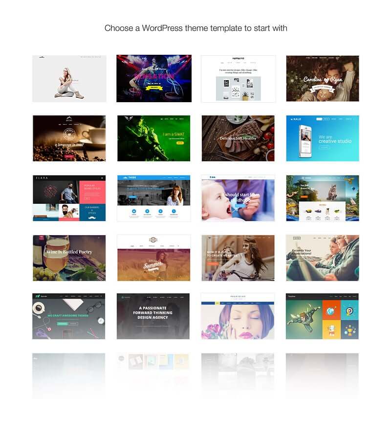
6- Templates
Templates are an integral part of modern WordPress themes. Last summer we launched our template repository along with our theme portal, artbees-themes.com. Given that this is a great way to start the path toward customizing your website, we found this to be a great boost to our theme. At that time, with the launch of artbees-themes.com we had promised to deliver a new template every week. In order to accomplish this while maximizing theme compatibility with leading website user interface trends we prepare a list of missing niches or user requested sectors and put a team of 4 designers together to create a collection of templates reflecting these. Using this strategy, we prepared over 20 new templates using the new V5 features, incorporating its different headers, elements and styles as a testament to the V5’s increased capabilities.
Always a Work in Progress
When it comes to the Jupiter, particularly its visual features and function, we’re always finding ways to make it better and more versatile. Apart from that, there are some new shortcodes and post types that are on the way. First, we’ve extended the optionality for some of the most commonly used shortcodes such as the “custom box” or “page section”. You can also look forward to new layouts for headers, blog posts and a whole new admin panel. Yes, that’s right we created a whole new UI for you and it looks amazing! What you get now is a richer variety of coloring and shading, a more interactive environment and better usage of space. We’re not done yet though! Always a work in progress, you can be that we’ll continue to improve this new modular interface based on the feedback from our users.
As a member of our design team, I was thrilled to be a part of this project. Trying to find ways to improve an already high-performing WP Theme such as the Jupiter and eliminate annoying quirks for our users was a gratifying challenge to take on. With this type of work you can evaluate your design skills as a problem solver which I believe is the most important role for a designer. We identified the aforementioned areas worth improving in order to make the Jupiter better comply with its new modern back-end structure. Though what makes Jupiter’s new architecture what it is, is its ability to reform and extend over the needs and circumstances of the market and industry in the future. So our mission in the design team is a progressive one that may last forever. Jupiter is meant to be a trailblazer and thanks to its new architecture, it will constantly be adapting to offer new website user interface features, characteristics and capabilities in order to ensure aesthetic and UI versatility and innovation.
The best way for us to realize this mission is to ask you, our users, what you think about our V5 visual additions and improvements! We welcome any and all feedback and will work to take your contributions and integrate them into the V5. Now that’s customization!

4 Comments
Another great article that goes beyond just the Jupiter update. You guys are CRUSHING IT with well-thought-out and well-executed updates. Jupiter is easily my favorite WP theme/framework. Keep up the great work!
Thanks. It is great to hear this once in a while 🙂 Hope you enjoy the new version as well.
Great article and theme! is there any place I can see a comparison of the new Jupiter to the latest Ken themes? I have been using The Ken extensively but am curious how this new Jupiter compares/differs….. Thanks!
Maybe comparing the templates they offer can give you a clue which one to choose.
https://themes.artbees.net/template/ 😉
However there is major update and multiple new template are coming to The Ken as well.