Minimalism refers to an economic usage of elements in design. Each element should have a meaning or carry out an important role in the text as if being void of it would result in a lack of something in the text (text here refers to any form of cultural product like graphic, photographic novel, and so forth). Minimalism not only functions as an aesthetic tool but also as a way of showing specific meanings in the content. While minimalism has its roots in Eastern art and culture it has been widely used in Western forms of modern art as well.
Web design as an independent form of graphic design has had its own approach to minimalism over the years. Early forms of web design were maybe unconsciously forms of minimal designs due to the limited design possibilities the web had to offer to designers. While getting improvements and additions over the years, web design approached or moved away from the minimal design aesthetics. Modern forms of web design, including design trends from just last week, have all the tendencies of minimal design.
You have seen websites with large intro images and single textual elements right in the center, or layouts with a paragraph of text surrounded by large areas of white space. Yes you guessed it right, navigation bars that pop up on the screen and occupy the entire viewport, or section-based layouts each filled with a small set of elements are all instances of a minimal approach to design. But how can we obtain a unique approach to minimalism in our web page layout, and what capabilities does WordPress have to offer?
How Does It Work?
In a minimal design, every element gets double the value and weight. We should therefore be picky on the elements we choose to bear that responsibility. In this article we’ll discuss the basic layout sections and see how the minimal approach can apply to each of these sections. Before we start though, let me explain the very concept of minimalism through the fundamental definition of positive and negative space in graphic design.
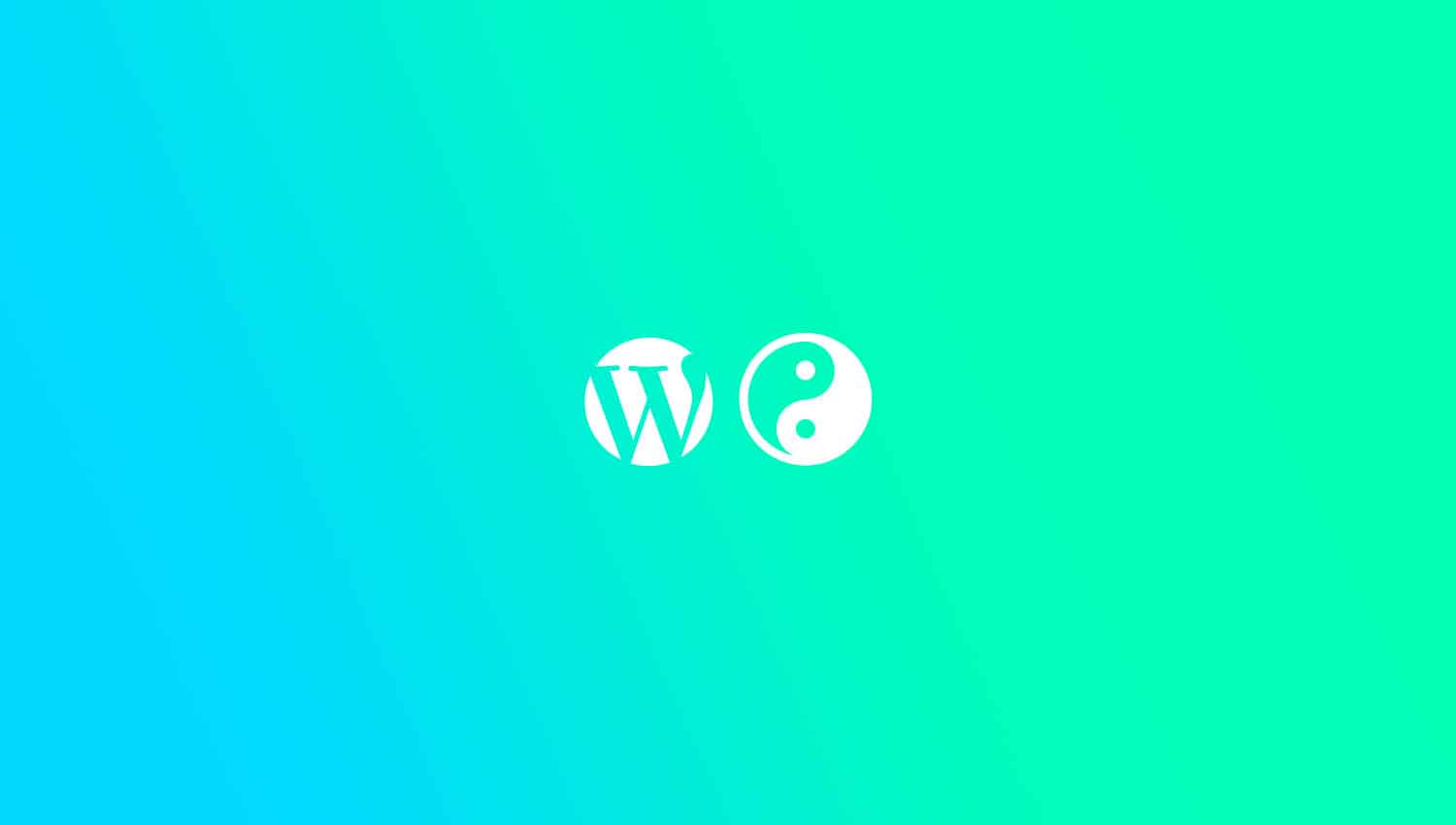
One of the first lessons a graphic design student learns in school is the definition and function of positive and negative space. All of the canvas is occupied with negative space unless we put something in it. A dot, a line, a shape, or a letter we paint on our white canvas, a film frame or a piece of stone are all examples of positive spaces occupying some of the negative space. Let’s look at the WordPress logo:
![]()
We can identify the positive/negative space as the following:
![]()
Concept of negative/positive space is very important in all areas of visual arts from graphic design, photography, sculpting, industrial design, interior design, painting all the way to architecture. One of the most important missions of a visual artist is to decide on the usage and correlation between the negative and positive spaces on the canvas. A good visual artist can create a solid correlation between these two visual poles. All other fundamental factors of visual design like balance, composition, contrast, etc. are derived from this correlation.
So when we are talking about minimalism we are talking about none other than keeping this correlation minimal and economical. A wise and economic usage of positive space on the canvas assures a seamless, meaningful transfer to your audience and assures the lifespan of a visual piece as it will hardly be affected by trends and seasonal visual popularities. If you want to know the bottom line of minimalism, remember that it’s nothing but the usage of a small dose of positive area surrounded by a large negative space.
How to Achieve Minimalism in WordPress Templates
Intro is Everything
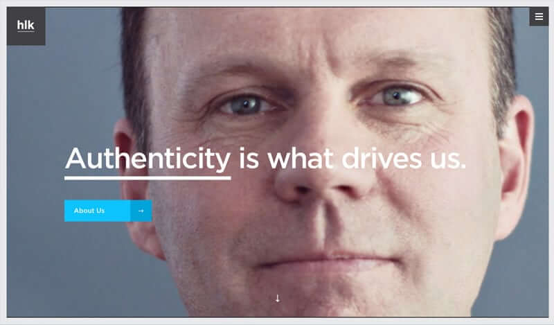
Yes! This is maybe the best spot where you can express your design perspective and understanding and where you are given a chance to hunt your user’s attention. Your user may decide to stay on your page and learn more about your service or skills or decide to leave right away. And if you want to advertise your minimalist passions upon arrival to your site, look no further than your landing page intro.
Try Transparent Header Scenarios or No Header at All!
Vertical or horizontal header menu navigations each occupy a noticeable horizontal or vertical part of your viewport. Transparent headers will melt into your general layout and will not attract unnecessary attention or occupy your valuable space. But you can reduce the area your header navigation area occupies even further. Modal navigation scenarios which are triggered by burger icons are actually leaving no trace of header navigation in your handsome intro layout. Your audience simply clicks on a burger icon and will see your navigation links.
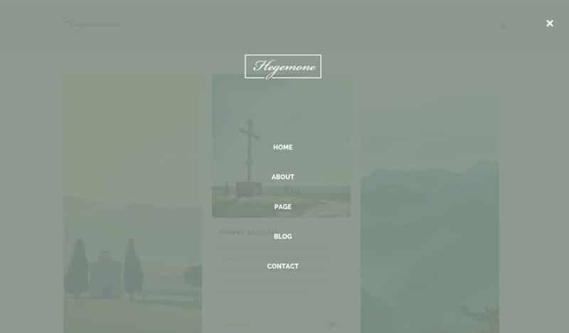
Place Yourself in the Center of the World!
You are not only your name, title, and logo. Your great slogan can do better than your name can do to introduce you. A great line of text written by a creative copywriter can transfer book-worthy messages about you and your business. Accompany that text with one or two CTO buttons all centered vertically and horizontally on your page.
Use Sections
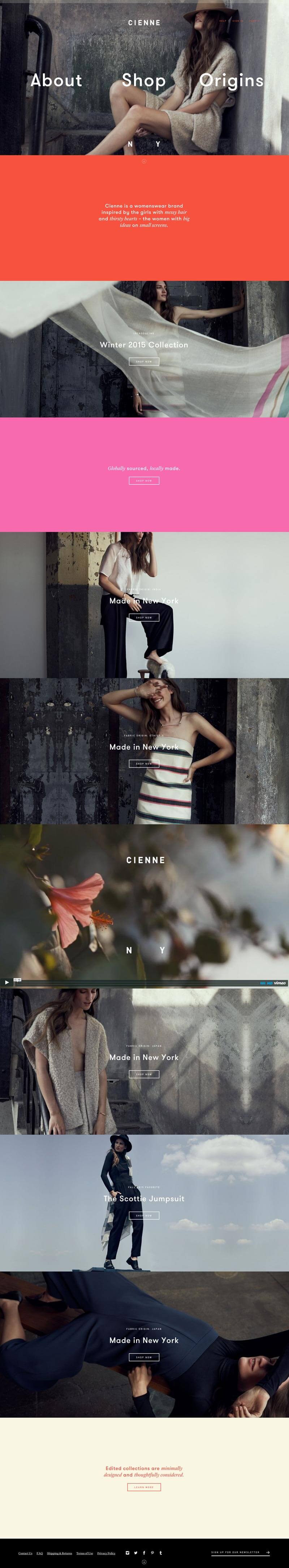
Cutting down the content and releasing it slowly in intentional small doses for no clear reason will annoy your user. Using sections is a good way to familiarize your user with small and creative consumption of your content. It implies a journey that you and your user will take together instead of a one-way relation in which you feed your audience and he/she consumes it. When you use section-based layouts, you can simply provide one element or component of your content for consumption at a time, for example a title, an icon, and a paragraph of text only, or an image, a big milestone you recently hit, and a description text only.
Tip: Use expandable page sections to save space and present your content interactively. A good scenario for an expandable page section is creating a section with an intriguing symbol that reflects the content inside and that once clicked expands to show the full content of the section.
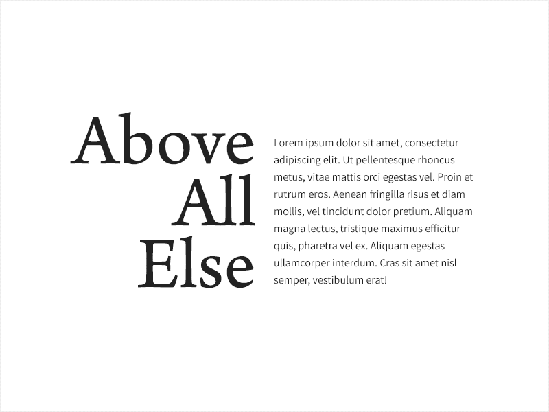
Leverage Great Typography
A wise usage of serif and sans-serif will guarantee a visually-appealing yet minimal composition to your audience’s eye. Pick a large serif for a short title element (usually 1-4 words) and accompany it with a small paragraph of sans-serif text or vice versa. Leave some sections of your layout calm with just a handful of beautiful words. Here is a handful of fonts we’re in love with here in Artbees Themes:
Serif
Sans-Serif
and here are some examples of them used together:
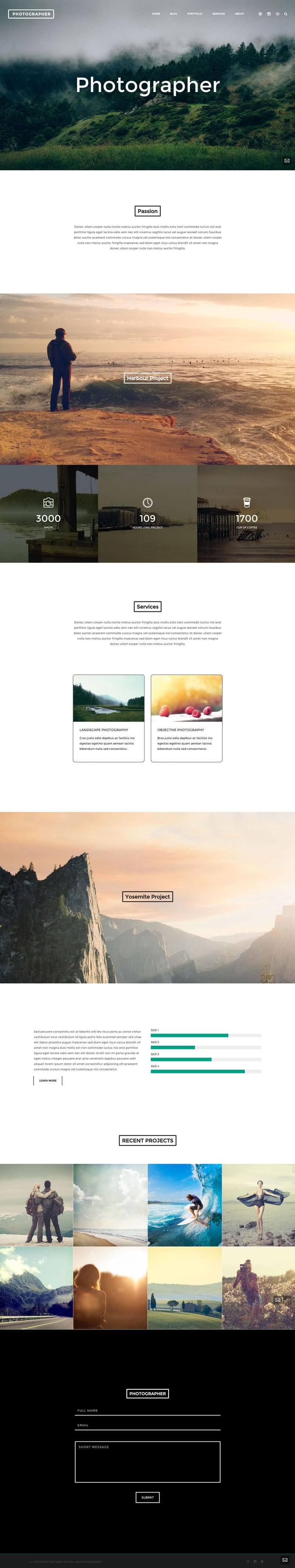
Accompany Text with Eye-Catching and Large Imagery
Use large areas of an image with no other element next to or over it, or use large images with a single element (like a large letter or an icon) over it. Remember when we’re talking about imagery, it includes videography as well. Using a large video section as a context to a single letter or shape will make an even better composition.
Bonus tip:
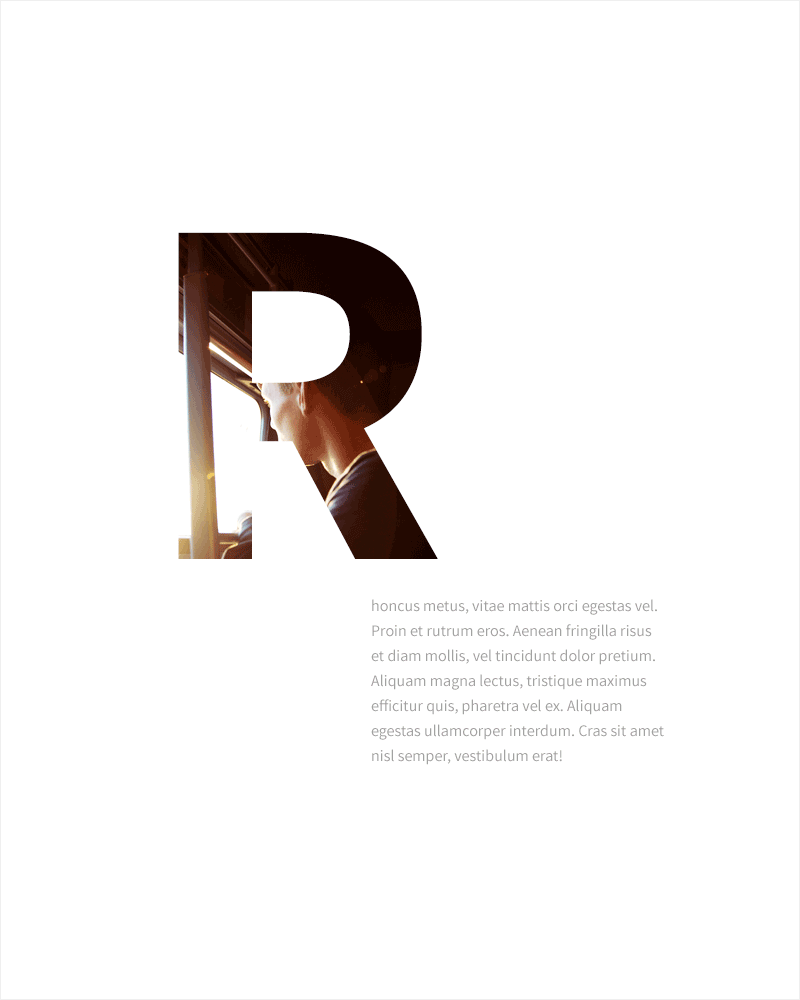
Clip Mask Large Type Faces with High-Res Imagery
This will add a unique look to your design and mix the beauty of text and image on your canvas in a perfectly minimal way.
Use One-Page Websites
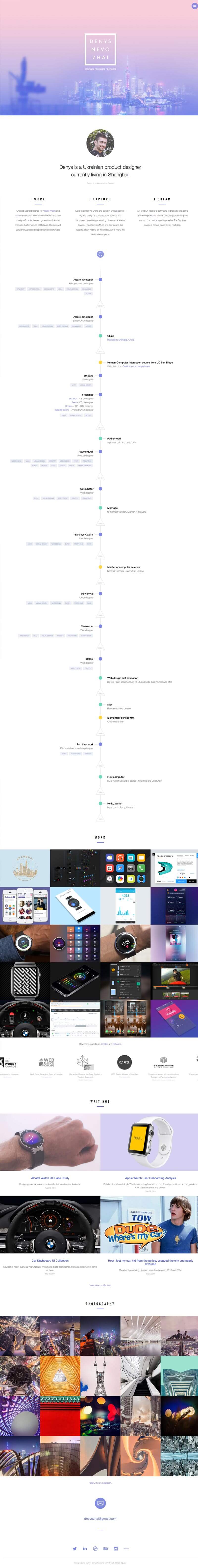
We’re hearing recently more than ever that the era of one-page websites is coming to its end, although this looks far from imminent and at least not about to happen anytime soon. The reason is even more prevalent in single-scroll surfing habitats, thanks to scrolling titans like Facebook and Pinterest. (And why doesn’t Dribbble embrace this lovely trend by the way?! Even though its ancestors such as DeviantArt pioneered it years before regular social networks!) So in order to keep up with the trend, always remember this one rule: Always do your best to feed your audience with enough of a dose of content on the same page they land, so you can hunt their interest and keep them interested for further browsing on your site. Single page websites can best serve that purpose. That’s also what most of the converting landing pages are doing. But the desire to keep your content deliverable only through a single page should not give you a crowded messy web page with a nasty layout. On a single-page website, your mission is to narrate a story with as many visual elements as you can (see how Denys Nevozhai describes his story and presents his portfolio in his one-page website).
Try to:
- Sketch a linear or nonlinear description of your business, product or company
- Appoint each key point of your story to one section, for example: product description, product categories, featured product image, testimonials, clients, pricing, and CTO.
- Create and define one symbol for each section of the story. A symbol is the visual equivalent of its parent section. For example you can use a heart icon for the testimonials section, a happy user face in the clients section, and so forth.
Once-per-Scroll Sliders
Once-per-scroll sliders can also help achieve a good section-based minimal experience. If you’re using one of the modern Artbees Themes, there is a rich slider feature called EdgeOnePager through which you can create full screen sliders that get triggered once per each mouse wheel scroll. You can include every element of your story inside a once-per-scroll slider and provide your audience with a unique and clean scrolling experience. Once-per-scroll sliders are also great for minimal portfolio presentations.
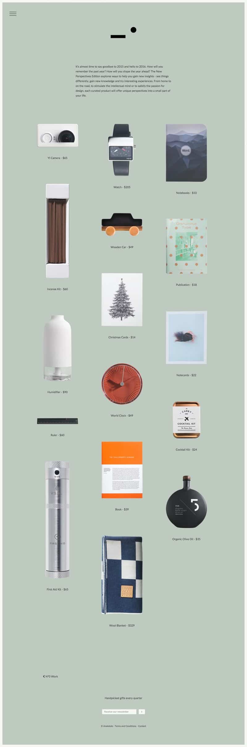
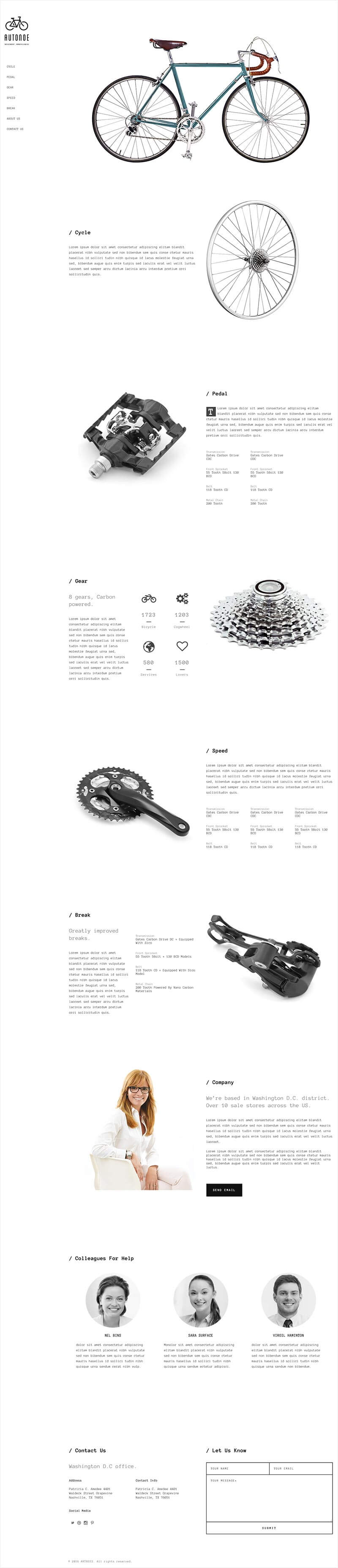
Use Some Isolated Images
If it’s possible, list your products with isolated images. Removing their background or surrounding areas will help give a seamless perception of the object over your canvas and create a good positive/negative space correlation. This idea also perfectly works with one-page websites.
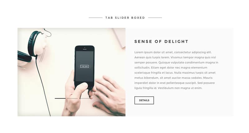
Use Interactive Content Containers in WordPress
Shortcodes like tab slider, flip box, icon text, animated columns, expandable page sections, and such can help you save a good amount of space by organizing the content in interactive containers.
“Nothing” is a Critical Part of Your WordPress Layout!
Let me make one thing clear with you. In order to become a good minimalist designer, you should identify both the used space and unused space equally. You should also believe in the fact that design is not only about adding visual content to your canvas, but also about avoiding using visual elements on the canvas. It’s not only shortcodes, sliders, blog styles, animations, and such that shape your design elements. You should consider ‘nothing’ as a design element as well. There are many minimal WordPress themes out there that offer a good balance of positive and negative content.
The rules we have discussed here do not exclusively apply to WordPress templates but are true for every website layout, regardless of the CMS or application you use to create them. But WordPress as a popular CMS can provide you with great possibilities to facilitate the creation of these kinds of layouts, some of which we discussed in this article. What other ways do you use to achieve minimalism in your layout? Let your fellow web designers know in the comments!

2 Comments
Great post. Negative space is critical in beautiful design.
Hello,
Hope you are doing well.
Bein an experienced blogger, I am really impressed with the content you’re producing for your website
I’ve got some great content ideas below that I believe would do well for your readers.
1) Ecommerce Upselling: 6 Best Practices to Leverage Your Sales & Make The Most Revenue.
2) Plan for the 2021 Holiday Shopping Season: 10 Ways to Prepare for Shipping Demands.
3) Getting Success: How to Search For The Right Mentor For Your Business.
4) Demand Generation Strategy: How To Attract More Leads in 2021.
5) Starting Your First Venture? Here’s What You Need to Become a Business Owner.
6) eCommerce User Experience: Reducing Buyer Friction
Let me know if you are interested and I’ll send you the high quality article on any suggested topic..
Thanks,