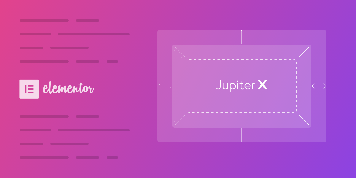
Every Elementor’s widget is composed of different input types called a control. A control is used to construct the interface of a widget. Using controls allows us to customize and set our favorite settings for a widget and see a live preview of it.
Before diving headfirst into this article, we suggest that you check out the following articles.
- Extend Elementor like a pro: Creating a new extension in Elementor
- Extend Elementor like a pro: Creating a New Widget
Elementor control
In default, Elementor has several control types like Text, Color, Dimension, Select, Icon, Media, Typography and so on that meet most common usages. But sometimes we need to create a custom control to realize our needs.
Directory Structure of a Control
Normally, each control contains three files as PHP, JavaScript, and CSS:
- control.php
- js/control.js
- css/control.css
PHP File
The PHP file generates HTML and constructs UI of control in Panel. To create the PHP file, we need to extend the Base_Control abstract class.
The Base_Control provides several methods.
- get_type: retrieve the type of control.
- content_template: render the HTML output in Panel.
- enqueue: use to add CSS and JavaScript files to control.
- get_default_settings: retrieve the default setting of control on initialisation.
- get_default_value: retrieve the default value of control.
- get_value: determine how the control returns its value.
- get_style_value: interact with the CSS rule that passed with Selector argument.
Elementor allows for five base classes to extend Base_Control for different purposes. We can extend the following classes to create new controls. For more info, you can refer to this page about Elementor controls.
- Base_UI_Control: creates a UI control that is visible in the panel and doesn’t return any value. For example, Heading control.
- Base_Data_Control: a base class that returns a single value. For example, Number Control.
- Control_Base_Multiple: a base class that returns multiple values. For example, Media control.
- Control_Base_Units: a base class that returns unit based values. For example, Dimension control.
- Group_Control_Base: a base class for creating group control. For example, Typography control.
JavaScript File
The JavaScript file is used for interacting between UI and live preview and manipulate events that are related to control.
The Elementor uses the Backbone.js library for JS manipulation. For more information about Backbone.js, you can check out backbonejs.org and https://www.javatpoint.com/backbonejs-tutorial
Also in Elementor, there is an exclusive JS file for each PHP file that interacts with them. For instance, the above base PHP classes have JS files such as:
- base.js
- base-data.js
- base-multiple.js
- base-units.js
To create a new control JS file, we need to extend one of the above JS files. You can find the source of the JS file at GitHub.
Note: For some reason, Elementor merges all JS files in the editor.js file. We can extend the above JS file from by using the elementor.modules.controls object.
CSS File
CSS allows us to style the UI of a control. In the following sections, we’ll go into detail about the actual usage of CSS.
Creating a Custom Control
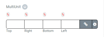
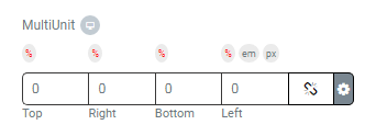
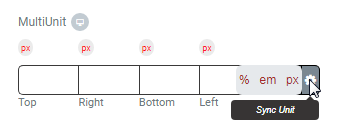
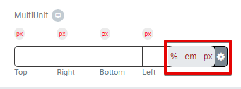
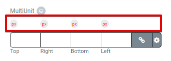
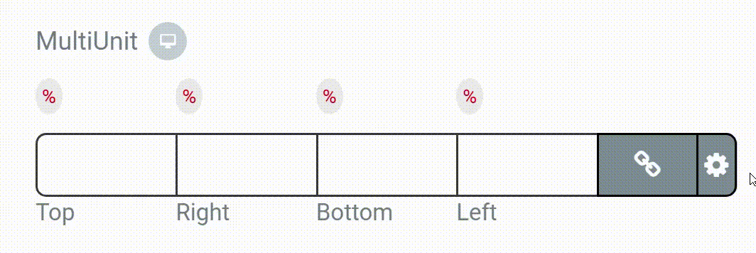
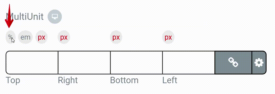
Now that we have gained a basic understanding of an Elementor control, we are ready to create a custom control called MultiUnit, which is similar to Elementor’s Dimension control.
In the Dimension control, we can only set the same unit (px, em,…) for the top, right, bottom and left values, but in MultiUnit control, we can set a different unit for each value.
At the end of this article, we’re going to create the following control.
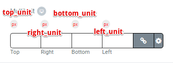
| Default Values | Return Values (Array) |
| [ ‘top’ => ”, ‘right’ => ”, ‘bottom’ => ”, ‘left’ => ”, ‘top_unit’=>’px’, ‘right_unit’ =>’px’, ‘left_unit’ =>’px’, ‘bottom_unit’ =>’px’, ‘isLinked’ => true, ]; | [ ‘top’ => ”, //int ‘right’ => ”, //int ‘bottom’ => ”, //int ‘left’ => ”, //int ‘top_unit’=>”, //string ‘right_unit’ =>” //string ‘left_unit’ =>”, //string ‘bottom_unit’ =>”, //string ‘isLinked’ => ”, //bool ]; |
Directory Structure of a Custom Control
- index.php
- multi-unit.php
- css/MultiUnit.css
- js/MultiUnit.js
You can download the full source code from Github.
Creating the PHP File
To create a custom control, we need to have a unique type. For our control, we’ll choose spicy-multi-unit-control.
Our control extends Control_Base_Multiple and overrides essential functions, as well as creates custom functions to meet our needs.
In this section, we’ll go into detail of each function one-by-one:
1. The below function sets the control type.
public function get_type() {
     return 'spicy-multi-unit-control';
 }
2. This function returns the default values of the control.
public function get_default_value() {
     return [
         'top' => '',
         'right' => '',
         'bottom' => '',
         'left' => '',
         'top_unit'=>'px',
         'right_unit' =>'px',
         'left_unit' =>'px',
         'bottom_unit' =>'px',
         'isLinked' => true,
     ];
 }
3. The below function returns the default settings of the control.
protected function get_default_settings() {
   return [
       'size_units' => [ 'px' ],
       'label_block' => true,
       'range' => [
           'px' => [
               'min' => '',
               'max' => 100,
               'step' => 1,
           ],
           'em' => [
               'min' => 0.1,
               'max' => 10,
               'step' => 0.1,
               ],
           'rem' => [
               'min' => 0.1,
               'max' => 10,
               'step' => 0.1,
           ],
           '%' => [
               'min' => 0,
               'max' => 100,
               'step' => 1,
           ],
           'deg' => [
               'min' => 0,
               'max' => 360,
               'step' => 1,
               ],
           'vh' => [
               'min' => 0,
               'max' => 100,
               'step' => 1,
           ],
           'vw' => [
               'min' => 0,
               'max' => 100,
               'step' => 1,
           ],
       ],
   ];
}
4. This function is used for adding JavaScript and CSS files to the control:
public function enqueue() {
     wp_enqueue_script( 'spicy_multi_unit',plugins_url( 'https://d3pa45a5f8vwb1.cloudfront.net/js/MultiUnit.js', FILE ) );
     wp_enqueue_style( 'spicy_multi_unit' , plugins_url( 'https://d3pa45a5f8vwb1.cloudfront.net/css/MultiUnit.css', FILE ) );
 }
5. The below function renders a button that is used to sync all units together.
private function print_link_unit_template(){
    ?>
    <# if ( data.size_units && data.size_units.length > 1 ) { #>
                                                    Sync Unit                                    <# _.each( data.size_units, function( unit ) { #>                {{{unit}}}            <#});#>
     <#}#>
    <?php
 }
6. We’ll use the below function to create a unit for each input:
private function print_units_template($arg){
    ?>
    <# if ( data.size_units && data.size_units.length > 1 ) { #>
                    <# .each( data.size_units, function( unit ) {            if(unit=='px' && data.range.px.step < 1){                data.range.px.step=1;            }            #>                        {{{ unit }}}            <# } ); #>
    <# } #>
    <?php
 }
7. Finally, the essential function for creating the UI:
public function content_template() {
    $dimensions = [
        'top' => __( 'Top', 'Spicy-extension' ),
        'right' => __( 'Right', 'Spicy-extension' ),
        'bottom' => __( 'Bottom', 'Spicy-extension' ),
        'left' => __( 'Left', 'Spicy-extension' ),
    ];
 ?>
   <div class="elementor-control-field">
    <label class="elementor-control-title">{{{ data.label }}}</label>
    <div class="spicy-control-input-wrapper">
     <div class="units-wrapper">
       <div>
        <ul>
          <?php
            foreach ( $dimensions as $dimension_key => $dimension_title ) :
               echo '<li>';
          ?>
          <# if ( -1 !== _.indexOf( allowed_dimensions, '<?php echo $dimension_key; ?>' ) ) { #>
             <?php                      $this->print_units_template($dimension_key );
             ?>
          <# } #>
                 <?php
                   echo '</li>';
                   endforeach;
                 ?>
         </ul>
    </div>
   </div>

   <div>
     <ul class="spicy-control-dimensions">
       <?php
         foreach ( $dimensions as $dimension_key => $dimension_title ) :
            $control_uid = $this->get_control_uid( $dimension_key );
       ?>
         <li class="spicy-control-multiunit">
         <#
          var unit=data.controlValue[<?php echo "'". $dimension_key.'_unit'."'"; ?>];
         #>
          <input id="<?php echo $control_uid; ?>" type="number"  data-name="{{data.name}}-<?php echo esc_attr( $dimension_key ); ?>" min="{{ data.range[unit].min}}" max="{{ data.range[unit].max}}" step="{{ data.range[unit].step}}" data-setting="<?php echo esc_attr( $dimension_key ); ?>"
    placeholder="<#
                   if ( _.isObject( data.placeholder ) ) {
                    if ( ! _.isUndefined( data.placeholder.<?php echo $dimension_key; ?> ) ) {
                       print( data.placeholder.<?php echo $dimension_key; ?> );
                       }
                      } else {
                              print( data.placeholder );
                             }
                     #>"

   <label for="<?php echo esc_attr( $control_uid ); ?>" class="spicy-control-multiunit-label"><?php echo $dimension_title; ?></label>
         </li>
       <?php endforeach; ?>
         <li>
          <div style="display: flex;">
           <button class="spicy-link-dimensions tooltip-target" data-tooltip="<?php echo esc_attr__( 'Link values together', 'Spicy-extension' ); ?>">
             <span id="spisy-{{data.name}}" class="spicy-linked">
               <i class="fa fa-link" aria-hidden="true"></i>
               <span class="elementor-screen-only"><?php echo __( 'Link values together', 'Spicy-extension' ); ?></span>
             </span>
             <span id="spisy-{{data.name}}" class="spicy-unlinked">
               <i class="fa fa-chain-broken" aria-hidden="true"></i>
               <span class="elementor-screen-only"><?php echo __( 'Unlinked values', 'Spicy-extension' ); ?></span>
             </span>
            </button>
            <?php
             $this->print_link_unit_template();
            ?>
           </li>
          </ul>
         </div>
        </div>
        </div>
        <# if ( data.description ) { #>
        <div class="elementor-control-field-description">{{{ data.description }}}</div>
        <# } #>
        <?php
    }
Creating the JavaScript File
Our JS file is named MultiUnit.js and extends the Elementor BaseMultiple module. This JS file contains a JavaScript class that has several functions, which are explained briefly below.
1. The below function defines the essential UI CSS selectors.
var ControlMultiUnitItemView=
    elementor.modules.controls.BaseMultiple.extend( {
    ui: function() {
     var ui = ControlBaseMultipleItemView.prototype.ui.apply( this, arguments );
         ui.controls = '.spicy-control-multiunit > input:enabled';
         ui.link = 'button.spicy-link-dimensions';
         ui.top_choices ='div.spicy-units-choices > input[type=radio][data-setting=top_unit]';
         ui.right_choices = 'div.spicy-units-choices > input[type=radio][data-setting=right_unit]';
         ui.bottom_choices = 'div.spicy-units-choices > input[type=radio][data-setting=bottom_unit]';
         ui.left_choices = 'div.spicy-units-choices > input[type=radio][data-setting=left_unit]';
         ui.unitLink = '.spicy_link';
         ui.gear = '.spicy_link_first';
         ui.ranges_top = '.spicy-units-choices-label-top';
         ui.ranges_right = '.spicy-units-choices-label-right';
         ui.ranges_bottom = '.spicy-units-choices-label-bottom';
         ui.ranges_left = '.spicy-units-choices-label-left';
         ui.linked = '.spicy-linked';
         ui.unlinked = '.spicy-unlinked';
         return ui;
     }
2. This function defines the related event for each UI element.
events: function() {
  return _.extend( ControlBaseMultipleItemView.prototype.events.apply( this, arguments ), {
   'click @ui.ranges_top' : 'TopRangeToggle',
   'click @ui.ranges_right' : 'RightRangeToggle',
   'click @ui.ranges_bottom' : 'BottomRangeToggle',
    'click @ui.ranges_left' : 'LeftRangeToggle',
    'click @ui.link': 'onLinkDimensionsClicked',
    'change @ui.top_choices' : 'setTopInputRange',
    'change @ui.right_choices' : 'setRightInputRange',
    'change @ui.bottom_choices' : 'setBottomInputRange',
    'change @ui.left_choices' : 'setLeftInputRange',
    'click @ui.unitLink' : 'linkUnit',
    'click @ui.gear' : 'gearToggle',
   } );
 }
3. This defines the essential variables.
defaultDimensionValue: 0,
 range_control:'',
 name_control:'',
 gear_check:true,
 range_all:true,
 Range_top:true,
 range_right:true,
 range_bottom:true,
 range_left:true,
4. This defines initial function for control initialization.
 initialize: function() {
 ControlBaseMultipleItemView.prototype.initialize.apply( this, arguments );
 this.model.set( 'allowed_dimensions', this.filterDimensions( this.model.get( 'allowed_dimensions' ) ) );
 this.range_control = this.model.get(['range']);
 this.name_control = this.model.get(['name']);
 }
5. We need a function to select the proper unit when it’s clicked. The below function is used for top_unit.

setTopInputRange : function( event ) {
  var val = $(event.target).val() ;
  var min = this.range_control[val].min;
  var max = this.range_control[val].max;
  var step = this.range_control[val].step;

  $('li.spicy-control-multiunit > input[type=number][data-name='+this.name_control+'-top]').attr({"min":min,"max":max,"step":step});
}
We’ve also declared similar functions for right_unit, bottom_unit, and left_unit that you can find in the source code.
6. We need other functions to show/hide units when clicked. The below function is used for the top_unit.
TopRangeToggle : function (event) {
  var cat = $(event.target).attr("data-cat");
  if(this.range_top==false){    $('.spicy-units-choices-label-top[data-cat='+cat+']').not(event.target).hide();
  this.range_top = true;
  }else if(this.range_top==true){
   $('.spicy-units-choices-label-top[data-cat='+cat+']').show();
   this.range_top=false;
 }
 }
We also declared similar functions for right_unit, bottom_unit, and left_unit.
7. The function below syncs top_unit, right_unit, bottom_unit and left_unit together.
linkUnit : function(event) {
  var text=$(event.target).text();
  $('div.spicy-units-choices > input[type=radio][name=spicy-choose-'+this.name_control+'-top][value='+"'"+text+"'"+']').prop("checked", true).trigger('change');
  $('div.spicy-units-choices > input[type=radio][name=spicy-choose-'+this.name_control+'-right][value='+"'"+text+"'"+']').prop("checked", true).trigger('change');
  $('div.spicy-units-choices > input[type=radio][name=spicy-choose-'+this.name_control+'-bottom][value='+"'"+text+"'"+']').prop("checked", true).trigger('change');
  $('div.spicy-units-choices > input[type=radio][name=spicy-choose-'+this.name_control+'-left][value='+"'"+text+"'"+']').prop("checked", true).trigger('change');
  $('div.spicy-units-choices > input[class='+this.name_control+']').not(':checked').next().hide();
  $('div.spicy-units-choices > input[class='+this.name_control+']:checked').next().show();

this.allRangeToggle(event);
 }
Finally, we have other functions that are similar to the JS file of the Dimension control and other custom functions that we haven’t explained. But you can find them in source code.
Creating the CSS File
To style the UI of control in the panel, we need CSS rules as seen below.
ul.spicy-control-dimensions {
 width: 100%;
}

.spicy-control-input-wrapper ul li {
 width: 20%;
 float: left;
}

div.spicy-units-choices > input {
 display: none;
}

div.spicy-units-choices > input:checked+label {
 color:red;
}
.spicy-control-multiunit > label {
 font-size: 11px;
}

div.spicy-units-choices > input:not(:checked)+label {
 display:none;
}

.spicy-link-dimensions {
 width:90%;
 height: 30px;
 border: 1px solid;
 border-color: black;
 background-color: #7a8791;
}

div.spicy-units-choices > label {
 border-radius:50%;
 padding:3px;
 font-size:9px;
 background-color:#ebebeb;
 line-height: 16px;
}

.units-wrapper {
 height :29px;
 margin-top: 5px;
}

.units-wrapper ul li {
 margin-bottom: 0px;
 margin-top: 4px;
}

div.spicy-units-choices {
position: absolute;
}

.spicy_linkAllUnit {
 position: relative;
 height:30px;
 font-size: 14px;
 border-top-right-radius: 5px;
 border-bottom-right-radius: 5px;
 border: 1px solid;
 border-color: black;
 border-left: 0;
 background-color: #7a8791;
}

.spicy-control-multiunit > input {
 border-right : 0;
 border-radius: 0;
 border-color:rgb(58, 57, 57) !important;
 height:30px;
 padding-right: 0;
}

.spicy-control-dimensions >.spicy-control-multiunit:first-child input {
 border-top-left-radius: 5px;
 border-bottom-left-radius: 5px;
}

.spicy_link_first {
 display:block;
 border-radius:5px;
 padding:3px;
 font-size:13px;
 color: white;
}

.spicy_link {
 display:none;
 border-radius:50%;
 padding:3px;
 font-size: 12px;
 color: brown;
}

.spicy-unlinked {
 display: none;
}

.spicy_tooltip {
 width: max-content;
 background-color: #e6e9ec;
 text-align: center;
 border-radius: 6px;
 padding: 5px 0;
 position: absolute;
 z-index: 10;
 top: -1px;
 right: 100%;
}

.spicy-units-choices-label-top {
 position:relative;
 z-index: 5;
}

.spicy-units-choices-label-right {
 position:relative;
 z-index: 4;
}

.spicy-units-choices-label-bottom {
 position:relative;
 z-index: 3;
}

.spicy-units-choices-label-left {
 position:relative;
 z-index: 2;
}
.spicy_link_first:hover .spicy_link_tooltiptext {
 visibility: visible;
}
.spicy_linkAllUnit .spicy_link_tooltiptext {
 visibility: hidden;
 width: 88px;
 background-color: #373434;
 color: #fff;
 text-align: center;
 border-radius: 4px;
 padding: 5px;
 position: absolute;
 z-index: 1;
 right: 0;
 font-size: 9px;
 bottom: -26px;
}
.spicy_linkAllUnit .spicy_link_tooltiptext::after {
 content: " ";
 position: absolute;
 right: 5%;
 bottom: 94%;
 margin-left: -5px;
 border-width: 5px;
 border-style: solid;
 border-color: transparent transparent #373434 transparent;
}
How to Use the Custom Control
It’s time to put the control in action. Follow the steps below in order to use the control.
1. Register the custom control in our plugin using the following codes.
add_action( 'elementor/controls/controls_registered', [ $this,'init_controls']);

public function init_controls() {

  // Include Control files
  require_once( __DIR__ . '/controls/multi_unit.php' );

  // Register control
  \Elementor\Plugin::$instance->controls_manager->register_control( 'spicy-multi-unit-control', new Spicy_multi_unit());

}
2. Add the custom control to any widget. Now, it’s ready to use.
$this->add_responsive_control(
  'multiunit',
             [
              'label' => __( 'MultiUnit ', 'spicy' ),
              'type' => 'spicy-multi-unit-control',
              'size_units' => [ '%','em', 'px' ],
              'allowed_dimensions' =>'all',
              'selectors' => [
                '{{WRAPPER}} .elementor-widget-container' => 'padding: {{TOP}}{{TOP_UNIT}} {{RIGHT}}{{RIGHT_UNIT}} {{BOTTOM}}{{BOTTOM_UNIT}} {{LEFT}}{{LEFT_UNIT}};',
                             ],
            ]
 );
For more information, you can read this article.
Conclusion
In this article, we tried to explain how to create a custom control for Elementor. Also, we describe the essential files of control and the structure of them. Finally, we created a custom control named MultiUnit.
Feel free to share your experiences with us in the comments.

3 Comments
CSS stands for Cascading Style Sheet. Typical CSS file is a text file with an extention.css and contains a series of commands or rules.
thanks for the article.
I have A QUESTION => how to make Elementor custom group control?
hi thank you for this blog but there is a issue
“ControlBaseMultipleItemView is not defined”
what do i have to do for debug it ?