Elementor is packed with various elements or widgets. Widgets allow us to build websites and display appropriate content. But sometimes we need specific functionality for our website. And to do this, we need to create a new widget or element.
What is a widget?
A widget or element is a section in the Graphical User Interface (GUI) that lets us display the information we want to showcase to users.
The Elementor widget is a combination of PHP, JavaScript, HTML and CSS codes that generate a custom output for us. We suggest visiting this link before reading this article.
Elementor Widgets
Each widget has custom controls like input, fields, buttons and more. With these controls, we can set our custom settings and see a live preview in the editor and render the final HTML in frontend.
Widget Structure
In order to create a new widget, we must extend the Widget_Base abstract class. This class has several methods that we first need to override.
<?php
class Elementor_Test_Widget extends \Elementor\Widget_Base {

    public function get_name() {}

    public function get_title() {}

    public function get_icon() {}

    public function get_categories() {}

    protected function _register_controls() {}

    protected function render() {}

    protected function _content_template() {}
}
Widget Name
With the get_name() method, we can set the name of a widget and return the name of the widget.
public function get_name() {
    return 'Widget Name';
}
Widget Title
With the get_title() method, we can set the label of the widget.
public function get_title() {
    return __( 'Widget Title', 'Plugin Name' );
}
Widget Icon
The get_icon() method set the icon for our widget that displayed in the panel.
public function get_icon() {
    return 'eicon-gallery-grid';
}
Widget Categories
The get_categories() method set the category that our widget must be placed on the panel’s categories. In default, there are several categories including the following:
- Basic
- Pro-elements
- General
- Woocommerce-elements
- WordPress
- And so on.
public function get_categories() {
    return [ 'basic' ];
}
We can also create custom categories with the elementor/elements/categories_registered action.
<?php
function create_custom_categories( $elements_manager ) {

    $elements_manager->add_category(
        'custom-category',
        [
         'title' => __( 'Custom Category', 'plugin-name' ),
         'icon' => 'fa fa-plug',
        ]
    );
}
add_action( 'elementor/elements/categories_registered', 'create_custom_categories' );
Widget Controls
With the _register_controls() method, we can set essential sections and controls for the widget.
There are several controls that we can use for widget settings, such as the following:
- UI Controls
- Button
- Divider
- Heading
- Raw Html
- Data Controls
- Text
- Select
- Choose
- Gallery
- Slider
- Typography
- And so on.
- Multiple Controls
- Url
- Media
- Image Dimensions
- Unit Controls
- Slider
- Dimensions
- Group Controls
- Typography
- Text Shadow
- Box Shadow
- Border
- Background
For more information on Elementor controls, you can check out this link.
Widget Template
The render() method allows creating a frontend HTML code with the PHP.
The _content_template() method generates a live preview for the widget in the editor by using the Backbone JavaScript library.
How to add controls to our widget
In default, there are three tabs in the Elementor panel, which are the Content Tab, Style Tab, and Advanced Tab. To add controls to our widget, we should first create a section and assign it to one of the tabs. Then we can add our favorite controls to the section. As mentioned above, we must put our code in the _register_controls() method.
Creating a Section
To create a section, we need to set the following essential parameters:
- Section Name
- Section Settings(label ,tab)
$this->start_controls_section(
     'section_name',//set unique name

          //set setting of section
        [
         'label' => __( 'Section Label', 'plugin-name' ),
         'tab' => \Elementor\Controls_Manager::TAB_CONTENT,
        ]
 );

  //THE CONTROLS COME HERE

$this->end_controls_section();
We must set the following parameters for each control as seen below:
- Control Name
- Control Setting(label,type)
Adding a normal control
Use the following control to add a normal control.
$this->add_control(
    'control_name',//set unique name for control

           //set essential settings
         [
        'label' => __( 'Control Label', 'plugin-name' ),

            //CONTROL_TYPE can be TEXT, SLIDER, ...
        'type' => \Elementor\Controls_Manager::CONTROL_TYPE,
         ]
    );
Adding a responsive control
This control type includes different settings value for desktop, tablet, and mobile devices.
$this->add_responsive_control(
     'control_name',
       [
        'label' => __( 'Control Name', 'plugin-name' ),
           //CONTROL_TYPE can be TEXT, SLIDER, …

         type' => \Elementor\Controls_Manager::CONTROL_TYPE,
           //SET FAVORITE RANGE LIKE PX, %, EM

         'range' => [
                 'px' => [
                        'min' => 0,
                        'max' => 100,
                       ],
                ],
            // SET FAVORITE DEVICES
          'devices' => [ 'desktop', 'tablet', 'mobile' ],
        'desktop_default' => [
                        'size' => 30,
                        'unit' => 'px',
                         ],
          'tablet_default' =>  [
                        'size' => 20,
                        'unit' => 'px',
                         ],
          'mobile_default' =>  [
                        'size' => 10,
                        'unit' => 'px',
                         ],

                ],
            ]
        );
Adding a group control
This control groups several normal controls in one control such as typography.
$this->add_group_control(
//Group_Control_Class can be       Group_Control_Typography,Group_Control_Border or other group controls

  Group_Control_Class::get_type(),
  [
   'name' => 'control_name',
   'label' => __( 'control Label', 'plugin-name' ),
  ]
);
Adding control tabs
Create a tab area to add various controls.
//start tabs area container
$this->start_controls_tabs();

  // create first tab area
  $this->start_controls_tab();

    $this->add_control();

      $this->end_controls_tab();

     // create second tab area
      $this->start_controls_tab();

    $this->add_control();

      $this->end_controls_tab();

$this->end_controls_tabs();
//end tabs area container
Adding control popovers
Create a popover window will allow you to display various controls.
$this->add_control(
   'control_name',
    [
     'label' => __( 'Control Label', 'plugin-name' ),
     'type' => \Elementor\Controls_Manager::POPOVER_TOGGLE,
     'label_off' => __( 'Default', 'plugin-name' ),
     'label_on' => __( 'Custom', 'plugin-name' ),
     'return_value' => 'yes',
    ]
  );

    $this->start_popover();

    $this->add_control();

    $this->add_control();

    $this->end_popover();
How to Display or Hide Sections and Controls in Widgets
At times, you might want to hide some sections or controls in your widget, but using if / else in the code is a hassle. Fortunately, now you can do this conveniently with the condition in the settings for sections or controls.
$this->start_controls_section(
  'my_section',
   [
    'label' => __( 'My Section', 'plugin-name' ),
    'tab' => \Elementor\Controls_Manager::TAB_CONTENT,
    'condition' => [
                       'Name' => 'Value',
                      ]
      //name must be unique name of one control
      //Value must be the return value of control
   ]
);
Let’s say that we have one control named Choose_ Layout with two values first and second. After adding the code found below code to any section or control, our section or control will be displayed if the return value of the Choose_ Layout control is equal to first. And it will be hidden if the return value of Choose_ Layout control is equal to the second.
'condition' => [
                'Choose_ Layout' => 'first',
               ]
How to Change Widget Output Style Automatically from the Control Settings
One of Elementor’s amazing features is the ability to easily change the style of widget output with CSS code and selectors. For example, if we want to change the height of images in output, first we must assign a class attribute to our HTML tag. Then use this class with the selector in settings of control.
<img class="test-img">

$this->add_control(
          'test_height',
            [
             'label' => __( 'Height', 'Spicy-extension' ),
             'type' => \Elementor\Controls_Manager::SLIDER,
             'separator' => 'after',
             'show_label' => true,
             'selectors' => [
                '{{WRAPPER}} .test-img' => 'height: {{SIZE}}{{UNIT}};',
              ],
            ]
        );
How to Get Widget Settings
To create the final Html code in the render() method and live preview in the _content_template() we’ll need input the parameter from the widget controls like height, width, font-size and more. In Elementor, the input parameter is called Settings. We can arrange settings in render() using this method.
$widget_settings= $this->get_settings_for_display();
$widget_settings['control_name'];
For the _content_template() method the Elementor store setting in the settings variable.
settings.control_nameOne important note that we must consider is the settings are saved in a multidimensional array. We can get an inner setting with the following code.
$widget_settings['control_name ']['option'];

settings.control_name.option
Creating a Sample Widget
Below, we have illustrated how to build a gallery widget step-by-step so you can better understand how to cover the topics mentioned above and create an Elementor widget.
Our gallery widget is registered in the Spicy plugin and the root directory of the gallery widget is:
-Css
-gallery.css
-index.php
-widgets
-gallery.php
-index.php
-spicy.php
-index.php
Index.php file is an empty file that prevents a malicious hacker from directly accessing the plugin.
Spicy.php file is the main plugin file that we register our widget with.
Gallery.css file is a CSS file that sets the default style of a gallery widget.
Gallery.php is the main file that defines the functionality of a gallery widget.
Download the Source Code here.
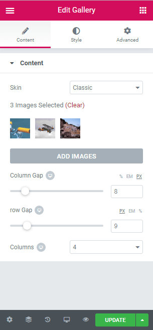
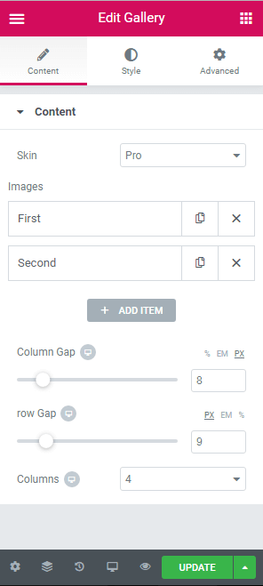
Our gallery widget is based on the grid and has two layouts, which are classic and pro. Both layouts have the following controls:
- Skin
- Column gap
- Row gap
- Columns
- Hover Animation
- Box Shadow
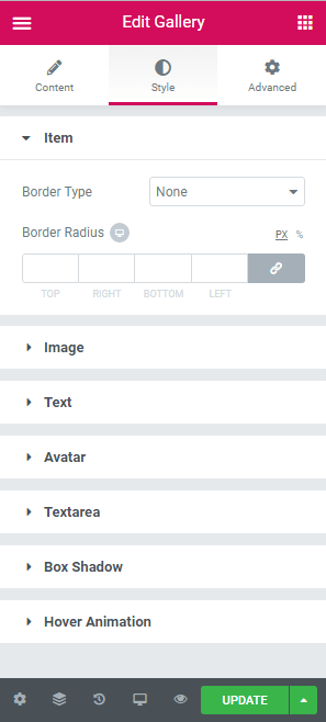
The classic layout has a gallery control, and the image section contains the below controls:
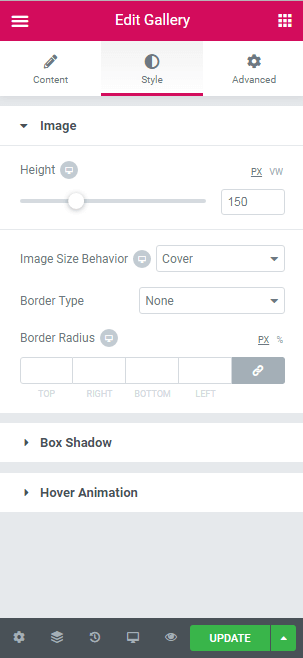
- Height
- Image size behavior
- Border type
- Border radius
Also, the pro layout has an image repeater control with several sections such as the following:
- Item section contains Border Type, Width, Color, and Border Radius controls.
- Image section contains Height and Image Size behavior controls.
- Text section contains Color, Typography, Alignment, and Spacing controls.
- Avatar section contains Height, Width, Alignment, and Spacing controls.
- Textarea section contains Color, Typography, Alignment, and Spacing controls.
Extending the Widget_Base Abstract Class
The main class of the gallery widget is similar to the code found below.
gallery.php
<?php
class Spicy_Gallery_Widget extends \Elementor\Widget_Base {
public function get_name() {
   return 'Gallery';
   }
public function get_title() {
    return __( 'Gallery', 'Spicy-extension' );
    }
public function get_icon() {
    return 'eicon-gallery-grid';
    }
public function get_categories() {
    return [ 'basic' ];
    }
protected function _register_controls() {

    //  start Content tab
        $this->start_controls_section(
            'content_section',
            [
             'label' => __( 'Content', 'Spicy-extension' ),
             'tab' => \Elementor\Controls_Manager::TAB_CONTENT,
            ]
        );
        //add skin control
        $this->register_controls_skin();

        //add repeater for pro skin
        $this->register_controls_pro_repeater();

        //add gallery control
        $this->register_controls_Classic_gallery();

        //add column-gap slider
        $this->register_controls_column_gap();

        //add row-gap slider
        $this->register_controls_row_gap();


 //add columns number list
        $this->register_controls_column_number();

        $this->end_controls_section();
        // end content tab

        //start Style tab
        $this->register_controls_classic_style_image();

        //create pro item section
        $this->register_controls_pro_item();

      //create pro style section-image
        $this->register_controls_pro_style_image();

      //create pro style section-text
        $this->register_controls_pro_style_text();

      //create pro style section-avatar
        $this->register_controls_pro_style_avatar();

      //create pro style section-textarea
        $this->register_controls_pro_style_textarea();

      //Box Shadow
        $this->register_controls_pro_style_boxshadow();

        //hover animation
        $this->register_controls_pro_style_hoveranimation();
      //end style tab
    }

protected function render() {
        $settings = $this->get_settings_for_display();
        ?>
        <div class="spicy-gallery" width="100%">
        <?php

        if($settings['spicy_skin']=='classic'){
            $this->classic_render($settings);
        }else{
            $this->pro_render($settings);

                 }
        ?>
        </div>

        <?php
    }

protected function _content_template() {
        ?>
        <div class="spicy-gallery">
        <#
         if(settings.spicy_skin=='classic'){
         _.each( settings.spicy_images, function( image ) {
        #>
        <div class="spicy-item elementor-animation-{{settings.spicyhover}}">
         <img  class="spicy-img" id="{{image.id}}" src="{{image.url}}"/>
        </div>
        <# }); } else{
         _.each( settings.spicy_image_list, function( image ) {
        #>
        <div class="spicy-item elementor-animation-{{settings.spicyhover}}">
          <div class="spicy-pro-container">
            <img class="spicy-pro-img" src="{{image.spicy_pro_image.url}}" >
          </div>
          <p class="spicy-pro-text">{{image.spicy_pro_text}}</p>
          <div class="spicy-avatar-wrapper">
           <img class="spicy-avatar" src="{{image.spicy_pro_avatar.url}}" alt="Avatar">
          </div>
          <p class="spicy-pro-description">{{image.spicy_pro_description}}</p>
         </div>
        <# }); }#>
        </div>
     <?php
    }
?>
Creating Controls for a Gallery Widget
In the above code, you’ll see several functions in _register_controls() and render() functions.In fact, these methods assign sections and controls for the gallery widget. We can create these functions only for grouping codes and simplicity.
Common Controls
1. Skin control: This control’s type is Select with two options set as classic and pro. With this control, we have the ability to change the layout of the gallery widget.
protected function register_controls_skin(){
        $this->add_control(
               'spicy_skin',
               [
                'label' => __( 'Skin', 'spicy' ),
                'type' => \Elementor\Controls_Manager::SELECT,
                'options' => [
                'classic' => __( 'Classic', 'Spicy-extension' ),
                'pro' => __( 'Pro', 'spicy' ),
               ],
                'default' => 'classic',
            ]
       );
}
2. Column Gap: This type of control is Slider, which allows us to change the space between columns of the gallery widget.
protected function register_controls_column_gap(){
        $this->add_responsive_control(
               'spicy_column_gap',
               [
                'label' => __( 'Column Gap', 'Spicy-extension' ),
                'type' => \Elementor\Controls_Manager::SLIDER,
                'size_units' => [ '%','em', 'px' ],
                'range' => [
                    'px' => [
                        'min' => 0,
                        'max' => 50,
                        'step' => 1,
                    ],
                    '%' => [
                        'min' => 0,
                        'max' => 10,
                        'step' => 0.1,
                    ],
                    'em' => [
                        'min' => 0,
                        'max' => 10,
                        'step' => 0.1,
                    ],
                ],
                'default' => [
                    'unit' => '%',
                    'size' => 0.5,
                ],
                'show_label' => true,
                'selectors' => [
                    '{{WRAPPER}} .spicy-gallery' => 'grid-column-gap: {{SIZE}}{{UNIT}};',
                ],
            ]
        );
    }
3. Row Gap: This type of control is Slider, which we can use to change the space between rows of the gallery widget.
protected function register_controls_row_gap(){
        $this->add_responsive_control(
               'spicy_row_gap',
               [
                'label' => __( 'row Gap', 'Spicy-extension' ),
                'type' => \Elementor\Controls_Manager::SLIDER,
                'size_units' => [ 'px','em','%' ],
                'range' => [
                    'px' => [
                        'min' => 0,
                        'max' => 50,
                        'step' => 1,
                    ],
                    '%' => [
                        'min' => 0,
                        'max' => 10,
                        'step' => 0.1,
                    ],
                    'em' => [
                        'min' => 0,
                        'max' => 10,
                        'step' => 0.1,
                    ],
                ],
                'default' => [
                    'unit' => 'px',
                    'size' => 5,
                ],
                'show_label' => true,
                'selectors' => [
                  '{{WRAPPER}} .spicy-gallery' => ' grid-row-gap: {{SIZE}}{{UNIT}};',
                ],
            ]
        );
    }
4. Columns: The type of control is Select, which lets us alter the number of columns of the gallery widget.
protected function register_controls_column_number(){
        $this->add_responsive_control(
               'spicy_columns',
               [
                'label' => __( 'Columns', 'Spicy-extension' ),
                'type' => \Elementor\Controls_Manager::SELECT,
                'default' => 3,
                'options' => ['1'=>1,'1'=>1,'2'=>2,'3'=>3,'4'=>4,'5'=>5,'6'=>6,'7'=>7,'8'=>8,'9'=>9,'10'=>10],
                'devices' => [ 'desktop', 'tablet', 'mobile' ],
                'desktop_default' => [
                    'size' => '',
                ],
                'tablet_default' => [
                    'size' => '',
                ],
                'mobile_default' => [
                    'size' => '',
                ],
                'selectors' => [
                  '{{WRAPPER}} .spicy-gallery' => 'grid-template-columns: repeat({{SIZE}},1fr);',
                ],
            ]

       );
    }
5. Box Shadow: This section is used to add a box shadow effect to gallery items.
protected function register_controls_style_boxshadow(){
        $this->start_controls_section(
               'spicy_box_shadow',
               [
                'label' => __( 'Box Shadow', 'Spicy-extension' ),
                'tab' => \Elementor\Controls_Manager::TAB_STYLE,
               ]
        );
        $this->add_group_control(
               Elementor\Group_Control_Box_Shadow::get_type(),
               [
                'name' => 'box_shadow',
                'label' => __( 'Box Shadow', 'Spicy-extension' ),
                'selector' => '{{WRAPPER}} .spicy-item',
               ]
        );
        $this->end_controls_section();
 }
6. Hover Animation: This section adds an animation effect to the gallery item.
protected function register_controls_style_hoveranimation(){
        $this->start_controls_section(
               'spicy_hover',
               [
                'label' => __( 'Hover Animation', 'Spicy-extension' ),
               'tab' => \Elementor\Controls_Manager::TAB_STYLE,
             ]
        );
        $this->add_control(
               'spicyhover',
               [
                'label' => __( 'Hover Animation', 'Spicy-extension' ),
                'type' => \Elementor\Controls_Manager::HOVER_ANIMATION,
                'default'=>'',
               ]

        );
        $this->end_controls_section();
    }
Classic Layout
The following controls or sections are only displayed in the classic layout.
1. Gallery Control: used to select multiple images for the gallery and displayed in the Content Tab.
protected function register_controls_Classic_gallery(){
        $this->add_control(
               'spicy_images',
              [
                'label' => __( 'Add Images', 'Spicy-extension' ),
                'type' => \Elementor\Controls_Manager::GALLERY,
                'separator' => 'default',
                'show_label' => false,
                'condition' => [
                                'spicy_skin' => 'classic',
                               ],
                'dynamic' => [
                              'active' => true,
                             ]
              ]
        );
 }
2. Image sections: This is displayed in the Style Tab to change the style of the image.
protected function register_controls_classic_style_image(){
        $this->start_controls_section(
               'style_section',
               [
                'label' => __( 'Image', 'Spicy-extension' ),
                'tab' => \Elementor\Controls_Manager::TAB_STYLE,
                'condition'=>[
                              'spicy_skin' => 'classic'
                             ]
               ]
        );
        //classic height image control
        $this->add_responsive_control(
               'spicy_height',
               [
                'label' => __( 'Height', 'Spicy-extension' ),
                'type' => \Elementor\Controls_Manager::SLIDER,
                'separator' => 'after',
                'size_units' => [ 'px','vw'],
                'range' => [
                            'px' => [
                                     'min' => 0,
                                     'max' => 500,
                                     'step' => 1,
                                    ],
                            'vw' => [
                                     'min' => 0,
                                     'max' => 100,
                                     'step' => 1,
                                    ],
                           ],
                'default' => [
                              'unit' => 'px',
                              'size' => 150,
                             ],
                'show_label' => true,
                'selectors' => [
                    '{{WRAPPER}} .spicy-img' => 'height: {{SIZE}}{{UNIT}};',
                ],
            ]
        );

        //image fitness classic
        $this->add_responsive_control(
               'spicy_image_fitness',
               [
                'label' => __( 'Image Size Behavior', 'Spicy-extension' ),
                'type' => \Elementor\Controls_Manager::SELECT,
                'options' => ['cover'=> __( 'Cover', 'Spicy-extension' ),'fill'=>__( 'Fit', 'Spicy-extension' ),'contain'=>__( 'Contain', 'Spicy-extension' ),'scale-down'=>__( 'Scale Down', 'Spicy-extension' ),'none'=>__( 'None', 'Spicy-extension' )],
                'devices' => [ 'desktop', 'tablet', 'mobile' ],
                'desktop_default' => [
                                      'val' => '',
                                     ],
                'tablet_default' => [
                                      'val' => '',
                                    ],
                'mobile_default' => [
                                     'val' => '',
                                    ],
                'default' => 'cover',
                'selectors' => [
                    '{{WRAPPER}} .spicy-img' => 'object-fit: {{val}};',
                 ],
               ]

            );
        //border classic
        $this->add_group_control(
               Elementor\Group_Control_Border::get_type(),
               [
                'name' => 'spicy_border',
                'label' => __( 'Border', 'Spicy-extension' ),
                'selector' => '{{WRAPPER}} .spicy-img',
               ]
        );
        //border radius classic
        $this->add_responsive_control(
               'spicy_image_border_radius',
               [
                'label' => __( 'Border Radius', 'Spicy-extension' ),
                'type' => Elementor\Controls_Manager::DIMENSIONS,
                'size_units' => [ 'px', '%' ],
                'selectors' => [
                    '{{WRAPPER}} .spicy-img' => 'border-radius: {{TOP}}{{UNIT}} {{RIGHT}}{{UNIT}} {{BOTTOM}}{{UNIT}} {{LEFT}}{{UNIT}};',
                ],
            ]
        );
        $this->end_controls_section();
    }
Pro Layout
The following controls or sections are only displayed in the pro layout.
1. Repeater Section: This section has four controls, which are Image, Text, Avatar, and Textarea. It’s used for adding images individually and is displayed in the Content Tab.
protected function register_controls_pro_repeater(){
        $repeater = new \Elementor\Repeater();
        //add pro image control
        $repeater->add_control(
                   'spicy_pro_image',
                   [
                    'label' => __( 'Choose Image', 'Spicy-extension' ),
                    'type' => \Elementor\Controls_Manager::MEDIA,
                    'dynamic' => [
                                  'active' => true,
                                 ],
                    'default' => [
                     'url' => \Elementor\Utils::get_placeholder_image_src(),
                    ],
                  ]
        );
        //add pro text control
        $repeater->add_control(
                   'spicy_pro_text',
               [
                'label' => __( 'Text', 'Spicy-extension' ),
                'type' => \Elementor\Controls_Manager::TEXT,
                'label_block' => true,
                'placeholder' => __( 'Your Text', 'Spicy-extension' ),
                'default' => __( '', 'Spicy-extension' ),
                'dynamic' => [
                              'active' => true,
                             ],
               ]
        );
        //add avatar image control
        $repeater->add_control(
            'spicy_pro_avatar',
            [
                'label' => __( 'Choose Avatar', 'Spicy-extension' ),
                'type' => \Elementor\Controls_Manager::MEDIA,
                'dynamic' => [
                    'active' => true,
                ],
                'default' => [
                    'url' => \Elementor\Utils::get_placeholder_image_src(),
                ],
            ]
     );
        //pro textarea control
        $repeater->add_control(
               'spicy_pro_description',
               [
                'label' => __( 'Description', 'Spicy-extension' ),
                'type' => \Elementor\Controls_Manager::TEXTAREA,
                'rows' => 5,
                'default' => __( '', 'Spicy-extension' ),
                'placeholder' => __( 'Type your description here', 'spicy' ),
               ]
        );

        //add repeater control
        $this->add_control(
               'spicy_image_list',
               [
                'label' => __('Images','Spicy-extension'),
                'type' => \Elementor\Controls_Manager::REPEATER,
                'label_block' => true,
                'separator' => 'default',
                'fields' => $repeater->get_controls(),
                'title_field' => '{{{spicy_pro_text }}}',
                'condition' => [
                                'spicy_skin' => 'pro',
                            ],
             ]
        );
    }
2. Item Section: This is displayed in the Style Tab to change the border style of the gallery item.
protected function register_controls_pro_item(){
     $this->start_controls_section(
               'spicy_pro_item',
               [
                'label' => __( 'Item', 'Spicy-extension' ),
                'tab' => \Elementor\Controls_Manager::TAB_STYLE,
                'condition'=>[
                              'spicy_skin' => 'pro'
                             ]
              ]
        );
        // pro item border
        $this->add_group_control(
               \Elementor\Group_Control_Border::get_type(),
               [
                'name' => 'spicy_item_border',
                'label' => __( 'Border', 'Spicy-extension' ),
                'selector' => '{{WRAPPER}} .spicy-item',
               ]
        );
        //pro item border radius
        $this->add_responsive_control(
               'spicy_pro_item_border_radius',
               [
                'label' => __( 'Border Radius', 'Spicy-extension' ),
                'type' => Elementor\Controls_Manager::DIMENSIONS,
                'size_units' => [ 'px', '%' ],
                'selectors' => [
                    '{{WRAPPER}} .spicy-item' => 'border-radius: {{TOP}}{{UNIT}} {{RIGHT}}{{UNIT}} {{BOTTOM}}{{UNIT}} {{LEFT}}{{UNIT}};',
                ],
               ]
        );
        $this->end_controls_section();
    }
3. Image Section: This is displayed in the Style Tab to change the image size.
protected function register_controls_pro_style_image(){
        $this->start_controls_section(
               'spicy_pro_style_image',
               [
                'label' => __( 'Image', 'Spicy-extension' ),
                'tab' => \Elementor\Controls_Manager::TAB_STYLE,
                'condition'=>[
                              'spicy_skin' => 'pro'
                             ]
               ]
        );
        //pro image size
        $this->add_responsive_control(
               'spicy_pro_image_height',
               [
                'label' => __( 'height', 'Spicy-extension' ),
                'type' => \Elementor\Controls_Manager::SLIDER,
                'size_units' => [ 'px','em','vh' ],
                'range' => [
                            'px' => [
                                     'min' => 0,
                                     'max' => 800,
                                     'step' => 1,
                                    ],
                            'vh' => [
                                     'min' => 0,
                                     'max' => 100,
                                     'step' => 1,
                                    ],
                            'em' => [
                                     'min' => 0,
                                     'max' => 10,
                                     'step' => 0.1,
                                    ],
                          ],
                'default' => [
                              'unit' => 'px',
                              'size' => 150,
                             ],
                'show_label' => true,
                'selectors' => [
                  '{{WRAPPER}} .spicy-pro-img' => ' height: {{SIZE}}{{UNIT}};',
                ],
            ]
        );
        //pro image fitness
        $this->add_responsive_control(
            'spicy_pro_image_fitness',
            [
                'label' => __( 'Image Size Behavior', 'Spicy-extension' ),
                'type' => \Elementor\Controls_Manager::SELECT,
                'options' => ['cover'=> __( 'Cover', 'Spicy-extension' ),'fill'=>__( 'Fill', 'Spicy-extension' ),'contain'=>__( 'Contain', 'Spicy-extension' ),'scale-down'=>__( 'Scale Down', 'Spicy-extension' ),'none'=>__( 'None', 'Spicy-extension' )],
                'devices' => [ 'desktop', 'tablet', 'mobile' ],
                'desktop_default' => [
                                      'val' => '',
                                     ],
                'tablet_default' => [
                                     'val' => '',
                                    ],
                'mobile_default' => [
                                     'val' => '',
                                    ],
                'default' => 'cover',
                'selectors' => [
                  '{{WRAPPER}} .spicy-pro-img' => 'object-fit: {{val}};',
                ],
            ]

      );
        $this->end_controls_section();
4. Text Section: This is displayed in the Style Tab to change the style of the text item.
protected function register_controls_pro_style_text(){
        $this->start_controls_section(
                'spicy_pro_style_text',
                [
                 'label' => __( 'Text', 'Spicy-extension' ),
                 'tab' => \Elementor\Controls_Manager::TAB_STYLE,
                 'condition'=>[
                    'spicy_skin' => 'pro'
                ]
            ]
        );

        //pro text color control
        $this->add_control(
               'spicy_pro_text_color',
               [
                'label' => __( 'Color', 'Spicy-extension' ),
                'type' => \Elementor\Controls_Manager::COLOR,
                'default' => '',
                'selectors' => [
                  '{{WRAPPER}} .spicy-pro-text' => 'color: {{VALUE}};',
                 ],
                'scheme' => [
                             'type' => \Elementor\Scheme_Color::get_type(),
                             'value' => \Elementor\Scheme_Color::COLOR_1,
                            ],
               ]
        );

        //pro text typography
        $this->add_group_control(
                \Elementor\Group_Control_Typography::get_type(),
                [
                 'name' => 'spicy_pro_text_typography',
                 'selector' => '{{WRAPPER}} .spicy-pro-text',
                 'scheme' => \Elementor\Scheme_Typography::TYPOGRAPHY_1,
                ]
        );

        //pro text alignment
        $this->add_responsive_control(
               'spicy_pro_text-_align',
               [
                'label' => __( 'Alignment', 'Spicy-extension' ),
                'type' => \Elementor\Controls_Manager::CHOOSE,
                'options' => [
                              'left' => [
                                          'title' => __( 'Left','Spicy-extension'),
                                          'icon' => 'fa fa-align-left',
                                        ],
                              'center' => [
                                            'title' => __( 'Center', 'Spicy-extension' ),
                                            'icon' => 'fa fa-align-center',
                                           ],
                              'right' => [
                                          'title' => __( 'Right', 'Spicy-extension' ),
                                          'icon' => 'fa fa-align-right',
                                         ],
                              'justify' => [
                                            'title' => __( 'Justified', 'Spicy-extension' ),
                                            'icon' => 'fa fa-align-justify',
                                           ],
                             ],
                'default' =>'',
                'selectors' => [
                  '{{WRAPPER}} .spicy-pro-text' => 'text-align: {{VALUE}};',
                ],
            ]
        );
        //pro text spacing control
        $this->add_responsive_control(
               'spicy_text_margin',
               [
                'label' => __( 'Spacing', 'Spicy-extension' ),
                'type' => \Elementor\Controls_Manager::DIMENSIONS,
                'size_units' => [ 'px', '%', 'em' ],
                'selectors' => [
                  '{{WRAPPER}} .spicy-pro-text' => 'margin: {{TOP}}{{UNIT}} {{RIGHT}}{{UNIT}} {{BOTTOM}}{{UNIT}} {{LEFT}}{{UNIT}};',
                ],
              ]
        );

        $this->end_controls_section();
    }
5. Avatar Section: This is displayed in the Style Tab to change the style of the avatar.
protected function register_controls_pro_style_avatar(){
        $this->start_controls_section(
            'spicy_pro_style_avatar',
            [
                'label' => __( 'Avatar', 'Spicy-extension' ),
                'tab' => \Elementor\Controls_Manager::TAB_STYLE,
                'condition'=>[
                    'spicy_skin' => 'pro'
                ]
            ]
        );
        //pro avatar height
        $this->add_responsive_control(
            'spicy_avatar_height',
             [
                'label' => __( 'height', 'Spicy-extension' ),
                'type' => \Elementor\Controls_Manager::SLIDER,
                'size_units' => [ 'px','em','vh' ],
                'range' => [
                    'px' => [
                        'min' => 0,
                        'max' => 100,
                        'step' => 1,
                    ],
                    'vh' => [
                        'min' => 0,
                        'max' => 100,
                        'step' => 1,
                    ],
                    'em' => [
                        'min' => 0,
                        'max' => 10,
                        'step' => 0.1,
                    ],
                ],
                'default' => [
                    'unit' => 'px',
                    'size' => 50,
                ],
                'show_label' => true,
                'selectors' => [
                    '{{WRAPPER}} .spicy-avatar' => ' height: {{SIZE}}{{UNIT}};',
                ],
             ]
        );
        //pro avatar width
        $this->add_responsive_control(
            'spicy_avatar_width',
            [
                'label' => __( 'Width', 'Spicy-extension' ),
                'type' => \Elementor\Controls_Manager::SLIDER,
                'size_units' => [ 'px','em','vh' ],
                'range' => [
                    'px' => [
                        'min' => 0,
                        'max' => 100,
                        'step' => 1,
                    ],
                    'vh' => [
                        'min' => 0,
                        'max' => 100,
                        'step' => 1,
                    ],
                    'em' => [
                        'min' => 0,
                        'max' => 10,
                        'step' => 0.1,
                    ],
                ],
                'default' => [
                    'unit' => 'px',
                    'size' => 50,
                ],
                'show_label' => true,
                'selectors' => [
                    '{{WRAPPER}} .spicy-avatar' => ' width: {{SIZE}}{{UNIT}};',
                ],
            ]
        );
        //pro avatar align control
        $this->add_responsive_control(
            'spicy_avatar_align',
            [
                'label' => __( 'Alignment', 'Spicy-extension' ),
                'type' => \Elementor\Controls_Manager::CHOOSE,
                'options' => [
                    'left' => [
                        'title' => __( 'Left', 'Spicy-extension' ),
                        'icon' => 'eicon-h-align-left',
                    ],
                    'center' => [
                        'title' => __( 'Center', 'Spicy-extension' ),
                        'icon' => 'eicon-h-align-center',
                    ],
                    'right' => [
                        'title' => __( 'Right', 'Spicy-extension' ),
                        'icon' => 'eicon-h-align-right',
                    ],
                ],
                'selectors' => [
                    '{{WRAPPER}} .spicy-avatar-wrapper' => ' text-align: {{VALUE}};',
                ],
            ]
        );
        //pro avatar spacing control
        $this->add_responsive_control(
            'spicy_avatar_spacing',
            [
                'label' => __( 'Spacing', 'Spicy-extension' ),
                'type' => \Elementor\Controls_Manager::DIMENSIONS,
                'size_units' => [ 'px', '%', 'em' ],
                'selectors' => [
                    '{{WRAPPER}} .spicy-avatar' => 'margin: {{TOP}}{{UNIT}} {{RIGHT}}{{UNIT}} {{BOTTOM}}{{UNIT}} {{LEFT}}{{UNIT}};',
                ],
            ]
        );
        //pro border avatar
        $this->add_group_control(
            \Elementor\Group_Control_Border::get_type(),
            [
                'name' => 'spicy_avatar_border',
                'label' => __( 'Border', 'Spicy-extension' ),
                'selector' => '{{WRAPPER}} .spicy-avatar',
            ]
        );
        //pro border radius
        $this->add_responsive_control(
            'spicy_pro_border_radius',
            [
                'label' => __( 'Border Radius', 'Spicy-extension' ),
                'type' => Elementor\Controls_Manager::DIMENSIONS,
                'size_units' => [ 'px', '%' ],
                'selectors' => [
                    '{{WRAPPER}} .spicy-avatar' => 'border-radius: {{TOP}}{{UNIT}} {{RIGHT}}{{UNIT}} {{BOTTOM}}{{UNIT}} {{LEFT}}{{UNIT}};',
                ],
            ]
        );
        $this->end_controls_section();
    }
5. Textarea Section: This is displayed in the Style Tab to change the style of Textarea.
protected function register_controls_pro_style_textarea(){
        $this->start_controls_section(
               'spicy_pro_style_textarea',
               [
                'label' => __( 'Textarea', 'Spicy-extension' ),
                'tab' => \Elementor\Controls_Manager::TAB_STYLE,
                'condition'=>[
                  'spicy_skin' => 'pro'
                ]
              ]
        );
        //pro textarea color control
        $this->add_control(
               'spicy_pro_textarea-color',
               [
                'label' => __( 'Color', 'Spicy-extension' ),
                'type' => \Elementor\Controls_Manager::COLOR,
                'default' => '',
                'selectors' => [
                  '{{WRAPPER}} .spicy-pro-description' => 'color: {{VALUE}};',
                ],
                'scheme' => [
                  'type' => \Elementor\Scheme_Color::get_type(),
                  'value' => \Elementor\Scheme_Color::COLOR_1,
                ],
               ]
        );
        //pro textarea typography control
        $this->add_group_control(
                \Elementor\Group_Control_Typography::get_type(),
                [
                 'name' => 'spicy_pro_textarea_typography',
                 'selector' => '{{WRAPPER}} .spicy-pro-description',
                 'scheme' => \Elementor\Scheme_Typography::TYPOGRAPHY_1,
             ]
        );
        //pro textarea align control
        $this->add_responsive_control(
               'spicy_pro_textarea-align',
                [
                 'label' => __( 'Alignment', 'Spicy-extension' ),
                 'type' => \Elementor\Controls_Manager::CHOOSE,
                 'options' => [
                               'left' => [
                                          'title' => __( 'Left','Spicy-extension' ),
                                          'icon' => 'fa fa-align-left',
                                         ],
                               'center' =>[
                                           'title'=>__('Center','Spicy-extension' ),
                                           'icon' => 'fa fa-align-center',
                                          ],
                               'right' =>[
                                          'title' => __( 'Right','Spicy-extension'),
                                          'icon' => 'fa fa-align-right',
                                         ],
                               'justify'=>[
                                           'title' => __( 'Justified','Spicy-extension'),
                                           'icon' => 'fa fa-align-justify',
                                          ],
                              ],
                'default' =>'',
                'selectors' => [
                  '{{WRAPPER}} .spicy-pro-description' => 'text-align: {{VALUE}};',
                ],
            ]
        );
        //pro textarea spacing control
        $this->add_responsive_control(
               'spicy_textarea_spacing',
               [
                'label' => __( 'Spacing', 'Spicy-extension' ),
                'type' => \Elementor\Controls_Manager::DIMENSIONS,
                'size_units' => [ 'px', '%', 'em' ],
                'selectors' => [
                  '{{WRAPPER}} .spicy-pro-description' => 'padding: {{TOP}}{{UNIT}} {{RIGHT}}{{UNIT}} {{BOTTOM}}{{UNIT}} {{LEFT}}{{UNIT}};',
                ],
            ]
        );
        $this->end_controls_section();
    }
Create Final Html Output
To render our gallery output in the frontend, we must create the render function as the following:
protected function render() {
        $settings = $this->get_settings_for_display();
        ?>
        <div class="spicy-gallery" width="100%">
        <?php

        if($settings['spicy_skin']=='classic'){
            $this->classic_render($settings);
        }
         else{
          $this->pro_render($settings);
         }
        ?>
        </div>
        <?php
    }
protected function classic_render($settings){
if($settings['spicy_images']){
foreach ( $settings['spicy_images'] as $image ) {
echo '<div class="spicy-item elementor-animation-'. $settings['spicyhover'] .' ">';
echo '<img id="'. $image['id'].'" class="spicy-img" src="' . $image['url'] . '">';
echo '</div>';
}
}
}
protected function pro_render($settings){
if($settings['spicy_image_list']){
foreach ( $settings['spicy_image_list'] as $image ) {
echo '<div class="spicy-item elementor-animation-'. $settings['spicyhover'] .' ">';
echo '<div class="spicy-pro-container">';
echo '<img class="spicy-pro-img" src="'.$image['spicy_pro_image']['url'].'" >';
echo '</div>';
echo '<p class="spicy-pro-text">'.$image['spicy_pro_text'].'</p>';
echo'<div class="spicy-avatar-wrapper">';
echo '<img class="spicy-avatar" src="'.$image['spicy_pro_avatar']['url'].'" alt="Avatar">';
echo'</div>';
echo '<p class="spicy-pro-description">'.$image['spicy_pro_description'].'</p>';
echo '</div>';
}
}
}Create Live Preview in Editor
To generate a live preview of the gallery output, we must create the _content_template() method by using Javascript:
protected function _content_template() {
       ?>
        <div class="spicy-gallery">
        <#
         if(settings.spicy_skin=='classic'){
         _.each( settings.spicy_images, function( image ) {
        #>
        <div class="spicy-item elementor-animation-{{settings.spicyhover}}">
         <img  class="spicy-img" id="{{image.id}}" src="{{image.url}}"/>
        </div>
        <# }); } else{
            _.each( settings.spicy_image_list, function( image ) {
        #>
            <div class="spicy-item elementor-animation-{{settings.spicyhover}}">
             <div class="spicy-pro-container">
                <img class="spicy-pro-img" src="{{image.spicy_pro_image.url}}" >
           </div>
              <p class="spicy-pro-text">{{image.spicy_pro_text}}</p>
                <div class="spicy-avatar-wrapper">
                 <img class="spicy-avatar" src="{{image.spicy_pro_avatar.url}}" alt="Avatar">
                </div>
                <p class="spicy-pro-description">{{image.spicy_pro_description}}</p>
            </div>
        <# }); }#>
        </div>
      <?php
    }
How to Register CSS Style to Widget
After creating a gallery widget, we need to register essential CSS style to our widget. To do this, we need to first create a CSS file, then register it in Spicy.php.
Gallery.css
.spicy-gallery{
 display:grid;
 grid-template-rows: auto;
 }
.spicy-gallery .spicy-img{
 width: 100%;
 object-fit: cover;
 margin: 0 auto;
 }

.spicy-gallery .spicy-pro-container{
 width:100%;
 }
.spicy-gallery .spicy-pro-text{
 text-align:center;
 margin-top:-70px;
 margin-bottom: 10px;
 }
.spicy-gallery .spicy-pro-description{
 width:100%;
 text-align: center;
 padding-left: 10px;
 padding-right: 10px;

 }
.spicy-gallery .spicy-pro-img{
 width: 100%;
 }
.spicy-gallery .spicy-avatar{
 display:inline-block;
 margin-left:10px;
 margin-bottom: 20px;
 border-radius: 12px;
 }
.spicy-gallery .spicy-avatar.wrapper{
 display: block;
 }
In order to register our CSS file, we need to add below code to Spicy.php
// Register Widget Styles
add_action( 'elementor/frontend/after_enqueue_styles', [ $this, 'widget_styles' ] );
public function widget_styles() {
wp_enqueue_style( 'spicyPluginStylesheet', plugins_url( 'https://d3pa45a5f8vwb1.cloudfront.net/css/gallery.css', __FILE__ ) );
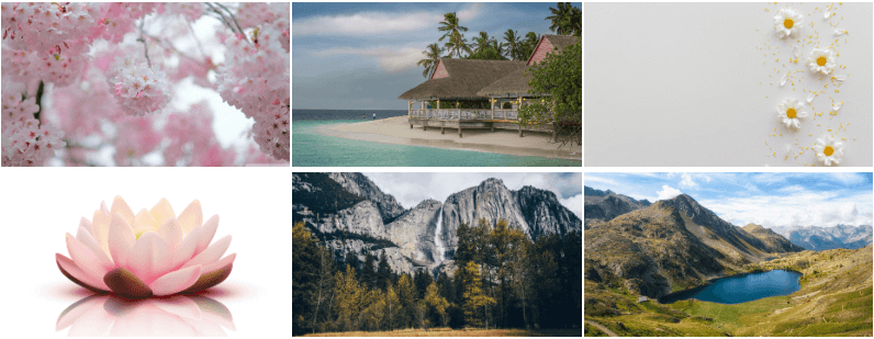
}Classic layout output
Pro layout output

Conclusion
In this blog post, we described how to extend Elementor like a pro in detail and explained the structure of an Elementor widget. We also illustrated how to create a section and control, how to display/hide a section or control, how to change the widget style from controls, how to get settings and how to render the final output in frontend and Elementor editor.
Finally, we walked you through the steps of developing a gallery widget. Feel free to share your ideas and experiences in the comments section below.

5 Comments
You did an amazing job here
Consider the investment a lot in the detailed explanations
I learned a lot
a big thanks
thanks for the details and good explanation. helps me a lot!
very nice thank you for the detailed explanation, keep it up!
To create your own WordPress Website widget is just a great way to save time. Thank you very much for your great post.
thanks for the details and the great explanation. sometimes elementor rules.