
During the past couple of years, CSS has been improved rapidly with many features now possible in pure CSS. There are several websites that provide tutorials and introductions for CSS features. One of the best among all of them is MDN Web Docs.
The MDN site contains interactive examples, allowing you to learn many of the current and upcoming features. It also shows the browser compatibility table so you can understand the coverage of whichever feature in different browsers.
One of the features needed for nearly all websites is cropping images. Many websites rely on PHP, Node and other programming languages to crop images. But let’s not get bogged down in programming languages and focus on two CSS techniques that rely less on these languages. Sometimes, we just need to hide a part of an image instead of actually cropping the image.
Using object-fit and object-position to crop images in CSS
The object-fit and object-position properties in CSS allow developers to have control over images and videos similar to the way they have control of background images. These two properties offer a wide range of usages in pure to crop images in CSS and position them within a container.
Exploring the object-fit property
The object-fit property tells the content – like an image – to respond in certain ways to its content box (the black border in the below images). By using object-fit, you can tell an image to fill the content box by keeping or ignoring its aspect ratio.
This property can accept five values according to the standards. You can view the following examples live in CodePen. Each example shows an image that is contained in a content box that has a different width.
The contain value
The image is scaled to maintain its aspect ratio while fitting within the content box. The entire image is made to fill the box while preserving its aspect ratio.
img { object-fit: contain; }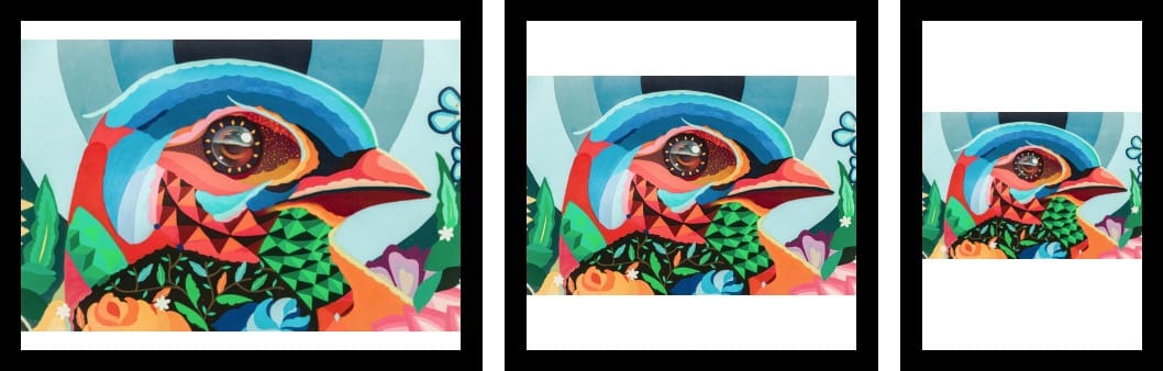
The cover value
The image is sized to keep its aspect ratio to fill the entire content box. If the image’s aspect ratio isn’t the same as the aspect ratio of the box, then the image will be clipped to fit.
img { object-fit: cover; }
The fill value
The image is sized to fill the content box. If the object’s aspect ratio isn’t the same as the box’s aspect ratio, then the image will be stretched to fit it.
img { object-fit: fill; }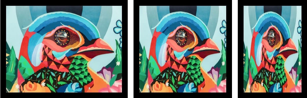
The none value
The image will not be resized.
img { object-fit: none; }
The scale-down value
The image is sized as if none or contain were specified, which results in smaller concrete image size.
img { object-fit: scale-down; }
Putting the object-position property into practice
This property is a game-changer in positioning the images when using object-fit. It works similarly to the background-position property.
This property can accept different values according to the standards. You can view the following examples live in CodePen.
Values can be directions (top, left, right) or numeric (10px, 20%).
img { object-position: top left; }
img { object-position: 100px 50px; }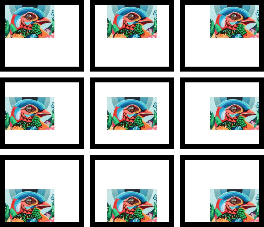
Using width, height and overflow to crop images in CSS
This method sounds like a workaround but it has its own use cases. In this technique, we use width, height and overflow properties in CSS.
You can view the following example live in CodePen.
- Add a div can give it class container.
- Set width and height to 150px then set the overflow to hidden.
- Use margin to position the image based on your needs. In this case, set it to -100px 0 0 -150px.

Conclusion
The object-fit property is a popular and modern method used to crop images in CSS. This feature is well supported among modern browsers, meaning that you can make use of it without worrying about compatibility issues.
The object-fit technique can be used in many different cases, but it might not be a perfect solution for every website. In some websites, we need actual background cropping to prevent loading large images.
We’ve used the object-fit technique in the Raven plugin for the Jupiter X theme, which made the development a breeze. Feel free to share your use cases in the comment section below.

1 Comment
Trying to learn HTML, CSS3, Javascript to build my own webpages rather than be limited by Blogger. I am a relative Newby and can handle most simple HTML and some CSS but am struggling with cropping an image. I could do it in a photo editor but want to learn the CSS to crop a photo. This sight is very useful because it alerted me that any CSS books that are more than 5 years old are probably not going to help. Suggestions on the latest and greatest manual that is current. Thanks