In this comprehensive guide, we’ll share expert tips and insights on how to create and choose the ideal blog layout that will make your content shine and leave a lasting impression on your audience. Specifically, we will cover the new layout for blog grid and blog single page introduced in the newly released Jupiter X v3, along with use cases and examples for each style.
- Essential Elements of Blog Layout to Consider
- How to Create Blog Layout with Jupiter X3 Layout Builder
- Top 5 Practices for Single Blog Layout Design
- Top 8 Blog Archive Layout Practices to Follow
- Key Takeaways
Essential Elements of Blog Layout to Consider
There are certain essential elements that must be considered to ensure a seamless reading experience for your blog audience. Any standard blog can incorporate all or some of the following elements in blog archive or single pages. These elements will not only enhance reader engagement but also provide an appealing and organized visual design.
Each item serves a specific purpose, ranging from contextualizing your content with post meta and dynamic tags to facilitating reader engagement with comments and navigation.
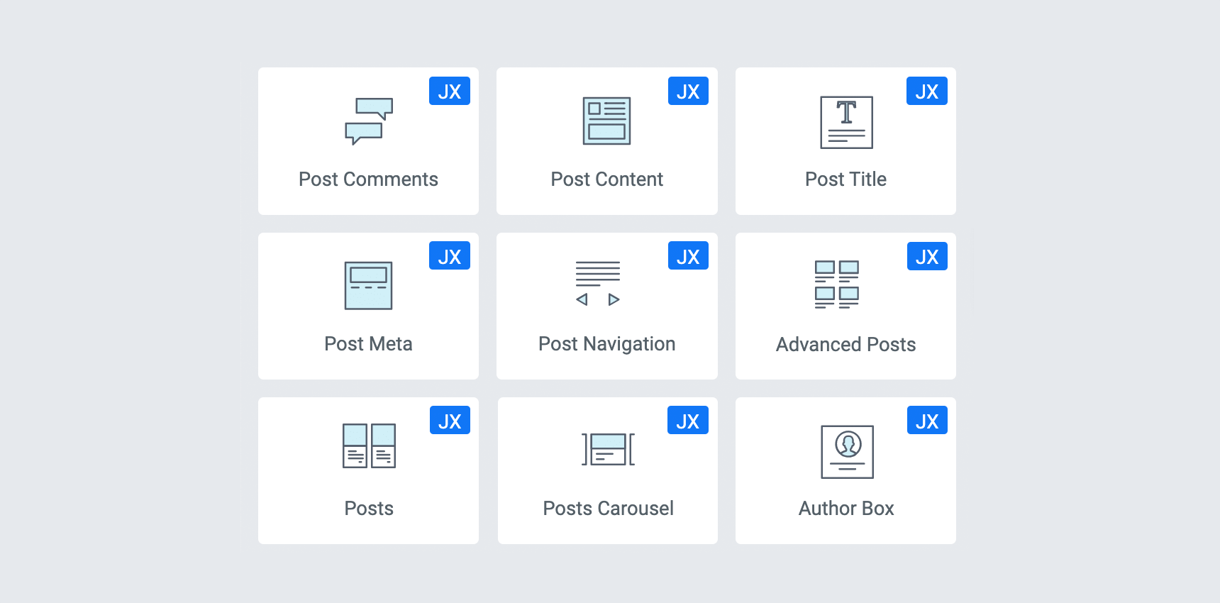
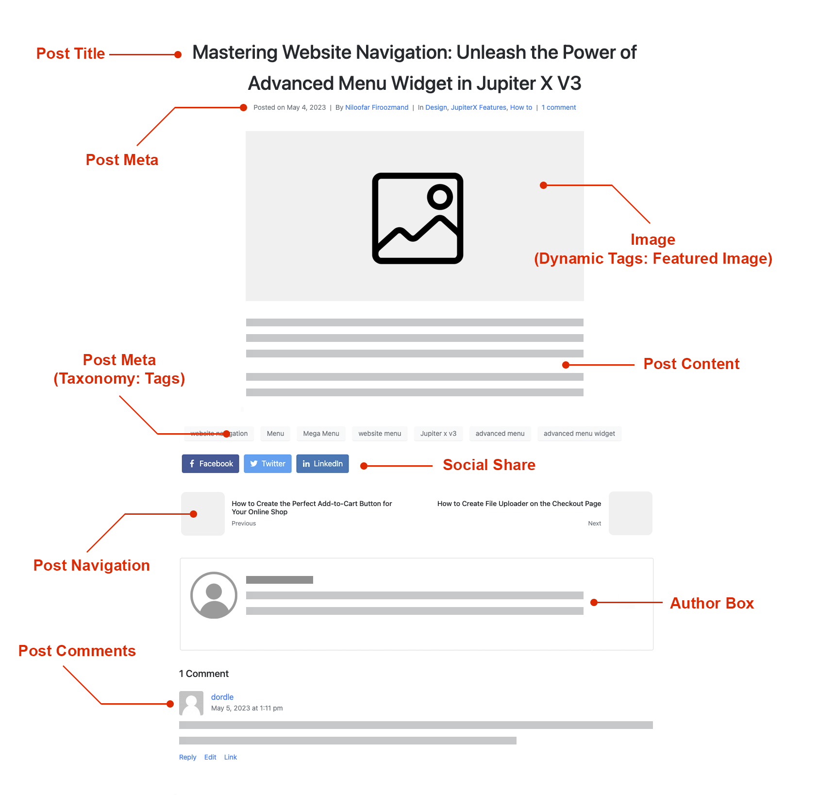
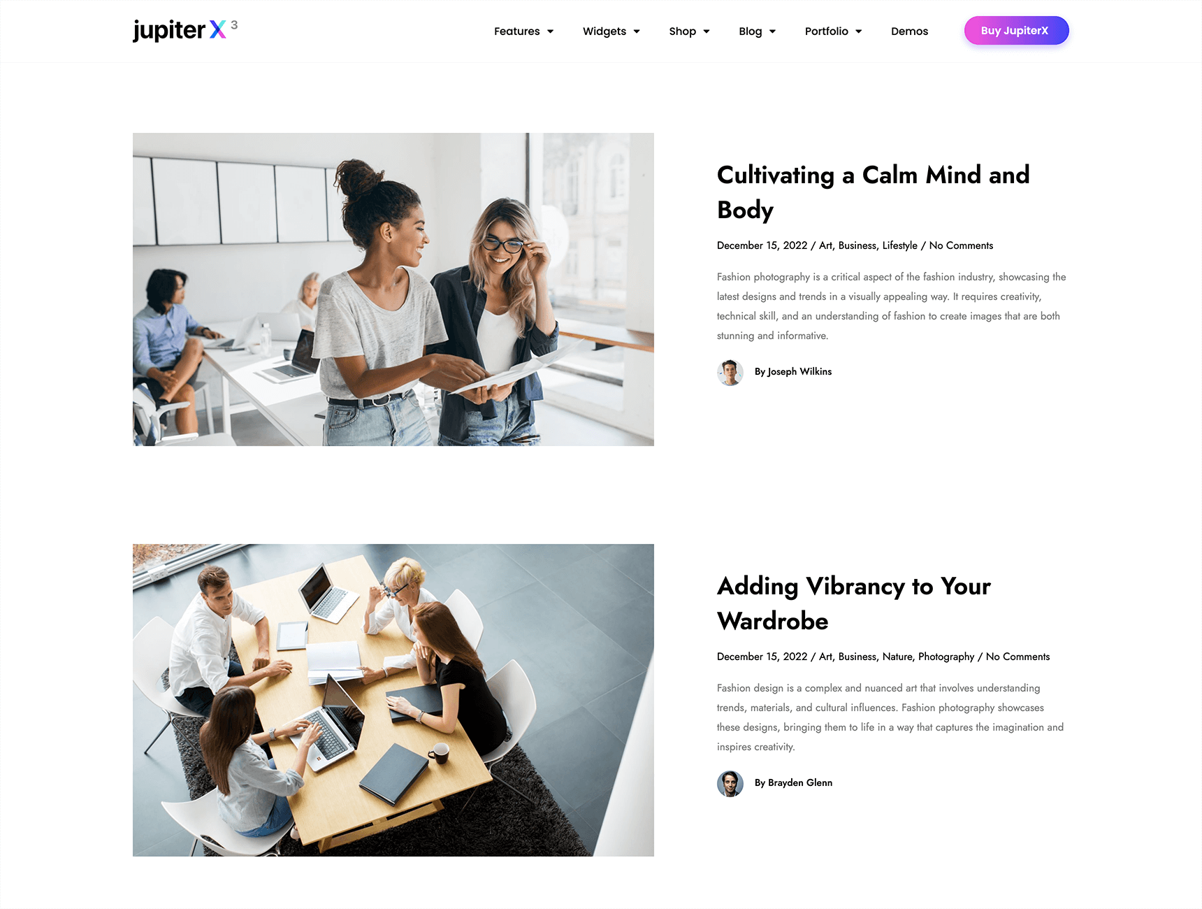
| Post Title | Post Meta | Post Content |
| A dynamic placeholder for blog titles that allows you to customize the style, typography, alignment, and other aspects of your blog titles. | It shows the author, date and time, number of comments and reading time for each post. Additionally, it displays any custom terms, tags or custom fields you specify. In most cases, this widget appears beneath the post title. | A placeholder for your content. It allows you to customize various aspects of your content’s appearance. With this widget, you can easily modify the style, padding, margin and width of your content. |
| Post Navigation | Author Box | Post Comments |
| It is a Single Post Template widget that provides dynamic navigation links to Next/Previous posts, allowing users to easily navigate through your content and keep visitors on your website. | A tool for providing information about the writer of a blog post. This widget allows you to share the author’s bio, avatar and social media links, fostering a personal connection between the writer and the readers. | This widget enables users to share their thoughts, opinions and feedback on your posts, creating a dynamic and interactive community around your content. |
| Posts Carousel | Dynamic Tags | Advanced Posts |
| A native widget of Jupiter X3 that displays blog posts in a carousel format. You can set the content layout, transition duration, load effects, and consider a wide range of styles. The widget is suitable for designing an archive blog layout. | A feature that generates dynamic contents based on a post or page. For instance, with this functionality, you can assign a Featured Image tag to an image widget, so that added image turns into a placeholder for the featured image. | A blog loop widget that enables you to display blog posts in a variety of layouts including grid, matrix, metro, list and masonry with options to customize the number of posts displayed, the order in which they appear and the style of the posts. |
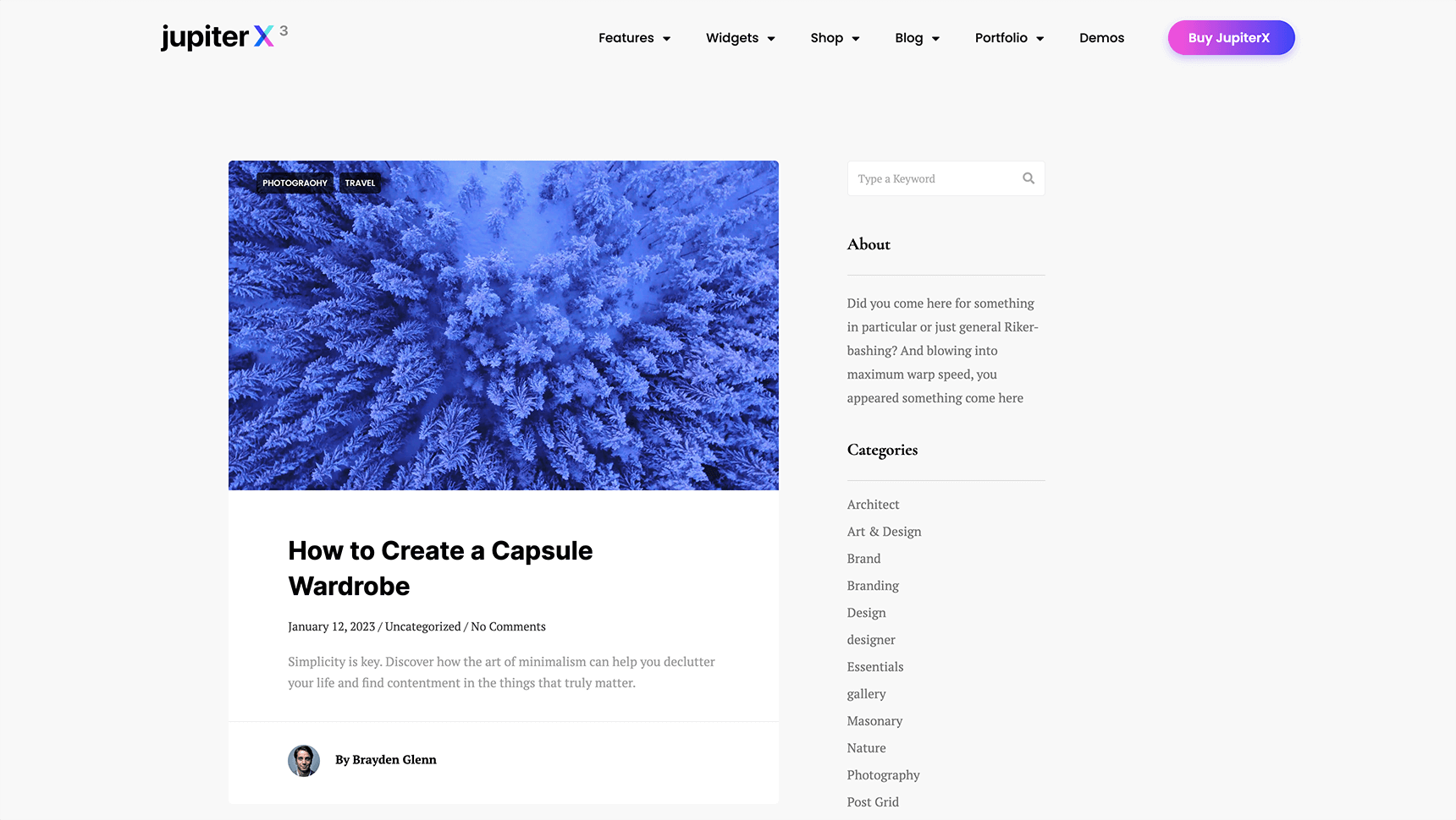
The above widgets are the constituent elements of a single blog page, and some of them, such as Advanced Posts, Posts, and Posts Carousel, can also be used in the blog grid (blog archive). The image displayed below can help provide a clear understanding of these widgets and their functions within a blog single page.
How to Create Blog Layout with Jupiter X3 Layout Builder
The Jupiter X3 layout builder offers a visual depiction of your entire website, including single and archive pages, allowing for straightforward customization of even the most minute details. This allows you to design custom single layouts, assign them to any post type, or create an archive page layout and apply conditional logic to determine where to display it. Let’s see how it works.
Widgets that need to be enabled in Elementor
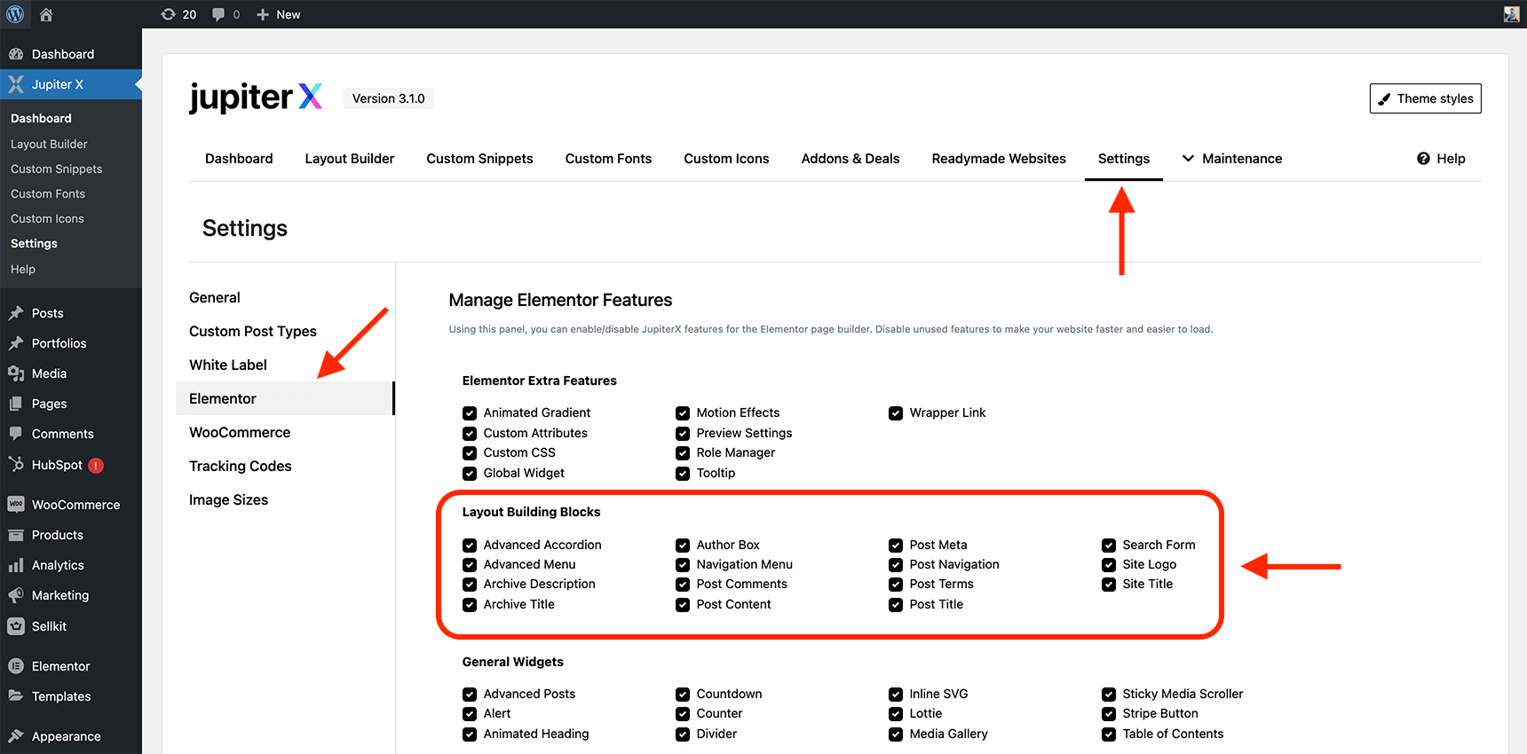
Before creating a blog layout, let’s check if all our required widgets can be found in Elementor. To check this, from your WordPress dashboard, navigate to Jupiter X > Settings and choose the Elementor tab. Then, make sure that all items in the Layout Building Blocks are marked. Finally, click on the Save Settings button at the bottom of the page.
By doing this, we ensure that all the required widgets of Jupiter X3 are available when creating a blog layout in Elementor.
A simple tip for a pixel-perfect and SEO-optimized layout
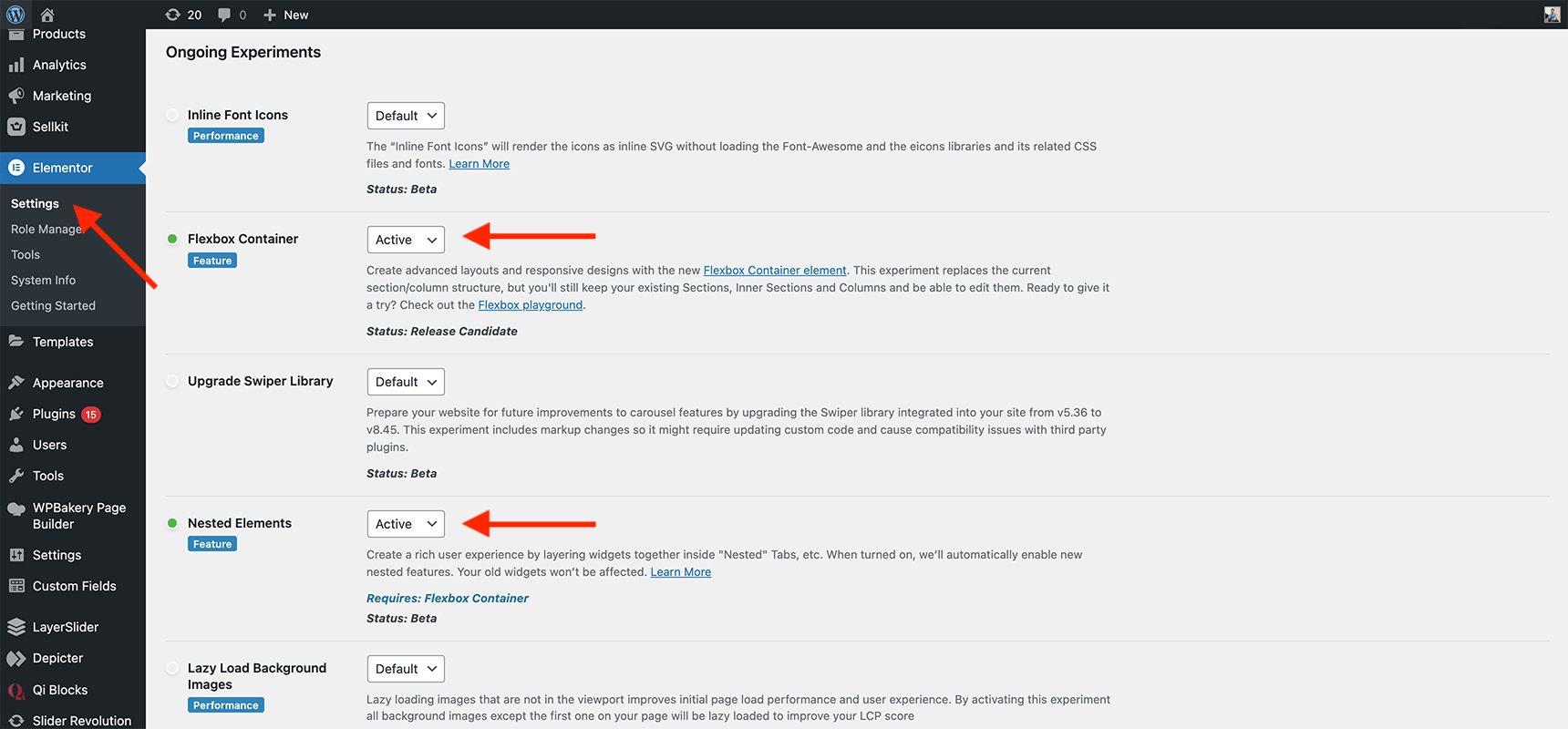
When designing a blog layout using Elementor, it is necessary to optimize the layout for search engines and ensure maximum design flexibility. To achieve this objective, you need to activate the Flexbox Container and Nested Elements features in Elementor first. These features help to group widgets in a container when creating layouts, improve page rendering performance, and bring more flexibility when designing a pixel-perfect page. Note that enabling these features affects the entire website.
To activate them, follow these steps:
- Go to your WordPress dashboard and navigate to Elementor > Settings > Features.
- Locate the Flexbox Container and Nested Elements features.
- Set both features to “Active“.
- Click on the “Save Changes” button to save your settings.
How to create a blog single page
A blog single page is a web page that displays the content of a post from a blog. It mostly consists of the post’s title, metadata, the main content, and sections such as the author box and comments. Here, we explain how to create a single page template with Jupiter X3.
To get started, follow these steps:
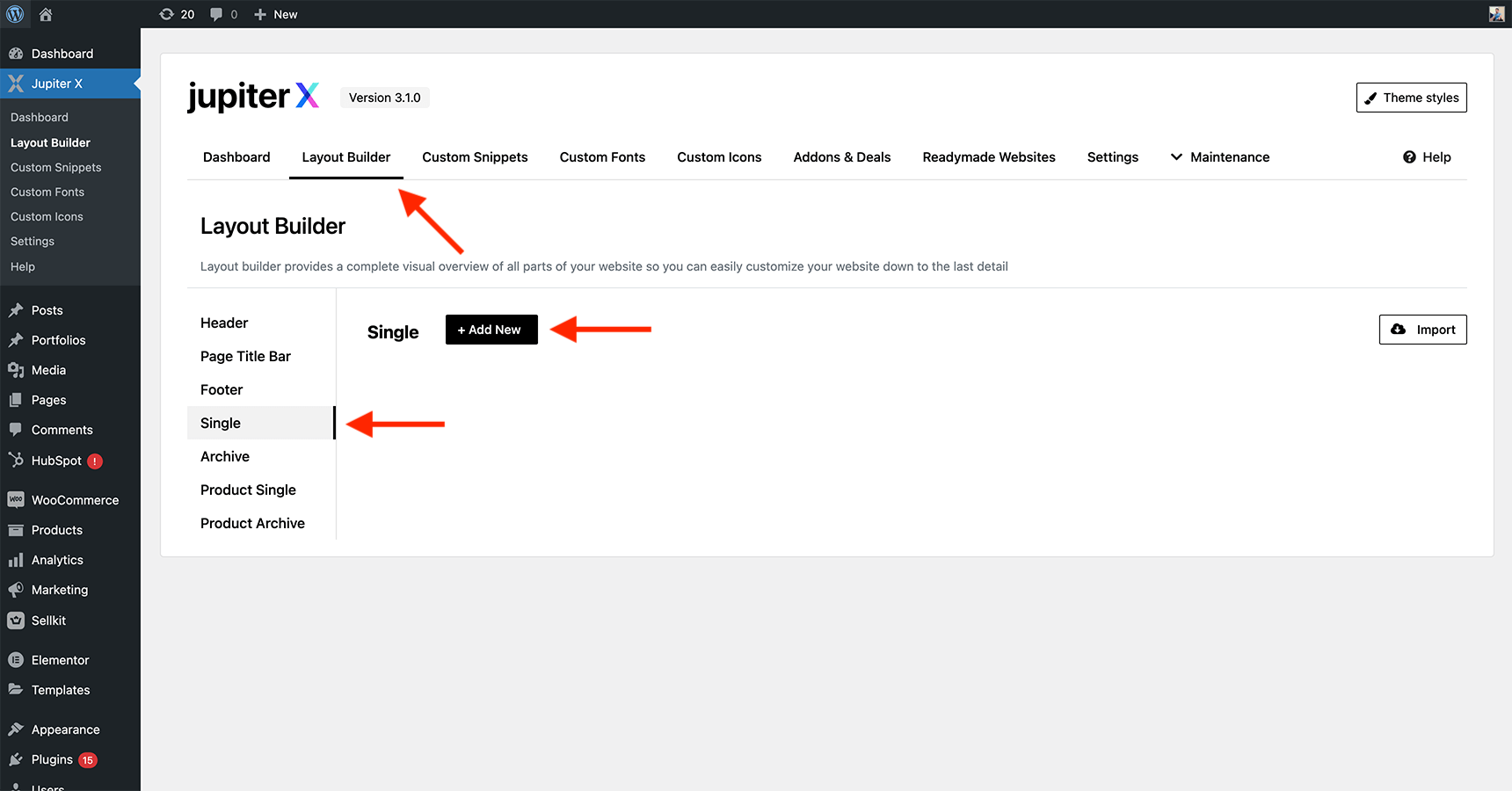
- Go to your Jupiter X dashboard and select the Layout Builder tab.
- Choose Single from the left sidebar and click on the + Add New button.
- Name your layout and click on the Create button.
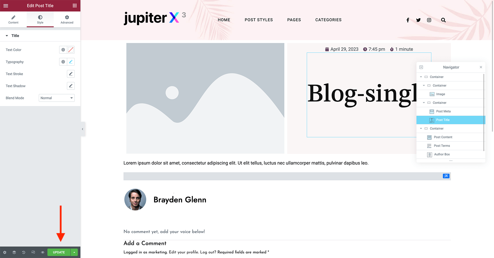
- Then, you will be redirected to the Elementor environment.
- Search for Jupiter from the left-side panel and you will see all the available widgets of Jupiter X3.
- Drag and drop related post widgets like title, meta, content, author box, comments, etc. into a single container on the right side.
- Customize the widget settings and design to your liking using the settings panel.
- Once you have added all the widgets you want to your page, click the Update button to save your changes.
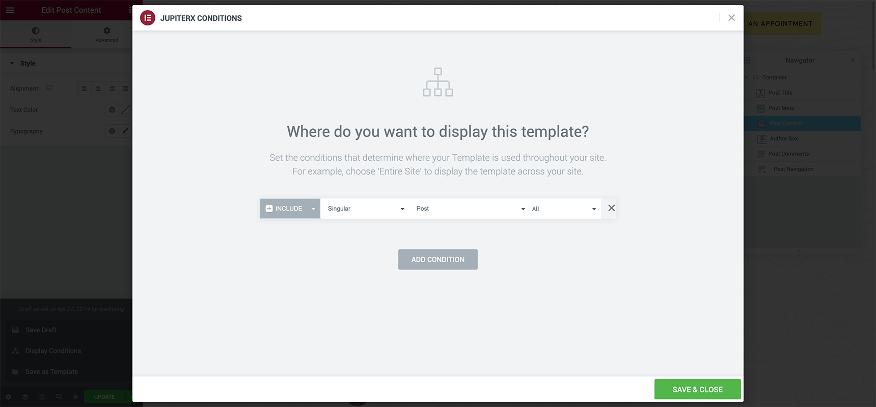
- Click on the arrow icon next to the Update button and select Display Conditions.
- Here, you can assign the created layout to your posts by defining conditional logics and then save it. For example, considering a Singular > Post > All value will assign the layout to all post types.
How to create blog archive page
For the archive page, the same steps as designing a single page layout apply, but with a few changes:
- You need to select Archive from the Layout Builder tab when creating a new layout.
- To benefit from a variety of layouts including grid, metro, matrix, column and masonry it is highly recommended to use the Advanced Post widget (these blog layouts will be discussed in the next section).
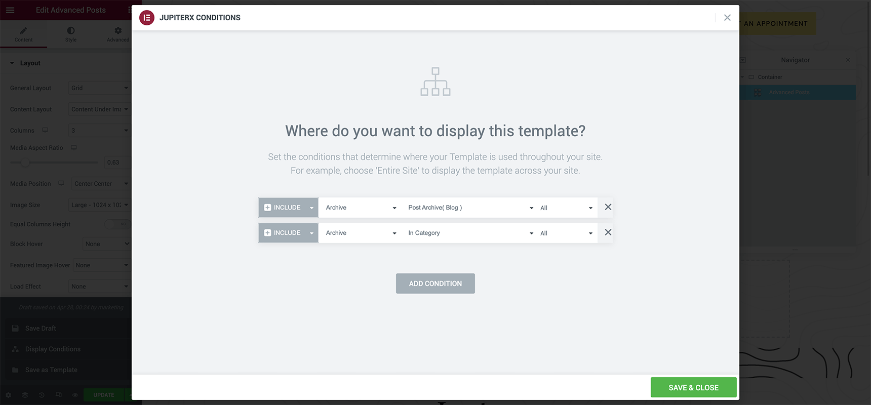
Note: If you have decided to use the Posts widget instead, it’s important to make sure that the Is Archive Template option is toggled on in the widget’s Content settings. - To assign your created layout to your archive page, you can use the following conditions together, as shown in the image below:
- Include > Archive > Post Archive (blog) > All
- Include > Archive > In Category > All
In the next section we will cover some of the best practices to follow when designing layout for blog single and blog archive.
Top 5 Practices for Single Blog Layout Design
Blog layouts can strongly enhance the user experience and readability of a blog. These layouts adapt to different types of content and audiences, so it’s imperative to choose one that perfectly suits your blog’s purpose and style.
However, during the blog design process, it’s important to consider various aspects beyond just the layout. For instance, you should simplify the layout by avoiding too many elements and using templates with multiple columns. Or choose colors wisely to create an easy-to-read and cohesive look, and limit your palette to three colors or fewer.
Let’s take a look at a few practices implemented using Jupiter X.
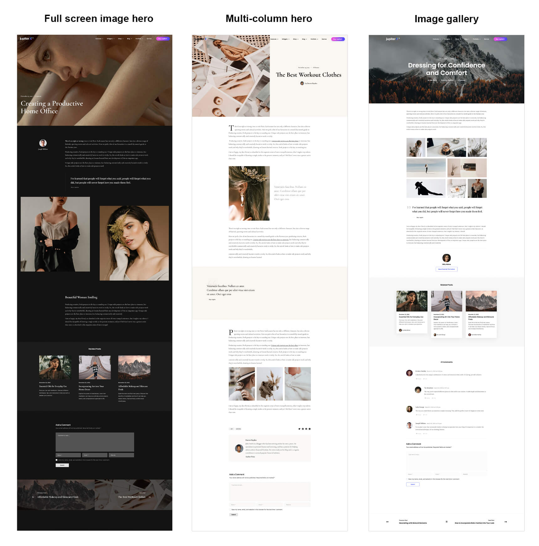
Full screen image hero
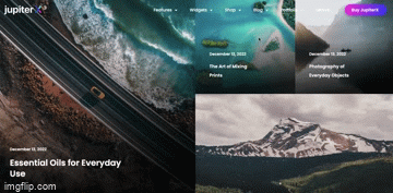
This layout sports a fullscreen image hero section followed by nice imagery in the body of the post. The Page Dynamic layout in Jupiter X is a good example of such a layout.
This layout is ideal for a blog single page that prioritizes both images and textual content, such as photo blogs, travel blogs, and lifestyle blogs.
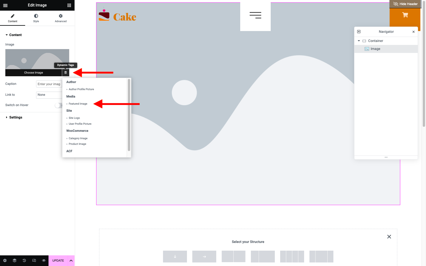
To create the hero section, you can set the Featured Image value for the Dynamic Tags and apply it as a background container. You can also add the post title and post meta to the container with proper padding and left alignment.
Multi-column hero
This layout makes good use of columns in the hero and body to organize content without sacrificing the aesthetic beauty. By using a two-column layout in the body of the article, you can emphasize the key points and spice up your post with a decent visual hierarchy.
This type of layout can be used for topics that do not rely much on imagery, such as diaries, literature, and academic blogs. The Page Builder blog layout in Jupiter X is a good example of this type of layout.
Image gallery
Image gallery layout is also useful for topics involving heavy imagery. As the title suggests, the post single page begins with a big image hero section and centrally-aligned post title and meta info. The hero is followed by one or multiple image galleries in the body of the post.
Check the Image Gallery layout by Jupiter X as an example. You can use this layout for a variety of topics such as beauty magazines, design blogs, and more.
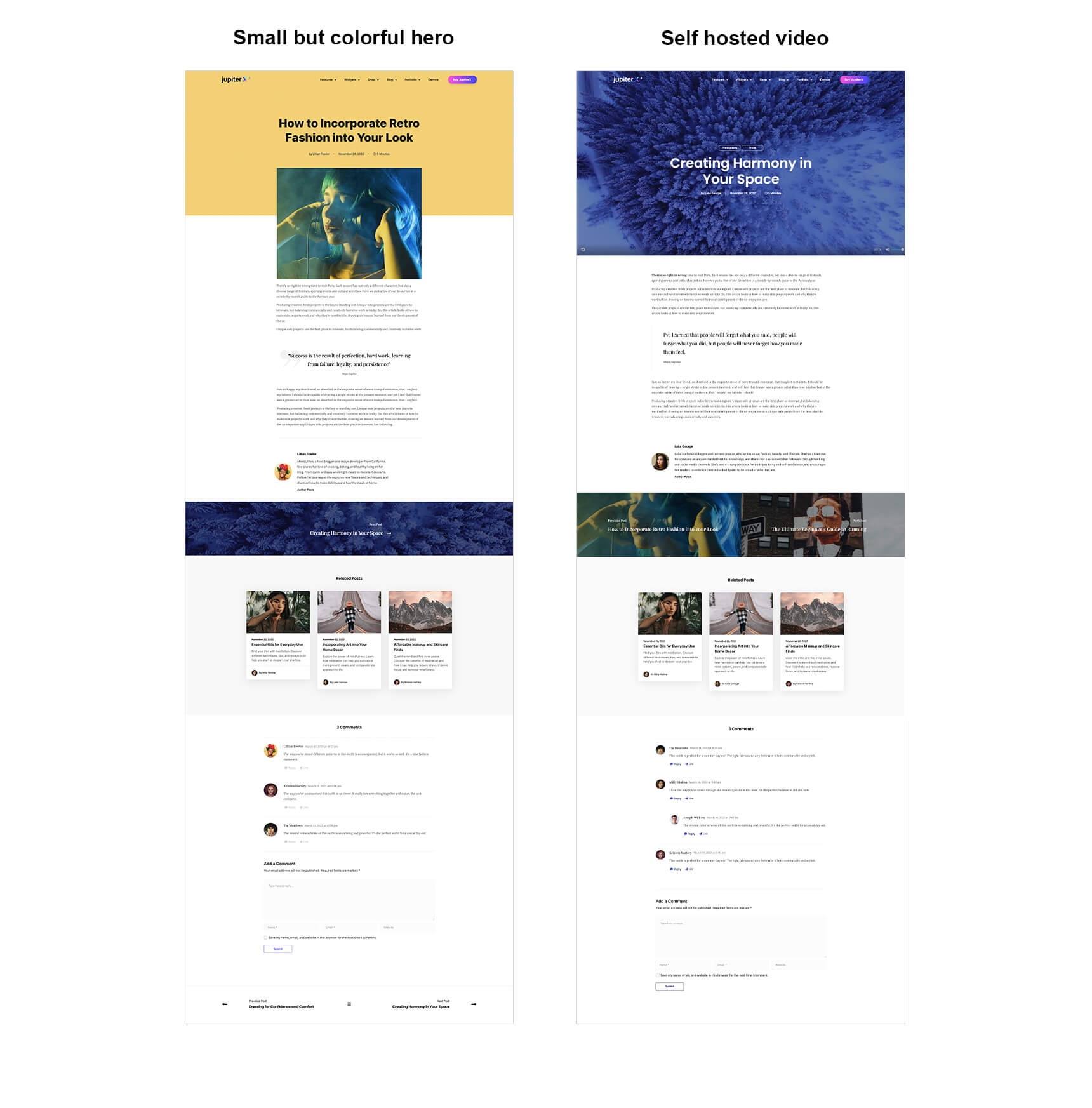
Small but colorful hero
This layout displays the title and post meta in a centered alignment within a container that has a colored background. The featured image is located in a container below, with a negative margin-top value.
This is a standard blog layout (and my favorite!) that can be used for a large variety of blog types. Check the Audio External layout in Jupiter X as an example.
Self hosted video
When your content is all about video, you want it to become the center of your blog too. If you are a videographer, filmmaker, or a vlogger, this is the right style for your blog.
To create the Self Hosted Video blog single layout, you will need to set a video as the background of the top container. To do this, you should add a new field group using the ACF plugin first. You can accomplish this by following these steps:
- Go to your WordPress dashboard and navigate to ACF > Field Groups > Add New.
- Enter a Field Group Name, such as Post Hero Video.
- Select Text as the Field Type.
- Enter ‘Video URL’ as the Field Label.
- Enter ‘video_url’ as the Field Name.
- Select Post as the Post Type.
- Save your changes.
Next, using the JX layout builder, define a new single layout. Add a container with full width and a minimum height of, for example, 400 px. Then, set the background type to Video and for the video link value, select Dynamic Tags > ACF Field, and set the Settings Key to Video URL.
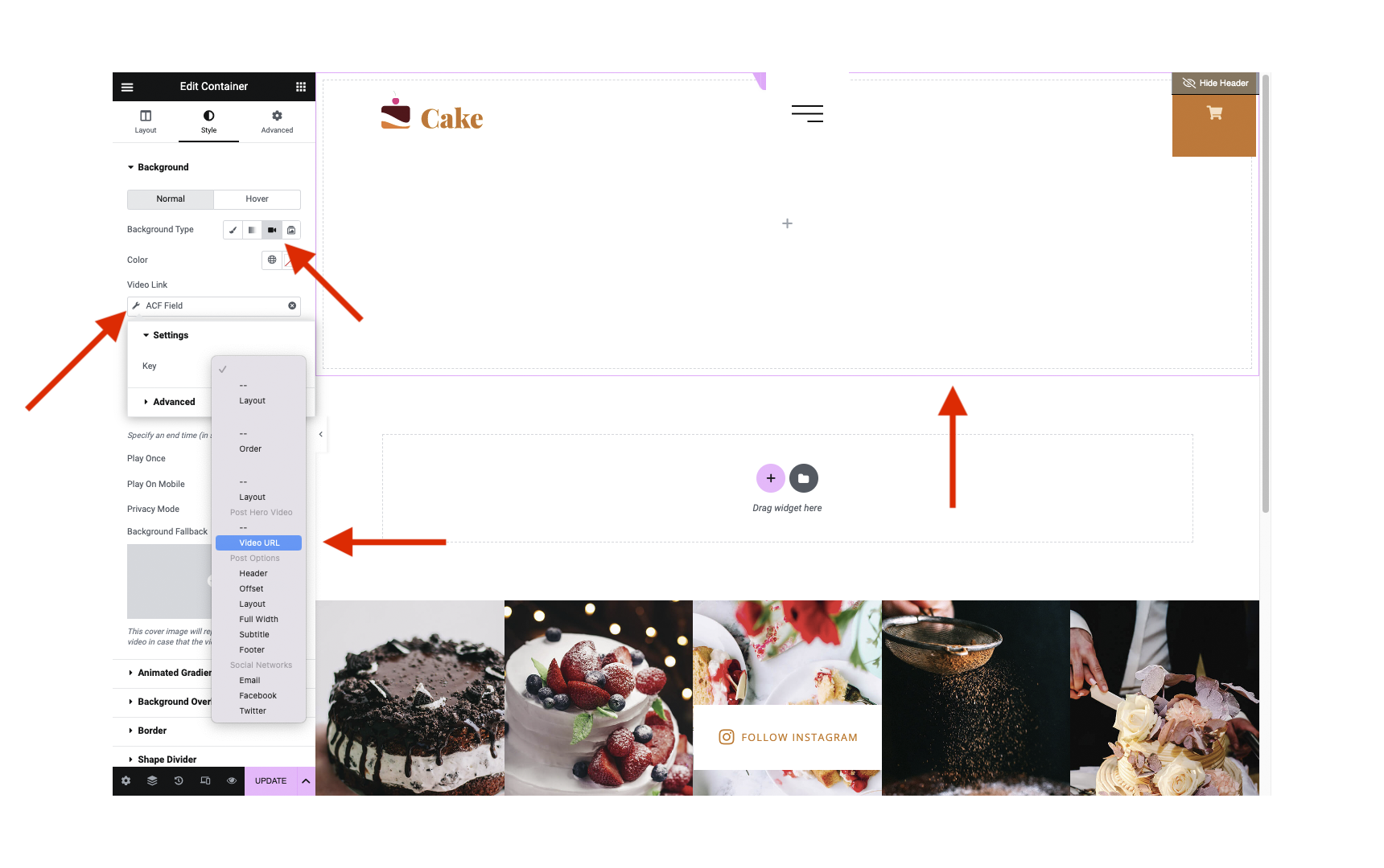
In the next step, set the display condition as:
Include > Singular > In Post Tag > Video Cover
Note: Before selecting the ‘Video Cover’ tag in this step, you must first add the ‘video cover’ tag.
All you need to do then is to add the video URL (YouTube, Vimeo, or direct MP4 hosted on the same website) from the Post Hero Video section when creating a new post in WordPress and include the ‘video cover’ tag for it.
Top 8 Archive Blog Archive Layout Practices to Follow
The following archive layout practices aim to showcase layouts that can be implemented using the Advanced Posts widget for a variety of content types and target audiences.
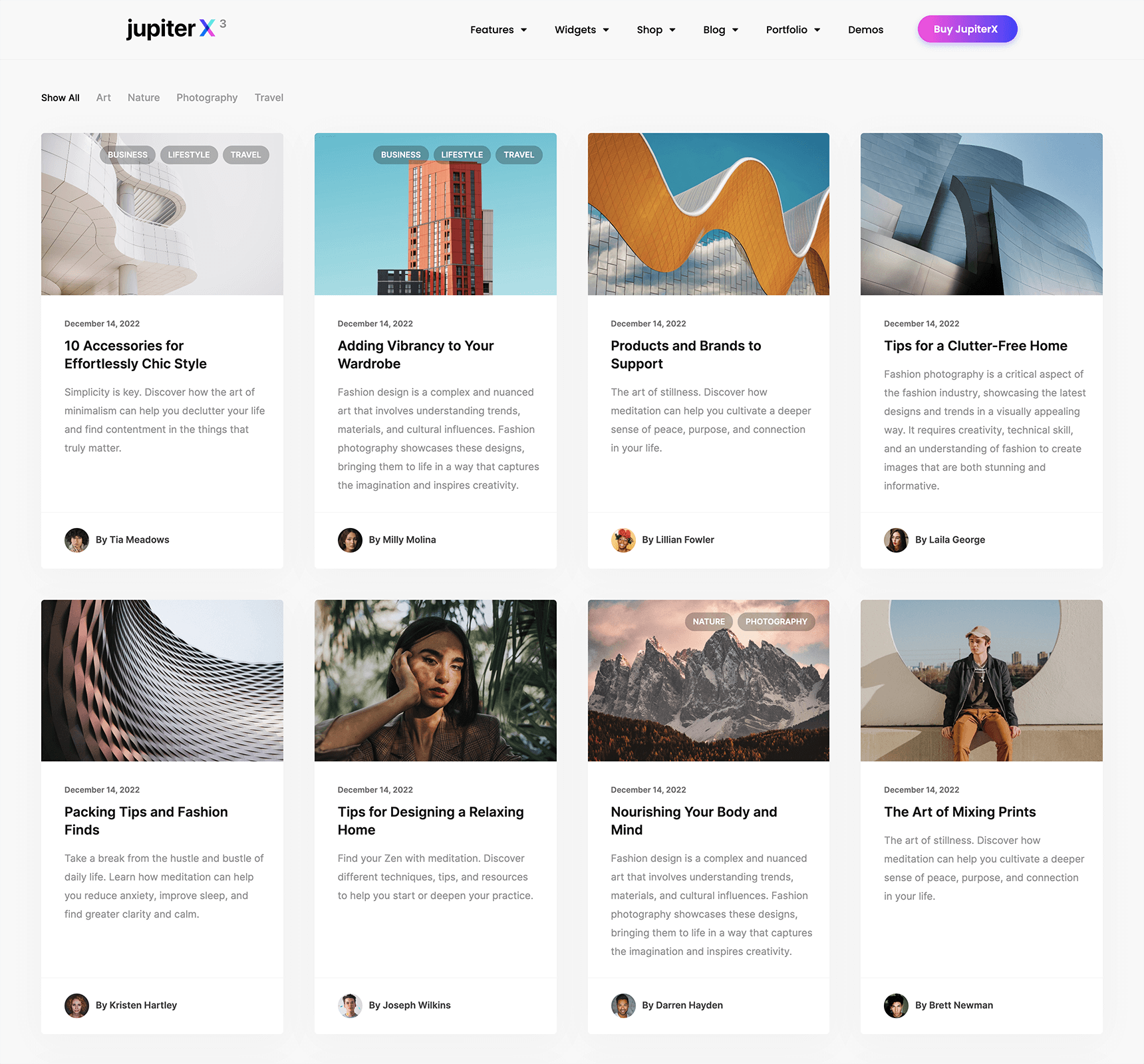
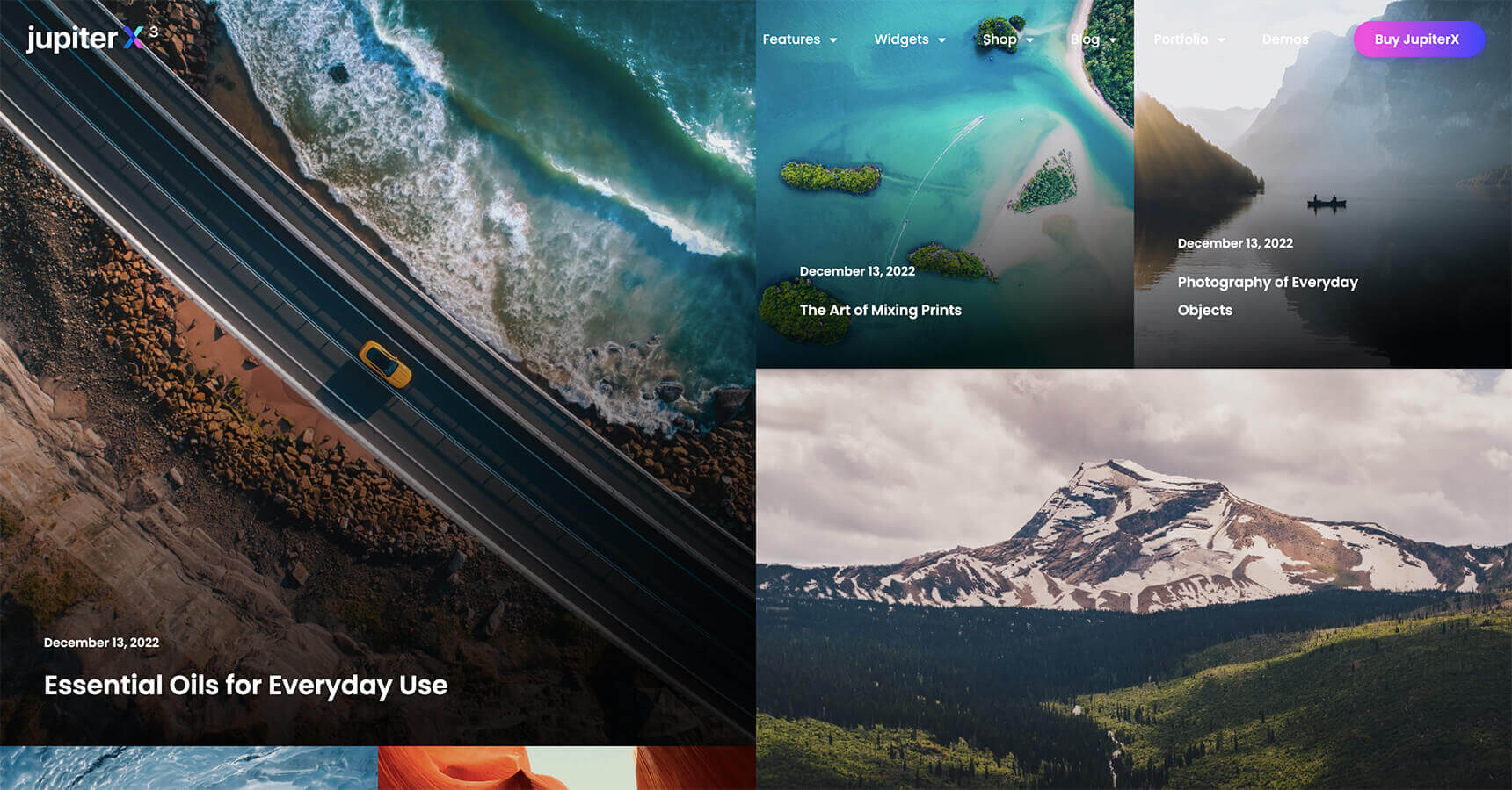
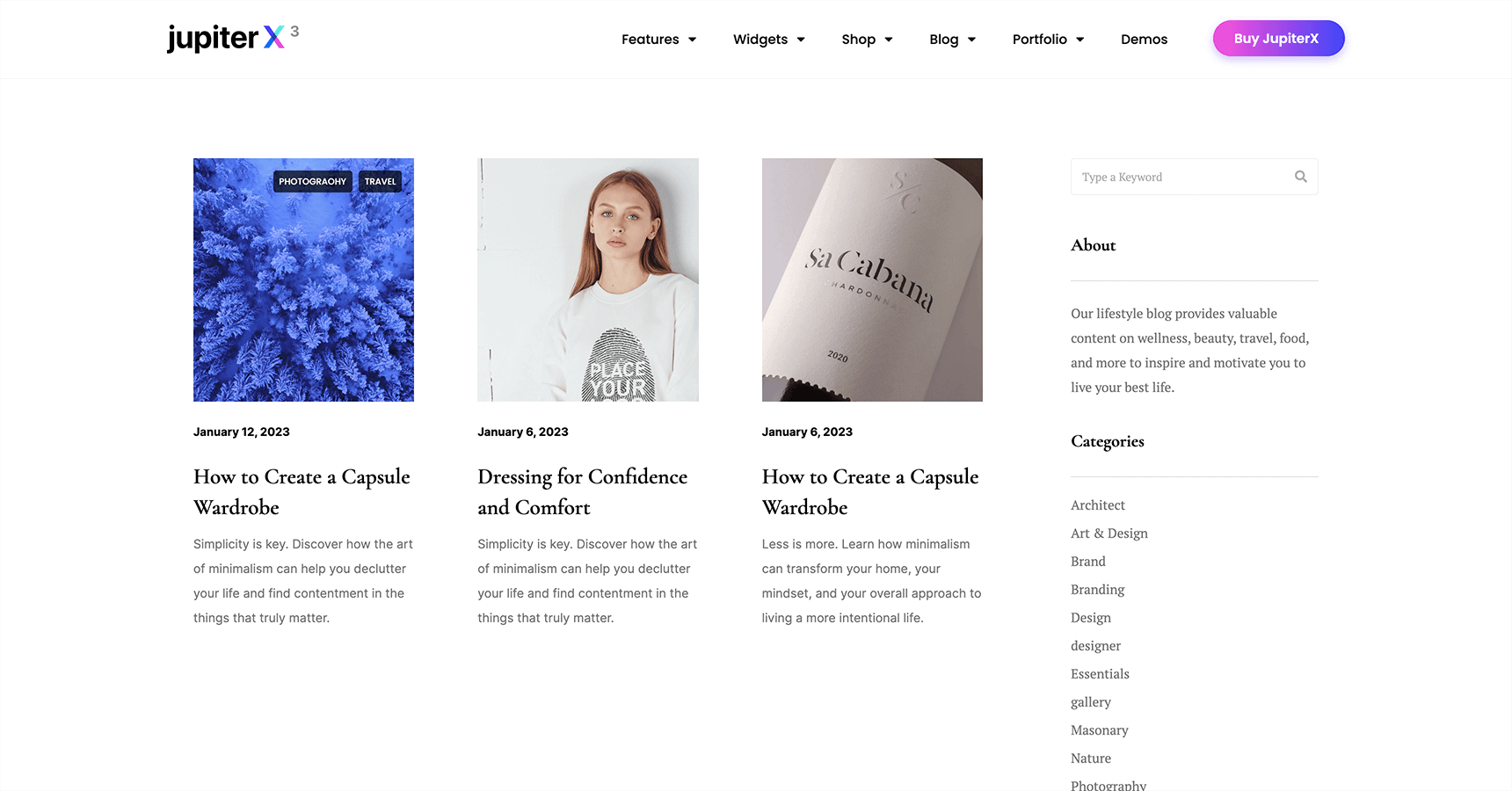
Grid
You can design a blog grid structure by choosing the Grid value for the Advanced Posts widget and setting the columns to two to six. This layout organizes your blog posts into a series of equal-sized squares or rectangles, creating a clean and visually appealing design.
Grid layout is ideal for blogs with a large number of posts, as it allows users to quickly scan and find the content they’re interested in. Newspapers, magazines, or news sites are the best use cases of grid layout as it makes long texts easier to read.
To clarify further, imagine you run a blog that covers a variety of scientific fields, such as astrobiology, astronomy, geology, meteorology, and more. With so many diverse topics to cover, it can be challenging to organize your content in a way that is both visually appealing and easy to navigate. This is where a grid layout can be incredibly useful. Here, you can see a preview of the grid layout designed with 4 columns and content under images:
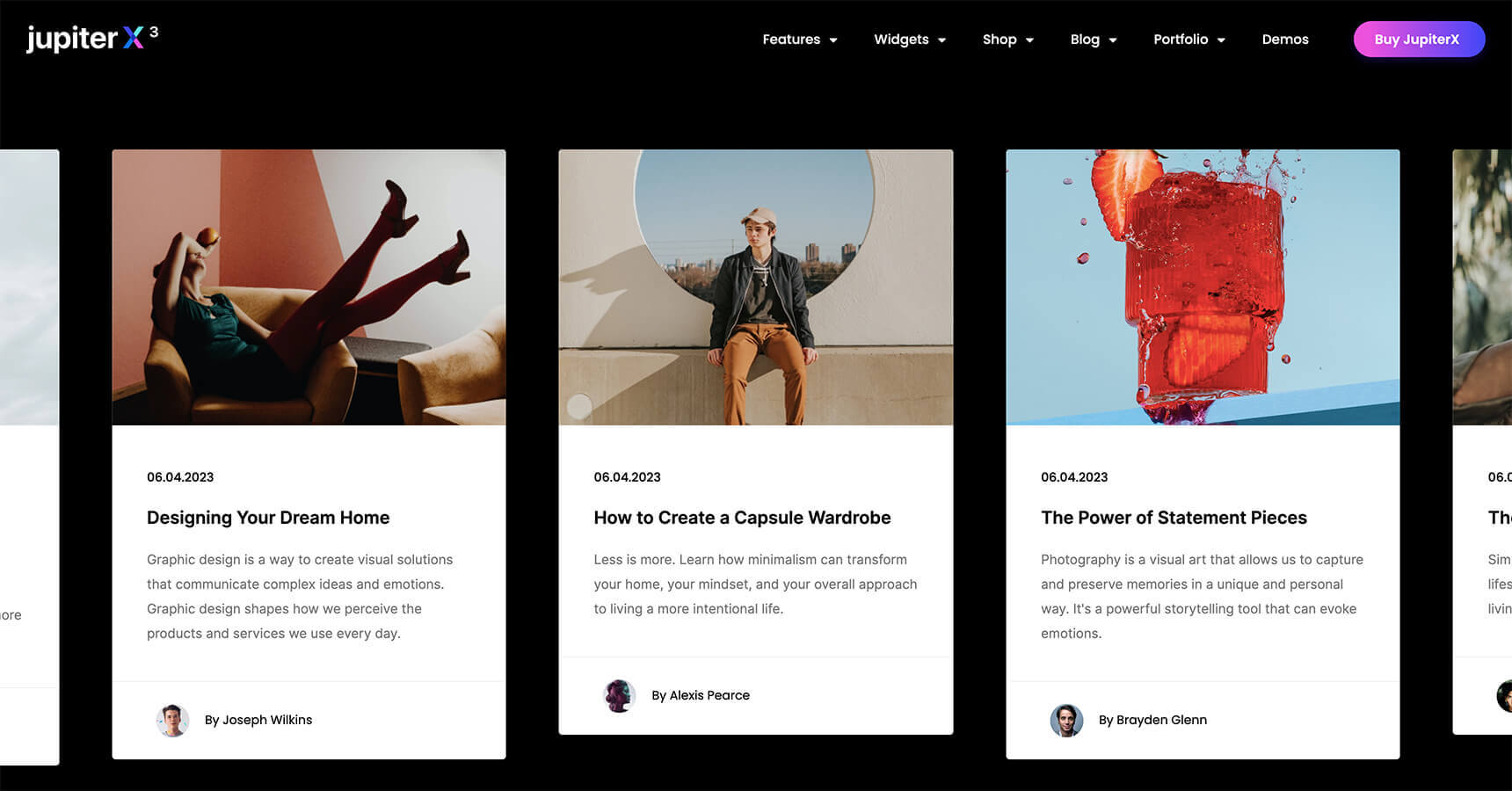
List/Column
A blog list or column is a popular layout that presents blog posts in a single column, stacked vertically. This layout typically arranges posts in chronological order, with the latest post at the top of the list. The simplicity and intuitiveness of the blog list layout make it a great choice for bloggers who want to present a large volume of content in an easy-to-read and organized format.
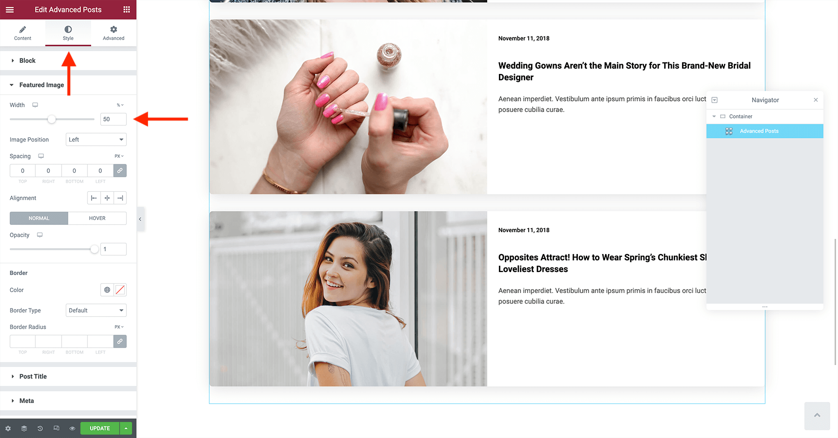
To create this layout, you will need to use the Advanced Posts widget, set the general layout to Grid with one column, and use the content on the side or under image options. For Content on the side to work, make sure that the featured image size is set to 50% from the Style > Featured Image.
Here are a few examples of how a blog list layout can be used:
- News Websites: News websites often use a blog list layout to display the latest news articles in chronological order.
- Recipe Blogs: These blogs can show a list of recipes in a particular category, such as desserts or appetizers, using the list layout. This makes it easy for users to find the recipe they are looking for without having to navigate through a complicated menu.
- Education Websites: With a blog list layout, these blogs can display a list of upcoming events, news about the school or university, or tips and advice for students. This makes it easy for students to stay up-to-date on the latest information and events.
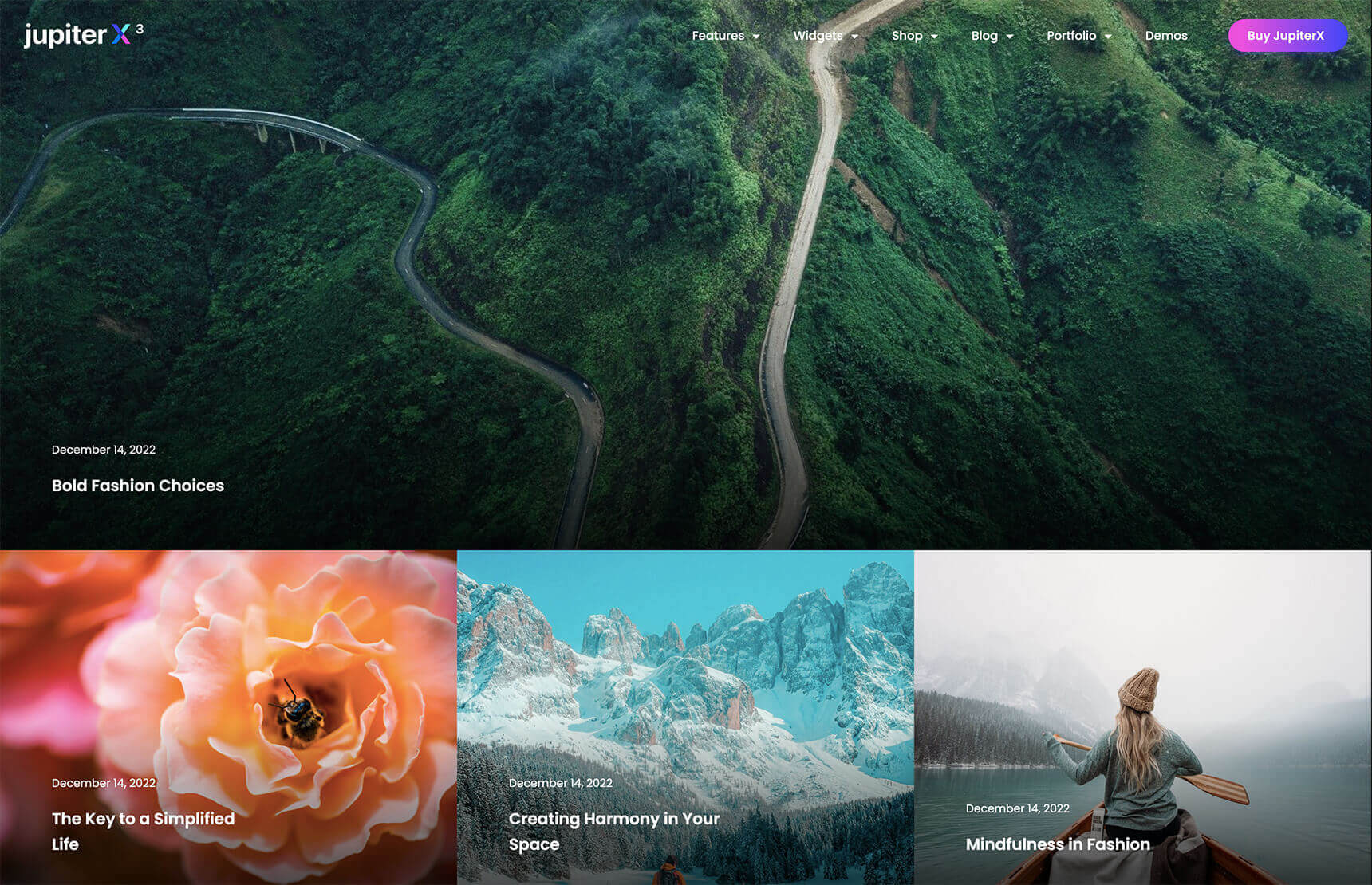
Metro style
Inspired by the Windows Metro interface, this layout arranges blog posts in a mosaic of tiles with varying sizes. The tiles are arranged in a grid format, with each tile occupying a fixed amount of space. This creates a visually stunning and highly organized layout that is both engaging and easy to navigate. The Metro style layout is highly visual and focuses on showcasing images, making it an ideal choice for websites that rely heavily on visual content.
Photography and tourism blogs are great examples of sites that can benefit from a Metro style. One of the key features of a Metro style layout is the use of tiles or panels to display each post. Each tile typically includes a featured image, a headline, and maybe a brief excerpt from the post. You can choose the Metro option from the Advanced Posts widget and select to show content overlay or under the images.
The following examples illustrate how the Metro layout can be used in a variety of contexts:
- Fashion Blogs: Blogs about fashion can utilize the Metro style layout to visually showcase outfits. Each tile could include a photo of the outfit, for example.
- Travel Websites: Different destinations can be showcased on travel websites using Metro style layouts. Tiles can contain images of popular tourist destinations, headlines, and brief descriptions of each, facilitating the user’s search for information.
- Photography Blogs: Metro-style layouts are perfect for photography blogs. Users can easily explore the photographer’s work since each tile would feature a different photograph.
Matrix
The Matrix layout shows blog posts in a grid-like format. The name of the blog matrix layout comes from its resemblance to a criteria matrix, which has data selection criteria associated with its columns and rows. In Jupiter X3, the Matrix layout displays one post on the first row, three on the next, and the pattern continues for the following lines.
The Matrix layout is similar to the Metro style as it features an image-centered layout. Similarly, the use cases and examples of Metro style layouts also apply to Matrix layouts, with the main difference being the visual appearance and design.
To use the Matrix layout for the archive page, select Matrix from the Advanced Posts widget. After implementing it and making a few modifications, this is what we got:
Carousel
The carousel blog layout is characterized by a horizontally scrolling display of blog posts, often accompanied by images. This layout style breaks away from traditional linear blog designs, allowing readers to easily navigate through multiple posts in a dynamic and fluid manner.
This layout is excellent for highlighting your most popular or recent content, drawing users in and encouraging them to explore further. By adding the Posts Carousel widget to your archive page template, you can have this layout.
Sidebar
The sidebar layout includes a vertical column alongside your main content area, which can be used to display additional information such as an about section, social media links, or categories. To utilize this layout, you will need to create a container that includes a sidebar and add the Advanced Posts widget to the main area. Then, select the Grid layout with one column for the content. Finally, you may add any widget of your choice to the sidebar.
A well-designed sidebar can help users quickly find what they’re looking for, reducing the need to scroll through long pages or use the back button. This layout can be a valuable addition to a wide range of blog types, helping to enhance user experience and navigation, especially for category-based or personal blogs. Here are a few examples:
- Lifestyle Blogs: Personal lifestyle blogs often cover various aspects of the blogger’s life, such as travel, fashion, food, and wellness. A sidebar layout can help organize these diverse topics and make it easier for readers to find content that resonates with them. For example, a lifestyle blogger could use a sidebar to display categories like “Travel Diaries,” “Fashion Tips,” “Recipes,” and “Wellness Advice.”
- Educational Blogs: Blogs that focus on providing educational content, such as tutorials, guides, or courses, can benefit from sidebar layouts by organizing their content into easily accessible categories. For example, a language learning blog could use a sidebar to display categories like “Grammar Lessons,” “Vocabulary,” and “Listening Exercises.”
- Business Blogs: Business blogs can use sidebar layouts to showcase their products or services, display testimonials, or provide easy access to case studies. For example, a marketing agency’s blog could use a sidebar to display categories such as “SEO Tips,” “Social Media Strategies,” and “Content Marketing Advice,” along with a section for client testimonials.
Grid sidebar
Combining the grid and sidebar layouts, the grid sidebar layout organizes your blog posts in a grid format while also incorporating a sidebar for additional content. It features more than one column, enabling the display of content areas in a structured manner. This layout is particularly useful for websites with a vast array of information, as it allows for better categorization and easier navigation. The grid sidebar layout has similar use cases to a sidebar layout. Currently, we use this template for the Artbees Blog.
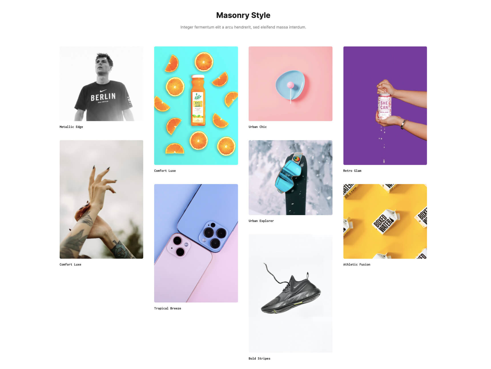
Masonry
The Masonry blog layout is a type of blog design that features a grid-based arrangement of posts with varying sizes and proportions. This layout is characterized by its irregular and asymmetrical appearance, which creates an interesting and dynamic visual effect. Unlike traditional blog layouts, where posts are displayed in a linear and uniform manner, the Masonry blog layout allows for more creative and flexible post arrangements that can better showcase visual content like images and videos.
This layout can be used for a variety of blog niches and content types, from fashion and lifestyle to food and travel. However, this layout is particularly well-suited for blogs that feature a lot of visual content, such as photography blogs or portfolio websites.
To apply the Masonry layout, simply drag and drop the Advanced Posts widget to your archive page and set the General Layout to Masonry. You also have the option to use it with different numbers of columns.
Key Takeaways
In summary, creating the perfect blog layout requires careful consideration of design widgets and proper customizations. By following the tips outlined in this blog post, you can choose a layout that suits you best and implement it to your blog. Here are some key takeaways to keep in mind when creating a blog layout:
- For a better understanding of the widgets and elements available to use for a blog layout, we recommend visiting the JupiterX website.
- Keep your blog layout simple and easy to navigate, with a clear hierarchy of information that guides the reader’s eye.
- While designing your layout in Elementor, ensure that it is optimized for SEO purposes.
- To discover the layout that best illustrates your content and resonates with your audience, we recommend experimenting with various layouts available in Jupiter X3.
- Don’t be afraid to make changes to your blog layout over time to keep it fresh and up-to-date.

3 Comments
Thanks for sharing all these details of creating a custom blog page. Is this to replace the standard blog template or is this to use in addition to the existing blog template?
I basically use two blog formats. One is a standard jupiter template and another is an elementor version that allows me to use a cover/hero image that goes across the entire page. Similar thing with images. With the custom template I can go full width.
In other words, if I go through the steps to create a new template, will I be able to choose which template to use for each post I create or would this new template become the new default template for all posts?
I basically utilize two different forms for my blogs. The first is a regular Jupiter template, and the second is a modified version of Elementor that enables me to make use of a cover or hero image that fills the space of the full page. The same thing may be said with pictures. Because this is a custom template, I have the ability to utilize the whole width.
Excellent piece, and the insights you’ve shared are both fascinating and helpful to me. Your post has provided me with a wealth of information. I really hope that you will be publishing more fresh posts in the not too distant future!