An essential feature of the human brain is its ability to pay attention to moving objects, and such objects can be used to attract the attention of your site’s visitors. CSS animations are a powerful and useful tool that can help make the design of individual elements unique and attractive, as well as improve the user journey through your site. It makes websites dynamic. The main advantages of CSS animations over JavaScript animations are as follows:
- Animations run smoothly even with medium system load
- CSS is easy to use for simple animation effects
- It allows the browser to control the animation sequence to optimize performance, which is especially useful when the tab is not currently active
In this article we will cover the basic concepts of CSS animations.
CSS animation building blocks
CSS animations consist of two basic building blocks: Keyframes and Animation Properties. The keyframes block defines the appearance of the animation, and the animation properties are used to style the element you want to animate.
Using the @keyframe rule we can set two or more keyframes for our animation and then describe how the animated element should render during the animation sequence. Each @keyframes consists of:
- Animation name
- Animation stages
- CSS properties
In the animation name section you need to define the name of the animation; for example, myFadeIn. The animation stages section describes each stage of the animation and is represented as a percentage. The start of the animation is indicated as 0% (or from) and the end of the animation is indicated as 100% (or to). Between the starting and ending states of an animation you can add multiple intermediate states. Finally, with the help of CSS properties you can define an animation timeline on each state. Let’s take a look at a simple example of the animation keyframes below, called myFadeIn.
@keyframes myFadeIn {
  from {
    opacity: 0;
  }
  to {
    opacity: 1;
  }
}
As you can see it has two stages. At the first stage (from) the element has 0 opacity and in the final stage it changes to 1.
When you’re done with @keyframes you need to add animation properties to make the animation function. Animation properties assign @keyframes to the elements you want to animate and allow you to configure the timing, duration, and other details of the animation sequence.
There are two required animation sub-properties you need to add for the animation to take effect:
- animation-name: The name of the animation, which is defined in @keyframes
- animation-duration: The duration of the animation in seconds or milliseconds
Let’s apply a previously created myFadeIn animation to a div block:
div {
  animation-name: myFadeIn;
  animation-duration: 3s;
}
Animation property shorthand
You can define each animation property separately, but animation shorthand can also be used for fast and clear code. The animation property includes the animation sub-properties in the following order:
animation: [animation-name] [animation-duration] [animation-timing-function]
[animation-delay] [animation-iteration-count] [animation-direction]
[animation-fill-mode] [animation-play-state];
Be aware that you need to define at least the first two values following the proper shorthand order to make your animation work properly.
Optional animation sub-properties
As was mentioned before, the animation-name and animation-duration sub-properties are required, but there are also additional sub-properties that can be added to create complex CSS animations:
- animation-timing-function
- animation-delay
- animation-iteration-count
- animation-direction
- animation-fill-mode
- animation-play-state
The animation-timing-function defines the animation speed curve. There are predefined timing options that can be specified for this sub-property:
- ease
- ease-in
- ease-out
- ease-in-out
- linear
- initial
- inherit
If no option is assigned, the default value is ease.
Below are examples of the animation-timing-function using shorthand syntax.
ease-in:
div {
  animation: myFadeIn 3s ease-in;
}
ease-out:
div {
  animation: myFadeIn 3s ease-out;
}
linear:
div {
  animation: myFadeIn 3s linear;
}
More detailed information about the animation-timing-function and its options can be found in this article.
The animation-delay specifies when the animation starts. The value can be defined in seconds or milliseconds and a positive or negative value. For example, animation-delay is set to 5s, so animation will start 5 seconds after it is triggered.
div {
  animation: myMove 3s ease 5s;
}
The animation-iteration-count allows you to define the number of times the animation will be played before stopping. You can set the following values:
- a specific number of iterations (default is 1)
- infinite: The animation repeats indefinitely
- initial: Sets the default value of iteration count
- inherit: Inherits the value from the parent
In the example below the animation plays 2 times.
div {
  animation: bounceIn 1s ease-in-out 2;
}
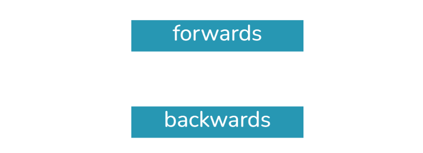
The animation-direction defines the direction an animation should play: forward, backward, or alternate. The possible values are:
- normal: The animation plays forwards each cycle (this is the default value)
- reverse: The animation plays backwards each cycle
- alternate: The animation reverses direction each cycle, starting the first iteration from the beginning state. On each odd cycle the animation plays forwards, and on each even cycle it plays backwards
- alternate-reverse: The animation reverses direction each cycle, starting the first iteration from the ending state
Normal direction:
div {
  animation: myMove 3s infinite normal;
}
Reverse direction:
div {
  animation: myMove 3s infinite reverse;
}
The animation-fill-mode helps you define whether the animation styles are visible before or after the animation plays. The possible values are:
- none: This is the default value, and animation won’t apply any styles to the element when it’s not running
- forwards: After the animation is completed, the styles defined in the ending keyframe will be kept by the element
- backwards: Before the animation, when the animation delay is set, the styles of the initial keyframe will be applied to the element
- both: The animation follows the rules for both forwards and backwards, taking the animation properties before and after the animation
Forwards:
.div {
  animation: customScale 1s ease-in-out 3s 1 forwards;
}
Backwards:
.div {
  animation: customScale 1s ease-in-out 3s 1 backwards;
}
The animation-play-state can be used to specify whether the animation is playing or paused. When resuming a paused animation, it will start where it left off, rather than starting from the beginning. This sub-property is good to use for hover states, when the animation pauses as the mouse hovers over the element. There are two possible values:
- playing: The animation is running
- paused: The animation is paused
Note that you can add multiple animations to a selector by simply separating the values with a comma as shown in the example below:
.div {
  animation: fadeIn 3s, rotate 2s;
}
CSS animation examples for your website
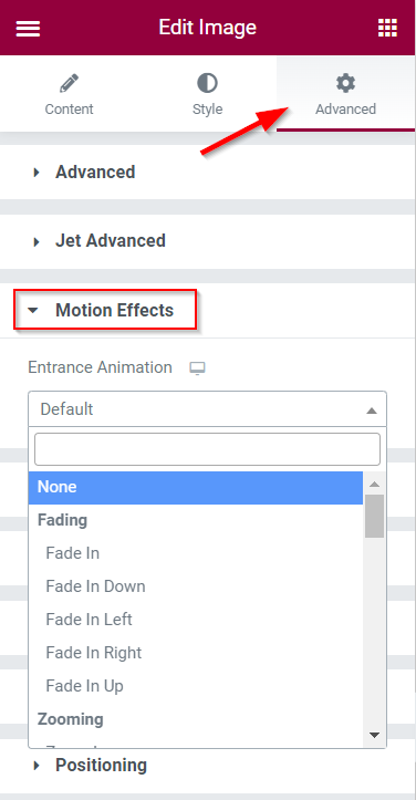
In the Elementor editor there is a built-in feature to add entrance animations in the Advanced > Motion Effects section of the element settings, but it doesn’t include loop animations.
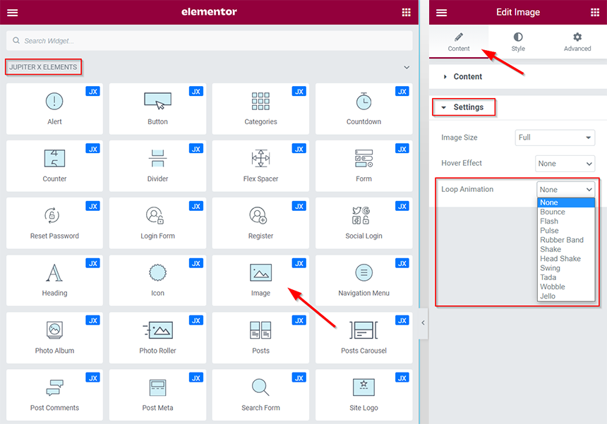
However, in addition to default Elementor CSS animations, the Image widget from the Jupiter X Elements list has the ability to apply loop animation.
Now let’s take a look at some custom CSS animations that could be useful for your website. In our examples we’ll use the Icon widget from Jupiter X Elements. One important note: you can animate block or inline-block level elements (grid and flex containers are also block-level elements), as animation won’t work for inline elements.
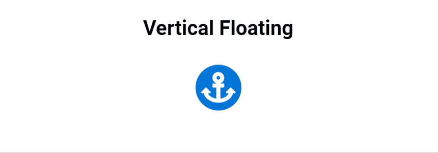
CSS Animations: Vertical Floating
First, we need to add the Icon element and assign an extra CSS class to it in Advanced > CSS Classes, which will be used to apply the animation to. For the first example the CSS class is animated-icon-one. When it’s done, open the customizer and go to the Additional CSS section. Here we’ll add the CSS code for our animation:
@keyframes custom-vertical-floating {
    0% { transform: translateY(0); }
    100% { transform: translateY(-10px); }
}

.animated-icon-one .raven-icon {
	animation: custom-vertical-floating 2s infinite alternate;
}
Below you can see the result of our vertical floating animation.
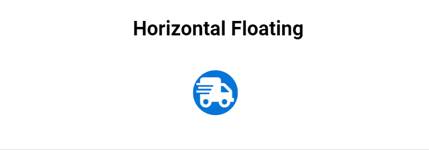
CSS Animations: Horizontal Floating
For the element of this animation we used the animated-icon-two extra CSS class. The CSS animation code is:
@keyframes custom-horizontal-floating {
    0% { transform: translateX(-10px); }
    100% { transform: translateX(10px); }
}

.animated-icon-two .raven-icon {
	animation: custom-horizontal-floating 1s infinite alternate ease-in-out;
}
The result of the horizontal floating animation is provided below.
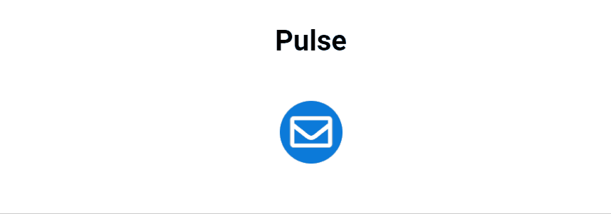
CSS Animations: Pulse
The extra CSS class for this animation element is animated-icon-three and the CSS code is:
@keyframes custom-pulse {
    0% {
       transform: scale(0.8);
       opacity: 0.6; }
    50% {
       transform: scale(1);
       opacity: 1; }
    100% {
       transform: scale(0.8);
       opacity: 0.6; }
}

.animated-icon-three .raven-icon {
	animation: custom-pulse 2.5s infinite linear;
}
The result of the custom pulse animation is shown below.
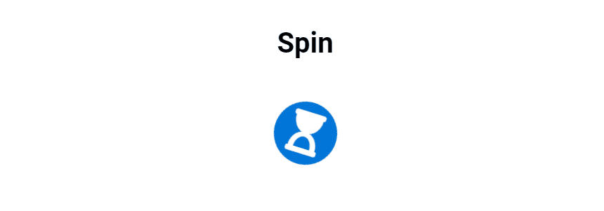
CSS Animations: Spin
And the last example is the custom spin CSS animation. Here the animated-icon-four extra CSS class is assigned, and we also used a paused animation state when the mouse hovers over the Icon element. Here is the code:
@keyframes custom-spin {
    0% {
       transform: rotate(0deg); }
    100% {
       transform: rotate(359deg); }
}

.animated-icon-four .raven-icon {
	animation: custom-spin 3s infinite linear;
}

.animated-icon-four .raven-icon:hover {
	animation-play-state: paused;
}
The result of the animation is shown below.
Conclusion
In this article, we got to know the basic concepts of CSS animations and its importance in website design. Although the Elementor and certain elements allow you to add ready-made CSS animations, it is important to understand how you can create custom animations and apply them to the elements you need. The possible CSS animations you can create are endless, and the best way to learn is to start animating. To practice with your animations, you can use the CSS playground resource, called Codepen, where you can edit your code and immediately see the results.

1 Comment
You must use the animation property or one of its child properties to style the element you wish to animate in order to construct a CSS animation sequence.