
One frustration we often hear about, and one that I’ve personally experienced on a frequent basis involves issues with image sizes and image quality. Images and videos are a major part of any modern WordPress website. We live in strange times where visitors are drawn to more and more visuals, and yet expect more and more simplicity out of any given website that they visit.
These high expectations in web browsing could very well be due to the popularization of inexhaustible search engines like Youtube and photo-heavy social media platforms such as Instagram.
Nowadays, images and videos account for more than 70% of a website’s total bandwidth. That’s pretty wild! That means that almost three-fourths of the data traveling between your website, users and the internet are images and videos alone, while all other coding, written content, layouts, formatting, widgets, and the rest make up just about a fourth!
These figures are even more pronounced for those of you dealing with cutting-edge web design. On an image-rich social website employing a Pinterest-like layout, the bandwidth of images and videos can reach upward of 85%. It’s about time we start paying closer attention to improve and optimize these features to avoid any common issues with image sizes and video in the future.
[call_to_action title=” Choose from 600,000+ video effects and stock footage from our partner VideoHive.” target=”_blank” url=”https://1.envato.market/c/1239055/275988/4415?subId1=video-related-docs-posts&u=https%3A%2F%2Fvideohive.net%2F%3F_ga%3D2.121018312.1576656066.1529567969-1771989461.1491563327″ type=”link”]
Classic Issues With Image Sizes

#1: Bandwidth gets overloaded and slows down, driving you and everyone else crazy.
As mentioned earlier, webpages in general are very small in size compared to images and videos, so they’re usually to blame for an overloaded bandwidth. This can occur when you receive lots of visitors. If your hosting account doesn’t crash (which hopefully won’t be the case), there’s a chance that the amount of files that are downloaded at once will exceed your account’s bandwidth limit. This can leave you with an ugly bill.
For high traffic websites, bandwidth will probably be responsible for the majority of issues with image sizes and videos, not to mention your IT costs, easily surpassing hosting and storage costs. When browsing your website, your visitors are likely to spend a lot of time waiting for images and videos to load. It makes perfect sense to optimize your images and video delivery as much as possible.
We’ll explain some ways to do just that.
Solution to get your sanity back and your bandwidth within range:
If you know you’ll be using many images and videos consistently in your website, the first thing you should do is invest in a shared hosting service and VPS account that offers a larger bandwidth, or even unlimited bandwidth if it’ll help you breathe a bit better and prevent issues with image sizes and videos.
Compress the image.
In any case, regardless of your host, compressing an image in a photo editing program is a good practice to get into. It’ll allow you to adjust the resolution and file size of each individual image.
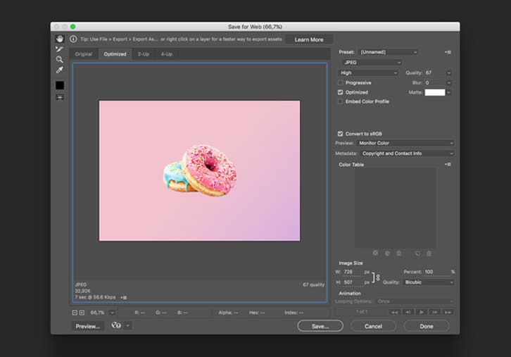
For example, when saving JPG images in Photoshop, you can use the “Save For Web & Devices” option and preset the quality settings (Low, Medium, High, Very High, or Maximum). This will reduce the file size (speeding up page loading times), and also reduce the visual quality (unless you go too low) to address issues with image sizes and videos. It’s a win-win!
In the “Save For Web & Devices” dialog box, you can preview and compare multiple versions of your image (with different file types, settings, etc.). You can even view estimated download times or preview your image in any web browser you’ve installed on your system.
Crop the image.
Cropping your images can be a very important step in the formatting process, particularly for photographs. You don’t want to crop out anything important, but feel free to crop to improve the focus or mood of the image.
On the other hand, you don’t want to crop in so close that your photo becomes distorted (the more pixels you remove, the lower the resolution); if you want to do this, you need to start out with a fairly high-resolution photo.
#2. Editing photos browser-side instead of server-side and facing frustration in the future.
One of the common shortcuts developers are using is browser-side image resizing instead of resizing images on the server-side. This is actually not a good idea when you’re trying to avoid issues with image sizes.
You can spend lots of precious time creating lots of thumbnails of exact dimensions and then the graphics design might change on you. The new graphics design might call for the thumbnails to be of a slightly different dimension.
Many developers, sometimes accidentally, sometimes intentionally, leave the original images as is and use different CSS width and height for the browser. Your website visitors are then forced to spend extra time downloading large image and you’ve wasted bandwidth delivering it to them. This problem is actually much more common than you might think and is found in many of the websites we visit daily.
Solution to save yourself the hassle and resize images correctly:
Make sure the images you deliver perfectly fit their required website dimensions to prevent issues with image sizes. Even if the same image should be made into different sized thumbnails to fit different pages. It’s worth creating all these different thumbnails rather than deliver an unnecessarily large image and rely on the browser to resize it.
Invest in a compression tool.
While PNG is a lossless format, you can compress it even further. Freely available PNG compression tools will reduce the PNG size by up to 50%, delivering the exact same image. Unfortunately, many developers and web designers skip this step and deliver non-optimized images.
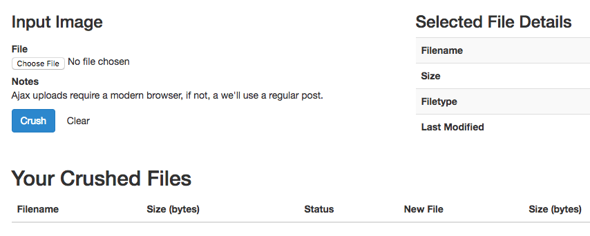
PNGCrush and OptiPNG are two open-source image optimization libraries. If you’re not using these already, you should definitely check them up, or you may find yourself struggling with more issues with image sizes.
Classic Issues With Video Sizes
#1: Files are too large to handle.
There are some issues when it comes to video sizes, too. The first relates to files being too large when they come out of video editing applications. This is a big issue as limited bandwidth and poor internet connections can lead to videos pausing and buffering a lot before they’re loaded in full. It goes without saying that this kind of delay takes away from the overall impression of a website and can cause visitors to become nasty if they have to wait for all elements to load and display correctly.
Large videos are not just bad for overall page load times and provide a negative user experience but they can also negatively impact your site’s SEO as fast page load times are an important factor that Google and others take into consideration. Therefore, compressing videos before using them on a website is the way to go.
Solution to keep those impatient video viewers happy:
Reduce the file size, resolution and/or quality.
One way to optimize videos for web design is to reduce the video file size, which will help to drastically improve page loading times and playback performance. Additional options include reducing the video’s resolution and quality (compression level and bit rate). Yet another factor is to pick a widely recognized video format.
While it’s usually not recommend to reduce resolution or bit rate of your videos too much as these two are important for the visible quality of a video, this is less of a concern when it comes to website background videos due to the fact that these kinds of clips are often not what visitors are focusing on.
Instead, looped HTML5 videos are getting displayed behind transparent layers and/or text elements and are a supporting design item that needs to load and play quickly on any device your visitors use to access your site, regardless of the internet connection they’re on. Small file size trumps resolution, bit rate and visible quality to a certain extent.
To make it simple, we’d say that the best settings for background videos are either Web, 720p, medium quality, MP4 or WebM or Mobile, 720p, medium quality, MP4. Depending on your input file and the quality as well as file size of output videos produced in your scenario, it’s best to try a combination of different settings to achieve a result you’re happy with.
Hopefully this article that identified some classic issues with image sizes and videos, and laid out a number of solutions will be beneficial to you in many ways. This is an article you’ll want to save for a rainy day. Anything to prevent blurry images, slow videos or extra charges with your host is a good thing to commit to. We promise that if you follow our solutions, you’re sight will look more professional than ever and your visitors will be well pleased.
Review of Image and Video Issues & Solutions
Classic issues with image sizes and their solutions
#1: Bandwidth gets overloaded and slows down: driving you and everyone else crazy.
Solution to get your sanity back and your bandwidth within range:
Compress the image.
Crop the image.
#2. Editing photos browser-side instead of server-side and facing frustration in the future.
Solution to save yourself the hassle and resize images correctly:
Make sure the images you deliver perfectly fit their required website dimensions – even if you have to create loads of different thumbnails.
Invest in a compression tool to avoid issues with image sizes!
Classic issues with video sizes and their solutions
#1: Files are too large to handle.
Solution to keep those impatient video viewers happy:
Reduce the file size, resolution and/or quality.
Best settings for background videos are either Web, 720p, medium quality, MP4 or WebM or Mobile, 720p, medium quality, MP4.

No comment yet, add your voice below!