
Not hard to believe when you think of your commute to work or lunch hour when your thumb scrolls uncontrollably through websites and social media. Yeah yeah, we’ve all reached over for our phone before bedtime to “set the alarm” or “check tomorrow’s weather” only to spend the next hour scrolling through articles and memes. Reading this from your mobile device or tablet? Point and case. If you haven’t already mobile optimized your website, now’s the time people! Luckily one of our own, Alberto Nillson, founder of his own Webshop in Brisbane, Australia, swooped in to provide us with five immediate steps you can take to mobile optimize your Jupiter website today!
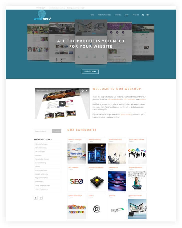
Alberto’s webshop provide a handful of clients on-going services in the area of general optimization. He commented, “we do Google advertising, website building using WordPress, video productions, print productions and basically use any means to help our clients with anything they need in the online and digital sector.” Alberto has seen first-hand the transition between desktop and mobile devices and has had to shift his strategies and techniques on behalf of his customers to ensure their website is mobile optimized.
Having an optimized mobile site will keep them on the site, and will give you a higher chance of increasing your conversions.
Why’s It So Important to Mobile Optimize Your Website?
For Alberto this was a simple no-brainer. “With everything that’s happening in the digital world right now, mobile searches are taking over the desktop. That means it’s absolutely necessary to have a great-looking website for a mobile phone because it’s going to be easier for your users to navigate. If most of your prospective followers or customers are going to find you on their mobile device, having an optimized mobile site will keep them on the site, and will give you a higher chance of increasing your conversions.”
In looking at his clients across all sectors, Alberto emphasized that it would be a digital marketing misstep to not take calculated measures to cater your mobile website to your mobile user experience. “I’ve seen with my clients over the last two years, the growth from mobile usage go from 30-40% up to 60-70% so having a mobile-user friendly website now that’s functional and customized will absolutely increase user engagement, followers and conversions.”
Okay, so Jupiter users, now that we’ve established the direct benefits of offering an optimized mobile website to your users, what features can you use to quickly and effectively optimize your mobile website? Here, Alberto will give us, step by step, a quick cheatsheet for you to start that optimization process.
I’ve seen with my clients over the last two years, the growth from mobile usage go from 30-40% up to 60-70%
5 Ways to Mobile Optimize Your Website
1. Modify Your Fonts
Being able to change the size of your font from the desktop to the mobile screen is a must. When adding various shortcodes such as Fancy Title to your website, you can use Force Responsive Font Size to change the Font Size on your tablet and mobile website. Modifying the size of your Titles (H1 to H7) and even hiding titles all together can quickly optimize your mobile or tablet website.
2. Modify Your Images
This might take some custom coding but Jupiter allows you to change the size of your images and their formatting from the desktop to the mobile device and also optimize your images accordingly so that you keep a high loading speed. For example, with the Page Section or Image shortcode, you have the option to choose on which devices your image will be shown.
Remember, anything that takes more than 3 seconds makes it more likely that your mobile visitors will leave, and with the Jupiter themes I don’t have any of my sites sitting over 2.5 seconds. 70-80% of our Jupiter sites are loading under 2 seconds, taking around 1.5 seconds to load.
3. Hide Unnecessary Elements
Jupiter allows you to hide elements that may not be necessary visually or functionally on your mobile or tablet device. That way, your desktop and mobile website can each be customized to optimize the experience for your users. After all, what you include on one isn’t necessary for the other. For example, try hiding Padding or Dividers on your mobile website.
4. Use Elements That Are Best for Device-oriented Engagement
What does that mean? Okay, we all know that your user experience on a desktop device versus a mobile device is different; not just in size but where you’re likely to be or what you’re likely to be doing while browsing. This means that some shortcodes which may be easier for users to use on their desktop may not be on their mobile device. With Jupiter, certain elements like contact forms, for example, being shown on the bottom of only certain pages on a mobile phone which helps mobile users who aren’t able to contact the business immediately to be able to send a quick request for information. We see a lot of contact requests coming through our client’s mobile users and that allows our clients to be able to connect and engage with them.
I’ve been using Jupiter for about a year and a half. I had dabbled in a few others before but once I came across Jupiter I realized it covered all the areas I needed, including enabling me to mobile optimize my client’s websites.
5. Utilize PageSpeed Insights- Google Developer
We do a lot of tests on our mobile sites with PageSpeed Insights- Google Developer Tools because once you’ve taken a few steps in mobile optimizing your website, these tests act as a good indicator of where you are. It doesn’t mean your website is bad if you have, for example, 90/100 on certain elements, it just helps you as a developer. Google also offers tips and tricks to mobile optimize your website that can be really helpful. All of my Jupiter-themed websites have great scoring with over 95% on the most important features on Google Developer Tools.
All of my Jupiter-themed websites have great scoring with over 95% on the most important features on Google Developer Tools.

No comment yet, add your voice below!