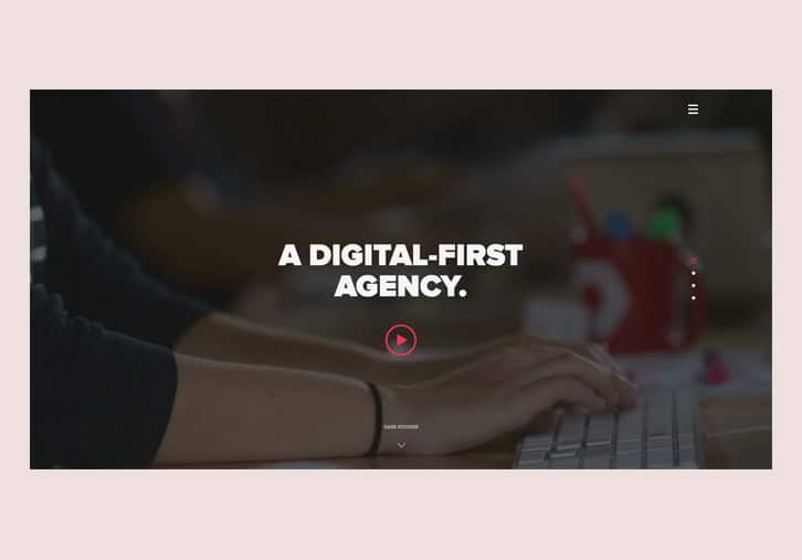
The design and fashion industry are especially being affected by this problem and web design trends are no exception. Just take a look at design trends that have been evolving from 2014 and still dominated well into 2016. Here, let me paint a picture for you; your web pages start with a big hero image or a full screen video with buzzwords about the person or brand most probably starting with ‘we’ followed by a series of page sections including large portions of texts or images, some milestones with viewport animations in the middle and testimonials of users/clients/customers within a slider. Then there’s that final cherry on top, the CTA button accompanied by some inviting copy.
Websites With an Identity Crisis.
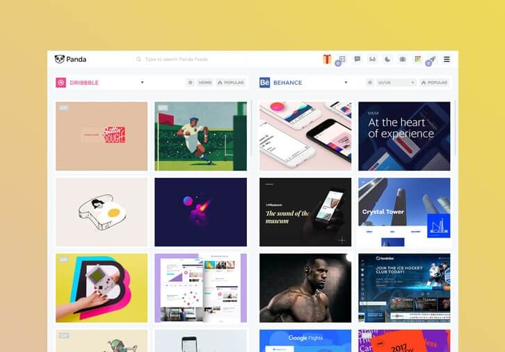
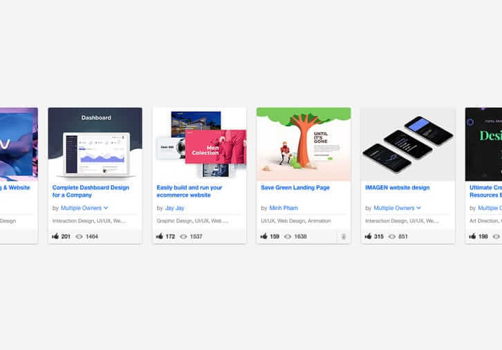
The problem with these trend-based designs is that when you have people from different sectors, talents and niches all following the same latest fads it becomes increasingly difficult to differentiate between the good, mediocre and the bad, the beautiful and the ugly and the professional and the rookie. Look at Dribbble and Behance and you’ll find thousands of great template designs that look beautiful and professional when viewed separately, but are hardly distinguishable when looked upon as a whole, side by side.
And there you have it, 2017’s web design identity crisis; the legacy of design trends that have emerged over the last 2 years. If you’re starting a new brand or about to design a new website for a client with these trends, be aware that the time for new guests to this party is over. You’re late to the game. There are many brands from small and local to big and global that have employed these trends and oversaturated the market with similar design patterns. It may be your favorite startup’s landing page or favorite designer’s Dribbble portfolio.In any case, avoid following it! It’s time to change!
Minimaluminiumalism Is Boring. Flat Is Dead. Be Brutal!
In the last years of his life, Steve Jobs probably wasn’t aware that shortly after his passing a new design would begin to emerge which would be missioned to essentially kill Apple design culture and its highly acclaimed Minimaluminiumalist approach. One of the most important principles of minimaluminiumalism, which was not only a design style for hardware, but also influenced the entire digital design industry, was to design a product with a minimalist approach, rid of superfluous gizmos and gadgets that would be fitted with bold presentations of what’s important.
Brutalism is a return to pre-flat era like shadows and gradients but in a whole new way.
Also the Jony Ive inclination for aluminum surfaces in Apple hardware products were translated to a dominant use of gray and grayish colors in digital designs trends. Sooner or later, though, flat design began to creep up and purge the design world of these principles with the removal of gradients and realistic shadows.
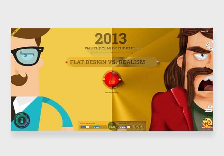
To be fair, there have been new changes like Material Design and Flat 2.0 which are slight deviation towards realism, but as of today, the biggest change to Flat design is what is now being referred to as Brutalism. Brutalism is a return to pre-flat era like shadows and gradients but in a whole new way. Here’s a list of defining factors and principles of Brutalism, though for further reading, this post can also be helpful. Take these pointers into consideration and you’ll be sure to change the face of your website to stand out in a crowd of over-rated design:
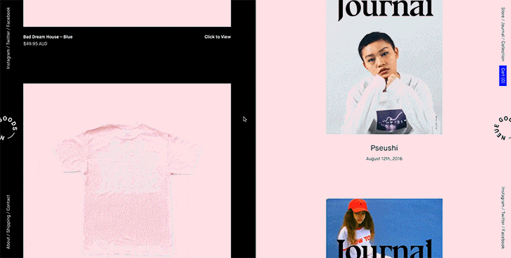
Embrace Colors
The era of small parts of hued colors surrounded by wide areas of gray-toned colors is over. Embrace colors. Your page should describe its story not only with words but with colors. Don’t be afraid of using large parts of vivid colors, even next to each other, on one page.
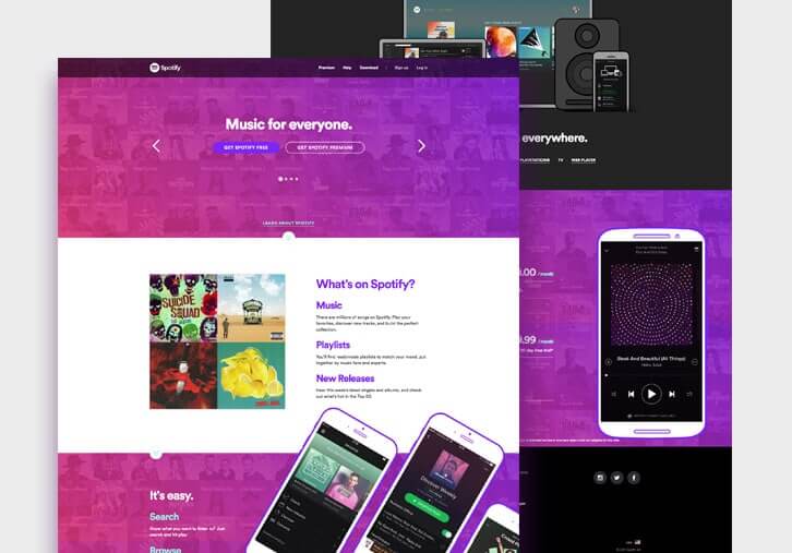
Befriend Gradients
Gradients were banned in flat design. Material design revived them pretty cautiously but they are still an integral part of brutalism. Don’t hesitate to apply large chunks of gradients of hued colors from one side of the page to the other. You can even use an element with gradient over a gradient background.
Get Out of The Grid
The emergence and application of Bootstrap in 2012 resulted a wide usage and popularity of grid-based design and presentations. Look at the web and you’ll see how websites have used grids to organize and showcase different types of information from blog posts and portfolio items to just simple chunks of texts. Be brave and adapt a non-grid presentation for your content. Be a web design maverick and adopt an uncommon and asymmetrical layout for your content presentation.
Your Story Is the Best Story
Trust yourself, your story is one of a kind. As tempting and safe as it may seem, don’t copy what everyone else is doing. Do what you think better represents and serves your brand. Start writing your own story. This may include a paragraph of text instead of a big image. Or perhaps a simple font icon with a slogan that is powerful enough to keep the user scrolling all the way down the page to find out more about it.
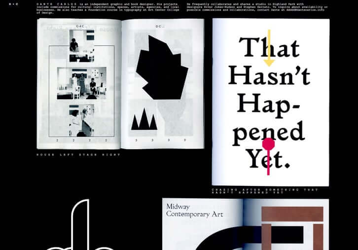
Page sections are overrated. Sport a vibrant rebellious layout.
Straight lines that divide your layout into horizontal content containers are taken for granted for every web designer now. If you want to be heard in 2017, follow alternative and more playful layout models. Use diagonal lines, sections and dividers and try out split layout instead of full width layout or even consider using them together.
Memes and GIFs are fine but Cinemagraphs can add a real taste.
In the brutal return of the web to its origins, many elements from the early years of internet design have been revived. It was very unlikely to enter a website with Netscape Navigator without an animated elements (most probably a pixelated animated GIF) but now the internet is so thirsty for those types of animations again. This has given birth to a new animated entity called Cinemagraphs which is a combination of mixed and animated parts in the image. Make use of this newborn while it’s not ubiquitous.
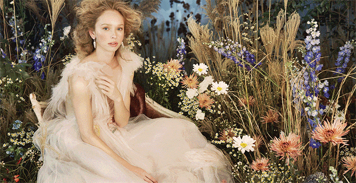
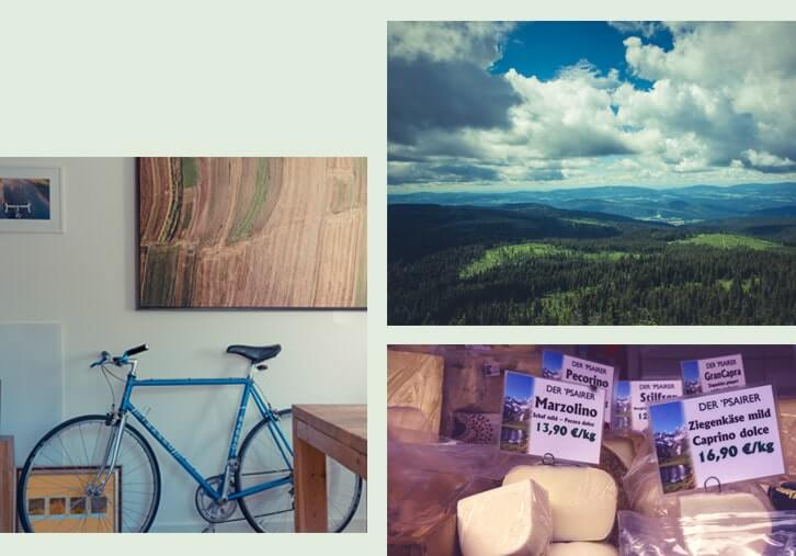
Use Authentic Photography.
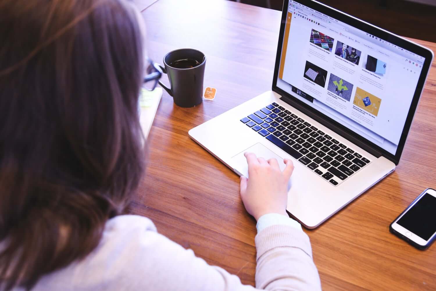
If there is one resolution you want to set for 2017, it should be avoiding stock photography in your website. Nobody will trust your service or product this year if you use the soulless photos of Rebecca Ariane Givens to present them. If you’re short on budget, there are many free photo resources which provide high-quality authentic photos from real people with real emotions in the real world: freeforcommercialuse, littlevisuals, picjumbo, Unsplash, lifeofpix, thestocks, imcreator, Pikiwizard
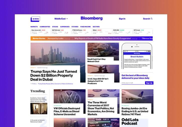
This post was not intended to just list off the web design trends for 2017 but was more geared towards identifying which elements and features can be used to bring your website to another level, beyond the throngs of generic websites. At this point, I’ve seen so many top notch designers and agencies create and maintain websites using the repetitive design patterns we mentioned earlier and I’ve also watched them charge hundreds of thousands of dollars. And yet, something I can’t shake from my memory still stands as a lesson to me; that is, that paying big doesn’t always pay off. Earlier this January, I saw Bloomberg.com with its unconventional and unique design embracing the practices of brutalism, and it was immediately engraved in my mind to the point where every time I think about a news/media company in 2017, Bloomberg.com immediately flashes before me. That’s the powerful identity and impression your site can make taking into account the points I’ve covered. Give it some thought, and then perhaps give it a try!

4 Comments
very nice, the courage we need! and where wll be ariane now?
Thanks Divulga. I think she will have to change career then or she has already made enough to retire forever!
Very few companies have brands that wield more than a smidge of influence. It just not about identity these days; It’s all about satisfying content needs for visitors. Off the grid? You just doubled or tripled your mobile budget and ongoing maintenance budget. For the web, we’re in an era of strategic graphic design. Your thinking is better suited to less interactive media, like print and video, that must entertain to grab adn keep attention.
Thank you for your comment Theron. I admit that everything in a website should work to deliver meaningful content to your audience but at the end of the day the all the content you produce is meant to fill the gap between your customer and your brand. and your brand is your identity. I believe no strategy is a good one until it works hand in hand with your content to contribute to your identity.