Let’s first all start off on the same foot though before we dive in. The psychology of UX design studies how users’ behaviors and actions on a website are influenced by their perception of the content before them. In other words, in using these principles, you can strategically design your site down to the specific colors used for different buttons, motion features, images, and placement of CTA buttons and announcements. This may all sound pretty obvious, but there’s a whole field of study dedicated to these nuances. Luckily we were able to tap into the well-versed and practiced knowledge of one of our very own users, Michael Hahn, joining us all the way from Hawaii, USA.
Michael: “I’ve been doing web development and web design for over five years and my background is in product and user-centered design so when I moved to digital development and coding it was really interesting and translated really well and it was a lot easier than selling physical products. I worked with a couple of agencies including some large Fortune 500 companies everything down to individuals that are building their own businesses to startups.
I now work mostly with startups and mid-sized businesses. Sometimes it’s business to business; I’ve worked with dentists, laser eye surgeons, derivative marketers and life coaches—so all across the board.”
Don’t Make People Work Harder Than They Have To!
Okay let’s just have an honest moment with ourselves and admit that some days most of us have the attention span of a squirrel. On top of that, our memory is constantly challenged in retaining the flood of information we’re seeing on a daily basis. Point is, our attention is short and our memory could use a little help every once in awhile. Keeping this in mind as a web designer can really help dictate how you bring the most important calls to action and information to the forefront of your user’s attention. This could be as easy as using internationally recognizable symbols, having moving Call to Action (CTA) buttons that have eye-popping colors or structuring information in a bulleted or list format. Another concept worth noting is the notion of ‘progressive disclosure’ in which you present the bare minimum of content and labels to avoid cluttering your landing page and overwhelming your users. During our conversation Michael also points out how the images you use can make a lasting impression on how your users regard your enterprise:
Michael: “So, a lot of it comes down to some basic things which are, people don’t want to work harder than they have to for the information that they want and that’s becoming more and more the status quo. As far as people taking action when they get to your site, some general things are that people like to see people so in general if there’s a call to action, a free gift or something that allows people to see what services you have, it’s really important to have them greeted by a human in some way. It kind of takes it out of this digital space and makes it a more personal user experience.”
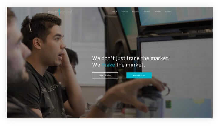
This homepage incorporates the idea of progressive disclosure, presenting minimum data or choices to keep overwhelm at a minimum and encouraging interaction.
See Your Website for the First Time.
To understand what your visitors see when first going onto your website, it’s best to first clarify the difference between our ability to recognize and recall information. Simply put, it is far easier for us to recognize information, especially when presented in the form of symbols, signs or colors. Your brain is able to process the meaning of information much more quickly upon seeing, for example, an exclamation mark in red or an arrow indicating movement. You can make it even easier in some cases by initiating a live chat with someone to engage your customers immediately. With all of this in mind, really your goal as a web designer should be to initiate as much fast thinking as possible to allow your visitors to navigate effortlessly through your site in a scheme that leads them exactly to where you want. Additionally, the images you use can have a big impact in setting the tone for your company culture. Here Michael gives us some clues into what your images say about your product and services.
Michael: “In deciding what images and symbols to use on your landing page, start with what are the goals of the website. There are no blanket rules to engage people without understanding that and once you understand the client’s ultimate goals with their website you can then support that with the visual design that’s appropriate whether it be something a little more safe and clear for a doctor or something a little more edgy and fun for a design professional. It’s really important to know who the audience is, who they’re talking to and make sure you’re speaking a language that people will connect with on the site.
There’s a difference to be aware of in using digital images. You’re telling a story when people arrive so if you have a background image of people and you have a lot of words over top of it you’re telling your visitors that the background image is for context only and isn’t really important as opposed to when it’s at the forefront of how you’re greeting them. So sometimes if you want someone to be more engaged, you might want to have that image of a person without any obstructions. This initiates a personal connection and studies have found that images of people authentically experiencing happy emotions, or in a group together is more appealing to just a generic photo of a model or statuesque-like person with kind of unapproachable expression.
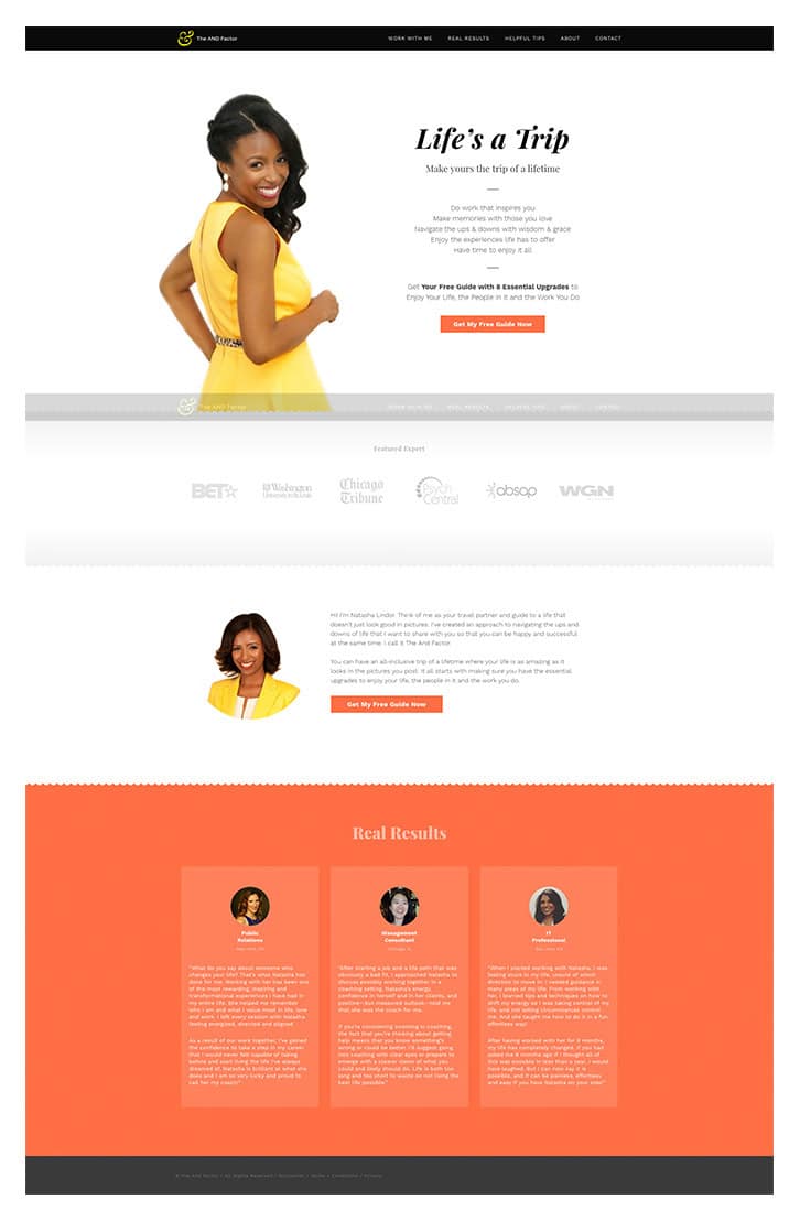
Uses images to greet site visitors which is proven to increase conversions. Testimonials at the bottom of the page include images as well to ‘humanize’ the site and their stories. Also, 1 clear call-to-action presented in two places on the page so visitors have a couple chances to hit it.
As far as using live chat to initiate that personal connection, I think that’s dependent on what kind of website it is. I know a lot of times with web development, it’s very nice to see that so that I can interact with an IT professional and ask questions. Other users may find that, depending on the website, frustrating or annoying if they have someone interrupting their experience and asking questions. If we back up to user centered design the main thing is realizing who your audience is and of course it’s tough with web development because anyone can come to your site but taking into account who your ultimate audience is and keeping that in mind is really important.”
Some WordPress Themes Just Get It.
In just brushing the surface of some of these principles, I think you’ve already realized that by applying these points to your approach to design, you can maximize user engagement. To summarize what is a very rich and extensive field of study, here are some main takeaways from our interview with Michael:
- Our attention and memory is limited and imperfect. Using Call to Action buttons, images and colors that are strategically placed and easily recognizable enables your users to activate quick thinking while scanning through your site.
- Our visual perception and capacity is affected by the proximity, placement and continuity of the content we’re looking at. That means lists, bullet points and numbered content placed in an easily detectable structure will be most meaningful.
- Add a human touch to your landing page by adding images of people or engaging your user through a Live Chat. By knowing your target audience and reflecting their needs and preferences right as they enter your site, they are more likely to identify and connect with your services and product.
- Don’t reinvent the wheel when it comes to most commonly used buttons and symbols. If it’s easier for people to recognize because most other sites use them, it’ll be easier for them to quickly navigate through your site to where you want them to go.
When I discovered Jupiter I had never seen a theme that took into consideration all of the same elements I always wanted to include.
Michael: “By the end of the month I’ll be up to my 10th Jupiter theme. When I used to build websites for people I built my own templates and frameworks to create nice responsive websites. Then when I discovered Jupiter I had never seen a theme that took into consideration all of the same elements I always wanted to include. It went even further in offering the template building component which ultimately allows my clients to not have to come back to me for every minute detail and lets them get a lot more done moving forward.”
During our conversation with Michael as well as our independent research of this topic, it immediately became clear how dense and multifaceted this topic actually is. Yet it certainly deserves further exploration and study for those of us who are driven to improve our users experience on our sites. So to keep up the momentum we’ve gathered a few resources that might be worth your while to scan through:


No comment yet, add your voice below!