Many people underestimate the power of CSS. Some of the fancy features that we see on the websites use JavaScript codes, but they can be implemented with pure CSS these days. For example, parallax sections almost always use JavaScript libraries, but in this article, we’ll cover how to build a pure CSS parallax section in just a few minutes.
Using pure CSS parallax can be easier and more performant since we don’t need to use JavaScript libraries.
What we’ll build
In this article, we’re going to build the following parallax sections with pure CSS. You can see the live demo at CodePen.
Understanding the used properties for pure CSS parallax
This technique relies on the CSS3 transform and perspective properties. By using these properties, we can create 3D elements in the space and scale and move them as necessary.
Transform property
This property enables you to transform elements in a two-dimensional and three-dimensional space. By using this property, we can rotate, scale, move and skew the element in the space.
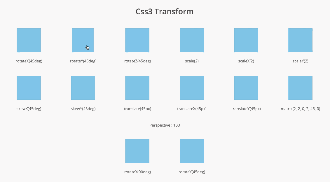
You can see different examples of transform properties in this pen.
Perspective property
This property is used to enable three-dimensional space for the element. The children of the element can be positioned in the space.
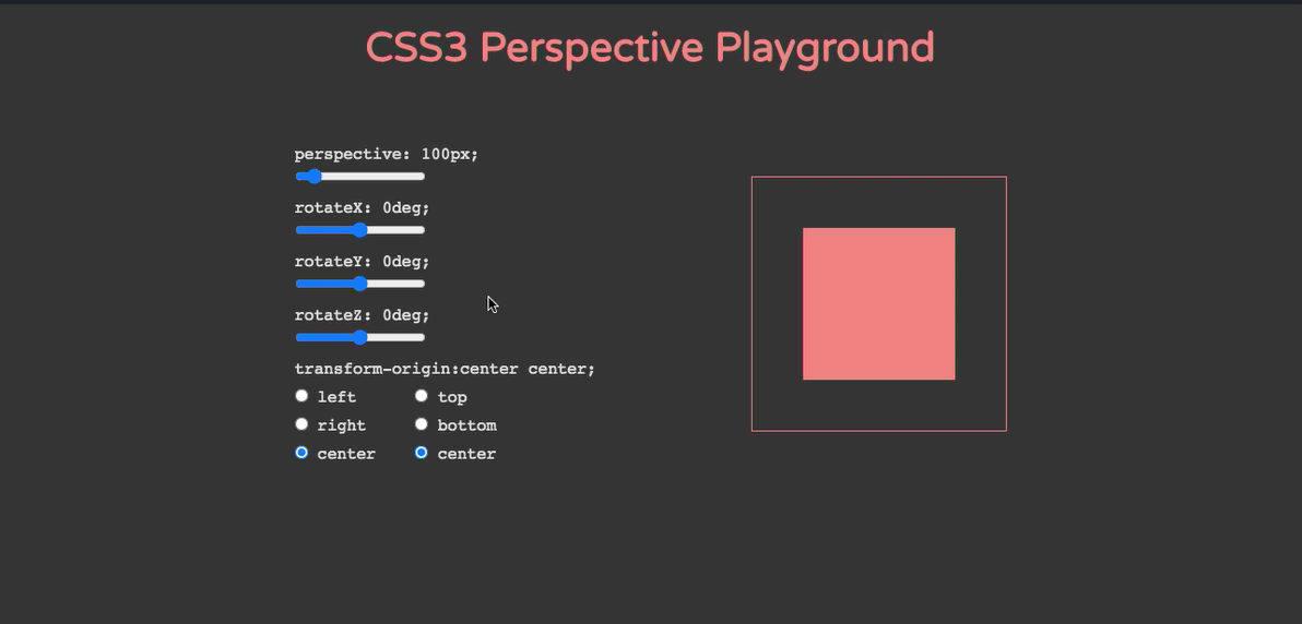
In this pen, you can test the perspective property live.
Implementing the technique
Now that we’ve learned a bit about transform and perspective properties, let’s get our hands dirty and write some actual codes. The codes will be divided into two sections: HTML and CSS codes.
Markup
We need some simple markups for the parallax section. The role of each markup is explained below.
<main class="main">
  <section class="section static static-one">Static</section>
  <section class="section parallax parallax-one"></section>
  <section class="section static static-two">Static</section>
  <section class="section parallax parallax-two"></section>
  <section class="section static static-three">Static</section>
</main>
Notes
- .main is used for setting perspective and overflow properties.
- .section is used for setting general styling, not necessarily related to parallax.
- .static is used for setting the static section properties.
- .static-(one|two|three) is used for setting different background colors for static sections.
- .parallax is used for setting ::after (pseudo-element) which holds the transform properties.
- .parallax-(one|two) is used for setting different background images.
Styling
This is where the magic happens. The necessary lines are commended to help you understand the codes.
.main {
  /* Fill the available space */
  height: 100vh;

  /* Make the children of the element closer to the viewport */
  perspective: 2px;

  /* Hide the overflow */
  overflow-x: hidden;
}

/* General styling, not necessarily related to parallax effect  */
.section {
  position: relative;
  display: flex;
  align-items: center;
  justify-content: center;
  height: 80vh;
  font-size: 40px;
  text-transform: uppercase;
  font-weight: bold;
}

/* Different background colors for demo purpose */
.static-one {
  background-color: #feceab;
}

.static-two {
  background-color: #aacfcf;
}

.static-three {
  background-color: #c06c84;
}

.parallax::after {
  /* Position the pseudo-element to fill the parent */
  content: '';
  position: absolute;
  top: 0;
  right: 0;
  bottom: 0;
  left: 0;

  /* Scale the image to full */
  background-size: cover;

  /* Move the element back then scale the element, it helps to appears more slowly */
  transform: translateZ(-1px) scale(1.7);

  /* Set the parallax section before the other elements. */
  z-index: -1;
}

/* Different background images */
.parallax-one::after {
  background-image: url(https://source.unsplash.com/vs6a4EHj_Ro/1600x900);
}

.parallax-two::after {
  background-image: url(https://source.unsplash.com/P86-JPbDnPY/1600x900);
}
Wrapping up
In this article, we covered one of the coolest CSS implementations. By learning these types of techniques, we’ll understand how CSS is powerful and what we may be able to create in pure CSS.
This implementation was one of the most straight-forward ones, you can see the following ones for more advanced usages.
We’d love to hear about your pure CSS parallax websites, so please share your examples with us in the comment section below.

6 Comments
Hi there!
Thanks for the post. I implemented this method on a site I’m currently building and it was working wonderfully, but I’m noticing just this week that the effect is no longer working with the latest versions of Chrome, Edge, or Firefox. Oddly, it still works just fine in Brave.
Any thoughts on why this might have been borked? I’ve gone through a little debugging but I couldn’t turn anything up.
Try adding the following to your CSS. It works for me. 🙂
.section {
transform-style: preserve-3d;
}
.static {
z-index: 1;
}
Hi, this was working so well.
Buy yep, no longer works in latest browsers….bummer! Any ideas?
Try adding the following to your CSS. It works for me. 🙂
.section {
transform-style: preserve-3d;
}
.static {
z-index: 1;
}
This for some reason will not work on chrome for me, works fine on all other browsers. Had to triple check it was update and just seems to be the parallax that isn’t working on chrome. Any help on why this is failing on one browser only would be appreciated.
This didn’t work on any browser for me, but after some time playing around with the code, I found that adding the following to the CSS makes it work as expected. 🙂
.section {
transform-style: preserve-3d;
}
.static {
z-index: 1;
}