When it comes to Website builders – as a creative tool – it gets even more complicated. Website builder UX designers, in effect, are challenged to create an interface that can control a multi-layered component and look as intuitive as possible!
When HTML was created in 1990, only a handful of programmers knew the language and could work with it. As the foundation of what we know as the web today, HTML, and later CSS, became quite popular and many less tech-savvy people learned it.
But, those were still a machine’s language, not man’s. That’s why many website builders emerged over the years, each with a vision to fill a gap that is left by the former one. These software are designed to make it easy enough for ordinary people and creatives to design websites without writing any code.
Website builder UX and UI for a simple HTML element is easy. But, when it comes to more complex components, it becomes quite tricky.
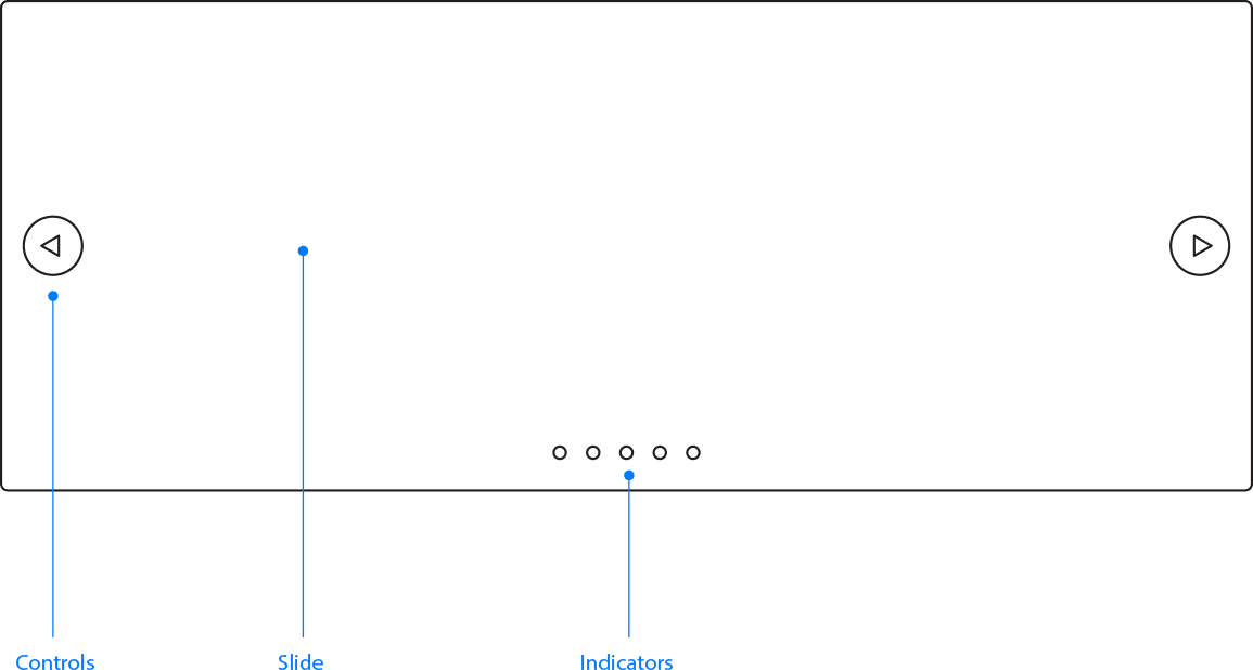
Assume a simple paragraph of text. It has properties such as font family, font weight, color, size, alignment, etc. It’s quite easy to modify those properties through a simple interface. However, it’s not same with carousel component. It contains multiple elements inside, each obviously needing its own settings.
For instance, how many of those color pickers would we need? One for the next/prev controls, one for indicators, and one for slide background, perhaps? And, how do you make this easy for users to instantly understand which is doing what?
From what we learned at Artbees, there are three approaches to resolve the issue:
Solution: Less options, less worries.
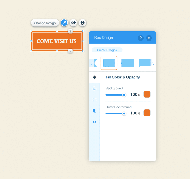
When it comes to website builder UX, keep it simple and stay away from too much customisation. WIX offers a live editor where you can customise elements across your website but it’s designed to be simple to work with, so it’s offering a limited set of options. For example, you can’t cast a shadow under carousel controls or slides.
The best way of making things simple is to remove unnecessary extras.
Verdict: It’s very simple to learn and work with. The outcome might not look exactly what you have in your mind though. It is not very customisable and you have to live with preset designs to some extent. WIX is a product for normal people — non-technical professionals, entrepreneurs, or marketers. So, the simplicity comes first. Customisability is not a big issue for much of their clients.
Solution: Made for pros.
Owen the other side of the story are people who love to customise and create something of their own. For these people, it’s quite important to change the appearance of next/prev controls or indicator.
Some freelancers, web designers and even developers use website builders to create unique looking websites for their clients without writing a code. Webflow is an online app designed to serve this type of people.
This website builder UX offers visual interface for HTML and CSS, far more customisable than many other website builders. But, you won’t like it much until you have a slight background in writing HTML and CSS. Moreover, the interface, while beautifully designed, is quite intimidating and crowded. There’s so much to learn and experiment with.
Verdict: This strategy is very customisable to the point that it actually has few limits! But, it is not for everyone. It’s a tool just for creatives and freelancers, which is exactly who Webflow has as its target market.
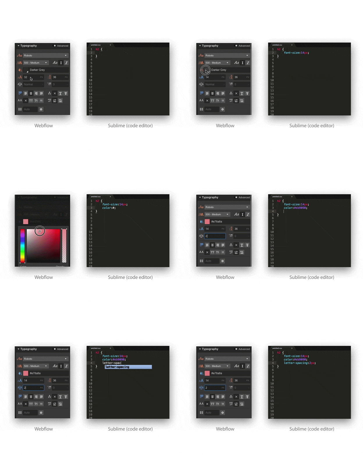
For Webflow users, the primary concern is customisability. They don’t care about the difficulty or complexity of website builder UX and UI as it’s still a superb experience compared to writing codes and script manually.
Solution: Something in between.
Customisability and simplicity are two variables with indirect relationship. The closer you get to one the farther you get from the other. It’s just impossible to be perfected at both. But, what if you can create a balance between both? Good news is, it seems possible. All you need to do is to minimise the drawbacks.
We all know that adding a feature to a system makes it more complicated. Meanwhile, we also know that a good UI strategy saves users from being lost or confused. So, what if a user is well-guided through the mess if the mess is inevitable.
Here are some suggestions:
Hide the Monster
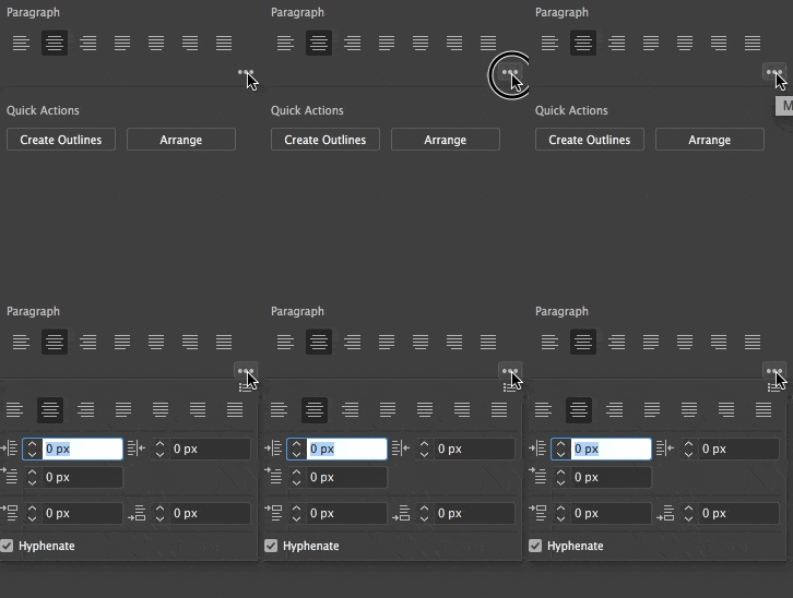
Your website builder can have just a few options and a clutter-free user interface with basic functionality at first. Then, offer more complicated options on demand. This scenario can serve a wide range of customers, from basic to advanced users.
A big downside of this, is that it’s too difficult to plan out and develop a system like this due to the fact that the UI is multifaceted. Another issue is that it’s designed in favour of simplicity over customisation. Something extra always has to be done by user to activate the pro settings.
Keep It Tidy
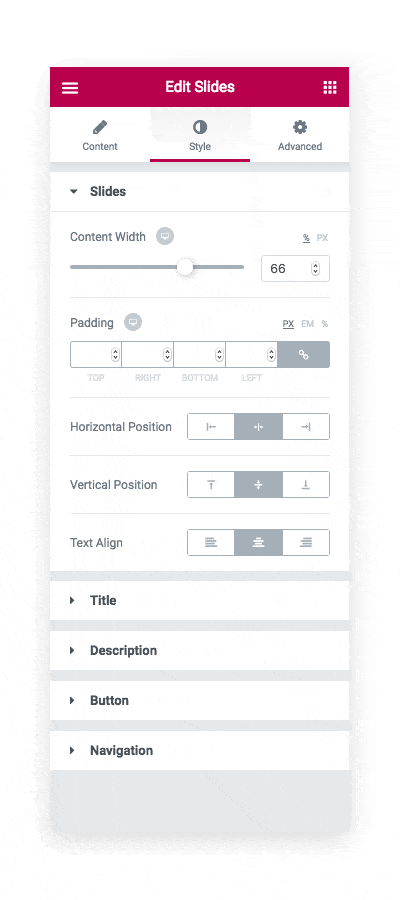
No matter how many options you offer, just organise them to win people’s heart. There might be two icon elements inside a carousel component, but as long as they are clearly named and split, things start to look easier than before.
Avoid Interfaces for Components
Last but not the least, is to just eliminate the question instead of solving it. Do not try to control everything with its own component UI. If a small control in carousel component has to change, let its own user interface handle it.
Do not combine interfaces into one unless you really have to. In other words, instead of creating complex elements with their own interfaces, group objects together comprised of multiple basic elements, each with its own settings.
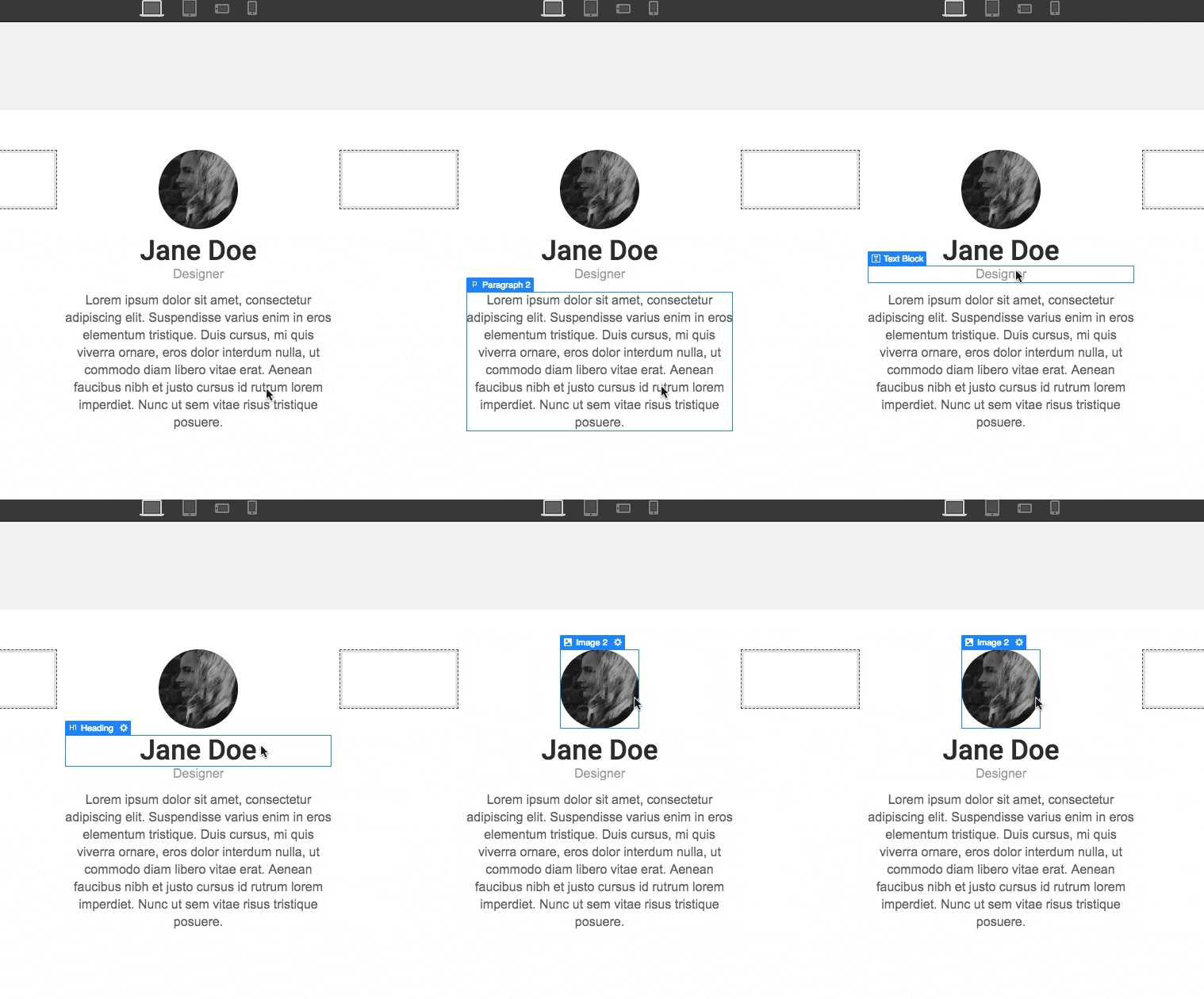
Best of all: A mixture of all
After we learned that nothing would be perfect, we can start using all of the aforementioned strategies accordingly. A combination of these secret recipes would promise a well-balanced software that holds a reasonable set of options.
A well-balanced application which holds a remarkable amount of settings to support user’s wildest creativities while keeping it easy enough for everyday web users, is achievable only when all secret recipes are at work.



1 Comment
It was a complete story
I really enjoy this kind of content
Thank you