Jupiter’s New Header Builder essentially lets you create and modify your website header using a visual drag and drop editor. It provides you more ways to customize your header with countless styles and arrangements. With this new feature, you’ll be able to create any kind of header you need without being limited by default options and pre-built styles. Now, since we’re already familiar and comfortable with the visual drag and drop editor, it makes the job easy.
To use the Header Builder, it needs to be activated on your Jupiter website:
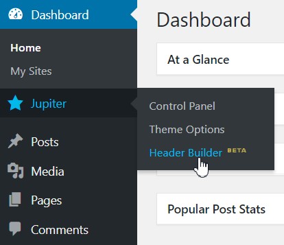
From the WordPress left menu, go to Jupiter > Theme Options > Header.
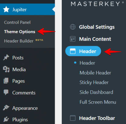
Click on the Header Builder button.
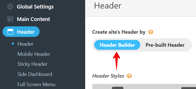
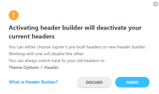
A popup warning message will appear. Click on the Agree button.
Now, click on the Save Settings button.
After activating the Header Builder, you’ll be able to access it from the WordPress’ left menu. Now, go to Jupiter > Header Builder.
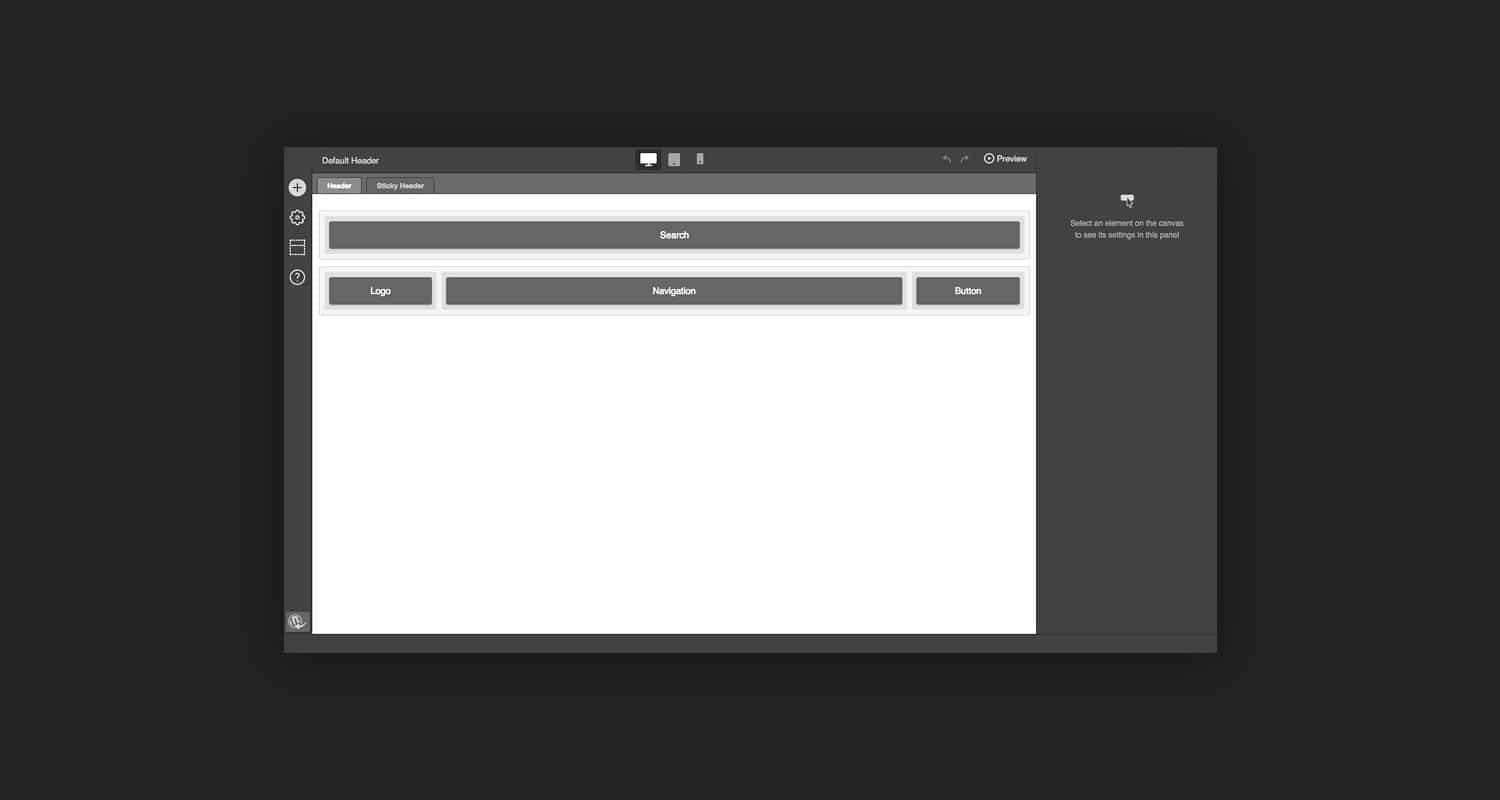
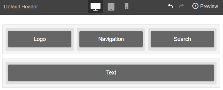
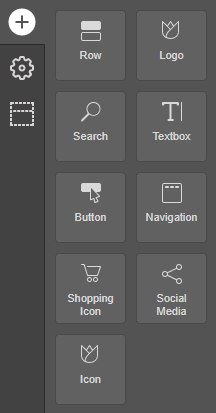
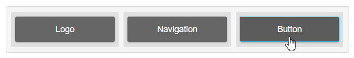
Now, you’re ready to use the Header Builder to create your header. At the moment, Header Builder includes nine (9) fully customizable elements to be used in your header with many more to come!
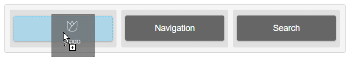
This is how easy it is! Now you can simply drag the header elements, and drop them into your desired place on the header.
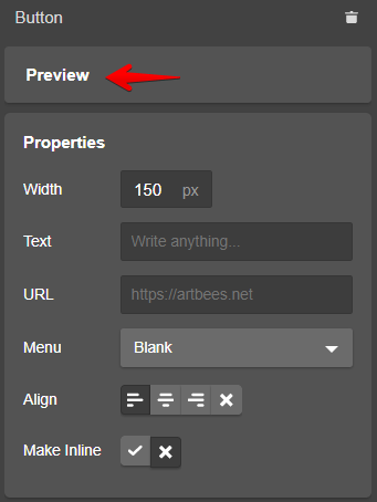
After adding an element to the header, a new pane on the right side of the screen will open containing the elements settings. Each element has a specific set of options so you can configure and style them as you please.
This level of customizability is unprecedented in any other header offered by WordPress Themes! Here you can tweak everything from the font type, colors, borders, included links, and background color!
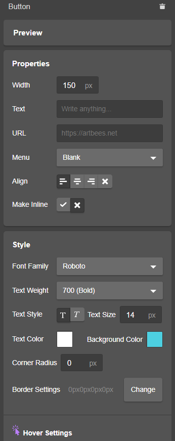
These settings even allow you to customize the button the way you want it to look. For instance, you can redesign its look on hover or change its position and style depending on the device. You can even hide the button on a specific device.
Header Builder features the Header Responsive States, which lets you create a completely different header design for different devices. There are three different responsive states related to the screen width.
Use the Header Responsive States to create and improve the header appearance on desktop, tablet, and mobile. Go ahead and try using these headers and you’ll immediately see the difference it can make on your mobile versus desktop.
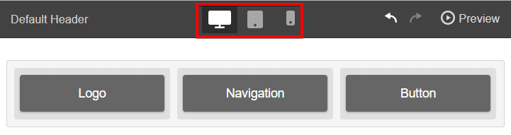
By clicking on one of the devices, you will be able to create a header to be displayed on that specific device only.
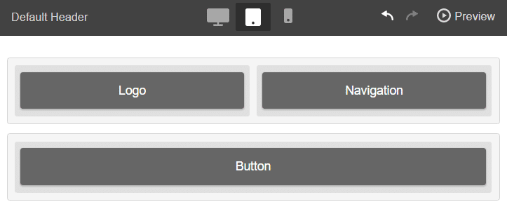
Take note that changing the header in the parent state will also bring changes to its child state. Though when the header is changed in the child state, no changes will happen to the parent state.
For instance, when you change the header in desktop, changes will also apply to tablet and mobile states (child states). Changing the header in tablet will apply the changes to mobile (child state) but not to desktop (parent state).
Click on the related “cog” icon to open the header settings.

A new panel will open with the list of settings:
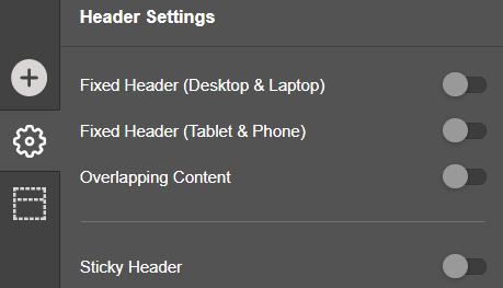
These settings let you configure fixed and sticky headers should they overlap with the content or not. Fixed Headers (Desktop & Laptop) enable a fixed header for desktop and laptop devices only, while Fixed Header (Tablet & Phone) creates a fixed header for tablet and phone devices only.
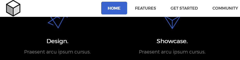
If you enable the overlapping content option, the header will overlay your site content. Look at the screenshot below. It shows a header overlapping the content as if it’s a transparent header.
If you want to preview the elements and the changes you’ve made to the header before applying them to the front end of your website, it’s possible using the following steps:
Click on an element inside the header area.
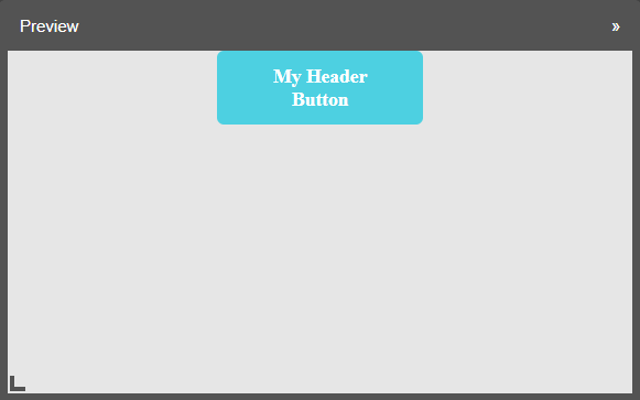
A new panel will open on the right side of the page containing the elements settings. Click on the Preview button.
A new window will pop up now and show you the preview of the element.
To preview the whole header, click on the Preview button on the top right corner of the page. A new tab will open in your browser where you can check the header changes.
Easy-to-use and configure, Header Builder gives you more freedom to design your own header. Now that you know how to use Header Builder, it’s time to customize your own header!

No comment yet, add your voice below!