If you’ve been checking the Artbees weekly newsletters in recent weeks, then you may have noticed the recent new additions to the Jupiter X templates world! We not only added an advanced search module to the Jupiter X templates repository and to some of the landing pages but we also added about 60 brand new templates that are different in many ways.
In this article, I’m going to explore a little more about these additions. So let’s start with why we ideated and released this new generation of templates and which problem we tried to solve with them.
What are the problems with the usual website templates?
1- They are a dumb piece of generic design!
They are all generic so they can hunt a bigger chunk of users with one template. You can easily say when a website is built upon a template.
2- They look perfect until you touch them!
Just take a look at it on dumblatemobster.com, which is as charming as a McDonald’s Hamburger until you unbox it!
3- They are lifeless, not lifelike
Website templates basically do not reflect a real mission and purpose in their content. They are not really built to carry out a purpose.
Meet Jupiter X’s latest round of templates
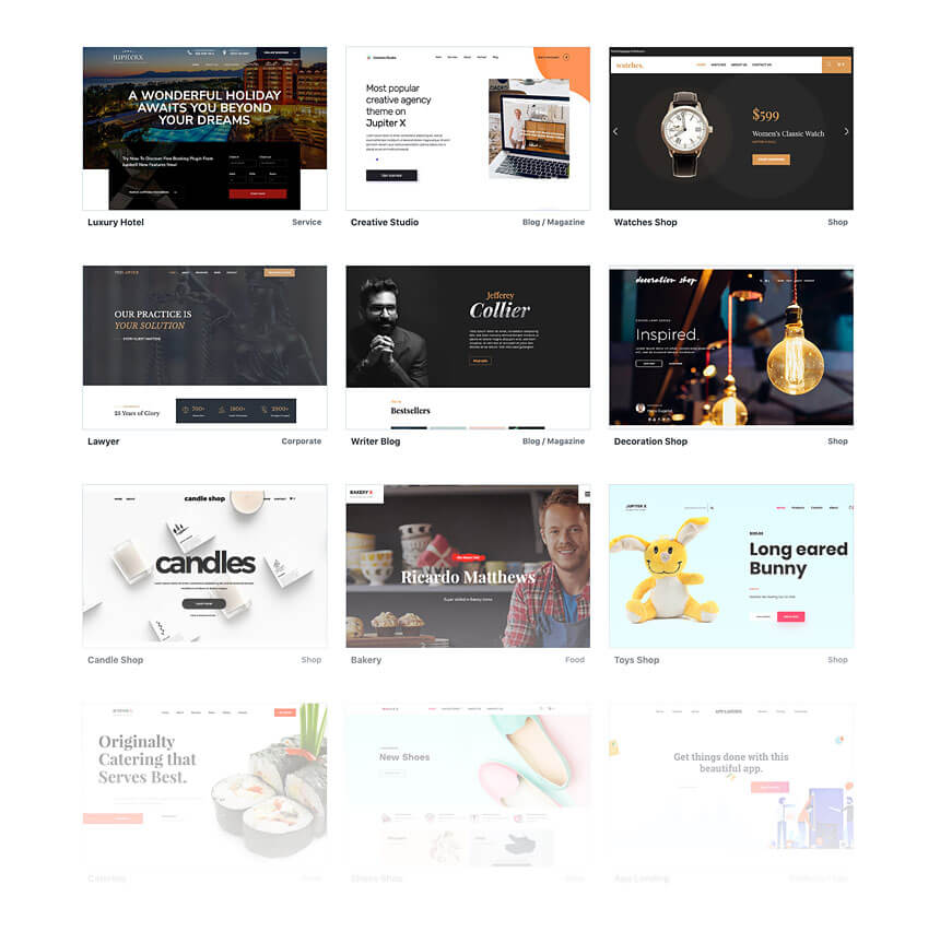
In its update to the template repository over the past two months, Jupiter X has added about 60 new website templates for you that addresses all the downsides of the usual website templates! And they are from a vast category of niches and types. They encompass businesses and sectors such as agencies, leisure, online shops, creative portfolios, blogs, health, restaurants, listings, startups, events, community and much more. And even more stunning templates are on the way every month.
So what are these templates capable of in addition to being beautiful, customizable and responsive?
New Jupiter X templates carry a purpose
Long gone are the days of “design is beauty.” Design means more of purpose than aesthetics now so despite a usual template’s promise. Even when you add your copy and replace the dummy images with your own images. you are far from the actual website you were waiting to see. It’s because your template is just a presentation without a mission.
Purposeful Architecture
The new approach in template design at Artbees is not only in designing a visually appealing template. It’s a design that serves the mission of that template. The mission of a template consists of:
Mission of the website as a whole (based on its category and niche)
Mission of the homepage or landing page
Mission of the inner pages
The driving force and philosophy behind the new templates is to fulfill these missions.
Targeted Design
Your template’s design boils down to your customer profile and what is appealing to your business audience. The category/niche belonging to a template plays a critical role in its design. The characteristics of the target audience for that business have been deeply thought about and the findings are made sure to get reflected in that niche’s template design.
Actionable Storytelling
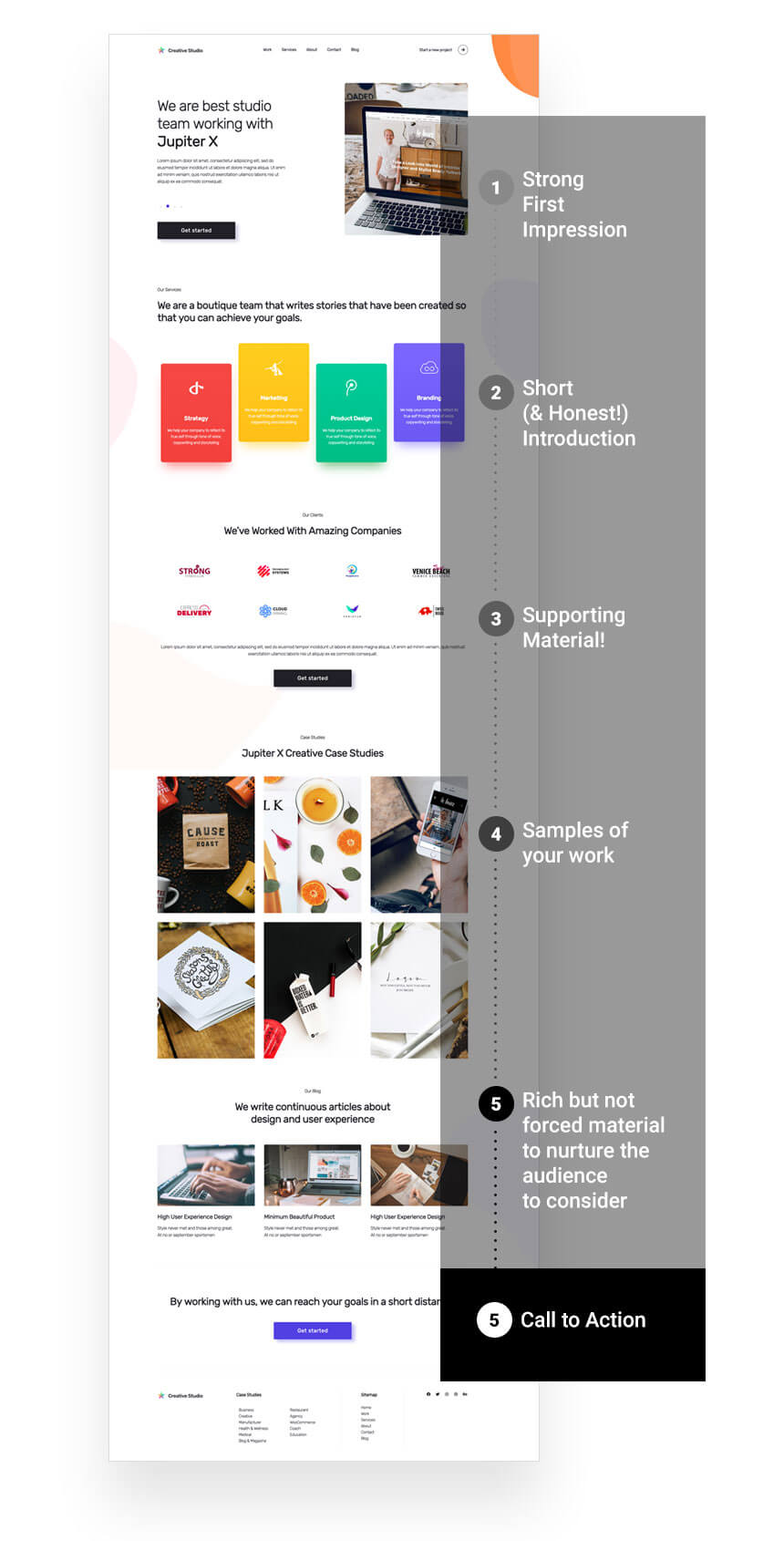
Your Jupiter X template will convey your remarkable story tailored to a specific audience. It’s geared to generate leads and convert those leads into paying customers. Sometimes this is done with a mouth-watering food menu and a booking option right underneath. Or with a timeline and list of achievements to showcase a company’s credibility and trust with an option to call or email.
Content such as hero sections, headings, and call-to-action buttons are now in complete harmony with your website’s purpose and goal. Moreover, most of the templates now include nimble pop-up designs that support your site’s mission by drawing in subscribers or helping to boost sales.
Meet Jupiter X Advanced Template Finder
With the new 60 templates added to the repository, the Jupiter X template count now exceeds 220. While this might be an impressive figure for a WordPress website builder, it can also be worrisome for some users as they are left with several options and unsure about how to find the right template for themselves.
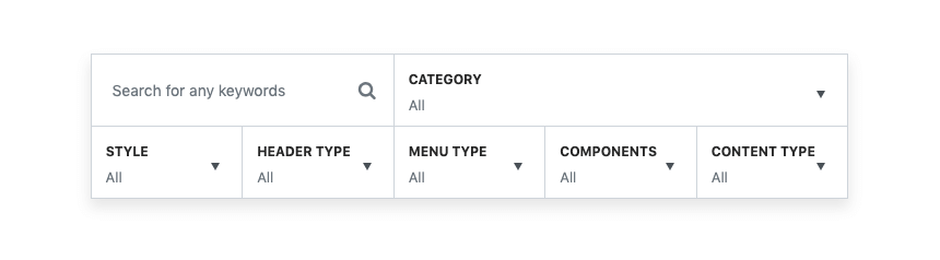
In order to better organize the growing number of Jupiter X templates, we built an advanced template finder module into the Jupiter X control panel as well as our demo websites. This is a powerful tool that locates the right template(s) based on the various factors that you set such as:
Keywords (manually entered)
Category
Style
Header Type
Menu Type
Components
Content-Type
Once you get your hands on it, it’ll prove a very effective way of filtering down the templates you are really after instead of wasting time opening and checking irrelevant templates.
What’s Next?
Jupiter X templates are a tool you can use to build authentic-looking websites with genuine content for businesses with a goal. And the best part? You don’t need to be a designer or a marketer. So the quick answer to the above question is: ‘A lot more new templates’! We will constantly build new templates based on this new approach and add them to the repository.
Stay current with the new added templates by checking the Artbees weekly newsletter and let us know if there is any niche or category you’d like to see as the next template released in Jupiter X. We transformed our template design approach based on Jupiter X community feedback and now look forward to your feedback about how we did it. Enjoy what’s left of the summer 😉
Knowing how to customize a blog in WordPress has always been a big challenge, particularly for those who don’t want to deal with coding. Want to do something like creating a custom single post simply to remove a page title? Or something more complicated like changing the entire layout of single blog posts? Of course, the latter is much more involved.
The Blog Customizer is one of Jupiter X’s best features as it allows users to create custom single blog pages quickly and easily. It’s highly customizable, and you can change the layout of your blog pages without a single line of code.
By using the single Blog Customizer, you can:
Change the whole template of single blog posts.
Display/hide every element of the blog posts such as featured image, title, author box, etc.
Customize and change the styles of the blog post elements.
In this article, by using a practical example, we’re going to show you how easily you can customize your blog single page using the Jupiter X Blog Customizer feature. Let’s first create the single blog page before customizing it.
Adding a New Post
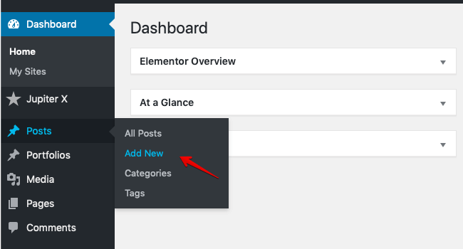
1. You are probably familiar with creating blog posts in WordPress. All you have to do is click on Posts > Add New from the WordPress sidebar menu.
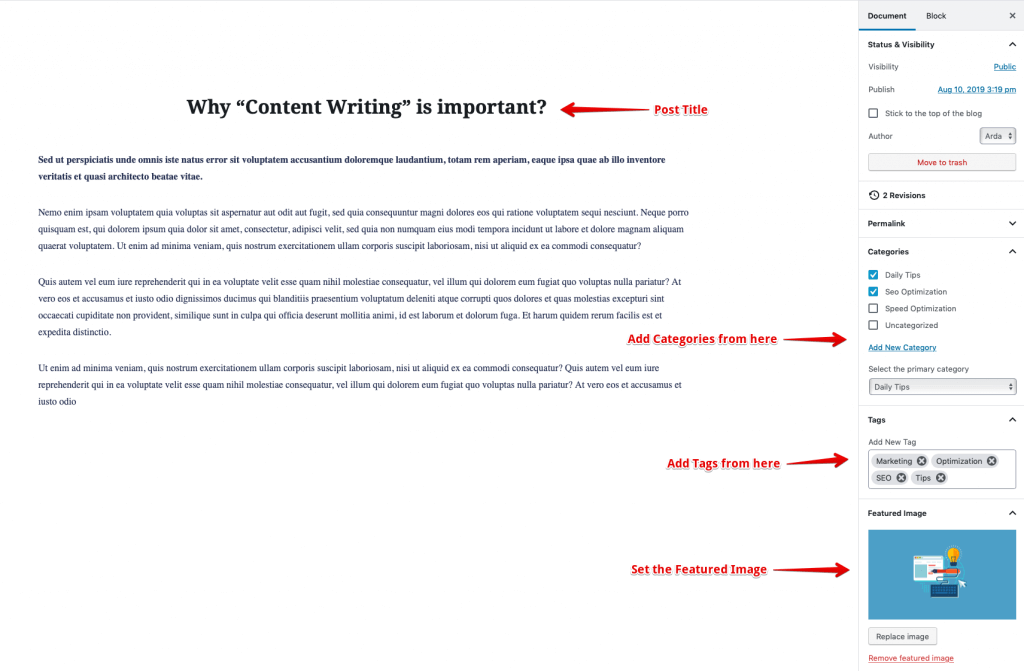
2. Now you’re in the post editor. You can add a title and content to your post. Also from the right sidebar in the editor, you can add categories, tags and a featured image to your post. These things are optional but as we want to show how we can customize them, let’s add categories, some tags and a featured image to our post.
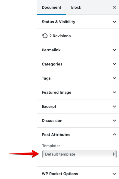
3. To be able to customize your posts with the Jupiter X Blog Customizer, your posts must have a Default Template. So from the right sidebar menu, find Post Attribute and select the Default Template.
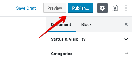
4. Publish(Update) the page.
Important: To customize your posts with Jupiter X Blog Customizer, you must create at least one post and set its Post Attribute to the Default Template.
How to Customize your Blog Posts via Blog Customizer
To customize your posts:
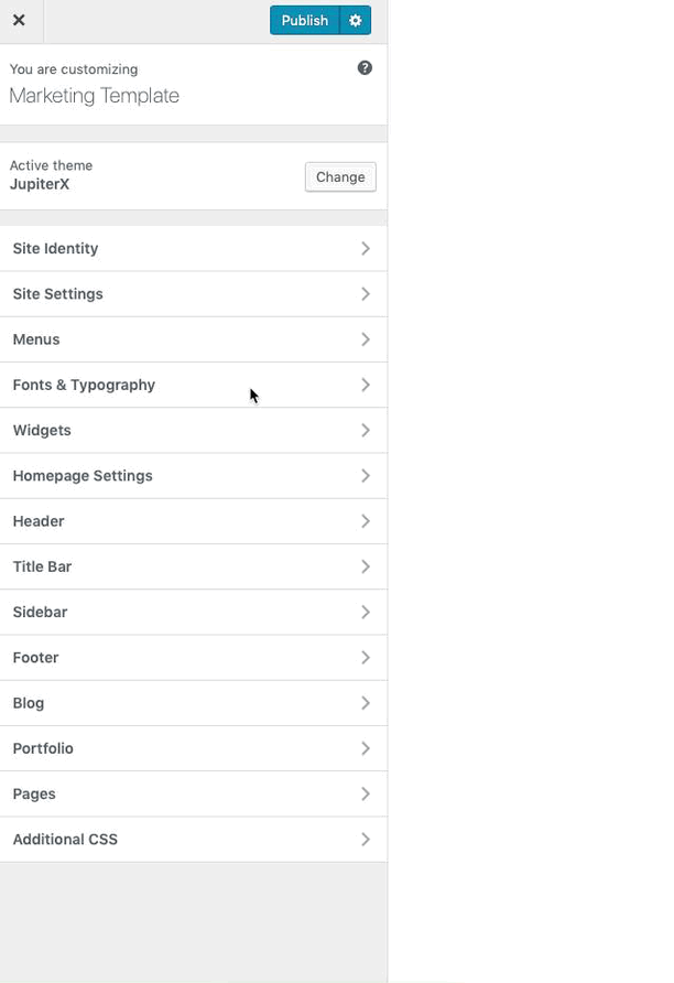
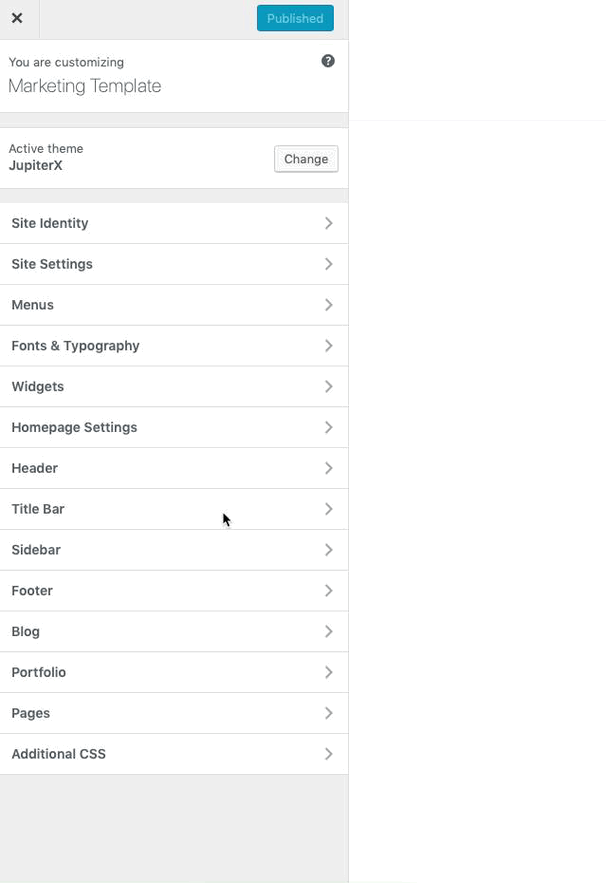
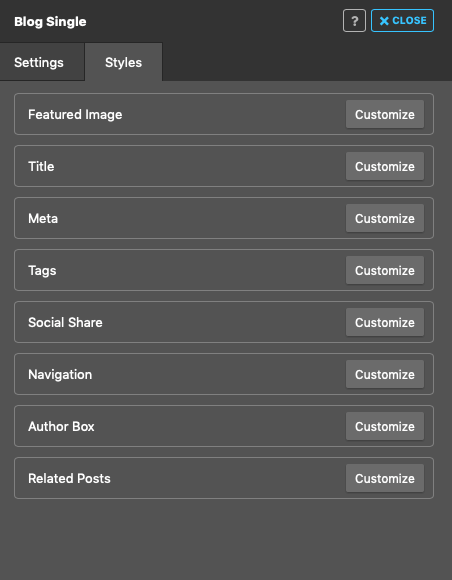
1. From the left menu in WordPress, go to JupiterX > Customize > Blog > Single Blog
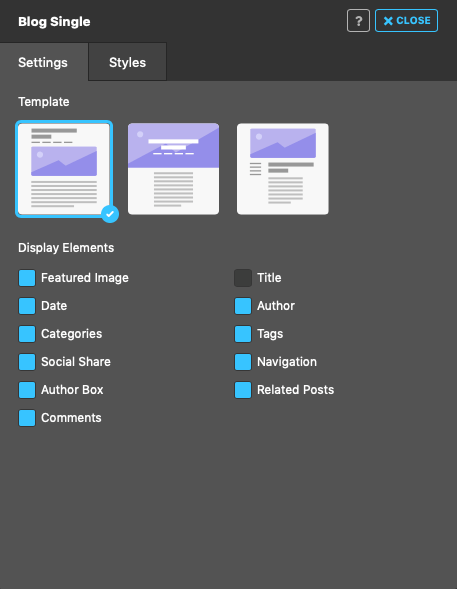
2. A new window will open with all the available options to customize and style the blog post. The Single Blog Customizer has two tabs: Settings and Styles. The first tab (Settings) allows you to choose a default template for your blog posts and enable or disable the feature image, title, date, author, categories, etc for them. In the second tab (Styles), you can change the styles of each element of the blog post.
Settings
Here are the available options for customizing the blog posts that you can find in the Settings tab.
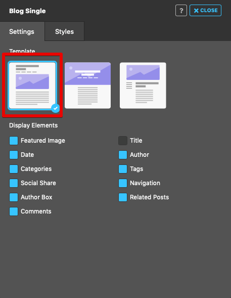
Template
Choose a default template from the sample templates.
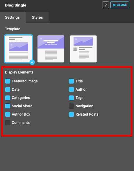
Display Elements
Enable/disable the below elements in the blog posts. The available elements include the following:
Featured Image: Displaying a representative image for our posts
Title: Displaying the title of the post
Date: Showing the publish date for each post
Author: Displaying the author of the post
Categories: Showing the post categories
Tags: Showing the post tags
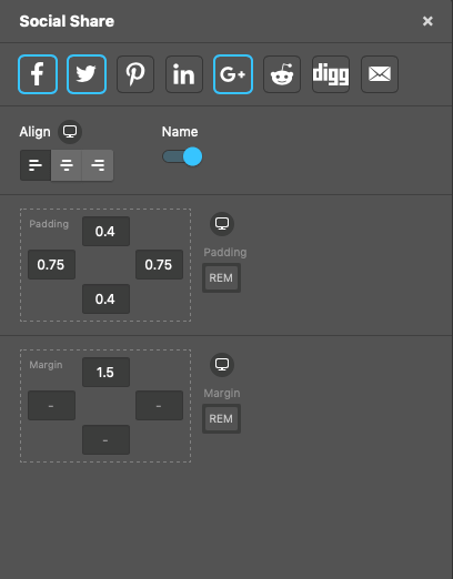
Social Share: Adding a social share button for our blog posts
Navigation: Navigating through the next and previously published posts
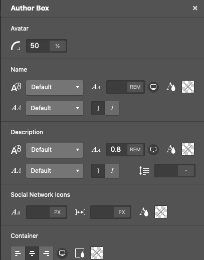
Author Box: Displaying all the author’s information, such as the author’s name, bio, avatar, etc.
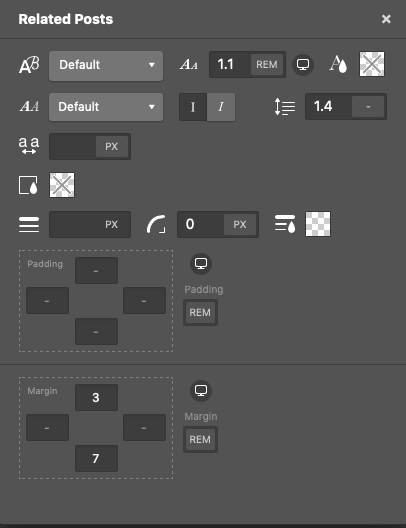
Related Posts: Displaying the related posts at the bottom of each blog post.
Comments: Enabling/disabling the comment feature for blog posts.
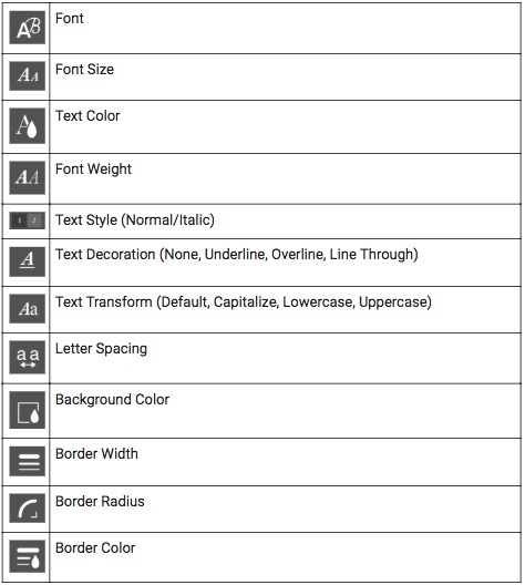
Styles
Here, you can change the styles of every enabled element in the blog post. All the available options for styling elements can be accessed by clicking on Customize for each element.
Here are some sample options for element customization:
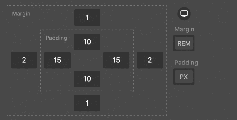
Margins and Paddings
You can set margin and padding for every available element for the blog post.
Units
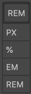
Units are crucial to set font sizes, measuring spaces, setting the width, etc. Because of that, you can set different units for all the properties that have units. There are four types of units in the Jupiter X Customizer: PX, REM, EM, and %. By clicking on the chosen unit, other possible units will be shown, and you can choose another unit for the property.
Responsive Option
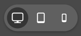
An important and useful feature in Jupiter X Customizer is the responsive option. This option allows you to set different values for different screen sizes for some of the properties of a particular element. For example, you can choose different font sizes for tablet and mobile screen sizes. For every property that has the responsive option, you will see the Monitor icon next to it. By hovering over the monitor icon, three devices will be displayed, and you can choose another value for them.
Case Study
Let’s assume that we want to customize a single blog page by using the Jupiter X Blog Customizer.
Here is what we do:
Create blog posts.
Customize global options.
Enable/disable elements in your blog posts.
Change the styles of existing elements.
Creating blog posts
We’ve described this section earlier. To customize your blog posts, you must create at least one blog post, but we recommend that you have multiple blog posts as we want to show the related posts below each blog post. Also, we suggest you add some tags and set a featured image to your posts to be able to display them for all single pages.
To emphasize what was mentioned before, the Page Attribute option for all of your posts must be set to the Default template.
Customizing global options
Before customizing blog posts, you might want to change the style of the body text or remove/add a sidebar from/to your pages. Also, you can decide whether the Title Bar must be visible for your pages or not. These options can be set globally and not only for the blog posts.
To change the style of body content: Go to WordPress left menu > Jupiter X > Customize > Fonts and Typography to customize it.
Let’s add the popping font named popping. From Typography, click on Customize for Body. Set the font family to Poppins and the font size to 16px.
To remove the sidebar from your pages: Go to WordPress left menu > Jupiter X > Customize > Sidebar and set its layout to No Sidebar.
And finally, let’s remove the title bar from our pages by going to Jupiter X > Customize > Title Bar and disable the Title, Subtitle, and Breadcrumb from it.
Finally, Publish the changes.
Enabling/disabling elements in your posts
You must decide which elements that must exist and which elements must be removed from your blog posts.
We have multiple pre-made templates for our blog posts that we can select and then customize to our preferences. Let’s choose the first template.
Also, we want to remove Comments and Navigation elements from our blog posts and keep all the other options enabled:
All the changes happen instantly.
Change the styles of existing elements
So now that you’ve decided which elements should remain on your blog posts, it’s time to change the styles of enabled elements. Keep the Blog Customizer’s panel open, and go to the Styles tab.
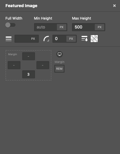
Featured Image
Let’s start from the first element. Click on Customize for Featured Image. Set the max-height to 500px, border-radius to 0 and margin-bottom to 3rem. Here is our final customization for the Featured Image:
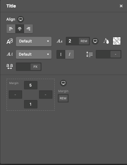
Title
Let’s go for the second element, which is Title. We won’t touch any settings for color and the font family so it inherits these styles from its parent which is body, But we will center align it, and change its font size to 2rem. 2rem means it’s two times bigger than its parent’s font size (body: 16px), so it equals 2x16px = 32px. Here is the result:
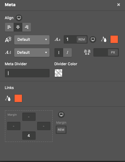
Meta
Let’s change the color for Meta, and the available links to #ff6334. We will center align it as well.
Social Links
You can add your desired social links icon to the bottom of your blog posts. They could either have names or simply keep the icons visible.
Author Box
We have plenty of options for customizing the author box. Let’s add a border-radius: 50% to our avatar to have a circular profile image in the author box. And change the font-size for the name, description and the social icons. Note that WordPress collects this information from your profile. To modify it, from the left menu in WordPress, go to Users > Your Profile and add the required information there. Here is the result:
Related Posts
Finally, let’s customize the Related Posts element. Changing the font size and adding a little bit of margin to the top and bottom of this element is enough.
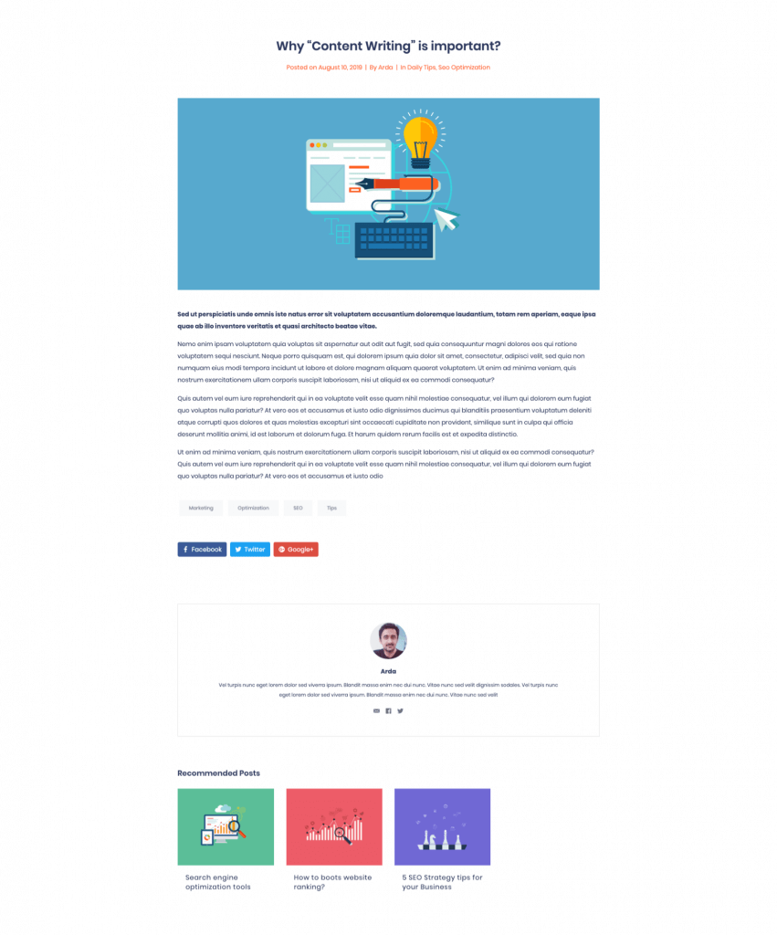
This is the result after customizing single blog posts with the Blog Customizer:
After you’re done with all the customizations, simply close the Single Blog settings panel and Publish the changes.
Summary
In this article, we’ve explained how to customize your blog posts with the Jupiter X Blog Customizer. We showed how you can add your desired elements to blog posts, remove any unwanted ones and easily and quickly change the styles of all the available elements.
We’d love to hear from you. Let us know your experiences with Jupiter X Blog Customizer in the comment section below!
What’s trending on the web today is likely to be forgotten tomorrow. When thinking about building a website, many business owners are afraid due to the sheer number of modern website design trends to follow. You need to learn the rules of this game so that your website is in tip-top shape and has enough conversion.
What is a “modern website design trend” in 2019?
First, let’s look at what a modern website trend is. The trend reflects the changes taking place in the web society. Also, it’s an indicator of development. What doesn’t develop dies.
Web design trends come and go in circles. As time progresses, web design trends and development technologies directly impact what we consider “good” and “bad” in website building. The truth is that presently web is at the point where web design is not limited by technology.
Today, we can do pretty much everything we might want to do on the web. And the future of web design is no longer about what we can do, rather, what we should do to design websites that result in positive experiences for users.
How do Design Trends Appear
What are your thoughts about how web design trends appear? Well, some believe that web designers gather secretly at night to create something extraordinary. Others think the thoughts of web designers are intuitively the same. At last, the third option states that web designers have a predicted forecasting team who predict the future “needs & wants” of consumers.
In fact, there’s nothing wrong with any of these options. One thing is certain here: each web design trend goes a long way until the moment when web design professionals are bound to use it.
Think of a trend as the general direction that the web market is taking during a specific period of time. The time for a trend to appear may take longer than predicted or it may not even become a trend at all.
Typically, web design trends are not something that changes within a few weeks. Instead, they evolve gradually, making it easier for web designers to find the most creative way to implement them. Many trends are cycled by nature, some of them come and go, while others are here to stay. And those web designers who know the difference between a fleeting fad and a real trend are the ones who create web products that compel us to admire and take action.
Top 5 Web Design Trends for 2019-2020 (with Examples)
So, what are the top design trends for 2019-2020? Well, by looking across the high-predictable and high-impact modern web design trends, it’s worth highlighting the top 5 web design trends for 2019-2020.
Custom Three-Dimensional Looks
It seems 3D designs are everywhere right now. The fame of fabulously flat designs is gone. Today, web designers are looking to add depth and realism to graphics with only one purpose: to breathe life into your projects by embracing 3D elements. Having proved itself as a quite stable and persistent modern web design trend for the last few years, 3D needs to be high up on your list.
Sometimes web designers use 3D designs as windows to another world. Especially, when they need to define the contrast between two worlds – the digital and physical ones. MakeReign, a digital design studio website, is an ample example of that. It has earned multiple awards, including Awwwards Site of the Day and FWA of the Day.
Sometimes web designers use 3D designs to create the world around you. They can even construct new environments and dimensions to let you enjoy AR and VR experiences on a go.
Some creative web designers go even further. They go outside the box and create imaginary spaces full of surreal and abstract elements. The playful and cartoon nature of a Pitch website is the best illustration of that.
At last, 3D design confidently takes its place in the world of typography. New eye-catching 3D typefaces pop off the page and are part of the main design. Often, some web designer pros use 3D typography as a go-to tool to improvise. They sometimes do this to create a whole new world you need to overdo.
In the above image, you can see letters constructed of blocks and machine parts in bold colors that are extra punchy in 3D. The object smoothly emerging from nowhere makes you stop and focus attention on it.
When you visit the Arche68 website, you’ll be impressed with its outstanding design that has nothing in common with fashion. In fact, it takes some clicking to discover their purpose (hint: they sell fashion accessories). Yet, it’s one of the many fashion websites that opt for a wilder approach with bold typography that creates an innovative, eye-catching design.
More Vibrant Bright Colors
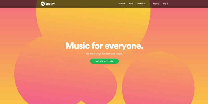
Vibrant, vivid colors will continue to be trendy in 2019-2020. This time, get ready for even more bright and striking colors. Standard website elements are long gone. Today, more original, creative and vibrant designs are making waves. As a result, the overall design feels more futuristic. Thus, mesmerizing and out-of-this-world designs of Spotify or Elje captivate at first sight. All-in-all, a bright color is everywhere.
Gradient color shifts across the page create a natural flow between image and text, guiding a visitor’s eye so that reading information feels more natural and comfortable.
When designing your own website, give it up to the gradients combined with bright, vivid colors. It’s a surefire way to add movement onto your page. Website designs differ – one may lack photography, while others don’t have imagery elements. That’s when gradients can change the way your website is perceived by visitors.
Even More Video
In our day and age when a picture says a thousand words, a video says it best. With a large and beautiful hero image, gaining the attention you need is a no-brainer. Now, a relevant and great video of your brand or your customers speaking for you is a game-changer. It will create a tremendous impact on your visitors, increasing your conversion rates up to 80%.
It’s not a secret, most visitors have no desire to stay for long on a website. Even though speed is such a huge factor today, a great video tends to increase conversions. For that reason, different social media platforms prioritize videos over other kinds of posts. If done right, a video that can grab attention raises your website metric.
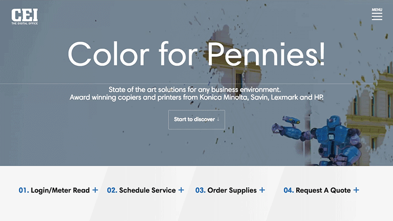
Videos work particularly great when you need to explain complex things quickly. Look at how rapidly and effectively CEI The Digital Office convey their message in a matter of seconds. Breaking through the online noise is hard. With a high-quality video, you can do a lot for your branding.
What is the best way to show off? Marisa Passos has the solution. Just visit her personal portfolio to learn how to pitch yourself in the most effective manner. You can’t help but admire her work.
Minimalistic Asymmetrical Layouts
Minimalism – which is not new but trendy – is still hot. Because it keeps a visitor focused, minimalistic design dominates the web. The best thing is that it presupposes that your website is simple and clean. Our life today is dynamic and full of distractions that bombard us from every direction. We don’t have the time or the desire to pay attention to the complex structure or distracting elements.
In fact, combined with asymmetrical grids, your website design has a chance to stand out. Ideal for creating hierarchy, asymmetrical grids are nothing but the best.
The Impact website is one of the best examples of minimalistic asymmetrical layouts. The idea is to call attention to what matters most. So, they break up the content into several parts. Each of them guides the user’s eyes to the information they’re looking for.
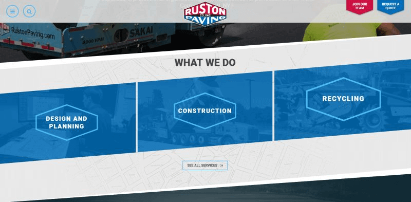
When it comes to asymmetrical hierarchy, Ruston Paving sticks out a mile. Peculiar placements and repeating incorrect patterns are a whole new game. A mix of colors and textures sparks attention. At last, the user-focused design funnel people to the right places.
Geometric and organic shapes
What is the best way to add a sense of playfulness and creativity to modern website design? It’s not only colors that evoke particular thoughts and emotions. Specific emotions and feelings are no stranger to geometric shapes. Why not add a bit of extra vibe and dynamism to your web design? Triangles, hexagons, and circles are a big deal in modern web design.
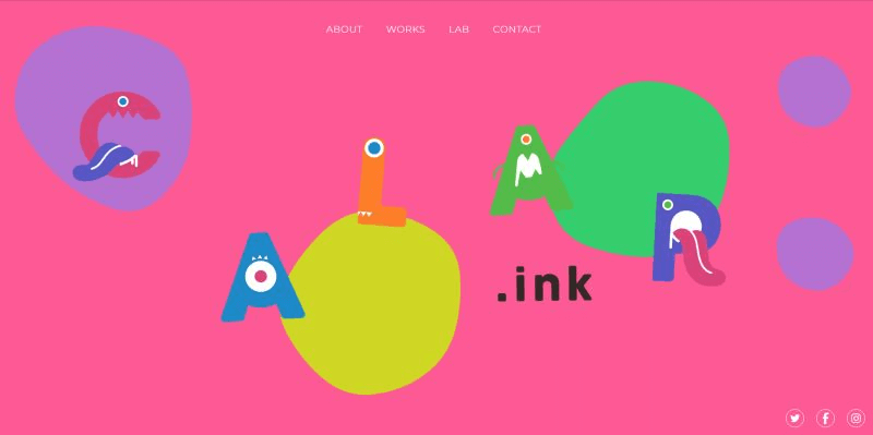
Just take a look at how great the Calar website is. With brilliant, vivid color palettes and interactive elements, their website makes a user feel like a child in art class. Get creative with shapes, and you’ll succeed in establishing visual hierarchy. What part of your website do you want your users to notice?
In fact, streamlined lines are especially successful if supplemented by different shapes. There are no straight lines in nature, so streamlined forms give a website much more loyalty. Rounded corners have appeared to become a trend last year.
Final Thoughts
It’s always fascinating to watch how modern web design trends appear and evolve with time. But what’s more interesting is to watch how some trends turn out differently than expected.
All in all, responsive, clean, speedy and user-friendly websites continue to make waves. 2019-2020 will see the introduction of other web design trends and features, and the ThemeREX team is quite excited to see them coming.
WordPress, the most popular CMS (Content Management System) is known for its flexibility. It’s highly customizable, and making any changes is incredibly easy. One of the most important aspects of WordPress and its flexibility is WordPress hooks. In this post, we are going to explore what exactly a WordPress hook is, how it works and how we can use them.
Users are able to extend WordPress functionality by using plugins. WordPress.org has more than 55,000 plugins in its repository – many of which are free. There are some premium plugins hosted by WordPress.org as well.
So, even by looking at the plugin’s stats, we see that a lot of developers create plugins for WordPress. This is due to the flexible nature of the WordPress structure. So where do hooks come into play? They are an integral part of how plugins work with WordPress core.
What is a WordPress hook?
Let’s break it down. A WordPress hook will let you know that something is happening. In other words, a hook will let you run custom codes when loading a WordPress website to add, remove or modify certain functionality or data. You can do the following with a hook:
Executing a code to send a welcome email right after a new user has registered to the site.
Running a custom code to clear site cache after saving new changes in customizer.
Modifying the default admin footer text.
Changing the label of the “Register” button on the registration page.
Modifying the markup of the page right before the page loads.
Including new styles in certain conditions.
The main point of using hooks is that you don’t need to touch WordPress core files that are required by WordPress to work. If you edit any file in WordPress core, you’ll lose it after updating WordPress.
These are some basic examples of WordPress hooks. As previously mentioned, they work with certain functionality or data. So, there are two different types of WordPress hooks:
Actions
Filters
WordPress Actions
Action hooks can be used to add custom functionality when needed. For instance, imagine that you want to run a code to log the last login time for each user. You’ll need to run a piece of code that records the time right after a user logs into the site. So you’ll need to run an additional functionality at a certain time. In this case, we would have to use action hooks. Action hooks work with functionality – they are doing something new.
How do action hooks work?
Action hooks are similar to informing everyone that you want to do a specific thing such as saying, “Hey buds, I’ve just arrived” or “Bye guys, I’m leaving.” When you inform others, they are aware of what you did or what you want to do, and they can say something in response, remind you of something or react in any other type of way.
While WordPress is loading and reaches a specific point, it’ll let us know about it. So, you can run your codes to add specific functionality or to extend existing functionality.
Some examples of actions include the following:
wp_head When you reach the <head> tag, WordPress lets you know by running the wp_head hook. Remember it as a name. We will provide you with some codes and an explanation about how to use hooks.
publish_post This runs when a post is published or if it is edited and its status is changed to “published.” So, Imagine that you want to tweet a post automatically after publishing it to your WordPress site. This hook makes it easy for you to do it.
wp_footer This action hook is triggered near the tag. That means you are reaching the end of document markup. Many developers use this hook to include their javascript files to the footer of the page.
Filter hooks work with data. By data, we mean a simple text, HTML markups and even a PHP variable that could be the value of an option. This means that you can change an option value on the fly. Or you can change a certain text in the admin dashboard without editing WordPress core files. Also, filters could be used to modify multiple things at the same time. For example, you can add a new class name and data attribute simultaneously to the navigation menu items using a filter.
How do filter hooks work?
Filter hooks differ from action hooks. When you reach a certain code, WordPress allows you to make changes to something. Imagine that your child wants to go to school and right before going out, you put an extra book in their backpack. In this example, you’ve changed the content of the backpack and filtered it when you had access to it. Filters work in the same way. They will let you know that content is going to be printed or when an option is going to be used – and you’ll be able to modify it if you want.
Some real example of filters are:
login_erros This runs whenever an error is going to be shown to the user in the login page.
body_class This fires (runs) while generating the tag. Use this filter hook if you want to modify the class names of the body tag.
pre_delete_post This fires right before deleting a post. You may want to avoid sending them to the trash and delete them completely. This filter hook will be useful for you.
How to use WordPress hooks
We’ve covered the basics of WordPress hooks. It’s time to learn code and use actions and filters in the real world. In this section, we’ll see some new things such as Hooked functions, Hook priority and Hook arguments.
Basic WordPress hooks usage
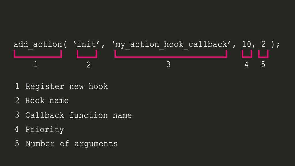
add_action( ‘init’, function(){
     // Do something.
 } );
Code explanation:
add_action: This is a function from WordPress. You’ll need to use this whenever you want to register a new action hook (run an action).
init: This is the hook name. Each event has a unique hook name. You can find a list of existing WordPress hooks on the Plugin API/Action reference page.
function(): This is the callback. The code that you want to execute when reaching the event.
For filters, it is a bit different:
add_filter( ‘excerpt_length’, function( $value ){
     // Do something and change $value.
     return $value
 } );
add_filter: Same as actions, this is a function name from WordPress. You’ll need to use this whenever you want to register a new filter hook.
excerpt_length: Again, this is the hook name. Hook names are meaningful. So, while using excerpt_length you can expect that it will change the excerpt length of the post excerpt.
function(): This is the callback and the code that you want to execute in order to change something.
And the big difference with actions:
return $value
Filters need to return something. Why? Because using filters, you’re going to change something, not destroy it. If you don’t return, your variable/value will be missed. So, keep in mind, always return in filter callback.
Another way to implement this:
add_action( ‘init’, ‘my_callback’ );

 Function my_callback(){
    // Do something.
}
In this mode, we have separated the callback function instead of using an anonymous function. There is no difference.
The priority determines when the callback function will be executed in relation to the other callback functions associated with a given hook.
In the above example, my_callback_early is the first function that runs when reaching the init hook. After that, the my_callback_normal will run and at the end my_callback_late.
When there are multiple registered callback functions for the same hook with the same priority, the order of registering them will be used to running callback functions.
Hook Arguments
A callback function can take some arguments. For example, the excerpt_length hook will pass the current length as a parameter. So you have access to it in your callback function.
In the above example, 10 is the priority of the running callback, and 1 is the number of the callback function parameters. Because both of them are like default values, you can avoid writing them. The following code does exactly the same thing:
function my_custom_post_footer($content) {
        if(!is_feed() && !is_home()) {
                $content.= "<p>Share your idea about this post in comments.</p>";
        }
        return $content;
}
add_filter('the_content', 'my_custom_post_footer');
Disable autosave
function my_prefix_disable_auto_save(){
    wp_deregister_script( 'autosave' );
}
add_action( 'wp_print_scripts', 'my_prefix_disable_auto_save' );
Change the login page message
function my_prefix_the_login_message( $message ) {
    if ( empty($message) ){
        return "<p>Welcome to this site. Please log in to continue</p>";
    } else {
        return $message;
    }
}
add_filter( 'login_message', 'my_prefix_the_login_message' );
Wrapping up, WordPress hooks are one of the most important concepts that allow us to develop plugins and add new custom functionality to WordPress. Again, don’t forget to return when using a filter hook ;).
In this article, we guided you through the basics of WordPress hooks, including what they are and how they work. We also gave you some examples of how they are used in code to add further functionality to your website.
In the comments section below, please share your experiences and thoughts with us!
Elementor is packed with various elements or widgets. Widgets allow us to build websites and display appropriate content. But sometimes we need specific functionality for our website. And to do this, we need to create a new widget or element.
What is a widget?
A widget or element is a section in the Graphical User Interface (GUI) that lets us display the information we want to showcase to users.
The Elementor widget is a combination of PHP, JavaScript, HTML and CSS codes that generate a custom output for us. We suggest visiting this link before reading this article.
Elementor Widgets
Each widget has custom controls like input, fields, buttons and more. With these controls, we can set our custom settings and see a live preview in the editor and render the final HTML in frontend.
Widget Structure
In order to create a new widget, we must extend the Widget_Base abstract class. This class has several methods that we first need to override.
<?php
class Elementor_Test_Widget extends \Elementor\Widget_Base {

    public function get_name() {}

    public function get_title() {}

    public function get_icon() {}

    public function get_categories() {}

    protected function _register_controls() {}

    protected function render() {}

    protected function _content_template() {}
}
Widget Name
With the get_name() method, we can set the name of a widget and return the name of the widget.
public function get_name() {
    return 'Widget Name';
}
Widget Title
With the get_title() method, we can set the label of the widget.
public function get_title() {
    return __( 'Widget Title', 'Plugin Name' );
}
Widget Icon
The get_icon() method set the icon for our widget that displayed in the panel.
public function get_icon() {
    return 'eicon-gallery-grid';
}
Widget Categories
The get_categories() method set the category that our widget must be placed on the panel’s categories. In default, there are several categories including the following:
Basic
Pro-elements
General
Woocommerce-elements
WordPress
And so on.
public function get_categories() {
    return [ 'basic' ];
}
We can also create custom categories with the elementor/elements/categories_registered action.
With the _register_controls() method, we can set essential sections and controls for the widget.
There are several controls that we can use for widget settings, such as the following:
UI Controls
Button
Divider
Heading
Raw Html
Data Controls
Text
Select
Choose
Gallery
Slider
Typography
And so on.
Multiple Controls
Url
Media
Image Dimensions
Unit Controls
Slider
Dimensions
Group Controls
Typography
Text Shadow
Box Shadow
Border
Background
For more information on Elementor controls, you can check out this link.
Widget Template
The render() method allows creating a frontend HTML code with the PHP.
The _content_template() method generates a live preview for the widget in the editor by using the Backbone JavaScript library.
How to add controls to our widget
In default, there are three tabs in the Elementor panel, which are the Content Tab, Style Tab, and Advanced Tab. To add controls to our widget, we should first create a section and assign it to one of the tabs. Then we can add our favorite controls to the section. As mentioned above, we must put our code in the _register_controls() method.
Creating a Section
To create a section, we need to set the following essential parameters:
Section Name
Section Settings(label ,tab)
$this->start_controls_section(
     'section_name',//set unique name

          //set setting of section
        [
         'label' => __( 'Section Label', 'plugin-name' ),
         'tab' => \Elementor\Controls_Manager::TAB_CONTENT,
        ]
 );

  //THE CONTROLS COME HERE

$this->end_controls_section();
We must set the following parameters for each control as seen below:
Control Name
Control Setting(label,type)
Adding a normal control
Use the following control to add a normal control.
$this->add_control(
    'control_name',//set unique name for control

           //set essential settings
         [
        'label' => __( 'Control Label', 'plugin-name' ),

            //CONTROL_TYPE can be TEXT, SLIDER, ...
        'type' => \Elementor\Controls_Manager::CONTROL_TYPE,
         ]
    );
Adding a responsive control
This control type includes different settings value for desktop, tablet, and mobile devices.
This control groups several normal controls in one control such as typography.
$this->add_group_control(
//Group_Control_Class can be       Group_Control_Typography,Group_Control_Border or other group controls

  Group_Control_Class::get_type(),
  [
   'name' => 'control_name',
   'label' => __( 'control Label', 'plugin-name' ),
  ]
);
Adding control tabs
Create a tab area to add various controls.
//start tabs area container
$this->start_controls_tabs();

  // create first tab area
  $this->start_controls_tab();

    $this->add_control();

      $this->end_controls_tab();

     // create second tab area
      $this->start_controls_tab();

    $this->add_control();

      $this->end_controls_tab();

$this->end_controls_tabs();
//end tabs area container
Adding control popovers
Create a popover window will allow you to display various controls.
How to Display or Hide Sections and Controls in Widgets
At times, you might want to hide some sections or controls in your widget, but using if / else in the code is a hassle. Fortunately, now you can do this conveniently with the condition in the settings for sections or controls.
$this->start_controls_section(
  'my_section',
   [
    'label' => __( 'My Section', 'plugin-name' ),
    'tab' => \Elementor\Controls_Manager::TAB_CONTENT,
    'condition' => [
                       'Name' => 'Value',
                      ]
      //name must be unique name of one control
      //Value must be the return value of control
   ]
);
Let’s say that we have one control named Choose_ Layout with two values first and second. After adding the code found below code to any section or control, our section or control will be displayed if the return value of the Choose_ Layout control is equal to first. And it will be hidden if the return value of Choose_ Layout control is equal to the second.
'condition' => [
                'Choose_ Layout' => 'first',
               ]
How to Change Widget Output Style Automatically from the Control Settings
One of Elementor’s amazing features is the ability to easily change the style of widget output with CSS code and selectors. For example, if we want to change the height of images in output, first we must assign a class attribute to our HTML tag. Then use this class with the selector in settings of control.
To create the final Html code in the render() method and live preview in the _content_template() we’ll need input the parameter from the widget controls like height, width, font-size and more. In Elementor, the input parameter is called Settings. We can arrange settings in render() using this method.
Below, we have illustrated how to build a gallery widget step-by-step so you can better understand how to cover the topics mentioned above and create an Elementor widget.
Our gallery widget is registered in the Spicy plugin and the root directory of the gallery widget is:
Index.php file is an empty file that prevents a malicious hacker from directly accessing the plugin. Spicy.php file is the main plugin file that we register our widget with. Gallery.css file is a CSS file that sets the default style of a gallery widget. Gallery.php is the main file that defines the functionality of a gallery widget.
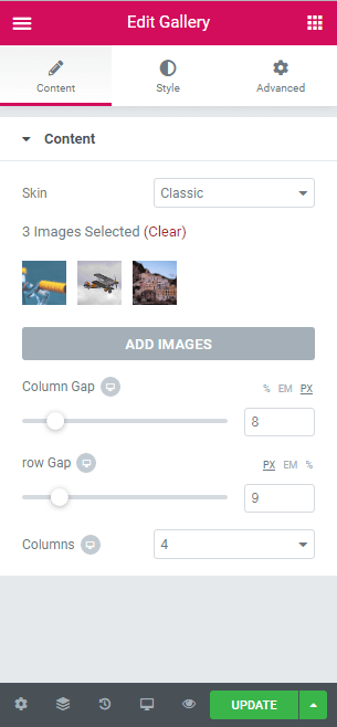
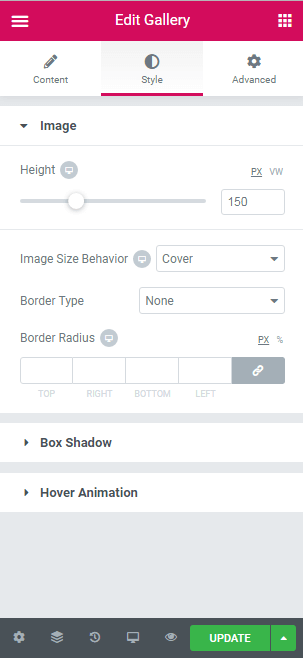
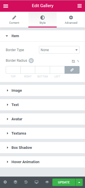
Image section contains Height and Image Size behavior controls.
Text section contains Color, Typography, Alignment, and Spacing controls.
Avatar section contains Height, Width, Alignment, and Spacing controls.
Textarea section contains Color, Typography, Alignment, and Spacing controls.
Extending the Widget_Base Abstract Class
The main class of the gallery widget is similar to the code found below.
gallery.php
<?php
class Spicy_Gallery_Widget extends \Elementor\Widget_Base {
public function get_name() {
   return 'Gallery';
   }
public function get_title() {
    return __( 'Gallery', 'Spicy-extension' );
    }
public function get_icon() {
    return 'eicon-gallery-grid';
    }
public function get_categories() {
    return [ 'basic' ];
    }
protected function _register_controls() {

    //  start Content tab
        $this->start_controls_section(
            'content_section',
            [
             'label' => __( 'Content', 'Spicy-extension' ),
             'tab' => \Elementor\Controls_Manager::TAB_CONTENT,
            ]
        );
        //add skin control
        $this->register_controls_skin();

        //add repeater for pro skin
        $this->register_controls_pro_repeater();

        //add gallery control
        $this->register_controls_Classic_gallery();

        //add column-gap slider
        $this->register_controls_column_gap();

        //add row-gap slider
        $this->register_controls_row_gap();


 //add columns number list
        $this->register_controls_column_number();

        $this->end_controls_section();
        // end content tab

        //start Style tab
        $this->register_controls_classic_style_image();

        //create pro item section
        $this->register_controls_pro_item();

      //create pro style section-image
        $this->register_controls_pro_style_image();

      //create pro style section-text
        $this->register_controls_pro_style_text();

      //create pro style section-avatar
        $this->register_controls_pro_style_avatar();

      //create pro style section-textarea
        $this->register_controls_pro_style_textarea();

      //Box Shadow
        $this->register_controls_pro_style_boxshadow();

        //hover animation
        $this->register_controls_pro_style_hoveranimation();
      //end style tab
    }

protected function render() {
        $settings = $this->get_settings_for_display();
        ?>
        <div class="spicy-gallery" width="100%">
        <?php

        if($settings['spicy_skin']=='classic'){
            $this->classic_render($settings);
        }else{
            $this->pro_render($settings);

                 }
        ?>
        </div>

        <?php
    }

protected function _content_template() {
        ?>
        <div class="spicy-gallery">
        <#
         if(settings.spicy_skin=='classic'){
         _.each( settings.spicy_images, function( image ) {
        #>
        <div class="spicy-item elementor-animation-{{settings.spicyhover}}">
         <img  class="spicy-img" id="{{image.id}}" src="{{image.url}}"/>
        </div>
        <# }); } else{
         _.each( settings.spicy_image_list, function( image ) {
        #>
        <div class="spicy-item elementor-animation-{{settings.spicyhover}}">
          <div class="spicy-pro-container">
            <img class="spicy-pro-img" src="{{image.spicy_pro_image.url}}" >
          </div>
          <p class="spicy-pro-text">{{image.spicy_pro_text}}</p>
          <div class="spicy-avatar-wrapper">
           <img class="spicy-avatar" src="{{image.spicy_pro_avatar.url}}" alt="Avatar">
          </div>
          <p class="spicy-pro-description">{{image.spicy_pro_description}}</p>
         </div>
        <# }); }#>
        </div>
     <?php
    }
?>
Creating Controls for a Gallery Widget
In the above code, you’ll see several functions in _register_controls() and render() functions.In fact, these methods assign sections and controls for the gallery widget. We can create these functions only for grouping codes and simplicity.
Common Controls
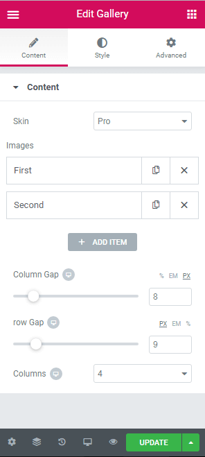
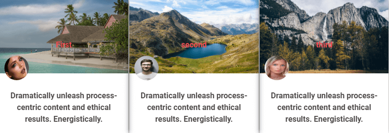
1.Skin control: This control’s type is Select with two options set as classic and pro. With this control, we have the ability to change the layout of the gallery widget.
The following controls or sections are only displayed in the pro layout.
1. Repeater Section: This section has four controls, which are Image, Text, Avatar, and Textarea. It’s used for adding images individually and is displayed in the Content Tab.
After creating a gallery widget, we need to register essential CSS style to our widget. To do this, we need to first create a CSS file, then register it in Spicy.php.
In this blog post, we described how to extend Elementor like a pro in detail and explained the structure of an Elementor widget. We also illustrated how to create a section and control, how to display/hide a section or control, how to change the widget style from controls, how to get settings and how to render the final output in frontend and Elementor editor.
Finally, we walked you through the steps of developing a gallery widget. Feel free to share your ideas and experiences in the comments section below.
This is a guest post contributed to Artbees Themes blog by Kristin Savage.
Writing a brief for your WordPress developer is something you must never overlook or discard as unnecessary. If you want to get a high-quality end product, you must be ready to put in some effort to phrase what you want this product to be. Here are the things to keep in mind when creating a brief for your WordPress developer.
Why Is It Important?
A brief for your WordPress developer is important for four main reasons:
It provides key details about what you want the developer to do and what you want the result to be.
It sets the tone of your project and gives a general idea of what it is that you have in mind.
It sets the timeframes and deadlines for the project describing when and what should be completed.
It specifies the requirements and additional features you might decide to add later on.
If your brief achieves all of these, then your WordPress developer will definitely know what you want from them and what they must do to get the results you need. Now, let’s get into the step-by-step guide.
1. General Project Information
The first section of your brief contains general project information. It functions as a kind of introduction to your document that aims to provide some of the key data about the client and the project.
First, include your personal details such as your full name, contact information, the company or organization you are representing, and so on. Anything that you consider necessary can be added. If you are not the client, then include the details of the person who you are working for and who will be the client.
Second, include the basic details about the project such as the project’s name, timeframes, and so on. Don’t go into much detail about any particular piece of information in this section as these will be discussed later on in your brief.
2. Goals & Estimates
The next section of your brief must contain the goals and estimates for your project. Think of what you want to achieve with this particular endeavor and then also include what your personal goals are if you are in charge of it.
In addition to that, talk about the problems that the project will solve. These can be both big and small, but make sure to include at least one problem. Also, include estimates for your project and what you think it will achieve that is not connected to solving problems.
If you haven’t set your goals yet, it’s a good idea to use a goal tracking app such as Aha! to do this and keep your aims in front of you at all times as well as check progress.
The third section of your brief must contain the details about your target audience. If you haven’t researched this yet, then make sure to do it as soon as possible as this is a very important component of every successful project.
Describe such characteristics of your audience as its gender, age, occupation, location, interests, habits, and so on. Any relevant information will only be useful rather than a burden, so don’t be afraid to add something on top of that.
However, keep in mind that your audience may vary a lot and you may need to construct several customer personas. As long as you do this, you will be heading in the right direction with your project.
4. Detailed Project Description
This is the biggest section of your brief which goes into detail about every aspect of your project. Look back at your first section and elaborate on the points you made in it. You must be as precise and clear as possible. Otherwise, your developer won’t have a concrete picture of what you want and need.
If you don’t want to write your brief yourself, you can hire a professional from an online writing service such as Studicus to do this for you. Alternatively, you can ask only for this biggest part to be written for you and work on everything else yourself. If you decide to write your brief entirely on your own, make sure to check its grammar, spelling, and punctuation with the help of Grammarly.
5. Project Requirements
Right after the detailed project description, outline the project requirements. These include both functional and secondary requirements. Any tools, as well as resources, can also be added here in case you require those. Functional requirements are the ones that the project absolutely needs in order to be what you want it to be.
These include different features you want to be added and such. Secondary requirements are the ones that are not necessary right away and can be considered if there is enough time or resources for them. They serve as an additional advantage that your project may have in the future.
This section must include a timeline with all of the deadlines for your project. Even though you included a start and end date in the very first section of your brief, you must elaborate on it here and outline other dates. Make sure that you write about deadlines and timeframes for each stage of development. This will guarantee that the progress is steady and you can check back on how your developer is doing every once in a while.
Alternatively, you may want to ask your developer to report back on certain dates. You can also outline another timeline that can be used in case the first one fails due to an unexpected turn of events. This will work as a kind of a Plan B, so you don’t necessarily have to include it into the brief and can simply keep it for yourself.
The budget and expenses are always a sensitive topic for both sides. This is why you must treat this section with caution and make sure that all of the data you include here is as accurate as possible. Think of all the expenses you will have. If there are any additional ones that can happen out of the blue, describe them too as you wouldn’t want any surprises. You can use different apps such as Mint to help you keep track of your budget and manage your bank accounts at the same time.
The last section should include your measures of success. To put it simply, these are the standards that you will be comparing the result in order to check the project’s success. You must make them as realistic as possible, but not too high or too low at the same time.
You could say that these are similar to the second section of your brief where you mentioned your estimates. But unlike that section, this one should have more exact and concrete standards that you will stick to more seriously.
Final Thoughts on Creating a Brief for your WordPress Developer
In conclusion, writing a brief for your WordPress developer is definitely not as difficult once you know what it must include. Proper communication with your developer will ensure that both of you are aware of each other’s thoughts and intentions, so don’t hesitate to contact them if there is something you’d like to specify.
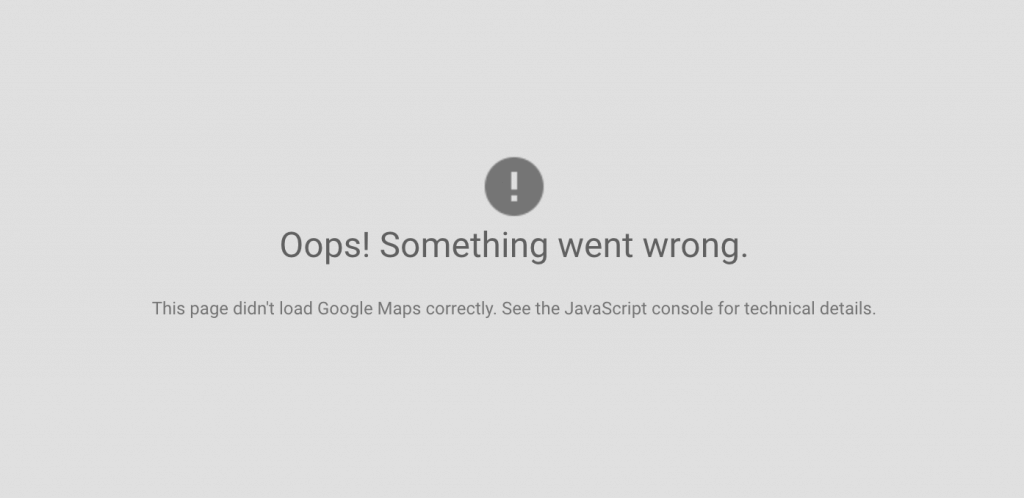
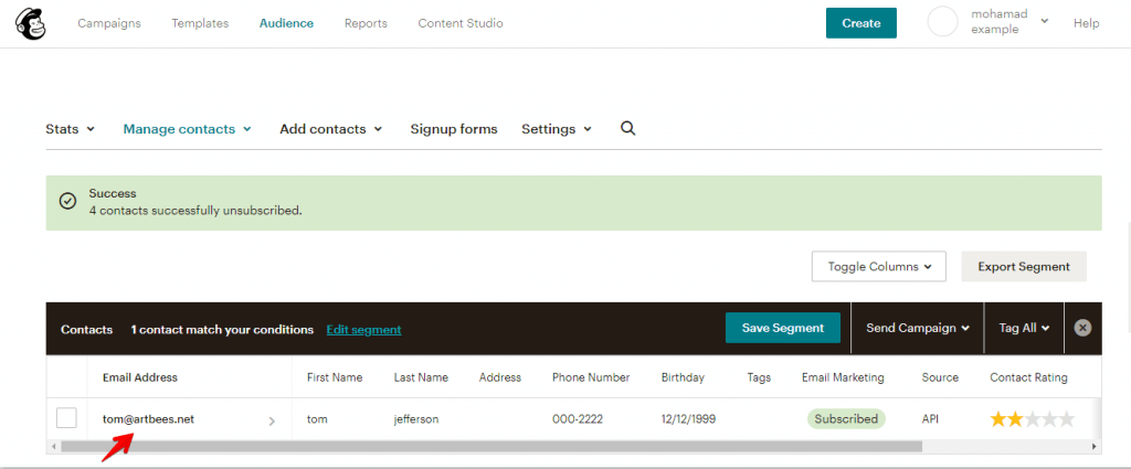
Many websites created by Jupiter users include a Google Map element. They’re particularly helpful for businesses who have a set location that they would like their visitors to know about and visit. But in using Google Maps, you might run into difficulties such as error messages as seen in the image below. In the next paragraph, we’ll explain in detail why you’ve received this message and how you can begin using alternatives to Google Maps!
The launch of Google Maps Platform
As of 11 June 2018, Google Maps changed its name to Google Maps Platform. With this change, any site that uses Google Maps is required to have a valid API key and a Google Cloud Platform billing account. Featuring Google Maps on your website is still possible, but you’ll have to make some modifications to how it is set up, including giving Google your credit card.
Without an API key, sites with Google Maps will no longer be supported, and any Maps requests will now show only low-resolution maps watermarked with “for development purposes only” unless a credit card is associated with it.
If you are unwilling to create a billing account with Google, you can still find some Google Maps alternatives. We’ll list some of them.
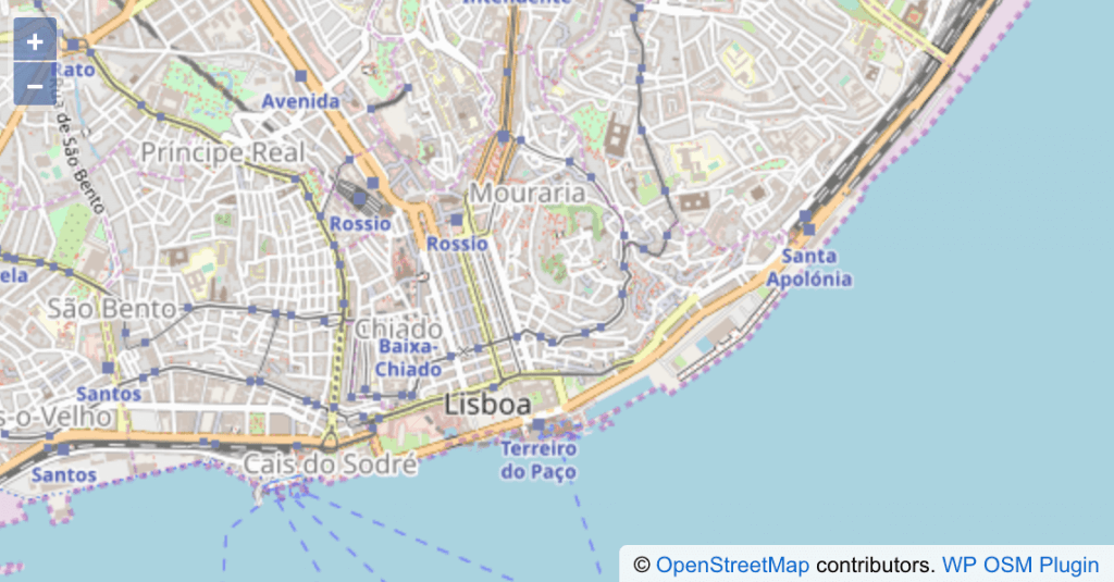
Open Street Maps as a Google Maps Alternative
Tons of sites all around the world are working on OSM. The WP OSM Plugin is an open-source plugin with a free license and without any pro version or a business plan.
Features of the WP OSM Plugin include:
Add geolocation to a post or a page
Add GPX and KML files or just a single marker to a map
Add maps as shortcode or widget to a post/page
Fullscreen map, maps with markers linked to post/page with geolocation
OpenStreetMap, OpenSeaMap, Stamen maps, basemap, etc.
You can read their FAQ and documentation on their official site. Read the “Display a simple map” article to find out how to add a map to your WordPress site.
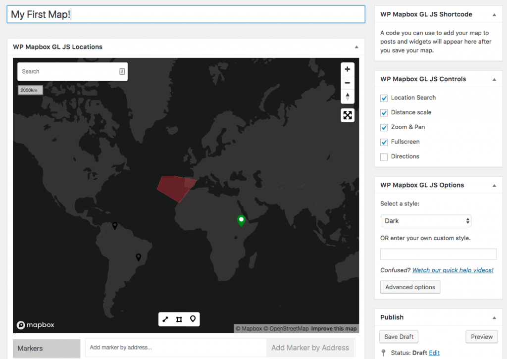
MapBox
Another alternative to Google Maps is MapBox. Mapbox is an online mapping service that allows users to customize maps – much more than Google Maps ever did. You can change backgrounds, road colors, and a lot more directly with a simple interface.
WP Mapbox GL JS Maps is the only plugin that enables you to make highly customized maps with 3D features, custom icons, zooming, custom filters, among many more options. It has a free and an inexpensive premium version, which adds custom markers, better control over directions, and more advanced control over marker and popup behavior.
To get started with MapBox, visit http://mapbox.com/ and click “Sign Up.” There are different pricing options you can select when signing up for MapBox. For now, go ahead and sign up for a free account, which comes with more than enough to get started. Read more here on how to use it.
The plugin provides you with a live preview while building the map, so you’ll always be able to see what the map will be before it’s published onto the main site. You can embed your map with a shortcode or publish it directly!
We’ll now show you how to use these alternatives to Google Maps on the Jupiter X site and describe the Open Street Map.
How to use Open Street Maps on Jupiter X
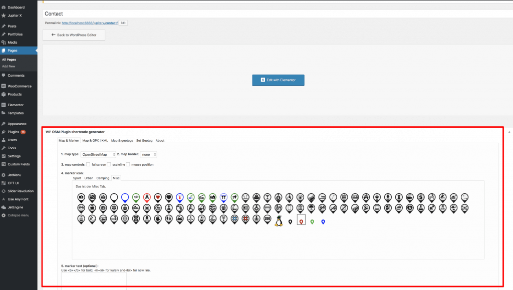
You’ll first need to install the OSM plugin in your WordPress dashboard via Plugins > Add New as described in this Jupiter X article.
Then follow the instructions from the OSM article:
1. Create a page or a post where you want to show a map and open it to edit.
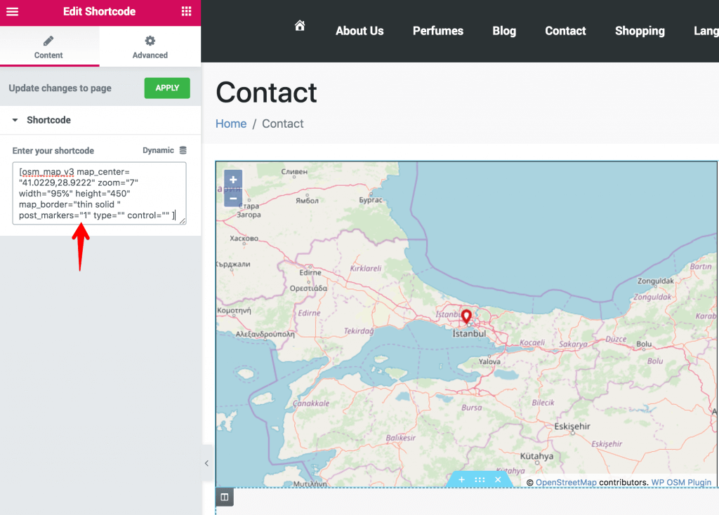
2. Find the “WP OSM Plugin shortcode generator” section in the page editor and customize the map to your liking.
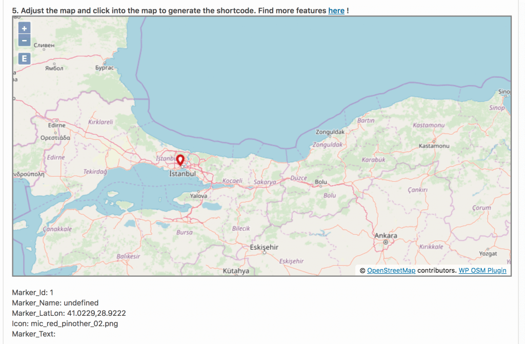
3. Below, you’ll see a map that you’ll need to adjust. Click on the place where you want to show a marker on the map. It will generate the map latitude and longitude based on where you placed the marker.
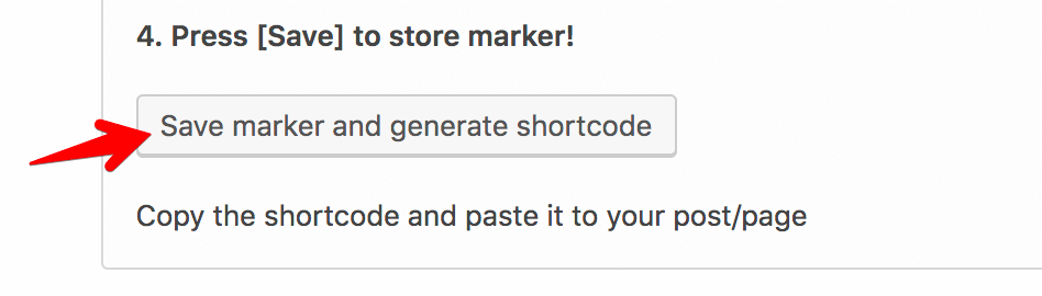
4. The last step is saving your marker and generating the shortcode.
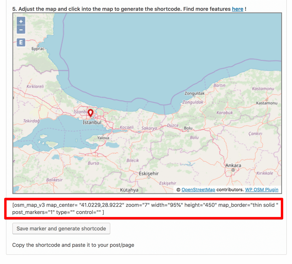
5. You’ll see a shortcode above the button.
6. Copy it to be able to add it to the page in the Elementor editor.
7. Once you’ve copied the shortcode, you can go and edit the page with Elementor.
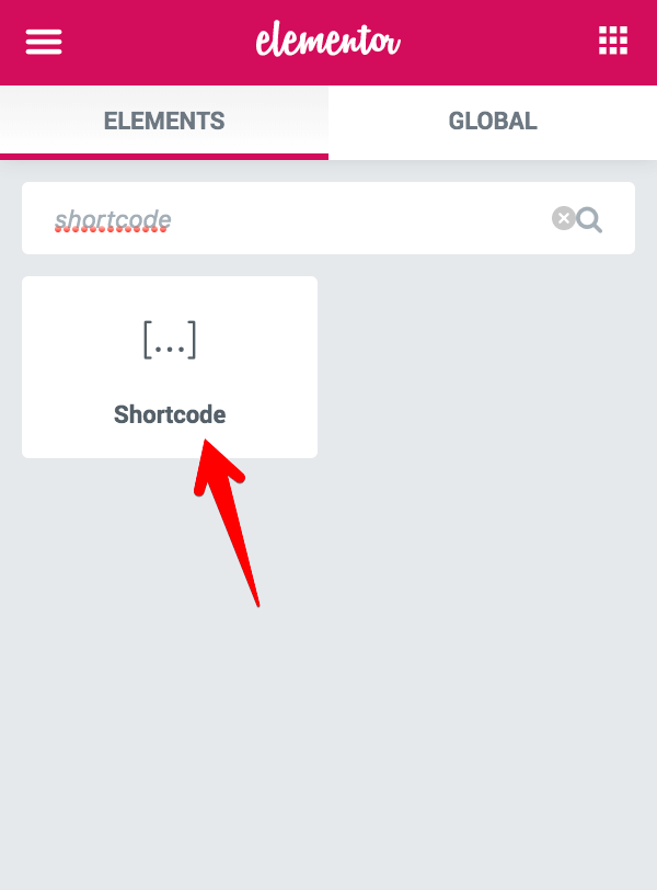
8. Look for the “Shortcode” widget in the Elementor editor.
9. Drag it to the page and paste the OSM shortcode you copied in the previous step.
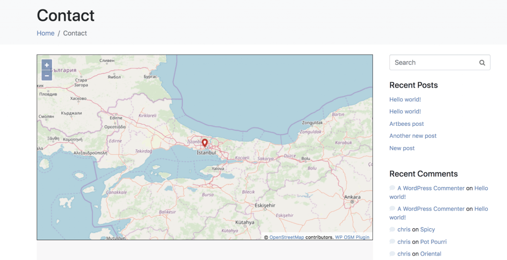
10. You’ll see the map as you styled it. Here is the result you’ll see on the frontend:
Wrapping Up
Open Street Maps and MapBox are fantastic free plugins for placing detailed, interactive maps on your website. If you take the time to read the instructions for the plugins, you’ll find that they are a useful way of enhancing any post or page.
Creating custom forms in WordPress has always been a hassle. Jupiter X has begun a new era in the form building experience. Now, you can create custom forms visually. Typically, site visitors come across forms such as signup, sign in, register, subscription, contact or any other custom forms.
Forms allow site visitors the ability to send information such as usernames, passwords, comments, emails, among other things to the server.
Forms contain fields such as dropdowns, checkboxes, text boxes, input, as well as submit and radio buttons. Nowadays forms play an integral role, particularly in digital marketing and social networks.
Form Builder in Depth
If you want to build a beautiful and secure form with Jupiter X, then you can use the Form Builder, which allows you to create custom forms in a few minutes with minimum effort.
Content Tab
This tab contains four sections such as Form Fields, Submit Button, Settings and Feedback Messages. Let’s go through each of them one by one.
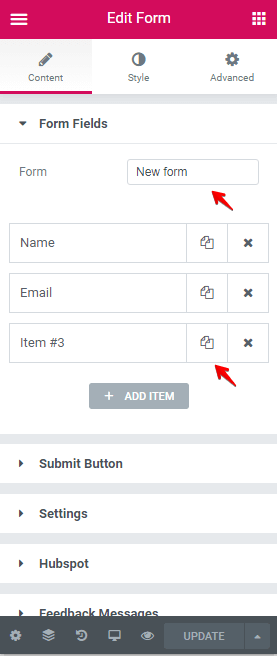
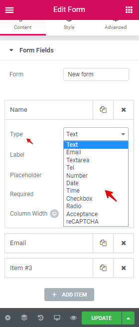
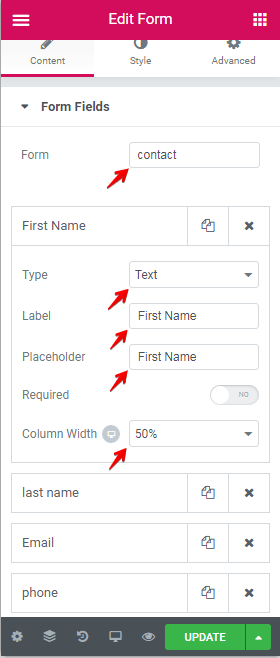
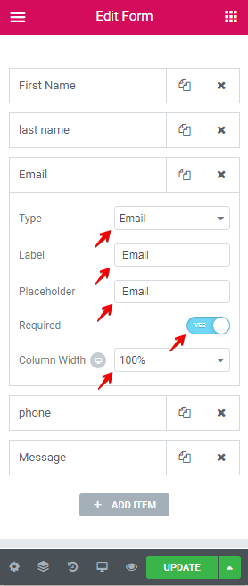
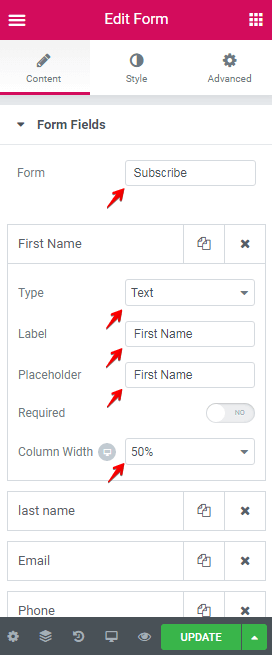
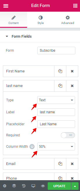
Form Fields
In this section, we can create fields for our forms. Form Fields have two options:
Form: for setting the name of the form.
Items: each field in the form.
Furthermore, each item has its options like:
Type
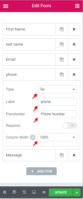
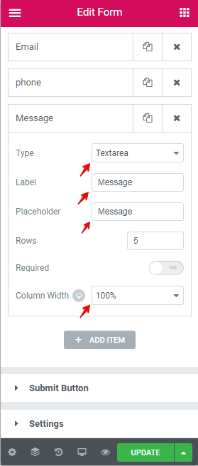
Label
Placeholder
Required
Column Width
And more.
One of the important options of each field is the Type option, which defines the role of the field. The Jupiter X Form Builder has eleven types for fields:
Text: for creating the text input.
Email: for creating the email input.
Textarea: for creating the textarea input.
Tel: for creating only the phone number input.
Number: for creating only the number input.
Date: for creating the date picker.
Time: for creating the time picker.
Checkbox: for creating a checkbox element.
Radio: for creating a radio button element.
Acceptance: for creating an agreement for conditions or a term of use button.
reCAPTCHA: for creating the human testing Google service.
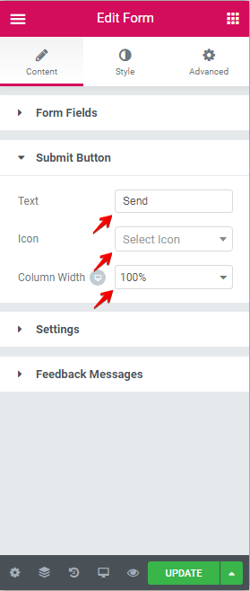
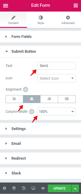
Submit Button
After clicking on the Submit Button, the information contained in the form is sent to the server. The Submit Button section has three options:
Text: for changing the bottom text.
Icon: for setting an icon for the Submit Button.
Column Width: for changing the Submit Button container.
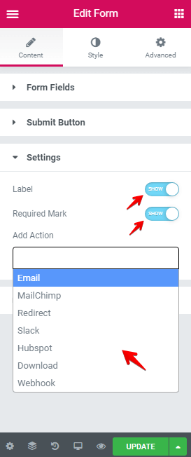
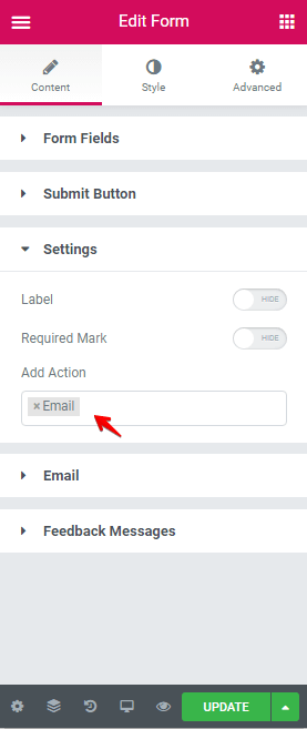
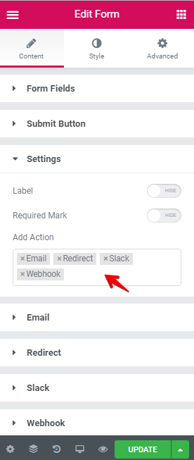
Settings
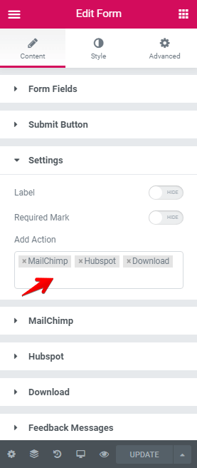
The Settings section has three options:
Label: Show/Hide status for fields label.
Required Mark: Show/Hide * after fields label for required fields.
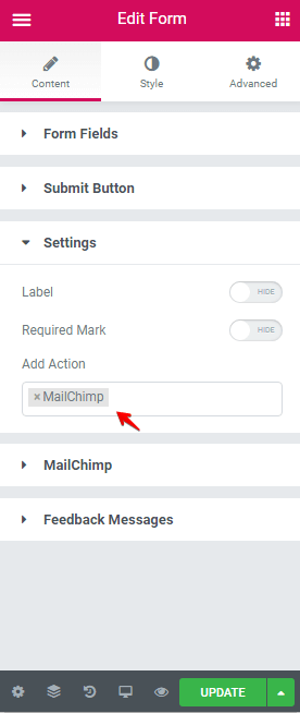
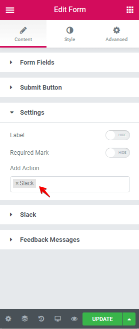
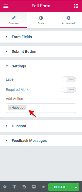
Add Action: Set the action in the form.
The Jupiter X Form Builder allows the user to choose from seven action fields. If you choose one of them, the options section of each action appears at the bottom of the setting section to where you can modify it.
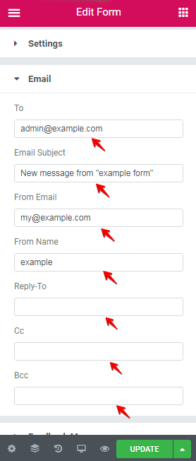
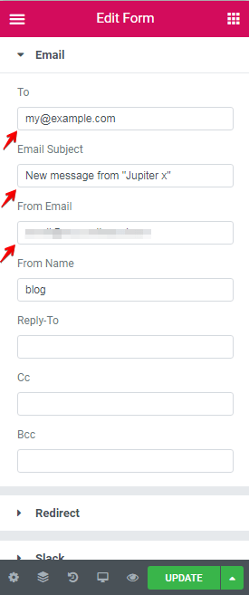
1. Email: This action email form allows users to fill in their email address such as admin. We can set To, Email Subject, From Email, From Name, Reply-To, Cc, Bcc.
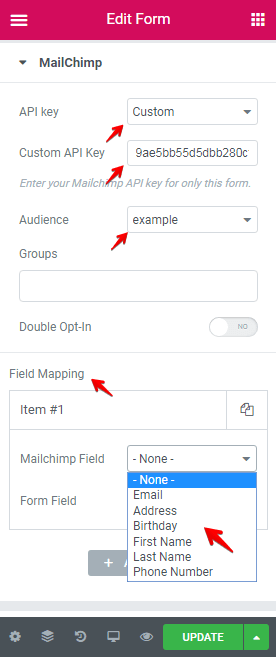
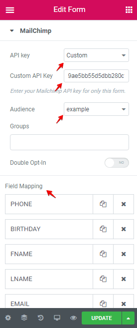
2. MailChimp: This is used for a subscription form. In order to use this, we must first have an API Key from MailChimp to manage our subscriber list. You can learn more about how to get a MailChimp API by clicking on this link.
In the MailChimp section, set the API Key, choose the Audience, and finally set the field mapping. In default, MailChimp has six fields including Email, Address, Birthday, First Name, Last Name, and Phone Number.
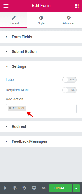
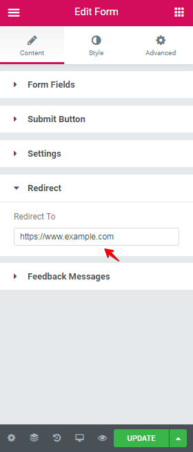
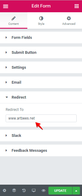
3. Redirect: With this, we can redirect our page to another URL.
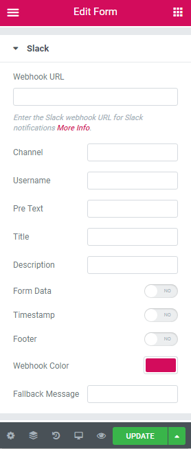
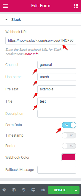
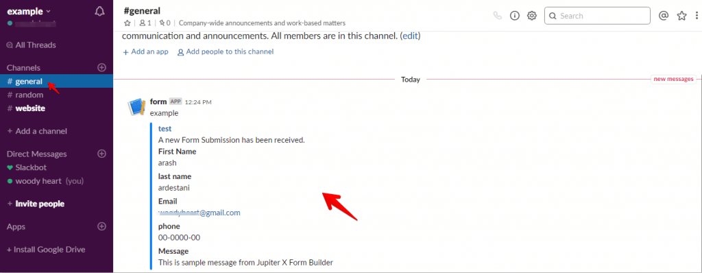
4. Slack: this action allows us to send information from our form to Slack. In order to do this, we must first sign up for Slack, enable the incoming webhook, then set our information in the Slack setting section. For more info on how to do this, you can head over to this link.
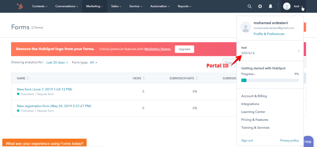
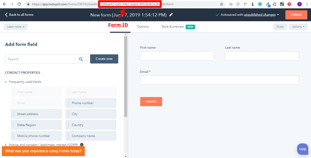
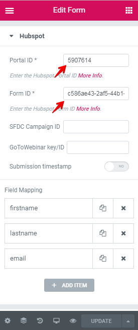
5. HubSpot: One feature that Hubspot provides is allowing users to create a contact form and then to publish these forms on the internet. This allows us to directly submit our form data to the Hubspot form.
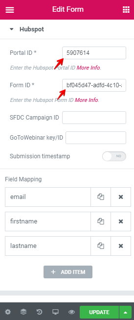
First, signup to HubSpot then go to Marketing > Forms and create a new form. After that, design a form and get a Portal ID and Form ID to enter in the HubSpot action settings in the form.
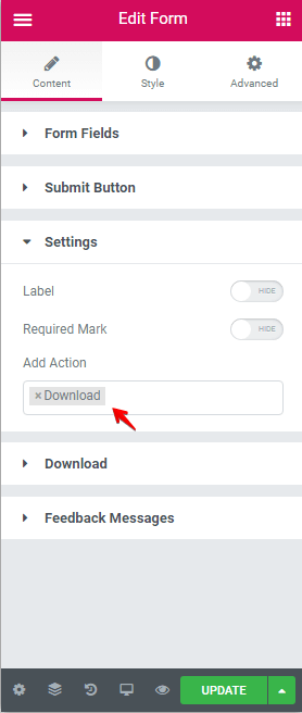
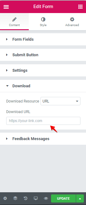
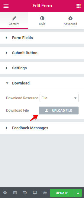
6. Download: This allows site visitors to download a file from your website.
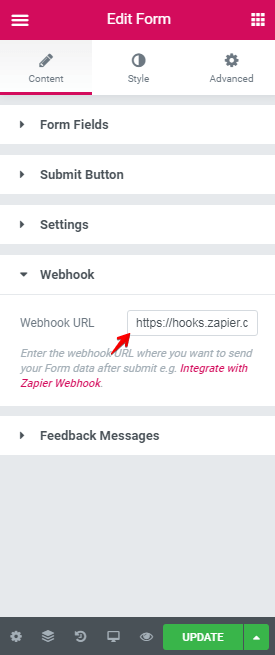
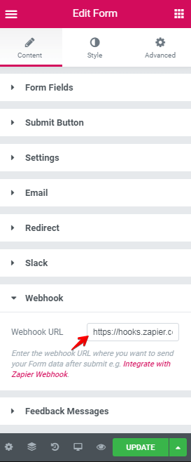
7. Webhook: this enables us to integrate our form with Zapier webhooks. Zapier webhooks allows us to complete several tasks such as sending an email, connecting to Facebook, Twitter, and Slack, as well as accessing more than 1,500 apps.
To activate this action, go to Zapier, generate a zap, and copy the Webhook URL and paste it into the Webhook action setting. To find out more about how to do this, visit this link.
Feedback Messages
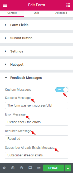
After a page visitor submits a form, they will be able to see a message on their screen. The Jupiter X Form Builder has four types of messages, including Successful Message, Error Message, Required Message and Subscriber Already Exists Message. In the Feedback Messages section, you can alter the messages tailored to fit your needs.
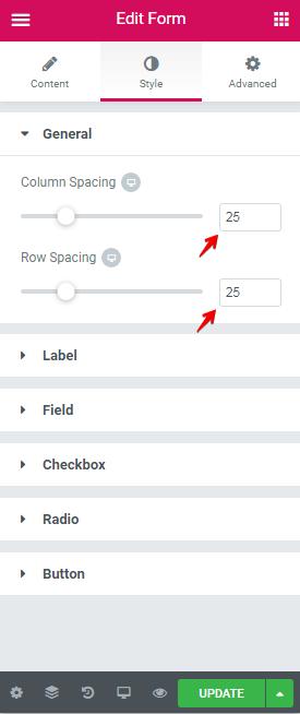
Style Tab
This tab contains six settings including General, Label, Field, Checkbox, Radio, Button. Let’s walk through each setting one by one.
General
In the general section, we have two options:
Column Spacing: this allows you to change the space between fields that are arranged horizontally.
Row Spacing: this enables you to adjust the space between fields that are arranged vertically.
Label
In the label section, we can set the below style for the label:
Color
Font family
Font size
Font weight
Transform
Style
Decoration
Line-height
Letter spacing
Space between the label and field.
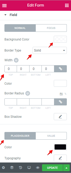
Field
In the field section, we can set the below style in the normal and focused situation.
Background color
Border Type
Border Radius
Box Shadow
Also, we can set Color, Typography, and Padding of the placeholder and value.
Checkbox
In the section, we can set below style in the normal and checked situation.
Size
Color
Typography
Spacing between
Spacing
Background color
Border style
Box-shadow
Radio
In the section, we can set below style in the normal and checked situation.
Size
Color
Typography
Spacing between
Spacing
Background color
Border style
Box-shadow
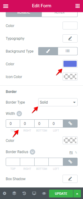
Button
In this section, we can adjust the style for a button with the following settings:
Height
Color
Typography
Spacing
Alignment
Background Type
Icon color
Border style
Box-shadow
Creating a Custom Contact Form
Contact forms are a useful type of form commonly used on websites. Visitors to your page can fill out contact forms to send messages, ideas, questions or any other information to the site owner.
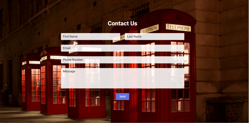
In creating this form, you have the option to include Email, Redirect, Slack and Webhook actions. At the end of this section, we will create a Contact Us form like in the image below:
1. Go to Elementor > Add New.
2. Create a Section that is named Contact Us.
3. Add a new section with one column and set the following:
In the Advanced tab, Padding top and Padding bottom: 100px
4. Add a Heading.
In the Content tab, set Title to Contact Us and Alignment to Center.
In the Style tab, set Color to #FFFFFF
In the Advanced tab, set Padding Bottom to 16px.
5. Add a Form element from Raven Elements, then set the name to contact.
6. Create a First Name Field.
7. Create a Last Name field.
8. Create an Email Field.
9. Create a Phone Number field.
10. Create a Message field.
11. In the Style tab, set:
Background Color to rgba(255,255,255,0.91)
Placeholder Color to #000000
Also, set the other settings as shown in the images below.
12. Go to Content tab > Submit Button section.
13. Go to Style Tab > Button Section. Set Background Color to #6073e0
14. Go to Content tab > Setting section. Set your preferred actions.
15. Change the settings like in the images below in the sections of each action.
In the end, when submitting the form, the data will be sent to [email protected], the page will be redirected to www.artbees.net, the form data will be sent to our Slack channel and a new email will be sent to the Gmail account that we set up in our zap in Zapier.
Creating a Subscription Form
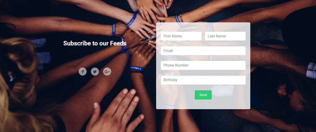
Subscription forms are popular on websites as it enables the site owner to send news and deals to their subscriber list.
In this section, we’ll go through and explain the MailChimp, Download and Hubspot actions in detail. Also at the end, we’ll create the subscription form shown in the following image.
1. Go to Elementor > Add New. Create a new section and call it “subscribe.”
3. Edit the left column. In the Advanced tab, set:
Padding-top to 19 %.
Padding-Right to 30%.
4. Add a Heading element in the left column the set following settings.
Title: Subscribe to our Feeds
Alignment: center
Text color : #FFFFFF
Size: 26
5. Add a Spacer element in the left column.
6. Add a Social Icons element in the left column with the following settings.
Shape : Circle
Alignment : Center
In style tab: Primary Color to rgba(255,255,255,0.54), Secondary Color to rgba(0,0,0,0.68), Size to 17, Spacing to 18.
7. Edit the Right column:
In the Style tab, set background color to rgba(255,255,255,0.8).
In the Advanced tab, set the following:
Padding-top to 10%.
Padding-Right to 5%.
Padding-left to 5%.
Padding-bottom to 4%.
8. Edit the Right column:
Add a Form Element. In the Content tab set Form to Subscribe.
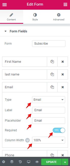
9. Create the First Name and Last Name fields like in the images below:
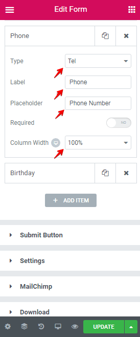
10. Create the Email and Phone fields as seen in the following images:
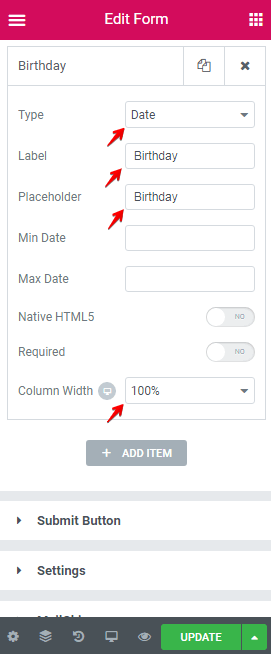
11. Create a Birthday field like the images below:
Important Note: In your MailChimp account, the type of birthday field must be Date.
12. Change the Submit button and Settings sections like in the image below:
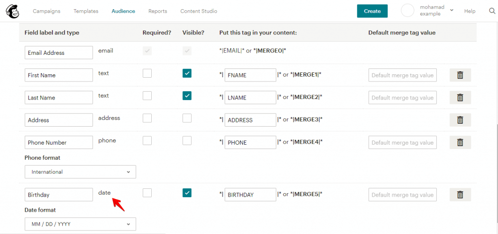
13. In the MailChimp section, set our API Key and create five fields in Field Mapping with the following values:
Field Mapping
MailChimp Field
Form Field
Phone Number
Phone
Birthday
Birthday
First Name
First Name
Last Name
Last Name
Email
Email
14. In the Download section, set your URL for download.
15. In the Hubspot section, set the settings as seen in the following image:
Field Mapping
Hubspot
Form Field
firstname
First Name
lastname
Last Name
email
Email
16. Edit the Form > Style Tab, set the following:
Column Spacing: 15
Row Spacing: 25
Finally, after submitting a form the download will begin, the data in the form will be sent to Hubspot, and users will be subscribed to MailChimp.
Securing the Form
There’s no doubt that security is one of the most vital factors when it comes to forms. The Jupiter X Form Builder has been built on top of standard security practices.
Frontend Validation
Frontend validation (HTML5 validation) is used on the client-side to ensure that the data is correct before sending. The data entered into a form needs to be in the right format and certain fields need to be filled in order to effectively send the submitted form. For example, if we enter a number in the email field, an error occurs and the data is not sent.
Backend validation
Backend validation runs on the server after the data from the form is sent to the server. Backend is more important than frontend validation because hackers can disable frontend validation and send malicious data to the server.
reCAPTCHA
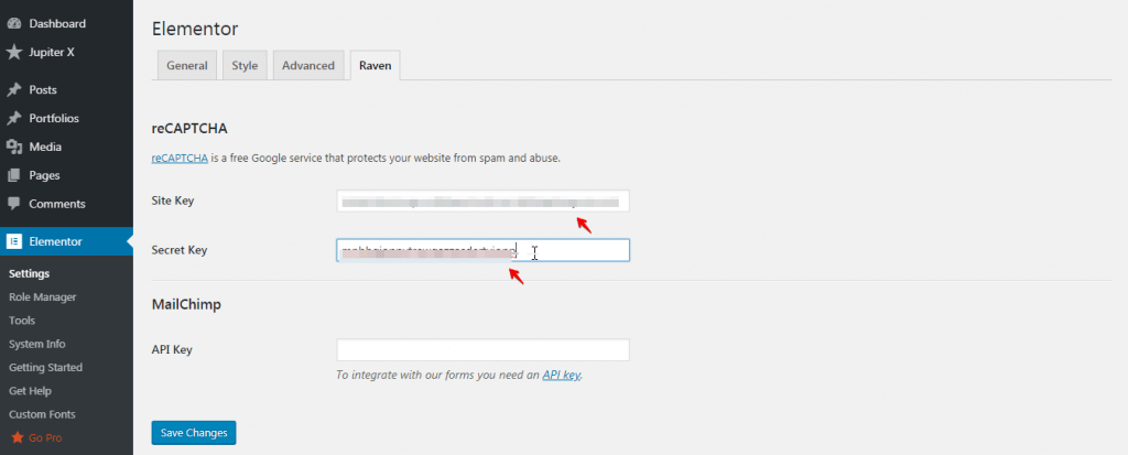
reCAPTCHA is a free Google service that protects websites from spam and abuse. With this service, we can ensure that the data is sent by a human, not a robot.
To add this to our form, we must go to reCAPTCHA and get the Site Key and Secret Key, and then insert them into Elementor > Setting > Raven.
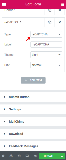
Then, create a field with reCAPTCHA type to use it.
Logging the Sent Emails
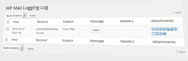
Being able to log and view the sent emails in WordPress admin is very helpful both for development purposes and in tracking the emails.
There are some plugins that allow us to log the emails.
WP Mail Logging logs each email sent by WordPress. This can be useful if you don’t want to lose such mail content. It can also be useful for debugging purposes while developing.
Features
A complete list of sent emails.
Error status from mail implementation is logged.
Zero-configuration – just install and enjoy.
Log rotation – decide which emails you want to keep.
DevOP: IP of server sent the mail.
Conclusion
In this article, we took a deep dive into how you can create custom forms with the Jupiter X Form Builder. This post provided step-by-step instructions on how to create two types of forms: a contact form and a subscription form. Through looking at both of these examples, we also covered the Email, Redirect, Slack, MailChimp and Download actions that are found in them.
We took this post a step further and explained the significance of security and addressed frontend and backend validations, as well as reCAPTCHA. This post further examined two plugins that will allow you to log the emails that have been sent to your server from your site’s forms.
Feel free to share your ideas and experiences with us in the comments!
Almost all of the themes out there provide you a way to customize the footer for the website they belong to. But have you ever wondered if there is a way to break the mold and build a brand new design to create a custom footer? This was a question frequently asked by Artbees users – now it’s possible with the new Jupiter X theme!
In this article, we’re going to discover how we can customize our footer area with the Jupiter X theme via the default options and then see how we can create a completely new footer design from scratch. The tools we need for this tutorial include:
Raven Plugin (Exclusively developed by Artbees to extend Elementor free functionality)
Let’s have a quick overview of how we can customize our website footer with the default options first since it’s an easy and fast method for having a beautiful footer. After that, we’ll show you how to create a completely new footer from scratch.
Customizing the Default Footer in Jupiter X
The first method will use the Jupiter X Customizer settings. As mentioned, it’s powerful enough to build a completely customized footer. However, when using this method, you have only one footer for your entire website, and in case you need a different footer for other pages, you’ll need to create a custom footer and assign it to those pages. We’ll get to that later. For now, let’s look at how we can access the footer customizer and apply some changes on the prebuilt footer.
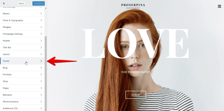
From the WordPress left sidebar click on Jupiter X > Customize.
Access to Jupiter X Customizer
Then find Footer from the list and click on it.
Customizer Dashboard Menu
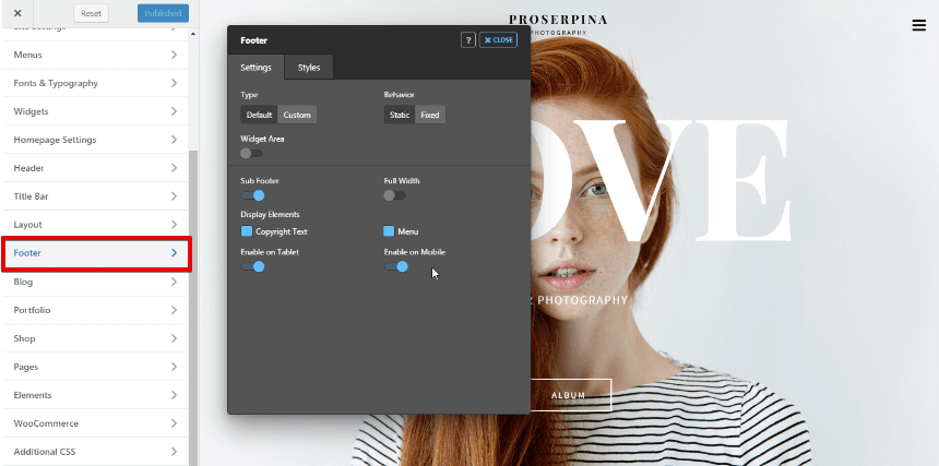
These settings will allow you to customize everything in your footer including static/fixed behavior, showing/hiding the sub footer, making it full width, and showing/hiding some other elements on the footer like Copyright text and menu.
Choose Footer from the customizer left dashboard
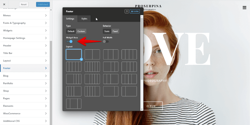
The cool part is the Widget Area option. As soon as you enable it, you’ll see how many layouts of widgets you can choose for your footer. You can then populate the footer widget areas from WordPress Appearance > Widgets.
Enabling Widget Area option unveils a set of footer layouts
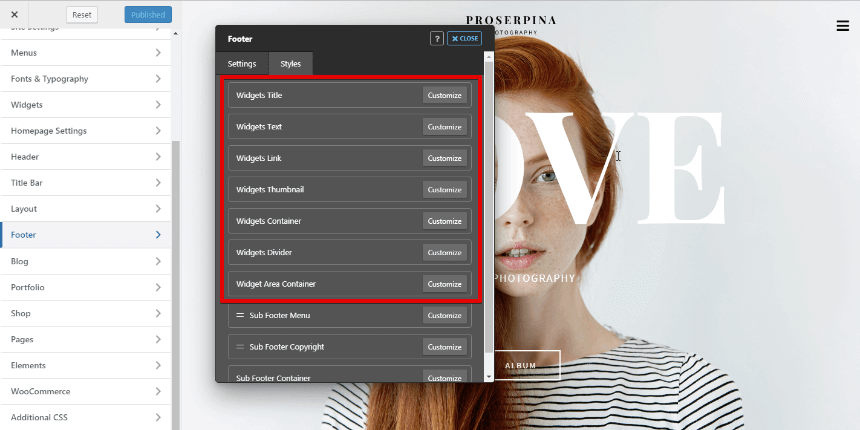
As soon as you enable the Widget Area, you’ll be able to see the widget styling options in the second tab. It has a set of options including Widgets Title, Texts, Links, Thumbnail, Container, Divider, and Container Styles which allows you to customize every single corner of your widget. And you can do all of it live.
Widget Styling options in Jupiter X Footer Customizer
It’s pretty neat, isn’t it? Now, let’s see what we can build as a custom footer.
Creating a Custom Footer in Jupiter X
This is the part where you’ll need the Elementor and Raven plugins. Elementor will give you the ability to build fantastic layouts, and the Raven plugin will let you create custom footers and headers on Elementor (free version) and also will give you 22 new elements to use. You can find more information about Raven plugin here.
The great thing about a custom footer is that you are no longer limited to the WordPress widgets. You can put anything you want, anywhere you want in your footer. Also, Jupiter X Pro offers a set of bundled plugins that extends the number of elements and effects (such as Jet Elements and Jet Tricks) that you can use in Elementor. You can utilize them as well.
To use a custom footer on your website, you must:
Create your custom footer in Elementor.
Assign it to all pages on your website or to a specific page.
We’ll walk you through this process step-by-step.
Creating a new Custom Footer in Elementor
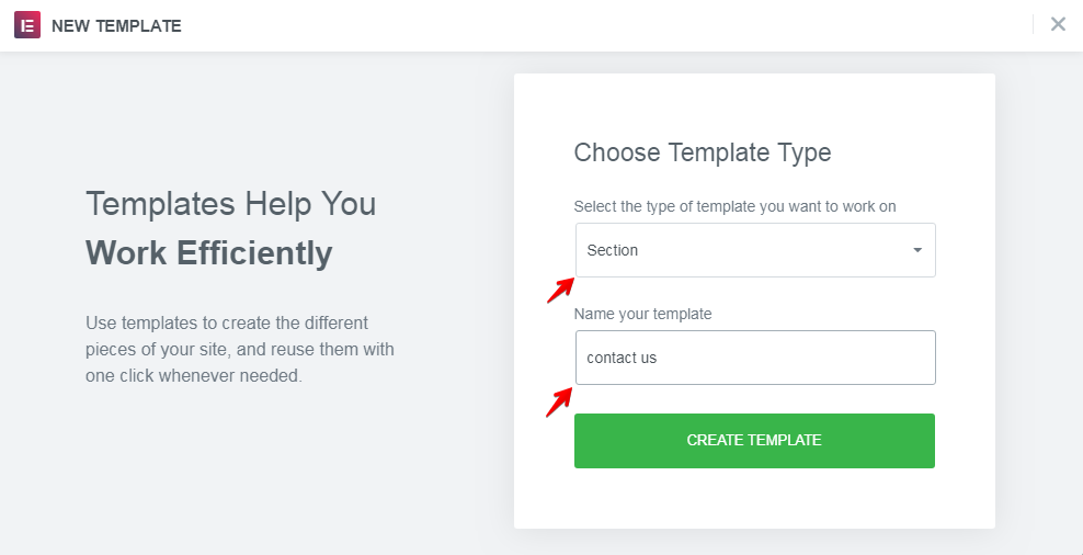
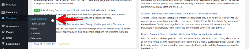
1. Like every other WordPress modification, the first step will start from the backend Side Dashboard. From the menu on the left in, click on Saved Templates beneath Elementor.
Click on Saved Templates to see the old templates and add a new one
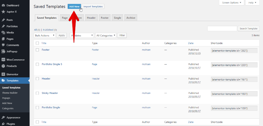
2. Next to the Saved Templates title, click on the Add New button.
Add a new template to Elementor
Note: If you are using Elementor Pro, you may see your old footer templates in the Theme Builder instead of Saved Templates.
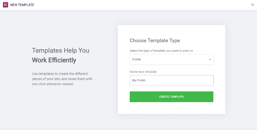
3. For the template type select Footer, give your footer a name and click on the Create Template button.
Choosing a template type while adding a new template to Elementor
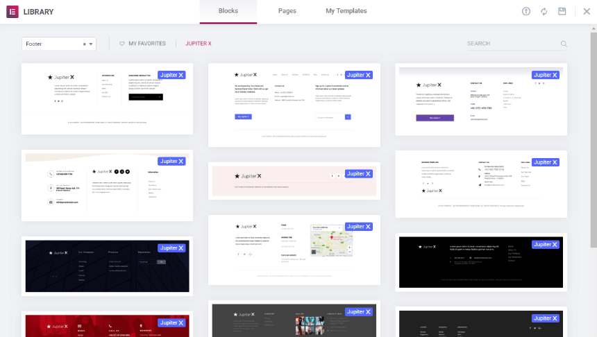
4. You will now be redirected to the Elementor page editor where you can choose a footer template from the library or create a custom footer from scratch using Elementor. Some of the pre-made footers are part of Elementor Pro and, in order to use them, you must first purchase Elementor Pro. You can also use the pre-made Jupiter X templates, which are free.
To see the Jupiter X templates, simply click on Jupiter X. You can use your preferred template by clicking on the Insert button.
Jupiter X Footer Templates for Elementor
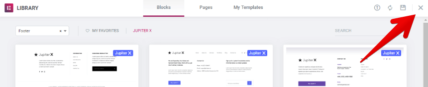
If you don’t want to use pre-made templates and plan to create your custom footer from scratch, simply click on the “x” icon. That will redirect you to the Elementor page editor.
Closing the templates modal
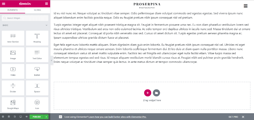
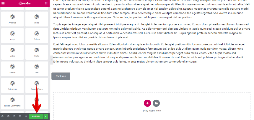
5. If you’re using a pre-made template, you can customize it or add new widgets. In order to customize a brand new footer (without using a pre-made template), first determine how many columns you need for your footer template. Then add your desired Elementor’s widgets to it, such as Site Logo. Since this is same as creating any other content on your page, in case you needed more information about how to add and modify content on your template, you can check some Elementor Tutorials and the Jupiter X knowledge base.
Building up the template from scratch
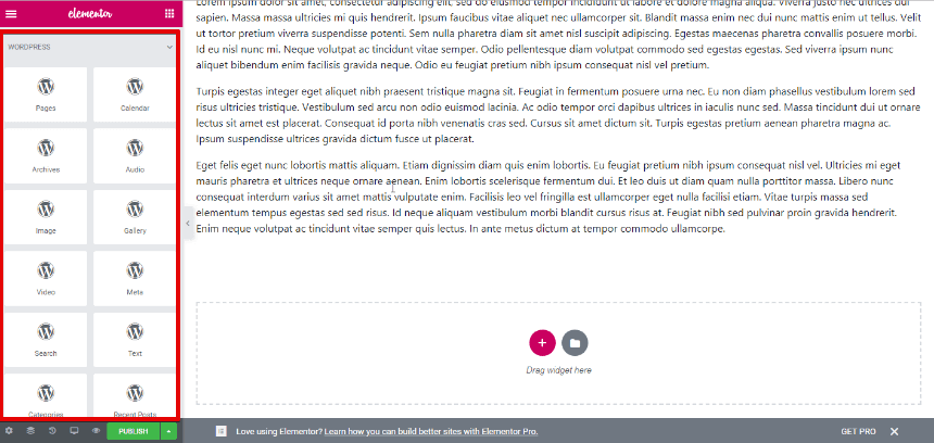
You can also add WordPress widgets to your footer template by going to the WORDPRESS category in the Elementor widgets panel.
WordPress widgets in Elementor
6. Publish the template after customizing it.
Save and Publish the changes
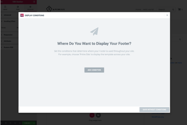
Important Notes! 1. In case you are using Elementor Pro for a footer template with Display Conditions, some of the Jupiter X footer customizations may not work properly. To fix this:
Make sure the Display Conditions are not provided for your footer templates.
Elementor Display Conditions
Simply save a template without conditions.
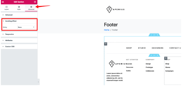
2. Make sure the Sticky option under Scrolling Effect is set to None in the Advanced settings of the Section container in your footer template.
Section Scrolling effect option.
Assigning a Custom Footer to your Website
Now it’s time to assign our beloved footer template to the website.
1. From the menu on the left in WordPress, go to Jupiter X > Customize.
2. From the dashboard on the left in Customizer, click on Footer.
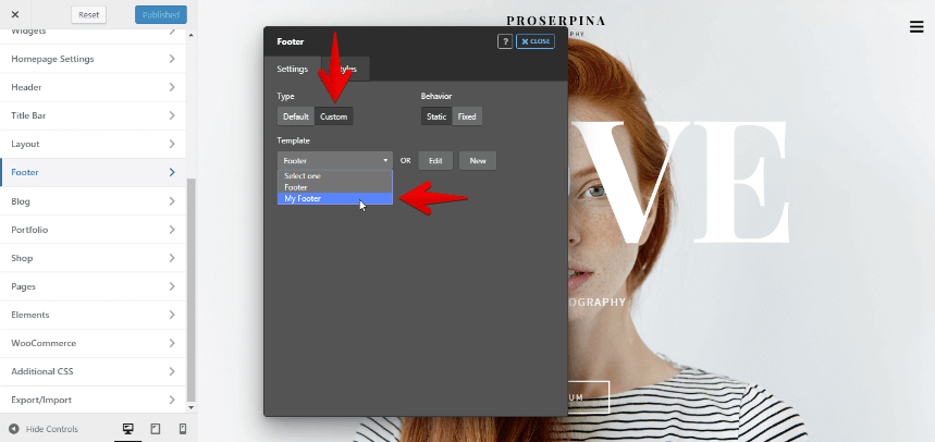
3. For the Footer Type, select Custom and assign your footer from Template.
Choosing the footer template in the Footer Customizer
4. Click on Close and Publish the changes.
You’re done! Now, refresh your page and see how your new footer looks on your website. One thing to mention is that you can add as many footer templates as you want and assign them to different pages. Have a look at this tutorial to find more!.
Summary
Footers are like the summary of an entire website. Having a good summary that contains relevant links and content at the end of a page will send your viewers to the right place.
In this article, we learned how to get rid of the technical coding stuff when creating a footer and easily build customized or new footers using the Jupiter X theme. Now, you can channel your energy into creating amazing your content instead of worrying about how to build a footer because every tool you need is ready for you!
Let’s consider for a moment a hot topic when it comes to the web: security. Poor security on WordPress websites could lead to secrets being exposed, reputations getting lost in the market and even a service getting shut down.
Yes, security is the most important thing on the web and, unfortunately, many users and even administrators don’t have enough know-how about this matter.
In this post, we’ll take a glance at WordPress security to become familiar with the most crucial things about securing a WordPress website.
As an immense open-source project, WordPress is the most well-known CMS (content management system). Based on statistics, WordPress powers 34% of websites on the internet and more than 60% of websites that use a known CMS use WordPress. This also makes it the most attractive platform for hackers as well. Indeed, if you find an important security hole in WordPress, you can affect 34% of the internet.
You may have heard about WordPress websites getting hacked, and the main question that comes to mind is: “Is WordPress secure enough?” In this post, we’ll address this question by reviewing some stats, layers of WordPress installation security and the performances of administrators. Read until the end to get a good idea of the state of WordPress security.
According to a report from Sucuri & GoDaddy, from a total of 25,466 infected sites in 2018, 90% of them used WordPress. The report reveals an increase in WordPress infections from 2017.
When looking at the most significant problems, you won’t find anything related to WordPress core security. Interestingly, common issues with WordPress security are not related to WordPress itself. What matters are the configuration, the usage and what administrators do.
We know that WordPress is an open-source project, meaning that everyone can see the codes and make some changes to them. On the one hand, this would seem to be an open-source CMS that could potentially cause more security problems because anyone can see the codes, discover a security bug and later use it to attack websites.
On the other hand, any individual can watch the status of a project’s security and report any possible security issue privately to the team. WordPress applies security patches immediately, and a new version becomes available to download as soon as possible. Each time a new version comes out, they mention how many security problems have been fixed in the changelog.
Based on the statistics, there is no common effect on websites due to WordPress core security problems. In other words, it works!
Layers of WordPress Security
We first need to wrap our heads about the fact that the security of a WordPress site is not only about WordPress itself. It depends on some other aspects such as themes and plugins, as well as some third-party tools like hosts and servers – and above all, site administrators.
WordPress Core Security
We briefly reviewed WordPress core security in the previous paragraph and mentioned that WordPress patches any security problems immediately. But, what will happen if you don’t upgrade your WordPress installation with the latest version? Then, you’re an excellent target for hackers.
Detecting the version of WordPress is not hard to do. Even if you use plugins and codes to hide which version of WordPress your site is using, there’s no guarantee that hackers won’t be able to detect the version of your WordPress. And after that, there’s a list of security problems (which are fixed in the latest version) that you won’t have access to it unless you upgrade WordPress. With a list of potential security holes in your site, the chances of being hacked increase. Therefore, it’s better to constantly keep your WordPress site up to date.
Security of Themes & Plugins
Unknown Sources
Most WordPress sites get hacked because of their backdoors. So, if you download a theme or plugin from an unknown source or a site that provides a nulled version of premium themes, you are at risk. It’s all too easy to inject some codes into the package and provide a zip package to download. Unfortunately, some users are not aware of this and, for that, administrators are responsible.
Non-updated Themes or Plugins
Similar to WordPress core, you should keep plugins or themes up to date because they are even more vulnerable. Sometimes it takes time to patch a security problem. If you read the fascinating facts surrounding the Panama Papers hack on Wordfence’s site, you may never forget to update your themes and plugins with the latest version.
Host, Server and WordPress Installation Configuration
Sometimes, a website gets hacked in shared hosting. After hacking a website, the hacker may penetrate the host and then access other websites on that server.
Consequently, it’s crucial to host your website in a known and secure host provider. And it’s better to configure the hosts accurately. There are many factors to consider while configuring a server for a WordPress installation. As a quick checklist, you should be aware of the firewall, backup system, SSL and SFTP, automatic security checks, malicious activity detector, email security, and file permission. We’ll take a deep dive into these matters in a later blog post.
Moreover, it’s necessary to be aware of configuring the installation. Changing default database table prefixes, using a strong password and not using “admin” as the username can decrease the chances of your website getting hacked. Following these simple steps can help you to avoid any possible security problems on your website. We’ll also describe in detail WordPress configuration problems in another blog post.
Administration
As mentioned previously, admin is one of the biggest problems and the main reason why websites get hacked. As we can gather from the statistics, the most prevalent problem is website administrators and webmasters. Unfortunately, not enough attention has been paid to this matter.
The security of a website is highly dependent on the performance of webmasters. They can simply allow hackers in by setting an easy-to-guess password or username like “admin” and “12345678.” Sometimes, webmasters aren’t informed about security patches or small updates, and it can put the website at risk. An administrator should be cautious about user roles and permissions when a website is open for new user registration.
Many of these precautions are easy to take when using a security plugin. We’ll have a blog post about WordPress security plugins that will include a review of the most popular ones.
As a result, it’s easy to say that the WordPress core is highly secure. The community will take care of WordPress security, and if you want to use it for your new project, it’s better to take some time to learn more about common security problems, find a good host provider and correct configuration.