Recently we released Jupiter X v1.10. This new version pieces together some very exciting and frequently requested features and additions to Jupiter X. In this post, I’m going to outline the 4 most important features added in the version.
Custom Single Pages
Creating custom single pages was not previously possible in Jupiter X without Elementor Pro. It’s needed when you want to define a different standard design for a single page of your post type. It can help save a lot of time redoing a design for every post and also completely customize it for you or your clients’ needs and preferences.
Custom Single Pages for Blog, Portfolios & Pages
Before, you had to choose from readymade templates available in Jupiter X in order to add custom single pages to your blog and portfolio posts. But now, you can design your very own templates with Elementor and assign it to your portfolio and single pages.
After updating to Jupiter X v1.10, you’ll see a new tab labeled Single in the saved templates section where you can add and manage the single page templates. You can click on the Add New button and just like a regular header, page or section templates, you’ll be taken to the Elementor editing space to build your page whichever way you want and save it.
Once saved, you can go to Customizer and simply assign the template you just built to all new portfolio single pages.
By using the same method, you can also create a standard design to apply to your page templates. Imagine that when your client requires specific elements on every page, you’ll be able to create a template including those elements to load every time they create a new page.
Learn more about new custom single pages in the knowledge base.
Custom Single Page for Custom Post Types
You can now define custom single pages for your custom post types as well. Imagine you’re running a hotel-listing website with tons of rooms you constantly manage, add and remove. You’ll need a custom post type with a custom single page design that includes only the content you require (e.g. room types, sleeps, amenities, options, price, etc.)
Or say you are creating a talent-listing website for a headhunting company with a large database of freelancers. They need a custom talent post type with a custom single page that includes the talents’ information such as personal information, location, bio, experience, skills, etc. with a vertical portrait next to this info. You’ll need a custom layout that you cannot find in the readymade blog single styles in Jupiter X.
In Jupiter X v1.10, you can simply create a custom single page for your custom post type and make it standard for all future posts in that post type.
Learn more about new custom single pages for custom post types in the knowledge base.
Dynamic Content in Custom Post Types
The attributes you need to include in the single pages for hotel and outsourcing website examples are custom data sets that are not normally included in a blog or portfolio single page. In order to add all this info, we need to do two things:
Inside our custom post type, define and add a set of dynamic content fields for the custom attributes we need (rooms, price, skills, bio, etc.). These fields will appear inside the post meta section in the single page in the backend. The tenant will set the value for each attribute and publish the post
The attributes along with the values set by the tenant for each should appear in the frontend. So we should add each dynamic data set we require inside the blog single page for the custom post type as well.
All this is now possible with Jupiter X. Thanks to the new Dynamic Fields Mapping feature, you can add a variety of standard elements to your custom single page such as heading, image, button, video, text editor, as well as many dynamic elements such as post content, post comments and post meta.
Custom Archive Page Template
If you want a custom design for your blog, portfolio or any other post type archive page, you are now able to do it without any other plugin such as Elementor Pro. Thanks to the new Archive Custom Templates in Customizer, you can create, edit and assign custom archive page templates for any post type.
Using the advanced dynamic tools, you can add both the blog loop wherever you want in the custom archive page template as well as any other dynamic content to your template:
Heading Element
Image Element
Video Element
Button Element
Text Editor Element
Photo Roller Element
Posts Element
Posts Carousel Element
Assigning a custom archive page for blog and portfolio is easy with Customizer. If you need to assign the archive page template to your custom post type, simply enable your desired custom post type from Jupiter X > Control Panel> Settings and check the Customizer settings again. You will see the post type name in your Customizer menu, and it will give you the ability to assign custom templates to it.
Learn more about new custom archive pages in the knowledge base.
Custom Title Bar Template
With Jupiter X, it was previously possible to customize the comprising elements of the Title Bar such as the container, title, subtitle, breadcrumb or enable/disable the title bar for different post types. However, it was not possible to create a custom design from the ground up and set it as the standard page title. Now it’s possible.
In Jupiter X v1.10, you can use Customizer to design a custom title bar just like a page section in Elementor and assign it as your page title. With the help of the newly added Breadcrumbs element to the Raven plugin, it’s also possible to choose between Jupiter X default Breadcrumbs, YOAST Breadcrumbs, and NavXT Breadcrumbs.
Would you like me to give you an example of this feature? Though so. Imagine you wanted to add a dynamic image to the background of your title bar so each page could have its own title bar background image. Similar to any other dynamic templating feature, you can now assign a dynamic background image element to your page title container section and set it to fetch the source from the featured image. Isn’t that cool?
Learn more about the new custom title bar template in the knowledge base.
Global Typography Option for Post Content
This is a feature that has been frequently asked about by heavy-duty bloggers and writers. In Jupiter X Customizer, you were able to customize the look of many things in your blog single page including the featured image, title, meta, tag, social shares and more – but the main body text was not one of them. If you weren’t using Elementor to write blog posts, there was no way you could define standard formatting for the main body text in your blog single pages.
With the latest update, you’ll have a Post Content section among your blog single style tab in Customizer where you can define all the formatting attributes for your body text in the blog single page. This is not limited only to your blog post content, as you can do the same thing for a portfolio and any custom post type single pages as well.
Learn more about the new post content formatting in the knowledge base.
What’s Next!
What’s next is great projects made by great people for great people! We believe the newly added features – particularly the custom single pages and the new dynamic content in custom post types – adds even more capabilities to Jupiter X as a WordPress website builder. Dynamic content alone opens a whole new chapter on the types of websites that can be created by Jupiter X. Just one example is various listing websites!
In the near future, we’ll publish blog posts to exclusively cover each of these features more in-depth. Until then, we’d like to know your feedback about Jupiter X v1.10 and if you think its features might come in handy for your next Jupiter X project. Let us know in the comments and stay tuned for related blog posts soon 😉
Freelance web developers and web design agencies completely understand what it means to have a hasty client and to work harder to deliver website projects faster. Clients usually want their projects to be done in a blink of an eye in addition to all the practical aspects such as elegance, speed, content structure, navigation, ease of management, SEO, security and more. Of course, most of the time, they want all this on a low budget. It gets beautiful, isn’t it?
So, if you were a freelance web developer or a web design company in New York or any other city, what would you do in this situation? Possible options include the following:
Increase the project delivery time which causes more costs for both you and the client.
Increase the cost and try to hire some other developers to implement and develop the design as fast as possible.
Simply say “no, I can’t accept this project.”
Use tools to speed up your project.
Wait a second – which tools? Well, there are tools for every job! Imagine you have to move all your furniture in your apartment to another city, and you have these options:
Put each thing one at a time into your car and move them to the other city.
Load everything into an old truck – which could break down at any second – but for free.
Use a big, nice truck with all the gadgets required to move the stuff safely in a short period of time with a low fee.
I would personally choose the third option. It’s also the same for every other job in the world. Tools are there to help us do our jobs better and faster. But which tools to deliver website projects faster and better?
Before we get into this, I should mention that every web developer has their own methods of working quickly. Sometimes, someone uses a CMS (Content Management System) that contains a customly designed template, making it easier for the developer to create a website using his or her own templates. Sometimes, a developer more quickly writes the whole management system than setting up a new CMS.
So, what I’m really trying to say is that each developer chooses their own way of going about things. However, typically there are ways to improve the speed and reduce the costs of a web design project such as:
Using a good and flexible CMS. (We will consider WordPress only since it has more than 60% of CMS usage over the internet)
Using premade PSD templates that you can easily convert to a website
Using a premium WordPress theme that is feature-rich and requires no coding
Using premade website templates
Let me explain more about each of these ways.
Using WordPress as a CMS
As of October 2019, WordPress is used by 61.5% of all the websites whose CMS we know. This is 34.7% of all websites. It means that WordPress has the biggest community of users among all CMSs in the world. It also is a great choice for running websites from simple to complex use cases. Since WordPress is actively maintained and has a large community, it’s a secure platform if you keep it updated. Also, plugin variety and theme availability are making it the number one choice for many web developers.
Using Premade PSD Templates
You might have your own PSD designs that can be used with some changes for your other clients or you might be looking for other PSDs and sketch designs. In general, when you show your client a PSD of what his website would look like after implementation, you saved a lot of time and headaches. This is because in case it was not accepted or your client didn’t like it, you could easily change the design using PhotoShop, Sketch or XDesign software which is much less time consuming compared to developing a whole website, then showing it to your client.
Using a Premium WordPress Theme
If you ask an experienced web developer if free or premium themes are more cost-effective, they would most certainly tell you that premium themes are the way to go. Why? After all, doesn’t a free theme mean FREE? Of course, it does, but when using a free theme, you’d need to use a lot of other features and combine everything together. Most of the time, you’ll pay more for a small feature that you need. So, it’s not time and/or cost-efficient at all. Choose a good and flexible WordPress theme, and you can rest assured that what you get is much more than what you pay.
Using Premade Website Templates
This is also a big story alone. There are thousands of premade templates for every category you can think of. Plenty of them is free and available on different websites. Many of them are even award winnings. You only need to search for your category name and “website template” in Google to see thousands of results. Using premade templates is like having a cheat sheet with yourself on your final exam. It gives you great results, but this time, it’s completely legal.
Now that you know what can help us improve our speed, one question that probably annoys you is: How can I ensure that I can implement a premade PSD design with my changes, over another premade template using another theme? The answer is that you can’t. If you’re going to design and implement a website like this, then what’s the point of using tools? You need to find a tool that gives you all of the options together.
Imagine you have a multipurpose WordPress theme that has a vast variety of different templates for different categories and it has the PSD design of each template beside it. What else do you need? You need to be sure that this theme is good for your SEO, performance and has enough flexibility to implement your client’s requirements. It should be easy to manage, maintain and be compatible with third-party plugins. Having premium plugins bundled is a plus.
But, what is the chance that you’ll get all of these features together? If you look for it in big markets such as Envato, you’ll find some of them. The Jupiter X Multipurpose WordPress theme is an example. It’s a WordPress theme that has plenty of demo templates, and you can use any of them by a single click, plus the templates have PSD design files ready to download. The theme itself uses Elementor as the default page builder with 17 premium bundled plugins. It means that you get a $225 package for only $59.
Let’s see how we can build up a Barbery website for our hasty client using the Jupiter X WordPress theme.
Building up a Barbery Website
Before everything, let’s see what options we have among the Jupiter X templates. Open this page and search for keyword “barber”.
List of current barbery-related templates in the Jupiter X theme.
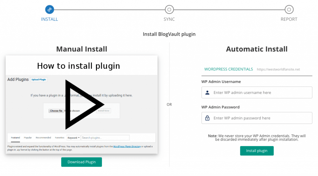
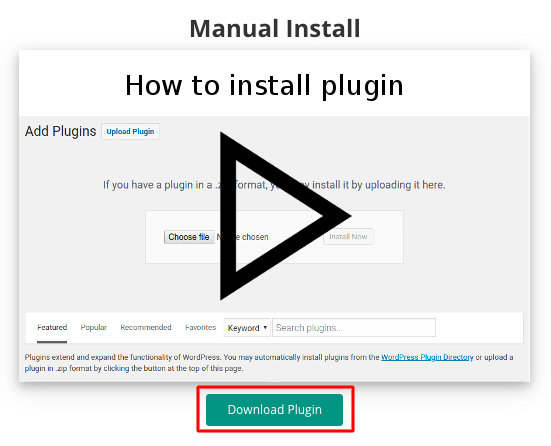
Let’s say that I like the Elara template, but I first need to show it with some changes to my client. So, I go to Jupiter X Control Panel and download the PSD package of this template.
Downloading the PSD package of Elara Template
I then open the homepage PSD file inside the package and start editing as I wish.
Changing the design on the PSD
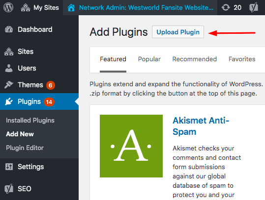
Then, I show this PSD to my client and get some feedback. After applying the feedback, it’s time to implement the design on my website. So, I simply install the Elara template on my website and then start changing the content and design based on the final PSD files.
Installing Elara Template
And it’s done!
Template Elara is successfully installed.
Now, all I have to do is to go to the homepage and edit my content as I previously edited on the PSD file.
Changing the background image of a column in Elara Template
And then update my page. This would be the final result:
Changing the background image of a column.
That’s it. We’ve made it. Changing the rest of the content is as easy as this. All you need to do is apply the changes one by one.
Ok, but I still want my project to be better than this. Give me some tips!
The best thing I can advise is to have a comprehensive understanding of your website requirements. Imagine that you need to build up a website for a furniture shop. What features first come to mind? Probably high-quality images, big headings, portfolios, shop page, checkout steps and etc. Now observe the templates carefully. See which one has the best match design with the one that you have in mind.
Furniture-related demos in Jupiter X templates
The first thing you need to do is to ensure the designed layout is suitable for your content. The rest is to make sure you can implement your extra features as well. For example, if you need an e-commerce furniture website and your template doesn’t have WooCommerce by default, make sure to provide the correct place for your shopping items first and then enable WooCommerce. Also, make sure to check the Artbees Crash Course that has a great A-to-Z tutorial on how to build a website with different subjects in our blog.
Wrapping Up Tips to Deliver Website Projects Faster
Web design is a tough job and gets worse when you have a client on a tight deadline. However, using tools such as a multipurpose theme will give you the ability to design quicker and better and deliver website projects faster. Here we explained which tools can help you design a quality website in a short timeframe – and that gets a thumbs up from your client.
While the WordPress login page is its most recognizable page – keeping its default design is not ideal. You might be thinking “why not”? We’ve gone ahead and detailed why you should create a custom login page with Jupiter X.
Why would you need a custom WordPress login page in the first place?
Traffic. The more traffic you get on your site, the more problematic it becomes to manage spammers, malicious scripts and bots. A custom login page can filter all suspicious activities and make your site more secure.
Branding. There’s nothing wrong with the default styling of the WordPress login page in and of itself. But if you’re an established brand, you’ll definitely want to brand every inch of your website, including the login page. Displaying your logo to users or clients is surely something they will appreciate.
Multi-user site. This is fine if you have a small blog and you are the only one who uses the login page. But if you have a membership website where users can register and login, a custom login page offers a better user experience.
Choosing the right plugin to create a custom login page
There are 2 ways to create a custom login page:
Using third-party plugins
The manual way
Both have their pros and cons. For instance, it’s easier to use third-party plugins to create a custom login page as it can be done in a matter of minutes without writing a single line of code. However, going the manual route will give you more control of the appearance and features. It also requires good coding skills.
In this example, we’ll choose the easy way: a third-party plugin to create a fabulous custom login page for our project.
There are several plugins that can be used to create custom login pages in Jupiter X. From drag and drop to custom-made templates, from simple to complex, you can find plugins for all tastes and purposes these days.
For our example, we’ll use Clean Login, which is a plugin that offers shortcodes allowing you to embed your form anywhere on your site, including posts, pages, sidebar widgets or widgetized footer areas.
A few other benefits of this plugin include the following:
Add your login form in the frontend easily (page or post), as well as the registration and the lost password form.
If the user is logged in, they will see a custom profile and will be able to edit his/her data in another frontend form.
Only one shortcode per form, which means that you’ll only need to create a page or post and apply this shortcode to create each form you want.
Designing this page for the custom login page with Jupiter X
This is the most interesting part of the post as designing a page is always challenging. But if you have a good design taste, you won’t ever fail. For our login page, we’ll use a simple, clean design. This is how it’ll appear:
We are using 2 columns: one with 40% width and second with 60% width. In the first column we have:
Image widget – Logo with an absolute position at the top
Spacer widget – Adds space between the logo and login form
While in the second column, we have only a spacer element and column that has a beautiful background image.
This is how the page looks from the backend:
There is a simpler way to speed up the page creation process. For example, instead of designing a page from scratch, you can use page templates or predesigned blocks from Elementor. This feature will speed up your design process, and all you’ll need to do is to place a login shortcode in the predesigned page:
Wrapping up
There are many ways to build a fantastic login page with Jupiter X using different tools and scenarios. However, the Clean Plugin is the simplest and does not require adding a heavy plugin to your project. Another benefit of this plugin and Jupiter X is that you can use a shortcode in the header builder in the popup window attached to the header or footer menu (The plugin offers the option to redirect the user after a successful login).
Another benefit of Jupiter X is that you can display various menus for different user roles. For example, after successfully logging in, you have access to different menus and options, while a user who has not logged in will see something else.
Please do let us know about your experiences and comment in the section below! 😉
Earlier last week we introduced WunderWP on ProductHunt. A new and free tool for Elementor that takes away a long-lasting pain shouldered by Elementor users. Let’s talk a little more about why this product was ideated and what problem it solves. Why on earth were preset styles for Elementor needed in the first place?
What is WunderWP?
WunderWP applies preset styling for Elementor widgets and beautifies your content in seconds. It helps you save big time by using its readymade styles to build your content and get your website up and going.
What problem preset styling for Elementor solves
Everyone who has used Elementor widgets knows that they are not ready to use right away! They won’t look nice until you put a good amount of time and energy stylizing and shaping them into something you want for your website. If you want to go about doing this, there are simply too many options and settings to deal with, and you need to make sure that what you customize looks professional and visually appealing.
All of this is time-consuming – and not to mention boring! WunderWP saves you that time by bringing on hours of work put by skilled designers and Elementor experts at Artbees to beautify your raw Elementor widgets and let you focus on the more important aspects of your project.
How WunderWP solves the problem
Regardless of which theme you use, once you install WunderWP, preset styles will appear in your element settings under the Content tab.
Try different styles by clicking on their thumbnails and see which one looks better on the element and get something that more closely matches your preference. Voila! The ugly-looking default widget instantly turns into something beautiful.
New styles from the WunderWP Cloud
WunderWP adds new styles for different elements over time and, as long as you have the plugin installed, your library automatically updates itself with the latest preset styles for Elementor.
Compatible with everything Elementor
WunderWP is free and compatible with all Elementor-based themes, Elementor Free and Elementor Pro. It is also fully compatible with Jupiter X and the Raven library. Jupiter X users can simply download it from the WordPress repository.
At the moment, WunderWP provides the following number of styles:
105 element styles for Elementor Free
139 element styles for Elementor Pro
36 element styles for Jupiter X Raven
…and new styles are being added over time!
Is it possible to save/reuse my own styles?
At the moment, it’s only possible to apply WunderWP’s preset styles but this sounds like a tempting feature! If you’d like to be able to add your own styles and reuse it again for other elements, please do let us know if you want to see that in WunderWP!
What’s next
WunderWP was ideated to automate styling and to create something like readymade website templates but for individual widgets. This helped us produce website templates for Jupiter X at a more rapid pace and then we thought that maybe it could be of use as an independent plugin for Jupiter X users and maybe all Elementor users.
WunderWP is doing its job at the moment, and we’ll keep adding beautiful styles to it over time but are there other directions it can go in? Yes, there are! There could be preset styles for Elementor that could be applied globally on the website. Or, for example, there could be automation and readymade content for other content types!
It’s up to how our community reacts and which features they’d like to see next! We’re eagerly waiting by to hear your feedback before we decide the next move 😉 You can follow WunderWP on social media to stay current with the latest styles and features added to it.
It’s no secret that WordPress is used around the world. So it’s a good idea to ensure that themes and plugins can be easily translated into other languages. Adding internationalization and localization support by having a translation ready WordPress theme can greatly increase its market share.
Difference Between Internationalization and Localization
Internationalization is the process of developing a plugin/theme so it can easily be translated into other languages.
Localization describes the subsequent process of translating an internationalized plugin into a new language.
Side Note: It’s worth noting that internationalization is often abbreviated as i18n (because there are 18 letters between the ‘i’ and the ‘n’), and localization is shortened to l10n (because there are 10 letters between the ‘l’ and the ‘n’.)
The localization process can be done using a software called Poedit with three types of language files: the POT file (that contains a list of all translatable messages in the WordPress theme), the .PO file (created when you translate a POT file to a particular language) and the .MO file (a binary file that is created automatically by Poedit and is not human-readable).
Translation Ready Themes
There is some confusion about what a translation-ready theme actually means. So let’s clear up any possible confusion and explain what this entails:
Translation ready themes that only come with a .pot file
You can find translation ready themes that only come with a .pot file (and sometimes with an English version of .mo and .po files). These files can be used to translate the theme into other languages. These themes don’t provide translations to other languages, but you have the tools needed to localize the WordPress theme like the Poedit software or the Loco Translate plugin.
For example, in the Jupiter X theme, we provide the jupiterx.pot file and a user can translate the theme to their language.
Translation ready themes with translations into other languages
You can find translation ready themes that come with .pot file that also come with translations into other languages. These translations usually have been done by translators, volunteers or any other users.
For example, in the Jupiter 6 theme we provide .po and .mo files for some languages, meaning a customer doesn’t have to translate the theme themselves.
Steps to Create a Translation Ready Theme
Create and load the text domain for your WordPress theme.
Enclose the Translatable Text String with the WordPress gettext function.
Create the POT file.
Create and Load the Text Domain
The Text Domain will be a part of the WordPress theme or plugin specification. The following code snippets show the theme and plugin specification with the text domain.
Note: The theme specification will be in the theme’s style.css
/*
 Theme Name: YOUR THEMENAME
 Theme URI: yourdomain/themes/yourthemename/
 …
 …
 Text Domain: yourthemename
 */
/*
 Plugin Name: Plugin Name
 Plugin URI: yourdomain
 …
 …
 Text Domain: yourthemename
 */
Load your theme’s text domain by using the load_theme_textdomain() function. This function has two parameters as the text domain name and the directory path where we will store the .pot, .po, .mo language files. Paste the code seen below in your theme’s functions.php to load the text domain.
Enclose the Translatable Text String with the WordPress gettext Function
WordPress uses the gettext framework function to translate the text string into the specified target language. It has a set of functions in a core translation API file l10n.php located in the wp-includes directory. We have to enclose the text string with the appropriate function. The code below shows how to use the gettext function to localize your theme.
__() This is one of the most basic translation functions. Like many of its siblings, it takes two parameters: the string to be translated and the text domain.
$name = __( ‘My Stats’, ‘textdomain’ );
It’s used when you want to mark a simple string for translation and return the value to use somewhere else. This is frequently the case within functions – think of registering post types.
_e()
This is almost the same as the function above, except it echoes the value. It can be used when you’re translating in the HTML content directory:
_n()
This function is used when translating strings with a conditional plural in them. This means that you don’t know in advance if the string will use the plural or singular form because it depends on the momentary value of some parameter. A good example would be a comment count.
For example, if a comment count is one, you would need to use a singular form: “One comment.” If a comment count is 0 or more than one, you would use the plural: “Many comments”. This can be done in one go by using the _n() function.
This takes four parameters: the singular form, the plural form, the number to check and the text domain:
Creating the POT file with the Translatable Text String
After applying appropriate gettext functions for all the translatable text strings of your theme files, create a .POT template file. This template will be the base consisting of all the translatable strings. This file will be referred to create language mapping file .po, .mo pair for each language translation. You can use any popular tool to create this file for getting the theme’s translatable strings.
One of the goals of WordPress is to make it easy for users across the world to publish content.
In this article, we took a look at the basics of translations, what a text domain is, the functions we can use and how to create translation files.
We hope this was helpful to you. Please share your experiences in the comments below!😉
Homepages were once the most important part of a website – or even for any online presence for that matter. Looking at the rapid evolution of the web over the last decade, especially in the last few years, we see that the situation is the complete opposite. A local business’ homepage might be the least important aspect of an online presence, especially if they also have social media profiles, an Instagram page, a Yelp or Foursquare page – and of course landing pages.
Think of landing pages as a place where you actually do, grow and conduct your business whereas homepages are a mere ornamental, beautiful and purposeless representation of your company or business. A landing page is a web page that serves as the entry point for a website or a particular section of a website. Landing pages are your best (and maybe the last!) opportunity to grab a visitor’s attention and make them consider you.
A homepage is built from thin air regardless of any other factors out there. But a landing page is built as part of your global business funnel. In fact, this gives your landing page its most important and differentiating feature than any of your website’s other pages which is its purpose. That purpose is defined with regard to where your landing page stands in your business funnel. Is it the page you’re directing the traffic from your Google Ads? Is it where your social media followers will land on when visiting your website?
Today, I’ll show you how to build a modern Agency landing page with Jupiter X. The landing page I have chosen for this month’s crash course is inspired by one of the most recently released Jupiter X templates called Agency. It’s been tweaked a little to fit the purpose of this course. If you are a Jupiter X premium user, you can activate it for your website from your Jupiter X control panel.
The final Agency landing page with Jupiter X will include the following sections:
Header
Hero section
Intro
Services
Sub services
Customers
Testimonials
Blog
Footer
This blog post will cover the general instructions on how to build these sections but for more detailed coverage of the building process, settings adjustments and final tweaks do not forget to watch the video.
Header
First thing first! What exactly do I mean by a header? The header is the topmost structure in a website that usually includes a logo and a navigation bar (unless there is side navigation). There can be search, social and cart icons depending on the website type as well. Also, some websites might need a toolbar above the main structure (e.g. e-commerce and listing websites) which is also considered to be part of the header structure.
Layout
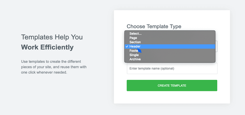
The header structure in Jupiter X is built and managed by the Header Builder. Once you are done installing Jupiter X in the WordPress dashboard go to:
Templates > Add new, and in the upcoming page find Template Type > Choose header as template type and give it a name.
You’ll be taken to the Elementor building environment. An Elementor library will load with three tabs: Block, Pages, My Templates. This window includes readymade or saved blocks and page templates. We’re going to create our own header template so we can close this window. We are in the Elementor building space with the element library bar on the left hand and authoring space on the other side.
Add New Structure (red circle with plus) > select the 16/66/16 structure
We need to tweak this column structure a little by manually resizing the columns. Click on the divider between columns until the following ratio is achieved: 25%, 55%, %20%
Edit Section (on the left side) > Layout settings > set the Vertical Align as Middle.
Edit Section (on the left side) > Advanced settings > set the padding as follows:
Logo
Let’s start adding content to our page by adding a logo to our header.
Add the Site Logo element to the left column.
Edit Site Logo > Choose a logo from the menu. If you haven’t uploaded your logo yet, you should click on the Customizer link below the dropdown and upload different logo versions for your website. In Jupiter X, you can define different logos for primary, secondary, sticky and mobile usages. In this tutorial, we’ll use the primary logo for the light version and secondary for the dark version.
Once you’ve uploaded your logo, go to Edit site logo > Style > Set logo size to 200px.
Menu
The second item that goes into the header structure is the menu where we list different sections of the page for users to navigate.
Add a Navigation Menu element into the second column
You will need to add a menu from the drop-down menu. This will specify the menu and includes the menu items that go inside the menu. You can do this two ways:
Appearance > Menu
Appearance > Customize
In this tutorial, we’ll use the second method.
Once the customizer is opened, select Menus from the left sidebar. In WordPress, menus are comprised of two concepts: The menu that includes the menu items and the Location to assign that menu to.
Click on the Create new menu button give it a name
Select a location for it which in this case is Primary Menu
Now click on the Add items button and in the upcoming panel, select Custom links
As you might have guessed, this is going to be a menu for a single landing page so we will need a one-pager menu for it. Each of our 5 menu items should be a custom link with its title in the Link Text field and the URL set as #title. For example, the menu item ‘Mission’ will have ‘Mission’ in the link text and #mission in the URL.
The process of creating the menu is not over yet and later in the tutorial, we’ll assign each menu item to its respective section on the page.
Once you’ve created your menu items, assign its location and save it and go back to your header template. Click on the menu elements and from the sidebar, select the menu that you just created.
Edit Navigation Menu > Style > Main Menu Items > Typography > Set the font size to 16 and the weight to 400.
Let’s make our logo items gray. In the same setting, we’ll find a 3-tabbed structure for normal, hover and active states of the items. Set the color of menu items in the normal state as #c8c9cc
Our menu items should go white on hover. So from the same setting area we’ll set the hover color to #fff
Let’s give our menu items some margin: Top:0, Right:7, Bottom:0, Left:7
We should also not forget to think about how our menu looks like on a mobile screen. Set the background color for the mobile menu container as well as the mobile menu toggle icon to white and black.
Call to Action
The last item to go into our header in a nice-looking CTA button.
Drag a button element to the third column in the header structure.
Edit Button > Content > Align the button centrally
Edit Button > Style > Button Typography > Set the font size to 16 and the font-weight to 700
Edit Button > Style > Normal > Set the text color as black and the background color to white
Edit Button > Style > Hover > Set the hover text color as white and the background color to our accent color, which in this case is a lovely blue.
And finally, let’s add some radius and margin to our button to make it fit best within the header structure.
So this is it. We’ve just built our header structure:
As you can see, the header structure is built in abstract and may look incomplete at first sight. But also as indicated above, it’ll look perfectly fine when it’s used along with the hero image, which we’ll create in the next step. But before that, there’s one more thing we should take care of! Our header will look as beautiful as above in the mobile version.
Jupiter X will automatically turn your menu into a burger icon, which will be left in between the logo and CTA. Mobile users are traditionally used to the burger icon in the corner of site navigations in mobile, so we better swap the placement of the menu and CTA. For that, we’ll need to add a header right below the current header with the mentioned changes applied:
Mobile Header
Right-click on Header Structure > Duplicate
In the second header structure, swap the menu and CTA columns. Hover over the CTA button column, click on the gray handle and drag it before the menu column. And you’re done!
You now have a two header structure below each other. The top structure will be used for desktop and tablet users, and the one below will be for mobile users. But how do we set those conditions?
Simply right-click on the top header structure:
Edit Section > Advanced > Responsive > Enable the ‘Hide on tablet’ and ‘Hide on Mobile’ (so it will be used only for desktop users)
Do the same thing for the below header structure but this time enable ‘Hide on Desktop’
Sticky header
There is one more header structure we need to decide about. The sticky header is the state of the header when you scroll down the page. In sticky mode, a header usually becomes narrower and includes only the information you want the audience to see along the way down the page. In Jupiter X, the header and sticky header can have two entirely different designs, so we should create them separately.
On our landing page, our sticky header will be exactly the same as the normal header. So what we need to do is to copy the header structure from the main header template.
Create a new template for the sticky header by using the same method we used to create the header template earlier in the article and then paste what we copied into the new template.
Activate your header
We have created three header structures so far: the main header, the mobile header and the sticky header. The mobile header is created right inside the same header but enabled only for mobile view, and the sticky header is created separately in another template (we don’t need to define the mobile version for the sticky header as it’s disabled on mobile by default). What’s left is to assign these templates to the right header slots in Jupiter X.
In the WordPress dashboard:
Appearance > Customize
Select Header from the sidebar
In the upcoming header dialogue box, select Custom as the header type and then select the main header template you created.
Also, choose Sticky as the behavior as the sticky template we just created from the drop down menu.
Enable the content overlap so our header overlaps the background image in the hero section.
And finally, make sure the Enable on Mobile is disabled as we don’t want a sticky menu in that view.
And that’s it! We’re officially done with our header structure. Now let’s move to the hero section.
Hero section
We created our header on a separate page as a template. Now we need to create an actual page that will be used as the landing page, set the template we just built as its header and then continue to build the hero section. In your WordPress dashboard, go:
Pages > Add New
In the ‘new page’ meta option section, there are settings about different sections of the page you are going to create including the header, main, title, and footer. In the header section, find the setting for ‘Overlap Content’ and set it as ‘No’. We do this so the header that we have created won’t disturb us while creating the section for the hero by overlapping it. Once we are done building the hero section, we’ll switch this option back to ‘Global’ so the header overlaps the hero.
In the new page authoring area, click on the Edit with the Elementor button and start creating the hero section in the Elementor environment.
Click on the Add new section red button and choose the single-column layout.
Edit Section > Layout setting > Set the content width as 700px.
Our hero section has a set height size, so we’ll set the min-height as ‘min height’ and the value to 615px.
The content in our hero section is vertically centered.
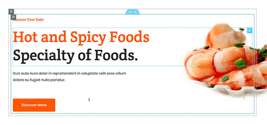
The hero section has a background image so here we go: Edit Section > Style setting > Set normal as background and choose the Classic style. Click on the plus button to choose an image from the library or to upload one.
So this is how our hero section looks like up to this point. As you can see, there are more details that should be added to the hero, and the header section should overlap the hero section. We’re going to apply this in the following steps:
Edit Section > style setting > Background
Position: Top Center so the most important part of the image will be visible most of the time.
Repeat: No Repeat to avoid unwanted repeating of the image
Size: Cover so the image covers the entire hero section.
Size: Cover to have the whole section filled with the background image
Edit Section > Style > Background Overlay:
Color: #114cbd
Opacity: 0.9
Blend Mode: Multiply
Add a heading, a spacer and an icon to the section. Edit the elements’ content according to the model and set the heading to H1. To get the playback button to look the way it is on the main landing page, don’t forget to change the size of the icon to 15px and set the correct color for it from Edit Icon > Style> Icon. Also on the same tab, add a 45px padding in all directions. From Edit Icon > Style> Icon > Container, change the container color to match the target.
Intro section
Compared to the hero, there is not much work to do in this section – paying attention to some can do the trick. Just add a two 1⁄2 1⁄2 section and from Edit Section > Advanced, add 100px of padding to the top and bottom of the section.
As for the rest of this section, just add two headings and one paragraph and a button to the left column and an image to the right column. Here are some details to get the look right:
The first heading is H4.
The second heading is H2.
The button has a no-color background and an icon.
Move the icon to after the text from Edit Button > Icon by setting it to be right-aligned.
Set the image size to Large and also make it right-aligned.
Add paddings from Advanced tab on each elements’ settings to give the correct spacing.
Services
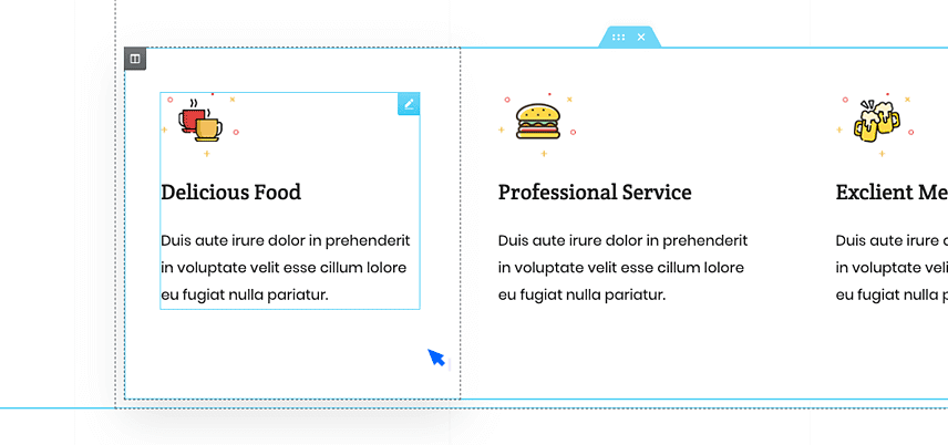
There is a trick to make this section really fast: add a ⅓ ⅓ ⅓ section. Make one of the columns exactly like the model and then remove the other two and just duplicate the first column twice to get the whole section done in under 5 minutes. But you need to do it as follows:
In the Edit Section > Layout, change the column gap to none.
Click to edit the first column on the left, from Edit Column > Advanced set all margins to 20 and padding to 0.
Add an Image Layout element from Edit Image Layout > Content > Settings. Adjust the settings as follows:
In the Edit Image Layout > Content > Item add one item and set the image size as full. Remove icon, title, and description. Set the link type as external.
Add a spacer, a heading, then a paragraph and edit the content, size and weight.
To add the hover effect, go to Edit Column > Style > Border set the Border Type to Solid then set the border width to 1px for bottom and zero for others. Change the color to #f1f1f1, click on hover and change the color to #2b71f6
Now you can remove the other two columns and duplicate the one you made twice and then simply change the content.
Note – You might wonder why we had to add a ⅓ ⅓ ⅓ structure as we could have added a single column, edit it and then duplicate. The issue is, in a real project you will not have the values for image height padding, etc. and therefore you would not be able to predict how your column will look unless it was within the proportions used in the design.
Subservices
Things get a tad bit more interesting in this section as we have an object that overflows this section. But before getting to that, let’s build the other parts of the section:
Add a 1⁄2 1⁄2 section and from Edit Section > Advanced set the top and bottom paddings to 100px.
On the left column:
From Edit Column > Layout, change the column width to 70%.
From Edit Column > Advanced, add a 25px padding in all directions.
Add a heading and an inner-section on the left column.
On the left Inner-Section column add an Image-Box set to the image to be on the left.
From Edit Image Box > Style > Image set the image space and width to 30.
Again From Edit Image Box > Style > Content set the spacing to 18 and also edit the typography and color.
Duplicate this three times and move two to the right column in the inner-section.
On the left column of the inner-section, add 100px padding from the right
On the right column of the inner-section, add 100px padding from the left
On the right column:
Duplicate the Work With Us button from the Intro section and bring it to this column and change the color to white.
Add a spacer under the button set it to 180px.
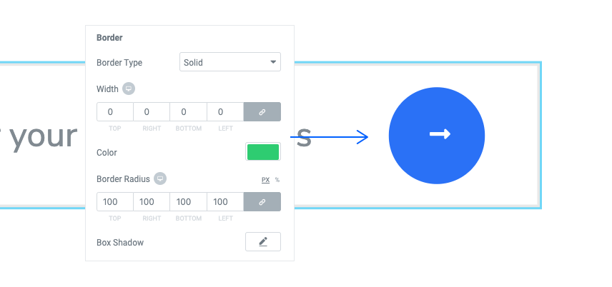
Here is the interesting bit: the smartphone mock-up screen. There are three things that we should get right here – the position, corner radius, and the box-shadow. Here it goes:
Add an image, change the image content to the smartphone mock-up.
From Edit Image > Style > Border
Change the border radius to 45px
Click on the box-shadow and give this value to the color rgba (71,72,133,0.16), and edit the rest of attributes as below
In Edit Image > Advanced > Custom Positioning
Set Position to Absolute
Set the offset values as below
Customers
This part of the page is made up of two sections: the part with headings and text as well as the part with logos.
For the upper half, duplicate the intro section and carry it to after Subservices. Modify the paddings to copy the look and remove the button (Work With Us). Also remove the image for the right column.
For the lower half, add a ⅓ ⅔ section.
On the left column from Edit Column > Advanced, add a 100px padding from the right and then do the following:
Add a Brands element and set the columns to 3.
Remove all the items but one, click to edit it, leave all fields empty and only choose the logo.
Duplicate the item and change the logo with another one.
From Edit Brands > Style > Company Logo > Logo Wrapper, add a 100px padding from the right.
On the right column from Edit Column > Advanced, add 20px and 50px paddings to the top and left respectively, and then continue by
Add a heading edit the content and typography
Add a spacing of 50px
Add the Google Ad badge
Add a small spacer
Add the Facebook MP Badge
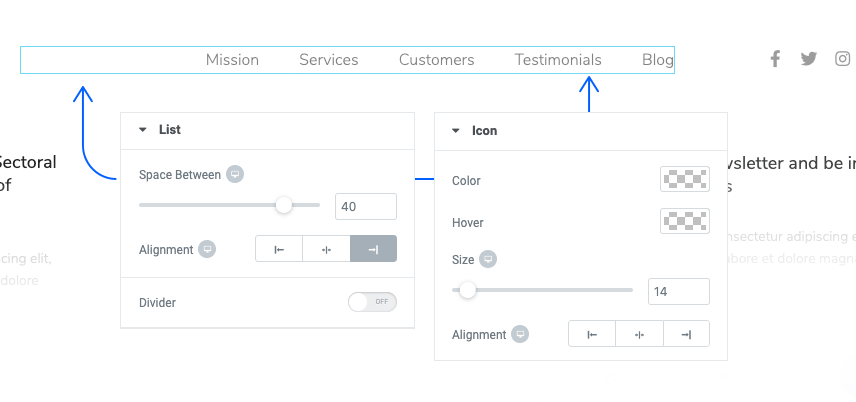
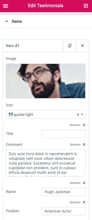
Testimonials
Jupiter X has a Testimonials element, however having absolute design freedom while showing the reviews in the agency landing page with Jupiter X tabs element comes in handy. Like the one we used for the Restaurant Menu in the first crash course. These are the things we should do:
Duplicate the upper half of the Customer and carry it to the bottom of the page and change the section background color to #f9fcff and also edit the section paddings to 80px top and bottom.
Remove the text editor.
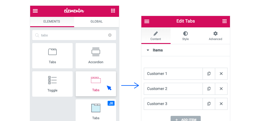
Add this tabs element (There are multiple tabs elements in Jupiter X. Make sure to use the one indicated below):
In Edit Tabs > Content remove two items and keep only one. Change the icon to user-o (short for User Outline) and for the label type Customer 1. Leave Choose Template on Select.
From Edit Tabs > Style change the looks of the element however you like. To remove the borders in each part, set the border type to Solid and then set the border width to 0.
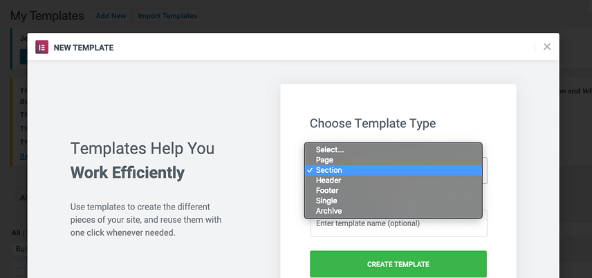
Save your work and go to Dashboard > Templates > Saved Templates and click on Add New. In the windows that open, choose a title for the template, choose Section for template type and wait for the editor to open.
Create a ½ ½ section, add an Image to the left and a Text Editor along with it and Icon Box to the right column.
Adjust the paddings and spaces as you wish.
Change the typography and color to match the design.
In Edit Icon Box > Style > Icon, enter 0 for the Icon Size and in Edit Icon Box > Style > Content, enter 0 for the Title Spacing.
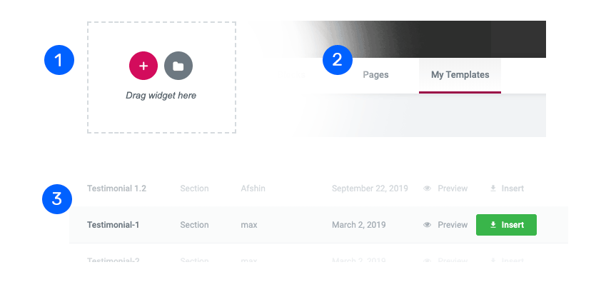
Publish and go back to the dashboard and add another section template
In the editor, click on the folder icon (see the pictures below), add your template and edit the content to create more testimonials in a breeze.
Now go back to edit the page.
In Item, choose one template, duplicate it and choose the rest of the templates for duplicated items.
Blog
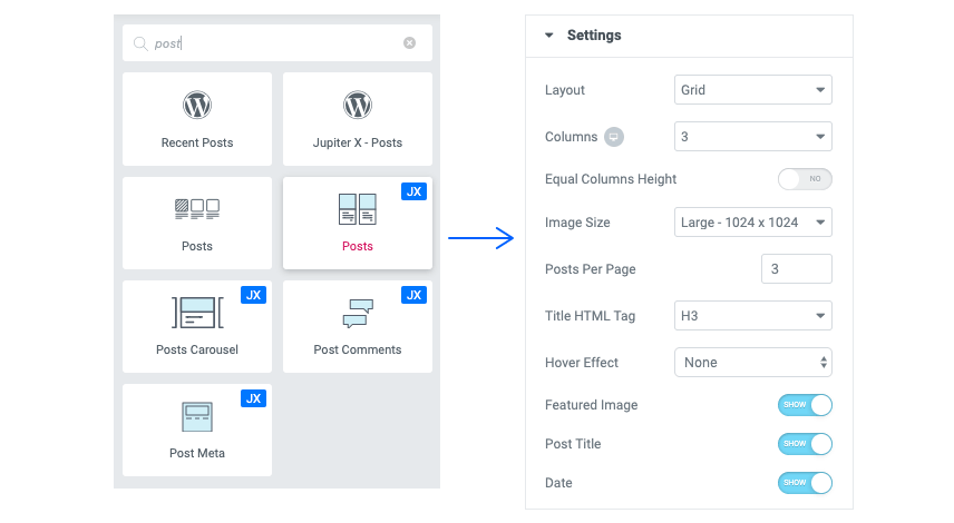
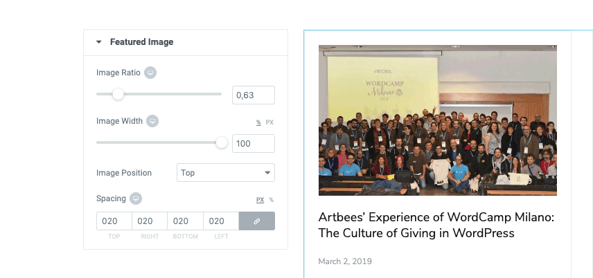
For the blog section, duplicate the Testimonials section and remove the Tabs. Add a Spacer on top of the section100 px. To get the Heading in two lines, use <br> where you want the line break. Add a Post element and do the following:
In the Edit Posts > Content > Settings make the settings as seen below:
Set the rest to inactive.
As for the look of the section, apply these settings in Edit Posts > Style
Set the Border Color to Normal: #e6e7ec and Hover: #4183ff and Border Width to 1px. Continue to Feature Image and make the following changes:
Do not forget to edit the typography and colors of the other parts of the element.
Contact Us
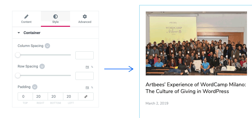
To make this section, add a two-column structure. Go to Edit Section > Layout, set the minimum height to 720px and column position as Middle.
To make the background look like the hero, apply the same settings to design. After doing this, set the left column to 35%.
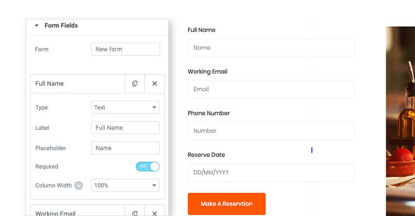
Add a Heading to the left column, and a Form to the right column.
Apply padding from the left for the right column.
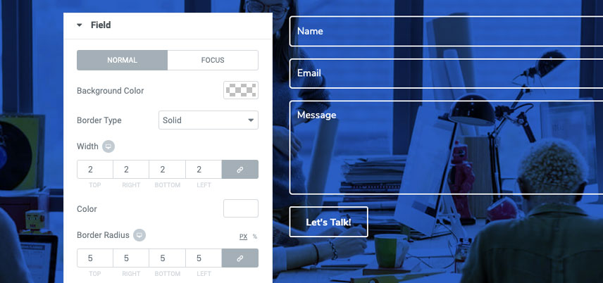
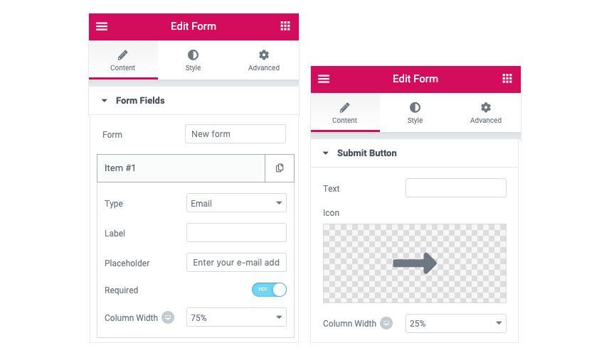
To get the look and function of the Form, go to Edit Form > Content> Form Fields.
Open each item and set them up according to the model.
From Edit Form > Content> Submit Button, change the text to “Let’s Talk”.
After that, go to Edit Form > Style and apply the settings below:
General: Column Spacing: 11 Row Spacing: 19
Field: Apply the following!
For field focus state, only change the Background Color to rgba (255,255,255,0.17)
Button: Border Type Solid – Border Width 2px (in every direction)
Footer
Hang in there – we’re almost done! There’s only one thing to do and believe me, it’s very straightforward. To get it done:
Go to Templates > Add New and choose the Section Type to Footer.
In the editor, add a ⅙ ⅔ ⅙ section.
Add a 100px from the top and 15px from right and left.
Add Logo to the left column and an Icon List (Set it to horizontal) to the middle column.
To remove the icon, set its color to Transparent.
Add and Social Icons in the right column.
Add a ⅓ ⅓ ⅓ section and set paddings to Top:50px, Bottom:30px and 15px from Right and Left.
Add a Heading, a Text Editor, and a Button to the left column.
Configure the typography, duplicate the Heading twice and drag the duplicates to the other two columns. Then edit the content.
Duplicate the Text Editor, drag it to the right column and then edit the content.
In the middle column, add an Icon List (Set it to Vertical), edit colors and typography and remove icons as mentioned previously.
In the Right Column, add a Form after the text editor and remove all fields other than email. To get the look, apply the settings below:
In Edit Form > Style > Button do the following:
Set the Height and Width of the button to 45px
Set the Color to Normal (#2b71f6) and Hover (#4183ff)
For the Border do as seen below:
Now, all you need is a Divider and a Text Editor (for the copyright section) to finish the job. Add a section for each – and you’re done!
That’s a Wrap on our Agency Landing Page with Jupiter X
In our second installment of the JupiterX crash course, we made an Agency landing page with Jupiter X in less than two hours. By following these crash courses, you’ll be able to build expensive-looking webpages without breaking the bank.
Jupiter X is there to empower people who want to imagine and create, be it for a business or some good looking digital content. Do watch the video that comes with the post so you don’t miss any steps in making an Agency landing page with Jupiter X. Stay tuned for our next crash course!
Every Elementor’s widget is composed of different input types called a control. A control is used to construct the interface of a widget. Using controls allows us to customize and set our favorite settings for a widget and see a live preview of it.
Before diving headfirst into this article, we suggest that you check out the following articles.
In default, Elementor has several control types like Text, Color, Dimension, Select, Icon, Media, Typography and so on that meet most common usages. But sometimes we need to create a custom control to realize our needs.
Directory Structure of a Control
Normally, each control contains three files as PHP, JavaScript, and CSS:
control.php
js/control.js
css/control.css
PHP File
The PHP file generates HTML and constructs UI of control in Panel. To create the PHP file, we need to extend the Base_Control abstract class.
The Base_Control provides several methods.
get_type: retrieve the type of control.
content_template: render the HTML output in Panel.
enqueue: use to add CSS and JavaScript files to control.
get_default_settings: retrieve the default setting of control on initialisation.
get_default_value: retrieve the default value of control.
get_value: determine how the control returns its value.
get_style_value: interact with the CSS rule that passed with Selector argument.
Elementor allows for five base classes to extend Base_Control for different purposes. We can extend the following classes to create new controls. For more info, you can refer to this page about Elementor controls.
Base_UI_Control: creates a UI control that is visible in the panel and doesn’t return any value. For example, Heading control.
Base_Data_Control: a base class that returns a single value. For example, Number Control.
Control_Base_Multiple: a base class that returns multiple values. For example, Media control.
Control_Base_Units: a base class that returns unit based values. For example, Dimension control.
Group_Control_Base: a base class for creating group control. For example, Typography control.
JavaScript File
The JavaScript file is used for interacting between UI and live preview and manipulate events that are related to control.
Also in Elementor, there is an exclusive JS file for each PHP file that interacts with them. For instance, the above base PHP classes have JS files such as:
base.js
base-data.js
base-multiple.js
base-units.js
To create a new control JS file, we need to extend one of the above JS files. You can find the source of the JS file at GitHub.
Note: For some reason, Elementor merges all JS files in the editor.js file. We can extend the above JS file from by using the elementor.modules.controls object.
CSS File
CSS allows us to style the UI of a control. In the following sections, we’ll go into detail about the actual usage of CSS.
Creating a Custom Control
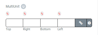
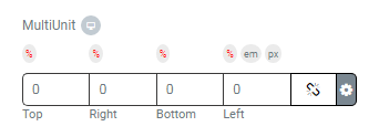
Now that we have gained a basic understanding of an Elementor control, we are ready to create a custom control called MultiUnit, which is similar to Elementor’s Dimension control.
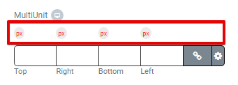
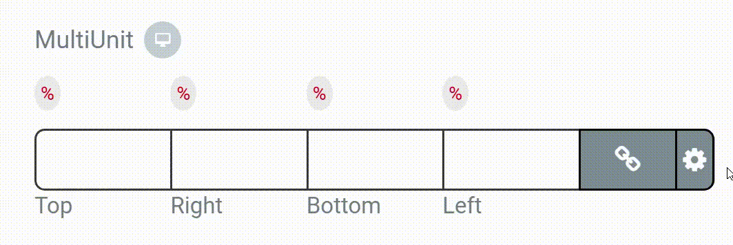
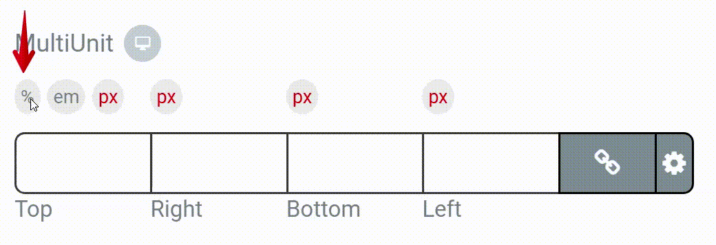
In the Dimension control, we can only set the same unit (px, em,…) for the top, right, bottom and left values, but in MultiUnit control, we can set a different unit for each value.
At the end of this article, we’re going to create the following control.
Our JS file is named MultiUnit.js and extends the Elementor BaseMultiple module. This JS file contains a JavaScript class that has several functions, which are explained briefly below.
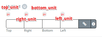
1. The below function defines the essential UI CSS selectors.
5. We need a function to select the proper unit when it’s clicked. The below function is used for top_unit.
setTopInputRange : function( event ) {
  var val = $(event.target).val() ;
  var min = this.range_control[val].min;
  var max = this.range_control[val].max;
  var step = this.range_control[val].step;

  $('li.spicy-control-multiunit > input[type=number][data-name='+this.name_control+'-top]').attr({"min":min,"max":max,"step":step});
}
We’ve also declared similar functions for right_unit, bottom_unit, and left_unit that you can find in the source code.
6. We need other functions to show/hide units when clicked. The below function is used for the top_unit.
TopRangeToggle : function (event) {
  var cat = $(event.target).attr("data-cat");
  if(this.range_top==false){    $('.spicy-units-choices-label-top[data-cat='+cat+']').not(event.target).hide();
  this.range_top = true;
  }else if(this.range_top==true){
   $('.spicy-units-choices-label-top[data-cat='+cat+']').show();
   this.range_top=false;
 }
 }
We also declared similar functions for right_unit, bottom_unit, and left_unit.
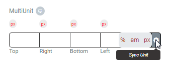
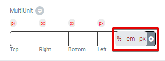
7. The function below syncs top_unit, right_unit, bottom_unit and left_unit together.
Finally, we have other functions that are similar to the JS file of the Dimension control and other custom functions that we haven’t explained. But you can find them in source code.
Creating the CSS File
To style the UI of control in the panel, we need CSS rules as seen below.
It’s time to put the control in action. Follow the steps below in order to use the control.
1. Register the custom control in our plugin using the following codes.
add_action( 'elementor/controls/controls_registered', [ $this,'init_controls']);

public function init_controls() {

  // Include Control files
  require_once( __DIR__ . '/controls/multi_unit.php' );

  // Register control
  \Elementor\Plugin::$instance->controls_manager->register_control( 'spicy-multi-unit-control', new Spicy_multi_unit());

}
2. Add the custom control to any widget. Now, it’s ready to use.
In this article, we tried to explain how to create a custom control for Elementor. Also, we describe the essential files of control and the structure of them. Finally, we created a custom control named MultiUnit.
Feel free to share your experiences with us in the comments.
While social media has dramatically changed the world of photography, it has also provided platforms for ordinary people to reveal their inner photographers. And the majority of us embraced it for good as these social media sites have become increasingly popular by the day. But if you’re a professional photographer – or have a real passion and talent for it – it might be time to create an ideal photography website as a way to store and showcase your valuable photos.
Wouldn’t you prefer your beautiful snaps be displayed in a professionally made website to impress the crowd and potential clients rather than scattered around Instagram or Flickr? You owe that to your skills and talent!
Too confused to know where to start? We hear you! Starting off somewhere is always a hassle, but worry not! Jupiter X has got you covered! In this post, we’ll walk you through 5 photography website templates, explaining each one’s unique anatomy as well as features that will help you choose the best option that best suits your expectations and goals. It will also help you get your hands on your personal or corporate photography website in a snap!
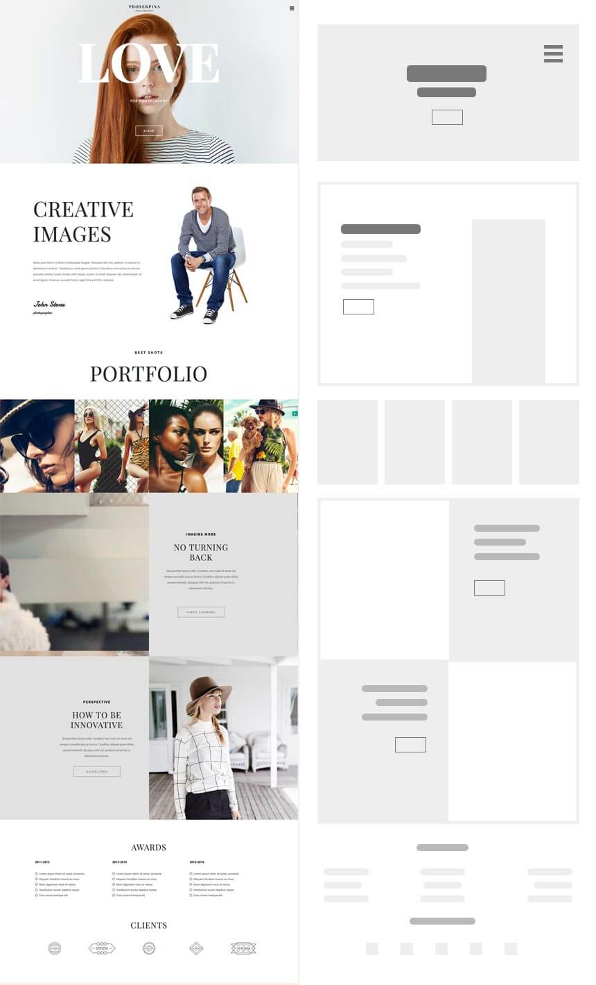
Proserpina: Mixed
Multipage with right sidebar navigation and sectioned homepage
One of our popular photography templates, Proserpina, is perfect for both freelancers and studios who want an uncluttered, yet descriptive portfolio website.
Homepage Structure
The homepage consists of a full-height hero section that you can leverage to shout your name as your personal/professional brand with an intriguing background image, descriptive sections to write about yourself, your business and your projects, portfolio and one-half large sections with video background that adds a cinematic feel to your website if you want to showcase your video editing and shooting abilities. The burger menu with the right sidebar navigation effect helps place focus on the content and images more by keeping menu items out of sight.
Inner Pages
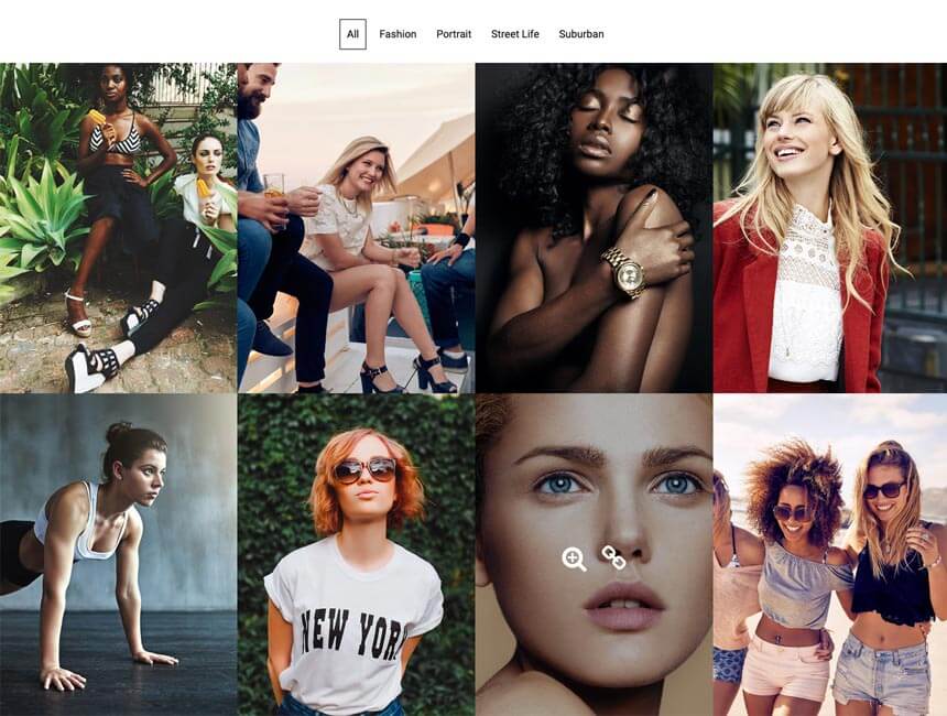
Proserpina has 2 inner pages: Portfolios and Contact. You can store your photo albums and collections in a clean portfolio page. Your concept and vision matter for every single photo. So what’s even better than putting them in different categories for faster and smoother navigation through your photos? Proserpina comes with Posts Element that you can categorize according to your point of view.
Proserpina Portfolio
Forms, addresses, and social media channels make you reachable to your customers and give them a way to stay in touch with you. You have it all in the contact page, which is ready for customization.
With no more than 3 pages (Home, Portfolio, Contact), this template has everything your audience needs to know about you, your style and your work.
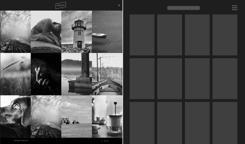
Want to impress your audience with nothing but your photos at first sight? Well, search no more! Locaste template does just that!
Who should use it?
This minimal template can suit both freelancers and studio owners of the same taste.
Homepage Structure
The homepage loads to a full gallery of photos using the images layout and is organized in 4 columns with no other text or elements to distract your visitors. And the tiny burger menu adds up to it! So the no-intro homepage style is also surprisingly compelling to website visitors.
Inner Pages
Locaste has 4 inner pages: About, Gallery, Blog and Contact. They all follow the overall minimal style of the template but contain multiple layout options to choose from for Gallery and Blog pages.
You can choose between various gallery and blog layouts, from classic to masonry, each with a categories option and different column structure to better organize your albums and posts.
Locaste Photography Template
The About page includes 4 main sections, a hero section with a background image, the about section to write about the artist or the business, a section to add teammates and the last section organized in 2 columns of an image and text, which can be dedicated to anything related to the photos, studio or the artist.
And finally, the contact page consists of a column for the address, social media accounts and a simple form following with a Google Map.
All in all, if you need a big album and a blog to write about the spirit behind your photos, this clutter-free template is the perfect choice. Just take your camera and let Locaste guide your fans through the magical world of your shots!
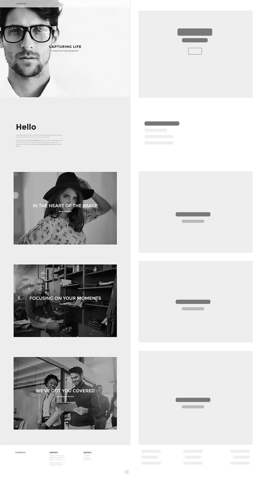
You’re a beginner, you know you’ve got the eye and want to share it with the world, but in no way want to mess with the technical hassles of creating a complicated website! We hear you and offer you the ultra-minimal one-page Cynosura template.
Who should use it?
This single page template is perfect for freelance photographers who just need to set up a virtual album and a place to communicate with those who find their photography interesting.
Homepage Structure
The homepage loads to a short intro consisting of a full-height background image and some minimal text without a navigation bar. There are no inner pages, and the portfolio is presented on the same page. So all you need to do is to add a photo album element, upload your photos, add your social media accounts and contact information in a simple footer, and trust us, that’s it! You have your simple cool portfolio website.
This multi-page template is ideal for those freelancers who would like to add a bit more detail to their online portfolio.
Homepage Structure
The homepage starts with a short intro and portfolio organized in two half large columns that each can be served as an album containing more information and photos inside, as well as a minimal footer.
Inner Pages
Arbius has three more inner pages: About, Personal and Contact.
The about page is simply made up of some image and text elements and defines what can be called the best “about” page in its most concise and well-set way.
The personal page can be called your album storage. You can organize your photos into different albums here using the photo album element.
And, finally, the very simple contact page contains your personal studio address, phone number, and email. Isn’t that what a typical contact page should offer?
Jovial: Classic
Multi-Page with classic navigation and sectioned homepage
Jovial is a classic multi-page template, perfect for photography studios that consider their website as the main platform to present their services, explain the techniques they use and to showcase their work samples.
Homepage Structure
The section-based homepage starts off with an eye-catching intro, a full-height hero image, and scrolls down to more sections, each containing details and explanations about the services offered. The proper combination of image and text while avoiding an uncluttered overall look is noticeable.
Inner Pages
Like the majority of the classic website templates, Jovial also has many inner pages: About Us, Our Team, Projects and Contact Us.
The about page has an intro with bold headings on top and a cover image below. The inner sections in between can be served as side notes about your business. The fixed background with text element walking on it adds a sophisticated look to the page.
The team page has the same bold heading and cover image style and uses sections to introduce the team members. A whole descriptive section that speaks to the members’ background and experiences sounds great! Some of the sample works can also be added as posts to the page. It will for sure invite the visitors to check on the projects page!
The projects page is all about its name! Following the same intro style, it’s your treasure chest, storing your work samples and past projects.
And finally, the contact page which will serve as a bridge between you and clients with a Google map and contact information down the page.
Wrap Up
We showcased 5 models that represent different approaches in design and content for an ideal photography website and can be chosen as a foundation or inspiration for your photography website based on your brand’s characteristics and preferences.
Have you already started setting up your website? Do you plan to strengthen your online presence and let the world see through your eyes? Let us know in the comments!
Restaurants – which are nearly as old as the service industry itself – have been serving food (hopefully clean!) on-demand and at a reasonable speed (at least the good ones) for all sorts of folks for centuries. Making a website that helps a restaurant business is essential (I know, you already knew that, but bear with me). The question is: “how can you make a website that is more than a digital brochure to actually helps the restaurant?”
My name is Afshin. I’ve been a Jupiter user for 5 years and used this theme to create many WordPress websites for my clients. My real expertise is branding, so I don’t know how to code aside from some handy custom CSS tricks I learned here and there. In this blog post, I’m going to cover the 4 important things that make a restaurant landing page with Jupiter X stand out of the crowd. I’ll then walk you through the steps of how to build it using Jupiter X – it goes without saying that not a single line of code will be written today!
4 Important Things that Make a Restaurant Website Stand Out (With Jupiter X, Obviously!)
1- Look and Feel (Because Instagram!)
The restaurant website should look the part of the cool, hip place it’s representing online. It’s “game on” the second a visitor enters a restaurant’s webpage as they will almost instantaneously make up their mind about that business. Things like using professional, tempting photos of the food and eye-catching pictures of the ambiance go a long way in communicating the quality of the services along with the restaurant’s look and feel.
2- Being Informative (But not Boring)
Having a well-thought-out, honest and clear message that tells visitors why a restaurant is different and more importantly, the type of cuisine served can leave a lasting impression. To make the webpage actually useful for visitors, information regarding working hours and the restaurant’s location should be easily accessible (But careful! This info shouldn’t be in their faces the whole time!). These details are the most looked at on any restaurant’s website. Let’s not forget people usually just Google the name of the place and working hours, which means that we need SEO to work right there and then. It would be a definite plus if visitors could also make reservations directly from the website.
3- Mobile First (For Real)
Have you seen those people who have their smartphones with them day and night? Yeah, they’re probably going to visit your website on those very same phones (After all, who checks a restaurant webpage on a desktop computer sitting in an upright position?!). So the website should be mobile-friendly or – as web designers like to put it – “responsive,” so people can find what they need on their tiny screens before moving onto the competition.
4- It Should Be Fast (Or Don’t Bother!)
Last but not least, your restaurant website needs to be snappy. I mean, you probably won’t get a second chance to be snappy (remember those people with smartphones? They’re not really known for their patience), so choose your hosting service, CMS, themes and plugins wisely because that website is going to fill your spot online. It better be worth it and fast.
Making a Restaurant Landing Page with Jupiter X
In this part of the blog post, I’ll explain the steps required to recreate the Jupiter X Pro Template Restaurant landing page with Jupiter X, Raven elements and Elementor. If you need more details about any of the steps, you can watch the video to see the entire process. I’m going to assume you have a fresh installation of WordPress, a registered Jupiter X WordPress Theme, installed necessary plugins and activated them.
Setting up the essentials
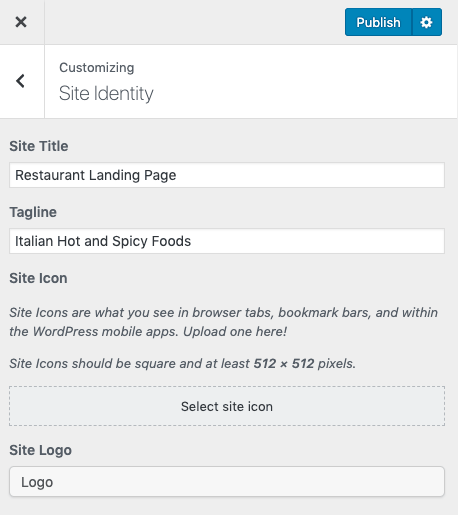
Making a website starts with the essentials like the website’s title and subtitle, its colors, typography settings and a few other global customizations. You can adjust these settings via Customizer. If you are unsure where to start, you can take this file and simply import it in your own Jupiter X installation (I won’t tell anyone, wink!). After importing the settings into Customizer, it would be a good idea for you to explore Customizer and get an understanding of what can be changed/adjusted and where, so you can make these settings in future projects using Jupiter X. I would recommend checking the site identity, typography, header, footer, and menu.
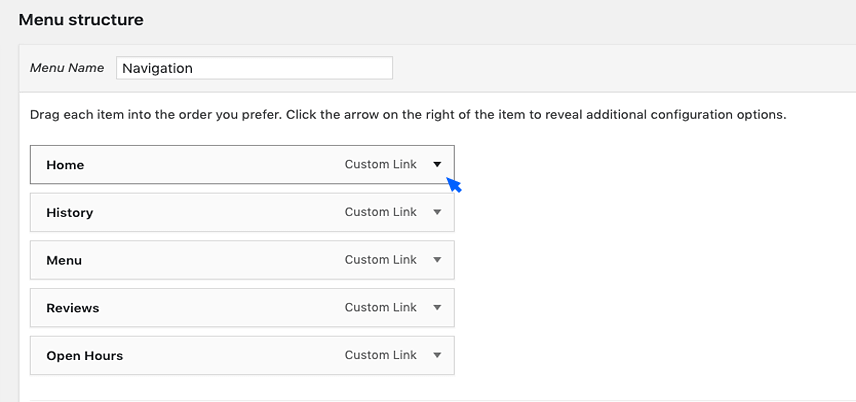
Creating the Navigation Menu
When you’re setting up the menu, it’s imperative that you consider which pages matter more and how most people would go about finding the relevant information they are after. To create your menu:
Go to Appearance > Menus, and create a menu.
Since this is a one-pager, you’ll need to add menu items as Custom Link.
Use titles such as #about (also known as anchors – more on this below) and save.
Making a Header and Footer for your Restaurant Website
Now that we took care of what is under the hood, it’s time to create the header. Headers matter as they are usually the second thing that catches visitors’ attention. Creating headers with Jupiter X is really straightforward.
In the Dashboard > Templates > Header tab, you can (create and) add a header. In the next screen, you can simply import one out of many header templates. Choose the one with the Jupiter X tag that looks like the one in the template. You can edit the template in Elementor to give it the look you need. The process for the footer is exactly the same.
Hero (Go big or go home!)
This is the first thing visitors to your website will see. Done correctly, it’ll save the day, hence the name hero. The hero section of a website usually has a hero image, an eye-catching graphic element, two to three pieces of typography and a call-to-action button (Duh!). To create the hero section:
Add a section from the left sidebar then add a heading, headline and text paragraph.
Edit the content in each of the sections you added. The great thing about the Jupiter X headline element is that it allows you to edit the text in two separate boxes and automagically applies two sets of typography and color adjustment to them.
Don’t forget to set the headline to H1 and the heading to H3 so they will get their size color and font from the customizer settings that you imported before.
Now add the button and change the text and color (the accent color hex code is #ff5600).
Intro (The specifics…)
If the user scrolls past your hero without bouncing (closing the browser tab), you are either lucky or have done a good job with the hero section (or the visitor just has nothing better to do!). Either way, you must now offer more details about your services to your online walk-in, so you need details on what you serve and why your place is different. But the trick is that you can’t just pile it on. It’s better to share this info in a structured way. Using icons really helps.
To create this part:
Add a section, then a headline, and set it to H2. Edit the two sections according to the template.
Add a sub-section and then click on the top-right corner on either of the columns to add one more column.
Drag and drop an image box element in on the columns, add the image from the settings and edit the styling from the middle tab for both the image and the content (watch the video for the full setting description.)
Right-click and click “duplicate it twice,” then drag and drop each of them in empty columns and edit the content.
History (Why should I trust you?)
You can claim you are the best, hippest, most awesome place in the city that serves Italian cuisine. But I would most probably not take your word for it. In this way, you should “show your work” and to build trust, a business (especially restaurants) should share their credentials such as the head chef, awards and the number of years in operation.
To make this part:
Add a section and a subsection.
Edit the column to use 65% of the total length, add an image to the right column and choose an image for it.
On the left column:
Add a heading (H3), a Jupiter X headline (H2) and edit the content accordingly.
Add a subsection then drag and drop image boxes into one of the columns. Edit the image and content, set up the style and make the title H3.
Now duplicate the image box three times and carry two to the right column in the under-section.
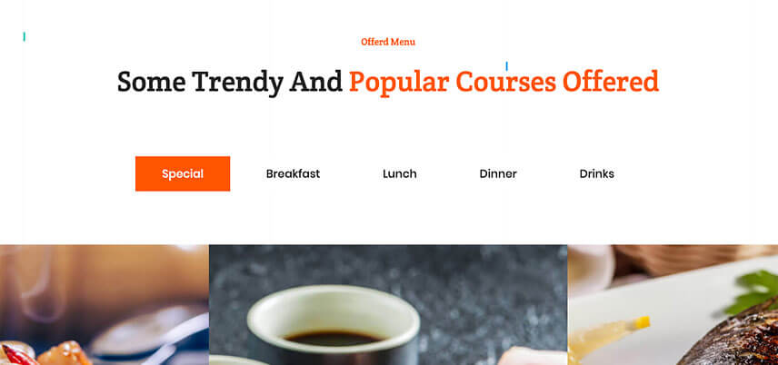
The Menu (The Juice)
Whatever you do, please don’t stick a picture of your restaurant’s menu on the first page – or any other page for that matter. The easy explanation is that Google doesn’t like it, and neither do your visitors. Offering text in the form of an image makes your website look unprofessional and difficult to operate and we don’t want that. Offer your menu with mouthwatering photos of the meal. Jupiter X has a set of comprehensive style options and a visually-appealing gallery element that can come in handy when we want to make any product/project showcase (namely a restaurant menu).
To make this part:
Add a section. Then you’ll need a heading (H3) and a headline (H2). Edit the content exactly like the similar ones above.
On the sidebar, search “tabs” and add the one you see in the picture below. Note that like the header, this element needs the content to be made beforehand so it can actually work.
Leave the tabs (save your work first!), go to Dashboard > Templates > Saved Templates and click Add New. (Since this is a mock website, we made only one template. But if you really want to make your tabs work like tabs, you should make five templates – one for each tab).
In the window that opens:
Choose the Section and give it a name such as “Offered Menu.”
Click “Create Template.” Add a subsection and duplicate one of the columns to get three columns. Also, make sure that you set the inner section to Full Length from the Layout.
Search for the Animated Box and then drag and drop it in one of the columns. Edit the content as seen in the picture below:
In Style > General, apply the below settings.
Duplicate this element four times. Put one in the middle column and two in the outer ones.
From Style > General, change the middle animated box.
Now you can click publish, and… Congrats, you’ve created your first custom template!
Testimonials and Partner Brands (Do not fake it until you really make it!)
Typically, people like to read about a new place before trying it. For that reason, having your own set of short review excerpts – especially if they are from Yelpers who have a high readership on the website – can really close the deal for you. To do this, you can invite a bunch of reviewers to eat at your restaurant to get their opinion. Also having the logos of your suppliers on your page gives a sense of trust and reliability.
To build this section:
Add a section.
Drag and drop testimonials, a heading (H3), a headline (H2) and finally a brands element to the section.
I’ve explained how to style the testimonial and brands in the video but In short, you’ll have to add testimonials one by one. We’ve included a picture, name, position and the rating in each item. In the style tab, you can change the shape of arrows, how pictures are shown and the testimonial background.
The same goes for the brands as you can adjust them, like below:
Have them make a reservation online (Don’t forget to tell your staff you have this feature on your restaurant website!)
Yes, yes, I know with a gazillion apps out there for making reservations at restaurants and bars, you’re thinking “who needs a reservation form on their own website?” Well, EVERYONE! If you don’t include a form to make a reservation, they’ll have to call your restaurant (What if your staff don’t hear the phone ring?) or use an app to make a reservation (What if they cannot find your place on their specific app?). So make everyone’s life easier and just add the form and link it to an email address you would always check. By the way, a little birdy just told me that soon taking reservations on your website in Jupiter X will be similar to taking orders on an e-commerce website, which would make the task of following up on reservations much easier and more practical.
To make the last part of your webpage’s body:
Add a heading (H3), a headline (H2) and finally a subsection.
Drop an image (and choose an image for it) into the right column and a Jupiter X form element into the left column.
In the settings you change the type of information you get from each field also the color, font, spacing and all styling details of the form element.
Setting up all the nitty gritties
Obviously, without adjusting all your paddings, margins and other little details, you won’t have a market-ready webpage. In other words, don’t forget to retouch each section to give it that nice and sleek look. I tried to only include the gist of the tutorial in the blog post to avoid getting TLDRs in the comment section.
In the video tutorial, I’ve made the whole restaurant landing page with Jupiter X from scratch without a single line of code – and this includes all the small settings and adjustments that make it look the way it looks. Make sure to watch the tutorial!
Building a WordPress website with Jupiter X is like taking a walk in the park – it’s easy. But building a website isn’t where the story ends. Websites could suddenly crash or get hacked, which could leave you with a rapid decline in traffic and revenue. Bad things happen when you least expect it. Better to be safe than sorry, right? You need to get your site a WordPress backup.
Taking regular backups is the best way to ensure that you have something to fall back on when things go wrong. A simple restoration can get your website up and running in no time.
So all you need to do is to have a good backup solution. But how do you go about choosing one? What does an ideal backup solution offer?
Choosing a Good Website Backup Solution
There are several WordPress backup services to choose from, which makes it difficult to select the right one. You either end up making a wrong choice or worse: you don’t choose at all.
But identifying a good backup service is not as difficult if you know what to look for. The backup solution should be able to provide the following:
Complete backups
Incremental backups
Multiple backups
Real-time backups
Backup storage
Restoration
Independent dashboard
Customer support
1. Complete backups
Your website contains different kinds of data. There are posts, pages, images, videos, tables, settings and configurations that should be backed up. A backup solution must be capable of backing up all these types of data and ensuring that it’s safely archived.
2. Incremental backups
Breaking the data into small chunks not only makes it easier to backup but also makes sure that nothing is left behind. This is called backing up your website incrementally. Incremental backups are best for large sites that contain a lot of data. The risk of leaving data behind is much higher for large websites.
3. Multiple backups
An ideal WordPress backup solution will take multiple backups of the same version and then store it in different locations. It can be stored in the solution’s own server or on cloud storage services like GDrive, DropBox or on your local system. It should also secure the backup copies by encrypting them so that if someone lays their hands on your backup, the copy will be illegible.
4. Real-time backups
Some websites need more than daily backups. Let’s say, for instance, that you run a very active photography blog. New pictures are being added and dozens of people are commenting and buying your prints. You’ll need to take backups in real-time for such a dynamic website. Every single change made on the site has to be backed up instantly. Failing to do so will cause loss of valuable data, such as prints that visitors added to cart but didn’t order. In such cases, you’ll lose orders when disaster strikes.
5. Backup storage
Simply taking backups is not enough: the data must be stored in an accessible location. Sometimes backups are stored on the site server, which makes it impossible to access them on certain occasions like when you can’t access your hosting account. Not just that, the server suffers because it’s burdened with storing backups on top of performing its regular processes.
6. Restoration
There are times when you need to restore your website. Many solutions don’t offer a reliable way to restore backups. Failing to implement a complete restore is a common complaint among website owners. Select a backup solution that comes with a good record for website recovery.
7. Independent dashboard
In a worst-case scenario, performing a backup is your fall back option. But what if you can’t access your backups when you need them? If the backup plugin is accessible only from the WordPress dashboard and if you lose access to wp-admin, then you won’t be able to access your WordPress backup either. Having a completely independent dashboard enables you to retrieve backups even when you can’t enter your website.
8. Customer support
Customer support is a primary benefit for a paid tool. But not all paid tools offer good customer service. A good backup solution values your time by offering reliable and agile customer service. Responses must be quick and easy to understand.
With that, we have covered everything that makes a good backup service. BlogVault Backup Solution is a service that checks all the boxes. Trusted by over 400,000 websites, BlogVault is the most reliable WordPress backup and restoration solution. Learn more about what the solution offers here.
You can use BlogVault to backup your Jupiter X website. In the next section, we’ll demonstrate how.
How to Perform a WordPress Backup with BlogVault
Step 1: First, sign up and add your website to BlogVault. From the dashboard, select Add New Site and enter your website address.
Add your site by selecting ‘Add New Site’
Step 2: Next, install the plugin to your site. There are two ways to do this. You can automate the installation or do it manually. We’ll show you both.
You can install the plugin manually or automate the process.
Install the BlogVault plugin manually
To download the plugin, click on Download Plugin
Download the plugin from your BlogVault dashboard. Then go over to your website and upload the plugin by navigating to Plugins > Add New > Upload Plugin.
Upload the plugin to your Jupiter X site.
Alternatively, you can install the plugin like any other WordPress plugin. Head straight to your website dashboard and then go to the Add New plugins page. Search for BlogVault in the Search bar and then install and activate the plugin.
Auto-install the BlogVault plugin
The benefit of auto-installing the plugin is that you don’t need to go to your website. Simply enter your site credentials (BlogVault doesn’t save your admin credentials) and select Install plugin. That’s it. The plugin will be installed on your site automatically, and the WordPress backup process will begin instantly.
Insert the username and password of your Jupiter X website.
The plugin will backup your entire website and store it safely. Since your website is being backed up for the first time, it’ll take some time. Sit back and relax. You’ll get a notification once the process is complete.
Conclusion
You should be able to rely on backups for any unforeseen situations. Whether you want a new backup service or plan on upgrading your old service, you need to verify whether it offers all the essential features.
In this guide, we explained all these features to be on the lookout for and showed you how to install BlogVault, a WordPress backup solution that’s one of the best out there. We hope you found our guide useful. If you have any questions, feel free to leave us a comment below.
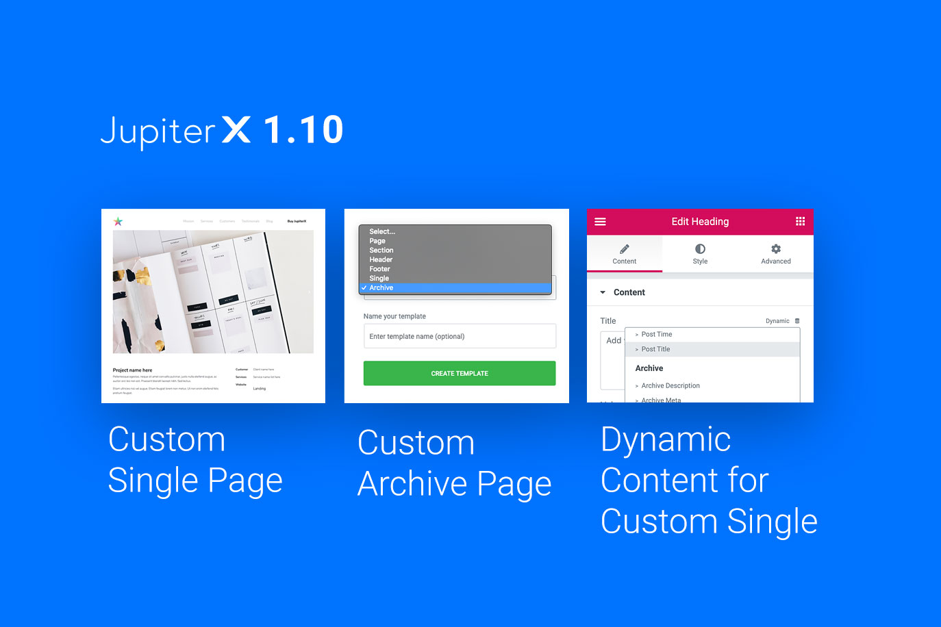
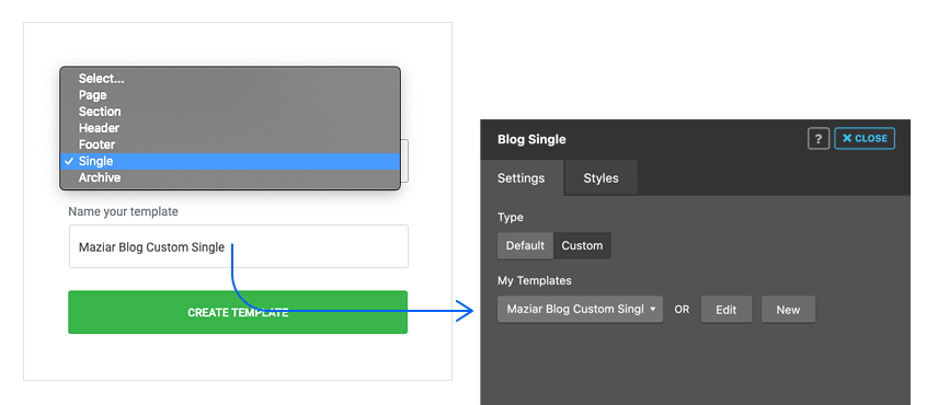
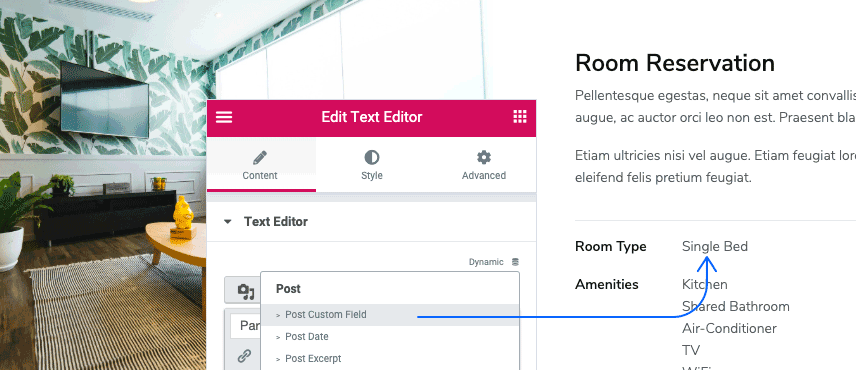
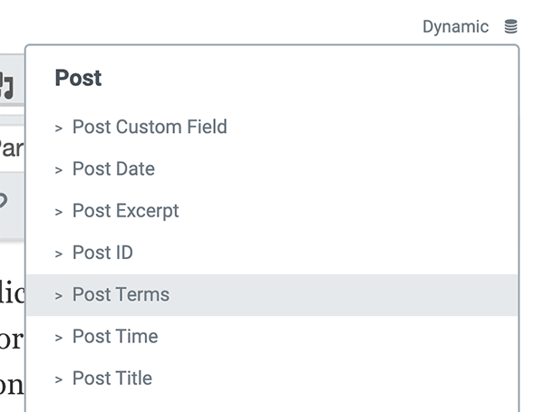
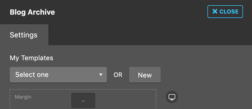
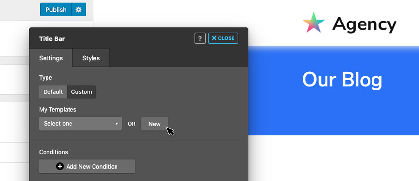

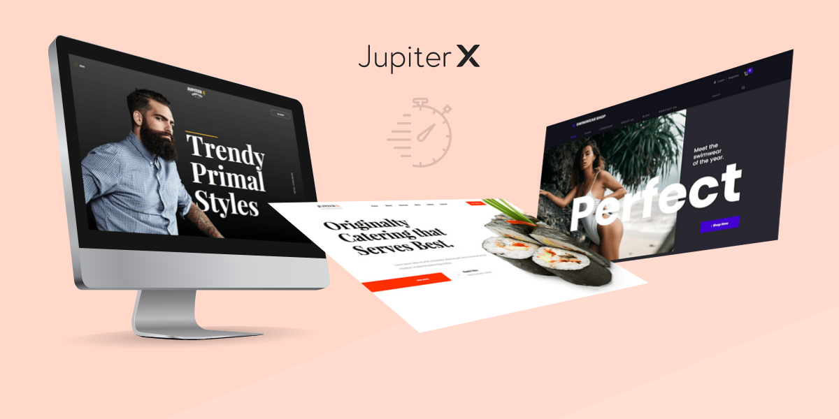
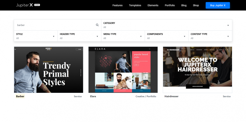
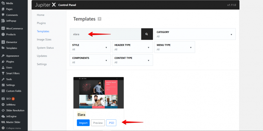
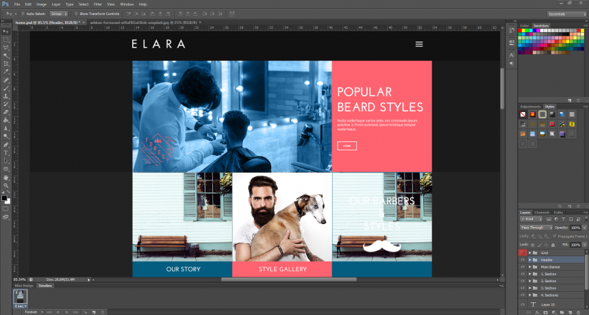
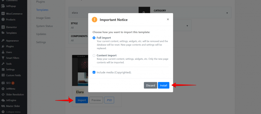
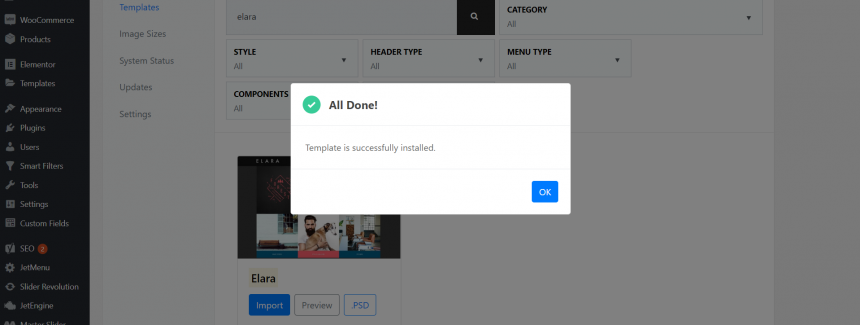
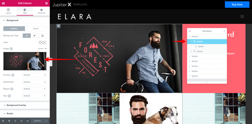
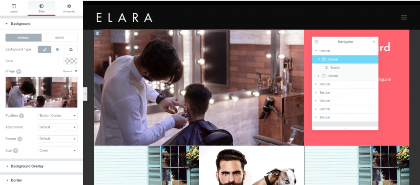
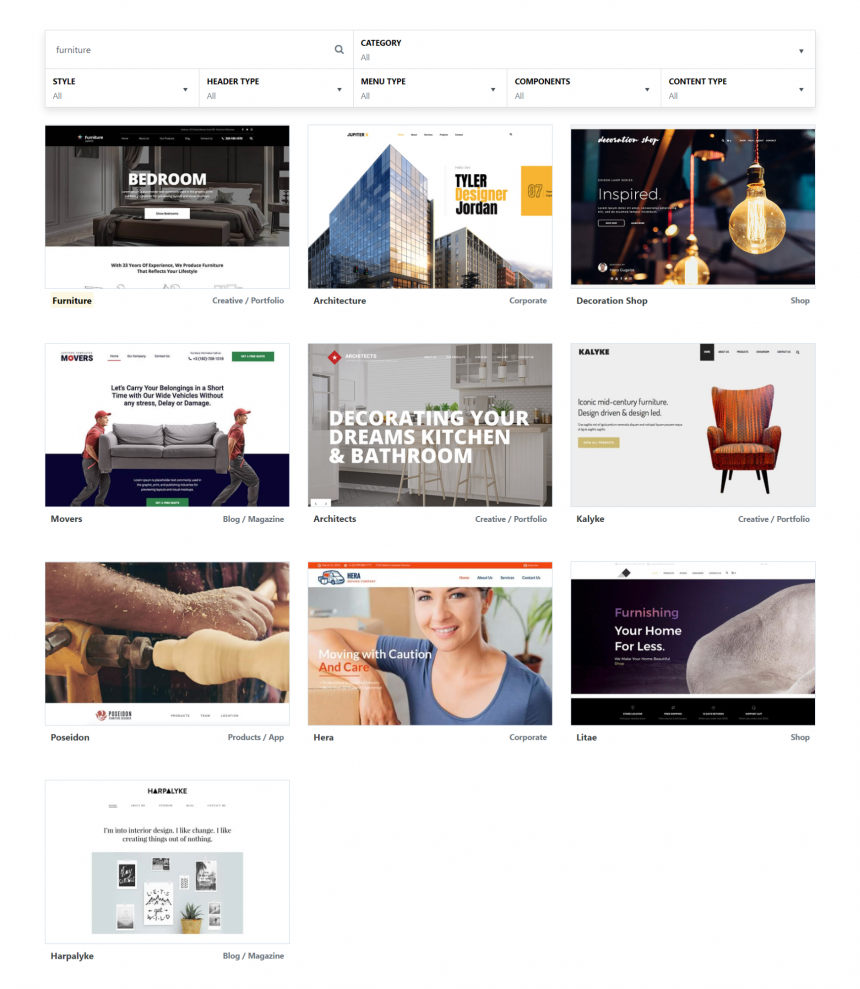
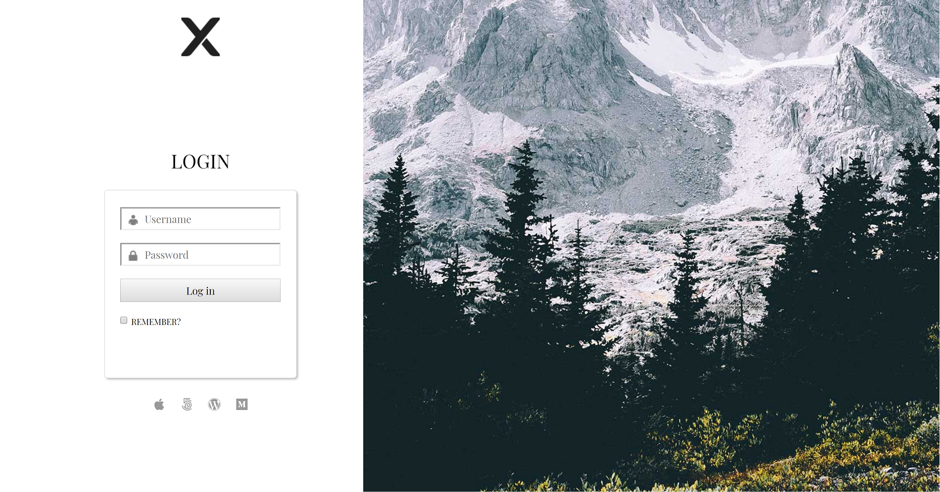
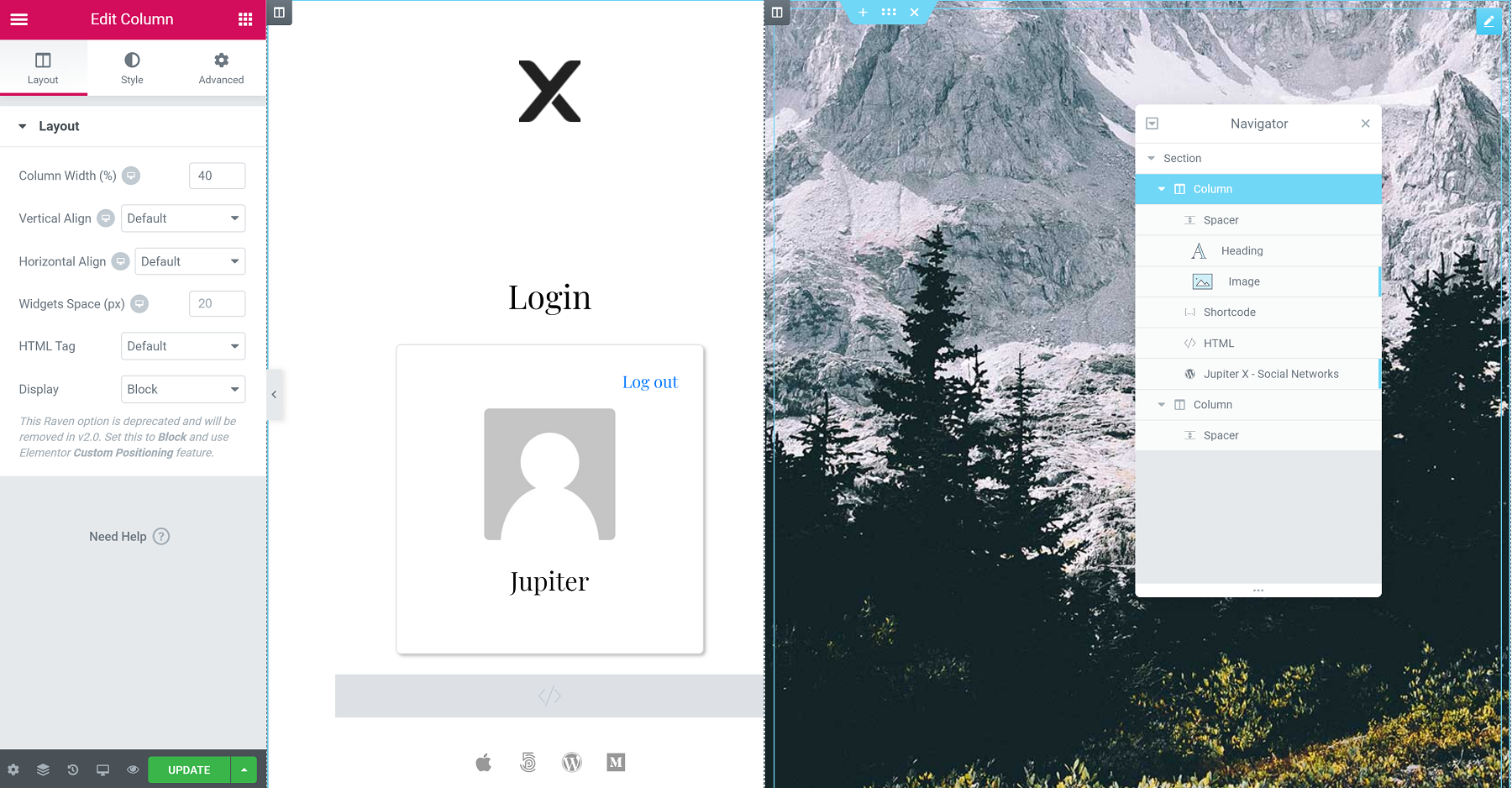

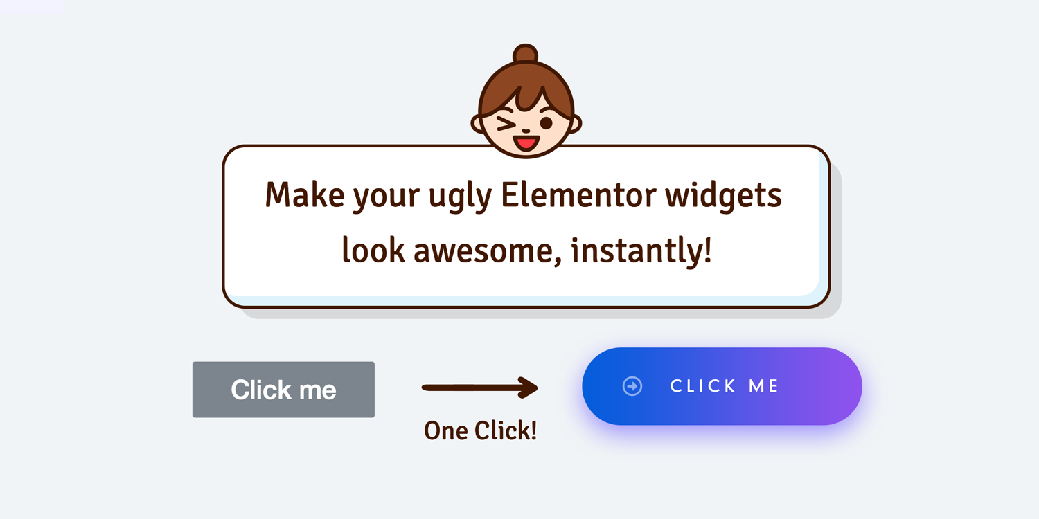
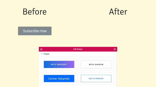
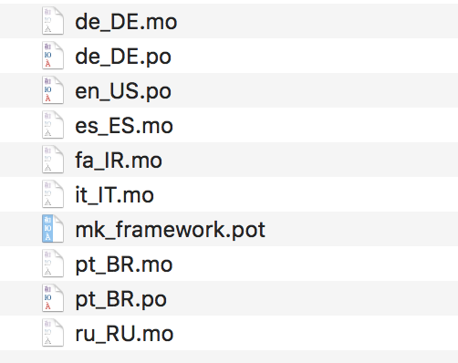

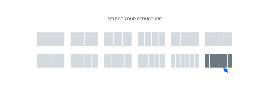
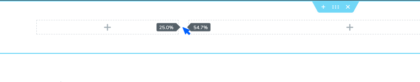
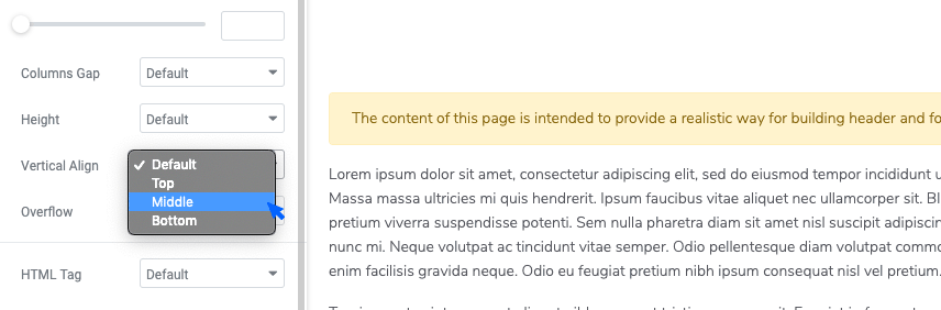
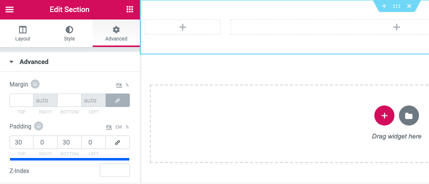
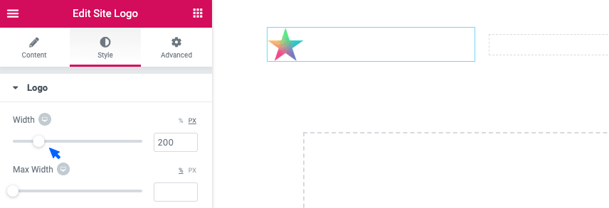
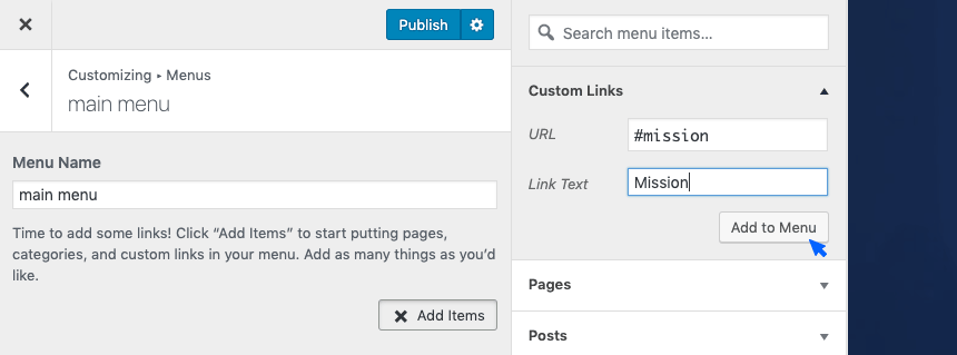
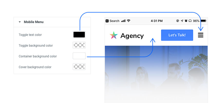
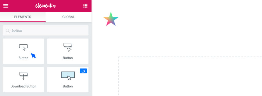
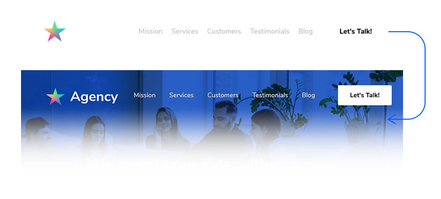
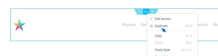
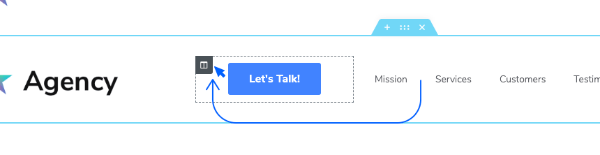
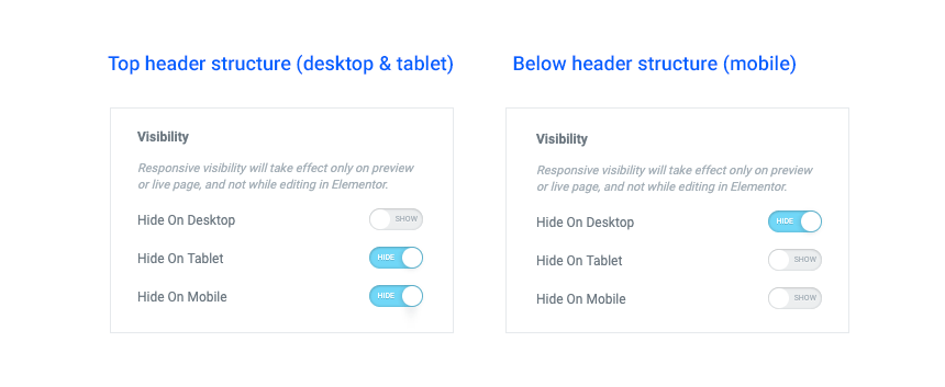
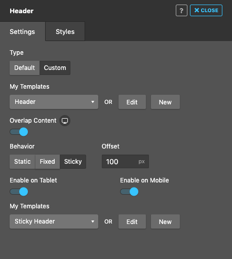
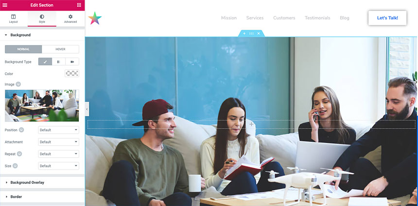
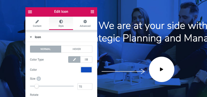
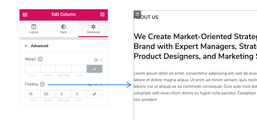
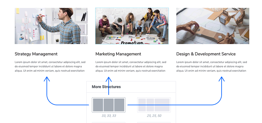
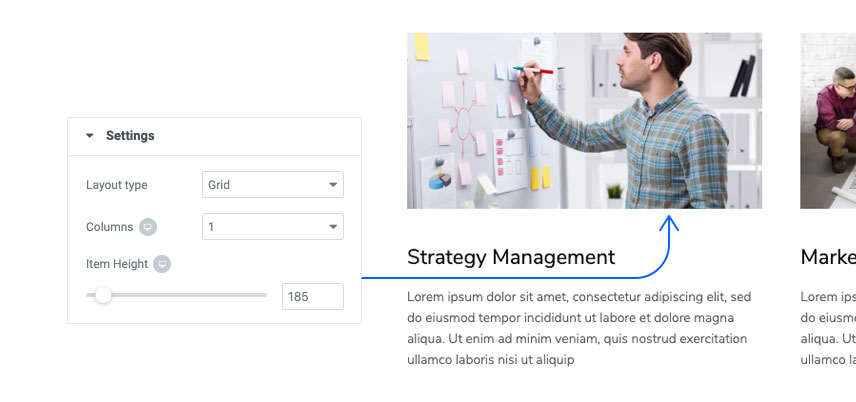
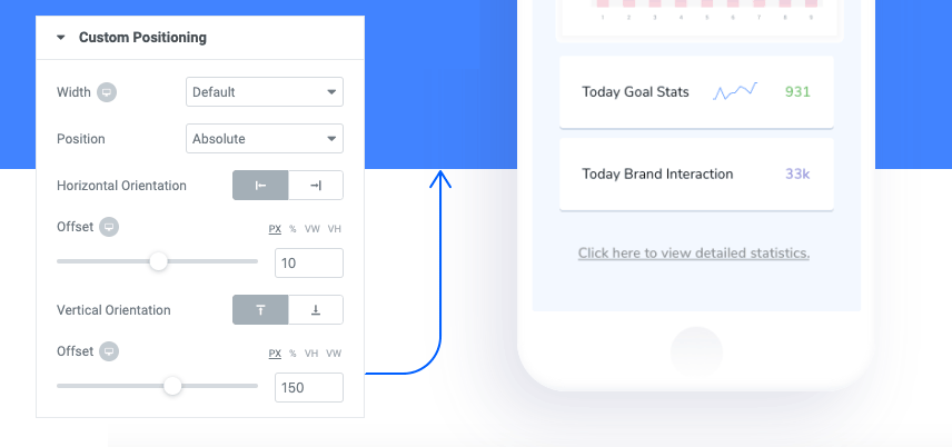
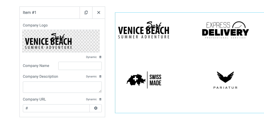